GTK 3 Tutorial for Lisp
Using the cl-cffi-gtk library for writing Lisp programs
Copyright (C) 2012 - 2021 Dieter Kaiser
- Introduction
- 1. Getting started
- 2. Packing Widgets
- 3. Button Widgets
- 4. Display Widgets
- 5. Adjustments
- 6. Range Widgets
- 7. Layout Widgets
- 8. Dialogs
- 9. Multiline Text Widget
- 10. Tree and List Widgets
- 11. Selecting Colors, Files, and Fonts
- 12. Menus and Toolbars
- 13. Miscellaneous Widgets
- 14. Printing
- 15. Application Support
- 16. GTK and Cairo
- 17. Deprecated
- A. Licenses
- 1.1. Simple Window
- 1.2. Getting started
- 1.3. Hello World
- 1.4. Upgraded Hello World
- 1.5. Drawing in response to input
- 2.1. Simple Box
- 2.2. Box Packing
- 2.3. Simple Grid
- 2.4. Grid Packing with more spacing
- 2.5. Packing using GtkGrid
- 3.1. Button with an image
- 3.2. More Buttons
- 3.3. Radio Button
- 3.4. Toggle Buttons
- 3.5. Link Button
- 3.6. Switch
- 3.7. Scale Button
- 4.1. Labels
- 4.2. More Labels
- 4.3. Images
- 4.4. Info Bar
- 4.5. Progress Bar
- 4.6. Statusbar
- 6.1. Scale Widget
- 7.1. Button Boxes
- 7.2. Paned Window Widgets
- 7.3. Layout Widget
- 7.4. Notebook
- 7.5. Frame Widget
- 7.6. Aspect Frame Container
- 7.7. Fixed Container
- 7.8. Scrolled Window
- 8.1. General Dialog Window
- 8.2. Message Dialog
- 8.3. About Dialog
- 9.1. Simple Text View
- 9.2. Changing Text Attributes of a Text View
- 9.3. Applying tags to text
- 9.4. Searching text in a text view
- 9.5. Inserting text in the Text View
- 9.6. Insert an Image
- 9.7. Insert a Widget
- 9.8. Text Buffer and Window Coordinates
- 9.9. Multiline Text Editing
- 10.1. Simple Tree View
- 10.2. Tree Path
- 10.3. GtkTreeViewColumn
- 10.4. Cell Renderer Properties
- 10.5. Persistent Cell Renderer Properties
- 10.6. Example Icon View
- 11.1. Color Button
- 11.2. Color Chooser Dialog
- 11.3. Color Chooser Dialog with a custom color and gray palette
- 11.4. File Chooser Dialog
- 11.5. File Chooser Button
- 11.6. Font Chooser Dialog
- 11.7. Font Button
- 12.1. Creating Menus by Hand
- 12.2. Creating a Pop-Up Menu
- 12.3. Creating a Toolbar
- 13.1. Calendar
- 13.2. Event Box
- 13.3. Text Entry
- 13.4. Spin Button
- 13.5. Combo Box
- 13.6. Combo Box Text
- 13.7. Tool Palette
- 14.1. Page Setup Dialog
- 15.1. Simple Application
- 16.1. Cairo Clock
- 17.1. Table Packing
- 17.2. Table Packing with more spacing
- 17.3. Alignment Widget
- 17.4. Arrow Button
- 2.1. Functions for GtkBox
- 4.1. GtkJustification
- 7.1. Values of the GtkPolicyType enumeration
- 8.1. Values of the GtkResponseType enumeration
- 8.2. Values of the GtkMessageType enumeration
- 8.3. Values of the GtkButtonsType enumeration
- 9.1. Properties used for creating Tags
- 10.1. Functions for GtkTreeModel
- 10.2. GtkCellRenderer
- 13.1. Properties of the GtkAdjustment widget
- 13.2. Values of the GtkSpinType enumeration
- 17.1. UI definitions
- 1.1. Simple window in C
- 1.2. Simple Window in Lisp
- 1.3. Getting started
- 1.4. Hello World in C
- 1.5. Hello World in Lisp
- 1.6. An upgraded Hello World in C
- 1.7. Upgraded Hello World in Lisp
- 1.8. Second Upgraded Hello World
- 1.9. Drawing in response to input
- 2.1. Simple Box
- 2.2. Box Packing
- 2.3. Simple Grid
- 2.4. Grid Packing with more spacing
- 2.5. Packing using GtkGrid
- 3.1. Button with an image
- 3.2. More buttons
- 3.3. Radio Button
- 3.4. Toggle Buttons
- 3.5. Link Button
- 3.6. Switch
- 3.7. Scale Button
- 4.1. A UI definition fragment specifying Pango attributes
- 4.2. Labels
- 4.3. More Labels
- 4.4. Image Widget
- 4.5. Info Bar
- 4.6. Progress Bar
- 4.7. Statusbar
- 6.1. Scale Widget
- 7.1. Button Boxes
- 7.2. Paned Window Widgets
- 7.3. Layout Widget
- 7.4. Notebook
- 7.5. Frame Widget
- 7.6. Aspect Frame Container
- 7.7. Fixed Container
- 7.8. Scrolled Window
- 8.1. Dialog Windows
- 9.1. Simple Text View
- 9.2. Changing Text Attributes of a Text View
- 9.3. Applying tags to text
- 9.4. Searching text in a text view
- 9.5. Searching text in a text view
- 9.6. Inserting text in the Text View
- 9.7. Insert an Image
- 9.8. Insert a widget
- 9.9. Show tooltips in a Text View
- 10.1. Simple Tree View
- 10.2. Converting a gtk-tree-path into a gtk-tree-iter
- 10.3. Going through every row in a list store
- 11.1. Color Button
- 11.2. Color Chooser Dialog with custom palettes
- 11.3. File Chooser Dialog
- 11.4. File Chooser Button
- 11.5. Font Button with a filter to select fonts
- 12.1. Creating Menus by Hand
- 12.2. Creating Pop-Up Menus
- 12.3. Creating a Toolbar
- 13.1. Calendar
- 13.2. Event Box
- 13.3. Text Entry
- 13.4. Spin Button
- 13.5. Combo Box
- 13.6. Combo Box Text
- 13.7. Tool Palette
- 14.1. Create Page Setup Dialog
- 14.2. Do Print Operation
- 15.1. Simple GTK Application
- 16.1. Demo Cairo Stroke
- 16.2. Demo Cairo Clock
- 17.1. Table Packing
- 17.2. Table Packing with more spacing
- 17.3. Alignment Widget
- 17.4. Arrow Button
Introduction
The cl-cffi-gtk library is a Lisp binding to GTK (GIMP Toolkit) which is a library for
creating graphical user interfaces. GTK is licensed using the LGPL which has been adopted for the
cl-cffi-gtk library with a preamble that clarifies the terms for use with Lisp programs and
is referred as the LLGPL.
This work is based on the cl-gtk2 library which has been developed by Kalyanov Dmitry and
already is a fairly complete Lisp binding to GTK. The focus of the cl-cffi-gtk library is
to document the Lisp library much more complete and to do the implementation as consistent as possible.
Most information about GTK can be gained by reading the C documentation. Therefore, the C documentation
from GTK 3 Reference Manual is included
into the Lisp files as an API documentation to document the Lisp binding to the GTK library. This way the
calling conventions are easier to determine and missing functionality is easier to detect. The Lisp API
documentation is available online at
cl-cffi-gtk API documentation.
The GTK library is called the GIMP toolkit because GTK was originally written for developing the GNU Image Manipulation Program (GIMP), but GTK has now been used in a large number of software projects, including the GNU Network Object Model Environment (GNOME) project. GTK is built on top of GDK (GIMP Drawing Kit) which is basically a wrapper around the low-level functions for accessing the underlying windowing functions (Xlib in the case of the X windows system), and GdkPixbuf, a library for client-side image manipulation.
GTK is essentially an object oriented application programmers interface (API). Although written completely in C, GTK is implemented using the idea of classes and callback functions (pointers to functions).
A third component is called GLib which contains replacements for standard calls, as well as additional
functions for handling linked lists, etc. The replacement functions are used to increase the portability
of GTK, as some of the functions implemented here are not available or are non standard on other Unixes
such as g_strerror(). Some also contain enhancements to the libc versions, such as
g_malloc() that has enhanced debugging utilities.
In version 2.0, GLib has picked up the type system which forms the foundation for the class hierarchy of GTK, the signal system which is used throughout GTK, a thread API which abstracts the different native thread APIs of the various platforms and a facility for loading modules.
As the last components, GTK uses the Pango library for internationalized text output, the Cario library, which is a 2D graphics library with support for multiple output devices, and the GIO library, which is a modern easy-to-use VFS API including abstractions for files, drives, volumes, stream IO, as well as network programming and DBus communication.
This tutorial describes the Lisp interface to GTK. It includes a lot of material and code from different sources. See Licences for more information.
Chapter 1. Getting started
1.1. Installation
The first thing to do is to download the cl-cffi-gtk source and to install it. The latest
version is available from the repository at
github.com/crategus/cl-cffi-gtk. The cl-cffi-gtk library is ASDF installable and can
be loaded with the command (asdf:load-system :cl-cffi-gtk) from the Lisp prompt. The library
is developed with the Lisp SBCL 2.0 on a Linux system and GTK 3.24. Furthermore, the library runs
successfully with Clozure Common Lisp and CLISP on Linux. The library compiles and the demos run with
Windows 10.
The minimum version requirements are GTK 3.16 and GLIB 2.48.
GTK depends on the libraries GLib, GObject, GDK, GDK-Pixbuf, GIO, Pango, and Cairo. These libraries can be loaded separately with the following commands:
(asdf:load-system 'cl-cffi-gtk-glib)
(asdf:load-system 'cl-cffi-gtk-gobject)
(asdf:load-system 'cl-cffi-gtk-gdk)
(asdf:load-system 'cl-cffi-gtk-gdk-pixbuf)
(asdf:load-system 'cl-cffi-gtk-gio)
(asdf:load-system 'cl-cffi-gtk-pango)
(asdf:load-system 'cl-cffi-gtk-cairo)
Please consult the ASDF documentation which is available at common-lisp.net/project/asdf/ for configuring ASDF to find your systems.
The cl-cffi-gtk library depends further on the following libraries:
- CFFI
-
the Common Foreign Function Interface, purports to be a portable foreign function interface for Common Lisp. See common-lisp.net/project/cffi/.
Warning: Yout must use the version 0.11.2 or newer of the CFFI library. Older versions of CFFI are no longer compatible with the implementation of
cl-cffi-gtk. - Trivial-Garbage
-
provides a portable API to finalizers, weak hash-tables and weak pointers on all major CL implementations. See common-lisp.net/project/trivial-garbage.
- Iterate
-
is a lispy and extensible replacement for the LOOP macro. See common-lisp.net/project/iterate/.
- Bordeaux-Threads
-
lets you write multi-threaded applications in a portable way. See common-lisp.net/project/bordeaux-threads/.
- Closer-MOP
-
Closer to MOP is a compatibility layer that rectifies many of the absent or incorrect MOP features as detected by MOP Feature Tests. See common-lisp.net/project/closer/closer-mop.html.
Information about the installation can be obtained with the function
cl-cffi-gtk-build-info. This is an
example for the output, when calling the function from the Lisp prompt after loading the library:
* (cl-cffi-gtk-build-info)

cl-cffi-gtk version: 1.0.0
cl-cffi-gtk build date: 21:37 5/12/2021
GTK version: 3.24.23
GLIB version: 2.66.1
GDK-Pixbuf version: 2.40.0
Pango version: 1.46.2
Cairo version: 1.16.0
Machine type: X86-64
Machine version: Intel(R) Core(TM) i5-4210U CPU @ 1.70GHz
Software type: Linux
Software version: 5.8.0-50-generic
Lisp implementation type: SBCL
Lisp implementation version: 2.0.6.debian
1.2. Simple Window
The cl-cffi-gtk source distribution contains the complete source to all of the examples used
in this tutorial. To begin the introduction to GTK, the output of the simplest program possible is shown
in Figure 1.1, “Simple Window”.
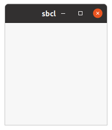
The program creates a 200 x 200 pixel window. In this case the window has the default title "sbcl". The window can be sized and moved. First in Example 1.1, “Simple window in C” the C program of the GTK 3 Reference Manual (Version 3.14) is presented to show the close connection between the C library and the implementation of the Lisp binding. The code of the Lisp program is shown in Example 1.2, “Simple Window in Lisp”.
#include <gtk/gtk.h>

int main (int argc, char *argv[])
{
  GtkWidget *window;

  gtk_init (&argc, &argv);

  window = gtk_window_new (GTK_WINDOW_TOPLEVEL);

  g_signal_connect (window, "destroy", G_CALLBACK (gtk_main_quit), NULL);

  gtk_widget_show (window);

  gtk_main ();

  return 0;
}
;;;; Example Simple Window (2021-5-12)
;;;;
;;;; This example shows a very simple window. The program creates a 200 x 200
;;;; pixel window. In this case the window has the default title "sbcl". The
;;;; window can be sized and moved.

(in-package :gtk-example)

(defun example-window-simple ()
  (within-main-loop
    (let (;; Create a toplevel window.
          (window (gtk-window-new :toplevel)))
      ;; Signal handler for the window to handle the signal "destroy".
      (g-signal-connect window "destroy"
                        (lambda (widget)
                          (declare (ignore widget))
                          (leave-gtk-main)))
      ;; Show the window.
      (gtk-widget-show-all window))))
The examples of this tutorial are defined in the package :gtk-example. The package
:gtk-example includes the symbols from the packages :gtk for GTK,
:gdk for GDK, :gdk-pixbuf for GDK-Pixbuf, :gobject for GObject,
:glib for GLib, :gio for GIO, :pango for Pango, and
:cairo for Cairo. Most of the symbols of the included packages are not needed for the first
simple examples, but we include all packages so later no symbol is missing.
You can load this package on the Lisp prompt and execute the examples of this tutorial. You can start the first example the following way:
* (asdf:load-system :gtk-example)
T
* (gtk-example:example-window-simple)
#<SB-THREAD:THREAD "cl-cffi-gtk main thread" RUNNING {10040EEB83}>
1
*
The macro
within-main-loop is a wrapper around a GTK program. The functionality of the macro corresponds
to the C functions gtk_init() and gtk_main() which initialize and start a GTK
program. Both functions have corresponding Lisp functions. The function gtk_main() is
exported as the Lisp function
gtk-main. The corresponding Lisp function to gtk_init() is
called internally when loading the library, but is not exported.
Already in this simple example, a signal is connected to the created window. More about signals and
callback functions follows in Section 1.5, “Introduction to Signals and Callbacks”. The "destroy"
signal is emitted when the user quits the window. The function
g-signal-connect connects a Lisp
lambda function to this signal, which calls the function
leave-gtk-main to destroy the GTK main loop.
Like the macro
within-main-loop the function
leave-gtk-main is special for the Lisp binding. It calls
internally the C function gtk_main_quit(), but does some extra work to finish the Lisp
program.
Only two further functions are needed in this simple example. The window is created with the function
gtk-window-new. The keyword :toplevel tells GTK to create a toplevel window. The second
function
gtk-widget-show-all displays the new window.
In addition to the function
gtk-widget-show-all the function
gtk-widget-show is available. It only
displays the widget, which is the argument to the function. The function
gtk-widget-show-all displays
the window and all the child widgets it contains. For the first simple window, this makes no difference,
because the window has no child widgets.
1.3. More about the Lisp binding to GTK
Figure 1.2, “Getting started” and Example 1.3, “Getting started” show a second
implementation of the simple program discussed in section Section 1.2, “Simple Window”. The second
implementation uses the fact, that all GTK widgets are internally represented in the Lisp binding through
a Lisp class. The Lisp class
gtk-window represents the required window, which corresponds to the C
class GtkWindow. An instance of the Lisp class
gtk-window can be created with the function
make-instance. Furthermore, the slots of the window class can be given new values to
overwrite the default values. These slots represent the properties of the C classes. In addition an
instance has all properties of the inherited classes. The object hierarchy in the
cl-cffi-gtk API documentation shows, that the
gtk-window class inherits all properties of the
gtk-widget,
gtk-container, and
gtk-bin classes.
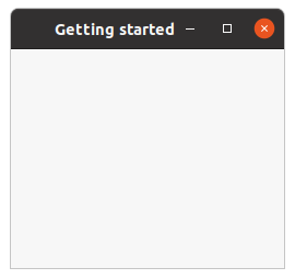
In Example 1.3, “Getting started” the
type property with the keyword
:toplevel creates again a toplevel window. In addition a title is set assigning the string
"Getting started" to the
title property and the width of the window is a little enlarged
assigning the value 250 to the
default-width property. The result of the example program is
shown in figure Figure 1.2, “Getting started”.
The keyword :toplevel is one of the values of the GtkWindowType enumeration in
C. In the Lisp binding this enumeration is implemented as the
gtk-window-type enumeration with the two
possible keywords :toplevel for GTK_WINDOW_TOPLEVEL and :popup for
GTK_WINDOW_POPUP. Most windows are of the type :toplevel. Windows with this
type are managed by the window manager and have a frame by default. Windows with type :popup
are ignored by the window manager and are used to implement widgets such as menus or tooltips.
;;;; Example Getting Started (2021-5-13)

(in-package :gtk-example)

(defun example-getting-started ()
  (within-main-loop
    (let (;; Create a toplevel window with a title and a default width.
          (window (make-instance 'gtk-window
                                 :type :toplevel
                                 :title "Getting started"
                                 :default-width 250)))
      ;; Signal handler for the window to handle the signal "destroy".
      (g-signal-connect window "destroy"
                        (lambda (widget)
                          (declare (ignore widget))
                          (leave-gtk-main)))
      ;; Show the window.
      (gtk-widget-show-all window))))
Example 1.3, “Getting started” shows, that the Lisp function
gtk-window-new is not needed.
The function
gtk-window-new is internally implemented in the Lisp binding simply as:
(defun gtk-window-new (type)
  (make-instance 'gtk-window :type type))
To set the title of the window or to change the default width of a window the C library knows accessor
functions to set the corresponding values. In C the title of the window is set with the function
gtk_window_set_title(). The corresponding Lisp function is
gtk-window-title. Accordingly,
the default width of the window can be set in C with the function
gtk_window_set_default_size(), which sets both the default width and the default height. In
Lisp this function is implemented as
gtk-window-default-size.
At last, in Lisp it is possible to use the accessors of the slots to get or set the value of a widget
property. The
default-width and
default-height properties of the Lisp
gtk-window class have the Lisp slot access functions
gtk-window-default-width and
gtk-window-default-height. With these slot access functions the C function
gtk_window_set_default_size() is implemented the following way in the Lisp library as the
function (setf gtk-window-default-size):
(defun (setf gtk-window-default-size) (size window)
  (destructuring-bind (width height) size
     (values (setf (gtk-window-default-width window) width)
             (setf (gtk-window-default-height window) height))))
As a second example the Lisp implementation of the C function gtk_window_get_default_size()
is shown:
(defun gtk-window-default-size (window)
  (values (gtk-window-default-width window)
          (gtk-window-default-height window)))
In distinction to the C function gtk_window_get_default_size(), which is implemented as
void gtk_window_get_default_size (GtkWindow *window,
                                  gint      *width,
                                  gint      *height)
the Lisp implementation does not modify the arguments width and height, but
returns the values.
Note the naming conventions for the translation of C accessor functions to Lisp slot access functions.
C reader functions with the name gtk_<class>_get_<property> get the Lisp name
gtk-<class>-<property> and the C writer functions
gtk_<class>_set_<property> are replaced by the corresponding
(setf gtk-<class>-<property>) functions. That is, for example, to get the
title property of a
gtk-window class use the slot access function
gtk-window-title and
to set the title use the slot access function (setf gtk-window-title).
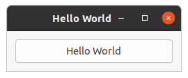
1.4. Hello World in GTK
Now a program with a button is presented. The output is shown in Figure 1.3, “Hello World”. Again the C program from the GTK 3 Reference Manual is shown first in Example 1.4, “Hello World in C” to illustrate the differences between a C and a Lisp implementation.
#include <gtk/gtk.h>

/* This is a callback function. The data arguments are ignored
 * in this example. More on callbacks below. */
static void hello( GtkWidget *widget, gpointer data )
{
    g_print ("Hello World\n");
}

static gboolean delete_event( GtkWidget *widget,
                              GdkEvent  *event,
                              gpointer   data )
{
    /* If you return FALSE in the "delete-event" signal handler,
     * GTK will emit the "destroy" signal. Returning TRUE means
     * you don't want the window to be destroyed.
     * This is useful for popping up 'are you sure you want to quit?'
     * type dialogs. */

    g_print ("delete event occurred\n");

    /* Change TRUE to FALSE and the main window will be destroyed with
     * a "delete-event". */

    return TRUE;
}

/* Another callback */
static void destroy( GtkWidget *widget, gpointer data )
{
    gtk_main_quit ();
}

int main( int argc, char *argv[] )
{
    /* GtkWidget is the storage type for widgets */
    GtkWidget *window;
    GtkWidget *button;

    /* This is called in all GTK applications. Arguments are parsed
     * from the command line and are returned to the application. */
    gtk_init (&argc, &argv);

    /* create a new window */
    window = gtk_window_new (GTK_WINDOW_TOPLEVEL);

    /* When the window is given the "delete-event" signal (this is given
     * by the window manager, usually by the "close" option, or on the
     * titlebar), we ask it to call the delete_event () function
     * as defined above. The data passed to the callback
     * function is NULL and is ignored in the callback function. */
    g_signal_connect (window, "delete-event",
		      G_CALLBACK (delete_event), NULL);

    /* Here we connect the "destroy" event to a signal handler.
     * This event occurs when we call gtk_widget_destroy() on the window,
     * or if we return FALSE in the "delete-event" callback. */
    g_signal_connect (window, "destroy",
		      G_CALLBACK (destroy), NULL);

    /* Sets the border width of the window. */
    gtk_container_set_border_width (GTK_CONTAINER (window), 10);

    /* Creates a new button with the label "Hello World". */
    button = gtk_button_new_with_label ("Hello World");

    /* When the button receives the "clicked" signal, it will call the
     * function hello() passing it NULL as its argument.  The hello()
     * function is defined above. */
    g_signal_connect (button, "clicked",
		      G_CALLBACK (hello), NULL);

    /* This will cause the window to be destroyed by calling
     * gtk_widget_destroy(window) when "clicked".  Again, the destroy
     * signal could come from here, or the window manager. */
    g_signal_connect_swapped (button, "clicked",
			      G_CALLBACK (gtk_widget_destroy),
                              window);

    /* This packs the button into the window (a gtk container). */
    gtk_container_add (GTK_CONTAINER (window), button);

    /* The final step is to display this newly created widget. */
    gtk_widget_show (button);

    /* and the window */
    gtk_widget_show (window);

    /* All GTK applications must have a gtk_main(). Control ends here
     * and waits for an event to occur (like a key press or
     * mouse event). */
    gtk_main ();

    return 0;
}
Now, the Lisp implementation is presented in Example 1.5, “Hello World in Lisp”. One difference is,
that the function make-instance is used to create the window and the button. Another point
is, that the definition of separate callback functions is avoided. The callback functions are short,
implemented through Lisp lambda functions and are passed as the third argument to the
function
g-signal-connect. More about signals and callback functions follows in
Section 1.5, “Introduction to Signals and Callbacks”.
In Example 1.5, “Hello World in Lisp” a border with a width of 12 is added to the window setting the
border-width property when creating the window with the function
make-instance. The C implementation uses the function
gtk_container_set_border_width() which is available in Lisp as the slot access function
gtk-container-border-width. The
border-width property is inherited from the C class
GtkContainer, which in the Lisp library is represented through the Lisp class
gtk-container. Therefore, the slot access function has the prefix gtk_container in C and
gtk-container in Lisp. A full list of properties of GtkContainer is available
in the
gtk-container documentation.
;;;; Example Hello World (2021-5-13)

(in-package :gtk-example)

(defun example-hello-world ()
  (within-main-loop
    (let (;; Create a toplevel window, set a border width.
          (window (make-instance 'gtk-window
                                 :type :toplevel
                                 :title "Hello World"
                                 :default-width 250
                                 :border-width 12))
          ;; Create a button with a label.
          (button (make-instance 'gtk-button
                                 :label "Hello World")))
      ;; Signal handler for the button to handle the signal "clicked".
      (g-signal-connect button "clicked"
                        (lambda (widget)
                          (declare (ignore widget))
                          (format t "Hello world.~%")
                          (gtk-widget-destroy window)))
      ;; Signal handler for the window to handle the signal "destroy".
      (g-signal-connect window "destroy"
                        (lambda (widget)
                          (declare (ignore widget))
                          (leave-gtk-main)))
      ;; Signal handler for the window to handle the signal "delete-event".
      (g-signal-connect window "delete-event"
                        (lambda (widget event)
                          (declare (ignore widget event))
                          (format t "Delete Event Occured.~%")
                          +gdk-event-stop+))
      ;; Put the button into the window.
      (gtk-container-add window button)
      ;; Show the window and the button.
      (gtk-widget-show-all window))))
An attentive reader notes that in distinction to the C implementation the function
gtk-widget-show is
not called for every single widget, which are in Example 1.5, “Hello World in Lisp” the window and the
button. Instead the function
gtk-widget-show-all is used to display the window with all including
widgets.
The function
gtk-widget-destroy takes as an argument any widget and destroys it. In the above example
this function is called by the signal handler for the button. When the button is clicked by the user, the
"clicked" signal is catched by the signal handler, which causes a call of the function
gtk-widget-destroy for the toplevel window. Now the toplevel window receives the "destroy" signal,
which is handled by a signal handler of the toplevel window. This signal handler calls the function
leave-gtk-main, which stops the event loop and finishes the application.
A second signal handler is connected to the toplevel window to catch the "delete-event" signal. The
"delete-event" signal occurs, when the user or the window manager tries to close the window. In this
case, the signal handler prints a message on the console. Because the value of the constant
+gdk-event-stop+ is true the signal handler stops the handling of the signal and the
window is not closed, but the execution of the application is continued. To close the window, the user
has to press the button in this example. There is a second constant
+gdk-event-propagate+ which is used
to make sure that the propagation of the event is continued. At last, the function
gtk-container-add is
used to put the button into the toplevel window. Chapter 2, Packing Widgets shows how it is
possible to put more than one widget into a window.
1.5. Introduction to Signals and Callbacks
GTK is an event driven toolkit, which means GTK will sleep until an event occurs and control is passed to the appropriate function. This passing of control is done using the idea of "signals". Note that these signals are not the same as the Unix system signals, and are not implemented using them, although the terminology is almost identical. When an event occurs, such as the press of a mouse button, the appropriate signal will be "emitted" by the widget that was pressed. This is how GTK does most of its useful work. There are signals that all widgets inherit, such as the "destroy" signal, and there are signals that are widget specific, such as the "toggled" signal on a toggle button.
To make a button perform an action, a signal handler is set up to catch these signals and to call the appropriate function. This is done in the C GTK library by using a function such as
gulong g_signal_connect( gpointer      *object,
                         const gchar   *name,
                         GCallback     func,
                         gpointer      func_data );
where the first argument is the widget which will be emitting the signal, and the second the name of the signal to catch. The third is the function to be called when the signal is caught, and the fourth, the data to have passed to this function.
The function specified in the third argument is called a "callback function", and is for a C program of the form
void callback_func( GtkWidget *widget,
                    ... /* other signal arguments */
                    gpointer   callback_data );
where the first argument will be a pointer to the widget that emitted the signal, and the last a pointer
to the data given as the last argument to the C function g_signal_connect() as shown above.
Note that the above form for a signal callback function declaration is only a general guide, as some
widget specific signals generate different calling parameters.
This mechanism is realized in Lisp with a similar function
g-signal-connect which has the arguments
widget, name, and func. In distinction from C the Lisp function
g-signal-connect has not the argument func_data. The functionality of passing data to a
callback function can be realized with the help of a lambda function in Lisp.
As an example the following code shows a typical C implementation which is used in the Hello World program.
g_signal_connect (window, "destroy", G_CALLBACK (destroy), NULL);
This is the corresponding callback function which is called when the "destroy" event occurs.
static void destroy (GtkWidget *widget, gpointer data)
{
    gtk_main_quit ();
}
In the corresponding Lisp implementation we simply declare a lambda function as a callback
function which is passed as the third argument.
(g-signal-connect window "destroy"
                  (lambda (widget)
                    (declare (ignore widget))
                    (leave-gtk-main)))
If it is necessary to have a separate function which needs user data, the following implementation is possible
(defun separate-event-handler (widget arg1 arg2 arg3)
  [ here is the code of the event handler ] )

(g-signal-connect window "destroy"
                  (lambda (widget)
                    (separate-event-handler widget arg1 arg2 arg3)))
If no extra data is needed, but the callback function should be separated out than it is also possible to implement something like
(g-signal-connect window "destroy" #'separate-event-handler)
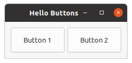
1.6. Upgraded Hello World
Figure 1.4, “Upgraded Hello World” and Example 1.7, “Upgraded Hello World in Lisp” show a slightly improved Hello World with better examples of callbacks. This will also introduce the next topic, packing widgets. First, the C program is shown in Example 1.6, “An upgraded Hello World in C”.
#include <gtk/gtk.h>

/* Our new improved callback.  The data passed to this function
 * is printed to stdout. */
static void callback( GtkWidget *widget, gpointer data )
{
    g_print ("Hello again - %s was pressed\n", (gchar *) data);
}

/* another callback */
static gboolean delete_event( GtkWidget *widget,
                              GdkEvent  *event,
                              gpointer   data )
{
    gtk_main_quit ();
    return FALSE;
}

int main( int argc, char *argv[] )
{
    /* GtkWidget is the storage type for widgets */
    GtkWidget *window;
    GtkWidget *button;
    GtkWidget *box1;

    /* This is called in all GTK applications. Arguments are parsed
     * from the command line and are returned to the application. */
    gtk_init (&argc, &argv);

    /* Create a new window */
    window = gtk_window_new (GTK_WINDOW_TOPLEVEL);

    /* This is a new call, which just sets the title of our
     * new window to "Hello Buttons!" */
    gtk_window_set_title (GTK_WINDOW (window), "Hello Buttons!");

    /* Here we just set a handler for delete_event that immediately
     * exits GTK. */
    g_signal_connect (window, "delete-event",
		      G_CALLBACK (delete_event), NULL);

    /* Sets the border width of the window. */
    gtk_container_set_border_width (GTK_CONTAINER (window), 10);

    /* We create a box to pack widgets into.  This is described in detail
     * in the "packing" section. The box is not really visible, it
     * is just used as a tool to arrange widgets. */
    box1 = gtk_hbox_new (FALSE, 0);

    /* Put the box into the main window. */
    gtk_container_add (GTK_CONTAINER (window), box1);

    /* Creates a new button with the label "Button 1". */
    button = gtk_button_new_with_label ("Button 1");

    /* Now when the button is clicked, we call the "callback" function
     * with a pointer to "button 1" as its argument */
    g_signal_connect (button, "clicked",
		      G_CALLBACK (callback), (gpointer) "button 1");

    /* Instead of gtk_container_add, we pack this button into the invisible
     * box, which has been packed into the window. */
    gtk_box_pack_start (GTK_BOX(box1), button, TRUE, TRUE, 0);

    /* Always remember this step, this tells GTK that our preparation for
     * this button is complete, and it can now be displayed. */
    gtk_widget_show (button);

    /* Do these same steps again to create a second button */
    button = gtk_button_new_with_label ("Button 2");

    /* Call the same callback function with a different argument,
     * passing a pointer to "button 2" instead. */
    g_signal_connect (button, "clicked",
		      G_CALLBACK (callback), (gpointer) "button 2");

    gtk_box_pack_start(GTK_BOX (box1), button, TRUE, TRUE, 0);

    /* The order in which we show the buttons is not really important, but I
     * recommend showing the window last, so it all pops up at once. */
    gtk_widget_show (button);

    gtk_widget_show (box1);

    gtk_widget_show (window);

    /* Rest in gtk_main and wait for the fun to begin! */
    gtk_main ();

    return 0;
}
The Lisp implementation in Example 1.7, “Upgraded Hello World in Lisp” tries to be close to the C
program. Therefore, the window and the box are created with the functions
gtk-window-new and
gtk-box-new. Various properties like the title of the window, the default size or the border width are
set with the functions
gtk-window-title,
gtk-window-default-size and
gtk-container-border-width. As
described for Example 1.5, “Hello World in Lisp” the function
gtk-widget-show-all is used to display
the window including all child widgets.
One main difference of the Lisp implementation is the use of the function
gtk-box-new with an argument
:horizontal to create a horizontal box. The GtkHBox widget which is used in the
C implementation is deprecated and is replaced by the GtkBox widget with the
orientation property. The argument :horizontal is one of the values of
the
gtk-orientation enumeration. More about boxes and their usages follows in
Chapter 2, Packing Widgets.
;;;; Example Upgraded Hello World (2021-5-13)

(in-package :gtk-example)

(defun example-hello-world-upgraded ()
  (within-main-loop
    (let ((window (gtk-window-new :toplevel))
          (box (gtk-box-new :horizontal 6))
          (button  nil))
      (g-signal-connect window "destroy"
                        (lambda (widget)
                          (declare (ignore widget))
                          (leave-gtk-main)))
      (setf (gtk-window-title window) "Hello Buttons")
      (setf (gtk-window-default-size window) '(250 75))
      (setf (gtk-container-border-width window) 12)
      (setf button (gtk-button-new-with-label "Button 1"))
      (g-signal-connect button "clicked"
                        (lambda (widget)
                          (declare (ignore widget))
                          (format t "Button 1 pressed.~%")))
      (gtk-box-pack-start box button :expand t :fill t :padding 0)
      (setf button (gtk-button-new-with-label "Button 2"))
      (g-signal-connect button "clicked"
                        (lambda (widget)
                          (declare (ignore widget))
                          (format t "Button 2 pressed.~%")))
      (gtk-box-pack-start box button :expand t :fill t :padding 0)
      (gtk-container-add window box)
      (gtk-widget-show-all window))))
The second implementation in Example 1.8, “Second Upgraded Hello World” makes more use of a Lisp
style. The window is created with the Lisp function make-instance. All desired properties of
the window are initialized by assigning values to the slots of the
gtk-window and
gtk-box classes.
The Lisp implementation uses a lot keywords arguments with default values for long lists of arguments. In
this example the keyword arguments expand, fill, and padding of
the function "
gtk-box-pack-start take default values. In future examples of this tutorial the style
shown in this example is preferred. Furthermore, the C code is no longer presented for comparison.
;;;; Example Upgraded Hello World (2021-5-13)
;;;;
;;;; A second, more Lisp like implementation.

(in-package :gtk-example)

(defun example-hello-world-upgraded-2 ()
  (within-main-loop
    (let ((window (make-instance 'gtk-window
                                 :type :toplevel
                                 :title "Hello Buttons"
                                 :default-width 250
                                 :default-height 75
                                 :border-width 12))
          (box (make-instance 'gtk-box
                              :orientation :horizontal
                              :spacing 6)))
      (g-signal-connect window "destroy"
                        (lambda (widget)
                          (declare (ignore widget))
                          (leave-gtk-main)))
      (let ((button (gtk-button-new-with-label "Button 1")))
        (g-signal-connect button "clicked"
                          (lambda (widget)
                            (declare (ignore widget))
                            (format t "Button 1 pressed.~%")))
        (gtk-box-pack-start box button))
      (let ((button (gtk-button-new-with-label "Button 2")))
        (g-signal-connect button "clicked"
                          (lambda (widget)
                            (declare (ignore widget))
                            (format t "Button 2 pressed.~%")))
        (gtk-box-pack-start box button))
      (gtk-container-add window box)
      (gtk-widget-show-all window))))
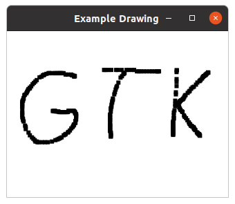
1.7. Drawing in response to input
Many widgets, like buttons, do all their drawing themselves. You just tell them the label you want to
see, and they figure out what font to use, draw the button outline and focus rectangle, etc. Sometimes,
it is necessary to do some custom drawing. In that case, a
gtk-drawing-area widget might be the right
widget to use. It offers a canvas on which you can draw by connecting to the "draw" signal.
The contents of a widget often need to be partially or fully redrawn, e.g. when another window is moved
and uncovers part of the widget, or when the window containing it is resized. It is also possible to
explicitly cause part or all of the widget to be redrawn, by calling the function
gtk-widget-queue-draw
or its variants. GTK takes care of most of the details by providing a ready-to-use Cairo context to the
"draw" signal handler.
The following example shows a "draw" signal handler. It is a more complicated than the previous examples, since it also demonstrates input event handling by means of "button-press" and "motion-notify" handlers.
;;;; Example Drawing in response to input (2021-5-13)

(in-package :gtk-example)

(defun example-drawing-area-input ()
  (within-main-loop
    (let ((surface nil)
          (window (make-instance 'gtk-window
                                 :type :toplevel
                                 :title "Example Drawing"))
          (area (make-instance 'gtk-drawing-area
                               :width-request 320
                               :height-request 240)))
      (g-signal-connect window "destroy"
                        (lambda (widget)
                          (declare (ignore widget))
                          (leave-gtk-main)))
      ;; Signals used to handle the backing surface
      (g-signal-connect area "draw"
         (lambda (widget cr)
           (declare (ignore widget))
           (let ((cr (pointer cr)))
             (cairo-set-source-surface cr surface 0.0 0.0)
             (cairo-paint cr)
             (cairo-destroy cr)
             +gdk-event-propagate+)))
      (g-signal-connect area "configure-event"
         (lambda (widget event)
           (declare (ignore event))
           (when surface
             (cairo-surface-destroy surface))
           (setf surface
                 (gdk-window-create-similar-surface
                                 (gtk-widget-window widget)
                                 :color
                                 (gtk-widget-allocated-width widget)
                                 (gtk-widget-allocated-height widget)))
           ;; Clear surface
           (let ((cr (cairo-create surface)))
             (cairo-set-source-rgb cr 1.0 1.0 1.0)
             (cairo-paint cr)
             (cairo-destroy cr))
           (format t "leave event 'configure-event'~%")
           +gdk-event-stop+))
      ;; Event signals
      (g-signal-connect area "motion-notify-event"
         (lambda (widget event)
           (format t "MOTION-NOTIFY-EVENT ~A~%" event)
           (when (member :button1-mask (gdk-event-motion-state event))
             (let ((cr (cairo-create surface))
                   (x (gdk-event-motion-x event))
                   (y (gdk-event-motion-y event)))
               (cairo-rectangle cr (- x 3.0) (- y 3.0) 6.0 6.0)
               (cairo-fill cr)
               (cairo-destroy cr)
               (gtk-widget-queue-draw-area widget
                                           (truncate (- x 3.0))
                                           (truncate (- y 3.0))
                                           6
                                           6)))
           ;; We have handled the event, stop processing
           +gdk-event-stop+))
      (g-signal-connect area "button-press-event"
         (lambda (widget event)
           (format t "BUTTON-PRESS-EVENT ~A~%" event)
           (if (= 1 (gdk-event-button-button event))
               (let ((cr (cairo-create surface))
                     (x (gdk-event-button-x event))
                     (y (gdk-event-button-y event)))
                 (cairo-rectangle cr (- x 3.0) (- y 3.0) 6.0 6.0)
                 (cairo-fill cr)
                 (cairo-destroy cr)
                 (gtk-widget-queue-draw-area widget
                                             (truncate (- x 3.0))
                                             (truncate (- y 3.0))
                                             6
                                             6))
               ;; Clear surface
               (let ((cr (cairo-create surface)))
                 (cairo-set-source-rgb cr 1.0 1.0 1.0)
                 (cairo-paint cr)
                 (cairo-destroy cr)
                 (gtk-widget-queue-draw widget)))))
      (gtk-widget-add-events area
                             '(:button-press-mask
                               :pointer-motion-mask))
      (gtk-container-add window area)
      (gtk-widget-show-all window))))
Chapter 2. Packing Widgets
2.1. Packing Boxes
When creating an application, it is necessary to put more than one widget inside a window. The first
example in Figure 1.3, “Hello World” only used one button so it could simply use the function
gtk-container-add to "pack" the button into the window. But when more than one widget must be put into
a window packing comes in.
Packing is done by creating boxes or grids. Grids are more general and powerful than boxes. Grids are explained later in this tutorial. Boxes are invisible widget containers that can pack widgets into, which come in two forms, a horizontal box, and a vertical box. When packing widgets into a horizontal box, the objects are inserted horizontally from left to right or right to left depending on the call used. In a vertical box, widgets are packed from top to bottom or vice versa. You may use any combination of boxes inside or beside other boxes to create the desired effect.
To create a new
gtk-box widget, the function
gtk-box-new or the call
(make-instance 'gtk-box) is used. The first argument of the function
gtk-box-new takes a
keyword with a value of the GtkOrientation enumeration, which, in the Lisp binding, is
implemented as the
gtk-orientation enumeration with the values :horizontal or
:vertical to determine a horizontal or a vertical box. Because the
gtk-box widget
implements the
gtk-orientable interface an instance of the
gtk-box widget has the
orientation property.
| Function | Description |
|---|---|
| Slot access functions | |
gtk-box-baseline-position |
Accessor of the baseline-position property. |
gtk-box-homogeneous |
Accessor of the homogeneous property. |
gtk-box-spacing |
Accessor of the spacing property. |
| Child access functions | |
gtk-box-child-expand |
Accessor of the expand child property. |
gtk-box-child-fill |
Accessor of the fill child property. |
gtk-box-child-pack-type |
Accessor of the pack-type child property. |
gtk-box-child-padding |
Accessor of the padding child property. |
gtk-box-child-position |
Accessor of the position child property. |
| More functions | |
gtk-box-new |
Creates a new gtk-box widget. |
gtk-box-pack-start |
Adds a child to the box, packed with reference to the start of the box. |
gtk-box-pack-end |
Adds a child to the box, packed with reference to the end of the box. |
gtk-box-reorder-child |
Move the child widget to a new position in the list of the box children. |
gtk-box-query-child-packing |
Obtains information about how the child widget is packed into the box. |
gtk-box-child-packing |
Sets the way the child widget is packed into the box. |
gtk-box-center-widget |
Sets a child widget that will be centered with respect to the full width of the box. |
The following code fragments show two equivalent ways to create an instance of a horizontal box. The first
argument of the function
gtk-box-new takes the value of the
orientation property. The
second argument is the value of the
spacing property, which is described in
Section 2.2, “Details of Boxes”:
(let ((box (gtk-box-new :horizontal 3)))
  ... )
or
(let ((box (make-instance 'gtk-box
                          :orientation :horizontal
                          :spacing 3)))
  ... )
The functions
gtk-box-pack-start and
gtk-box-pack-end are used to place widgets inside of boxes. The
function
gtk-box-pack-start starts at the top and works its way down in a vertical box, and packs left
to right in a horizontal box. The function
gtk-box-pack-end does the opposite, packing from bottom to
top in a vertical box, and right to left in a horizontal box. The widgets, which are packed into a box,
can be containers, which are composed of other widgets. Using the functions for packing widgets in boxes
allows to right justify or left justify the widgets. The functions can be mixed in any way to achieve the
desired effect. Most of the examples in this tutorial use the function
gtk-box-pack-start. In the
following example a vertical box is created. Then two label widgets are packed into the box with the
function
gtk-box-pack-start:
(let ((box (gtk-box-new :vertical 3)))
  (gtk-box-pack-start box (gtk-label-new "LABEL 1"))
  (gtk-box-pack-start box (gtk-label-new "LABEL 2"))
  ... )
By using boxes, GTK knows where to place the widgets so GTK can do automatic resizing and other nifty things. A number of options control as to how the widgets should be packed into boxes. This method of packing boxes gives the user quite a bit of flexibility when placing widgets.
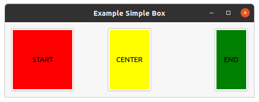
Figure 2.1, “Simple Box” shows a horizontal box with three colored buttons. The red button is
put at the start position into the box and the green button and the end position. The yellow button is
centered within the box. The size of the labels within the buttons is enlarged with the slot access
functions
gtk-widget-width-request and
gtk-widget-height-request. The label widget is extracted with
the function
gtk-bin-child from the button widget. In this example CSS data is applied to the buttons
to color the buttons.
;;;; Example Simple Box (2021-5-15)
;;;;
;;;; The example shows three buttons with colored labels. The red button
;;;; shows the start position in the box, the green button the end position,
;;;; and the yellow button is a center widget.
;;;;
;;;; In addition, this example demonstrate how to use CSS style information to
;;;; change the appearance of a widget.

(in-package :gtk-example)

(defparameter +css-button+
"button {
   padding: 3px; }
 button > label {
   color: black;
   background-color: yellow; }
 button:first-child > label {
   background-color: red; }
 button:last-child > label {
   background-color : green; }")

(defun apply-css-to-widget (provider widget)
  (gtk-style-context-add-provider (gtk-widget-style-context widget)
                                  provider
                                  +gtk-style-provider-priority-application+)
  (when (g-type-is-a (g-type-from-instance widget) "GtkContainer")
    (gtk-container-forall widget
                          (lambda (widget)
                            (apply-css-to-widget provider widget)))))

(defun example-box-simple ()
  (within-main-loop
    (let (;; Create a toplevel window
          (window (make-instance 'gtk-window
                                 :type :toplevel
                                 :title "Example Simple Box"
                                 :border-width 12))
          ;; Create a box
          (box (make-instance 'gtk-box
                              :orientation :horizontal
                              :homogeneous nil
                              :spacing 0
                              :halign :fill
                              :valign :center
                              :width-request 480))
          (provider (make-instance 'gtk-css-provider)))

      ;; Signal handler for the window to handle the signal "destroy".
      (g-signal-connect window "destroy"
                        (lambda (widget)
                          (declare (ignore widget))
                          (leave-gtk-main)))

      ;; Add Start button
      (let ((button (make-instance 'gtk-button
                                   :label "START")))
        (setf (gtk-widget-width-request (gtk-bin-child button)) 120)
        (setf (gtk-widget-height-request (gtk-bin-child button)) 120)
        (gtk-box-pack-start box button :expand nil))
      ;; Add Center button
      (let ((button (make-instance 'gtk-button
                                   :label "CENTER")))
        (setf (gtk-widget-width-request (gtk-bin-child button)) 80)
        (setf (gtk-box-center-widget box) button))
      ;; Add End button
      (let ((button (make-instance 'gtk-button
                                   :label "END")))
        (setf (gtk-widget-width-request (gtk-bin-child button)) 60)
        (gtk-box-pack-end box button :expand nil))

      ;; Add the box to the window.
      (gtk-container-add window box)
      ;; Load CSS from data into the provider
      (gtk-css-provider-load-from-data provider +css-button+)
      ;; Apply CSS to the widgets
      (apply-css-to-widget provider box)
      ;; Show the window.
      (gtk-widget-show-all window))))
Note
The GtkHBox for horizontal and GtkVBox widgets for vertical boxes are
deprecated, but still present in GTK 3. In this tutorial these classes are not used. In addition a
single-row or single-column
gtk-grid widget provides exactly the same functionality as the
gtk-box
widget. See Section 2.3, “Packing Using Grids” for examples to replace the
gtk-box widget with the
gtk-grid widget.
2.2. Details of Boxes
Because of the flexibility, packing boxes in GTK can be confusing at first. A lot of options control the packing of boxes, and it is not immediately obvious how the options all fit together. In the end, however, basically five different styles are available.
Boxes have the
homogeneous and
spacing properties. The functions
gtk-box-homogeneous
and
gtk-box-spacing are used to write and read the properties. The
homogeneous property
controls whether each widget in the box has the same width in a horizontal box or the same height in a
vertical box. The
spacing property controls the amount of space between children in the box. A
complete example for creating a box is therefore:
(let ((box (make-instance 'gtk-box
                          :orientation :vertical
                          :spacing 3
                          :homogeneous t)))
  ... )
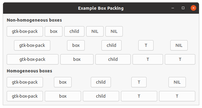
Figure 2.2, “Box Packing” shows an example of packing buttons into horizontal boxes. Each line
of the example contains one horizontal box with several buttons. The first button represents the call of
the function
gtk-box-pack-start and the following buttons represent the arguments of the function. The
first two arguments are box for the box and child for the child widgets to put
into the box, which are in our example buttons. The further arguments of the function
gtk-box-pack-start
are in the C implementation expand, fill and padding. In the Lisp
binding to GTK these arguments are defined as the keyword arguments :expand and
:fill, which both have a default value of true, and
:padding with a default value of 0. The keyword arguments can be omitted, in
which case the default values will be used.
The keyword argument :expand with a value true to the functions
gtk-box-pack-start and
gtk-box-pack-end controls whether the widgets are laid out in the box to fill
in all the extra space in the box so the box is expanded to fill the area allotted to it, or with a value
nil the box is shrunk to just fit the widgets. Setting expand to nil allows to
do right and left justification of the widgets. Otherwise, the widgets expand to fit into the box. The
same effect can be achieved by using only one of the functions
gtk-box-pack-start or
gtk-box-pack-end.
The keyword argument :fill with a value true to the
gtk-box-pack functions control whether the extra space is allocated to the objects
themselves, or with a value nil as extra padding in the box around these objects. It only
has an effect if the keyword argument expand is also true.
The difference between spacing, set when the box is created, and padding, set when elements are packed, is, that spacing is added between objects, and padding is added on either side of a child widget. In Figure 2.2, “Box Packing” the spacing is set to 6 and padding is 0 for all buttons.
The code for Figure 2.2, “Box Packing” is shown in Example 2.2, “Box Packing”. The
function example-box-packing takes the optional arguments spacing and
padding, which have default values 6 and 0, respectively.
;;;; Example Box Packing (2021-5-14)

(in-package :gtk-example)

(defun make-box (homogeneous spacing expand fill padding)
  (let ((box (make-instance 'gtk-box
                            :orientation :horizontal
                            :homogeneous homogeneous
                            :spacing spacing)))
    (gtk-box-pack-start box
                        (gtk-button-new-with-label "gtk-box-pack")
                        :expand expand
                        :fill fill
                        :padding padding)
    (gtk-box-pack-start box
                        (gtk-button-new-with-label "box")
                        :expand expand
                        :fill fill
                        :padding padding)
    (gtk-box-pack-start box
                        (gtk-button-new-with-label "child")
                        :expand expand
                        :fill fill
                        :padding padding)
    (gtk-box-pack-start box
                        (if expand
                            (gtk-button-new-with-label "T")
                            (gtk-button-new-with-label "NIL"))
                        :expand expand
                        :fill fill
                        :padding padding)
    (gtk-box-pack-start box
                        (if fill
                            (gtk-button-new-with-label "T")
                            (gtk-button-new-with-label "NIL"))
                        :expand expand
                        :fill fill
                        :padding padding)
    box))

(defun example-box-packing (&optional (spacing 6) (padding 0))
  (within-main-loop
    (let ((window (make-instance 'gtk-window
                                 :title "Example Box Packing"
                                 :type :toplevel
                                 :border-width 12))
          (vbox (make-instance 'gtk-box
                               :orientation :vertical
                               :spacing 12)))
      (g-signal-connect window "destroy"
                        (lambda (widget)
                          (declare (ignore widget))
                          (leave-gtk-main)))
      ;; Non-homogenous boxes
      (gtk-box-pack-start vbox
                          (make-instance 'gtk-label
                                         :use-markup t
                                         :label "<b>Non-homogeneous boxes</b>"
                                         :xalign 0)
                          :expand nil)
      (gtk-box-pack-start vbox
                          (make-box nil spacing nil nil padding)
                          :expand nil)
      (gtk-box-pack-start vbox
                          (make-box nil spacing t nil padding)
                          :expand nil)
      (gtk-box-pack-start vbox
                          (make-box nil spacing t t padding)
                          :expand nil)
      ;; Homogeneous boxes
      (gtk-box-pack-start vbox
                          (make-instance 'gtk-label
                                         :use-markup t
                                         :label "<b>Homogeneous boxes</b>"
                                         :xalign 0)
                          :expand nil)
      (gtk-box-pack-start vbox
                          (make-box t spacing t nil padding)
                          :expand nil)
      (gtk-box-pack-start vbox
                          (make-box t spacing t t padding)
                          :expand nil)
      (gtk-container-add window vbox)
      (gtk-widget-show-all window))))
2.3. Packing Using Grids
The
gtk-grid widget is an attempt to write a comprehensive box-layout container that is flexible enough
to replace
gtk-box,
gtk-table widgets and the like. The layout model of the
gtk-grid widget is to
arrange its children in rows and columns. This is done by assigning positions on a two-dimensions grid
that stretches arbitrarily far in all directions. Children can span multiple rows or columns.
Grids can be created with the function
gtk-grid-new. The function has no arguments. Alternatively, the
grid is created with the function make-instance.
The
gtk-grid class has the
column-homogeneous and
row-homogeneous properties. If
true the columns or the rows have all the same size, respectively. The
column-spacing and
row-spacing properties add space in pixels between two
consecutive columns or rows.
To place a widget into a grid, the function
gtk-grid-attach can be used. The function takes six
parameters:
grid- the
gtk-gridwidget child- the child widget to add to the grid
left- the column number to attach the left side of the child widget to
top- the row number to attach the top side of the child widget to
width, height- the number of columns and the number of the rows that the child widget will span
It is also possible to add a child widget next to an existing child widget, using the function
gtk-grid-attach-next-to. Finally, the
gtk-grid widget can be used like the
gtk-box widget by just
using the function
gtk-container-add, which will place children next to each other in the direction
determined by the
orientation property of the
gtk-grid widget. The property is
inherited from the implemented
gtk-orientable interface. The default value is :horizontal.
2.4. Grid Packing Example
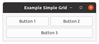
Figure 2.3, “Simple Grid” shows a window with three buttons in a grid. The first two buttons are placed in the upper row. A third button is placed in the lower row, spanning both columns. The code of this example is shown in Example 2.3, “Simple Grid”.
;;;; Example Simple Grid (2021-5-15)

(in-package :gtk-example)

(defun example-grid-simple ()
  (within-main-loop
    (let ((window (make-instance 'gtk-window
                                 :type :toplevel
                                 :title "Example Simple Grid"
                                 :border-width 12
                                 :default-width 320))
          (grid (make-instance 'gtk-grid
                               :column-homogeneous t
                               :column-spacing 6
                               :row-homogeneous t
                               :row-spacing 6))
          (button1 (make-instance 'gtk-button
                                  :label "Button 1"))
          (button2 (make-instance 'gtk-button
                                  :label "Button 2"))
          (button3 (make-instance 'gtk-button
                                  :label "Button 3")))

      (g-signal-connect window "destroy"
                        (lambda (widget)
                          (declare (ignore widget))
                          (leave-gtk-main)))

      (gtk-grid-attach grid button1 0 0 1 1)
      (gtk-grid-attach grid button2 1 0 1 1)
      (gtk-grid-attach grid button3 0 1 2 1)

      (gtk-container-add window grid)
      (gtk-widget-show-all window))))
Figure 2.4, “Grid Packing with more spacing” is an extended example to show the possibility to increase the spacing of the rows and columns. This is implemented through two toggle buttons which increase and decrease the spacings. Toggle buttons are described in Section 3.2, “Toggle Button” later in this tutorial. The code of this example is shown in Example 2.4, “Grid Packing with more spacing”.
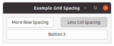
;;;; Example Grid Spacing (2021-5-18)

(in-package :gtk-example)

(defun example-grid-spacing ()
  (within-main-loop
    (let ((window (make-instance 'gtk-window
                                 :type :toplevel
                                 :title "Example Grid Spacing"
                                 :border-width 12
                                 :default-width 320))
          (grid (make-instance 'gtk-grid
                               :column-homogeneous t
                               :column-spacing 6
                               :row-homogeneous t
                               :row-spacing 6))
          (button1 (make-instance 'gtk-toggle-button
                                  :label "More Row Spacing"))
          (button2 (make-instance 'gtk-toggle-button
                                  :label "More Col Spacing"))
          (button3 (make-instance 'gtk-button
                                  :label "Button 3")))

      (g-signal-connect window "destroy"
                        (lambda (widget)
                          (declare (ignore widget))
                          (leave-gtk-main)))

      (g-signal-connect button1 "toggled"
         (lambda (widget)
           (if (gtk-toggle-button-active widget)
               (progn
                 (setf (gtk-grid-row-spacing grid) 24)
                 (setf (gtk-button-label widget) "Less Row Spacing"))
               (progn
                 (setf (gtk-grid-row-spacing grid) 6)
                 (setf (gtk-button-label widget) "More Row Spacing")))))
      (g-signal-connect button2 "toggled"
         (lambda (widget)
           (if (gtk-toggle-button-active widget)
               (progn
                 (setf (gtk-grid-column-spacing grid) 24)
                 (setf (gtk-button-label widget) "Less Col Spacing"))
               (progn
                 (setf (gtk-grid-column-spacing grid) 6)
                 (setf (gtk-button-label widget) "More Col Spacing")))))

      (gtk-grid-attach grid button1 0 0 1 1)
      (gtk-grid-attach grid button2 1 0 1 1)
      (gtk-grid-attach grid button3 0 1 2 1)

      (gtk-container-add window grid)
      (gtk-widget-show-all window))))
2.5. GtkBox versus GtkGrid
2.5.1. GtkBox versus GtkGrid - packing
The
gtk-box widget works by arranging child widgets in a single line, either horizontally or
vertically. It allows packing children from the beginning or end, using the functions
gtk-box-pack-start and
gtk-box-pack-end.
The following code creates a simple box with two labels:
(let ((box (gtk-box-new :horizontal 0)))
  (gtk-box-pack-start box (gtk-label-new "ONE") nil nil 0)
  (gtk-box-pack-start box (gtk-label-new "TWO") nil nil 0)
  ... )
This can be done with the
gtk-grid widget as follows:
(let ((grid (gtk-grid-new))
      (child1 (gtk-label-new "ONE"))
      (child2 (gtk-label-new "TWO")))
  (gtk-grid-attach grid child1 0 0 1 1)
  (gtk-grid-attach-next-to grid child2 child1 :right 1 1)
  ... )
And similarly for the function
gtk-box-pack-end. In that case, you would use :left to
place the grid children from left to right.
If you only need to pack children from the start, using the function
gtk-container-add is an even
simpler alternative. The
gtk-grid widget places children added with the function
gtk-container-add
in a single row or column according to its orientation.
One difference to keep in mind is that the functions
gtk-box-pack-start and
gtk-box-pack-end allow
you to place an arbitrary number of children from either end without ever 'colliding in the middle'.
With the
gtk-grid widget, you have to leave enough space between the two ends, if you want to combine
packing from both ends towards the middle. In practice, this should be easy to avoid; and the
gtk-grid
widget simply ignores entirely empty rows or columns for layout and spacing.
On the other hand, the
gtk-grid widget is more flexible in that its grid extends indefinitively in both
directions - there is no problem with using negative numbers for the grid positions. So, if you discover
that you need to place a widget before your existing arrangement, you always can.
2.5.2. GtkBox versus GtkGrid - sizing
When adding a child to a
gtk-box widget, there are two hard-to-remember parameters (child properties,
more exactly) named expand and fill that determine how the child size behaves
in the main direction of the box. If expand is set, the box allows the position occupied by
the child to grow when extra space is available. If fill is also set, the extra space is
allocated to the child widget itself. Otherwise it is left 'free'. There is no control about the 'minor'
direction. Children are always given the full size in the minor direction.
The
gtk-grid widget does not have any custom child properties for controlling size allocation to
children. Instead, it fully supports the newly introduced
hexpand,
vexpand,
halign, and
valign properties for widgets.
The
hexpand and
vexpand properties operate in a similar way to the expand child
properties of the
gtk-box widget. As soon as a column contains a horizontally expanding child,
the
gtk-grid widget allows the column to grow when extra space is available (similar for rows and the
vexpand property). In contrast to the
gtk-box widget, all the extra space is always
allocated to the child widget, there are no 'free' areas.
To replace the functionality of the fill child property, you can set the
halign
and
valign properties. An align value of :fill has the same effect as setting
fill to true, a value of :center has the same effect as
setting fill to nil.
Expansion and alignment with the
gtk-box widget:
(let ((box (gtk-box-new :horizontal 0)))
  (gtk-box-pack-start box (gtk-label-new "ONE") t nil 0)
  (gtk-box-pack-start box (gtk-label-new "TWO") t t 0)
  ... )
This can be done with the
gtk-grid widget as follows:
(let ((grid (gtk-grid-new))
      (child1 (make-instance 'gtk-label
                             :label "ONE"
                             :hexpand t
                             :halign :center))
      (child2 (make-instance 'gtk-label
                             :label "TWO"
                             :hexpand t
                             :halign :fill))
  (gtk-grid-attach grid child1 0 0 1 1)
  (gtk-grid-attach-next-to grid child2 child1 :right 1 1)
  ... )
One difference between the new
gtk-widget expand properties and the
gtk-box child property of the
same name is that widget expandability is 'inherited' from children. What this means is that a container
will become itself expanding as soon as it has an expanding child. This is typically what you want, it
lets you e.g. mark the content pane of your application window as expanding, and all the intermediate
containers between the content pane and the toplevel window will automatically do the right thing. This
automatism can be overridden at any point by setting the expand flags on a container explicitly.
Another difference between the
gtk-box and
gtk-grid widget with respect to expandability is when
there are no expanding children at all. In this case, the
gtk-box widget will forcibly expand all
children whereas the
gtk-grid widget will not. In practice, the effect of this is typically that a
grid will 'stick to the corner' when the toplevel containing it is grown, instead of spreading out its
children over the entire area. The problem can be fixed by setting some or all of the children to expand.
When you set the
homogeneous property on a
gtk-box widget, it reserves the same space for all
its children. The
gtk-grid widget does this in a very similar way, with
row-homogeneous and
column-homogeneous properties which control whether all rows have the same height and whether
all columns have the same width.
2.5.3. GtkBox versus GtkGrid - spacing
With the
gtk-box widget, you have to specify the "spacing" when you construct it. This property
specifies the space that separates the children from each other. Additionally, you can specify extra
space to put around each child individually, using the padding child property.
The
gtk-grid widget is very similar when it comes to spacing between the children, except that it has
two separate properties,
row-spacing and
column-spacing, for the space to leave
between rows and columns. Note that the
row-spacing property is the space between rows, not
inside a row. So, if you doing a horizontal layout, you need to set the
column-spacing
property.
The
gtk-grid widget does not have any custom child properties to specify per-child padding; instead you
can use the
margin property. You can also set different padding on each side with the
margin-start,
margin-end,
margin-top and
margin-bottom properties.
Example with spacing in boxes:
(let ((box (gtk-box-new :vertical 6))
      (child (gtk-label-new "Child")))
  (gtk-box-pack-start box child nil nil 12)
  ... )
This can be done with the
gtk-grid widget as follows:
(let ((grid (gtk-grid-new))
      (child (make-instance 'gtk-label
                            :label "Child"
                            :margin 12)))
  (gtk-grid-attach box child 0 0 1 1)
  ... )
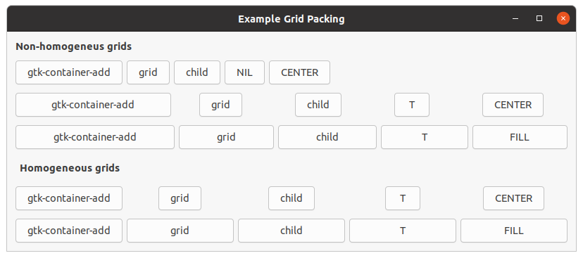
2.5.4. GtkBox versus GtkGrid - packing example
Example 2.5, “Packing using GtkGrid” shows how to replace the
gtk-box widget with the
gtk-grid
widget to create horizontal boxes. The layout corresponds to the layout of the previous example in
Figure 2.2, “Box Packing”.
;;;; Example Grid Packing (2021-5-18)

(in-package :gtk-example)

(defun make-grid (homogeneous spacing expand align margin)
  (let ((grid (make-instance 'gtk-grid
                             :orientation :horizontal
                             :column-homogeneous homogeneous
                             :column-spacing spacing)))
    (gtk-container-add grid
                       (make-instance 'gtk-button
                                      :label "gtk-container-add"
                                      :hexpand expand
                                      :halgin align
                                      :margin margin))
    (gtk-container-add grid
                       (make-instance 'gtk-button
                                      :label "grid"
                                      :hexpand expand
                                      :halign align
                                      :margin margin))
    (gtk-container-add grid
                       (make-instance 'gtk-button
                                      :label "child"
                                      :hexpand expand
                                      :halign align
                                      :margin margin))
    (gtk-container-add grid
                       (make-instance 'gtk-button
                                      :label (if expand "T" "NIL")
                                      :hexpand expand
                                      :halign align
                                      :margin margin))
    (gtk-container-add grid
                       (make-instance 'gtk-button
                                      :label (format nil "~A" align)
                                      :hexpand expand
                                      :halign align
                                      :margin margin))
    grid))

(defun example-grid-packing (&optional (spacing 6) (margin 0))
  (within-main-loop
    (let ((window (make-instance 'gtk-window
                                 :title "Example Grid Packing"
                                 :type :toplevel
                                 :border-width 12
                                 :default-height 200
                                 :default-width 300))
          (grid (make-instance 'gtk-grid
                               :orientation :vertical
                               :row-spacing 12)))

      (g-signal-connect window "destroy"
                        (lambda (widget)
                          (declare (ignore widget))
                          (leave-gtk-main)))

      (gtk-container-add grid
                         (make-instance 'gtk-label
                                        :use-markup t
                                        :label "<b>Non-homogeneus grids</b>"
                                        :xalign 0
                                        :yalign 0
                                        :vexpand nil
                                        :valign :start))

      (gtk-container-add grid (make-grid nil spacing nil :center margin))
      (gtk-container-add grid (make-grid nil spacing t :center margin))
      (gtk-container-add grid (make-grid nil spacing t :fill margin))

      (gtk-container-add grid
                         (make-instance 'gtk-label
                                        :use-markup t
                                        :label "<b>Homogeneous grids</b>"
                                         :xalign 0
                                         :yalign 0
                                         :vexpand nil
                                         :valign :start
                                         :margin 6))

      (gtk-container-add grid (make-grid t spacing t :center margin))
      (gtk-container-add grid (make-grid t spacing t :fill margin))

      (gtk-container-add window grid)
      (gtk-widget-show-all window))))
Chapter 3. Button Widgets
3.1. Simple Button
We have almost seen all there is to see of the button widget, which is represented by the
gtk-button
widget. The button widget is pretty simple. There is however more than one way to create a button. You can
use the the function
gtk-button-new-with-label or the function
gtk-button-new-with-mnemonic to create
a button with a label, use the function
gtk-button-new-from-icon-name to create a button containing the
image from the current icon theme or use the function
gtk-button-new to create a blank button. It is
then up to you to pack a label or pixmap into this new button. To do this, create a new box, and then
pack your objects into this box using the function
gtk-box-pack-start, and then use the function
gtk-container-add to pack the box into the button.
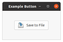
Figure 3.1, “Button with an image” shows an example of using the function make-instance
to create a button with an image and a label in it. For this example the
halign and
valign properties inherited from the
gtk-widget class are set to the value
:center. Therefore, the button is centered in the window and does not fill the available
space of the window. The image is loaded from a file with the function
gtk-image-new-from-file. The code
to create the box is separated in the function image-label-box.
Example 3.1, “Button with an image” shows the complete program to create
Figure 3.1, “Button with an image”. The function image-label-box can be used to pack
images and labels into any widget that can be a container.
;;;; Example Simple Button (2021-5-19)

(in-package :gtk-example)

(defun image-label-box (filename text)
  (let ((box (make-instance 'gtk-box
                            :orientation :horizontal
                            :border-width 3))
        (label (make-instance 'gtk-label
                              :hexpand nil
                              :margin-left 6
                              :label text))
        (image (gtk-image-new-from-file filename)))
    (gtk-box-pack-start box image :expand nil :fill nil :padding 3)
    (gtk-box-pack-start box label :expand nil :fill nil :padding 3)
    box))

(defun example-button-image ()
  (within-main-loop
    (let ((window (make-instance 'gtk-window
                                 :title "Example Button"
                                 :type :toplevel
                                 :default-width 240
                                 :default-height 120))
          (button (make-instance 'gtk-button
                                 :halign :center
                                 :valign :center))
          (box (image-label-box (sys-path "save.png") "Save to File")))
      (g-signal-connect window "destroy"
                        (lambda (widget)
                          (declare (ignore widget))
                          (leave-gtk-main)))
      (gtk-container-add button box)
      (gtk-container-add window button)
      (gtk-widget-show-all window))))
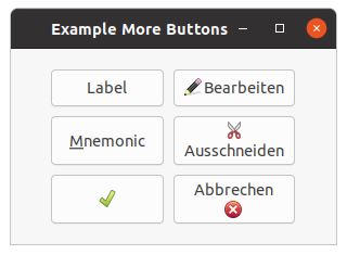
Figure 3.2, “More Buttons” shows more buttons, which are created with standard functions and
with the function make-instance. The buttons created with the function
make-instance show both a label and an image. The images are created with the function
make-instance from the current icon theme by setting the
icon-name property to
the icon name of the image. More about the
gtk-image widget follows in Section 4.2, “Image Widget”.
To show the images, the
always-show-image property must be set to the value
true. This is done in the call to the function make-instance. The code
is shown in Example 3.2, “More buttons”.
;;;; Example More Buttons (2021-5-19)

(in-package :gtk-example)

(defun example-button-more ()
  (within-main-loop
    (let ((window (make-instance 'gtk-window
                                 :title "Example More Buttons"
                                 :type :toplevel
                                 :default-width 300
                                 :default-height 180
                                 :border-width 12))
          (grid (make-instance 'gtk-grid
                               :halign :center
                               :valign :center
                               :column-spacing 9
                               :row-spacing 9)))

      (g-signal-connect window "destroy"
                        (lambda (widget)
                          (declare (ignore widget))
                          (leave-gtk-main)))

      ;; These are the standard functions to create a button
      (gtk-grid-attach grid
                       (gtk-button-new-with-label "Label")
                       0 0 1 1)
      (gtk-grid-attach grid
                       (gtk-button-new-with-mnemonic "_Mnemonic")
                       0 1 1 1)
      (gtk-grid-attach grid
                       (gtk-button-new-from-icon-name "gtk-apply" :button)
                       0 2 1 1)

      ;; Create some buttons with make-instance
      (gtk-grid-attach grid
                       (make-instance 'gtk-button
                                      :image-position :left
                                      :always-show-image t
                                      :image
                                      (make-instance 'gtk-image
                                                     :icon-name "gtk-edit")
                                      :label "Bearbeiten")
                       1 0 1 1)
      (gtk-grid-attach grid
                       (make-instance 'gtk-button
                                      :image-position :top
                                      :always-show-image t
                                      :image
                                      (make-instance 'gtk-image
                                                     :icon-name "gtk-cut")
                                      :label "Ausschneiden")
                       1 1 1 1)
      (gtk-grid-attach grid
                       (make-instance 'gtk-button
                                      :image-position :bottom
                                      :always-show-image t
                                      :image
                                      (make-instance 'gtk-image
                                                     :icon-name "gtk-cancel")
                                      :label "Abbrechen")
                       1 2 1 1)

      (gtk-container-add window grid)
      (gtk-widget-show-all window))))
3.2. Toggle Button
Toggle buttons are derived from the
gtk-button class and are very similar, except toggle buttons always
are in one of two states, alternated by a click. Toggle buttons can be depressed, and when clicked again,
the toggle button will pop back up. Toggle buttons are the basis for check buttons and radio buttons, as
such, many of the calls used for toggle buttons are inherited by radio and check buttons.
Beside make-instance, toggle buttons can be created with the functions
gtk-toggle-button-new,
gtk-toggle-button-new-with-label, and
gtk-toggle-button-new-with-mnemonic.
The first function creates a blank toggle button, and the last two functions, a toggle button with a
label widget already packed into it. The
gtk-toggle-button-new-with-mnemonic variant additionally
parses the label for '_'-prefixed mnemonic characters.
To retrieve the state of the toggle button, including radio and check buttons, a construct as shown in
the example below is used. This tests the state of the toggle button, by accessing the
active property of the toggle button with the function
gtk-toggle-button-active.
The signal of interest to us emitted by toggle buttons (the toggle button, check button, and radio button
widgets) is the "toggled" signal. To check the state of these buttons, set up a signal handler to catch
the toggled signal, and access the
active property to determine the state of the
button. A signal handler will look something like:
(g-signal-connect button "toggled"
   (lambda (widget)
     (if (gtk-toggle-button-active widget)
         (progn
           ;; If control reaches here, the toggle button is down
         )
        (progn
           ;; If control reaches here, the toggle button is up
         ))))
To force the state of a toggle button, and its children, the radio and check buttons, use this function
gtk-toggle-button-active. This function can be used to set the state of the toggle button, and its
children the radio and check buttons. Passing in your created button as the first argument, and a
true or false value for the second state argument to specify
whether it should be down (depressed) or up (released). Default is up, or the value
false.
Note that when you use the
gtk-toggle-button-active function, and the state is actually changed, it
causes the "clicked" and "toggled" signals to be emitted from the button. The current state of the toggle
button as a boolean true or false value is returned from the
function
gtk-toggle-button-active.
In Example 2.4, “Grid Packing with more spacing” and Figure 2.4, “Grid Packing with more spacing” the usage of toggle buttons is shown.
3.2.1. Check Button
Check buttons are implemented as the
gtk-check-button class and inherit many properties and functions
from the toggle buttons, but look a little different. Rather than being buttons with text inside them,
they are small squares with the text to the right of them. These are often used for toggling options on
and off in applications.
The creation functions are similar to those of the normal button:
gtk-check-button-new,
gtk-check-button-new-with-label,
gtk-check-button-new-with-mnemonic. The function
gtk-check-button-new-with-label creates a check button with a label beside it.
Checking the state of the check button is identical to that of the toggle button. Figure 3.4, “Toggle Buttons” shows check and radio buttons and Example 3.4, “Toggle Buttons” the code to create the buttons.
3.2.2. Radio Button
Radio buttons are similar to check buttons except they are grouped so that only one may be selected or depressed at a time. This is good for places in your application where you need to select from a short list of options.
Creating a new radio button is done with one of these calls:
gtk-radio-button-new,
gtk-radio-button-new-with-label, and
gtk-radio-button-new-with-mnemonic. These functions take a list
of radio buttons as the first argument or NIL. When NIL a new list of radio
buttons is created. The newly created list for the radio buttons can be get with the function
gtk-radio-button-get-group. More radio buttons can then be added to this list. The important thing to
remember is that the function
gtk-radio-button-get-group must be called for each new button added to
the group, with the previous button passed in as an argument. The result is then passed into the next
call to the function
gtk-radio-button-new or the other two functions for creating a radio button. This
allows a chain of buttons to be established. Figure 3.3, “Radio Button” shows a radio
button group with two buttons. The code is shown in Example 3.3, “Radio Button”.
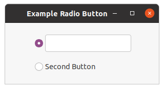
;;;; Example Radio Button (2021-5-21)

(in-package :gtk-example)

(defun example-radio-button ()
  (within-main-loop
    (let ((window (make-instance 'gtk-window
                                 :type :toplevel
                                 :title "Example Radio Button"
                                 :border-width 12
                                 :default-width 300
                                 :default-height 120))
          (grid (make-instance 'gtk-grid
                               :orientation :vertical
                               :halign :center
                               :valign :center
                               :row-spacing 18)))

      (g-signal-connect window "destroy"
                        (lambda (widget)
                          (declare (ignore widget))
                          (leave-gtk-main)))

      (let ((radio (gtk-radio-button-new nil)))
        (gtk-container-add radio (gtk-entry-new))
        (gtk-container-add grid radio)
        (setf radio
              (gtk-radio-button-new-with-label-from-widget radio
                                                           "Second Button"))
        (gtk-container-add grid radio))

      (gtk-container-add window grid)
      (gtk-widget-show-all window))))
You can shorten this slightly by using the following syntax, which removes the need for a variable to hold the list of buttons:
(setq button
      (gtk-radio-button-new-with-label (gtk-radio-button-get-group button)
                                       "Button"))
Each of these functions has a variant, which take a radio button as the first argument and allows to omit
the
gtk-radio-button-get-group call. In this case the new radio button is added to the list of radio
buttons the argument is already a part of. These functions are:
gtk-radio-button-new-from-widget,
gtk-radio-button-new-label-from-widget, and
gtk-radio-button-new-with-mnemonic-from-widget.
It is also a good idea to explicitly set which button should be the default depressed button with the
function
gtk-toggle-button-active. This is described in the section on toggle buttons, and works in
exactly the same way. Once the radio buttons are grouped together, only one of the group may be active at
a time. If the user clicks on one radio button, and then on another, the first radio button will first
emit a "toggled" signal (to report becoming inactive), and then the second will emit its "toggled" signal
(to report becoming active).
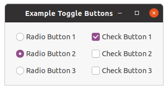
;;;; Example Toggle Buttons (2021-5-20)

(in-package :gtk-example)

(defun example-toggle-buttons ()
  (within-main-loop
    (let ((window (make-instance 'gtk-window
                                 :title "Example Toggle Buttons"
                                 :type :toplevel
                                 :border-width 18))
          (grid (make-instance 'gtk-grid
                               :halign :center
                               :valign :center
                               :column-spacing 24
                               :row-spacing 12)))

      ;; Handler for the signal "destroy"
      (g-signal-connect window "destroy"
                        (lambda (widget)
                          (declare (ignore widget))
                          (leave-gtk-main)))

      ;; Create three radio buttons and put the buttons into the grid
      (let ((button (gtk-radio-button-new-with-label nil "Radio Button 1")))
        (gtk-grid-attach grid button 0 0 1 1)
        (setq button
              (gtk-radio-button-new-with-label
                                          (gtk-radio-button-get-group button)
                                          "Radio Button 2"))
        ;; Make this button active
        (setf (gtk-toggle-button-active button) t)
        (gtk-grid-attach grid button 0 1 1 1)
        (setq button
              (gtk-radio-button-new-with-mnemonic
                                          (gtk-radio-button-get-group button)
                                          "Radio Button _3"))
        (gtk-grid-attach grid button 0 2 1 1))

      ;; Create three check buttons and put the buttons into the grid
      (gtk-grid-attach grid
                       (gtk-check-button-new-with-label "Check Button 1")
                       1 0 1 1)
      (gtk-grid-attach grid
                       (gtk-check-button-new-with-label "Check Button 2")
                       1 1 1 1)
      (gtk-grid-attach grid
                       (gtk-check-button-new-with-label "Check Button 3")
                       1 2 1 1)
      ;; Make the first check button active
      (setf (gtk-toggle-button-active (gtk-grid-child-at grid 1 0)) t)

      (gtk-container-add window grid)
      (gtk-widget-show-all window))))
3.3. Link Button
A
gtk-link-button widget is a
gtk-button widget with a hyperlink, similar to the one used by web
browsers, which triggers an action when clicked. It is useful to show quick links to resources.
A link button is created by calling either the functions
gtk-link-button-new or
gtk-link-button-new-with-label. If using the former, the URI you pass to the constructor is used as a
label for the widget. The URI bound to a link button can be set specifically or retrieved using the
slot access function
gtk-link-button-uri.
By default, the
gtk-link-button widget calls the function
gtk-show-uri when the button is clicked.
This behavior can be overridden by connecting to the "activate-link" signal and returning the value
+gdk-event-stop+ from the signal handler.
Figure 3.5, “Link Button” shows two different styles of link buttons. The code is shown in Example 3.5, “Link Button”.
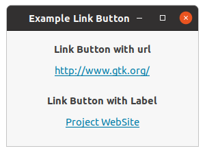
;;;; Link button (2021-5-20)

(in-package :gtk-example)

(defun example-link-button ()
  (within-main-loop
    (let ((window (make-instance 'gtk-window
                                 :type :toplevel
                                 :title "Example Link Button"
                                 :default-width 280
                                 :border-width 18))
          (grid (make-instance 'gtk-grid
                               :orientation :vertical
                               :row-spacing 6
                               :column-homogeneous t)))
      (g-signal-connect window "destroy"
                               (lambda (widget)
                                 (declare (ignore widget))
                                 (leave-gtk-main)))
      (gtk-container-add grid
                         (make-instance 'gtk-label
                                        :use-markup t
                                        :label
                                        "<b>Link Button with url</b>"))
      (gtk-container-add grid
                         (gtk-link-button-new "http://www.gtk.org/"))
      (gtk-container-add grid
                         (make-instance 'gtk-label
                                        :margin-top 12
                                        :use-markup t
                                        :label
                                        "<b>Link Button with Label</b>"))
      (gtk-container-add grid
                         (gtk-link-button-new-with-label "http://www.gtk.org/"
                                                         "Project WebSite"))
      (gtk-container-add window grid)
      (gtk-widget-show-all window))))
3.4. Switch
The
gtk-switch widget has two states: on or off. The user can control which state should be active by
clicking the switch, or by dragging the handle. The switch is created with the function
gtk-switch-new
or the call (make-instance 'gtk-switch).
The
gtk-switch widget has the
active property, which can be set or retrieved with the slot
access function
gtk-switch-active.
An example of a switch is shown in Figure 3.6, “Switch”. The code is shown in Example 3.6, “Switch”. Note that in the example the "notify::active" signal is connected to the switch to display a label with the state of the switch.
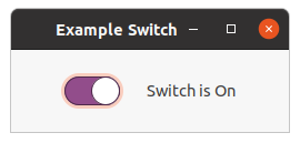
;;;; Example Switch (2021-5-20)

(in-package :gtk-example)

(defun example-switch ()
  (within-main-loop
    (let ((window (make-instance 'gtk-window
                                 :type :toplevel
                                 :title "Example Switch"
                                 :default-width 250
                                 :border-width 24))
          (switch (make-instance 'gtk-switch
                                 :active t))
          (label (make-instance 'gtk-label
                                :xalign 0.0
                                :label "Switch is On"))
          (grid (make-instance 'gtk-grid
                               :orientation :horizontal
                               :halign :center
                               :valign :center
                               :column-spacing 24)))

      (g-signal-connect window "destroy"
                               (lambda (widget)
                                 (declare (ignore widget))
                                 (leave-gtk-main)))

      (g-signal-connect switch "notify::active"
         (lambda (widget param)
           (declare (ignore param))
           (if (gtk-switch-active widget)
               (setf (gtk-label-label label) "Switch is On")
               (setf (gtk-label-label label) "Switch is Off"))))

      (gtk-container-add grid switch)
      (gtk-container-add grid label)
      (gtk-container-add window grid)
      (gtk-widget-show-all window))))
3.5. Scale Button
The
gtk-scale-button widget provides a button which pops up a scale widget. This kind of widget is
commonly used for volume controls in multimedia applications, and GTK provides a
gtk-volume-button
subclass that is tailored for this use case.
The
icons property holds a list of strings with the names of the icons to be used by
the scale button. The first item in the list will be used in the button when the current value is the
lowest value, the second item for the highest value. All the subsequent icons will be used for all the
other values, spread evenly over the range of values. If there is only one icon name in the icons list,
it will be used for all the values. If only two icon names are in the icons array, the first one will be
used for the bottom 50% of the scale, and the second one for the top 50%. It is recommended to use at
least three icons so that the scale button reflects the current value of the scale better for the users.
Figure 3.7, “Scale Button” shows an example with seven icons which represents the values from 0.0 to 10.0. Example 3.7, “Scale Button” shows the code of the example.
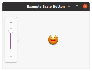
;;;; Example Scale Button (2021-4-27)

(in-package :gtk-example)

(defun example-scale-button ()
  (within-main-loop
    (let ((window (make-instance 'gtk-window
                                 :type :toplevel
                                 :title "Example Scale Button"
                                 :border-width 12
                                 :width-request 360
                                 :height-request 240))
          (button (make-instance 'gtk-scale-button
                                 :margin-left 60
                                 :size 6
                                 :value 9.0
                                 :icons
                                 '("face-crying"     ; lowest value
                                   "face-smile-big"  ; highest value
                                   "face-sad"        ; other value between
                                   "face-worried"
                                   "face-uncertain"
                                   "face-plain"
                                   "face-smile")
                                 :adjustment
                                 (make-instance 'gtk-adjustment
                                                :lower 0.0
                                                :upper 10.0
                                                :step-increment 1.0
                                                :page-increment 2.0))))
      (g-signal-connect window "destroy"
                        (lambda (widget)
                          (declare (ignore widget))
                          (leave-gtk-main)))
      ;; Pack and show the widgets
      (gtk-container-add window button)
      (gtk-widget-show-all window))))
Chapter 4. Display Widgets
4.1. Label Widget
Labels are used a lot in GTK, and are relatively simple. The
gtk-label widget displays a small amount
of text. As the name implies, most labels are used to label another widget such as a
gtk-button widget,
a
gtk-menu-item widget, or a
gtk-combo-box widget. Labels emit no signals as they do not have an
associated X window. If you need to catch signals, or do clipping, place it inside a
gtk-event-box
widget or a button widget.
To create a new label, use the function make-instance with the class name
gtk-label or the
functions
gtk-label-new or
gtk-label-new-with-mnemonic. The sole argument of the functions is the
string you wish the label to display. To retrieve or change the text of the label after creation, use the
function
gtk-label-text. The first argument is the label you created previously, and the second is the
new string. The space needed for the new string will be automatically adjusted if needed. You can produce
multi-line labels by putting line breaks in the label string.
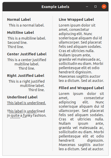
Label with Mnemonics
Labels may contain mnemonics. Mnemonics are underlined characters in the label, used for keyboard
navigation. Mnemonics are created by providing a string with an underscore before the mnemonic
character, such as "_File", to the functions
gtk-label-new-with-mnemonic or
gtk-label-set-text-with-mnemonic.
Mnemonics automatically activate any activatable widget the label is inside, such as a
gtk-button
widget. If the label is not inside the target widget of the mnemonic, you have to tell the label about
the target using the function
gtk-label-mnemonic-widget.
Here is a simple example where the label is inside a button:
;; Pressing Alt+H will activate this button
(let* ((button (gtk-button-new))
       (label (gtk-label-new-with-mnemonic "_Hello")))
  (gtk-container-add button label)
  [...] )
There is the convenience function
gtk-button-new-with-mnemonic to create buttons with a mnemonic label
already inside:
;; Pressing Alt+H will activate this button
(let ((button (gtk-button-new-with-mnemonic "_Hello")))
  [...] )
To create a mnemonic for a widget alongside the label, such as a
gtk-entry widget, you have to point
the label at the entry with the function
gtk-label-mnemonic-widget:
;; Pressing Alt+H will focus the entry
(let ((entry (gtk-entry-new))
      (label (gtk-label-new-with-mnemonic "_Hello")))
  (setf (gtk-label-mnemonic-widget label) entry)
  [...] )
Label with Markup (styled text)
To make it easy to format text in a label (changing colors, fonts, etc.), label text can be provided in a simple markup format. Here is how to create a label with a small font:
(let ((label (gtk-label-new)))
  (gtk-label-set-markup label
                        "<small>Small text</small>")
  [...] )
or
(let ((label (make-instance 'gtk-label
                            :use-markup t
                            :label "<small>Small text</small>")))
  [...] )
(See complete documentation of available tags in the Pango manual.)
The markup passed to the function
gtk-label-set-markup must be valid. For example, literal <, > and
& characters must be escaped as \<, \>, and \&. If you pass text obtained from the user,
file, or a network to the function
gtk-label-set-markup, you will want to escape it with the functions
g_markup_escape_text () or g_markup_printf_escaped (). Note: The
functions g_markup_escape_text () and g_markup_printf_escaped () are not
implemented in the Lisp binding.
Markup strings are just a convenient way to set the
pango-attr-list attributes on a label. The function
gtk-label-attributes may be a simpler way to set attributes in some cases. Be careful though, the
pango-attr-list attributes tends to cause internationalization problems, unless you are applying
attributes to the entire string (i.e. unless you set the range of each attribute to
[0, G_MAXINT)). The reason is that specifying the start_index and
end_index for a PangoAttribute requires knowledge of the exact string being
displayed, so translations will cause problems.
Selectable Labels
Labels can be made selectable with the function
gtk-label-selectable. Selectable labels allow the user
to copy the label contents to the clipboard. Only labels that contain useful-to-copy information - such
as error messages - should be made selectable.
Text Layout
A label can contain any number of paragraphs, but will have performance problems if it contains more than a small number. Paragraphs are separated by newlines or other paragraph separators understood by Pango.
The label widget is capable of line wrapping the text automatically. This can be activated using the
function
gtk-label-line-wrap. The first argument is the label and the second argument take the values
true or false to switch on or to switch off the line wrapping.
The function
gtk-label-justify sets how the lines in a label align with one another. The first argument
is the label and the second argument one of the following values of the
gtk-justification enumeration.
The possible values are shown in Table 4.1, “GtkJustification”. If you want to set how the
label as a whole aligns in its available space, see the
halign and
valign
properties.
| Value | Description |
|---|---|
:left |
The text is placed at the left edge of the label. |
:right |
The text is placed at the right edge of the label. |
:center |
The text is placed in the center of the label. |
:fill |
The text is placed is distributed across the label. |
The
width-chars and
max-width-chars properties can be used to control the size
allocation of ellipsized or wrapped labels. For ellipsizing labels, if either is specified (and less than
the actual text size), it is used as the minimum width, and the actual text size is used as the natural
width of the label. For wrapping labels, the
width-chars property is used as the minimum
width, if specified, and the
max-width-chars property is used as the natural width. Even if
the
max-width-chars property specified, wrapping labels will be rewrapped to use all of the
available width.
Note that the interpretation of “width-chars” and “max-width-chars” has changed a bit with the introduction of width-for-height geometry management.
If you want your label underlined, then you can set a pattern on the label with the function
gtk-label-pattern. The pattern argument indicates how the underlining should look. It consists of a
string of underscore and space characters. An underscore indicates that the corresponding character in
the label should be underlined. For example, the string "__ __" would underline the first two characters
and eight and ninth characters.
Links
GTK supports markup for clickable hyperlinks in addition to regular Pango markup. The markup for links is borrowed from HTML, using the a with href and title attributes. GTK renders links similar to the way they appear in web browsers, with colored, underlined text. The title attribute is displayed as a tooltip on the link. An example looks like this:
(gtk-label-set-markup label
                      "Go to the <a href=\"http://gtk.org/\"> GTK Website</a> for more ...")))
It is possible to implement custom handling for links and their tooltips with the "activate-link" signal
and the function
gtk-label-current-uri.
GtkLabel as GtkBuildable
The
gtk-label widget implementation of the
gtk-buildable interface supports a custom
<attributes> element, which supports any number of <attribute> elements.
The <attribute> element has attributes named name, value,
start and end and allows you to specify PangoAttribute values for
this label.
<object class="GtkLabel">
  <attributes>
    <attribute name="weight" value="PANGO_WEIGHT_BOLD"/>
    <attribute name="background" value="red" start="5" end="10"/>"
  </attributes>
</object>
The start and end attributes specify the range of characters to which the
Pango attribute applies. If start and end are not specified, the attribute
is applied to the whole text. Note that specifying ranges does not make much sense with translatable
attributes. Use markup embedded in the translatable content instead.
Examples
Figure 4.1, “Labels” and Figure 4.2, “More Labels” illustrate the functions for
the
gtk-label widget. The code for these examples is shown in Example 4.2, “Labels” and
Example 4.3, “More Labels”.
;;;; Example Labels (2021-5-21)

(in-package :gtk-example)

(defparameter *label-text-1* "This is a normal label.")
(defparameter *label-text-2*
              (format nil "This is a multiline label.~%~
                           Second line.~%~
                           Third line."))
(defparameter *label-text-3*
              (format nil
                      "This is a center justified~%~
                       multiline label.~%~
                       Third line."))
(defparameter *label-text-4*
              (format nil
                      "This is a right justified~%~
                       multiline label.~%~
                       Third line."))
(defparameter *label-text-5*
              (format nil
                      "This label is underlined.~%~%~
                       This label is underlined~%~
                       in quite a funky fashion."))
(defvar *lorem-ipsum-short*
        (format nil "Lorem ipsum dolor sit amet, consectetur adipiscing elit. ~
Nunc scelerisque aliquam dui id ullamcorper. Sed placerat felis sed aliquam ~
sodales. Cras et ultricies nulla. Nullam ipsum ante, gravida vel malesuada ac, ~
sollicitudin eu diam. Morbi pellentesque elit et odio hendrerit dignissim. ~
Maecenas sagittis auctor leo a dictum. Sed at auctor."))

(defparameter *label-pattern*
  "_________________________ _ _________ _ ______     __ _______ ___")


(defun make-heading (text)
  (make-instance 'gtk-label
                 :xalign 0
                 :margin-top 6
                 :use-markup t
                 :label (format nil "<b>~A</b>" text)))

(defun example-label ()
  (within-main-loop
    (let ((window (make-instance 'gtk-window
                                 :type :toplevel
                                 :title "Example Labels"
                                 :default-width 250
                                 :border-width 18))
          (vbox1 (make-instance 'gtk-box
                                :orientation :vertical
                                :spacing 6))
          (vbox2 (make-instance 'gtk-box
                                :orientation :vertical
                                :spacing 6))
          (hbox (make-instance 'gtk-box
                               :orientation :horizontal
                               :spacing 24)))
      ;; Connect a handler for the signal "destroy" to window.
      (g-signal-connect window "destroy"
                        (lambda (widget)
                          (declare (ignore widget))
                          (leave-gtk-main)))
      ;; Create a Normal Label
      (gtk-box-pack-start vbox1
                          (make-heading "Normal Label")
                          :expand nil)
      (gtk-box-pack-start vbox1
                          (make-instance 'gtk-label
                                         :label *label-text-1*)
                          :expand nil)
      ;; Create a Multi-line Label
      (gtk-box-pack-start vbox1
                          (make-heading "Multiline Label")
                          :expand nil)
      (gtk-box-pack-start vbox1
                          (make-instance 'gtk-label
                                         :label *label-text-2*)
                          :expand nil)
      ;; Create a Left Justified Label
      (gtk-box-pack-start vbox1
                          (make-heading "Center Justified Label")
                          :expand nil)
      (gtk-box-pack-start vbox1
                          (make-instance 'gtk-label
                                         :justify :center
                                         :label *label-text-3*)
                          :expand nil)
      ;; Create a Right Justified Label
      (gtk-box-pack-start vbox1
                          (make-heading "Right Justified Label")
                          :expand nil)
      (gtk-box-pack-start vbox1
                          (make-instance 'gtk-label
                                         :justify :right
                                         :label *label-text-4*)
                          :expand nil)
      ;; Create an underlined label
      (gtk-box-pack-start vbox1
                          (make-heading "Underlined Label")
                          :expand nil)
      (gtk-box-pack-start vbox1
                          (make-instance 'gtk-label
                                         :justify :left
                                         :use-underline t
                                         :pattern *label-pattern*
                                         :label *label-text-5*)
                          :expand nil)

      ;; Create a Line wrapped label
      (gtk-box-pack-start vbox2
                          (make-heading "Line Wrapped Label")
                          :expand nil)
      (gtk-box-pack-start vbox2
                          (make-instance 'gtk-label
                                         :wrap t
                                         :label *lorem-ipsum-short*)
                          :expand nil)
      ;; Create a Filled and wrapped label
      (gtk-box-pack-start vbox2
                          (make-heading "Filled and Wrapped Label")
                          :expand nil)
      (gtk-box-pack-start vbox2
                          (make-instance 'gtk-label
                                         :wrap t
                                         :justify :fill
                                         :label *lorem-ipsum-short*)
                          :expand nil)

      ;; Put the boxes into the window and show the window
      (gtk-box-pack-start hbox vbox1 :expand nil)
      (gtk-box-pack-start hbox (gtk-separator-new :vertical))
      (gtk-box-pack-start hbox vbox2 :expand nil)
      (gtk-container-add window hbox)
      (gtk-widget-show-all window))))
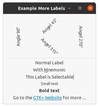
;;;; Example More Labels (2021-5-21)

(in-package :gtk-example)

(defun example-label-more ()
  (within-main-loop
    (let ((window (make-instance 'gtk-window
                                 :type :toplevel
                                 :title "Example More Labels"
                                 :default-width 300
                                 :border-width 12))
          (vbox1 (make-instance 'gtk-box
                                :orientation :vertical
                                :homogeneous nil
                                :spacing 6))
          (vbox2 (make-instance 'gtk-box
                                :orientation :vertical
                                :homogeneous nil
                                :spacing 6))
          (hbox (make-instance 'gtk-box
                               :orientation :horizontal
                               :homogeneous nil
                               :spacing 6)))
      (g-signal-connect window "destroy"
                        (lambda (widget)
                          (declare (ignore widget))
                          (leave-gtk-main)))
      (gtk-box-pack-start hbox
                          (make-instance 'gtk-label
                                         :label "Angle 90°"
                                         :angle 90))
      (gtk-box-pack-start vbox1
                          (make-instance 'gtk-label
                                         :label "Angel 45°"
                                         :angle 45))
      (gtk-box-pack-start vbox1
                          (make-instance 'gtk-label
                                         :label "Angel 315°"
                                         :angle 315))
      (gtk-box-pack-start hbox vbox1)
      (gtk-box-pack-start hbox
                          (make-instance 'gtk-label
                                         :label "Angel 270°"
                                         :angle 270))
      (gtk-box-pack-start vbox2 hbox)
      (gtk-box-pack-start vbox2
                          (make-instance 'gtk-separator
                                         :orientation :horizontal))
      (gtk-box-pack-start vbox2
                          (gtk-label-new "Normal Label"))
      (gtk-box-pack-start vbox2
                          (gtk-label-new-with-mnemonic "With _Mnemonic"))
      (gtk-box-pack-start vbox2
                          (make-instance 'gtk-label
                                         :label "This Label is Selectable"
                                         :selectable t))
      (gtk-box-pack-start vbox2
                          (make-instance 'gtk-label
                                         :label
                                         "<small>Small text</small>"
                                          :use-markup t))
      (gtk-box-pack-start vbox2
                          (make-instance 'gtk-label
                                         :label
                                         "<b>Bold text</b>"
                                          :use-markup t))
      (gtk-box-pack-start vbox2
                          (make-instance 'gtk-label
                                         :use-markup t
                                         :label
                                         (format nil
                                         "Go to the ~
                                         <a href=\"http://gtk.org/\">~
                                         GTK+ Website</a> for more ...")))
      (gtk-container-add window vbox2)
      (gtk-widget-show-all window))))
4.2. Image Widget
The
gtk-image widget displays an image. Various kinds of object can be displayed as an image. Most
typically, you would load a
gdk-pixbuf object ("pixel buffer") from a file, and then display that. There
is a convenience function
gtk-image-new-from-file to do this, used as follows:
(let ((image (gtk-image-new-from-file "myfile.png")))
  ... )
If the file is not loaded successfully, the image will contain a "broken image" icon similar to that used
in many web browsers. If you want to handle errors in loading the file yourself, for example by displaying
an error message, then load the image with the function
gdk-pixbuf-new-from-file, then create the
gtk-image widget with the function
gtk-image-new-from-pixbuf.
The image file may contain an animation, if so the
gtk-image widget will display an animation
instead of a static image.
The
gtk-image widget is a subclass of the
gtk-misc class, which implies that you can align it (center,
left, right) and add padding to it, using the functions of the
gtk-misc class.
The
gtk-image widget is a "no window" widget (has no
gdk-window object of its own), so by default does
not receive events. If you want to receive events on the image, such as button clicks, place the image
inside a
gtk-event-box widget, then connect to the event signals on the event box.
(let ((event-box (make-instance 'gtk-event-box))
      (image (gtk-image-new-from-file "myfile.png")))
  (g-signal-connect event-box "button-press-event"
     (lambda (event-box event)
       (format t "Event Box ~A clicked at (~A, ~A)~%"
                 event-box
                 (gdk-event-button-x event)
                 (gdk-event-button-y event))
       ...

       ;; Returning +gdk-event-stop+ means we handled the event, so the signal
       ;; emission should be stopped (do not call any further callbacks that
       ;; may be connected). Return +gdk-event-propagate+ to continue invoking
       ;; callbacks.
       +gdk-event-stop+))
  ... )
When handling events on the event box, keep in mind that coordinates in the image may be different from
event box coordinates due to the alignment and padding settings on the image (see the
gtk-misc widget.
The simplest way to solve this is to set the alignment to 0.0 (left/top), and set the padding to zero.
Then the origin of the image will be the same as the origin of the event box.
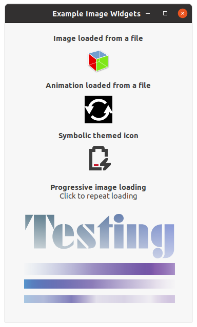
Example 4.4, “Image Widget” shows various images. The code includes an example of parsing an image
data file in small chunks with the
gdk-pixbuf-loader class. The image is reloaded when clicking the
image. This is an example for using a
gtk-event-box widget to receive and process the "button-press"
signal on an image. The output of this example is shown in Figure 4.3, “Images”.
;;;; Example Image Widgets (2021-5-23)
;;;;
;;;; GtkImage is used to display an image. The image can be in a number of
;;;; formats. Typically, you load an image into a GdkPixbuf, then display the
;;;; pixbuf.
;;;;
;;;; This demo code shows some of the more obscure cases, in the simple case a
;;;; call to the function gtk-image-new-from-file is all you need.

(in-package :gtk-example)

(let ((pixbuf-loader nil)
      (image-stream nil))

  (defun progressive-timeout (image)
    (if image-stream
        (let* ((buffer (make-array 128 :element-type '(unsigned-byte 8)))
               (len (read-sequence buffer image-stream)))
          (if (= 0 len)
              ;; We have reached the end of the file.
              (progn
                (close image-stream)
                (setf image-stream nil)
                (gdk-pixbuf-loader-close pixbuf-loader)
                (setf pixbuf-loader nil)
                (return-from progressive-timeout +g-source-remove+))
              ;; Load the buffer into GdkPixbufLoader
              (gdk-pixbuf-loader-write pixbuf-loader buffer 128)))
        (progn
          ;; Create the image stream and the GdkPixbufLoader
          (setf image-stream
                (open (sys-path "alphatest.png")
                      :element-type '(unsigned-byte 8)))
          (when pixbuf-loader
            (gdk-pixbuf-loader-close pixbuf-loader)
            (setf pixbuf-loader nil))
          (setf pixbuf-loader (gdk-pixbuf-loader-new))
          (g-signal-connect pixbuf-loader "area-prepared"
             (lambda (loader)
               (let ((pixbuf (gdk-pixbuf-loader-pixbuf loader)))
                 (gdk-pixbuf-fill pixbuf #xaaaaaaff)
                 (gtk-image-set-from-pixbuf image pixbuf))))
          (g-signal-connect pixbuf-loader "area-updated"
             (lambda (loader x y width height)
               (declare (ignore loader x y width height))
               ;; We know the pixbuf inside the GtkImage has changed, but the
               ;; image itself does not know this. So give it a hint by setting
               ;; the pixbuf again. Queuing a redraw used to be sufficient, but
               ;; nowadays GtkImage uses GtkIconHelper which caches the pixbuf
               ;; state and will just redraw from the cache.
               (let ((pixbuf (gtk-image-pixbuf image)))
                 (gtk-image-set-from-pixbuf image pixbuf))))))
    ;; Continue the GSource
    +g-source-continue+)

  (defun example-image ()
    (within-main-loop
      (let* ((timeout nil)
             (window (make-instance 'gtk-window
                                    :type :toplevel
                                    :title "Example Image Widgets"
                                    :default-width 320
                                    :border-width 12))
             (vgrid (make-instance 'gtk-grid
                                   :orientation :vertical
                                   :row-spacing 6)))

        (g-signal-connect window "destroy"
                          (lambda (widget)
                            (declare (ignore widget))
                            ;; Destroy the timeout source
                            (when timeout
                              (g-source-remove timeout)
                              (setf timeout nil))
                            ;; Close the GdkPixbufLoader object
                            (when pixbuf-loader
                              (gdk-pixbuf-loader-close pixbuf-loader)
                              (setf pixbuf-loader nil))
                            ;; Close open input stream
                            (when image-stream
                              (close image-stream)
                              (setf image-stream nil))
                            (leave-gtk-main)))

        ;; Image loaded from a file
        (let* ((label (make-instance 'gtk-label
                                     :margin-top 9
                                     :margin-bottom 6
                                     :use-markup t
                                     :label
                                     "<b>Image loaded from a file</b>"))
               (pixbuf (gdk-pixbuf-new-from-file (sys-path "gtk3-demo.png")))
               (image (gtk-image-new-from-pixbuf pixbuf)))
          (gtk-container-add vgrid label)
          (gtk-container-add vgrid image))

        ;; Animation loaded from a file
        (let* ((label (make-instance 'gtk-label
                                     :margin-top 9
                                     :margin-bottom 6
                                     :use-markup t
                                     :label
                                     "<b>Animation loaded from a file</b>"))
               (image (gtk-image-new-from-file (sys-path "spinner.gif"))))
          (gtk-container-add vgrid label)
          (gtk-container-add vgrid image))

        ;; Symbolic icon
        (let* ((label (make-instance 'gtk-label
                                     :margin-top 9
                                     :margin-bottom 6
                                     :use-markup t
                                     :label
                                     "<b>Symbolic themed icon</b>"))
               (gicon (g-themed-icon-new-with-default-fallbacks
                          "battery-caution-charging-symbolic"))
               (image (gtk-image-new-from-gicon gicon :dialog)))
          (gtk-container-add vgrid label)
          (gtk-container-add vgrid image))

        ;; Progressive loading
        (let* ((label (make-instance 'gtk-label
                                     :margin-top 18
                                     :justify :center
                                     :use-markup t
                                     :label
                                     (format nil
                                             "<b>Progressive image loading</b>~
                                              ~%Click to repeat loading")))
               (frame (make-instance 'gtk-frame
                                     :shadow-type :none
                                     :width-request 340
                                     :height-request 220))
               (event-box (make-instance 'gtk-event-box))
               ;; Create an empty image for now. The progressive loader will
               ;; create the pixbuf and fill it in.
               (image (gtk-image-new-from-pixbuf nil)))

          ;; This is obviously totally contrived (we slow down loading on
          ;; purpose to show how incremental loading works). The real purpose
          ;; of incremental loading is the case where you are reading data from
          ;; a slow source such as the network. The timeout simply simulates a
          ;; slow data source by inserting pauses in the reading process.
          (setf timeout
                (g-timeout-add 100 (lambda () (progressive-timeout image))))

          ;; Restart loading the image from the file
          (g-signal-connect event-box "button-press-event"
             (lambda (widget event)
               (declare (ignore widget))
               (format t "Event Box clicked at (~,2f, ~,2f)~%"
                         (gdk-event-button-x event)
                         (gdk-event-button-y event))
               (setf timeout
                     (g-timeout-add 100
                                    (lambda () (progressive-timeout image))))))
          (gtk-container-add vgrid label)
          (gtk-container-add event-box image)
          (gtk-container-add frame event-box)
          (gtk-container-add vgrid frame))

        (gtk-container-add window vgrid)
        (gtk-widget-show-all window)))))
4.3. Info Bar Widget
The
gtk-info-bar widget can be used to show messages to the user without showing a dialog. It is often
temporarily shown at the top or bottom of a document. In contrast to the
gtk-dialog widget, which has a
horizontal action area at the bottom, the
gtk-info-bar widget has a vertical action area at the side.
The API of the
gtk-info-bar widget is very similar to the
gtk-dialog widget, allowing you to add
buttons to the action area with the functions
gtk-info-bar-add-button or
gtk-info-bar-new-with-buttons. The sensitivity of action widgets can be controlled with the function
gtk-info-bar-set-response-sensitive. To add widgets to the main content area of a the
gtk-info-bar
widget, use the function
gtk-info-bar-content-area and add your widgets to the container.
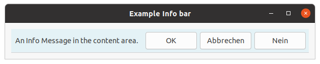
Similar to the
gtk-message-dialog widget, the contents of a the
gtk-info-bar widget can by classified
as error message, warning, informational message, etc, by using the function
gtk-info-bar-message-type.
GTK uses the message type to determine the background color of the message area.
;;;; Example Info Bar (2021-5-24)

(in-package :gtk-example)

(defun example-info-bar ()
  (within-main-loop
    (let* ((window (make-instance 'gtk-window
                                  :type :toplevel
                                  :title "Example Info bar"
                                  :border-width 12
                                  :default-width 250))
           (grid (make-instance 'gtk-grid
                                :orientation :vertical))
           (info-bar (make-instance 'gtk-info-bar
                                    :no-show-all t))
           (message (make-instance 'gtk-label
                                   :label ""))
           (content (gtk-info-bar-content-area info-bar)))
      (g-signal-connect window "destroy"
                        (lambda (widget)
                          (declare (ignore widget))
                          (leave-gtk-main)))
      (gtk-widget-show message)
      ;; Add a label to the content area of the info bar
      (gtk-container-add content message)
      ;; Add a button OK to the action area
      (gtk-info-bar-add-button info-bar "gtk-ok" 1)
      ;; Add two more buttons to the action area
      (gtk-info-bar-add-buttons info-bar "gtk-cancel" 2
                                         "gtk-no" 3)
      ;; Connect a handler for the "response" signal of the info bar
      (g-signal-connect info-bar "response"
         (lambda (widget response-id)
           (declare (ignore widget))
           (format t "response-id is ~A~%" response-id)
           (gtk-widget-hide info-bar)))
      (gtk-container-add grid info-bar)
      ;; Show the info bar
      (setf (gtk-label-text message) "An Info Message in the content area.")
      (setf (gtk-info-bar-message-type info-bar) :info)
      (gtk-widget-show info-bar)
      ;; Add the container grid to the window and show all
      (gtk-container-add window grid)
      (gtk-widget-show-all window))))
4.4. Progress Bar Widget
Progress bars are implemented as the
gtk-progress-bar class and are used to show the status of an
operation. They are pretty easy to use, as you will see with the code below. But first lets start out
with the function
gtk-progress-bar-new to create a new progress bar. Now that the progress bar has been
created we can use it and set the fraction with the function
gtk-progress-bar-fraction, which has two
arguments. The first argument is the progress bar you wish to operate on, and the second argument is
the amount "completed", meaning the amount the progress bar has been filled from 0 - 100%. This is passed
to the function as a real number ranging from 0.0 to 1.0.
A progress bar may be set to one of a number of orientations using the function
gtk-orientable-orientation. The second argument is the orientation and may take one of the values of
:horizontal or :vertical of the
gtk-orientation enumeration. Progress bars
normally grow from top to bottom or left to right. With the function
gtk-progress-bar-inverted can be
set to grow in the opposite direction.
As well as indicating the amount of progress that has occurred, the progress bar may be set to just
indicate that there is some activity. This can be useful in situations where progress cannot be measured
against a value range. The function
gtk-progress-bar-pulse indicates that some progress has been made.
The step size of the activity indicator is set using the function
gtk-progress-bar-pulse-step.
The progress bar can also display a configurable text string within its trough, using the function
gtk-progress-bar-text. You can turn off the display of the string by calling the function
gtk-progress-bar-text again with nil as second argument. The current text setting of a
progress bar can be retrieved with the function
gtk-progress-bar-text.
Progress bars are usually used with timeouts or other such functions to give the illusion of multitasking.
All will employ the functions
gtk-progress-bar-fraction or
gtk-progress-bar-pulse in the same manner.
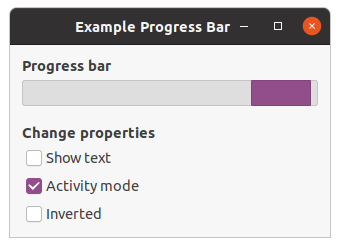
Example 4.6, “Progress Bar” shows an example of the progress bar, updated using timeouts. This code also shows how to reset the progress bar. The output of this example is shown in Figure 4.5, “Progress Bar”.
;;;; Example Progress Bar (2021-5-2)

(in-package :gtk-example)

(defstruct pbar
  widget
  timer
  mode)

(defun progress-bar-timeout (pdata)
  (if (pbar-mode pdata)
      (gtk-progress-bar-pulse (pbar-widget pdata))
      (let ((val (+ (gtk-progress-bar-fraction (pbar-widget pdata))
                    0.01)))
        (when (> val 1.0) (setq val 0.0))
        (setf (gtk-progress-bar-fraction (pbar-widget pdata)) val)))
  +g-source-continue+)

(defun example-progress-bar ()
  (within-main-loop
    (let ((window (make-instance 'gtk-window
                                 :type :toplevel
                                 :title "Example Progress Bar"
                                 :default-width 320))
          (pdata (make-pbar :widget (make-instance 'gtk-progress-bar)))
          (vbox (make-instance 'gtk-box
                               :orientation :vertical
                               :border-width 12
                               :spacing 6)))

      (g-signal-connect window "destroy"
                        (lambda (widget)
                          (declare (ignore widget))
                          (g-source-remove (pbar-timer pdata))
                          (setf (pbar-timer pdata) 0)
                          (leave-gtk-main)))

      (let ((provider (gtk-css-provider-new))
            (context (gtk-widget-style-context (pbar-widget pdata)))
            (css-data "progressbar > trough,
                       progressbar > trough > progress {
                           min-height : 24px; }"))
         (gtk-css-provider-load-from-data provider css-data)
         (gtk-style-context-add-provider context
                                         provider
                                         +gtk-style-provider-priority-application+))

      (setf (pbar-timer pdata)
            (g-timeout-add 100
                           (lambda ()
                             (progress-bar-timeout pdata))))

      (gtk-box-pack-start vbox
                          (make-instance 'gtk-label
                                         :use-markup t
                                         :xalign 0.0
                                         :label
                                         "<b>Progress bar</b>"))

      (gtk-box-pack-start vbox (pbar-widget pdata))

      (gtk-box-pack-start vbox
                          (make-instance 'gtk-label
                                         :use-markup t
                                         :xalign 0.0
                                         :margin-top 12
                                         :label
                                         "<b>Change properties</b>"))

      (let ((check (gtk-check-button-new-with-label "Show text")))
        (g-signal-connect check "clicked"
           (lambda (widget)
             (declare (ignore widget))
             (if (gtk-toggle-button-active check)
                 (setf (gtk-progress-bar-text (pbar-widget pdata))
                       (if (pbar-mode pdata)
                           "Progress bar is in activity mode"
                           "Progress bar is in normal mode"))
                 (setf (gtk-progress-bar-text (pbar-widget pdata)) ""))
             (setf (gtk-progress-bar-show-text (pbar-widget pdata))
                   (gtk-toggle-button-active check))))
        (gtk-box-pack-start vbox check))

      (let ((check (gtk-check-button-new-with-label "Activity mode")))
        (g-signal-connect check "clicked"
           (lambda (widget)
             (declare (ignore widget))
             (setf (pbar-mode pdata)
                   (not (pbar-mode pdata)))
             (if (pbar-mode pdata)
                 (progn
                   (gtk-progress-bar-pulse (pbar-widget pdata))
                   (setf (gtk-progress-bar-text (pbar-widget pdata))
                         "Progress bar is in activity mode"))
                 (progn
                   (setf (gtk-progress-bar-text (pbar-widget pdata))
                         "Progress bar is in normal mode")
                   (setf (gtk-progress-bar-fraction (pbar-widget pdata))
                         0.0)))))
        (gtk-box-pack-start vbox check))

      (let ((check (gtk-check-button-new-with-label "Inverted")))
        (g-signal-connect check "clicked"
           (lambda (widget)
             (declare (ignore widget))
             (setf (gtk-progress-bar-inverted (pbar-widget pdata))
                   (gtk-toggle-button-active check))))
        (gtk-box-pack-start vbox check))

      (gtk-container-add window vbox)
      (gtk-widget-show-all window))))
4.5. Statusbar Widget
Statusbars are simple widgets used to display a text message. They keep a stack of the messages pushed onto them, so that popping the current message will re-display the previous text message.
In order to allow different parts of an application to use the same statusbar to display messages, the statusbar widget issues context Identifiers which are used to identify different "users". The message on top of the stack is the one displayed, no matter what context it is in. Messages are stacked in last-in-first-out order, not context identifier order.
A statusbar is created with a call to the function
gtk-statusbar-new. A new context identifier is
requested using a call to the function
gtk-statusbar-context-id with a short textual description of the
context as the second argument.
There are three functions that can operate on statusbars:
gtk-statusbar-push,
gtk-statusbar-pop, and
gtk-statusbar-remove. The first function,
gtk-statusbar-push, is used to add a new message to the
statusbar. It returns a message identifier, which can be passed later to the function
gtk-statusbar-remove to remove the message with the given message and context identifiers from the stack
of the statusbar. The function
gtk-statusbar-pop removes the message highest in the stack with the given
context identifier.
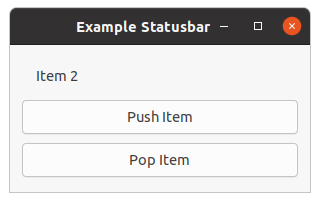
Example 4.7, “Statusbar” creates a statusbar and two buttons, one for pushing items onto the statusbar, and one for popping the last item back off.
;;;; Example Statusbar (2021-5-28)

(in-package :gtk-example)

(defun example-statusbar ()
  (within-main-loop
    (let* ((window (make-instance 'gtk-window
                                  :type :toplevel
                                  :title "Example Statusbar"
                                  :default-width 300
                                  :border-width 12))
           (vbox (make-instance 'gtk-box
                                :orientation :vertical
                                :homogeneous nil
                                :spacing 3))
           (statusbar (make-instance 'gtk-statusbar))
           (id (gtk-statusbar-context-id statusbar "Example Statusbar"))
           (count 0))
      (g-signal-connect window "destroy"
                        (lambda (widget)
                          (declare (ignore widget))
                          (leave-gtk-main)))
      (gtk-box-pack-start vbox statusbar)
      (let ((button (gtk-button-new-with-label "Push Item")))
        (g-signal-connect button "clicked"
           (lambda (widget)
             (declare (ignore widget))
             (setq count (+ 1 count))
             (gtk-statusbar-push statusbar id (format nil "Item ~A" count))))
        (gtk-box-pack-start vbox button :expand t :fill t :padding 3))
      (let ((button (gtk-button-new-with-label "Pop Item")))
        (g-signal-connect button "clicked"
           (lambda (widget)
             (declare (ignore widget))
             (gtk-statusbar-pop statusbar id)))
        (gtk-box-pack-start vbox button :expand t :fill t :padding 3))
      (gtk-container-add window vbox)
      (gtk-widget-show-all window))))
Chapter 5. Adjustments
5.1. Introduction to Adjustments
GTK has various widgets that can be visually adjusted by the user using the mouse or the keyboard, such
as the range widgets, described in Chapter 6, Range Widgets. There are also a few widgets that
display some adjustable portion of a larger area of data, such as the
gtk-viewport widget.
Obviously, an application needs to be able to react to changes the user makes in range widgets. One way to do this would be to have each widget emit its own type of signal when its adjustment changes, and either pass the new value to the signal handler, or require it to look inside the data structure of the widget in order to ascertain the value. But you may also want to connect the adjustments of several widgets together, so that adjusting one adjusts the others. The most obvious example of this is connecting a scrollbar to a panning viewport or a scrolling text area. If each widget has its own way of setting or getting the adjustment value, then the programmer may have to write their own signal handlers to translate between the "output" of one widget's signal and the "input" of another's adjustment setting function.
GTK solves this problem using the
gtk-adjustment object, which is not a widget but a way for widgets to
store and pass adjustment information in an abstract and flexible form. The most obvious use of the
gtk-adjustment object is to store the configuration parameters and values of range widgets, such as
scrollbars and scale controls. However, since the
gtk-adjustment object is derived from the
g-object class, adjustments have some special powers beyond those of normal data structures. Most
importantly, they can emit signals, just like widgets, and these signals can be used not only to allow a
program to react to user input on adjustable widgets, but also to propagate adjustment values
transparently between adjustable widgets.
You will see how adjustments fit in when you see the other widgets that incorporate them: Progress Bars, Viewports, Scrolled Windows, and others.
5.2. Creating an Adjustment
Many of the widgets which use adjustment objects do so automatically, but some cases will be shown in
later examples where you may need to create an adjustment yourself. An adjustment can be created with
the function
gtk-adjustment-new which has the arguments value, lower,
upper, step-increment, page-increment, and page-size.
The argument value is the initial value you want to give to the adjustment, usually
corresponding to the topmost or leftmost position of an adjustable widget. The argument
lower specifies the lowest value which the adjustment can hold. The argument
step-increment specifies the "smaller" of the two increments by which the user can change
the value, while page-increment is the "larger" one. The argument page-size
usually corresponds somehow to the visible area of a panning widget. The argument upper is
used to represent the bottom most or right most coordinate in a panning widget's child. Therefore it is
not always the largest number that value can take, since page-size of such
widgets is usually non-zero.
5.3. Using Adjustments the Easy Way
The adjustable widgets can be roughly divided into those which use and require specific units for these values and those which treat them as arbitrary numbers. The group which treats the values as arbitrary numbers includes the range widgets (scrollbars and scales, the progress bar widget, and the spin button widget). These widgets are all the widgets which are typically "adjusted" directly by the user with the mouse or keyboard. They will treat the lower and upper values of an adjustment as a range within which the user can manipulate the value of the adjustment. By default, they will only modify the value of an adjustment.
The other group includes the text widget, the viewport widget, the compound list widget, and the scrolled window widget. All of these widgets use pixel values for their adjustments. These are also all widgets which are typically "adjusted" indirectly using scrollbars. While all widgets which use adjustments can either create their own adjustments or use ones you supply, you will generally want to let this particular category of widgets create its own adjustments. Usually, they will eventually override all the values except the value itself in whatever adjustments you give them, but the results are, in general, undefined (meaning, you'll have to read the source code to find out, and it may be different from widget to widget).
Now, you are probably thinking, since text widgets and viewports insist on setting everything except the value of their adjustments, while scrollbars will only touch the value of the adjustment, if you share an adjustment object between a scrollbar and a text widget, manipulating the scrollbar will automagically adjust the viewport widget? Of course it will! Just like this:
(let (;; A viewport creates its own adjustments
      (viewport (gtk-viewport-new))
      ;; use the adjustment from the viewport for the scrollbar
      (vscrollbar (make-instance 'gtk-scrollbar
                                 :orientation :vertical
                                 :vadjustment
                                 (gtk-scrollable-vadjustment viewport))))
  [...] )
5.4. Adjustment Internals
Ok, you say, that's nice, but what if I want to create my own handlers to respond when the user adjusts a
range widget or a spin button, and how do I get at the value of the adjustment in these handlers? To
answer these questions and more, let's start by taking a look at the Lisp class representing the
gtk-adjustment object itself:
(define-g-object-class "GtkAdjustment" gtk-adjustment
  (:superclass gtk-object
   :export t
   :interfaces nil
   :type-initializer "gtk_adjustment_get_type")
  ((lower
    gtk-adjustment-lower
    "lower" "gdouble" t t)
   (page-increment
    gtk-adjustment-page-increment
    "page-increment" "gdouble" t t)
   (page-size
    gtk-adjustment-page-size
    "page-size" "gdouble" t t)
   (step-increment
    gtk-adjustment-step-increment
    "step-increment" "gdouble" t t)
   (upper
    gtk-adjustment-upper
    "upper" "gdouble" t t)
   (value
    gtk-adjustment-value
    "value" "gdouble" t t)))
The slots of the class are lower, page-increment, page-size,
step-increment, upper, and value. The slots represent the
properties of the C
gtk-adjustment class. The slots can be accessed with the corresponding Lisp accessor
functions.
As mentioned earlier, an adjustment object is a subclass of the
g-object class just like all the various
widgets, and thus it is able to emit signals. This is, of course, why updates happen automagically when
you share an adjustment object between a scrollbar and another adjustable widget; all adjustable widgets
connect signal handlers to their adjustment's "value-changed" signal, as can your program.
The various widgets that use the adjustment object will emit the signal "value-changed" on an adjustment
whenever they change its value. This happens both when user input causes the slider to move on a range
widget, as well as when the program explicitly changes the value with the function
gtk-adjustment-value. So, for example, if you have a scale widget, and you want to change the rotation
of a picture whenever its value changes, you would create a callback like this:
(defun cb-rotate-picture (adj picture)
  (set-picture-rotation picture (gtk-adjustment-value adj))
  ... )
and connect it to the scale widget's adjustment like this:
(g-signal-connect adj "value-changed"
                  (lambda (widget)
                    (cb-rotate-picture widget picture)))
What about when a widget reconfigures the upper or lower fields of its adjustment, such as when a user adds more text to a text widget? In this case, it emits the signal "changed". Range widgets typically connect a handler to this signal, which changes their appearance to reflect the change - for example, the size of the slider in a scrollbar will grow or shrink in inverse proportion to the difference between the lower and upper values of its adjustment.
You probably won't ever need to attach a handler to the signal "changed", unless you are writing a new
type of range widget. However, if you change any of the values in an adjustment directly, you should
emit this signal on it to reconfigure whatever widgets are using it, like this
(g-signal-emit adj "changed").
Chapter 6. Range Widgets
6.1. Introduction to Range Widgets
The category of range widgets includes the ubiquitous scrollbar widget and the less common scale widget. Though these two types of widgets are generally used for different purposes, they are quite similar in function and implementation. All range widgets share" a set of common graphic elements, each of which has its own X window and receives events. They all contain a "trough" and a "slider" (what is sometimes called a "thumbwheel" in other GUI environments). Dragging the slider with the pointer moves it back and forth within the trough, while clicking in the trough advances the slider towards the location of the click, either completely, or by a designated amount, depending on which mouse button is used.
As mentioned in Chapter 5, Adjustments, all range widgets are associated with an adjustment object, from which they calculate the length of the slider and its position within the trough. When the user manipulates the slider, the range widget will change the value of the adjustment.
6.2. Scale Widgets
Scale widgets are used to allow the user to visually select and manipulate a value within a specific range. You might want to use a scale widget, for example, to adjust the magnification level on a zoomed preview of a picture, or to control the brightness of a color, or to specify the number of minutes of inactivity before a screensaver takes over the screen.
As with scrollbars, the
gtk-scale widget is a horizontal or vertical scale, depending on the value of
the
orientation property. A scale can be created with the function
gtk-scale-new,
which takes two arguments. The first argument gives the direction :horizontal or
:vertical and the second a
gtk-adjustment object.
The adjustment argument can either be an adjustment which has already been created with the function
gtk-adjustment-new, or NIL, in which case, an anonymous adjustment is created with all of
its values set to 0.0 (which is not very useful in this case). In order to avoid confusing yourself, you
probably want to create your adjustment with a
page-size of 0.0 so that its upper value
actually corresponds to the highest value the user can select. The function
gtk-scale-new-with-range
variant take care of creating a suitable adjustment. The function takes four arguments. The first argument
is again the orientation of the scale and the next arguments represent the values for creating an
gtk-adjustment object with initial values for the properties
lower,
upper, and
step-increment. If you are already thoroughly confused, read
Chapter 5, Adjustments again for an explanation of what exactly adjustments do and how to create
and manipulate them.
6.2.1. Functions and Signals
Scale widgets can display their current value as a number beside the trough. The default behavior is
to show the value, but you can change this with this with the generic function
gtk-scale-draw-value,
which takes as the first argument a widget of type
gtk-scale and as the second argument
draw-value, which is either T or NIL, with predictable
consequences for either one.
The value displayed by a scale widget is rounded to one decimal point by default, as is the value field
in its adjustment. You can change this with the function
gtk-scale-digits. The first argument is a
gtk-scale widget and the second argument digits, where digits is the number
of decimal places you want. You can set digits to anything you like, but no more than 13 decimal places
will actually be drawn on screen.
Finally, the value can be drawn in different positions relative to the trough with the function
gtk-scale-value-pos. The first argument is again a scale widget. The second argument pos
is a value of the
gtk-position-type enumeration.
If you position the value on the "side" of the trough (e.g., on the top or bottom of a horizontal scale widget), then it will follow the slider up and down the trough.
6.3. Common Range Functions
The range widget class is fairly complicated internally, but, like all the base class widgets, most of its complexity is only interesting if you want to hack on it. Also, almost all of the functions and signals it defines are only really used in writing derived widgets. There are, however, a few useful functions that will work on all range widgets.
6.3.1. Getting and Setting Adjustments
Getting and setting the adjustment for a range widget "on the fly" is done with the function
gtk-range-adjustment. The function
gtk-range-adjustment returns the adjustment to which the range is
connected.
The function
gtk-range-adjustment does absolutely nothing if you pass it the adjustment that range is
already using, regardless of whether you changed any of its fields or not. If you pass it a new
adjustment, it will unreference the old one if it exists (possibly destroying it), connect the
appropriate signals to the new one, and emit the "changed" signal, which will recalculate the size or
position of the slider and redraw if necessary. As mentioned in the section on adjustments, if you wish
to reuse the same adjustment, when you modify its values directly, you should emit the "changed" signal
on it.
6.3.2. Key and Mouse bindings
All of the GTK range widgets react to mouse clicks in more or less the same way. Clicking button-1 in
the trough will cause its adjustment's page-increment to be added or subtracted from its
value, and the slider to be moved accordingly. Clicking mouse button-2 in the trough will jump the
slider to the point at which the button was clicked. Clicking button-3 in the trough of a range or any
button on a scrollbar's arrows will cause its adjustment's value to change by
step-increment at a time.
Scrollbars are not focusable, thus have no key bindings. The key bindings for the other range widgets (which are, of course, only active when the widget has focus) are do not differentiate between horizontal and vertical range widgets.
All range widgets can be operated with the left, right, up and down arrow keys, as well as with the Page
Up and Page Down keys. The arrows move the slider up and down by step-increment, while
Page Up and Page Down move it by page-increment.
The user can also move the slider all the way to one end or the other of the trough using the keyboard. This is done with the Home and End keys.
6.4. Example Range Widgets
Example 6.1, “Scale Widget” basically puts up a window with three range widgets all connected to the same adjustment, and a couple of controls for adjusting some of the parameters mentioned above and in the section on adjustments, so you can see how they affect the way these widgets work for the user.
You will notice that the program does not call the function
g-signal-connect for the "delete-event",
but only for the "destroy" signal. This will still perform the desired function, because an unhandled
"delete-event" will result in a "destroy" signal being given to the window.
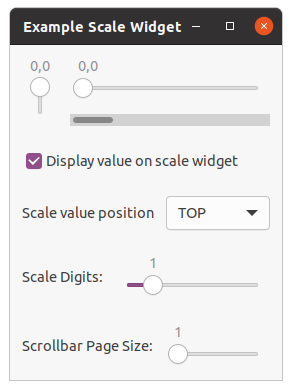
;;;; Example Scale Widget (2021-5-28)

(in-package :gtk-example)

(defun example-scale-widget ()
  (within-main-loop
    (let* ((window (make-instance 'gtk-window
                                  :type :toplevel
                                  :title "Example Scale Widget"))
           (box1 (make-instance 'gtk-box
                                :orientation :vertical
                                :homogeneous nil
                                :spacing 0))
           (box2 (make-instance 'gtk-box
                                :orientation :horizontal
                                :homogeneous nil
                                :spacing 12
                                :border-width 12))
           (box3 (make-instance 'gtk-box
                                :orientation :vertical
                                :homogeneous nil
                                :spacing 12))
           (adj1 (make-instance 'gtk-adjustment
                                :value 0.0
                                :lower 0.0
                                :upper 101.0
                                :step-increment 0.1
                                :page-increment 1.0
                                :page-size 1.0))
           (vscale (make-instance 'gtk-scale
                                  :orientation :vertical
                                  :digits 1
                                  :value-pos :top
                                  :draw-value t
                                  :adjustment adj1))
           (hscale (make-instance 'gtk-scale
                                   :orientation :horizontal
                                   :digits 1
                                   :value-pos :top
                                   :draw-value t
                                   :width-request 200
                                   :height-request -1
                                   :adjustment adj1))
           (scrollbar (make-instance 'gtk-scrollbar
                                     :orientation :horizontal
                                     :adjustment adj1)))
      ;; Connect a handler for the signal "destroy" to the main window.
      (g-signal-connect window "destroy"
                        (lambda (widget)
                          (declare (ignore widget))
                          (leave-gtk-main)))
      ;; Packing of the global widgets hscale, vscale, and scrollbar
      (gtk-container-add window box1)
      (gtk-box-pack-start box1 box2)
      (gtk-box-pack-start box2 vscale)
      (gtk-box-pack-start box2 box3)
      (gtk-box-pack-start box3 hscale)
      (gtk-box-pack-start box3 scrollbar)
      ;; A check button to control whether the value is displayed or not.
      (let ((box (make-instance 'gtk-box
                                :orientation :horizontal
                                :homogeneous nil
                                :spacing 12
                                :border-width 12))
            (button (make-instance 'gtk-check-button
                                   :label "Display value on scale widget"
                                   :active t)))
        (g-signal-connect button "toggled"
           (lambda (widget)
             (setf (gtk-scale-draw-value hscale)
                   (gtk-toggle-button-active widget))
             (setf (gtk-scale-draw-value vscale)
                   (gtk-toggle-button-active widget))))
        (gtk-box-pack-start box button)
        (gtk-box-pack-start box1 box))
      ;; A ComboBox to change the position of the value.
      (let ((box (make-instance 'gtk-box
                                :orientation :horizontal
                                :homogeneous nil
                                :spacing 12
                                :border-width 12))
            (combo (make-instance 'gtk-combo-box-text)))
        (gtk-combo-box-text-append-text combo "TOP")
        (gtk-combo-box-text-append-text combo "BOTTOM")
        (gtk-combo-box-text-append-text combo "LEFT")
        (gtk-combo-box-text-append-text combo "RIGHT")
        (setf (gtk-combo-box-active combo) 0)
        (g-signal-connect combo "changed"
           (lambda (widget)
             (let ((pos (gtk-combo-box-text-active-text widget)))
               (format t "type      : ~A~%"
                         (g-type-from-instance (pointer widget)))
               (format t "active is : ~A~%"
                         (gtk-combo-box-active widget))
               (setq pos (if pos (intern pos :keyword) :top))
               (setf (gtk-scale-value-pos hscale) pos)
               (setf (gtk-scale-value-pos vscale) pos))))
        (gtk-box-pack-start box
                            (make-instance 'gtk-label
                                           :label "Scale value position")
                            :expand nil :fill nil :padding 0)
        (gtk-box-pack-start box combo)
        (gtk-box-pack-start box1 box))
      ;; Create a scale to change the digits of hscale and vscale.
      (let* ((box (make-instance 'gtk-box
                                 :orientation :horizontal
                                 :homogeneous nil
                                 :spacing 12
                                 :border-width 12))
             (adj (make-instance 'gtk-adjustment
                                 :value 1.0
                                 :lower 0.0
                                 :upper 5.0
                                 :step-increment 1.0
                                 :page-increment 1.0
                                 :page-size 0.0))
             (scale (make-instance 'gtk-scale
                                   :orientation :horizontal
                                   :digits 0
                                   :adjustment adj)))
        (g-signal-connect adj "value-changed"
           (lambda (adjustment)
             (setf (gtk-scale-digits hscale)
                   (truncate (gtk-adjustment-value adjustment)))
             (setf (gtk-scale-digits vscale)
                   (truncate (gtk-adjustment-value adjustment)))))
        (gtk-box-pack-start box
                            (make-instance 'gtk-label
                                           :label "Scale Digits:")
                            :expand nil :fill nil)
        (gtk-box-pack-start box scale)
        (gtk-box-pack-start box1 box))
      ;; Another hscale for adjusting the page size of the scrollbar
      (let* ((box (make-instance 'gtk-box
                                 :orientation :horizontal
                                 :homogeneous nil
                                 :spacing 12
                                 :border-width 12))
             (adj (make-instance 'gtk-adjustment
                                 :value 1.0
                                 :lower 1.0
                                 :upper 101.0
                                 :step-increment 1.0
                                 :page-increment 1.0
                                 :page-size 0.0))
             (scale (make-instance 'gtk-scale
                                   :orientation :horizontal
                                   :digits 0
                                   :adjustment adj)))
        (g-signal-connect adj "value-changed"
           (lambda (adjustment)
             (setf (gtk-adjustment-page-size adj1)
                   (gtk-adjustment-page-size adjustment))
             (setf (gtk-adjustment-page-increment adj1)
                   (gtk-adjustment-page-increment adjustment))))
        (gtk-box-pack-start box
                            (make-instance 'gtk-label
                                           :label "Scrollbar Page Size:")
                            :expand nil :fill nil)
        (gtk-box-pack-start box scale)
        (gtk-box-pack-start box1 box))
      (gtk-widget-show-all window))))
Chapter 7. Layout Widgets
7.1. Button Boxes
A
gtk-button-box widget should be used to provide a consistent layout of buttons throughout your
application. The layout/spacing can be altered by the programmer, or if desired, by the user to alter the
'feel' of a program to a small degree.
The main purpose of
gtk-button-box widget is to make sure the children have all the same size. The
gtk-button-box widget gives all children the same size, but it does allow 'outliers' to keep their own
larger size. The function
gtk-button-box-layout-style retrieves and alters the method used to spread
the buttons in a button box across the container. To excempt individual children from homogeneous sizing
regardless of their 'outlier' status, you can set the non-homogeneous child property with
the function
gtk-button-box-child-non-homogeneous.
You can create a new button box with the function
gtk-button-box-new, which creates a horizontal or
vertical button box depending on the argument orientation which takes the values
:horizontal or :vertical, respectively. Buttons are added to a button box using
the usual function
gtk-container-add. The code in Example 7.1, “Button Boxes” shows an example
that illustrates different layout settings for button boxes.
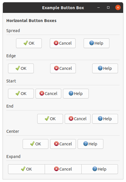
;;;; Example Button Boxes (2021-4-30)

(in-package :gtk-example)

(defun create-bbox (orientation title style)
  (let ((box (make-instance 'gtk-box
                            :orientation :vertical))
        (bbox (make-instance 'gtk-button-box
                             :orientation orientation
                             :border-width 6
                             :layout-style style
                             :spacing 6)))
    (gtk-container-add bbox
                       (make-instance 'gtk-button
                                      :label "OK"
                                      :always-show-image t
                                      :image
                                      (make-instance 'gtk-image
                                                     :icon-name "gtk-ok")))
    (gtk-container-add bbox
                       (make-instance 'gtk-button
                                      :label "Cancel"
                                      :always-show-image t
                                      :image
                                      (make-instance 'gtk-image
                                                     :icon-name "gtk-cancel")))
    (gtk-container-add bbox
                       (make-instance 'gtk-button
                                      :label "Help"
                                      :always-show-image t
                                      :image
                                      (make-instance 'gtk-image
                                                     :icon-name "gtk-help")))

    (gtk-box-pack-start box (make-instance 'gtk-label
                                           :xalign 0.0
                                           :label title)
                            :expand nil)
    (gtk-box-pack-start box (make-instance 'gtk-separator
                                           :margin-top 6
                                           :margin-bottom 6
                                           :orientation :horizontal)
                            :expand nil)
    (gtk-box-pack-start box bbox)
    box))

(defun example-button-box ()
  (within-main-loop
    (let ((window (make-instance 'gtk-window
                                 :type :toplevel
                                 :title "Example Button Box"
                                 :default-width 420
                                 :border-width 12))
          (vbox (make-instance 'gtk-box
                               :orientation :vertical
                               :homogeneous nil
                               :spacing 12)))
      (g-signal-connect window "destroy"
                        (lambda (widget)
                          (declare (ignore widget))
                          (leave-gtk-main)))
      (gtk-box-pack-start vbox
                          (make-instance 'gtk-label
                                         :margin-top 6
                                         :margin-bottom 6
                                         :xalign 0
                                         :use-markup t
                                         :label
                                         "<b>Horizontal Button Boxes</b>")
                          :expand nil)
      (gtk-box-pack-start vbox
                          (create-bbox :horizontal "Spread" :spread))
      (gtk-box-pack-start vbox
                          (create-bbox :horizontal "Edge" :edge))
      (gtk-box-pack-start vbox
                          (create-bbox :horizontal "Start" :start))
      (gtk-box-pack-start vbox
                          (create-bbox :horizontal "End" :end))
      (gtk-box-pack-start vbox
                          (create-bbox :horizontal "Center" :center))
      (gtk-box-pack-start vbox
                          (create-bbox :horizontal "Expand" :expand))
      (gtk-container-add window vbox)
      (gtk-widget-show-all window))))
7.2. Paned Window Widgets
The
gtk-paned widget has two panes, arranged either horizontally or vertically. The division between the
two panes is adjustable by the user by dragging a handle.
A paned window can be created with the function
gtk-paned-new, which takes as an argument a value of
the
gtk-orientation enumeration. With the value :horizontal a horizontal paned window is
created, and with the value :vertical a vertical paned window.
Child widgets are added to the panes of the widget with the functions
gtk-paned-pack1 and
gtk-paned-pack2 or the functions
gtk-paned-add1 and
gtk-paned-add2. The division between the two
children is set by default from the size requests of the children, but it can be adjusted by the user.
A paned widget draws a separator between the two child widgets and a small handle that the user can drag
to adjust the division. It does not draw any relief around the children or around the separator. The
space in which the separator is called the gutter. Often, it is useful to put each child inside a
gtk-frame widget with the shadow type set to :in so that the gutter appears as a ridge. No
separator is drawn if one of the children is missing.
Each child has two options that can be set, resize and shrink. If
resize is true, then when the paned window is resized, that child will
expand or shrink along with the paned widget. If shrink is true, then
that child can be made smaller than its requisition by the user. Setting shrink to
false allows the application to set a minimum size. If resize is
false for both children, then this is treated as if resize is
true for both children.
The application can set the position of the slider as if it were set by the user, by calling the function
gtk-paned-position.
Figure 7.2, “Paned Window Widgets” shows a simple example. The corresponding code is shown in example Example 7.2, “Paned Window Widgets”.
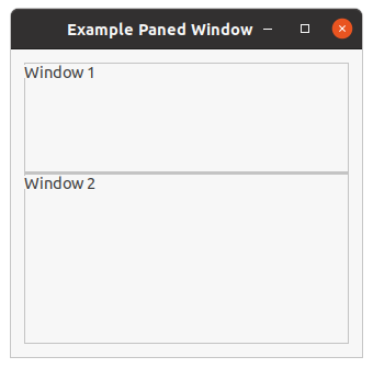
;;;; Paned Window Widgets (2021-5-28)

(in-package :gtk-example)

(defun example-paned-window ()
  (within-main-loop
    (let ((window (make-instance 'gtk-window
                                 :type :toplevel
                                 :title "Example Paned Window"
                                 :default-width 320
                                 :default-height 280
                                 :border-width 12))
          (paned (make-instance 'gtk-paned
                                :position 100
                                :orientation :vertical))
          (frame1 (make-instance 'gtk-frame
                                 :label "Window 1"
                                 :label-yalign 0.0))
          (frame2 (make-instance 'gtk-frame
                                 :label "Window 2"
                                 :label-yalign 0.0)))
      (g-signal-connect window "destroy"
                        (lambda (widget)
                          (declare (ignore widget))
                          (leave-gtk-main)))
      (gtk-container-add window paned)
      (gtk-paned-add1 paned frame1)
      (gtk-paned-add2 paned frame2)
      (gtk-widget-show-all window))))
7.3. Layout Widget
The
gtk-layout widget is similar to the
gtk-fixed widget except that it implements an infinite
scrolling area. A layout widget is created using the function
gtk-layout-new which accepts the
optional arguments hadjustment and vadjustment to specify adjustment objects
that the layout widget will use for its scrolling.
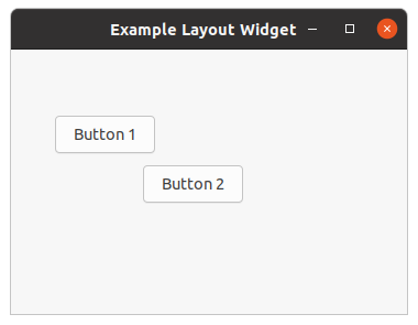
Widgets can be added and moved in the layout widget using the functions
gtk-layout-put and
gtk-layout-move. The size of the layout widget can be set using the function
gtk-layout-size.
The
gtk-layout class implements the
gtk-scrollable interface. Therefore, for manipulating the
horizontal and vertical adjustment objects the functions
gtk-scrollable-hadjustment
and
gtk-scrollable-vadjustment are available.
;;;; Example Layout widget (2021-4-26)

(in-package :gtk-example)

(defun example-layout ()
  (within-main-loop
    (let ((window (make-instance 'gtk-window
                                 :type :toplevel
                                 :title "Example Layout Widget"
                                 :width-request 360
                                 :height-request 240))
          (layout (make-instance 'gtk-layout)))
      (g-signal-connect window "destroy"
                        (lambda (widget)
                          (declare (ignore widget))
                          (leave-gtk-main)))

      (gtk-layout-put layout
                      (make-instance 'gtk-button
                                     :label "Button 1")
                      40 60)
      (gtk-layout-put layout
                      (make-instance 'gtk-button
                                     :label "Button 2")
                      120 105)
      ;; Pack and show the widgets
      (gtk-container-add window layout)
      (gtk-widget-show-all window))))
7.4. Notebook Widget
The
gtk-notebook widget is a
gtk-container widget whose children are pages that can be switched
between using tab labels along one edge. You are able to specify the location of the tabs, although they
appear along the top by default. You can also hide the tabs altogether. Figure 7.4, “Notebook”
shows a
gtk-notebook widget with three tabs that was created with the code in
Example 7.4, “Notebook”.
There are many configuration options for the
gtk-notebook widget. Among other things, you can choose on
which edge the tabs appear, see the function
gtk-notebook-tab-pos, whether, if there are too many tabs
to fit the notebook should be made bigger or scrolling arrows added, see the function
gtk-notebook-scrollable, and whether there will be a popup menu allowing the users to switch pages, see
the functions
gtk-notebook-popup-enable,
gtk-notebook-popup-disable.
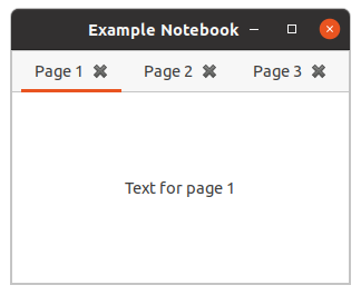
When creating a notebook container, you must specify a tab label widget and a child widget for each tab. Tabs can be added to the front or back, inserted, reordered, and removed.
After you create a
gtk-notebook widget, it is not very useful until you add tabs to it. To add a tab to
the end or beginning of the list of tabs, you can use the functions
gtk-notebook-append-page or
gtk-notebook-prepend-page, respectively. Each of these functions accepts a
gtk-notebook child widget,
and a widget to display in the tab.
The tab label does not have to be a
gtk-label widget. For example, you could use a
gtk-box widget
that contains a label and a close button. This allows you to embed other useful widgets such as buttons
and images into the tab label.
Each notebook page can only display one child widget. However, each of the children can be another
container, so each page can display many widgets. In fact, it is possible to use the
gtk-notebook
widget as the child widget of another notebook tab.
If you want to insert a tab in a specific location, you can use the function
gtk-notebook-insert-page.
This function will allow you to specify the integer location of the tab. The index of all tabs located
after the inserted tab will increase by one.
All three of the functions used to add tabs to a
gtk-notebook widget will return the integer location
of the tab you added or -1 if the action has failed.
Notebook Properties
Tab position can be set in the function
gtk-notebook-tab-pos by using the
gtk-position-type
enumeration. These include :top, :bottom, :left, and
:right.
Notebooks are useful if you want to give the user multiple options, but you want to show them in multiple
stages. If you place a few in each tab and hide the tabs with the function
gtk-notebook-show-tabs, you
can progress the user back and forth through the options. An example of this concept would be many of the
wizards you see throughout your operating system, similar to the functionality provided by the
gtk-assistant widget.
At some point, the notebook will run out of room to store tabs in the allocated space. In order to remedy
this problem, you can set notebook tabs as scrollable with the function
gtk-notebook-scrollable. This
property will force tabs to be hidden from the user. Arrows will be provided so that the user will be able
to scroll through the list of tabs. This is necessary because tabs are only shown in one row or column.
If you resize the window so that all of the tabs cannot be shown, the tabs will be made scrollable. Scrolling will also occur if you make the font size large enough that the tabs cannot all be drawn. You should always set this property to True if there is any chance that the tabs will take up more than the allotted space.
Notebook Tab Operations
GTK provides multiple functions that allow you to interact with tabs that already exist. Before learning about these methods, it is useful to know that most of these will cause the "change-current-page" signal to be emitted. This signal is emitted when the current tab that is in focus is changed.
If you can add tabs, there has to be a method to remove tabs as well. By using the function
gtk-notebook-remove-page, you can remove a tab based on its index reference.
You can manually reorder the tabs by calling the function
gtk-notebook-reorder-child. You must specify
the child widget of the page you want to move and the location to where it should be moved. If you specify
a number that is greater than the number of tabs or a negative number, the tab will be moved to the end of
the list.
There are three methods provided for changing the current page. If you know the specific index of the
page you want to view, you can use the function
gtk-notebook-current-page to move to that page. At
times, you may also want switch to the next or previous tab, which can be done with the functions
gtk-notebook-next-page or
gtk-notebook-prev-page. If a call to either of these functions would cause
the current tab to drop below zero or go above the current number of tabs, nothing will occur; the call
will be ignored.
When deciding what page to move to, it is often useful to know the current page and the total number of
tabs. These values can be obtained with the function
gtk-notebook-n-pages respectively.
;;;; Example Notebook (2021-6-4)

(in-package :gtk-example)

(defun example-notebook ()
  (within-main-loop
    (let ((window (make-instance 'gtk-window
                                 :title "Example Notebook"
                                 :type :toplevel
                                 :default-width 300
                                 :default-height 210))
          (notebook (make-instance 'gtk-notebook
                                   :enable-popup t)))
      (g-signal-connect window "destroy"
                        (lambda (widget)
                          (declare (ignore widget))
                          (leave-gtk-main)))
      (dotimes (i 3)
        (let ((page (make-instance 'gtk-label
                                   :label
                                   (format nil
                                           "Text for page ~a" (1+ i))))
              (tab-label (make-instance 'gtk-label
                                        :label (format nil "Page ~a" (1+ i))))
              (tab-button (make-instance 'gtk-button
                                         :image
                                         (make-instance 'gtk-image
                                                        :icon-name
                                                        "gtk-close"
                                                        :icon-size 1)
                                         :relief :none)))
          (g-signal-connect tab-button "clicked"
             (let ((page page))
               (lambda (button)
                 (declare (ignore button))
                 (format t "Removing page ~a~%" page)
                 (gtk-notebook-remove-page notebook page))))
          (let ((tab-hbox (make-instance 'gtk-box
                                         :orientation :horizontal)))
            (gtk-box-pack-start tab-hbox tab-label)
            (gtk-box-pack-start tab-hbox tab-button)
            (gtk-widget-show-all tab-hbox)
            (gtk-notebook-add-page notebook page tab-hbox))))
      (gtk-container-add window notebook)
      (gtk-widget-show-all window))))
7.5. Frame Widget
Frames can be used to enclose one or a group of widgets with a box which can optionally be labeled. The position of the label and the style of the box can be altered to suit.
A frame can be created with (make-instance 'gtk-frame) or the function
gtk-frame-new. The
label is by default placed in the upper left hand corner of the frame. A value of NIL for the
label argument will result in
no label being displayed. The text of the label can be changed using the function
gtk-frame-label.
The position of the label can be changed using the function
gtk-frame-label-align which has the
arguments xalign and yalign which take values between 0.0 and 1.0.
xalign indicates the position of the label along the top horizontal of the frame.
yalign indicates the vertival position of the label. With a value of 0.5 of
yalign the label is positioned in the middle of the line of the frame. The default value of
xalign is 0.0 which places the label at the left hand end of the frame.
The function
gtk-frame-shadow-type alters the style of the box that is used to outline the frame. The
second argument is a keyword of the
gtk-shadow-type enumeration.
Figure 7.5, “Frame Widget” illustrates the use of the frame widget. The code of this example is shown in Example 7.5, “Frame Widget”.
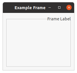
;;;; Example Simple Frame (2021-5-28)

(in-package :gtk-example)

(defun example-frame ()
  (within-main-loop
    (let ((window (make-instance 'gtk-window
                                 :type :toplevel
                                 :title "Example Frame"
                                 :default-width 250
                                 :default-height 200
                                 :border-width 12))
          (frame (make-instance 'gtk-frame
                                :label "Frame Label"
                                :label-xalign 1.0
                                :label-yalign 0.5
                                :shadow-type :etched-in)))
      (g-signal-connect window "destroy"
                        (lambda (widget)
                          (declare (ignore widget))
                          (leave-gtk-main)))
      (gtk-container-add window frame)
      (gtk-widget-show-all window))))
7.6. Aspect Frame Widget
The
gtk-aspect-frame aspect frame widget is like a frame container, except that it also enforces the
aspect ratio (that is, the ratio of the width to the height) of the child widget to have a certain value,
adding extra space if necessary. This is useful, for instance, if you want to preview a larger image. The
size of the preview should vary when the user resizes the window, but the aspect ratio needs to always
match the original image.
To create a new aspect frame use (make-instance 'gtk-aspect-frame) or the function
gtk-aspect-frame-new. The arguments xalign and yalign specify alignment as
with alignment containers. If the obey-child property is true, the
aspect ratio of a child widget will match the aspect ratio of the ideal size it requests. Otherwise, it
is given by ratio.
The options of an existing aspect frame can be changed with the function
gtk-aspect-frame-set.
As an example, the following program uses an aspect frame widget to present a drawing area whose aspect ratio will always be 2:1, no matter how the user resizes the toplevel window.
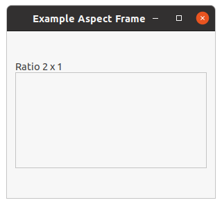
;;;; Example Aspect Frame (2021-5-28)

(in-package :gtk-example)

(defun example-aspect-frame ()
  (within-main-loop
    (let ((window (make-instance 'gtk-window
                                 :type :toplevel
                                 :title "Example Aspect Frame"
                                 :default-width 300
                                 :default-height 240
                                 :border-width 12))
          (frame (make-instance 'gtk-aspect-frame
                                :label "Ratio 2 x 1"
                                :label-yalign 1.0
                                :xalign 0.5
                                :yalign 0.5
                                :ratio 2
                                :obey-child nil))
          (area (make-instance 'gtk-drawing-area
                               :width-request 200
                               :hight-request 200)))
      (g-signal-connect window "destroy"
                        (lambda (widget)
                          (declare (ignore widget))
                          (leave-gtk-main)))
      (gtk-container-add window frame)
      (gtk-container-add frame area)
      (gtk-widget-show-all window))))
7.7. Fixed Container
The
gtk-fixed widget is a container widget which allows to place child widgets at a fixed position
within the container, relative to the upper left hand corner. The position of the child widgets can be
changed dynamically. Only a few functions are associated with the fixed container like the functions
gtk-fixed-new,
gtk-fixed-put, and
gtk-fixed-move.
The function
gtk-fixed-new creates a new
gtk-fixed container. The function
gtk-fixed-put places a
widget in the container fixed at the position specified by the arguments x and
y. The function
gtk-fixed-move allows the specified widget to be moved to a new position.
For most applications, you should not use this container. It keeps you from having to learn about the other GTK containers, but it results in broken applications. With the fixed container, the following things will result in truncated text, overlapping widgets, and other display bugs:
- Themes, which may change widget sizes.
- Fonts other than the one you used to write the application will of course change the size of widgets containing text. Keep in mind that users may use a larger font because of difficulty reading the default, or they may be using Windows or the framebuffer port of GTK, where different fonts are available.
- Translation of text into other languages changes its size. Also, display of non-English text will use a different font in many cases.
In addition, the fixed container can not properly be mirrored in right-to-left languages such as Hebrew and Arabic. I.e. normally GTK will flip the interface to put labels to the right of the thing they label, but it cannot do that with the fixed container. So your application will not be usable in right-to-left languages.
Finally, fixed positioning makes it kind of annoying to add/remove GUI elements, since you have to reposition all the other elements. This is a long-term maintenance problem for your application.
If you know none of these things are an issue for your application, and prefer the simplicity of the
gtk-fixed container, by all means use the widget. But you should be aware of the tradeoffs.
The following example illustrates how to use a fixed container. In this example three buttons are put
into the fixed container at random positions. A click on a button moves the button to a new random
position. To retrieve the size of the fixed container and the buttons the functions
gtk-widget-allocated-width and
gtk-widget-allocated-height are used.
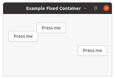
;;;; Example Fixed Container (2021-5-28)
;;;;
;;;; In this example, three buttons are placed in the fixed container with the
;;;; function gtk-fixed-put. When pressed, the buttons are moved randomly with
;;;; the function gtk-fixed-move.
;;;;
;;;; To get the width and height of the fixed container and the buttons the
;;;; functions gtk-widget-allocated-width and gtk-widget-allocated-height are
;;;; used.

(in-package :gtk-example)

(defun move-button (fixed button)
  (let ((width (- (gtk-widget-allocated-width fixed)
                  (gtk-widget-allocated-width button)))
        (height (- (gtk-widget-allocated-height fixed)
                   (gtk-widget-allocated-height button))))
    (gtk-fixed-move fixed button (random width) (random height))))

(defun example-fixed ()
  (within-main-loop
    (let ((window (make-instance 'gtk-window
                                 :type :toplevel
                                 :title "Example Fixed Container"
                                 :default-width 350
                                 :default-height 200
                                 :border-width 12))
          (fixed (make-instance 'gtk-fixed)))
      (g-signal-connect window "destroy"
                        (lambda (window)
                          (declare (ignore window))
                          (leave-gtk-main)))
      (dotimes (i 3)
        (let ((button (gtk-button-new-with-label "Press me")))
          (g-signal-connect button "clicked"
                            (lambda (widget)
                              (move-button fixed widget)))
          (gtk-fixed-put fixed button (random 250) (random 180))))
      (gtk-container-add window fixed)
      (gtk-widget-show-all window))))
7.8. Scrolled Windows
GtkScrollable
The
gtk-scrollable interface is an interface that is implemented by widgets with native scrolling
ability.This interface provides functions to access the
gtk-adjustment objects for horizontal and
vertical srolling and the
gtk-scrollable-policy settings of the scrollable widget.
GtkScrollbar
The
gtk-scrollbar widget is a horizontal or vertical scrollbar, depending on the value of the
orientation property.
The position of the thumb in a scrollbar is controlled by the scroll adjustments. See the
gtk-adjustment
object for the properties in an adjustment - for the
gtk-scrollbar widget, the
value
property represents the position of the scrollbar, which must be between the
lower
value and the difference
upper -
page-size. The
page-size property represents the size of the visible scrollable area. The
step-increment and
page-increment properties are used when the user
asks to step down, using the small stepper arrows, or page down, using for example the PageDown key.
GtkViewport
The
gtk-viewport widget acts as an adaptor class, implementing scrollability for child widgets that
lack their own scrolling capabilities. Use the
gtk-viewport widget to scroll child widgets such as
gtk-grid,
gtk-box, and so on.
If a widget has native scrolling abilities, such as the widgets
gtk-text-view,
gtk-tree-view or
gtk-icon-view, it can be added to a
gtk-scrolled-window widget with the function
gtk-container-add.
If a widget does not, you must first add the widget to a
gtk-viewport widget, then add the viewport to
the scrolled window. The function
gtk-container-add does this automatically if a child that does not
implement the
gtk-scrollable interface is added to a
gtk-scrolled-window widget, so you can ignore
the presence of the viewport.
The
gtk-viewport widget will start scrolling content only if allocated less than the child widget's
minimum size in a given orientation.
A viewport is created with the function
gtk-viewport-new. The function takes two optional arguments to
specify the horizontal and vertical adjustments that the widget is to use when you create the widget. It
will create its own if you use the optional values for the arguments.
The
gtk-viewport widget implement the
gtk-scrollable interface. Therefore, you can get and set the
adjustments after the widget has been created using the access functions
gtk-scrollable-hadjustment and
gtk-scrollable-vadjustment.
The viewport function
gtk-viewport-shadow-type is used to alter the shadow type of the viewport which
is a value of the
gtk-shadow-type enumeration.
GtkScrolledWindow
The
gtk-scrolled-window widget is a container that accepts a single child widget, makes that child
scrollable using either internally added scrollbars or externally associated adjustments, and optionally
draws a frame around the child.
Widgets with native scrolling support, i.e. those whose classes implement the
gtk-scrollable interface,
are added directly. For other types of widgets, the
gtk-viewport class acts as an adaptor, giving
scrollability to other widgets. The
gtk-scrolled-window widgets implementation of the function
gtk-container-add intelligently accounts for whether or not the added child is a
gtk-scrollable
widget. If it is not, the
gtk-scrolled-window widget wraps the child in a
gtk-viewport widget and
adds that for you. Therefore, you can just add any child widget and not worry about the details.
Unless the
hscrollbar-policy and
vscrollbar-policy properties
are :never or :external, the
gtk-scrolled-window widget adds internal
gtk-scrollbar widgets around its child. The scroll position of the child, and if applicable the
scrollbars, is controlled by the
hadjustment and
vadjustment
properties that are associated with the
gtk-scrolled-window widget. See the docs on the
gtk-scrollbar
widget for the details, but note that the
step-increment and
page-increment properties are only effective if the policy causes scrollbars to be
present.
If a
gtk-scrolled-window widget does not behave quite as you would like, or does not have exactly the
right layout, it is very possible to set up your own scrolling with the
gtk-scrollbar widget and for
example a
gtk-grid widget.
The function
gtk-scrolled-window-new is used to create a new scrolled window, where the first
optional argument is the adjustment for the horizontal direction, and the second optional argument,
the adjustment for the vertical direction.
The functions
gtk-scrolled-window-hscrollbar-policy and
gtk-scrolled-window-vscrollbar-policy set
the policy to be used with respect to the scrollbars. The scrollbar policy is a value of the
gtk-policy-type enumeration and may be one of :automatic or :always.
:automatic will automatically decide whether you need scrollbars, whereas
:always will always leave the scrollbars there. All possible values of the
gtk-policy-type enumeration are listed in Table 7.1, “Values of the GtkPolicyType enumeration”.
| Value | Description |
|---|---|
:always |
The scrollbar is always visible. The view size is independent of the content. |
:automatic |
The scrollbar will appear and disappear as necessary. For example, when all of a
gtk-tree-view
widget cannot be seen.
|
:never |
The scrollbar should never appear. In this mode the content determines the size. |
:external |
Do not show a scrollbar, but do not force the size to follow the content. This can be used e.g. to make multiple scrolled windows share a scrollbar. |
Example GtkScrolledWindow
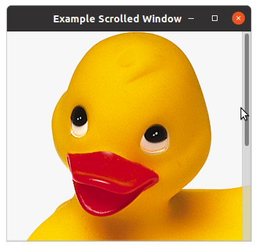
Example 7.8, “Scrolled Window” is a simple example that packs an image into a scrolled window. Try playing with resizing the window. You will notice how the scrollbars react.
;;;; Scrolled Window (2021-3-19)

(in-package #:gtk-example)

(defun example-scrolled-window ()
  (within-main-loop
    (let ((window (make-instance 'gtk-window
                                 :type :toplevel
                                 :title "Example Scrolled Window"
                                 :width-request 350
                                 :height-request 300))
          (scrolled (make-instance 'gtk-scrolled-window
                                   :hscrollbar-policy :automatic
                                   :vscrollbar-policy :always))
          (image (gtk-image-new-from-file (sys-path "ducky.png"))))
      (g-signal-connect window "destroy"
                        (lambda (widget)
                          (declare (ignore widget))
                          (leave-gtk-main)))
      ;; Pack and show the widgets
      (gtk-container-add scrolled image)
      (gtk-container-add window scrolled)
      (gtk-widget-show-all window))))
Chapter 8. Dialogs
8.1. General Dialog
The
gtk-dialog widget is just a window with a few things pre-packed into it. A dialog widget can be
created with the function
gtk-dialog-new or the call (make-instance 'gtk-dialog). The
function
gtk-dialog-new does not take an argument. In addition the function
gtk-dialog-new-with-buttons is available. It allows you to set the dialog title, some convenient flags,
and add simple buttons.
The dialog widget consists of an content area which is a vertical
gtk-box widget. The content area can
be filled with the content of a dialog. At the button of the window the dialog widget has an action area
which takes the desired buttons of the dialog.
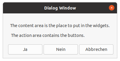
The function
gtk-dialog-content-area gets the content area of a dialog. Because the content area is a
vertical
gtk-box widget, any desired widgets can be added to the content area with the functions
gtk-box-pack-start or
gtk-box-pack-end. To display the content area it is necessary to call the
function
gtk-widget-show explicitly. The function create-dialog in
Example 8.1, “Dialog Windows” shows how to fill widgets into a dialog widget.
The action area can be filled with the desired buttons for the dialog window. Standard buttons can be
added with the function
gtk-dialog-add-button. The function takes three arguments. The first argument is
the dialog window the button is added to. The second argument is a string which is the text of the button
or a stock ID. The last argument is a value of the
gtk-response-type enumeration and defines the
response type of the button. Possible values of the
gtk-response-type enumeration are shown in
Table 8.1, “Values of the GtkResponseType enumeration”.
Alternatively to the function
gtk-dialog-add-button buttons can be added with the functions
gtk-box-pack-start or
gtk-box-pack-end to the action area. The action area is a horizontal
gtk-button-box widget and can be get with the function
gtk-dialog-action-area.
| Value | Description |
|---|---|
:none |
Returned if an action widget has no response ID, or if the dialog gets programmatically hidden or destroyed. |
:reject |
Generic response ID, not used by GTK dialogs. |
:accept |
Generic response ID, not used by GTK dialogs. |
:event |
Returned if the dialog is deleted. |
:ok |
Returned by OK buttons in GTK dialogs. |
:cancel |
Returned by Cancel buttons in GTK dialogs. |
:close |
Returned by Close buttons in GTK dialogs. |
:yes |
Returned by Yes buttons in GTK dialogs. |
:no |
Returned by No buttons in GTK dialogs. |
:apply |
Returned by Apply buttons in GTK dialogs. |
:help |
Returned by Help buttons in GTK dialogs. |
After creation and configuration of the dialog window the dialog is executed with the function
gtk-dialog-run. The function takes the dialog window
of type
gtk-dialog as the only argument. After closing the dialog window with one of the buttons the
response is returned as an integer value of the
gtk-response-type enumeration.
8.2. Message Dialog
The
gtk-message-dialog class is a subclass of the more general
gtk-dialog class and gives an easy way
to display messages to the user. Figure 8.2, “Message Dialog” shows an example for an
informational message.
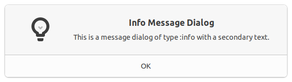
A message dialog is created with the call (make-instance 'gtk-message-dialog) or the
functions
gtk-message-dialog-new and
gtk-message-dialog-new-with-markup. Various properties control
the appearance of a message dialog. The function create-message-dialog in
Example 8.1, “Dialog Windows” shows the settings of the properties message-type,
buttons, text, and secondary-text. The type of a message dialog is
one of the values of the
gtk-message-type enumeration. The possible values are listed in
Table 8.2, “Values of the GtkMessageType enumeration”. Predefined buttons of the
gtk-buttons-type enumeration for a
message dialog are listed in Table 8.3, “Values of the GtkButtonsType enumeration”.
| Value | Description |
|---|---|
:info |
Informational message. |
:warning |
Nonfatal warning message. |
:question |
Question requiring a choice. |
:error |
Fatal error message. |
:other |
None of the above, does not get an icon. |
| Value | Description |
|---|---|
:none |
No buttons at all. |
:ok |
An OK button. |
:close |
A Close button. |
:cancel |
A Cancel button. |
:yes-no |
Yes and No buttons. |
:ok-cancel |
Ok and Cancel buttons. |
8.3. About Dialog
The
gtk-about-dialog offers a simple way to display information about a program like its logo, name,
copyright, website and license. It is also possible to give credits to the authors, documenters,
translators and artists who have worked on the program. An about dialog is typically opened when the user
selects the About option from the Help menu. All parts of the dialog are optional.
About dialogs often contain links and email addresses. The
gtk-about-dialog widget displays these as
clickable links. By default, it calls the function
gtk-show-uri when a user clicks one. The behavior
can be overridden with the "activate-link" signal.
To make constructing a
gtk-about-dialog widget as convenient as possible, the function
gtk-show-about-dialog is available which constructs and shows a dialog and keeps it around so that it
can be shown again.
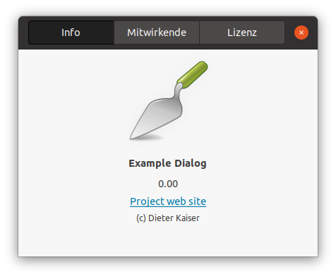
Note that GTK sets a default title of _("About %s") on the dialog window, where
%s is replaced by the name of the application, but in order to ensure proper translation of
the title, applications should set the title property explicitly when constructing a
gtk-about-dialog
widget.
It is possible to show a
gtk-about-dialog widget like any other
gtk-dialog widget, e.g. using the
function
gtk-dialog-run. In this case, you might need to know that the 'Close' button returns the
:cancel response ID.
;;;; Example Dialog Windows (2021-6-1)

(in-package :gtk-example)

(defun license-text ()
  (format nil
          "This program is free software: you can redistribute it and/or ~
          modify it under the terms of the GNU Lesser General Public ~
          License for Lisp as published by the Free Software Foundation, ~
          either version 3 of the License, or (at your option) any later ~
          version and with a preamble to the GNU Lesser General Public ~
          License that clarifies the terms for use with Lisp programs and ~
          is referred as the LLGPL.~%~% ~
          This program is distributed in the hope that it will be useful, ~
          but WITHOUT ANY WARRANTY; without even the implied warranty of ~
          MERCHANTABILITY or FITNESS FOR A PARTICULAR PURPOSE.  See the ~
          GNU Lesser General Public License for more details. ~%~% ~
          You should have received a copy of the GNU Lesser General Public ~
          License along with this program and the preamble to the Gnu ~
          Lesser General Public License.  If not, see ~
          <http://www.gnu.org/licenses/> and ~
          <http://opensource.franz.com/preamble.html>."))

(defun create-dialog ()
  (let ((dialog (make-instance 'gtk-dialog
                               :title "Dialog Window"
                               :has-separator t)))
    ;; Add a border width to the vbox of the content area
    (setf (gtk-container-border-width (gtk-dialog-content-area dialog)) 12)
    ;; Add a label widget with text to the content area
    (let ((vbox (make-instance 'gtk-box
                               :orientation :vertical
                               :border-width 12))
          (label (make-instance 'gtk-label
                                :wrap t
                                :label
                                (format nil
                                        "The content area is the place to ~
                                         put in the widgets.~%~% ~
                                         The action area contains ~
                                         the buttons."))))
      (gtk-box-pack-start vbox label)
      (gtk-box-pack-start (gtk-dialog-content-area dialog) vbox)
      ;; Show the content area of the dialog
      (gtk-widget-show-all (gtk-dialog-content-area dialog)))
    ;; Add buttons with a stock id to the action area
    (gtk-dialog-add-button dialog "gtk-yes" :yes)
    (gtk-dialog-add-button dialog "gtk-no" :no)
    (gtk-dialog-add-button dialog "gtk-cancel" :cancel)
    (gtk-dialog-set-default-response dialog :cancel)
    ;; Change the order of the buttons
    (gtk-dialog-set-alternative-button-order dialog
                                             (list :yes :cancel :no))
    ;; Run the dialog and print the message on the console
    (format t "Response was: ~S~%" (gtk-dialog-run dialog))
    ;; Destroy the dialog
    (gtk-widget-destroy dialog)))

(defun create-message-dialog ()
  (let ((dialog (make-instance 'gtk-message-dialog
                               :message-type :info
                               :buttons :ok
                               :text "Info Message Dialog"
                               :secondary-text
                               (format nil
                                       "This is a message dialog of type ~
                                        :info with a secondary text."))))
    ;; Run the message dialog
    (gtk-dialog-run dialog)
    ;; Destroy the message dialog
    (gtk-widget-destroy dialog)))

(defun create-about-dialog ()
  (let ((dialog (make-instance 'gtk-about-dialog
                               :program-name "Example Dialog"
                               :version "0.00"
                               :copyright "(c) Dieter Kaiser"
                               :website
                               "github.com/crategus/cl-cffi-gtk"
                               :website-label "Project web site"
                               :license (license-text)
                               :authors '("Kalyanov Dmitry"
                                          "Dieter Kaiser")
                               :documenters '("Dieter Kaiser")
                               :artists '("None")
                               :logo-icon-name
                               "applications-development"
                               :wrap-license t)))
    ;; Run the about dialog
    (gtk-dialog-run dialog)
    ;; Destroy the about dialog
    (gtk-widget-destroy dialog)))

(defun example-dialog ()
  (within-main-loop
    (let ((window (make-instance 'gtk-window
                                 :type :toplevel
                                 :title "Example Dialog"
                                 :default-width 250
                                 :border-width 12))
          (vbox (make-instance 'gtk-box
                               :orientation :vertical
                               :spacing 6)))
      (g-signal-connect window "destroy"
                        (lambda (widget)
                          (declare (ignore widget))
                          (leave-gtk-main)))
      (gtk-container-add window vbox)
      (let ((button (make-instance 'gtk-button
                                   :label "Open a Dialog Window")))
        (gtk-box-pack-start vbox button)
        (g-signal-connect button "clicked"
           (lambda (widget)
             (declare (ignore widget))
             ;; Create and show the dialog
             (create-dialog))))
      (let ((button (make-instance 'gtk-button
                                   :label "Open a Message Dialog")))
        (gtk-box-pack-start vbox button)
        (g-signal-connect button "clicked"
           (lambda (widget)
             (declare (ignore widget))
             ;; Create and show the message dialog
             (create-message-dialog))))
      (let ((button (make-instance 'gtk-button
                                   :label "Open an About Dialog")))
        (gtk-box-pack-start vbox button)
        (g-signal-connect button "clicked"
           (lambda (widget)
             (declare (ignore widget))
             ;; Create and show the about dialog
             (create-about-dialog))))
      (gtk-box-pack-start vbox
                          (make-instance 'gtk-separator
                                         :orientation :horizontal))
      ;; Create a quit button
      (let ((button (make-instance 'gtk-button
                                   :label "Quit")))
        (g-signal-connect button "clicked"
                          (lambda (widget)
                            (declare (ignore widget))
                            (gtk-widget-destroy window)))
        (gtk-box-pack-start vbox button))
      (gtk-widget-show-all window))))
Chapter 9. Multiline Text Widget
9.1. Text Widget Overview
GTK has a powerful framework for multiline text editing. The primary objects involved in the process
are the
gtk-text-buffer object, which represents the text being edited, and the
gtk-text-view widget,
a widget which can display a
gtk-text-buffer object. Each text buffer can be displayed by any number of
text views.
One of the important things to remember about text in GTK is that it is in the UTF-8 encoding. This means that one character can be encoded as multiple bytes. Character counts are usually referred to as offsets, while byte counts are called indexes. If you confuse these two, things will work fine with ASCII, but as soon as your text buffer contains multibyte characters, bad things will happen.
Text in a text buffer can be marked with tags. A tag is an attribute that can be applied to some range of
text. For example, a tag might be called "bold" and make the text inside the tag bold. However, the tag
concept is more general than that. Tags do not have to affect appearance. They can instead affect the
behavior of mouse and key presses, "lock" a range of text so the user cannot edit it, or countless other
things. A tag is represented by a
gtk-text-tag object. One
gtk-text-tag object can be applied to any
number of text ranges in any number of text buffers.
Each tag is stored in a
gtk-text-tag-table object. A tag table defines a set of tags that can be used
together. Each text buffer has one tag table associated with it. Only tags from that tag table can be
used with the text buffer. A single tag table can be shared between multiple text buffers, however.
Tags can have names, which is convenient sometimes. For example, you can name your tag that makes things bold "bold", but they can also be anonymous, which is convenient if you are creating tags on-the-fly.
Most text manipulation is accomplished with iterators, represented by a
gtk-text-iter instance. An
iterator represents a position between two characters in the text buffer. The
gtk-text-iter structure
is a structure designed to be allocated on the stack. It is guaranteed to be copiable by value and never
contain any heap allocated data. Iterators are not valid indefinitely. Whenever the text buffer is
modified in a way that affects the number of characters in the text buffer, all outstanding iterators
become invalid. Note that deleting 5 characters and then reinserting 5 still invalidates iterators,
though you end up with the same number of characters you pass through a state with a different number.
Because of this, iterators cannot be used to preserve positions across text buffer modifications. To
preserve a position, the
gtk-text-mark object is ideal. You can think of a text mark as an invisible
cursor or insertion point. It floats in the text buffer, saving a position. If the text surrounding the
text mark is deleted, the text mark remains in the position the text once occupied. If text is inserted
at the text mark, the text mark ends up either to the left or to the right of the new text, depending on
its gravity. The standard text cursor in left-to-right languages is a text mark with right gravity,
because it stays to the right of inserted text.
Like tags, marks can be either named or anonymous. There are two marks built-in to the
gtk-text-buffer
class. These are named "insert" and "selection_bound" and refer to the insertion point and the boundary
of the selection which is not the insertion point, respectively. If no text is selected, these two marks
will be in the same position. You can manipulate what is selected and where the cursor appears by moving
these marks around. If you want to place the cursor in response to a user action, be sure to use the
function
gtk-text-buffer-place-cursor, which moves both marks at once without causing a temporary
selection. Moving one mark then the other temporarily selects the range in between the old and new
positions.
Text buffers always contain at least one line, but may be empty, that is, text buffers can contain zero characters. The last line in the text buffer never ends in a line separator (such as newline). The other lines in the text buffer always end in a line separator. Line separators count as characters when computing character counts and character offsets. Note that some Unicode line separators are represented with multiple bytes in UTF-8, and the two-character sequence "\r\n" is also considered a line separator.
9.2. Simple Text Widget
The
gtk-text-view widget can be created using the function
gtk-text-view-new. This function takes no
arguments. When the text view is created this way, a
gtk-text-buffer object associated with this text
view is also created. The text buffer is responsible for storing the text and associated attributes,
while the text view is responsible for displaying the text, i.e. it provides an I/O interface to buffer.
All text modification operations are related to the
gtk-text-buffer object. The text buffer associated
with a
gtk-text-view widget can be obtained using the function
gtk-text-view-buffer which takes
the
gtk-text-view widget as the argument.
Some common operations performed on a text view widget are, setting the entire text and reading the
entire text from the text buffer. The entire text of the text buffer can be set using the slot access
function
gtk-text-buffer-text.
Getting the entire text of a text buffer, could be a little more complicated than setting the entire text
of the text buffer. You cannot use the slot access function
gtk-text-buffer-text to retrieve the text
from the text buffer, but you must use the function
gtk-text-buffer-get-text, which takes iterators
as arguments to select the desired text. Iterators are
gtk-text-iter objects that represent positions
between two characters in a text buffer. Iterators in a text buffer can be obtained using many different
functions, but for our simple case the functions
gtk-text-buffer-start-iter and
gtk-text-buffer-end-iter can be used to get the iterators at the start and end of the text buffer.
To retrieve the entire contents of the text buffer you can use the function
gtk-text-buffer-get-text
the following way
(let* (;; Get the start and end iterators of the text buffer
       (start (gtk-text-buffer-start-iter buffer))
       (end (gtk-text-buffer-end-iter buffer))
       (include-hidden-chars t)
       ;; Get the entire contents of the text buffer
       (text (gtk-text-buffer-get-text buffer start end include-hidden-chars)))
  ... )
The argument include-hidden-chars is used to specify whether text for which the text
attribute invisible is set should be included or not. Text attributes and how to set them will be
discussed later in this tutorial.
In many cases it is also convenient to first create the text buffer with the function
gtk-text-buffer-new, then create a text view for that text buffer with the function
gtk-text-view-new-with-buffer. Or you can change the text buffer the text view displays after the
text view is created with the slot access function
gtk-text-view-buffer.
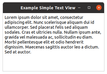
Below is a sample program, that implements a simple text widget. The program assigns a default text to
the text buffer. To wrap the text lines at word boundaries the
wrap-mode property is set
to :word. Other possible values of the
gtk-wrap-mode enumeration are :none,
:char, and :word-char. Furthermore, the text gets a small distance of 6 pixel
to the window using the
top-margin,
left-margin, and
right-margin properties of the
gtk-text-view widget. The text in the text buffer can be
modified by the user and when the window is closed it prints the contents of the text buffer and quits.
The window is shown in figure Simple Text View.
;;;; Simple Text View (2021-6-4)

(in-package :gtk-example)

(defun example-text-view-simple ()
  (within-main-loop
    (let* ((window (make-instance 'gtk-window
                                  :type :toplevel
                                  :title "Example Simple Text View"
                                  :default-width 350
                                  :default-height 200))
           (textview (make-instance 'gtk-text-view
                                    :wrap-mode :word
                                    :top-margin 6
                                    :left-margin 6
                                    :right-margin 6))
           (buffer (gtk-text-view-buffer textview)))
      (g-signal-connect window "destroy"
          (lambda (widget)
            (declare (ignore widget))
            (let ((start (gtk-text-buffer-start-iter buffer))
                  (end (gtk-text-buffer-end-iter buffer))
                  (include-hidden-chars t))
              (print (gtk-text-buffer-get-text buffer
                                               start
                                               end
                                               include-hidden-chars))
              (terpri)
              (leave-gtk-main))))
      (setf (gtk-text-buffer-text buffer) *lorem-ipsum-short*)
      (gtk-container-add window textview)
      (gtk-widget-show-all window))))
Other functions for text buffers
The function
gtk-text-buffer-delete can be used to delete text from a text buffer. It takes the
gtk-text-buffer object and two
gtk-text-iter iterators for the start and the end of the text as
arguments. Since this function modifies the text buffer, all outstanding iterators become invalid after
a call to this function. But, the iterators passed to the function are re-initialized to point to the
location where the text was deleted.
The function
gtk-text-buffer-insert can be used to insert text into a text buffer at a position
specified by an iterator or at the current cursor position. In the Lisp implementation the function
gtk-text-buffer-insert combines the functions
gtk-text-buffer-insert,
gtk-text-buffer-insert-at-cursor,
gtk-text-buffer-insert-interactive, and
gtk-text-buffer-insert-interactive-at-cursor into one function using the keyword arguments
position, interative, and editable. As with the function
gtk-text-buffer-delete, the text buffer is modified and hence all outstanding iterators become invalid,
and the start and end iterators are re-initialized. Hence the same iterator can be used for a series of
consecutive inserts.
The function
gtk-text-buffer-bounds can be used to get iterators at the beginning and end of the text
buffer in one go. The variant
gtk-text-buffer-selection-bounds can be used to obtain iterators at the
beginning and end of the current selection. The functions
gtk-text-buffer-iter-at-offset,
gtk-text-buffer-iter-at-line,
gtk-text-buffer-iter-at-line-offset, and
gtk-text-buffer-iter-at-line-index can be used to obtain an iterator at a specified character offset
into the text buffer, at the start of the given line, at an character offset into a given line, or at
a byte offset into a given line, respectively.
9.3. Formatted Text in the Text Widget
9.3.1. Changing Text Attributes
The way to affect text attributes in the
gtk-text-view widget is to apply tags that change the
attributes for a region of text. For text features that come from the theme — such as font and
foreground color — use CSS to override their default values.
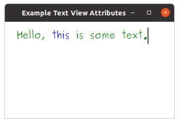
;;;; Text View Attributes (2021-6-4)

(in-package :gtk-example)

(defun example-text-view-attributes ()
  (within-main-loop
    (let* ((window (make-instance 'gtk-window
                                  :type :toplevel
                                  :title "Example Text View Attributes"
                                  :default-width 350
                                  :default-height 200))
           (provider (gtk-css-provider-new))
           (textview (make-instance 'gtk-text-view
                                    ;; Change left margin throughout the widget
                                    :left-margin 24
                                    ;; Change top margin
                                    :top-margin 12))
           (buffer (gtk-text-view-buffer textview)))
      (g-signal-connect window "destroy"
                        (lambda (widget)
                          (declare (ignore widget))
                          (leave-gtk-main)))
      (setf (gtk-text-buffer-text buffer) "Hello, this is some text.")
      ;; Change default font and color throughout the widget
      (gtk-css-provider-load-from-data provider
                                       "textview, text {
                                          color : Green;
                                          font : 20px Purisa; }")
      (gtk-style-context-add-provider (gtk-widget-style-context textview)
                                      provider
                                      +gtk-style-provider-priority-application+)
      ;; Use a tag to change the color for just one part of the widget
      (let ((tag (gtk-text-buffer-create-tag buffer
                                             "blue_foreground"
                                             :foreground "blue"))
            (start (gtk-text-buffer-iter-at-offset buffer 7))
            (end (gtk-text-buffer-iter-at-offset buffer 12)))
        ;; Apply the tag to a region of the text in the buffer
        (gtk-text-buffer-apply-tag buffer tag start end))
      ;; Add the text view to the window and show all
      (gtk-container-add window textview)
      (gtk-widget-show-all window))))
9.3.2. More about Tags
The
gtk-text-view widget can also be used to display formatted text. This usually involves creating
tags which represent a group of attributes and then applying them to a range of text.
Tag objects are associated with a text buffer and are created using the function
gtk-text-buffer-create-tag. This function takes as arguments a
gtk-text-buffer object, a string for
a optional tag name, and keyword/value pairs for the properties of the
gtk-text-tag object. Tags can
be optionally associated with a name. Thus, the tag could be referred using the returned
gtk-text-tag
object or using the tag name. For anonymous tags, nil is passed as an argument. The group
of properties represented by this tag is listed as keyword/value pairs after the tag name argument.
Common property keywords are :style, :weight, :editable,
:justification. The following table lists some properties with their meaning and assignable
values. See the
gtk-text-tag documentation for a complete list of properties and their corresponding
values.
| Property | Description | Values |
|---|---|---|
:style |
Font style as a value of the
pango-style enumeration. |
:normal :oblique :italic |
:weight |
Font weight as an integer. See predefined values in the
pango-weight enumeration. |
:thin, :normal, :bold |
:editable |
Whether the text can be modified by the user. | true false |
:justification |
Justification of the text as an value of the
gtk-justification enumeration. |
:left :right :center :fill |
:foreground |
The foreground color as a string. | e.g. "Red" or "rgb(255,0,0)" |
:background |
The background color as a string. | e.g. "Red" or "rgb(255,0,0)" |
:wrap-mode |
A value of the
gtk-wrap-mode enumeration whether to wrap lines never, at word boundaries, or at
character boundaries.
|
:none :char :word :word-char |
:font |
Font description as a string. | e.g. "Sans Italic 12" |
The created tag can then be applied to a range of text using the functions
gtk-text-buffer-apply-tag
and
gtk-text-buffer-apply-tag-by-name. The first function specifies the tag to be applied by a
gtk-text-tag object and the second function specifies the tag by it's name. The range of text over
with the tag is to applies is specified by start and end iterators. Tags applied to a range of text can
be removed by using the function
gtk-text-buffer-remove-tag. This function also has the
gtk-text-buffer-remove-tag-by-name variant. All tags on a range of text can be removed in one go using
the function
gtk-text-buffer-remove-all-tags.
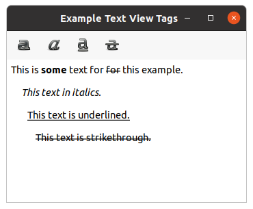
Below is an extension of the previous example, that has a toolbar to apply different tags to selected regions of the text.
;;;; Text View Tags (2021-6-4)

(in-package :gtk-example)

(defun on-toggle-tool-button-clicked (button buffer tag)
  (when (gtk-text-buffer-has-selection buffer)
    (multiple-value-bind (start end)
        (gtk-text-buffer-selection-bounds buffer)
      (if (gtk-toggle-tool-button-active button)
          (gtk-text-buffer-apply-tag-by-name buffer tag start end)
          (gtk-text-buffer-remove-tag-by-name buffer tag start end)))))

(defun example-text-view-tags ()
  (within-main-loop
    (let* ((window (make-instance 'gtk-window
                                  :title "Example Text View Tags"
                                  :type :toplevel
                                  :default-width 350
                                  :default-height 250))
           (vbox (make-instance 'gtk-box
                                :orientation :vertical))
           (textview (make-instance 'gtk-text-view
                                    :top-margin 6
                                    :left-margin 6
                                    :right-margin 6))
           (buffer (gtk-text-view-buffer textview))
           (toolbar (make-instance 'gtk-toolbar)))
      (g-signal-connect window "destroy"
                        (lambda (widget)
                          (declare (ignore widget))
                          (leave-gtk-main)))
      ;; Signal handler for cursor movements in the text buffer
      (g-signal-connect buffer "notify::cursor-position"
          (lambda (object pspec)
            (declare (ignore pspec))
            (let* ((cursor (gtk-text-buffer-cursor-position object))
                   (iter (gtk-text-buffer-iter-at-offset buffer cursor))
                   (tags (mapcar #'gtk-text-tag-name
                                 (gtk-text-iter-tags iter))))
              ;; Iterate over the toggle tool buttons
              (dotimes (item (gtk-toolbar-n-items toolbar))
                (let* ((button (gtk-toolbar-nth-item toolbar item))
                       (label (gtk-tool-button-label button)))
                  ;; Activate/Deactivate the buttons
                  (if (member label tags :test #'string=)
                      (setf (gtk-toggle-tool-button-active button) t)
                      (setf (gtk-toggle-tool-button-active button) nil)))))))
      ;; Create toggle tool button for Bold
      (let ((button (make-instance 'gtk-toggle-tool-button
                                   :icon-name "format-text-bold"
                                   :label "Bold")))
        (g-signal-connect button "clicked"
           (lambda (widget)
             (on-toggle-tool-button-clicked widget buffer "Bold")))
        (gtk-container-add toolbar button))
      ;; Create toogle tool button for Italic
      (let ((button (make-instance 'gtk-toggle-tool-button
                                   :icon-name "format-text-italic"
                                   :label "Italic")))
        (g-signal-connect button "clicked"
           (lambda (widget)
             (on-toggle-tool-button-clicked widget buffer "Italic")))
        (gtk-container-add toolbar button))
      ;; Create toggle tool button for Underline
      (let ((button (make-instance 'gtk-toggle-tool-button
                                   :icon-name "format-text-underline"
                                   :label "Underline")))
        (g-signal-connect button "clicked"
           (lambda (widget)
             (on-toggle-tool-button-clicked widget buffer "Underline")))
        (gtk-container-add toolbar button))
      ;; Create toggle tool button for Strikethrough
      (let ((button (make-instance 'gtk-toggle-tool-button
                                   :icon-name "format-text-strikethrough"
                                   :label "Strikethrough")))
        (g-signal-connect button "clicked"
           (lambda (widget)
             (on-toggle-tool-button-clicked widget buffer "Strikethrough")))
        (gtk-container-add toolbar button))
      ;; Create tags associated with the text buffer
      (gtk-text-tag-table-add (gtk-text-buffer-tag-table buffer)
                              (make-instance 'gtk-text-tag
                                             :name "Bold"
                                             :weight 700))
      (gtk-text-tag-table-add (gtk-text-buffer-tag-table buffer)
                              (make-instance 'gtk-text-tag
                                             :name "Italic"
                                             :style :italic))
      (gtk-text-tag-table-add (gtk-text-buffer-tag-table buffer)
                              (make-instance 'gtk-text-tag
                                             :name "Underline"
                                             :underline :single))
      (gtk-text-tag-table-add (gtk-text-buffer-tag-table buffer)
                              (make-instance 'gtk-text-tag
                                             :name "Strikethrough"
                                             :strikethrough t))
      ;; Pack and show the widgets
      (gtk-box-pack-start vbox toolbar :expand nil)
      (gtk-box-pack-start vbox textview :expand t)
      (gtk-container-add window vbox)
      (gtk-widget-show-all window))))
More Functions for Applying and Removing tags
In the previous section, the function
gtk-text-buffer-insert was introduced. A variant
gtk-text-buffer-insert-with-tags of this function can be used to insert text with tags applied.
The variant
gtk-text-buffer-insert-with-tags-by-name is also available, in which the tags to be applied
are specified by the tag names.
Formatting the Entire Text View
The above functions apply attributes to portions of text in a buffer. If attributes have to be applied
for the entire
gtk-text-view widget, the functions for the text view can be used. For example, the
function
gtk-text-view-editable makes the text view editable/non-editable. See the
cl-cffi-gtk API documentation for a complete
documentation of available functions. The attributes set by these functions, on the entire widget, can be
overridden by applying tags to portions of text in the text buffer.
9.4. Searching in the Text Widget
9.4.1. Introduction to Searching
The functions
gtk-text-iter-forward-search and
gtk-text-iter-backward-search can be used to search
for a given text within a text buffer. Both functions return as the first value a boolean to indicate
whether the search was sucessful. If this is the case the second and third values contain the
match-start and match-end iterators.
The function
gtk-text-iter-forward-search searches for str starting from the
iter iterator in the forward direction. The start and end iterators of the first matched
string are return as the values match-start and match-end. The search is
limited to the limit iterator, if specified. The function returns nil, if no
match is found. The function
gtk-text-iter-backward-search is same as
gtk-text-iter-forward-search
but searches in the backward direction.
In the Lisp binding to GTK, we have in addition the function
gtk-text-iter-search which combines the
functions for forward and backward search and handles the arguments flags and
limit as keyword arguments. In addition the keyword argument direction with a
default value of :forward indicates the direction of the search. Set the value of
direction to :backward for backward search.
The function
gtk-text-buffer-selection-bounds was introduced earlier, to obtain the iterators around
the current selection. To set the current selection programmatically the function
gtk-text-buffer-select-range with the arguments buffer, start,
end can be used. The function sets the selection bounds of buffer to
start and end.
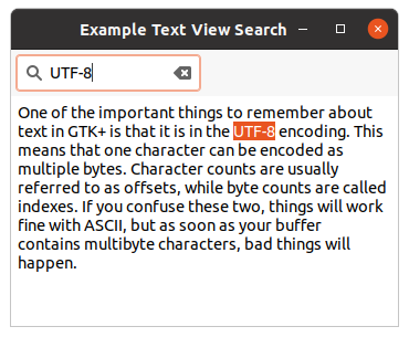
The following example which demonstrates searching, uses this function to highlight matched text.
;;;; Text View Search (2021-6-4)

(in-package :gtk-example)

(defun example-text-view-search ()
  (within-main-loop
    (let ((window (make-instance 'gtk-window
                                 :title "Example Text View Search"
                                 :type :toplevel
                                 :default-width 350
                                 :default-height 250))
          (entry (make-instance 'gtk-search-entry))
          (toolitem (make-instance 'gtk-tool-item))
          (toolbar (make-instance 'gtk-toolbar))
          (scrolled (make-instance 'gtk-scrolled-window))
          (textview (make-instance 'gtk-text-view
                                    :wrap-mode :word
                                    :top-margin 6
                                    :left-margin 6
                                    :right-margin 6))
          (vbox (make-instance 'gtk-box
                               :orientation :vertical)))
      (g-signal-connect window "destroy"
                        (lambda (widget)
                          (declare (ignore widget))
                          (leave-gtk-main)))
      ;; Search and select the text in the text buffer
      (g-signal-connect entry "search-changed"
          (lambda (widget)
            (let* ((text (gtk-entry-text widget))
                   (buffer (gtk-text-view-buffer textview))
                   (iter (gtk-text-buffer-start-iter buffer)))
              (multiple-value-bind (found start end)
                  (gtk-text-iter-search iter text)
                (when found
                      (gtk-text-buffer-select-range buffer start end))))))
      ;; Set some text into the text buffer
      (setf (gtk-text-buffer-text (gtk-text-view-buffer textview))
            *some-text*)
      ;; Pack and show the widgets
      (gtk-container-add toolitem entry)
      (gtk-container-add toolbar toolitem)
      (gtk-box-pack-start vbox toolbar :expand nil)
      (gtk-container-add scrolled textview)
      (gtk-box-pack-start vbox scrolled :expand t)
      (gtk-container-add window vbox)
      (gtk-widget-show-all window))))
9.4.2. Continuing the Search with Marks
If you had executed the above program you would have noted that, if there were more than one occurrence
of the text in the text buffer, typing text into the search entry will only highlight the first
occurrence of the text. To provide a feature similarly to Find Next the program has to remember the
location where the previous search stopped. So that you can start searching from that location. And this
should happen even if the text buffer were modified between the two searches. We could store the
match-end iterator passed on the function
gtk-text-iter-search and use it as the starting
point for the next search. But the problem is that if the text buffer were modified in between,
the iterator would get invalidated. This takes us to marks.
A mark preserves a position in the text buffer between modifications. This is possible because their behavior is defined when text is inserted or deleted. When text containing a mark is deleted, the mark remains in the position originally occupied by the deleted text. When text is inserted at a mark, a mark with left gravity will be moved to the beginning of the newly-inserted text, and a mark with right gravity will be moved to the end.
The gravity of the mark is specified while creation. The function
gtk-text-buffer-create-mark with the
arguments buffer, mark-name, where and left-grafity
can be used to create a mark associated with a text buffer. The iterator where specifies a
position in the text buffer which has to be marked. The argument left-gravity determines
how the mark moves when text is inserted at the mark. The argument mark-name is a string
that can be used to identify the mark. If mark-name is specified, the mark can be retrieved
using the function
gtk-text-buffer-mark.
With named marks, you do not have to carry around a pointer to the marker, which can be easily retrieved
using the function
gtk-text-buffer-mark. A mark by itself cannot be used for text buffer operations,
it has to converted into an iterator just before text buffer operations are to be performed. The function
gtk-text-buffer-iter-at-mark with the arguments buffer and mark returns the
iterator at the position of mark.
When a mark is no longer required, it can be deleted using the functions
gtk-text-buffer-delete-mark
or
gtk-text-buffer-delete-mark-by-name.
9.4.3. The Scrolling Problem
Before we show an example, we have to solve the problem that the text view should scroll to the matched
text. It can be irritating when the matched text is not in the visible portion of the text buffer. The
function
gtk-text-view-scroll-mark-onscreen with the arguments text-view and
mark scrolls to a position in the text buffer. The argument mark specifies the
position to scroll to. Note that this is a method of the
gtk-text-view widget rather than a
gtk-text-buffer object. Since it does not change the contents of the buffer, it only changes the way a
text buffer is viewed.
The function
gtk-text-view-scroll-mark-onscreen scrolls just enough, for the mark to be visible. But,
what if you want the mark to be centered, or to be the first line on the screen. This can be done using
the function
gtk-text-view-scroll-to-mark, which scrolls the text view so that the mark is on the
screen in the position indicated by the arguments xalign and yalign.
The following example shows the usage of marks to continue the search.
;;;; Text View Find Next (2021-6-4)

(in-package :gtk-example)

(defun find-next-match (textview text iter &key (direction :forward))
  (let ((buffer (gtk-text-view-buffer textview)))
    (multiple-value-bind (found start end)
        (gtk-text-iter-search iter text :direction direction)
      (when found
        (gtk-text-buffer-select-range buffer start end)
        (gtk-text-buffer-create-mark buffer "last-start" start)
        (let ((last-end (gtk-text-buffer-create-mark buffer "last-end" end)))
          (gtk-text-view-scroll-mark-onscreen textview last-end))))))

(defun example-text-view-find-next ()
  (within-main-loop
    (let ((window (make-instance 'gtk-window
                                 :title "Example Text View Find Next"
                                 :type :toplevel
                                 :default-width 350
                                 :default-height 250))
          (entry (make-instance 'gtk-search-entry))
          (toolitem (make-instance 'gtk-tool-item))
          (toolbar (make-instance 'gtk-toolbar))
          (scrolled (make-instance 'gtk-scrolled-window))
          (textview (make-instance 'gtk-text-view
                                   :wrap-mode :word
                                   :top-margin 6
                                   :left-margin 6
                                   :right-margin 6))
          (vbox (make-instance 'gtk-box
                               :orientation :vertical)))
      (g-signal-connect window "destroy"
                        (lambda (widget)
                          (declare (ignore widget))
                          (leave-gtk-main)))
      ;; Search and select the text in the text buffer
      (g-signal-connect entry "search-changed"
          (lambda (widget)
            (let* ((text (gtk-entry-text widget))
                   (buffer (gtk-text-view-buffer textview))
                   (iter (gtk-text-buffer-start-iter buffer)))
              (find-next-match textview text iter))))
      ;; Find the next match
      (g-signal-connect entry "next-match"
          (lambda (widget)
             (let* ((text (gtk-entry-text widget))
                    (buffer (gtk-text-view-buffer textview))
                    (last-end (gtk-text-buffer-mark buffer "last-end"))
                    (iter (gtk-text-buffer-iter-at-mark buffer last-end)))
               (when last-end
                 (find-next-match textview text iter)))))
      ;; Find the previous match
      (g-signal-connect entry "previous-match"
          (lambda (widget)
             (let* ((text (gtk-entry-text widget))
                    (buffer (gtk-text-view-buffer textview))
                    (last-start (gtk-text-buffer-mark buffer "last-start"))
                    (iter (gtk-text-buffer-iter-at-mark buffer last-start)))
               (when last-start
                 (find-next-match textview text iter :direction :backward)))))
      ;; Set some text into the text buffer
      (setf (gtk-text-buffer-text (gtk-text-view-buffer textview))
            *some-text*)
      ;; Pack and show the widgets
      (gtk-container-add toolitem entry)
      (gtk-container-add toolbar toolitem)
      (gtk-box-pack-start vbox toolbar :expand nil)
      (gtk-container-add scrolled textview)
      (gtk-box-pack-start vbox scrolled :expand t)
      (gtk-container-add window vbox)
      (gtk-widget-show-all window))))
9.5. Examing and Modifying Text
Examining and modifying text is another common operation performed on text buffers. Examples are
converting a selected portion of text into a comment while editing a program, determining and inserting
the correct end tag while editing HTML, inserting a pair of HTML tags around the current word, etc. The
gtk-text-iter iterator provides functions to do such processing.
In this section we will develop a program to demonstrate these functions. The program will insert
start/end <li> tags around the current line or a selection of text, when the
Make List Item button is clicked. Furthermore, the program will insert an end tag for an unclosed start
tag, when the Insert Close Tag is clicked.
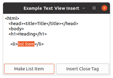
To insert <li> tags around the current line, we first obtain an iterator at the
current cursor position. Then we move the iterator to the beginning of the line, insert the start tag,
move the iterator to the end of the line, and insert the end tag. An iterator can be moved to a specified
offset in the same line using the accessor function (setf
with
the argument gtk-text-iter-line-offset)iter and the value char-on-line. The function moves
iter within the line, to the character offset specified by char-on-line. If
char-on-line is equal to the number of characters in the line, the iterator is moved to the
start of the next line. A character offset of zero, will move the iterator to the beginning of the line.
The iterator can be moved to the end of the line using the function
gtk-text-iter-forward-to-line-end.
To insert the <li> tags around the current selection, we use the "insert" mark, the
"selecton_bound" mark, and create an anonymous mark with right-gravity to remember the selection bound
of the text. First, we insert the tag at the position of the "insert" mark. We get the mark with the
function
gtk-text-buffer-mark and the iterator for the position to insert the text with the function
gtk-text-buffer-iter-at-mark. Then we get the mark at the current selection bound, create an anonymus
mark with the function
gtk-text-mark-new and add the mark with the function
gtk-text-buffer-add-mark
to the text buffer. Now, we get the iterator at this mark for inserting the end tag. After inserting the
start and end tags we retrieve the iterators for the "insert" mark and the anonymous mark and reselect
the previous selection. At last, we delete the anonymous mark.
Note: We cannot use the "selection_bound" mark to remember the selection of the text. The "selection_bound" mark has left-gravity and changes its position after inserting the end tag. Therefore, we create an anonymous mark with right-gravity, which does not change its position in the text buffer.
For the second part of the program, we will have to first get the iterator at the current cursor position.
We then search backwards from the cursor position, through the text buffer till we hit on an unclosed tag.
We then insert the corresponding end tag at the current cursor position. Note that the procedure given
does not take care of many special cases, and might not be the best way to determine an unclosed tag. We
can identify tags using the left angle bracket. So searching for start/end tags involves search for the
left angle bracket. This can be done using the function
gtk-text-iter-backward-find-char or the function
gtk-text-iter-find-char with a value :backward for the keyword argument
direction.
The function proceeds backwards from iter, and calls predicate for each
character in the text buffer, with the character as argument, till predicate returns
true. If a match is found, the function moves iter to the matching
position and returns true. If a match is not found, the function moves
iter to the beginning of the text buffer or the position limit (if not
nil) and returns nil. For our purpose we write a predicate that returns
true when the character is a left angle bracket. When we hit on a left angle bracket
we check whether the corresponding tag is a start tag or an end tag. This is done by examining the
character immediately after the left angle bracket. If it is a '/' it is an end tag. To extract the
character after the angle bracket we move the left angle bracket iterator by one character. And
then extract the character at that position. To move an iterator forward by one character, the
function
gtk-text-iter-forward-char can be used.
To extract the character at an iterator the function
gtk-text-iter-char can be used. After determining
the tag type we do the following:
- If the tag is an end tag, we push the tag name into a stack and then proceed to find more tags.
- If it is a start tag, we pop out it's matching tag from the stack. While poping out, if there were no more items in the stack, we have hit on an unmatched start tag. We then insert the corresponding end tag at the current cursor position.
We have not mentioned how we extract the tag name. The tag name is extracted using two iterators (start
and end iterators). The start iterator is obtained by starting from the left angle bracket iterator and
searching for an alphanumeric character, in the forward direction. The end iterator is obtained by
starting from the start iterator and searching for a non-alphanumeric character, in the forward direction.
The search can be done using the forward variant of the function
gtk-text-iter-backward-find-char.
;;;; Text View Insert (2021-6-4)

(in-package :gtk-example)

(defvar *text-for-example-text-view-insert*
"<html>
    <head><title>Title</title></head>
    <body>
    <h1>Heading</h1>
")

(defun get-this-tag (iter buffer)
  (let* ((start-tag (gtk-text-iter-copy iter))
         end-tag)
    (and (gtk-text-iter-find-char start-tag #'alpha-char-p)
         (setq end-tag (gtk-text-iter-copy start-tag))
         (gtk-text-iter-find-char end-tag
                                  (lambda (ch) (not (alphanumericp ch))))
         (gtk-text-buffer-get-text buffer start-tag end-tag nil))))

(defun closing-tag-p (iter)
  (let ((slash (gtk-text-iter-copy iter)))
    (gtk-text-iter-forward-char slash)
    (eql (gtk-text-iter-char slash) #\/)))

(defun example-text-view-insert ()
  (within-main-loop
    (let ((window (make-instance 'gtk-window
                                 :title "Example Text View Insert"
                                 :type :toplevel
                                 :default-width 350
                                 :default-height 200))
          (textview (make-instance 'gtk-text-view
                                   :top-margin 6
                                   :left-margin 6
                                   :right-margin 6))
          (button-make-item (make-instance 'gtk-button
                                           :label "Make List Item"
                                           :margin 3))
          (button-close-tag (make-instance 'gtk-button
                                           :label "Insert Close Tag"
                                           :margin 3))
          (hbox (make-instance 'gtk-box
                               :orientation :horizontal))
          (vbox (make-instance 'gtk-box
                                :orientation :vertical)))
    (g-signal-connect window "destroy"
                      (lambda (widget)
                        (declare (ignore widget))
                        (leave-gtk-main)))
    (g-signal-connect button-make-item "clicked"
        (lambda (widget)
          (declare (ignore widget))
          (let* ((buffer (gtk-text-view-buffer textview))
                 (cursor (gtk-text-buffer-mark buffer "insert"))
                 (bound (gtk-text-buffer-mark buffer "selection_bound")))
            (if (gtk-text-buffer-has-selection buffer)
                ;; Insert text before and after the selection
                (progn
                  ;; Insert start tag
                  (let ((iter (gtk-text-buffer-iter-at-mark buffer cursor)))
                    (gtk-text-buffer-insert buffer "<li>" :position iter))
                  ;; Insert end tag
                  (let ((mark (gtk-text-mark-new nil t))
                        (iter (gtk-text-buffer-iter-at-mark buffer bound)))
                    ;; Add the anonymous mark with right gravity
                    (gtk-text-buffer-add-mark buffer mark iter)
                    ;; Do the insertion at the position of the mark
                    (let ((end (gtk-text-buffer-iter-at-mark buffer mark)))
                      (gtk-text-buffer-insert buffer "</li>" :position end))
                    ;; Reselect the previous selection
                    (let ((iter1 (gtk-text-buffer-iter-at-mark buffer cursor))
                          (iter2 (gtk-text-buffer-iter-at-mark buffer mark)))
                      (gtk-text-buffer-select-range buffer iter1 iter2))
                    ;; Delete the mark
                    (gtk-text-buffer-delete-mark buffer mark)))
                ;; Insert at start and end of current line
                (let ((iter (gtk-text-buffer-iter-at-mark buffer cursor)))
                  ;; Move to the start of the line
                  (setf (gtk-text-iter-line-offset iter) 0)
                  (gtk-text-buffer-insert buffer "<li>" :position iter)
                  ;; Move to the end of the line
                  (gtk-text-iter-forward-to-line-end iter)
                  (gtk-text-buffer-insert buffer "</li>" :position iter)
                  ;; Place cursor and selection and the end of the line
                  (gtk-text-iter-forward-to-line-end iter)
                  (gtk-text-buffer-select-range buffer iter iter))))))
      (g-signal-connect button-close-tag "clicked"
          (lambda (widget)
            (declare (ignore widget))
            (let* ((buffer (gtk-text-view-buffer textview))
                   (cursor (gtk-text-buffer-mark buffer "insert"))
                   (iter (gtk-text-buffer-iter-at-mark buffer cursor)))
              (do ((stack '()))
                  ((not (gtk-text-iter-find-char iter
                                                (lambda (ch) (eq ch #\<))
                                                :direction :backward)))
                (let ((tag (get-this-tag iter buffer)))
                  (if (closing-tag-p iter)
                      (push tag stack)
                      (let ((tag-in-stack (pop stack)))
                        (when (not tag-in-stack)
                          (gtk-text-buffer-insert buffer
                                                  (format nil "</~a>" tag))
                          (return)))))))))
   (setf (gtk-text-buffer-text (gtk-text-view-buffer textview))
         *text-for-example-text-view-insert*)
   ;; Pack and show the widgets
   (gtk-box-pack-start vbox textview)
   (gtk-box-pack-start hbox button-make-item)
   (gtk-box-pack-start hbox button-close-tag)
   (gtk-box-pack-start vbox hbox :expand nil)
   (gtk-container-add window vbox)
   (gtk-widget-show-all window))))
9.6. Images and Widgets in the Text Widget
9.6.1. Inserting and Retrieving Images
A text buffer can hold images and anchor location for widgets. An image can be inserted into a text
buffer using the function
gtk-text-buffer-insert-pixbuf with the arguments buffer,
iter, and pixbuf. An image represented by pixbuf is inserted
at the position iter in the text buffer. The pixbuf can be created from an image file using
the function
gdk-pixbuf-new-from-file.
Images in a text buffer are represented by the character 0xFFFC (Unicode object replacement
character). When text containing images is retrieved from a buffer using the function
gtk-text-buffer-get-text the 0xFFFC characters representing images are dropped off in the
returned text. If these characters representing images are required, use the slice variant -
gtk-text-buffer-get-slice. The image at a given position can be retrieved using the function
gtk-text-iter-pixbuf.
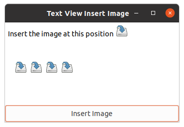
The example program given loads an image and inserts the image into the text buffer, whenever the user clicks on the Insert Image button.
;;;; Text View Insert Image (2021-6-4)

(in-package :gtk-example)

(defun example-text-view-insert-image ()
  (within-main-loop
    (let ((window (make-instance 'gtk-window
                                 :type :toplevel
                                 :title "Text View Insert Image"
                                 :default-width 350
                                 :default-height 200))
          (textview (make-instance 'gtk-text-view
                                    :top-margin 6
                                    :left-margin 6
                                    :right-margin 6))
          (button (make-instance 'gtk-button
                                 :label "Insert Image"))
          (vbox (make-instance 'gtk-box
                               :orientation :vertical)))
    (g-signal-connect window "destroy"
                      (lambda (widget)
                        (declare (ignore widget))
                        (leave-gtk-main)))
    ;; Signal handler to insert an image at the current cursor position.
    (g-signal-connect button "clicked"
       (lambda (widget)
         (declare (ignore widget))
         (let* ((pixbuf (gdk-pixbuf-new-from-file (sys-path "save.png")))
                (buffer (gtk-text-view-buffer textview))
                (cursor (gtk-text-buffer-get-insert buffer))
                (iter (gtk-text-buffer-iter-at-mark buffer cursor)))
           (gtk-text-buffer-insert-pixbuf buffer iter pixbuf))))
    (gtk-box-pack-start vbox textview)
    (gtk-box-pack-start vbox button :expand nil)
    (gtk-container-add window vbox)
    (gtk-widget-show-all window))))
9.6.2. Inserting and Retrieving Widgets
Unlike inserting an image, inserting a widget is a two step process. The additional complexity is due
to the functionality split between the
gtk-text-view class and the
gtk-text-buffer class. The first
step is to create and insert a
gtk-text-child-anchor object. A widget is held in a text buffer using a
gtk-text-child-anchor object. A child anchor is a spot in the text buffer where child widgets can be
anchored. A child anchor can be created and inserted into a text buffer using the function
gtk-text-buffer-create-child-anchor with the arguments buffer and iter,
where the argument iter specifies the position in the buffer, where the widget is to be
inserted. The next step is to add a child widget to the text view, at the anchor location with the
function
gtk-text-view-add-child-at-anchor.
An anchor can hold only one widget, it could be a container widget, which in turn can contain many
widgets, unless you are doing tricky things like displaying the same buffer using different
gtk-text-view objects.
Child anchors are represented in the text buffer using the object replacement character
0xFFFC. Retrieving a widget is also a two step process. First, the child anchor has to be
retrieved. This can be done using the function
gtk-text-iter-child-anchor. Next, the widget associated
with the child anchor has to be retrieved. This can be done using the function
gtk-text-child-anchor-widgets. The function returns a list of widgets. As mentioned earlier, if you
are not doing tricky things like multiple views for the same text buffer, you will find only one widget
in this list.
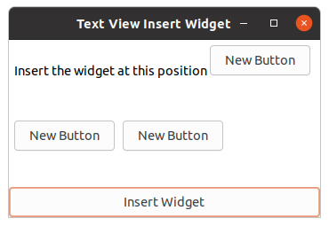
The following program inserts a button widget into a text buffer, whenever the user clicks on the Insert Widget button.
;;;; Text View Insert Widget (2021-6-4)

(in-package :gtk-example)

(defun example-text-view-insert-widget ()
  (within-main-loop
    (let ((window (make-instance 'gtk-window
                                 :type :toplevel
                                 :title "Text View Insert Widget"
                                 :default-width 350
                                 :default-height 200))
          (text-view (make-instance 'gtk-text-view
                                    :top-margin 6
                                    :left-margin 6
                                    :right-margin 6))
          (button (make-instance 'gtk-button
                                 :label "Insert Widget"))
          (vbox (make-instance 'gtk-box
                               :orientation :vertical)))
    (g-signal-connect window "destroy"
                      (lambda (widget)
                        (declare (ignore widget))
                        (leave-gtk-main)))
    ;; Signal handler to insert a widget at the current cursor position.
    (g-signal-connect button "clicked"
       (lambda (widget)
         (declare (ignore widget))
         (let* ((buffer (gtk-text-view-buffer text-view))
                (cursor (gtk-text-buffer-get-insert buffer))
                (iter (gtk-text-buffer-iter-at-mark buffer cursor))
                (anchor (gtk-text-buffer-create-child-anchor buffer iter))
                (button (gtk-button-new-with-label "New Button")))
           (gtk-text-view-add-child-at-anchor text-view button anchor)
           (gtk-widget-show button))))
    (gtk-box-pack-start vbox text-view)
    (gtk-box-pack-start vbox button :expand nil)
    (gtk-container-add window vbox)
    (gtk-widget-show-all window))))
9.7. Text Buffer and Window Coordinates
9.7.1. About Text Buffer and Window Coordinates
Sometimes it is necessary to know the position of the text cursor on the screen, or the word in a text buffer under the mouse cursor. For example, when you want to display a tooltip, when the user types text. To do this, you will have to understand text buffer coordinates and window coordinates.
Both the text buffer and window coordinates are pixel level coordinates. The difference is that the window coordinates takes into account only the portion of the text buffer displayed on the screen. The large white box (with grid lines) in the following figure depicts the text buffer. And the smaller inner grey box is the visible portion of the text buffer, displayed by the text view widget.
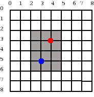
The text buffer coordinates of the red dot are (4, 3). But the window coordinates of the red dot are (2, 1). This is because the window coordinates are calculated relative to the visible portion of the text buffer. Similarly, the buffer coordinates of the blue dot are (3, 5) and the window coordinates are (1, 3).
The text buffer coordinates of a particular character in a text buffer can be obtained using the
function
gtk-text-view-iter-location. The function gets the rectangle that contains the character at
the iterator and returns it. The x and y members of the rectangle gives us
the buffer coordinates.
The buffer coordinates can be converted into window coordinates using the function
gtk-text-view-buffer-to-window-coords. The function converts text buffer coordinates
(buffer-x, buffer-y) to window coordinates (window-x, window-y).
(let* ((rect (gtk-text-view-iter-location textview location))
       (buffer-x (gdk-rectangle-x rect))
       (buffer-y (gdk-rectangle-y rect))
       (win (gtk-text-view-window textview :widget)))
  (multiple-value-bind (window-x window-y)
      (gtk-text-view-buffer-to-window-coords textview
                                             :widget
                                             buffer-x
                                             buffer-y)
    ... )
We can find the position in the text buffer corresponding to a particular (window-x, window-y)
coordinate. The window coordinates can be converted to text buffer coordinates using the function
gtk-text-view-window-to-buffer-coords. The iterator at a text buffer coordinate can be obtained using
the function
gtk-text-view-iter-at-location.
9.7.2. Tooltips under the Text Cursor
We use the functions for text buffer and window coordinates to display tooltips under the cursor in the text view. The procedure is as follows,
-
Get the text buffer coordinates of the text cursor with the function
gtk-text-view-iter-location. -
The text buffer coordinates (
buffer-x,buffer-y) are converted to window coordinates (window-x,window-y) with the functiongtk-text-view-buffer-to-window-coords. -
The position (
screen-x,screen-y) of the text view widget on the screen is obtained with the functiongdk-window-origin. -
The window with the tooltip is displayed at the position (
window-x + screen-x,window-y + screen-y).
Now that we know the position of the character within the text view widget, we will have to find the
position of the text view widget on the screen. Each GTK widget has a corresponding
gdk-window object
associated with it. Once we know the window associated with a widget, we can obtain it's
(screen-x, screen-y) coordinates using the function
gdk-window-origin. The
gdk-window object for the text view widget can be obtained using the function
gtk-text-view-window.
Here you will have to pass in the value :widget of the
gtk-text-window-type enumeration
for the argument win-type.
We now know the functions required to display a tooltip under the text cursor. Before we proceed to the example, you will have to know which signal has to be trapped to do display the tooltip. Since we want the tooltip to be displayed when the user inserts text, the "insert-text" signal emitted by the text buffer object can be used. As the signal's name suggests it is called whenever the user inserts text into the buffer. The callback prototype of the signal handler is
lambda (buffer location text len)
The callback function is called with the position after the inserted text in the location
iterator, a UTF-8 string with the inserted text in text and an integer with the length of
the inserted text len.
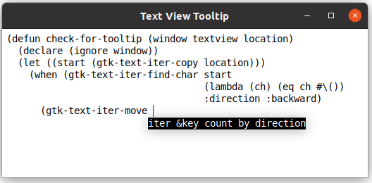
Below is an example program that displays a tooltip when the inserted text matches a Lisp function in a list of functions.
;;;; Text View Tooltip (2021-6-4)

(in-package :gtk-example)

(let ((tooltip nil)
      (provider (make-instance 'gtk-css-provider))
      (css-tooltip "label {
                      color: white;
                      background-color: black;
                      font: 14px 'Monospace'; }
                    textview {
                      font: 14px 'Monospace'; }"))

  (defun get-tip (word)
    (cdr (assoc word
                '(("format" . "destination control-string &rest args")
                  ("gtk-text-iter-move" ."iter &key count by direction")
                  ("gtk-text-iter-copy" ."iter")
                  ("gtk-text-iter-find-char" .
                   "iter predicate &key limit direction")
                  ("gtk-text-buffer-insert" .
                   "buffer text &key position interactive editable"))
                :test #'equal)))

  (defun tip-window-new (tip-text)
    (let ((win (make-instance 'gtk-window
                              :type :popup
                              :border-width 0))
          (event-box (make-instance 'gtk-event-box
                                    :border-width 1))
          (label (make-instance 'gtk-label
                                :label tip-text)))
      (gtk-container-add event-box label)
      (gtk-container-add win event-box)
      ;; Apply CSS to the label
      (apply-css-to-widget provider label)
      win))

  (defun check-for-tooltip (window textview location)
    (declare (ignore window))
    (let ((start (gtk-text-iter-copy location)))
      (when (gtk-text-iter-find-char start
                                     (lambda (ch) (eq ch #\())
                                     :direction :backward)
        (gtk-text-iter-move start)
        (let* ((word (string-trim " " (gtk-text-iter-text start location)))
               (tip-text (get-tip word)))
          (when tip-text
            (let* ((rect (gtk-text-view-iter-location textview location))
                   (buffer-x (gdk-rectangle-x rect))
                   (buffer-y (gdk-rectangle-y rect))
                   (text-height (gdk-rectangle-height rect))
                   (win (gtk-text-view-window textview :widget)))
              (multiple-value-bind (window-x window-y)
                  (gtk-text-view-buffer-to-window-coords textview
                                                         :widget
                                                         buffer-x
                                                         buffer-y)
                (multiple-value-bind (screen-x screen-y)
                    (gdk-window-origin win)
                  ;; Destroy any previous tool tip window
                  (when tooltip
                    (gtk-widget-destroy tooltip)
                    (setf tooltip nil))
                  ;; Create a new tool tip window
                  (setf tooltip (tip-window-new tip-text))
                  ;; Place it at the calculated position.
                  (gtk-window-move tooltip
                                   (+ window-x screen-x)
                                   (+ window-y screen-y text-height))
                  (gtk-widget-show-all tooltip)))))))))

  (defun example-text-view-tooltip ()
    (within-main-loop
      (let* ((window (make-instance 'gtk-window
                                    :title "Text View Tooltip"
                                    :type :toplevel
                                    :default-width 450
                                    :default-height 200))
             (scrolled (make-instance 'gtk-scrolled-window))
             (textview (make-instance 'gtk-text-view
                                      :top-margin 6
                                      :left-margin 6
                                      :right-margin 6))
             (buffer (gtk-text-view-buffer textview))
             (in-open-brace-p nil)
             (open-brace-count 0))
        (g-signal-connect window "destroy"
                        (lambda (widget)
                          (declare (ignore widget))
                          (when tooltip
                            (gtk-widget-destroy tooltip)
                            (setf tooltip nil))
                          (leave-gtk-main)))
        ;; Signal handler for the text buffer of the text view
        (g-signal-connect buffer "insert-text"
           (lambda (buffer location text len)
             (declare (ignore buffer len))
             (cond ((string= text "(")
                    (setf open-brace-count (1+ open-brace-count))
                    (setf in-open-brace-p t))
                   ((string= text ")")
                    (setf open-brace-count (max 0 (- open-brace-count 1)))
                    (when (= 0 open-brace-count)
                      (setf in-open-brace-p nil))
                    (when tooltip
                      (gtk-widget-destroy tooltip)
                      (setf tooltip nil)))
                   ((and in-open-brace-p (string= " " text))
                    (check-for-tooltip window textview location))
                   (t nil))))
        ;; Pack the widgets
        (gtk-container-add scrolled textview)
        (gtk-container-add window scrolled)
        ;; Load CSS from data into the provider
        (gtk-css-provider-load-from-data provider css-tooltip)
        (apply-css-to-widget provider textview)
        ;; show the window and child widgets
        (gtk-widget-show-all window)))))
Chapter 10. Tree and List Widgets
10.1. Tree and List Widget Overview
To create a tree or list in GTK, use the
gtk-tree-model interface in conjunction with the
gtk-tree-view widget. This widget is designed around a Model/View/Controller design and consists of
four major parts:
-
The tree view widget implemented as the
gtk-tree-viewclass. -
The view column implemented as the
gtk-tree-view-columnclass. -
The cell renderers etc. implemented as the
gtk-cell-rendererclass. -
The model interface implemented as the
gtk-tree-modelinterface.
The View is composed of the first three objects, while the last is the Model. One of the prime benefits of the MVC design is that multiple views can be created of a single model. For example, a model mapping the file system could be created for a file manager. Many views could be created to display various parts of the file system, but only one copy need be kept in memory.
The purpose of the cell renderers is to provide extensibility to the widget and to allow multiple ways of rendering the same type of data. For example, consider how to render a boolean variable. Should it render as a string of "True" or "False", "On" or "Off", or should it be rendered as a checkbox?
Creating a model
GTK provides two simple models that can be used: the
gtk-list-store object and the
gtk-tree-store
object. The
gtk-list-store object is used to model list widgets, while the
gtk-tree-store object is
used to model trees. It is possible to develop a new type of model, but the existing models should be
satisfactory for all but the most specialized of situations. Creating the model is quite simple:
(let ((model (make-instance 'gtk-list-store
                            :column-types '("gchararray" "gboolean"))))
  ... )
or with the function
gtk-list-store-new
(let ((model (gtk-list-store-new "gchararray" "gboolean")))
  ... )
This creates a list store with two columns: a string column and a boolean column. The next example
creates a tree store with 3 columns with the function
gtk-tree-store-new:
(defun create-and-fill-tree-store ()
  (let ((model (gtk-tree-store-new "gchararray" "gchararray" "guint")))
    ... ))
Adding data to the model is done using the functions
gtk-list-store-set or
gtk-tree-store-set,
depending upon which sort of model was created. To do this, a
gtk-tree-iter iterator must be acquired.
The iterator points to the location where data will be added.
Once an iterator has been acquired, the function
gtk-tree-store-set is used to apply data to the part
of the model that the iterator points to. Consider the following example:
(let ((iter (gtk-tree-store-append model nil))) ; Toplevel iterator
  ;; Set the toplevel row
  (gtk-tree-store-set model
                      iter
                      "The Art of Computer Programming"
                      "Donald E. Knuth"
                      2011)
... )
It can be used to set the data in all columns in a given row.
The second argument to the function
gtk-tree-store-append is the parent iterator. It is used to add a
row to a
gtk-tree-store object as a child of an existing row. This means that the new row will only
be visible when its parent is visible and in its expanded state. Consider the following example:
(let ((iter (gtk-tree-store-append model nil))) ; Toplevel iterator
  ;; Set the toplevel row
  (gtk-tree-store-set model
                      iter
                      "The Art of Computer Programming"
                      "Donald E. Knuth"
                      2011)
  ;; Append and set three child rows
  (gtk-tree-store-set model
                      (gtk-tree-store-append model iter) ; Child iterator
                      "Volume 1: Fundamental Algorithms"
                      ""
                      1997)
  ... )
Creating the view component
While there are several different models to choose from, there is only one view widget to deal with.
It works with either the list or the tree store. Setting up a
gtk-tree-view widget is not a difficult
matter. It needs a
gtk-tree-model object to know where to retrieve its data from. The following
example uses the function
gtk-tree-view-new-with-model:
(defun create-view-and-tree-store ()
  (let* ((model (create-and-fill-tree-store))
         (view (gtk-tree-view-new-with-model model)))
  ... ))
Columns and cell renderers
Once the
gtk-tree-view widget has a model, it will need to know how to display the model. It does
this with columns and cell renderers.
Cell renderers are used to draw the data in the tree model in a way. There are a number of cell
renderers that come with GTK, including the
gtk-cell-renderer-text,
gtk-cell-renderer-pixbuf
and the
gtk-cell-renderer-toggle objects. It is relatively easy to write a custom renderer.
A
gtk-tree-view-column object is the object that the
gtk-tree-view widget uses to organize the
vertical columns in the tree view. It needs to know the name of the column to label for the user, what
type of cell renderer to use, and which piece of data to retrieve from the model for a given row.
...
;; Create renderer for Title column
(let* ((renderer (gtk-cell-renderer-text-new))
       (column (gtk-tree-view-column-new-with-attributes "Title"
                                                         renderer
                                                         "text"
                                                         col-title)))
  (gtk-tree-view-append-column view column))
...
At this point, all the steps in creating a displayable tree have been covered. The model is created, data is stored in it, a tree view is created and columns are added to it.
Selection handling
Most applications will need to not only deal with displaying data, but also receiving input events from users. To do this, simply get a reference to a selection object, connect to the "changed" signal and then to retrieve data for the row selected:
(let* ((...
       (view (create-view-and-tree-store))
       ;; Get the selection of the view
       (select (gtk-tree-view-selection view)))
  ...
  ;; Setup the selection handler
  (setf (gtk-tree-selection-mode select) :single)
  (g-signal-connect select "changed"
     (lambda (selection)
       (let* ((view (gtk-tree-selection-tree-view selection))
              (model (gtk-tree-view-model view))
              (iter (gtk-tree-selection-selected selection))
              (title (gtk-tree-model-value model iter col-title)))
         (format t "Selected title is ~a~%" title))))
  ... ))
Simple Tree View
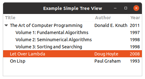
Here is an example of using a
gtk-tree-view widget in context of the other widgets. It creates a model
and view, and puts them together. The window is show in Figure 10.1, “Simple Tree View”.
;;;; Example Tree View Simple (2021-6-4)

(in-package :gtk-example)

(let ((col-title 0) (col-author 1) (col-year 2))

  (defun create-and-fill-model-simple ()
    (let ((model (gtk-tree-store-new "gchararray" "gchararray" "guint")))
      ;; First Book
      (let ((iter (gtk-tree-store-append model nil))) ; Top-level iterator
        ;; Set the top-level row
        (gtk-tree-store-set model
                            iter
                            "The Art of Computer Programming"
                            "Donald E. Knuth"
                            2011)
        ;; Append and set child rows
        (gtk-tree-store-set model
                            (gtk-tree-store-append model iter) ; Child iterator
                            "Volume 1: Fundamental Algorithms"
                            ""
                            1997)
        (gtk-tree-store-set model
                            (gtk-tree-store-append model iter) ; Child iterator
                            "Volume 2: Seminumerical Algorithms"
                            ""
                            1998)
        (gtk-tree-store-set model
                            (gtk-tree-store-append model iter) ; Child iterator
                            "Volume 3: Sorting and Searching"
                            ""
                            1998))
      ;; Second Book
      (let ((iter (gtk-tree-store-append model nil))) ; Top-level iterator
        (gtk-tree-store-set model
                            iter
                            "Let Over Lambda"
                            "Doug Hoyte"
                            2008))
      ;; Third Book
      (let ((iter (gtk-tree-store-append model nil))) ; Top-level iterator
        (gtk-tree-store-set model
                            iter
                            "On Lisp"
                            "Paul Graham"
                            1993))
      model))

  (defun create-view-and-model-simple ()
    (let* ((model (create-and-fill-model-simple))
           (view (gtk-tree-view-new-with-model model)))
      ;; Create renderer for Title column
      (let* ((renderer (gtk-cell-renderer-text-new))
             (column (gtk-tree-view-column-new-with-attributes "Title"
                                                               renderer
                                                               "text"
                                                                col-title)))
        (gtk-tree-view-append-column view column))
      ;; Create renderer for Author column
      (let* ((renderer (gtk-cell-renderer-text-new))
             (column (gtk-tree-view-column-new-with-attributes "Author"
                                                               renderer
                                                               "text"
                                                               col-author)))
        (gtk-tree-view-append-column view column))
      ;; Create renderer for Year column
      (let* ((renderer (gtk-cell-renderer-text-new))
             (column (gtk-tree-view-column-new-with-attributes "Year"
                                                               renderer
                                                               "text"
                                                               col-year)))
        (gtk-tree-view-append-column view column))
      view))

  (defun example-tree-view-simple ()
    (within-main-loop
      (let* ((window (make-instance 'gtk-window
                                    :title "Example Simple Tree View"
                                    :type :toplevel
                                    :default-width 350
                                    :default-height 200))
             (view (create-view-and-model-simple)))
        (g-signal-connect window "destroy"
                          (lambda (widget)
                            (declare (ignore widget))
                            (leave-gtk-main)))
        ;; Setup the selection handler
        (let ((selection (gtk-tree-view-selection view)))
          (setf (gtk-tree-selection-mode selection) :single)
          (g-signal-connect selection "changed"
             (lambda (object)
               (let* ((view (gtk-tree-selection-tree-view object))
                      (model (gtk-tree-view-model view))
                      (iter (gtk-tree-selection-selected object))
                      (title (gtk-tree-model-value model iter col-title)))
                 (format t "Selected title is ~a~%" title)))))
        ;; Pack and show the widgets
        (gtk-container-add window view)
        (gtk-widget-show-all window)))))
10.2. GtkListStore and GtkTreeStore
10.2.1. Introduction to GtkListStore and GtkTreeStore
It is important to realise what the
gtk-tree-model interface is and what it is not. The
gtk-tree-model interface is basically just an 'interface' to the data store, meaning that it is a
standardised set of functions that allows a
gtk-tree-view widget (and the application programmer) to
query certain characteristics of a data store, for example how many rows there are, which rows have
children, and how many children a particular row has. It also provides functions to retrieve data from
the data store, and tell the tree view what type of data is stored in the model. Every data store must
implement the
gtk-tree-model interface and provide these functions. The
gtk-tree-model interface
itself only provides a way to query a data store's characteristics and to retrieve existing data, it
does not provide a way to remove or add rows to the store or put data into the store. This is done using
the specific store's functions.
GTK comes with two built-in data stores (models): the
gtk-list-store object and the
gtk-tree-store
object. As the names imply, the
gtk-list-store object is used for simple lists of data items where
items have no hierarchical parent-child relationships, and the
gtk-tree-store object is used for
tree-like data structures, where items can have parent-child relationships. A list of files in a
directory would be an example of a simple list structure, whereas a directory tree is an example for a
tree structure. A list is basically just a special case of a tree with none of the items having any
children, so one could use a tree store to maintain a simple list of items as well. The only reason
the
gtk-list-store object exists is in order to provide an easier interface that does not need to
cater for child-parent relationships, and because a simple list model can be optimised for the special
case where no children exist, which makes it faster and more efficient.
The
gtk-list-store and
gtk-tree-store objects should cater for most types of data an application
developer might want to display in a
gtk-tree-view widget. However, it should be noted that the
gtk-list-store and
gtk-tree-store objects have been designed with flexibility in mind. If you plan
to store a lot of data, or have a large number of rows, you should consider implementing your own custom
model that stores and manipulates data your own way and implements the
gtk-tree-model interface. This
will not only be more efficient, but probably also lead to saner code in the long run, and give you more
control over your data.
Tree model implementations like the
gtk-list-store and
gtk-tree-store objects will take care of the
view side for you once you have configured the
gtk-tree-view widget to display what you want. If you
change data in the store, the model will notify the tree view and your data display will be updated. If
you add or remove rows, the model will also notify the store, and your row will appear in or disappear
from the view as well.
10.2.2. How Data is Organised in a Store
A model (data store) has model columns and rows. While a tree view will display each row in the model as a row in the view, the model's columns are not to be confused with a view's columns. A model column represents a certain data field of an item that has a fixed data type. You need to know what kind of data you want to store when you create a list store or a tree store, as you can not add new fields later on.
For example, we might want to display a list of files. We would create a list store with two fields: a field that stores the filename (i.e. a string) and a field that stores the file size (i.e. an unsigned integer). The filename would be stored in column 0 of the model, and the file size would be stored in column 1 of the model. For each file we would add a row to the list store, and set the row's fields to the filename and the file size.
The GLib type system (GType) is used to indicate what type of data is stored in a model column. These are the most commonly used types:
"gboolean""gint","guint"-
"glong","gulong","gint64","guint64" "gfloat","gdouble""gchararray""gpointer""GdkPixbuf"
You do not need to understand the type system, it will usually suffice to know the above types, so you can tell a list store or tree store what kind of data you want to store. Storing GObject-derived types is a special case that is dealt with further below.
Here is an example of how to create a list store with the funcion
gtk-list-store-new:
(let ((model (gtk-list-store-new "gchararray" "gchararray" "guint")))
  ... )
This creates a new list store with three columns. Column 0 and 1 store a string and column 3 stores an unsigned integer for each row. At this point the model has no rows yet of course. Before we start to add rows, let's have a look at the different ways used to refer to a particular row.
10.2.3. Refering to Rows
GtkTreePath
There are different ways to refer to a specific row. The two you will have to deal with are a
gtk-tree-iter iterator and a
gtk-tree-path instance.
A
gtk-tree-path instance is a comparatively straight-forward way to describe the logical position of
a row in the model. As a
gtk-tree-view widget always displays all rows in a model, a tree path always
describes the same row in both model and view.
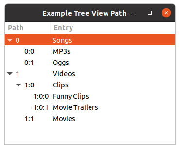
Figure 10.2, “Tree Path” shows the tree path in string form. Basically, it just counts the children from the imaginary root of the tree view. An empty tree path string would specify that imaginary invisible root. Now 'Songs' is the first child (from the root) and thus its tree path is just "0". 'Videos' is the second child from the root, and its tree path is "1". 'Oggs' is the second child of the first item from the root, so its tree path is "0:1". So you just count your way down from the root to the row in question, and you get your tree path.
The implication of this way of refering to rows is as follows: if you insert or delete rows in the middle or if the rows are resorted, a tree path might suddenly refer to a completely different row than it refered to before the insertion/deletion/resorting. This is important to keep in mind. See the section on GtkTreeRowReference below for a tree path that keeps updating itself to make sure it always refers to the same row when the model changes.
You can get a new
gtk-tree-path instance from a path in string form using the function
gtk-tree-path-new-from-string, and you can convert a given
gtk-tree-path instance into its string
notation with the function
gtk-tree-path-to-string. Usually you will rarely have to handle the string
notation, it is described here merely to demonstrate the concept of tree paths.
Instead of the string notation, the
gtk-tree-path structure uses an integer array internally. You can
get the depth, i.e. the nesting level, of a tree path with the function
gtk-tree-path-depth. A depth
of 0 is the imaginary invisible root node of the tree view and model. A depth of 1 means that the tree
path describes a toplevel row. As lists are just trees without child nodes, all rows in a list always
have tree paths of depth 1. The function
gtk-tree-path-indices returns the internal integer array of
a tree path. You will rarely need to operate with those either.
If you operate with tree paths, you are most likely to use a given tree path, and use functions like
gtk-tree-path-up,
gtk-tree-path-down,
gtk-tree-path-next,
gtk-tree-path-prev,
gtk-tree-path-is-ancestor, or
gtk-tree-path-is-descendant. Note that this way you can construct and
operate on tree paths that refer to rows that do not exist in model or view. The only way to check
whether a path is valid for a specific model, i.e. the row described by the path exists, is to convert
the path into an iterator using the function
gtk-tree-model-iter.
The
gtk-tree-path structure is an opaque structure. If you need to make a copy of a tree path, use
the function
gtk-tree-path-copy.
GtkTreeIter
Another way to refer to a row in a list or tree is a
gtk-tree-iter iterator. A tree iterator is just
a structure that contains a couple of pointers that mean something to the model you are using. Tree
iterators are used internally by models, and they often contain a direct pointer to the internal data
of the row in question. You should never look at the content of a tree iterator and you must not modify
it directly either. All tree models, and therefore also
gtk-list-store and
gtk-tree-store objects,
must support the
gtk-tree-model functions that operate on tree iterators. Some of these functions are
shown in Table 10.1, “Functions for GtkTreeModel”.
| Function | Description |
|---|---|
gtk-tree-model-iter-first |
Returns the iterator to the the first toplevel item in the list or tree. |
gtk-tree-model-iter-next |
Returns the iterator to the next item at the current level in a list or tree. |
gtk-tree-model-iter-previous |
Returns the iterator to the previous item at the current level in a list or tree. |
gtk-tree-model-iter-children |
Returns the iterator to the first child of the row referenced by the given iterator. Not very useful for lists, mostly useful for trees. |
gtk-tree-model-iter-n-children |
Returns the number of children the row referenced by the provided iterator has. If you pass
nil instead of an iterator, this function will return the number of toplevel
rows. You can use this function to count the number of items in a list store.
|
gtk-tree-model-iter-nth-child |
Returns the iterator to the n-th child of the row referenced by the given iterator. If you pass
nil instead of an iterator, you can get the iterator set to the n-th row of a list.
|
gtk-tree-model-iter-parent |
Returns the iterator to the parent of the row referenced by the given iterator. Does nothing for lists, only useful for trees. |
Almost all of those functions return the iterator if the requested operation succeeded, and return
nil otherwise. There are more functions that operate on iterators. Check out the
gtk-tree-model API reference for details.
Tree iterators are used to retrieve data from the store, and to put data into the store. You also get a
tree iterator as result if you add a new row to the store using the functions
gtk-list-store-append
or
gtk-tree-store-append.
Tree iterators are often only valid for a short time, and might become invalid if the store changes
with some models. It is therefore usually a bad idea to store tree iterators, unless you really know
what you are doing. You can use the function
gtk-tree-model-flags to get a model's flags, and check
whether the :iters-persist flag is set, in which case a tree iterator will be valid as
long as a row exists, yet still it is not advisable to store iterator instances unless you really mean
to do that. There is a better way to keep track of a row over time with a
gtk-tree-row-reference
instance.
GtkTreeRowReference
A
gtk-tree-row-reference structure is basically a structure that takes a tree path, and watches a
model for changes. If anything changes, like rows getting inserted or removed, or rows getting
re-ordered, the tree row reference object will keep the given tree path up to date, so that it always
points to the same row as before. In case the given row is removed, the tree row reference will become
invalid.
A new tree row reference can be created with the function
gtk-tree-row-reference-new, given a model
and a tree path. After that, the tree row reference will keep updating the path whenever the model
changes. The current tree path of the row originally refered to when the tree row reference was created
can be retrieved with the function
gtk-tree-row-reference-path. If the row has been deleted,
nil will be returned instead of of a tree path.
You can check whether the row referenced still exists with the function
gtk-tree-row-reference-valid.
For the curious: internally, the tree row reference connects to the tree model's "row-inserted", "row-deleted", and "rows-reordered" signals and updates its internal tree path whenever something happened to the model that affects the position of the referenced row.
Note that using tree row references entails a small overhead. This is hardly significant, but when you have multiple thousands of rows and/or row references, this might be something to keep in mind, because whenever rows are inserted, removed, or reordered, a signal will be sent out and processed for each row reference.
If you have read the tutorial only up to here so far, it is hard to explain really what tree row references are good for. An example where tree row references come in handy can be found further below in the section on removing multiple rows in one go.
In practice, a programmer can either use tree row references to keep track of rows over time, or store
tree iterators directly, if, and only if, the model has persistent iterators. Both
gtk-list-store
and
gtk-tree-store objects have persistent iterators, so storing iterators is possible. However,
using tree row references is definitively the right way to do things, even though it comes with some
overhead that might impact performance in case of trees that have a very large number of rows
Usage
Tree iterators can easily be converted into tree paths using the function
gtk-tree-model-path, and
tree paths can easily be converted into tree iterators using the function
gtk-tree-model-iter.
Here is an example that shows how to get the iterator from the tree path that is passed to us from the
tree view in the "row-activated" signal callback. We need the iterator here to retrieve data from the
store.
;; Print the name when double click a row
(g-signal-connect view "row-activated"
    (lambda (view path column)
      (declare (ignore column))
      (let* ((model (gtk-tree-view-model view))
             ;; Lookup iter from path
             (iter (gtk-tree-model-iter model path)))
        (when iter
          (format t "Double click on name ~a~%"
                    (gtk-tree-model-value model iter col-lastname))))))
Tree row references reveal the current path of a row with the function
gtk-tree-row-reference-path.
There is no direct way to get a tree iterator from a tree row reference, you have to retrieve the tree
row reference's path first and then convert that into a tree iterator.
The following example asks the model to return the iterator to the first row in the list store. If
there is a first row and the list store is not empty, the iterator will be returned by the function
gtk-tree-model-iter-first. If there is no first row, it will just return nil. If a first
row exists, the do loop will be entered and we change some of the first row's data. Then we ask the
model to return the iterator to the next row, until there are no more rows, which is when the function
gtk-tree-model-iter-next returns nil. Instead of traversing the list store we could also
have used the function
gtk-tree-model-foreach.
(do* ((model (gtk-tree-view-model view))
      (iter (gtk-tree-model-iter-first model)
            (gtk-tree-model-iter-next model iter)))
     ((not iter))
     (let ((value (gtk-tree-model-value model iter col-yearborn)))
           (gtk-list-store-set-value model
                                     iter
                                     col-yearborn
                                     (1+ value))))
10.2.4. Adding Rows to a Store
Adding Rows to a List Store
Rows are added to a list store with the function
gtk-list-store-append. This will insert a new empty
row at the end of the list. There are other functions, documented in the
gtk-list-store API reference,
that give you more control about where exactly the new row is inserted, but as they work very similar
to the function
gtk-list-store-append and are fairly straight-forward to use, we will not deal with
them here. Here is a simple example of how to create a list store and add an empty row to it.
(let* ((model (gtk-list-store-new "gchararray"))
       ;; Append an empty row to the list store
       (iter (gtk-list-store-append model)))
  ... )
This in itself is not very useful yet of course. We will add data to the rows in the next section.
Adding Rows to a Tree Store
Adding rows to a tree store works similar to adding rows to a list store, only that the function
gtk-tree-store-append is the function to use and one more argument is required, namely the tree
iterator to the parent of the row to insert. If you supply nil instead of providing the
tree iterator of another row, a new toplevel row will be inserted. If you do provide a parent tree
iterator, the new empty row will be inserted after any already existing children of the parent. Again,
there are other ways to insert a row into the tree store and they are documented in the
gtk-tree-store
API reference manual. Another short example
(let* ((model (gtk-tree-store-new "gchararray"))
       ;; Append an empty toplevel row to the tree store.
       ;; Iter will point to the new row.
       (iter (gtk-tree-store-append model nil))
       (child nil))
  ;; Append another empty toplevel row to the tree store.
  (setf iter (gtk-tree-store-append model nil))
  ;; Append a child to the row we just added.
  (setf child (gtk-tree-store-append model iter))
  ;; Get the first row, and add a child to it as well, could have been done
  ;; right away earlier of course, this is just for demonstration purposes
  (setf iter (gtk-tree-model-iter-first model))
  (setf child (gtk-tree-store-append model iter))
  ... )
Speed Issues when Adding a Lot of Rows
A common scenario is that a model needs to be filled with a lot of rows at some point, either at start-up, or when some file is opened. An equally common scenario is that this takes an awfully long time even on powerful machines once the model contains more than a couple of thousand rows, with an exponentially decreasing rate of insertion. As already pointed out above, writing a custom model might be the best thing to do in this case. Nevertheless, there are some things you can do to work around this problem and speed things up a bit even with the stock GTK models:
Firstly, you should detach your list store or tree store from the tree view before doing your mass insertions, then do your insertions, and only connect your store to the tree view again when you are done with your insertions. Like this:
(let ((model (gtk-tree-view-model view)))
  ;; Detach model from view
  (setf (gtk-tree-view-model view) nil)

  ... insert a couple of thousand rows ...

  ;; Re-attach model to view
  (setf (gtk-tree-view-model view) model)
  ... )
Secondly, you should make sure that sorting is disabled while you are doing your mass insertions, otherwise your store might be resorted after each and every single row insertion, which is going to be everything but fast. Thirdly, you should not keep around a lot of tree row references if you have so many rows, because with each insertion (or removal) every single tree row reference will check whether its path needs to be updated or not.
10.2.5. Manipulating Row Data
Adding empty rows to a data store is not terribly exciting, so let's see how we can add or change data
in the store. The functions
gtk-list-store-set and
gtk-tree-store-set are used to manipulate a given
row's data. There are also the functions
gtk-list-store-set-value and
gtk-tree-store-set-value to
set single values in a row.
Both functions
gtk-list-store-set and
gtk-tree-store-set take a variable number of arguments. The
first two arguments are the model, and the iterator to the row whose data we want to change. They are
followed by a variable number of data arguments. The data should be of the same data type as the model
column. Here is an example where we create a store that stores a string and one integer for the row:
(let ((model (gtk-list-store-new "gchararray" "gchararray" "guint")))
  ;; Append a row and fill in some data
  (gtk-list-store-set model
                      (gtk-list-store-append model)
                      "Hans" "Müller" 1961)
  ... )
10.2.6. Retrieving Row Data
Storing data is not very useful if it cannot be retrieved again. This is done using the function
gtk-tree-model-get, which takes similar arguments as the functions
gtk-list-store-set or
gtk-tree-store-set do, only that it takes column arguments.
Here is an example to traverse the list store and print out the data stored. As an extra, we use the
function
gtk-tree-model-foreach to traverse the store and retrieve the row number from the
gtk-tree-path instance passed to us in the foreach callback function:
;;;; Example Tree View Dump Model (2021-6-4)

(in-package :gtk-example)

(defun dump-model (model path iter)
  (let ((firstname (gtk-tree-model-value model iter 0))
        (lastname (gtk-tree-model-value model iter 1))
        (yearborn (gtk-tree-model-value model iter 2))
        (path-str (gtk-tree-path-to-string path)))
    (format t "Row ~A: ~A ~A, year ~A~%" path-str firstname lastname yearborn)))

(defun example-tree-view-dump-model ()
  (let ((model (create-and-fill-model-example)))
    ;; Traverse the model and dump it on the console
    (gtk-tree-model-foreach model #'dump-model)))
Note that when a new row is created, all fields of a row are set to a default value appropriate for the
data type in question. A field of type "gint" will automatically contain the value 0 until it is set to
a different value, and strings and all kind of pointer types will be NULL until set to
something else. Those are valid contents for the model, and if you are not sure that row contents have
been set to something, you need to be prepared to handle NULL pointers and the like in your
code. Run the above program with an additional empty row and look at the output to see this in effect.
10.2.7. Removing Rows
Rows can easily be removed with the functions
gtk-list-store-remove and
gtk-tree-store-remove.
The removed row will automatically be removed from the tree view as well.
Removing a single row is fairly straight forward: you need to get the iterator that identifies the row you want to remove, and then use one of the above functions. Here is a simple example that removes a row when you double-click on it (bad from a user interface point of view, but then it is just an example):
;; Signal handler for the signal "row-activated"
(g-signal-connect view "row-activated"
  (lambda (view path column)
    (declare (ignore column))
    (let* ((model (gtk-tree-view-model view))
           (iter (gtk-tree-model-iter model path)))
      (when iter
        (gtk-list-store-remove model iter)))))
If you want to remove the n-th row from a list (or the n-th child of a tree node), you have two
approaches: either you first create a
gtk-tree-path instance that describes that row and then turn it
into an iterator and remove it, or you take the iterator of the parent node and use the function
gtk-tree-model-iter-nth-child (which will also work for list stores if you use nil as the
parent iterator. Of course you could also start with the iterator of the first toplevel row, and then
step-by-step move it to the row you want, although that seems a rather awkward way of doing it. The
following code snippet will remove the n-th row of a list if it exists:
;; Removes the nth row of a list store if it exists.
(defun list-store-remove-nth-row (store n)
  (let (;; nil means the parent is the virtual root node, so the
        ;; n-th toplevel element is returned in iter, which is
        ;; the n-th row in a list store as a list store only has
        ;; toplevel elements, and no children
        (iter (gtk-tree-model-nth-child store nil n)))
    (when iter
      (gtk-list-store-remove store iter))))
Removing multiple rows at once can be a bit tricky at times, and requires some thought on how to do this
best. For example, it is not possible to traverse a store with the function
gtk-tree-model-foreach,
check in the callback function whether the given row should be removed and then just remove it by calling
one of the stores' remove functions. This will not work, because the model is changed from within the
foreach loop, which might suddenly invalidate formerly valid tree iterators in the foreach function, and
thus lead to unpredictable results.
Here is an example for an alternative approach to removing multiple rows in one go. Here we want to remove all rows from the store that contain persons that are older than 30, but it could just as well be all selected rows or some other criterion:
(let ((rowref-list nil))
  (defun foreach-func (model path iter)
    (let ((age (gtk-tree-model-value model iter col-age)))
      (when (> age 30)
        (let ((rowref (gtk-tree-row-reference-new model path)))
          (setf rowref-list (cons rowref rowref-list))))
      nil))

  (defun remove-people-older-than (model)
    (setf rowref-list nil)
    (gtk-tree-model-foreach model #'foreach-func)
    (dolist (rowref rowref-list)
      (let ((path (gtk-tree-row-reference-path rowref)))
      (when path
        (let ((iter (gtk-tree-model-iter model path)))
          (when iter
            (gtk-list-store-remove model iter))))))))
The functions
gtk-list-store-clear and
gtk-tree-store-clear come in handy if you want
to remove all rows.
10.3. Creating a Tree View
10.3.1. Connecting Tree View and Model
In order to display data in a tree view widget, we need to create one first, and we need to instruct it where to get the data to display from. A new tree view is created with:
(let ((view (gtk-tree-view-new)))
  ... )
Before we proceed to the next section where we display data on the screen, we need connect our data
store to the tree view, so it knows where to get the data to display from. This is achieved with the
function (setf
, which will by itself do very little. However, it is
a prerequisite for what we do in the following sections. The function
gtk-tree-view-model)gtk-tree-view-new-with-model is
a convenience function for the previous two.
The function
gtk-tree-view-model will return the model that is currently attached to a given tree view,
which is particularly useful in callbacks where you only get passed the tree view widget.
10.3.2. Tree View Look and Feel
There are a couple of ways to influence the look and feel of the tree view. You can hide or show
column headers with the function
gtk-tree-view-headers-visible, and set them clickable or not with the
function
gtk-tree-view-headers-clickable (which will be done automatically for you if you enable
sorting).
The function
gtk-tree-view-rules-hint will enable or disable rules in the tree view. 'Rules' means
that every second line of the tree view has a shaded background, which makes it easier to see which cell
belongs to which row in tree views that have a lot of columns. As the function name implies, this setting
is only a hint; in the end it depends on the active GTK theme engine if the tree view shows ruled lines
or not. Users seem to have strong feelings about rules in tree views, so it is probably a good idea to
provide an option somewhere to disable rule hinting if you set it on tree views (but then, people also
seem to have strong feelings about options abundance and 'sensible' default options, so whatever you do
will probably upset someone at some point).
The expander column can be set with the function
gtk-tree-view-expander-column. This is the column
where child elements are indented with respect to their parents, and where rows with children have an
'expander' arrow with which a node's children can be collapsed (hidden) or expanded (shown). By default,
this is the first column.
10.4. Mapping Data to the Screen
10.4.1. Introduction to Mapping Data
As outlined above, tree view columns represent the visible columns on the screen that have a column
header with a column name and can be resized or sorted. A tree view is made up of tree view columns,
and you need at least one tree view column in order to display something in the tree view. Tree view
columns, however, do not display anything by themselves, this is done by specialised
gtk-cell-renderer
objects. Cell renderers are packed into tree view columns much like widgets are packed into a
gtk-box
widget.
Here is a diagram (courtesy of Owen Taylor) that pictures the relationship between tree view columns and cell renderers:
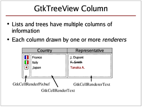
In the above diagram, both 'Country' and 'Representative' are tree view columns, where the 'Country' and 'Representative' labels are the column headers. The 'Country' column contains two cell renderers, one to display the flag icons, and one to display the country name. The 'Representative' column only contains one cell renderer to display the representative's name.
10.4.2. Cell Renderers
Cell renderers are objects that are responsible for the actual rendering of data within a
gtk-tree-view-column. They are basically just GObjects (i.e. not widgets) that have certain properties,
and those properties determine how a single cell is drawn.
In order to draw cells in different rows with different content, a cell renderer's properties need to be set accordingly for each single row/cell to render. This is done either via attributes or cell data functions. If you set up attributes, you tell GTK which model column contains the data from which a property should be set before rendering a certain row. Then the properties of a cell renderer are set automatically according to the data in the model before each row is rendered. Alternatively, you can set up cell data functions, which are called for each row to be rendererd, so that you can manually set the properties of the cell renderer before it is rendered. Both approaches can be used at the same time as well. Lastly, you can set a cell renderer property when you create the cell renderer. That way it will be used for all rows/cells to be rendered (unless it is changed later of course).
Different cell renderers exist for different purposes:
| Class | Description |
|---|---|
gtk-cell-renderer-text |
Renders strings or numbers or boolean values as text ("Joe", "99.32", "true"). Sets the given iterator to the first toplevel item in the list or tree. |
gtk-cell-renderer-pixbuf |
Is used to display images, either user-defined images, or one of the stock icons that come with GTK. |
gtk-cell-renderer-toggle |
Displays a boolean value in form of a check box or as a radio button. |
gtk-cell-renderer-editable |
Is a special cell that implements editable cells (i.e. the
gtk-entry or
gtk-spin-button widgets
in a tree view). This is not a cell renderer. If you want to have editable text cells, use
the
gtk-cell-renderer-text object and make sure the
editable property is
set. The
gtk-cell-editable widget is only used by implementations of editable cells and widgets
that can be inside of editable cells. You are unlikely to ever need it.
|
Contrary to what one may think, a cell renderer does not render just one single cell, but is responsible for rendering part or whole of a tree view column for each single row. It basically starts in the first row and renders its part of the column there. Then it proceeds to the next row and renders its part of the column there again. And so on.
How does a cell renderer know what to render? A cell renderer object has certain 'properties' that are documented in the API reference (just like most other objects, and widgets). These properties determine what the cell renderer is going to render and how it is going to be rendered. Whenever the cell renderer is called upon to render a certain cell, it looks at its properties and renders the cell accordingly. This means that whenever you set a property or change a property of the cell renderer, this will affect all rows that are rendered after the change, until you change the property again.
Here is a diagram (courtesy of Owen Taylor) that tries to show what is going on when rows are rendered:
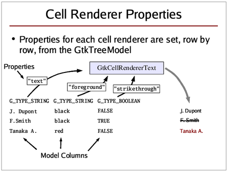
The above diagram shows the process when attributes are used. In the example, a text cell renderer's
text property has been linked to the first model column. The
text property contains the string to be rendered. The
foreground property, which contains the colour of the text to be shown, has
been linked to the second model column. Finally, the
strikethrough property,
which determines whether the text should be with a horizontal line that strikes through the text, has
been connected to the third model column (of type "gboolean").
With this setup, the cell renderer's properties are 'loaded' from the model before each cell is rendered.
Here is little example that demonstrates this behaviour, and introduces some of the most commonly used
properties of the
gtk-cell-renderer-text object:
;;;; Example Cell Renderer Properties (2021-6-5)

(in-package :gtk-example)

(defun create-and-fill-model-properties ()
  (let ((model (make-instance 'gtk-tree-store
                              :column-types '("gchararray" "gchararray"))))
    ;; Append a top level row and leave it empty
    (gtk-tree-store-append model nil)
    ;; Append a second top level row, and fill it with some data
    (let ((parent (gtk-tree-store-set model (gtk-tree-store-append model nil)
                                            "Joe" "Average")))
      ;; Append a child to the second top level row, and fill in some data
      (gtk-tree-store-set model (gtk-tree-store-append model parent)
                                "Jane" "Average"))
    model))

(defun create-view-and-model-properties ()
  (let* ((model (create-and-fill-model-properties))
         (view (make-instance 'gtk-tree-view
                              :model model)))
  ;; Create the first column
  (let* ((column (make-instance 'gtk-tree-view-column
                                :title "First Name"))
         (renderer (make-instance 'gtk-cell-renderer-text
                                  :text "Booooo")))
    ;; pack tree view column into tree view
    (gtk-tree-view-append-column view column)
    ;; pack cell renderer into tree view column
    (gtk-tree-view-column-pack-start column renderer))

  ;; Create the second column
  (let* ((column (make-instance 'gtk-tree-view-column
                                :title "Last Name"))
         (renderer (make-instance 'gtk-cell-renderer-text
                                  :cell-background "Orange"
                                  :cell-background-set t)))
    ;; pack tree view column into tree view
    (gtk-tree-view-append-column view column)
    ;; pack cell renderer into tree view column
    (gtk-tree-view-column-pack-start column renderer))
  ;; No selection possible
  (setf (gtk-tree-selection-mode (gtk-tree-view-selection view)) :none)
  view))

(defun example-cell-renderer-properties ()
  (within-main-loop
    (let ((window (make-instance 'gtk-window
                                 :title "Example Cell Renderer Properties"
                                 :type :toplevel
                                 :default-width 350
                                 :default-height 200))
          (view (create-view-and-model-properties)))
      (g-signal-connect window "destroy"
                        (lambda (widget)
                          (declare (ignore widget))
                          (leave-gtk-main)))
      (gtk-container-add window view)
      (gtk-widget-show-all window))))
The above code should produce something looking like this:
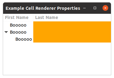
It looks like the tree view display is partly correct and partly incomplete. On the one hand the tree view renders the correct number of rows, and it displays the hierarchy correctly (on the left), but it does not display any of the data that we have stored in the model. This is because we have made no connection between what the cell renderers should render and the data in the model. We have simply set some cell renderer properties on start-up, and the cell renderers adhere to those set properties meticulously.
There are two different ways to connect cell renderers to data in the model: attributes and cell data functions.
10.4.3. Attributes
An attribute is a connection between a cell renderer property and a field/column in the model. Whenever a cell is to be rendered, a cell renderer property will be set to the values of the specified model column of the row that is to be rendered. It is very important that the column's data type is the same type that a property takes according to the API reference manual. Here is some code to look at:
(let* ((renderer (gtk-cell-renderer-text-new))
       (column (gtk-tree-view-column-new-with-attributes "Example"
                                                         renderer
                                                         "text" 0)))
  (gtk-tree-view-append-column view column)
  ... )
This means that the text cell renderer property "text" will be set to the string in model column 0 of each row to be drawn.
Again, when setting attributes it is very important that the data type stored in a model column is the
same as the data type that a property requires as argument. Check the API reference manual to see the
data type that is required for each property. When reading through the example a bit further above, you
might have noticed that we set the
cell-background property of a
gtk-cell-renderer-text object, even though the API documentation does not list such a property. We can
do this, because the
gtk-cell-renderer-text object is derived from the
gtk-cell-renderer object,
which does in fact have such a property. Derived classes inherit the properties of their parents. This
is the same as with widgets that you can cast into one of their ancestor classes. The API reference has
an object hierarchy that shows you which classes a widget or some other object is derived from.
There are two more noteworthy things about
gtk-cell-renderer properties: one is that sometimes there
are different properties which do the same, but take different arguments, such as the
foreground and
foreground-rgba properties of the
gtk-cell-renderer-text object (which specify the text colour). The
foreground
property take a colour in string form, such as "Orange" or "CornflowerBlue", whereas
foreground-rgba property takes a
gdk-rgba color argument. It is up to you to
decide which one to use - the effect will be the same. The other thing worth mentioning is that most
properties have a "foo-set" property taking a boolean value as argument, such as
foreground-set. This is useful when you want to have a certain setting
have an effect or not. If you set the
foreground property, but set
foreground-set to false, then your foreground color
setting will be disregarded. This is useful in cell data functions, or, for example, if you want set the
foreground colour to a certain value at start-up, but only want this to be in effect in some columns, but
not in others, in which case you could just connect the
foreground-set property
to a model column of type "gboolean" with the function
gtk-tree-view-column-add-attribute.
Setting column attributes is the most straight-forward way to get your model data to be displayed. This is usually used whenever you want the data in the model to be displayed exactly as it is in the model.
Another way to get your model data displayed on the screen is to set up cell data functions.
10.4.4. Cell Data Functions
A cell data function is a function that is called for a specific cell renderer for each single row before that row is rendered. It gives you maximum control over what exactly is going to be rendered, as you can set the cell renderer's properties just like you want to have them. Remember not only to set a property if you want it to be active, but also to unset a property if it should not be active, and it might have been set in the previous row.
Cell data functions are often used if you want more fine-grained control over what is to be displayed,
or if the standard way to display something is not quite like you want it to be. A case in point are
floating point numbers. If you want floating point numbers to be displayed in a certain way, say with
only one digit after the colon/comma, then you need to use a cell data function. Use the function
gtk-tree-view-column-set-cell-data-func to set up a cell data function for a particular cell renderer.
Here is an example:
(defun age-cell-data (column renderer model iter)
  (declare (ignore column))
  (let ((year (sixth (multiple-value-list (get-decoded-time))))
        (text nil)
        (value (gtk-tree-model-value model iter col-yearborn)))
    (if (and (< value year) (> value 0))
        (progn
          (setf text (format nil "~a  years old" (- year value)))
          (setf (gtk-cell-renderer-text-foreground-set renderer) nil))
        (progn
          (setf text "age unknown")
          (setf (gtk-cell-renderer-text-foreground renderer) "Red")
          (setf (gtk-cell-renderer-text-foreground-set renderer) t)))
    (setf (gtk-cell-renderer-text-text renderer) text)))

...
;; Create renderer for third column
(let* ((renderer (gtk-cell-renderer-text-new))
       (column (gtk-tree-view-column-new-with-attributes "Age"
                                                         renderer
                                                         "text"
                                                         col-yearborn)))
  ;; Set a Cell Data Function on the column
  (gtk-tree-view-column-set-cell-data-func column renderer #'age-cell-data)
  (gtk-tree-view-append-column view column))
...
For each row to be rendered by this particular cell renderer, the cell data function is going to be called, which then retrieves the year born from the model, and turns it into an age. When the age is not a positive value the text "age unknown" in the color red is rendered with the text cell renderer.
This is only a simple example, you can make cell data functions a lot more complicated if you want to.
As always, there is a trade-off to keep in mind though. Your cell data function is going to be called
every single time a cell in that (renderer) column is going to be rendered. Go and check how often this
function is called in your program if you ever use one. If you do time-consuming operations within a
cell data function, things are not going to be fast, especially if you have a lot of rows. The
alternative in this case would have been to make an additional column col-age of type
"gchararray, and to set the age in string form and the text "age unknown" whenever you set the year born
itself in a row, and then hook up the string column to a text cell renderer using attributes. This way
the age conversion would only need to be done once. This is a CPU cycles / memory trade-off, and it
depends on your particular case which one is more suitable. Things you should probably not do is to
convert long strings into UTF8 format in a cell data function, for example.
You might notice that your cell data function is called at times even for rows that are not visible at the moment. This is because the tree view needs to know its total height, and in order to calculate this it needs to know the height of each and every single row, and it can only know that by having it measured, which is going to be slow when you have a lot of rows with different heights. If your rows all have the same height, there should not be any visible delay though.
GtkCellRendererText and Integer, Boolean and Float Types
It has been said before that, when using attributes to connect data from the model to a cell renderer
property, the data in the model column specified in the function
gtk-tree-view-column-add-attribute
must always be of the same type as the data type that the property requires.
This is usually true, but there is an exception: if you use the function
gtk-tree-view-column-add-attribute to connect a text cell renderer's
text
property to a model column, the model column does not need to be of "gchararray", it can also be one of
most other fundamental GLib types, e.g. "gboolean", "gint", "guint", "glong", "gulong", "gint64",
"guint64", "gfloat", or "gdouble". The text cell renderer will automatically display the values of
these types correctly in the tree view. For example:
(let ((store (gtk-list-store-new "gchararray" "guint"))
      (renderer (gtk-cell-renderer-text-new))
      (column (gtk-tree-view-column-new)))
  (gtk-tree-view-column-add-attribute column renderer "text" 1)
  ... )
Even though the
text property would require a string value, we use a model
column of an integer type when setting attributes. The integer will then automatically be converted
into a string before the cell renderer property is set.
If you are using a floating point type, i.e. "gfloat" or "gdouble", there is no way to tell the text cell renderer how many digits after the floating point (or comma) should be rendered. If you only want a certain amount of digits after the point/comma, you will need to use a cell data function.
10.4.5. GtkCellRendererText, UTF8, and Pango markup
All text used in GTK widgets needs to be in UTF8 encoding, and the
gtk-cell-renderer-text object is
no exception. Text in plain ASCII is automatically valid UTF8, but as soon as you have special characters
that do not exist in plain ASCII (usually characters that are not used in the English language alphabet),
they need to be in UTF8 encoding. There are many different character encodings that all specify different
ways to tell the computer which character is meant. GTK uses UTF8, and whenever you have text that is in
a different encoding, you need to convert it to UTF8 encoding first. If you only use text input from
other GTK widgets, you are on the safe side, as they will return all text in UTF8 as well.
In addition to the
text property, the
gtk-cell-renderer-text object also has
a
markup property that takes text with Pango markup as input. Pango markup
allows you to place special tags into a text string that affect the style the text is rendered (see the
Pango documentation). Basically you can achieve everything you can achieve with the other properties also
with Pango markup (only that using properties is more efficient and less messy). Pango markup has one
distinct advantage though that you cannot achieve with text cell renderer properties: with Pango markup,
you can change the text style in the middle of the text, so you could, for example, render one part of a
text string in bold print, and the rest of the text in normal. Here is an example of a string with Pango
markup:
"You can have text in<b>bold</b>or in a<span color='Orange'>different color</span>"
It is possible to combine both Pango markup and text cell renderer properties. Both will be 'added'
together to render the string in question, only that the text cell renderer properties will be applied
to the whole string. If you set the
markup property to normal text without any
Pango markup, it will render as normal text just as if you had used the
text
property. However, as opposed to the
text property, special characters in the
markup property text would still need to be escaped, even if you do not use
Pango markup in the text.
10.4.6. A Working Example
Here is an example that shows the features mentioned so far in the tutorial. Both attributes and a cell data function are used for demonstration purposes.
;;;; Example Tree View Example (2021-6-4)

(in-package :gtk-example)

(let ((col-firstname 0) (col-lastname 1) (col-yearborn 2))

  (defun age-cell-data (column renderer model iter)
    (declare (ignore column))
    (let ((year (sixth (multiple-value-list (get-decoded-time))))
          (text nil)
          (value (gtk-tree-model-value model iter col-yearborn)))
      (if (and (< value year) (> value 0))
          (progn
            (setf text (format nil "~a  years old" (- year value)))
            (setf (gtk-cell-renderer-text-foreground-set renderer) nil))
          (progn
            (setf text "age unknown")
            (setf (gtk-cell-renderer-text-foreground renderer) "Red")
            (setf (gtk-cell-renderer-text-foreground-set renderer) t)))
      (setf (gtk-cell-renderer-text-text renderer) text)))

  (defun create-and-fill-model-example ()
    (let ((model (gtk-list-store-new "gchararray" "gchararray" "guint")))
      ;; Append a row and fill in some data
      (gtk-list-store-set model (gtk-list-store-append model)
                                "Hans" "Müller" 1961)
      ;; Append another row and fill in some data
      (gtk-list-store-set model (gtk-list-store-append model)
                                "Barbara" "Schmidt" 1998)
      ;; Append a third row
      (gtk-list-store-set model (gtk-list-store-append model)
                                "Peter" "Schneider" 1982)
      ;; Append a third row
      (gtk-list-store-set model (gtk-list-store-append model)
                                "Ursula" "Fischer" 2009)
      ;; Append a third row
      (gtk-list-store-set model (gtk-list-store-append model)
                                "Wolfgang" "Weber" 2002)
      model))

  (defun create-view-and-model-example ()
    (let* ((model (create-and-fill-model-example))
           (view (gtk-tree-view-new-with-model model)))
      ;; Create renderer for first column
      (let* ((renderer (gtk-cell-renderer-text-new))
             (column (gtk-tree-view-column-new-with-attributes "First Name"
                                                               renderer
                                                               "text"
                                                                col-firstname)))
        (gtk-tree-view-append-column view column))

      ;; Create renderer for second column
      (let* ((renderer (gtk-cell-renderer-text-new))
             (column (gtk-tree-view-column-new-with-attributes "Last Name"
                                                               renderer
                                                               "text"
                                                                col-lastname)))
        ;; Set weight property to bold
        (setf (gtk-cell-renderer-text-weight renderer) 700)
        (setf (gtk-cell-renderer-text-weight-set renderer) t)
        (gtk-tree-view-append-column view column))

      ;; Create renderer for third column
      (let* ((renderer (gtk-cell-renderer-text-new))
             (column (gtk-tree-view-column-new-with-attributes "Age"
                                                               renderer
                                                               "text"
                                                               col-yearborn)))
        (gtk-tree-view-column-set-cell-data-func column renderer #'age-cell-data)
        (gtk-tree-view-append-column view column))

      (setf (gtk-tree-selection-mode (gtk-tree-view-selection view)) :none)

      view))

  (defun example-tree-view-example ()
    (within-main-loop
      (let ((window (make-instance 'gtk-window
                                   :title "Example Tree View"
                                   :type :toplevel
                                   :default-width 350
                                   :default-height 200))
            (toolbar (make-instance 'gtk-toolbar))
            (button (make-instance 'gtk-tool-button
                                   :label "Add year"))
            (vbox (make-instance 'gtk-box :orientation :vertical))
            (view (create-view-and-model-example)))
        (g-signal-connect window "destroy"
                          (lambda (widget)
                            (declare (ignore widget))
                            (leave-gtk-main)))
        ;; Print the name when double click a row
        (g-signal-connect view "row-activated"
            (lambda (view path column)
              (declare (ignore column))
              (let* ((model (gtk-tree-view-model view))
                     ;; Lookup iter from path
                     (iter (gtk-tree-model-iter model path)))
                (when iter
                  (format t "Double click on name ~a~%"
                            (gtk-tree-model-value model iter col-lastname))))))
        ;; Add one year to the column year born
        (g-signal-connect button "clicked"
            (lambda (button)
              (declare (ignore button))
              (do* ((model (gtk-tree-view-model view))
                    (iter (gtk-tree-model-iter-first model)
                          (gtk-tree-model-iter-next model iter)))
                   ((not iter))
                   (let ((value (gtk-tree-model-value model iter col-yearborn)))
                     (gtk-list-store-set-value model iter
                                               col-yearborn
                                               (1+ value))))))
        ;; Pack and show the widgets
        (gtk-container-add toolbar button)
        (gtk-box-pack-start vbox toolbar :expand nil)
        (gtk-box-pack-start vbox view)
        (gtk-container-add window vbox)
        (gtk-widget-show-all window)))))
10.4.7. How to Make a Whole Row Bold or Coloured
This seems to be a frequently asked question, so it is worth mentioning it here. You have the two approaches mentioned above: either you use cell data functions, and check in each whether a particular row should be highlighted in a particular way (bold, coloured, whatever), and then set the renderer properties accordingly (and unset them if you want that row to look normal), or you use attributes. Cell data functions are most likely not the right choice in this case though.
If you only want every second line to have a gray background to make it easier for the user to see which data belongs to which line in wide tree views, then you do not have to bother with the stuff mentioned here. Instead just set the rules hint on the tree view as described in Section 10.3.2, “Tree View Look and Feel”, and everything will be done automatically, in colours that conform to the chosen theme even (unless the theme disables rule hints, that is).
Otherwise, the most suitable approach for most cases is that you add two columns to your model, one for
the property itself (e.g. a column col-row-color of type "gchararray", and one for the
boolean flag of the property (e.g. a column col-row-color-set of type "gboolean"). You
would then connect these columns with the
foreground and
foreground-set properties of each renderer. Now, whenever you set a row's
col-row-color field to a colour, and set that row's col-row-color-set field to
true, then this column will be rendered in the colour of your choice. If you only
want either the default text colour or one special other colour, you could even achieve the same thing
with just one extra model column: in this case you could just set all renderer's
foreground property to whatever special color you want, and only connect the
col-row-color-set column to all renderer's
foreground-set property
using attributes. This works similar with any other attribute, only that you need to adjust the data
type for the property of course (e.g. the
weight property would take a "gint",
in form of a
pango-weight value in this case).
As a general rule, you should not change the text colour or the background colour of a cell unless you have a really good reason for it.
10.4.8. How to Pack Icons into the Tree View
So far we have only put text in the tree view. While everything you need to know to display icons in
the form of
gdk-pixbuf objects has been introduced in the previous sections, a short example might
help to make things clearer. The following code will pack an icon and the icon name into the same tree
view column:
;;;; Example Tree View Content Type (2021-6-4)

(in-package :gtk-example)

(let ((col-icon 0) (col-icon-name 1) (col-mime-type 2) (col-desc 3))

  (defun create-and-fill-model-content-type ()
    (let ((data (g-content-types-registered))
          (model (gtk-list-store-new "GdkPixbuf"
                                     "gchararray" "gchararray" "gchararray"))
          (icon-theme (gtk-icon-theme-default)))
      (dolist (mime-type data)
        (let* ((description (g-content-type-description mime-type))
               (icon-name (g-content-type-generic-icon-name mime-type))
               (icon (gtk-icon-theme-load-icon icon-theme
                                               icon-name
                                               24
                                               0)))
          (gtk-list-store-set model (gtk-list-store-append model)
                                    icon
                                    icon-name
                                    mime-type
                                    description)))
      model))

  (defun create-view-and-model-content-type ()
    (let* ((model (create-and-fill-model-content-type))
           (view (gtk-tree-view-new-with-model model)))
     ;; First column displays icon and icon-name
     (let ((column (gtk-tree-view-column-new))
           (renderer (gtk-cell-renderer-pixbuf-new)))
       (setf (gtk-tree-view-column-title column) "Icon")
       (gtk-tree-view-column-pack-start column renderer :expand nil)
       (gtk-tree-view-column-set-attributes column
                                            renderer
                                            "pixbuf"
                                            col-icon)
       (setf renderer (gtk-cell-renderer-text-new))
       (gtk-tree-view-column-pack-start column renderer :expand nil)
       (gtk-tree-view-column-set-attributes column
                                            renderer
                                            "text"
                                            col-icon-name)
        (gtk-tree-view-append-column view column))
      ;; Second column for the MIME Type
      (let* ((renderer (gtk-cell-renderer-text-new))
             (column (gtk-tree-view-column-new-with-attributes "MIME Type"
                                                               renderer
                                                               "text"
                                                                col-mime-type)))
        (gtk-tree-view-append-column view column))
      ;; Third column for the description
      (let* ((renderer (gtk-cell-renderer-text-new))
             (column (gtk-tree-view-column-new-with-attributes "Descripton"
                                                               renderer
                                                               "text"
                                                               col-desc)))
        (gtk-tree-view-append-column view column))
      view))

  (defun example-tree-view-content-type ()
    (within-main-loop
      (let ((window (make-instance 'gtk-window
                                   :title "Example Tree View Content Type"
                                   :type :toplevel
                                   :default-width 550
                                   :default-height 350))
            (scrolled (make-instance 'gtk-scrolled-window))
            (view (create-view-and-model-content-type)))
        (g-signal-connect window "destroy"
                          (lambda (widget)
                            (declare (ignore widget))
                            (leave-gtk-main)))
        (gtk-container-add scrolled view)
        (gtk-container-add window scrolled)
        (gtk-widget-show-all window)))))
Note that the tree view will not resize icons for you, but displays them in their original size. In this
example the icons are loaded from an icon theme to obtain the
gdk-pixbuf object for the icon. We could
have set the
icon-name property of the
gtk-cell-renderer-pixbuf class to
display the themed icon without loading it into a pixbuf. For this case the model column should be of
type "gchararray", as all themed icons are just strings by which to identify the themend icon.
10.4.9. GtkIconView
The
gtk-icon-view widget provides an alternative view on a
gtk-tree-model object. It displays the
model as a grid of icons with labels. Like the
gtk-tree-view widget, it allows to select one or
multiple items, depending on the selection mode, see the function
gtk-icon-view-selection-mode. In
addition to selection with the arrow keys, the
gtk-icon-view widget supports rubberband selection,
which is controlled by dragging the pointer.
The following example shows the icons for the registed content types on the system. The description of the content types is shown in a tooltip of the icons.
;;;; Example Icon View Content Type (2021-6-5)

(in-package :gtk-example)

(let ((col-icon 0) (col-icon-name 1) (col-mime-type 2) (col-desc 3))

  (declare (ignore col-mime-type))

  (defun create-and-fill-model-icon-view ()
    (let ((data (g-content-types-registered))
          (model (gtk-list-store-new "GdkPixbuf"
                                     "gchararray" "gchararray" "gchararray"))
          (icon-theme (gtk-icon-theme-default)))
      (dolist (mime-type data)
        (let* ((description (g-content-type-description mime-type))
               (icon-name (g-content-type-generic-icon-name mime-type))
               (icon (gtk-icon-theme-load-icon icon-theme
                                               icon-name
                                               24
                                               0)))
          (gtk-list-store-set model (gtk-list-store-append model)
                                    icon
                                    icon-name
                                    mime-type
                                    description)))
      model))

  (defun example-icon-view ()
    (within-main-loop
      (let ((window (make-instance 'gtk-window
                                   :title "Example Icon View"
                                   :type :toplevel
                                   :default-width 500
                                   :default-height 350))
            (scrolled (make-instance 'gtk-scrolled-window))
            (view (make-instance 'gtk-icon-view
                                 :model (create-and-fill-model-icon-view)
                                 :pixbuf-column col-icon
                                 :text-column col-icon-name
                                 :tooltip-column col-desc)))
        (g-signal-connect window "destroy"
                          (lambda (widget)
                            (declare (ignore widget))
                            (leave-gtk-main)))
        (gtk-container-add scrolled view)
        (gtk-container-add window scrolled)
        (gtk-widget-show-all window)))))
10.5. Selections, Double-Clicks and Context Menus
10.5.1. Handling Selections
One of the most basic features of a list or tree view is that rows can be selected or unselected.
Selections are handled using the
gtk-tree-selection object of a tree view. Every tree view
automatically has a
gtk-tree-selection object associated with it, and you can get it using the funcion
gtk-tree-view-selection. Selections are handled completely on the tree view side, which means that the
model knows nothing about which rows are selected or not. There is no particular reason why selection
handling could not have been implemented with functions that access the tree view widget directly, but
for reasons of API cleanliness and code clarity the GTK developers decided to create this special
gtk-tree-selection object that then internally deals with the tree view widget. You will never need to
create a tree selection object, it will be created for you automatically when you create a new tree view.
You only need to use the function
gtk-tree-view-selection to get the selection object.
There are three ways to deal with tree view selections: either you get a list of the currently selected rows whenever you need it, for example within a context menu function, or you keep track of all select and unselect actions and keep a list of the currently selected rows around for whenever you need them; as a last resort, you can also traverse your list or tree and check each single row for whether it is selected or not (which you need to do if you want all rows that are not selected for example).
Selection Modes
You can use the function
gtk-tree-selection-mode to influence the way that selections are handled.
There are four selection modes available in the
gtk-selection-mode enumeration:
:none- no items can be selected
:single- no more than one item can be selected
:browse- exactly one item is always selected
:multiple- anything between no item and all items can be selected
Getting the Currently Selected Rows
You can access the currently selected rows either by traversing all selected rows using the function
gtk-tree-selection-selected-foreach or get a list of tree paths of the selected rows using the
function
gtk-tree-selection-selected-rows.
If the selection mode you are using is either :single or :browse, the most
convenient way to get the selected row is the function
gtk-tree-selection-selected, which will return
the specified tree iterator with the selected row (if a row is selected), and return
false otherwise. It is used like this:
...
(let* ((model (gtk-tree-view-model view))
       (selection (gtk-tree-view-selection view))
       ;; This will only work in single or browse selection mode
       (iter (gtk-tree-selection-selected selection model)))
  (if iter
      (format t "selected row is: ~a" (gtk-tree-model-value model iter col-name))
      (format t "no row selected"))
  ... )
One thing you need to be aware of is that you need to take care when removing rows from the model in a
gtk-tree-selection-selected-foreach callback, or when looping through the list that the function
gtk-tree-selection-selected-rows returns (because it contains paths, and when you remove rows in the
middle, then the old paths will point to either a non-existing row, or to another row than the one
selected). You have two ways around this problem: one way is to use the solution to removing multiple
rows that has been described above, i.e. to get tree row references for all selected rows and then
remove the rows one by one; the other solution is to sort the list of selected tree paths so that the
last rows come first in the list, so that you remove rows from the end of the list or tree. You cannot
remove rows from within a foreach callback in any case, that is simply not allowed.
Here is an example of how to use the function
gtk-tree-selection-selected-foreach:
(defun view-selected-foreach-func (model path iter)
  (declare (ignore path))
  (let ((value (gtk-tree-model-value model iter col-name)))
    (format t "~a is selected." value))

(defun do-something-with-all-selected-rows (view)
  (let ((selection (gtk-tree-view-selection view)))
    (gtk-tree-selection-selected-foreach selection #'view-selected-foreach-func)))

(defun create-view ()
  (let ((view (gtk-tree-view-new))
        (selection (gtk-tree-view-selection view)))
    ...
    (setf (gtk-tree-selection-mode selection) :multiple)
    ... ))
Using Selection Functions
You can set up a custom selection function with the function
gtk-tree-selection-set-select-function.
This function will then be called every time a row is going to be selected or unselected (meaning: it
will be called before the selection status of that row is changed). Selection functions are commonly
used for the following things:
... to keep track of the currently selected items (then you maintain a list of selected items yourself).
In this case, note again that your selection function is called before the row's selection status is
changed. In other words: if the row is going to be selected, then the boolean selected
variable that is passed to the selection function is still false. Also note that
the selection function might not always be called when a row is removed, so you either have to unselect
a row before you remove it to make sure your selection function is called and removes the row from your
list, or check the validity of a row when you process the selection list you keep. You should not store
tree paths in your self-maintained list of of selected rows, because whenever rows are added or removed
or the model is resorted the paths might point to other rows. Use tree row references or other unique
means of identifying a row instead.
... to tell GTK whether it is allowed to select or unselect that specific row (you should make sure though that it is otherwise obvious to a user whether a row can be selected or not, otherwise the user will be confused if she just cannot select or unselect a row). This is done by returning true or false in the selection function.
... to take additional action whenever a row is selected or unselected.
Yet another simple example:
(defun view-selection-func (selection model path selected)
  (let ((iter (gtk-tree-model-iter model path)))
    (when iter
      (let ((name (gtk-tree-model-value model iter col-name)))
        (if (not selected)
            (format t "~a is going to be selected" name)
            (format t "~a is going to be unselected" name))))
    t  ; allow selection state to change)

(defun create-view ()
  (let* ((view (gtk-tree-view-new))
         (selection (gtk-tree-view-selection view)))
    ...
    (gtk-tree-selection-set-select-function selection #'view-selection-func)
    ... ))
Checking Whether a Row is Selected
You can check whether a given row is selected or not using the functions the functions
gtk-tree-selection-iter-is-selected. or
gtk-tree-selection-path-is-selected. If you want to know all
rows that are not selected, for example, you could just traverse the whole list or tree, and use the
above functions to check for each row whether it is selected or not.
Selecting and Unselecting Rows
You can select or unselect rows manually with the functions
gtk-tree-selection-select-iter,
gtk-tree-selection-select-path,
gtk-tree-selection-unselect-iter,
gtk-tree-selection-unselect-path,
gtk-tree-selection-select-all, and
gtk-tree-selection-unselect-all should you ever need to do that.
Getting the Number of Selected Rows
Sometimes you want to know the number of rows that are currently selected (for example to set context
menu entries active or inactive before you pop up a context menu). If you are using selection mode
:single or :browse, this is trivial to check with the function
gtk-tree-selection-selected, which will return either true or
false (meaning one selected row or no selected row).
If you are using :multiple or want a more general approach that works for all selection
modes, the function
gtk-tree-selection-count-selected-rows will return the information you are
looking for.
10.5.2. Double-Clicks on a Row
Catching double-clicks on a row is quite easy and is done by connecting to a tree view's "row-activated" signal, like this:
(defun view-on-row-activated (view path col)
  (let* ((model (gtk-tree-view-model view))
         (iter (gtk-tree-model-iter model path)))
    (when iter
      (let ((value (gtk-tree-model-value model iter col-name)))
        (format t "Double-clicked row on name ~a" value)))))

(defun create-view ()

  (let ((view (gtk-tree-view-new)))
    ...
    (g-signal-connect view "row-activated" #'view-on-row-activaded)
    ... ))
10.5.3. Context Menus on Right Click
Context menus are context-dependent menus that pop up when a user right-clicks on a list or tree and usually let the user do something with the selected items or manipulate the list or tree in other ways.
Right-clicks on a tree view are caught just like mouse button clicks are caught with any other widgets,
namely by connecting to the tree view's "button-press-event" signal handler (which is a
gtk-widget
signal, and as the
gtk-tree-view class is derived from the
gtk-widget class it has this signal as
well). Additionally, you should also connect to the "popup-menu" signal, so users can access your context
menu without a mouse. The "popup-menu" signal is emitted when the user presses Shift-F10. Also, you
should make sure that all functions provided in your context menu can also be accessed by other means
such as the application's main menu. See the GNOME Human Interface Guidelines (HIG) for more details.
Straight from the a-snippet-of-code-says-more-than-a-thousand-words-department, some code to look at:
;;;; Example Tree View Context Menu (2021-6-4)

(in-package :gtk-example)

(defun create-popup-menu (view event)
  (declare (ignore view))
  (let ((menu (gtk-menu-new))
        (item (gtk-menu-item-new-with-label "Do something")))
    (g-signal-connect item "activate"
                      (lambda (widget)
                        (declare (ignore widget))
                        (format t "Do something.~%")))
    (gtk-menu-shell-append menu item)
    (gtk-widget-show-all menu)
    (gtk-menu-popup-at-pointer menu event)))

(defun example-tree-view-context-menu ()
  (within-main-loop
    (let ((window (make-instance 'gtk-window
                                 :title "Example Tree View Context Menu"
                                 :type :toplevel
                                 :default-width 350
                                 :default-height 200))
          (view (create-view-and-model-simple)))
      (g-signal-connect window "destroy"
                        (lambda (widget)
                          (declare (ignore widget))
                          (leave-gtk-main)))
      ;; Signal handler for button right clicked
      (g-signal-connect view "button-press-event"
          (lambda (widget event)
            (when (and (eq :button-press (gdk-event-type event))
                       (= 3 (gdk-event-button event)))
              (format t "Single right click on the tree view.~%")
              (create-popup-menu widget event))))
      ;; Signal handler for keyboard Shift F10
      (g-signal-connect view "popup-menu"
          (lambda (widget)
            (format t "Popup Menu is activated with Shift F10.~%")
            (create-popup-menu widget nil)))
      ;; Pack and show widgets
      (gtk-container-add window view)
      (gtk-widget-show-all window))))
10.6. Sorting
10.6.1. Introduction to Sorting
Lists and trees are meant to be sorted. This is done using the
gtk-tree-sortable interface that can be
implemented by tree models. Both the
gtk-list-store and
gtk-tree-store class implement the tree
sortable interface.
The most straight forward way to sort a list store or tree store is to directly use the tree sortable
interface on them. This will sort the store in place, meaning that rows will actually be reordered in the
store if required. This has the advantage that the position of a row in the tree view will always be the
same as the position of a row in the model, in other words: a tree path refering to a row in the view
will always refer to the same row in the model, so you can get a row's iterator easily with the function
gtk-tree-model-iter using a tree path supplied by the tree view. This is not only convenient, but also
sufficient for most scenarios.
However, there are cases when sorting a model in place is not desirable, for example when several tree
views display the same model with different sortings, or when the unsorted state of the model has some
special meaning and needs to be restored at some point. This is where the
gtk-tree-model-sort object
comes in, which is a special model that maps the unsorted rows of a child model (e.g. a list store or
tree store) into a sorted state without changing the child model.
10.6.2. GtkTreeSortable
The tree sortable interface is fairly simple and should be easy to use. Basically you define a 'sort
column ID' integer for every criterion you might want to sort by and tell the tree sortable which
function should be called to compare two rows (represented by two tree iterators) for every sort ID with
the function
gtk-tree-sortable-set-sort-func. Then you sort the model by setting the sort column ID and
sort order with the function
gtk-tree-sortable-sort-column-id, and the model will be re-sorted using
the compare function you have set up. Your sort column IDs can correspond to your model columns, but
they do not have to (you might want to sort according to a criterion that is not directly represented
by the data in one single model column, for example). Some code to illustrate this:
;;;; Example Tree View Sorting (2021-6-4)

(in-package :gtk-example)

(let ((col-firstname 0) (col-lastname 1) (col-yearborn 2))

  (defun age-cell-data (column renderer model iter)
    (declare (ignore column))
    (let ((year (sixth (multiple-value-list (get-decoded-time))))
          (text nil)
          (value (gtk-tree-model-value model iter col-yearborn)))
      (if (and (< value year) (> value 0))
          (progn
            (setf text (format nil "~a  years old" (- year value)))
            (setf (gtk-cell-renderer-text-foreground-set renderer) nil))
          (progn
            (setf text "age unknown")
            (setf (gtk-cell-renderer-text-foreground renderer) "Red")
            (setf (gtk-cell-renderer-text-foreground-set renderer) t)))
      (setf (gtk-cell-renderer-text-text renderer) text)))

  (defun create-and-fill-model-sortable ()
    (let ((model (gtk-list-store-new "gchararray" "gchararray" "guint")))
      ;; Append a row and fill in some data
      (gtk-list-store-set model (gtk-list-store-append model)
                                "Hans" "Müller" 1961)
      ;; Append another row and fill in some data
      (gtk-list-store-set model (gtk-list-store-append model)
                                "Barbara" "Schmidt" 1998)
      ;; Append a third row
      (gtk-list-store-set model (gtk-list-store-append model)
                                "Peter" "Schneider" 1982)
      ;; Append a third row
      (gtk-list-store-set model (gtk-list-store-append model)
                                "Ursula" "Fischer" 2009)
      ;; Append a third row
      (gtk-list-store-set model (gtk-list-store-append model)
                                "Wolfgang" "Weber" 2002)

      (gtk-tree-sortable-set-sort-func model col-yearborn
          (lambda (sortable iter1 iter2)
            (- (gtk-tree-model-value sortable iter2 col-yearborn)
               (gtk-tree-model-value sortable iter1 col-yearborn))))

      (setf (gtk-tree-sortable-sort-column-id model)
            (list col-yearborn :descending))

      model))

  (defun create-view-and-model-sortable ()
    (let* ((model (create-and-fill-model-sortable))
           (view (gtk-tree-view-new-with-model model)))
      ;; Create renderer for first column
      (let* ((renderer (gtk-cell-renderer-text-new))
             (column (gtk-tree-view-column-new-with-attributes "First Name"
                                                               renderer
                                                               "text"
                                                                col-firstname)))
        (gtk-tree-view-append-column view column))

      ;; Create renderer for second column
      (let* ((renderer (gtk-cell-renderer-text-new))
             (column (gtk-tree-view-column-new-with-attributes "Last Name"
                                                               renderer
                                                               "text"
                                                                col-lastname)))
        ;; Set weight property to bold
        (setf (gtk-cell-renderer-text-weight renderer) 700)
        (setf (gtk-cell-renderer-text-weight-set renderer) t)
        (gtk-tree-view-append-column view column))

      ;; Create renderer for third column
      (let* ((renderer (gtk-cell-renderer-text-new))
             (column (gtk-tree-view-column-new-with-attributes "Age"
                                                               renderer
                                                               "text"
                                                               col-yearborn)))
        (gtk-tree-view-column-set-cell-data-func column renderer #'age-cell-data)

        (setf (gtk-tree-view-column-sort-column-id column) col-yearborn)
        (setf (gtk-tree-view-column-sort-indicator column) t)

        (gtk-tree-view-append-column view column))

      (setf (gtk-tree-selection-mode (gtk-tree-view-selection view)) :none)

      view))

  (defun example-tree-view-sortable ()
    (within-main-loop
      (let ((window (make-instance 'gtk-window
                                   :title "Example Tree View Sortable"
                                   :type :toplevel
                                   :default-width 350
                                   :default-height 200))
            (toolbar (make-instance 'gtk-toolbar))
            (button (make-instance 'gtk-tool-button
                                   :label "Add year"))
            (vbox (make-instance 'gtk-box :orientation :vertical))
            (view (create-view-and-model-sortable)))
        (g-signal-connect window "destroy"
                          (lambda (widget)
                            (declare (ignore widget))
                            (leave-gtk-main)))
        ;; Print the name when double click a row
        (g-signal-connect view "row-activated"
            (lambda (view path column)
              (declare (ignore column))
              (let* ((model (gtk-tree-view-model view))
                     ;; Lookup iter from path
                     (iter (gtk-tree-model-iter model path)))
                (when iter
                  (format t "Double click on name ~a~%"
                            (gtk-tree-model-value model iter col-lastname))))))
        ;; Add one year to the column year born
        (g-signal-connect button "clicked"
            (lambda (button)
              (declare (ignore button))
              (do* ((model (gtk-tree-view-model view))
                    (iter (gtk-tree-model-iter-first model)
                          (gtk-tree-model-iter-next model iter)))
                   ((not iter))
                   (let ((value (gtk-tree-model-value model iter col-yearborn)))
                     (gtk-list-store-set-value model iter
                                               col-yearborn
                                               (1+ value))))))
        ;; Pack and show the widgets
        (gtk-container-add toolbar button)
        (gtk-box-pack-start vbox toolbar :expand nil)
        (gtk-box-pack-start vbox view)
        (gtk-container-add window vbox)
        (gtk-widget-show-all window)))))
Usually things are a bit easier if you make use of the tree view column headers for sorting, in which case you only need to assign sort column IDs and your compare functions, but do not need to set the current sort column ID or order yourself (see below).
Your tree iterator compare function should return a negative value if the row specified by iterator
iter1 comes before the row specified by iterator iter2, and a positive value
if row iter2 comes before row iter1. It should return 0 if both rows are equal
according to your sorting criterion (you might want to use a second sort criterion though to avoid
'jumping' of equal rows when the store gets resorted). Your tree iterator compare function should not
take the sort order into account, but assume an ascending sort order (otherwise bad things will happen).
10.6.3. GtkTreeModelSort
The
gtk-tree-model-sort class is a wrapper tree model. It takes another tree model such as a list
store or a tree store as child model, and presents the child model to the 'outside' (i.e. a tree view or
whoever else is accessing it via the tree model interface) in a sorted state. It does that without
changing the order of the rows in the child model. This is useful if you want to display the same model
in different tree views with different sorting criteria for each tree view, for example, or if you need
to restore the original unsorted state of your store again at some point.
The
gtk-tree-model-sort class implements the
gtk-tree-sortable interface, so you can treat it just
as if it was your data store for sorting purposes. Here is the basic setup with a tree view:
(defun create-list-and-view ()
  (let* ((liststore (gtk-list-store-new "gchararray" "guint"))
         (sortmodel (gtk-tree-model-sort-new-with-model liststore))
         (view (gtk-tree-view-new-with-model sortmodel)))
    ...
    (gtk-tree-sortable-set-sort-func sortmodel sortid-name #'sort-name-func)
    (gtk-tree-sortable-set-sort-func wortmodel wortid-year #'sort-year-func)
    ;; Set initial sort order
    (setf (gtk-tree-sortable-sort-column-id sortmodel) sortid-name)
    ... ))
However, when using the sort tree model, you need to be careful when you use iterators and paths with
the model. This is because a path pointing to a row in the view (and the sort tree model here) does
probably not point to the same row in the child model which is your original list store or tree store,
because the row order in the child model is probably different from the sorted order. Similarly, an
iterator that is valid for the sort tree model is not valid for the child model, and vice versa. You can
convert paths and iterators from and to the child model using the functions
gtk-tree-model-sort-convert-child-path-to-path,
gtk-tree-model-sort-convert-child-iter-to-iter,
gtk-tree-model-sort-convert-path-to-child-path, and
gtk-tree-model-sort-convert-iter-to-child-iter.
You are unlikely to need these functions frequently though, as you can still directly use the function
gtk-tree-model-get on the sort tree model with a path supplied by the tree view.
For the tree view, the sort tree model is the 'real' model - it knows nothing about the sort tree model's child model at all, which means that any path or iterator that you get passed from the tree view in a callback or otherwise will refer to the sort tree model, and that you need to pass a path or iterator refering to the sort tree model as well if you call tree view functions.
10.6.4. Sorting and Tree View Column Headers
Unless you have hidden your tree view column headers or use custom tree view column header widgets, each
tree view column's header can be made clickable. Clicking on a tree view column's header will then sort
the list according to the data in that column. You need to do two things to make this happen: firstly,
you need to tell your model which sort function to use for which sort column ID with the function
gtk-tree-sortable-set-sort-func. Once you have done this, you tell each tree view column which sort
column ID should be active if this column's header is clicked. This is done with the function
gtk-tree-view-column-sort-column-id.
And that is really all you need to do to get your list or tree sorted. The tree view columns will automatically set the active sort column ID and sort order for you if you click on a column header.
10.7. Editable Cells
10.7.1. Editable Text Cells
With the
gtk-cell-renderer-text object you cannot only display text, but you can also allow the user
to edit a single cell's text right in the tree view by double-clicking on a cell.
To make this work you need to tell the cell renderer that a cell is editable, which you can do by
setting the
editable property of the text cell renderer in question to
true. You can either do this on a per-row basis (which allows you to set each
single cell either editable or not) by connecting the
editable property to a
boolean type column in your tree model using attributes; or you can just do a ...
(setf (gtk-cell-renderer-text-editable renderer) t)
... when you create the renderer, which sets all rows in that particular renderer column to be editable.
Now that our cells are editable, we also want to be notified when a cell has been edited. This can be achieved by connecting to the cell renderer's "edited" signal:
(g-signal-connect renderer "edited"
                  (lambda (renderer pathstr text)
                    (declare (ignore renderer))
                    (let ((iter (gtk-tree-model-iter-from-string model pathstr)))
                      (gtk-list-store-set-value model
                                                iter
                                                col-product
                                                text))))
This callback is then called whenever a cell has been edited.
The tree path is passed to the "edited" signal callback in string form. You can convert this into a
gtk-tree-path instance with the function
gtk-tree-path-new-from-string, or convert it into an
iterator with the function
gtk-tree-model-iter-from-string.
Note that the cell renderer will not change the data for you in the store. After a cell has been edited, you will only receive an "edited" signal. If you do not change the data in the store, the old text will be rendered again as if nothing had happened.
Setting the cursor to a specific cell
You can move the cursor to a specific cell in a tree view with the function
gtk-tree-view-set-cursor
(or
gtk-tree-view-set-cursor-on-cell if you have multiple editable cell renderers packed into one tree
view column), and start editing the cell if you want to. Similarly, you can get the current row and
focus column with the function
gtk-tree-view-get-cursor. Use (gtk-widget-grab-focus view)
will make sure that the tree view has the keyboard focus.
As the API reference points out, the tree view needs to be realised for cell editing to happen. In other
words: If you want to start editing a specific cell right at program startup, you need to set up an idle
timeout with
g-idle-add that does this for you as soon as the window and everything else has been
realised (return false in the timeout to make it run only once). Alternatively you
could connect to the "realize" signal of the tree view with the function
g-signal-connect-after to
achieve the same thing.
Connect to the tree view's "cursor-changed" and/or "move-cursor" signals to keep track of the current position of the cursor.
10.7.2. Editable Toggle and Radio Button Cells
Just like you can set a
gtk-cell-renderer-text object editable, you can specify whether a
gtk-cell-renderer-toggle object should change its state when clicked by setting the
activatable property - either when you create the renderer (in which case all
cells in that column will be clickable) or by connecting the renderer property to a model column of
boolean type via attributes.
Connect to the "toggled" signal of the toggle cell renderer to be notified when the user clicks on a toggle button (or radio button). The user click will not change the value in the store, or the appearance of the value rendered. The toggle button will only change state when you update the value in the store. Until then it will be in an "inconsistent" state, which is also why you should read the current value of that cell from the model, and not from the cell renderer.
The callback for the "toggled" signal looks like this (the API reference is a bit lacking in this particular case):
(g-signal-connect renderer "toggled"
                  (lambda (cell pathstr)
                    (let* ((iter (gtk-tree-model-iter-from-string model pathstr))
                           (value (not (gtk-tree-model-value model iter col-done))))
                      (gtk-list-store-set-value model iter col-done value))))
Just like with the "edited" signal of the text cell renderer, the tree path is passed to the "toggled"
signal callback in string form. You can convert this into a
gtk-tree-path instance with the function
gtk-tree-path-new-from-string, or convert it into an iterator with the function
gtk-tree-model-iter-from-string.
10.7.3. Editable Spin Button Cells
Even though the
gtk-spin-button widget implements the
gtk-cell-editable interface (as does the
gtk-entry widget), there is no easy way to get a cell renderer that uses a spin button instead of a
normal entry when in editing mode.
To get this functionality, you need to either write a new cell renderer that works very similar to the
gtk-cell-renderer-text object, or you need to write a new cell renderer class that derives from the
text cell renderer and changes the behaviour in editing mode.
The cleanest solution would probably be to write a 'CellRendererNumeric' that does everything that the
text cell renderer does, only that it has a float type property instead of the
text property, and an additional digits property. However, no one seems to have
done this yet, so you need to either write one, or find another solution to get spin buttons in editing
mode.
10.7.4. Example Editable Tree View
The following examples shows an implementation of editable columns. The first column uses a
gtk-cell-renderer-toggle to render a column with boolean values which are toggled when clicked. The
second column allows the input of text which is converted into an integer and stored into the model. If
the input cannot be converted into an integer the value in the cell is not changed. The third column
uses a
gtk-cell-renderer-combo object. The model of the combo box is filled in the "editing-started"
signal handler with values from the column. The last column shows how to connect the
gtk-entry widget
with an
gtk-entry-completion object whose model is filled with some values from a given list.
;;;; Example Tree View Editable (2021-6-4)

(in-package :gtk-example)

(defvar *shoppinglist*
        '(("gboolean" "guint" "gchararray" "gchararray")
          (nil 500 "ml"    "Milk")
          (nil 300 "g"     "Sugar")
          (nil  10 "Piece" "Apples")
          (nil   2 "Glass" "Honey")
          (nil 500 "g"     "Oatmeal")
          (nil   2 "Piece" "Lamb's Lettuce")
          (nil  12 "Piece" "Tomatoes")
          (nil   1 "Glass" "Cucumbers")))

(let ((col-done 0) (col-quantity 1) (col-unit 2) (col-product 3))

  (defun mklist (obj)
    (if (listp obj)
        obj
        (list obj)))

  (defun create-and-fill-list-store (data)
    (let ((model (apply #'gtk-list-store-new (mklist (first data)))))
      (dolist (entry (rest data))
        (let ((iter (gtk-list-store-append model)))
          (apply #'gtk-list-store-set model iter (mklist entry))))
      model))

  (defun get-values-from-list-store (model column)
    (let ((values nil))
      (do ((iter (gtk-tree-model-iter-first model)
                 (gtk-tree-model-iter-next model iter)))
          ((not iter))
          (let ((value (gtk-tree-model-value model iter column)))
            (when (not (member value values :test #'string=))
              (push value values))))
      (sort values #'string-lessp)))

  (defun create-view-and-model-editable ()
    (let* ((model (create-and-fill-list-store *shoppinglist*))
           (view (gtk-tree-view-new-with-model model)))

      ;; Create renderer for Done column
      (let* ((renderer (gtk-cell-renderer-toggle-new))
             (column (gtk-tree-view-column-new-with-attributes "Done"
                                                               renderer
                                                               "active"
                                                               col-done)))
        (g-signal-connect renderer "toggled"
            (lambda (cell pathstr)
              (declare (ignore cell))
              (let* ((iter (gtk-tree-model-iter-from-string model pathstr))
                     (value (not (gtk-tree-model-value model iter col-done))))
                (gtk-list-store-set-value model iter col-done value))))
        (gtk-tree-view-append-column view column))

      ;; Create renderer for Quantity column
      (let* ((renderer (gtk-cell-renderer-text-new))
             (column (gtk-tree-view-column-new-with-attributes "Quantity"
                                                               renderer
                                                               "text"
                                                                col-quantity)))
        (setf (gtk-cell-renderer-xalign renderer) 1.0)
        (setf (gtk-cell-renderer-text-editable renderer) t)

        (g-signal-connect renderer "edited"
            (lambda (renderer pathstr text)
              (declare (ignore renderer))
              (let ((value (parse-integer text :junk-allowed t))
                    (iter (gtk-tree-model-iter-from-string model pathstr)))
                (when (and value iter)
                  (gtk-list-store-set-value model
                                            iter
                                            col-quantity
                                            value)))))

        (gtk-tree-view-append-column view column))

      ;; Create renderer for Unit column
      (let* ((data '("gchararray" "mg" "g" "ml" "l" "Piece" "Glass"))
             (combo (create-and-fill-list-store data))
             (renderer (gtk-cell-renderer-combo-new))
             (column (gtk-tree-view-column-new-with-attributes "Unit"
                                                               renderer
                                                               "text"
                                                               col-unit)))

        (setf (gtk-cell-renderer-text-editable renderer) t)
        (setf (gtk-cell-renderer-combo-model renderer) combo)
        (setf (gtk-cell-renderer-combo-text-column renderer) 0)

        (g-signal-connect renderer "editing-started"
            (lambda (renderer editable path)
              (declare (ignore renderer editable path))
              (let ((data (get-values-from-list-store model col-unit)))
                (gtk-list-store-clear combo)
                (dolist (entry data)
                  (let ((iter (gtk-list-store-append combo)))
                    (apply #'gtk-list-store-set combo iter (mklist entry)))))))

        (g-signal-connect renderer "edited"
            (lambda (renderer pathstr text)
              (declare (ignore renderer))
              (let ((iter (gtk-tree-model-iter-from-string model pathstr)))

                (gtk-list-store-set-value model
                                          iter
                                          col-unit
                                          text))))

        (gtk-tree-view-append-column view column))

      ;; Create renderer for Product column
      (let* ((data '("gchararray" "Apples" "Bread" "Cucumbers"))
             (completion (create-and-fill-list-store data))
             (entry (gtk-entry-completion-new))
             (renderer (gtk-cell-renderer-text-new))
             (column (gtk-tree-view-column-new-with-attributes "Product"
                                                               renderer
                                                               "text"
                                                               col-product)))

        (setf (gtk-entry-completion-model entry) completion)
        (setf (gtk-cell-renderer-text-editable renderer) t)

        (g-signal-connect renderer "editing-started"
            (lambda (renderer editable path)
              (declare (ignore renderer path))
              (setf (gtk-entry-completion editable) entry)
              (setf (gtk-entry-completion-text-column entry) 0)
              (setf (gtk-entry-completion-popup-completion entry) nil)
              (setf (gtk-entry-completion-inline-completion entry) t)))

        (g-signal-connect renderer "edited"
            (lambda (renderer pathstr text)
              (declare (ignore renderer))
              (let ((iter (gtk-tree-model-iter-from-string model pathstr)))

                (gtk-list-store-set-value model
                                          iter
                                          col-product
                                          text))))

        (gtk-tree-view-append-column view column))
      view))

  (defun example-tree-view-editable ()
    (within-main-loop
      (let* ((window (make-instance 'gtk-window
                                    :title "Example Tree View Editable"
                                    :type :toplevel
                                    :default-width 400
                                    :default-height 300))
             (vbox (make-instance 'gtk-box :orientation :vertical))
             (toolbar (make-instance 'gtk-toolbar))
             (add-item (make-instance 'gtk-tool-button
                                      :icon-name "list-add"))
             (remove-item (make-instance 'gtk-tool-button
                                         :icon-name "list-remove"))
             (scrolled (make-instance 'gtk-scrolled-window))
             (view (create-view-and-model-editable)))

        (g-signal-connect window "destroy"
                          (lambda (widget)
                            (declare (ignore widget))
                            (leave-gtk-main)))

        ;; Setup the selection
        (let ((selection (gtk-tree-view-selection view)))
          (setf (gtk-tree-selection-mode selection) :single)
          (g-signal-connect selection "changed"
              (lambda (selection)
                (let* ((view (gtk-tree-selection-tree-view selection))
                       (model (gtk-tree-view-model view))
                       (iter (gtk-tree-selection-selected selection)))
                  (when iter
                    (format t "Selected Product is ~a~%"
                            (gtk-tree-model-value model iter col-product)))))))

        ;; Add item to the shopping list
        (g-signal-connect add-item "clicked"
            (lambda (button)
              (declare (ignore button))
              (let* ((selection (gtk-tree-view-selection view))
                     (model (gtk-tree-view-model view))
                     (iter (gtk-list-store-append model)))
                (gtk-list-store-set model iter nil 0 "" "")
                (gtk-tree-selection-select-iter selection iter))))

        ;; Remove item from the shopping list
        (g-signal-connect remove-item "clicked"
            (lambda (button)
              (declare (ignore button))
              (let* ((selection (gtk-tree-view-selection view))
                     (model (gtk-tree-view-model view))
                     (iter (gtk-tree-selection-selected selection)))
              (when iter
                (gtk-list-store-remove model iter)))))

        ;; Pack and show the widgets
        (gtk-toolbar-insert toolbar add-item -1)
        (gtk-toolbar-insert toolbar remove-item -1)
        (gtk-box-pack-start vbox toolbar :expand nil)
        (gtk-container-add scrolled view)
        (gtk-box-pack-start vbox scrolled)
        (gtk-container-add window vbox)
        (gtk-widget-show-all window)))))
Chapter 11. Selecting Colors, Files, and Fonts
11.1. Selecting Colors
11.1.1. Representing Colors
Colors are represented as a
gdk-rgba structure, which is defined in the GDK library. The structure
has the properties red, green, blue, and alpha to
represent RGBA colors. It is based on Cairo's way to deal with colors and mirrors its behavior. All
values are in the range from 0.0 to 1.0 inclusive. Other values will be clamped to this range when
drawing.
The function
gdk-rgba-new is the constructor for creating a
gdk-rgba instance. To create a
representation of the color red use
(gdk-rgba-new :red 1.0)
The color
(gdk-rgba-new :red 0.0 :green 0.0 :blue 0.0 :alpha 0.0)
represents transparent black and the color
(gdk-rgba-new :red 1.0 :green 1.0 :blue 1.0 :alpha 1.0)
is opaque white.
Alternatively, the function
gdk-rgba-parse parses a textual representation of a color, filling in the
red, green, blue and alpha fields of the
gdk-rgba
instance. The textual representation can be either one of:
-
A standard name taken from the X11
rgb.txtfile. -
A hex value in the form
rgb,rrggbb,rrrgggbbborrrrrggggbbb. -
A RGB color in the form
rgb(r,g,b). In this case the color will have full opacity. -
A RGBA color in the form
rgba(r,g,b,a).
Where r, g, b and a are respectively the
red, green, blue, and alpha color values. In the
last two cases, r, g and b are either integers in the range 0 to
255 or precentage values in the range 0 % to 100 %, and a is a floating point value in the
range 0.0 to 1.0.
Conversely, the function
gdk-rgba-to-string returns a textual specification of the RGBA color in the
form rgb(r,g,b) or rgba(r,g,b,a). These string forms are supported by the CSS3
colors module, and can be parsed by the function
gdk-rgba-parse. Note that this string representation
may loose some precision, since r, g, and b are represented as
8-bit integers. If this is a concern, you should use a different representation.
A simple example is the representation of the color red, which can be created from a string with the call
(gdk-rgba-parse "Red")
=> #S(GDK-RGBA :RED 1.0d0 :GREEN 0.0d0 :BLUE 0.0d0 :ALPHA 1.0d0)
and converted back to a textual representation with
(gdk-rgba-to-string (gdk-rgba-parse "Red"))
=> "rgb(255,0,0)"
11.1.2. Color Button and Color Chooser Dialog
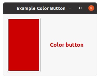
The
gtk-color-button widget is a button which displays the currently selected color and allows to
open a color selection dialog to change the color. It is a suitable widget for selecting a color in a
preference dialog. It implements the
gtk-color-chooser interface.
Example Color Button shows a simple implementation
of a
gtk-color-button widget. The example displays a color button and a label "Color Button". When
clicking the button, a color selection dialog is opened. The dialog is shown in figure
Color Chooser Dialog. To get the currently selected
color you should connect a handler to the signal "color-set" and retrieve the color with the slot access
function
gtk-color-chooser-rgba. To change the color of the label the CSS color is loaded in a CSS
provider with the function
gtk-css-provider-load-from-data and the style context of the label is
updated with the function
gtk-style-context-add-provider.
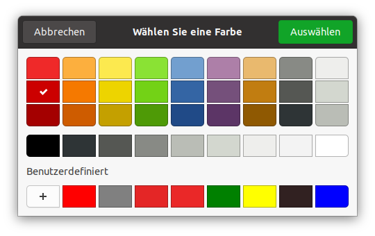
;;;; Example Color Button Label (2021-6-5)
;;;;
;;;; The example shows a color button. The button is initialized with the color
;;;; "Black". The handler for the "color-set" signal changes the color of the
;;;; "Color button" label. To change the color of the label the CSS color is
;;;; loaded in a CSS provider and the style context of the label is updated.

(in-package :gtk-example)

(defun example-color-button-label ()
  (within-main-loop
    (let ((window (make-instance 'gtk-window
                                 :title "Example Color Button"
                                 :border-width 12
                                 :default-width 300
                                 :default-height 200))
          (provider (gtk-css-provider-new))
          (box (make-instance 'gtk-box
                              :orientation :horizontal))
          (label (make-instance 'gtk-label
                                :label "<big><b>Color button</b></big>"
                                :use-markup t))
          (button (make-instance 'gtk-color-button
                                 :rgba (gdk-rgba-parse "Black"))))
      (g-signal-connect window "destroy"
                        (lambda (widget)
                          (declare (ignore widget))
                          (leave-gtk-main)))
      ;; Handler for the "color-set" signal
      (g-signal-connect button "color-set"
         (lambda (widget)
           (let* ((rgba (gtk-color-chooser-rgba widget))
                  (css-label (format nil "label { color : ~a }"
                                         (gdk-rgba-to-string rgba)))
                  (context (gtk-widget-style-context label)))
             ;; Update the color of the label
             (gtk-css-provider-load-from-data provider css-label)
             (gtk-style-context-add-provider context
                                             provider
                                             +gtk-style-provider-priority-user+))))
      ;; Pack and show the widgets
      (gtk-box-pack-start box button)
      (gtk-box-pack-start box label)
      (gtk-container-add window box)
      (gtk-widget-show-all window))))
The
gtk-color-chooser-dialog widget is a dialog for choosing a color. It implements the
gtk-color-chooser interface. The
gtk-color-chooser-widget widget is used in the dialog to provide a
dialog for selecting colors.
By default, the chooser presents a prefined palette of colors, plus a small number of settable custom
colors. The dialog is shown in figure
Color Chooser Dialog It is also possible to select a different color with the single-color editor.
To enter the single-color editing mode, use the context menu of any color of the palette, or use the '+'
button to add a new custom color. The chooser automatically remembers the last selection, as well as
custom colors. To change the initially selected color or to get the selected color use the slot access
function
gtk-color-chooser-rgba.
Example Color Chooser Palette shows how to replace
the default color palette and the default gray palette with the function
gtk-color-chooser-add-palette.
The custom color palettes are shown in figure
Color Chooser Palette. Clicking on the drawing area opens a color chooser dialog to select a new
background color for the drawing area.
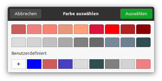
;;;; Example Color Chooser Dialog (2021-6-5)
;;;;
;;;; Clicking on the drawing area opens a color chooser dialog to select a
;;;; background color for the drawing area. The default palettes are replaced
;;;; for this color chooser dialog.

(in-package :gtk-example)

(let ((message "Click to change the background color.")
      (bg-color (gdk-rgba-parse "White"))
      ;; Color palette with 9 Red RGBA colors
      (palette1 (list (gdk-rgba-parse "IndianRed")
                      (gdk-rgba-parse "LightCoral")
                      (gdk-rgba-parse "Salmon")
                      (gdk-rgba-parse "DarkSalmon")
                      (gdk-rgba-parse "LightSalmon")
                      (gdk-rgba-parse "Crimson")
                      (gdk-rgba-parse "Red")
                      (gdk-rgba-parse "FireBrick")
                      (gdk-rgba-parse "DarkRed")))
      ;; Gray palette with 9 gray RGBA colors
      (palette2 (list (gdk-rgba-parse "Gainsboro")
                      (gdk-rgba-parse "LightGray")
                      (gdk-rgba-parse "Silver")
                      (gdk-rgba-parse "DarkGray")
                      (gdk-rgba-parse "Gray")
                      (gdk-rgba-parse "DimGray")
                      (gdk-rgba-parse "LightSlateGray")
                      (gdk-rgba-parse "SlateGray")
                      (gdk-rgba-parse "DarkSlateGray"))))

  (defun example-color-chooser-dialog ()
    (within-main-loop
      (let ((window (make-instance 'gtk-window
                                   :title "Example Color Chooser Dialog"
                                   :default-width 400))
            (area (make-instance 'gtk-drawing-area)))
        (g-signal-connect window "destroy"
                          (lambda (widget)
                            (declare (ignore widget))
                            (leave-gtk-main)))
        ;; Draw the background color and a hint on the drawing area
        (g-signal-connect area "draw"
            (lambda (widget cr)
              (declare (ignore widget))
              (let ((cr (pointer cr))
                    (red (gdk-rgba-red bg-color))
                    (green (gdk-rgba-green bg-color))
                    (blue (gdk-rgba-blue bg-color)))
                    ;; Paint the current color on the drawing area
                    (cairo-set-source-rgb cr red green blue)
                    (cairo-paint cr)
                    ;; Print a hint on the drawing area
                    (cairo-set-source-rgb cr (- 1 red) (- 1 green) (- 1 blue))
                    (cairo-select-font-face cr "Sans")
                    (cairo-set-font-size cr 12)
                    (cairo-move-to cr 12 24)
                    (cairo-show-text cr message)
                    (cairo-destroy cr))))
        ;; Create and run a color chooser dialog to select a background color
        (g-signal-connect area "event"
            (lambda (widget event)
              (declare (ignore widget))
              (when (eq (gdk-event-type event) :button-press)
                (let ((dialog (make-instance 'gtk-color-chooser-dialog
                                             :use-alpha nil)))
                  ;; Add a custom palette to the dialog
                  (gtk-color-chooser-add-palette dialog :vertical 1 palette1)
                  ;; Add a second coustom palette to the dialog
                  (gtk-color-chooser-add-palette dialog :vertical 1 palette2)
                  ;; Set the actual background color for the color chooser
                  (setf (gtk-color-chooser-rgba dialog) bg-color)
                  ;; Run the color chooser dialog
                  (let ((response (gtk-dialog-run dialog)))
                    (when (eq response :ok)
                      ;; Change the background color for the drawing area
                      (setf bg-color (gtk-color-chooser-rgba dialog)))
                      ;; Destroy the color chooser dialog
                      (gtk-widget-destroy dialog))))))
        ;; Set the event mask for the drawing area
        (setf (gtk-widget-events area) :button-press-mask)
        ;; Add the drawing area to the window
        (gtk-container-add window area)
        (gtk-widget-show-all window)))))
11.2. Selecting Files
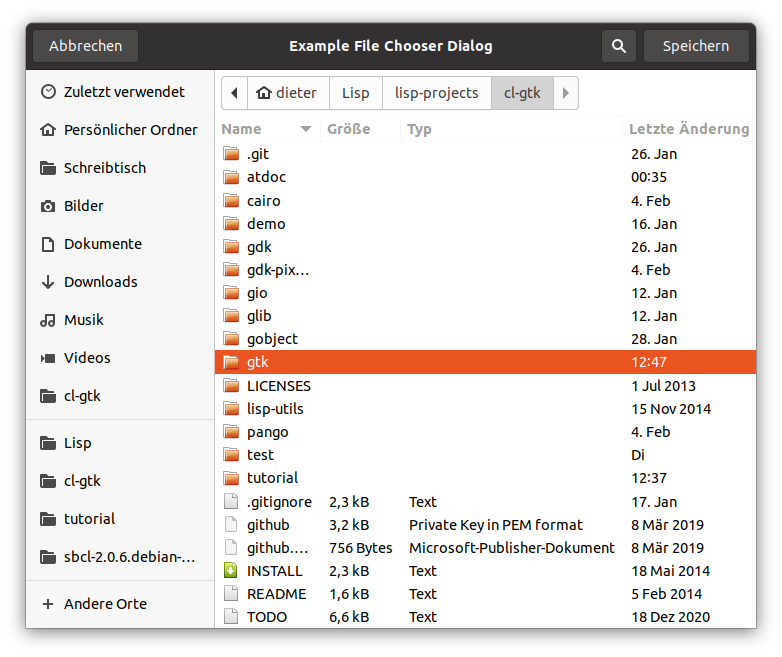
The
gtk-file-chooser interface is an interface that can be implemented by file selection widgets. In
GTK, the main objects that implement this interface are the
gtk-file-chooser-widget,
gtk-file-chooser-dialog, and
gtk-file-chooser-button widgets. You do not need to write an object that
implements the
gtk-file-chooser interface unless you are trying to adapt an existing file selector to
expose a standard programming interface.
The
gtk-file-chooser interface allows for shortcuts to various places in the filesystem. In the
default implementation these are displayed in the left pane. It may be a bit confusing at first that
these shortcuts come from various sources and in various flavours, so lets explain the terminology here:
- Bookmarks
- are created by the user, by dragging folders from the right pane to the left pane, or by using the "Add". Bookmarks can be renamed and deleted by the user.
- Shortcuts
- can be provided by the application or by the underlying filesystem abstraction (e.g. both the gnome-vfs and the Windows filesystems provide "Desktop" shortcuts). Shortcuts cannot be modified by the user.
- Volumes
- are provided by the underlying filesystem abstraction. Volumes are the "roots" of the filesystem.
File Names and Encodings
When the user has finished selecting files in a
gtk-file-chooser object, the program can receive the
selected names either as filenames or as URIs. For URIs, the normal escaping rules are applied if the URI
contains non-ASCII characters. However, filenames are always returned in the character set specified by
the G_FILENAME_ENCODING environment variable. Please see the Glib documentation for more
details about this variable.
Note: You may not be able to directly set the result of the function
gtk-file-chooser-filename as the text of a
gtk-label widget unless you convert it first to UTF-8,
which all GTK widgets expect. You should use the function
g-filename-to-utf8 to convert filenames into
strings that can be passed to GTK widgets.
Adding a Preview Widget
You can add a custom preview widget to a file chooser and then get notification about when the preview
needs to be updated. To install a preview widget, use the function
gtk-file-chooser-preview-widget.
Then, connect to the "update-preview" signal to get notified when you need to update the contents of the
preview.
Your callback should use the function
gtk-file-chooser-preview-filename to see what needs previewing.
Once you have generated the preview for the corresponding file, you must call the function
gtk-file-chooser-preview-widget-active with a boolean flag that indicates whether your callback could
successfully generate a preview.
Adding Extra Widgets
You can add extra widgets to a file chooser to provide options that are not present in the default
design. For example, you can add a toggle button to give the user the option to open a file in read-only
mode. You can use the function
gtk-file-chooser-extra-widget to insert additional widgets in a file
chooser.
Note: If you want to set more than one extra widget in the file chooser, you can
use a container such as a
gtk-box or a
gtk-grid widget and include your widgets in it. Then, set the
container as the whole extra widget.
The
gtk-file-chooser-dialog widget is a dialog box suitable for use with "File/Open" or "File/Save as"
commands. This widget works by putting a
gtk-file-chooser-widget widget inside a
gtk-dialog widget.
It exposes the
gtk-file-chooser interface, so you can use all of the
gtk-file-chooser functions on
the file chooser dialog as well as those for the
gtk-dialog class.
Note that the
gtk-file-chooser-dialog class does not have any methods of its own. Instead, you should
use the functions that work on a
gtk-file-chooser object.
11.2.1. Setting up a file chooser dialog
The
gtk-file-chooser-action enumeration describes whether a
gtk-file-chooser widget is being used
to open existing files or to save to a possibly new file. These are the cases in which you may need to
use a
gtk-file-chooser-dialog widget.
-
To select a file for opening, as for a File/Open command. Use the keyword
:openfor the slot:action, when creating a file chooser dialog. -
To save a file for the first time, as for a File/Save command. Use the keyword
:save, and suggest a name such as "Untitled" with the functiongtk-file-chooser-current-name. -
To save a file under a different name, as for a File/Save As command. Use the keyword
:save, and set the existing filename with the functiongtk-file-chooser-filename. -
To choose a folder instead of a file. Use the keyword
:select-folder.
11.2.2. Response Codes
The
gtk-file-chooser-dialog class inherits from the
gtk-dialog class, so buttons that go in its
action area have response codes such as :accept and :canel. For example, you
could create a file chooser dialog as follows:
(let ((dialog (gtk-file-chooser-dialog-new "Save"
                                           nil
                                           :save
                                           "gtk-save" :accept
                                           "gtk-cancel" :cancel)))
  [...] )
This will create buttons for "Cancel" and "Save" that use stock response identifiers from the
gtk-response-type enumeration. For most dialog boxes you can use your own custom response codes rather
than the ones in the
gtk-response-type enumeration, but the
gtk-file-chooser-dialog widget assumes
that its "accept"-type action, e.g. an "Open" or "Save" button, will have one of the following response
codes :accept, :ok, :yes, or :apply.
This is because the
gtk-file-chooser-dialog widget must intercept responses and switch to folders if
appropriate, rather than letting the dialog terminate - the implementation uses these known response
codes to know which responses can be blocked if appropriate. To summarize, make sure you use a stock
response code when you use the
gtk-file-chooser-dialog widget to ensure proper operation.
Example File Chooser Dialog shows an example for selecting a file for open. The dialog is shown in figure File Chooser Dialog.
(defun create-file-chooser-dialog ()
  (let ((dialog (gtk-file-chooser-dialog-new "Example File Chooser Dialog"
                                             nil
                                             :open
                                             "gtk-open" :accept
                                             "gtk-cancel" :cancel)))
    (when (eq :accept (gtk-dialog-run dialog))
      (format t "Save to file ~A~%"
                (gtk-file-chooser-filename dialog)))
    (gtk-widget-destroy dialog)))
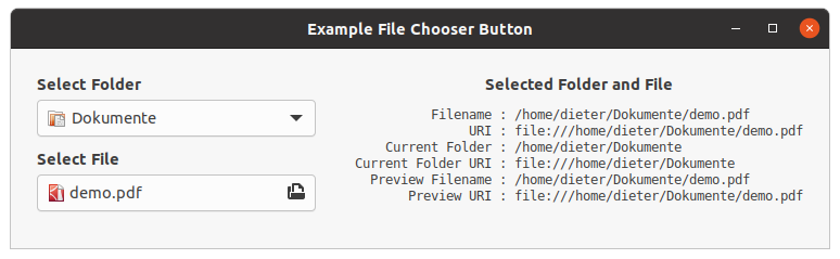
The
gtk-file-chooser-button widget is a widget that lets the user select a file. It implements the
gtk-file-chooser interface. Visually, it is a file name with a button to bring up a
gtk-file-chooser-dialog widget. The user can then use that dialog to change the file associated with
that button.
Example File Chooser Button shows an example for a file chooser button to select a folder and a second file chooser button to select a file. When a folder is selected, the second button is set to that folder accordingly and vice versa. Also, this example shows how to set some filters to allow the user to filter text and images files.
;;;; Example File Chooser Button (2021⁻6-5)

(in-package :gtk-example)

(defun show-file-chooser-info (label chooser)
  (let ((filename (gtk-file-chooser-filename chooser))
        (uri (gtk-file-chooser-uri chooser))
        (current-folder (gtk-file-chooser-current-folder chooser))
        (current-folder-uri (gtk-file-chooser-current-folder-uri chooser))
        (preview-filename (gtk-file-chooser-preview-filename chooser))
        (preview-uri (gtk-file-chooser-preview-uri chooser)))
    (setf (gtk-label-label label)
          (format nil "<small><tt>~{~20@a ~@a~%~}</tt></small>"
                      (list "Filename :" filename
                            "URI :" uri
                            "Current Folder :" current-folder
                            "Current Folder URI :" current-folder-uri
                            "Preview Filename :" preview-filename
                            "Preview URI :" preview-uri)))))

(defun example-file-chooser-button ()
  (within-main-loop
    (let* ((window (make-instance 'gtk-window
                                  :title "Example File Chooser Button"
                                  :type :toplevel
                                  :border-width 24
                                  :default-width 300
                                  :default-height 100))
           (info-box (make-instance 'gtk-box
                                    :orientation :vertical
                                    :valign :start
                                    :spacing 12))
           (info-label (make-instance 'gtk-label
                                      :use-markup t))
           (filter-all (make-instance 'gtk-file-filter))
           (filter-image (make-instance 'gtk-file-filter))
           (filter-text (make-instance 'gtk-file-filter))
           (hbox (make-instance 'gtk-box
                                :orientation :horizontal
                                :expand nil
                                :spacing 36
                                :halign :start))
           (vbox (make-instance 'gtk-box
                                :orientation :vertical
                                :expand nil
                                :spacing 6
                                :valign :start))
           (button-folder (make-instance 'gtk-file-chooser-button
                                         :action :select-folder))
           (button-open (make-instance 'gtk-file-chooser-button
                                       :action :open)))
      (g-signal-connect window "destroy"
                        (lambda (widget)
                          (declare (ignore widget))
                          (leave-gtk-main)))

      (g-signal-connect button-folder "file-set"
                        (lambda (chooser)
                          (show-file-chooser-info info-label chooser)
                          (setf (gtk-file-chooser-filename button-open)
                                (gtk-file-chooser-filename chooser))))

      (g-signal-connect button-open "file-set"
                        (lambda (chooser)
                          (show-file-chooser-info info-label chooser)
                          (setf (gtk-file-chooser-filename button-folder)
                                (gtk-file-chooser-current-folder chooser))))
      ;; Set some filters on the file chooser
      (setf (gtk-file-filter-name filter-all) "All Files")
      (gtk-file-filter-add-pattern filter-all "*")
      (gtk-file-chooser-add-filter button-open filter-all)
      ;; Filter for Image Files
      (setf (gtk-file-filter-name filter-image) "Image Files")
      (gtk-file-filter-add-mime-type filter-image "image/*")
      (gtk-file-chooser-add-filter button-open filter-image)
      ;; Filter for Text Files
      (setf (gtk-file-filter-name filter-text) "Text Files")
      (gtk-file-filter-add-mime-type filter-text "text/*")
      (gtk-file-chooser-add-filter button-open filter-text)
      ;; Pack and show the widgets
      (gtk-box-pack-start vbox (make-instance 'gtk-label
                                             :label "<b>Select Folder</b>"
                                             :use-markup t
                                             :halign :start))
      (gtk-box-pack-start vbox button-folder)
      (gtk-box-pack-start vbox (make-instance 'gtk-label
                                             :label "<b>Select File</b>"
                                             :use-markup t
                                             :margin-top 6
                                             :halign :start))
      (gtk-box-pack-start vbox button-open)
      (gtk-box-pack-start hbox vbox)
      (gtk-box-pack-start info-box
                          (make-instance 'gtk-label
                                         :use-markup t
                                         :label
                                         "<b>Selected Folder and File</b>"))
      (gtk-box-pack-start info-box info-label)
      (gtk-box-pack-start hbox info-box)
      (gtk-container-add window hbox)
      (gtk-widget-show-all window))))
11.3. Selecting Fonts
The
gtk-font-chooser-widget widget lists the available fonts, styles and sizes, allowing the user to
select a font. It is used in the
gtk-font-chooser-dialog widget to provide a dialog box for selecting
fonts. It implements the
gtk-font-chooser interface.
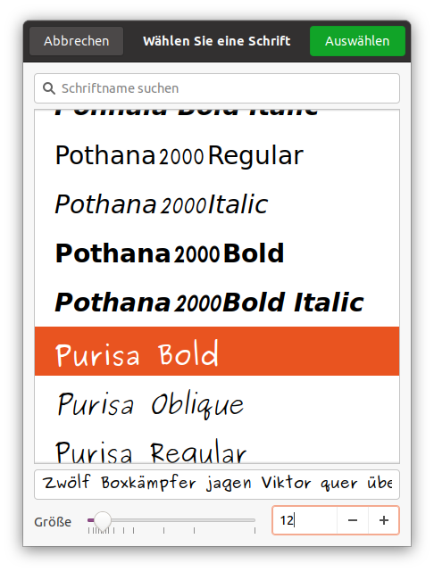
To set or get the font which is initially selected, use the functions
gtk-font-chooser-font or
gtk-font-chooser-font-desc. To change the text which is shown in the preview area, use the function
gtk-font-chooser-preview-text.
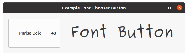
The
gtk-font-button widget is a button which displays the currently selected font and allows to open a
font chooser dialog to change the font. It is a suitable widget for selecting a font in a preference
dialog. Example 11.5, “Font Button with a filter to select fonts” shows how to retrieve the Pango font description from the
font chooser dialog with the function
gtk-font-chooser-font-desc and to use it to change the font of a
label with CSS.
;;;; Example Font Button Label (2021-6-5)

(in-package :gtk-example)

(defun font-filter (family face)
  (declare (ignore face))
  (member (pango-font-family-name family)
          '("Purisa" "Sans" "Serif" "Times New Roman")
          :test #'equal))

(defun example-font-button-label ()
  (within-main-loop
    (let ((window (make-instance 'gtk-window
                                 :title "Example Font Chooser Button"
                                 :type :toplevel
                                 :border-width 18
                                 :default-width 300
                                 :default-height 100))
          (provider (gtk-css-provider-new))
          (box (make-instance 'gtk-box
                              :orientation :horizontal
                              :spacing 12))
          (label (make-instance 'gtk-label
                                :label "Font Button"
                                :use-markup t))
          (button (make-instance 'gtk-font-button)))
      (g-signal-connect window "destroy"
                        (lambda (widget)
                          (declare (ignore widget))
                          (leave-gtk-main)))
      (g-signal-connect button "font-set"
         (lambda (chooser)
           (let* (;; Get the font description
                  (desc (gtk-font-chooser-font-desc chooser))
                  ;; Get font informations from the font description
                  (family (pango-font-description-family desc))
                  (size (pango-pixels (pango-font-description-size desc)))
                  (style (pango-font-description-style desc))
                  (weight (pango-font-description-weight desc))
                  (variant (pango-font-description-variant desc))
                  (stretch (pango-font-description-stretch desc))
                  ;; Write the CSS string
                  (css-label (format nil "label { font-family : ~a; ~
                                                  font-weight : ~a; ~
                                                  font-style : ~a; ~
                                                  font-variant : ~a; ~
                                                  font-stretch : ~a; ~
                                                  font-size : ~apx; }"
                                         family
                                         weight
                                         style
                                         variant
                                         stretch
                                         size))
                  ;; Get the style of the label
                  (context (gtk-widget-style-context label)))
             ;; Update the font of the label
             (gtk-css-provider-load-from-data provider css-label)
             (gtk-style-context-add-provider context
                                             provider
                                             +gtk-style-provider-priority-user+))))
      ;; Set a filter function to select fonts for the font chooser
      (gtk-font-chooser-set-filter-func button #'font-filter)
      ;; Pack the widgets
      (gtk-box-pack-start box button)
      (gtk-box-pack-start box label)
      (gtk-container-add window box)
      ;; Show the widgets
      (gtk-widget-show-all window))))
Chapter 12. Menus and Toolbars
This chapter is derived from Stewart Weiss's tutorial Menus and Toolbars in GTK. The original code snippets have been translated to Lisp.
GUI applications have menus and toolbars. They are an important part of how the user interacts with the application. Although menus and toolbars look like different things, they are both containers for widgets that, when clicked, result in the performance of actions. Menus contain menu items, and toolbars usually contain buttons. Although toolbars are actually more general than this in that they can contain arbitrary widgets, they are usually used to provide quick access to frequently used menu items.
12.1. Menus
GTK knows several classes related to the creation of menus:
gtk-menu-shell-
The
gtk-menu-shellclass is the abstract base class used to derive thegtk-menuandgtk-menu-barsubclasses. Agtk-menu-shellwidget is a container ofgtk-menu-itemwidgets arranged in a list which can be navigated, selected, and activated by the user to perform application functions. Agtk-menu-itemwidget can have a submenu associated with it, allowing for nested hierarchical menus. gtk-menu-bar-
The
gtk-menu-barclass is a subclass of thegtk-menu-shellclass which contains one or more menu items. The result is a standard menu bar which can hold many menu items. gtk-menu-
The
gtk-menuclass is agtk-menu-shellclass that implements a drop down menu consisting of a list ofgtk-menu-itemwidgets which can be navigated and activated by the user to perform application functions. Agtk-menuwidget is most commonly dropped down by activating agtk-menu-itemwidget in agtk-menu-barwidget or popped up by activating agtk-menu-itemwidget in anothergtk-menuwidget. Applications can display agtk-menuwidget as a pop-up menu by calling the functiongtk-menu-popup. gtk-menu-item-
The
gtk-menu-itemwidget and the derived widgets are the only valid childs for menus. Their function is to correctly handle highlighting, alignment, events and submenus. As it derives fromgtk-binit can hold any valid child widget, although only a few are really useful. gtk-check-menu-item-
A
gtk-check-menu-itemwidget is a menu item that maintains the state of a boolean value in addition to agtk-menu-itemwidget usual role in activating application code. A check box indicating the state of the boolean value is displayed at the left side of thegtk-menu-itemwidget. Activating thegtk-menu-itemwidget toggles the value. gtk-image-menu-item-
A
gtk-image-menu-itemwidget is a menu item which has an icon next to the text label. Note that the user can disable display of menu icons, so make sure to still fill in the text label. gtk-separator-menu-item-
The
gtk-separator-menu-itemwidget is a separator used to group items within a menu. It displays a horizontal line with a shadow to make it appear sunken into the interface.
12.1.1. Principles of Menus
Menu creation and menu handling follows the following:
-
Menus of the
gtk-menuclass and menubars of thegtk-menu-barclass are containers. They are dervid from the same abstract base classgtk-menu-shell. - The only thing that can be put into a menu or a menubar is a menu item.
- Menus can be attached to menu items so that when the item is activated, the menu drops down or pops up. If a menu item is a child of a menubar, the menu attached to it drops down. If it is a child of a menu, the menu attached to it pops up.
- Menu items are the only things that can be activated, and these emit an "activate" signal, which must be connected to a callback to handle the user's clicks on that item. Although they emit other signals, this is the normally used.
In essence, menus form a recursively defined hierarchy. The root of this hierarchy is always a menubar. Usually menubars are horizontal, rectangular regions at the top of a window, but they can be vertical as well, and can be placed anywhere. Those labels that can be seen in the menubar, such as "File", "Edit" or "Help", are menu items. Menu items can have menus attached to them, so that when they get clicked, the menu appears. Each of the menus attached to a menu item may have menu items that have menus attached to them, and these may have items that have menus attached to them, and so on.
Use the term submenu refers to a menu that is attached to a menu item within another menu, but there is
no special class of submenus; a submenu is just a menu. Because a menu item always exists as a child of
either a menu or a menubar, the menu that is attached to a menu item is always a submenu of something
else. This should make it easy to remember the fact that there is but a single way to attach a menu to
a menu item with the function
gtk-menu-item-submenu. The point is that the attached menu is of
necessity a submenu of something else.
12.1.2. Creating Menus by Hand
This method is called "by hand" because the menu is constructed in the same way that a typical house is constructed, by assembling the pieces and attaching them to each other, one by one. The outline of the steps that must be taken is:
- Create the menubar.
- Create the menu items that will be packed into the menubar.
- Pack the menu items into the menubar.
- Create the menus that the menu items will activate.
- Attach these submenus to the menu items.
- For each submenu (a) create the menu items that it will contain, and (b) pack these menu items into the submenu.
These steps are listed in a top-down sequence, but it is conceivable to carry them out in many different permutations.
An empty menubar is created with the function
gtk-menu-bar-new or the call
(make-instance 'gtk-menu-bar). The menubar itself should be added to its parent container
with an appropriate packing function. Typically the menubar is put at the top of the content area just
below the toplevel windows's title bar, so the usual sequence is
(let ((vbox (gtk-box-new :vertical 0)))
  ...
  (let ((menu-bar (gtk-menu-bar-new)))
    (gtk-container-add vbox menu-bar))
  ...
  (gtk-container-add window vbox)
  ... )
For each menu in the menubar, a separate menu item is needed. Regular menu items can be created with the
functions
gtk-menu-item-new,
gtk-menu-item-new-with-label,
gtk-menu-item-new-with-mnemonic, or
with the appropriate calls of the function make-instance.
The first of these creates a menu item with no label; later the function
gtk-menu-item-label can be
used to create a label for it. The second and third functions create menu items with either a plain label
or with a label and a mnemonic, just like is done with buttons. There are four subclasses of menu items,
among which are image menu items, which can contain an image instead of or in addition to a label.
There are three different ways to pack menu items into menubars and menus; they are all methods of the
gtk-menu-shell base class:
gtk-menu-shell-append,
gtk-menu-shell-prepend, and
gtk-menu-shell-insert.
The second argument in all three is the menu item to be put into the container. The differences are probably obvious. The append method adds the menu item to the end of the list of those already in the menu shell, whereas the prepend method inserts it before all of the items already in it. The insert method takes an integer position as the third argument, which is the position in the item list where child is added. Positions are numbered from 0 to (n-1). If an item is put into position k, then all items currently in the list at positions k through (n-1) are shifted downward in the list to make room for the new item.
The following code fragment creates a few labeled menu items, and packs them into the menubar in left-to-right order:
(let ((file-item (gtk-menu-item-new-with-label "File"))
      (view-item (gtk-menu-item-new-with-label "View"))
      (tools-item (gtk-menu-item-new-with-label "Tools"))
      (help-item (gtk-menu-item-new-with-label "Help")))
  (gtk-menu-shell-append menu-bar file-item)
  (gtk-menu-shell-append menu-bar view-item)
  (gtk-menu-shell-append menu-bar tools-item)
  (gtk-menu-shell-append menu-bar help-item)
  ... )
The next step is to create the menus that will be dropped down when these menu items are activated.
Menus are created with the function
gtk-menu-new.
For the above menu items, four menus are created and attached to the menu items with the function
gtk-menu-item-submenu:
(let ((file-menu (gtk-menu-new))
      (view-menu (gtk-menu-new))
      (tools-menu (gtk-menu-new))
      (help-menu (gtk-menu-new)))
  (setf (gtk-menu-item-submenu file-item) file-menu)
  (setf (gtk-menu-item-submenu view-item) view-menu)
  (setf (gtk-menu-item-submenu tools-item) tools-menu)
  (setf (gtk-menu-item-submenu help-item) help-menu)
  ... )
The next step is to create the menu items to populate each of the menus, and add them to these menus.
In the example, the "File" menu will have an "Open" item, a "Close" item, and an "Exit" item. Between
the "Close" item and the "Exit" item a separator item is added. Separators are members of the
gtk-separator-menu-item class and are created with the function
gtk-separator-menu-item-new or the
call (make-instance 'gtk-separator).
The "File" menus's items will be simple labeled items. The code to create them and pack them is:
 (let ((open-item (gtk-menu-item-new-with-label "Open"))
       (close-item (gtk-menu-item-new-with-label "Close"))
       (exit-item (gtk-menu-item-new-with-label "Exit")))
   (gtk-menu-shell-append file-menu open-item)
   (gtk-menu-shell-append file-menu close-item)
   (gtk-menu-shell-append file-menu (gtk-separator-menu-item-new))
   (gtk-menu-shell-append file-menu exit-item)
   ... )
To create a menu that contains submenus does not involve anything other than descending a level in the menu hierarchy and repeating these steps. To illustrate, a "Help" menu is designed so that it has two items, one of which is a menu item that, when activated, pops up a submenu. The first two steps are to create the two menu items and pack the into the "Help" menu:
(let ((query-item (gtk-menu-item-new-with-label "What's this?"))
      (about-help-item
        (gtk-menu-item-new-with-label "About this program")))
  (gtk-menu-shell-append help-menu query-item)
  (gtk-menu-shell-append help-menu (gtk-separator-menu-item-new))
  (gtk-menu-shell-append help-menu about-help-item)
  ... )
The next step is to create a submenu and attach it to the about-help-item:
(let ((about-help-menu (gtk-menu-new)))
  (setf (gtk-menu-item-submenu about-help-item) about-help-menu)
  ... )
The last step is to create a submenu and attach it to the about-help-menu:
(let ((about-tool-item (gtk-menu-item-new-with-label "About Tools"))
      (about-stuff-item
        (gtk-menu-item-new-with-label "About Other Stuff")))
  (gtk-menu-shell-append about-help-menu about-tool-item)
  (gtk-menu-shell-append about-help-menu about-stuff-item)
  ... )
The preceding steps create the menu items, but they are not yet connected to the "activate" signal. Menu items that have a submenu do not need to be connected to the "activate" signal; GTK arranges for that signal to open the submenu. But the others need to be connected. For example, the "Exit" menu item is connected to a callback to quit the application with
(g-signal-connect exit-item "activate"
                  (lambda (widget)
                    (declare (ignore widget))
                    (gtk-widget-destroy window))))
The following Lisp code shows a complete example for creating menus by hand. It includes all code snippets shown above. The output is shown in figure Figure 12.1, “Creating Menus by Hand”.
12.1.3. Pop-Up Menus for Widgets
The same techniques for creating menus rooted in a menubar applies to the creation of pop-up menus for
other widgets. For example, to create a button, which when the mouse button is pressed on it, would pop
up a menu instead of taking some action, first the menu is created using the instructions above. Then a
mouse button press event signal is connected to a callback that popped up the menu, using the function
g-signal-connect. To illustrate, a small pop-up
menu is created and two menu items are packed into it.
(let ((popup-menu (gtk-menu-new))
      (big-item (gtk-menu-item-new-with-label "Larger"))
      (small-item (gtk-menu-item-new-with-label "Smaller")))
  (gtk-menu-shell-append popup-menu big-item)
  (gtk-menu-shell-append popup-menu small-item)
  ... )
Next a callback is connected to the "button-press-event" signal. The callback will be responsible for
popping up the menu with the function
gtk-menu-popup.
This function displays a menu and makes it available for selection. It exists precisely for the purpose
of displaying context sensitive menus.
The first argument of the function is the menu to pop-up. All other arguments are keyword arguments
with the keywords :parent-menu-shell, :parent-menu-item,
:position-func, :button, and :activate-time. For normal use the
default values for most of the arguments can be accepted.
The :button parameter should be the mouse button pressed to initiate the menu popup. If
the menu popup was initiated by something other than a mouse press, such as a mouse button release or a
key-press, button should be 0.
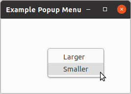
The API documentation states that the :activate-time parameter is used to conflict-resolve
initiation of concurrent requests for mouse/keyboard grab requests. To function properly, this needs to
be the time stamp of the user event that caused the initiation of the popup.
Putting this together, the callback should be:
(g-signal-connect button "button-press-event"
   (lambda (widget event)
     (declare (ignore widget))
     (gtk-menu-popup popup-menu
                     :button (gdk-event-button-button event)
                     :activate-time (gdk-event-button-time event))
     t))
The following code shows a complete example for creating a pop-up menu. It includes the code shown above. The output is shown in figure Menu Popup.
12.2. Toolbar Widget
Toolbars provide quick access to commonly used actions. They are containers that should be populated with
instances of the
gtk-tool-item class. Usually you will insert toolbar buttons into a toolbar. Toolbar
buttons belong to the
gtk-tool-button class, which is a sub class of the
gtk-tool-item class. There
are also two subclasses of the tool button class:
gtk-menu-tool-button and
gtk-toggle-tool-button, which has a
gtk-radio-tool-button subclass.
A toolbar is created with only a single function
gtk-toolbar-new. Once it is created, tool items can be
inserted into it, using the function
gtk-toolbar-insert.
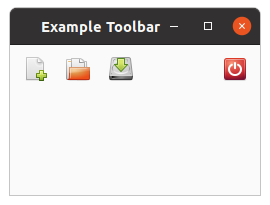
This inserts the tool item at position pos. If pos is 0 the item is prepended
to the start of the toolbar. If pos is negative, the item is appended to the end of the
toolbar. Therefore, if items are inserted successively into a toolbar passing -1 as pos,
they will appear in the toolbar in left to right order.
Although tool items can be created with the function
gtk-tool-item-new; we will have little use for this
function, as we will be putting only buttons and separators into our toolbars. Each of these has its own
specialized constructors. To create a toolbar button, you can use any of two different functions:
gtk-tool-button-new or
gtk-tool-button-new-from-stock.
The first function requires that you supply a custom icon and label. The second lets you pick a stock ID. You can use any stock item from the documentation. As we have not yet covered how to create icons, we will stay with the second method in the examples that follow. The following code fragment creates a toolbar and a few toolbar buttons using stock items and puts them into a toolbar.
(let ((toolbar (gtk-toolbar-new))
      (new-button (gtk-tool-button-new-from-stock "gtk-new"))
      (open-button (gtk-tool-button-new-from-stock "gtk-open"))
      (save-button (gtk-tool-button-new-from-stock "gtk-save"))
      (quit-button (gtk-tool-button-new-from-stock "gtk-quit"))
      (separator (make-instance 'gtk-separator-tool-item
                                :draw nil)))
  (gtk-toolbar-insert toolbar new-button -1)
  (gtk-toolbar-insert toolbar open-button -1)
  (gtk-toolbar-insert toolbar save-button -1)
  (gtk-toolbar-insert toolbar separator -1)
  (gtk-toolbar-insert toolbar quit-button -1)
  ... )
You can create separator items using the function
gtk-separator-tool-item-new. This creates a vertical
separator in a horizontal toolbar. If for some reason you want the buttons to the right of the separator
to be grouped at the far end of the toolbar, you can use the separator like a "spring" to push them to
that end by setting its "expand" property to true and its "draw" property to
false, using the sequence
(let (...
      (separator (gtk-separator-tool-item-new))
      ...)
  (setf (gtk-separator-tool-item-draw separator) nil)
  (setf (gtk-tool-item-expand separator) t)
  ... )
The "expand" property is inherited from the
gtk-tool-item class whereas the "draw" property is specific
to the separator. Because "draw" is a property of the
gtk-separator-tool-item class, we can save one
function call, when using the function make-instance to create a
gtk-separator-tool-item
widget.
(let (...
      (separator (make-instance 'gtk-separator-tool-item
                                :draw nil))
      ...)
  (setf (gtk-tool-item-expand separator) t)
  ... )
Toolbar buttons are buttons, not items, and therefore they emit a "clicked" signal. To respond to button clicks, connect a callback to the button as if it were an ordinary button, such as
(g-signal-connect quit-button "clicked"
                  (lambda (widget)
                    (declare (ignore widget))
                    (gtk-widget-destroy window)))
A complete program showing how to create a simple toolbar using this manual method is shown in the following example. The output is shown in Figure 12.3, “Creating a Toolbar”.
;;;; Example Toolbar by hand (2021-6-5)

(in-package :gtk-example)

(defun example-toolbar-by-hand ()
  (within-main-loop
    (let ((window (make-instance 'gtk-window
                                 :type :toplevel
                                 :default-width 250
                                 :default-height 150
                                 :title "Example Toolbar"))
          ;; A vbox to put a menu and a button in
          (vbox (gtk-box-new :vertical 0)))
      (let ((toolbar (gtk-toolbar-new))
            (new-button (gtk-tool-button-new-from-stock "gtk-new"))
            (open-button (gtk-tool-button-new-from-stock "gtk-open"))
            (save-button (gtk-tool-button-new-from-stock "gtk-save"))
            (quit-button (gtk-tool-button-new-from-stock "gtk-quit"))
            (separator (make-instance 'gtk-separator-tool-item
                                      :draw nil)))
        (gtk-toolbar-insert toolbar new-button -1)
        (gtk-toolbar-insert toolbar open-button -1)
        (gtk-toolbar-insert toolbar save-button -1)
        (gtk-toolbar-insert toolbar separator -1)
        (gtk-toolbar-insert toolbar quit-button -1)
        (setf (gtk-tool-item-expand separator) t)
        (gtk-box-pack-start vbox toolbar :fill nil :expand nil :padding 3)
        ;; Connect a signal handler to the quit button
        (g-signal-connect quit-button "clicked"
                          (lambda (widget)
                            (declare (ignore widget))
                            (gtk-widget-destroy window))))
      (g-signal-connect window "destroy"
                        (lambda (widget)
                          (declare (ignore widget))
                          (leave-gtk-main)))
      (gtk-container-add window vbox)
      (gtk-widget-show-all window))))
Chapter 13. Miscellaneous Widgets
13.1. Calendar
The
gtk-calendar widget displays a Gregorian calendar, one month at a time. It can be created with the
function
gtk-calendar-new.
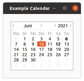
The month and year currently displayed can be altered with the function
gtk-calendar-select-month. The
exact day can be selected from the displayed month using the function
gtk-calendar-select-day.
To place a visual marker on a particular day, use the function
gtk-calendar-mark-day and to remove the
marker the function
gtk-calendar-unmark-day. Alternative, all marks can be cleared with the function
gtk-calendar-clear-marks.
The way in which the calendar itself is displayed can be altered using the function
gtk-calendar-date.
The selected date can be retrieved from a
gtk-calendar widget using the function
gtk-calendar-date.
Users should be aware that, although the Gregorian calendar is the legal calendar in most countries, it was adopted progressively between 1582 and 1929. Display before these dates is likely to be historically incorrect.
Example 13.1, “Calendar” shows a brief example of the calendar widget. It is possible to set a
special function with the function
gtk-calendar-set-detail-func. The example uses this to show a tooltip
whenever the 12th day of a month is selected.
;;;; Calendar Widget (2021-6-10)

(in-package :gtk-example)

(defun calendar-detail (calendar year month day)
  (declare (ignore calendar year month))
  (when (= day 12)
    "This day has a tooltip."))

(defun example-calendar ()
  (within-main-loop
    (let ((window (make-instance 'gtk-window
                                 :title "Example Calendar"
                                 :type :toplevel
                                 :border-width 24
                                 :default-width 250
                                 :default-height 100))
          (frame (make-instance 'gtk-frame))
          (calendar (make-instance 'gtk-calendar
                                   :show-details nil)))
      (g-signal-connect window "destroy"
                        (lambda (widget)
                          (declare (ignore widget))
                          (leave-gtk-main)))
      ;; Connect a signal handler to print the selected day
      (g-signal-connect calendar "day-selected"
                        (lambda (widget)
                          (declare (ignore widget))
                          (format t "selected: year ~A month ~A day ~A~%"
                                  (gtk-calendar-year calendar)
                                  (gtk-calendar-month calendar)
                                  (gtk-calendar-day calendar))))
      ;; Install a calendar detail function
      (gtk-calendar-set-detail-func calendar #'calendar-detail)
      ;; Mark a day
      (gtk-calendar-mark-day calendar 6)
      (gtk-container-add frame calendar)
      (gtk-container-add window frame)
      (gtk-widget-show-all window))))
13.2. Event Box
Some GTK widgets do not have associated X windows, so these widgets just draw on their parents. Because
of this, they cannot receive events and if they are incorrectly sized, they do not clip so you can get
messy overwriting. If you require more from these widgets, the
gtk-event-box widget is for you.
At first glance, the
gtk-event-box widget might appear to be totally useless. It draws nothing on the
screen and responds to no events. However, it does serve a function - it provides an X window for its
child widget. This is important as many GTK widgets do not have an associated X window. Not having an X
window saves memory and improves performance, but also has some drawbacks. A widget without an X window
cannot receive events, and does not perform any clipping on its contents. Although the name
gtk-event-box emphasizes the event-handling function, the widget can also be used for clipping.
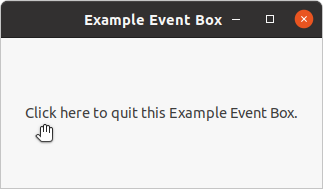
To create a new
gtk-event-box widget, use the call (make-instance 'gtk-event-box) or the
function
gtk-event-box-new. A child widget can then be added to this event box with the function
gtk-container-add. With the function
gtk-widget-events the events are set for the event box which can
be connected to a signal handler. To create the resources associated with an event box, the function
gtk-widget-realize has to be called explicitly for the
gtk-event-box widget.
Example 13.2, “Event Box” demonstrates both uses of a
gtk-event-box widget - a label is
created that is clipped to a small box, and set up so that a mouse-click on the label causes the program
to exit. Resizing the window reveals varying amounts of the label.
In addition, Example 13.2, “Event Box” shows how to change the cursor over a window. Every
widget has an associated
gdk-window GDK window, which can be get with the function
gtk-widget-window.
The function
gdk-window-cursor sets a cursor for this
gdk-window GDK window. A new cursor is created
with the function
gdk-cursor-new-from-name. The function takes two arguments. The first argument is the
gdk-display object for which the cursor will be created. The second argument is a string with the name
of the cursor. Look at the documentation of the function
gdk-cursor-new-from-name for available cursor
names. In example Example 13.2, “Event Box” the cursor with the name "pointer" is choosen. This
cursor is associated to the
gdk-window GDK window with the function
gdk-window-cursor.
;;;; Example Event Box (2021-6-11)
;;;;
;;;; Example Event Box demonstrates both uses of a GtkEventBox widget - a label
;;;; is created that is clipped to a small box, and set up so that a mouse-click
;;;; on the label causes the program to exit. Resizing the window reveals
;;;; varying amounts of the label.
;;;;
;;;; In addition, example Event Box shows how to change the cursor over a
;;;; window. Every widget has an associated window of type GdkWindow, which can
;;;; be get with the function gtk-widget-window. The function gdk-window-cursor
;;;; sets a cursor for this GdkWindow. A new cursor is created with the function
;;;; gdk-cursor-new-from-name. The function takes two arguments. The first
;;;; argument is the GdkDisplay object for which the cursor will be created.
;;;; The second argument is a string with the name of the cursor. Look at the
;;;; documentation of the function gdk-cursor-new-from-name for available cursor
;;;; names. In example Event Box the cursor with the name "pointer" is chosen.
;;;; This cursor is associated to the GdkWindow with the function
;;;; gdk-window-cursor.

(in-package :gtk-example)

(defun example-event-box ()
  (within-main-loop
    (let ((window (make-instance 'gtk-window
                                 :type :toplevel
                                 :title "Example Event Box"
                                 :default-height 150
                                 :border-width 24))
          (eventbox (make-instance 'gtk-event-box))
          (label (make-instance 'gtk-label
                                :ellipsize :end
                                :label
                                "Click here to quit this Example Event Box.")))
      (g-signal-connect window "destroy"
                        (lambda (widget)
                          (declare (ignore widget))
                          (leave-gtk-main)))
      ;; Set the available events for the event box
      (setf (gtk-widget-events eventbox) :button-press-mask)
      ;; Connect a signal handler to the eventbox
      (g-signal-connect eventbox "button-press-event"
                        (lambda (widget event)
                          (declare (ignore widget event))
                          (gtk-widget-destroy window)))
      ;; Add the label to the event box and the event box to the window
      (gtk-container-add eventbox label)
      (gtk-container-add window eventbox)
      ;; Realize the event box
      (gtk-widget-realize eventbox)
      ;; Set a new cursor for the event box
      (setf (gdk-window-cursor (gtk-widget-window eventbox))
            (gdk-cursor-new-from-name (gdk-display-default) "pointer"))
      ;; Show the window
      (gtk-widget-show-all window))))
13.3. Text Entries
The entry widget allows text to be typed and displayed in a single line text box. The text may be set with function calls that allow new text to replace, prepend or append the current contents of the entry widget.
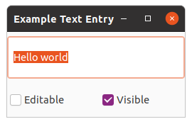
Create a new entry widget with the function
gtk-entry-new. The function
gtk-entry-text alters the text
which is currently within the entry widget. The function
gtk-entry-text sets the contents of the entry
widget, replacing the current contents. Note that the class entry implements the editable interface
which contains some more functions for manipulating the contents.
The contents of the entry can be retrieved by using a call to the function
gtk-entry-text. This is
useful in the callback functions described below.
If we do not want the contents of the entry to be changed by someone typing into it, we can change its
editable state with the function
gtk-editable-editable. This function allows us to toggle the editable
state of the entry widget by passing in a true or false value
for the editable argument.
If we are using the entry where we do not want the text entered to be visible, for example when a
password is being entered, we can use the function
gtk-entry-visibility, which also takes a boolean
flag.
A region of the text may be set as selected by using the function
gtk-editable-select-region. This would
most often be used after setting some default text in an Entry, making it easy for the user to remove it.
If we want to catch when the user has entered text, we can connect to the activate or changed signal. Activate is raised when the user hits the enter key within the entry widget. Changed is raised when the text changes at all, e.g., for every character entered or removed.
Example 13.3, “Text Entry” is an example of using an entry widget.
;;;; Example Text Entry (2021-6-11)

(in-package :gtk-example)

(defun example-text-entry ()
  (within-main-loop
    (let* ((window (make-instance 'gtk-window
                                  :type :toplevel
                                  :title "Example Text Entry"
                                  :default-width 250
                                  :default-height 120))
           (vbox (make-instance 'gtk-box :orientation :vertical))
           (hbox (make-instance 'gtk-box :orientation :horizontal))
           (entry (make-instance 'gtk-entry
                                 :text "Hello"
                                 :max-length 50))
           (pos (gtk-entry-text-length entry)))
      (g-signal-connect window "destroy"
                        (lambda (widget)
                          (declare (ignore widget))
                          (leave-gtk-main)))
      (g-signal-connect entry "activate"
                        (lambda (widget)
                          (declare (ignore widget))
                          (format t "Entry contents: ~A"
                                  (gtk-entry-text entry))))
      (gtk-editable-insert-text entry " world" pos)
      (gtk-editable-select-region entry 0 (gtk-entry-text-length entry))
      (gtk-box-pack-start vbox entry :expand t :fill t :padding 0)
      (let ((check (gtk-check-button-new-with-label "Editable")))
        (g-signal-connect check "toggled"
           (lambda (widget)
             (declare (ignore widget))
             (setf (gtk-editable-editable entry)
                   (gtk-toggle-button-active check))))
        (gtk-box-pack-start hbox check))
      (let ((check (gtk-check-button-new-with-label "Visible")))
        (setf (gtk-toggle-button-active check) t)
        (g-signal-connect check "toggled"
           (lambda (widget)
             (declare (ignore widget))
             (setf (gtk-entry-visibility entry)
                   (gtk-toggle-button-active check))))
        (gtk-box-pack-start hbox check))
      (gtk-box-pack-start vbox hbox)
      (gtk-container-add window vbox)
      (gtk-widget-show-all window))))
13.4. Spin Buttons
The spin button widget is generally used to allow the user to select a value from a range of numeric values. It consists of a text entry box with up and down arrow buttons attached to the side. Selecting one of the buttons causes the value to "spin" up and down the range of possible values. The entry box may also be edited directly to enter a specific value.
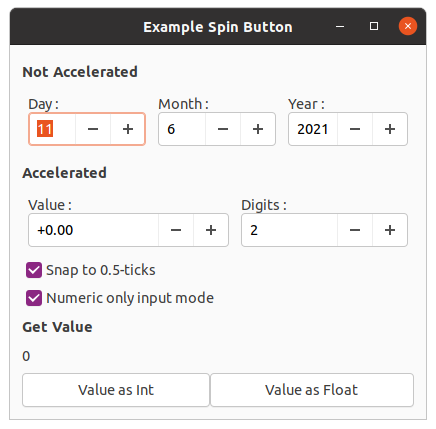
The spin button allows the value to have zero or a number of decimal places and to be incremented or decremented in configurable steps. The action of holding down one of the buttons optionally results in an acceleration of change in the value according to how long it is depressed.
The spin button uses an adjustment object to hold information about the range of values that the spin button can take. This makes for a powerful spin button widget.
Recall that an adjustment object is created with the function
gtk-adjustment-new, which has the
arguments value, lower, step-increment,
page-increment, and page-size. These properties of an adjustment are used by
the spin button in the following way:
| Value | Description |
|---|---|
value |
Initial value for the spin button |
lower |
Lower range value |
upper |
Upper range value |
step-increment |
Value to increment/decrement when pressing mouse button 1 on a button |
page-increment |
Value to increment/decrement when pressing mouse button 2 on a button |
page-size |
Unused |
Additionally, mouse button 3 can be used to jump directly to the upper or lower values when used to
select one of the buttons. A spin button is created with the function
gtk-spin-button-new, which as the
arguments adjustment, climb-rate, and digits.
The climb-rate argument take a value between 0.0 and 1.0 and indicates the amount of
acceleration that the spin button has. The digits argument specifies the number of decimal
places to which the value will be displayed.
A spin button can be reconfigured after creation using the function
gtk-spin-button-configure. The first
argument specifies the spin button that is to be reconfigured. The other arguments are as specified for
the function
gtk-spin-button-new.
The adjustment can be set and retrieved independently using the function
gtk-spin-button-adjustment.
The number of decimal places can also be altered using the function
gtk-spin-button-digits and the value
that a spin button is currently displaying can be changed using the function
gtk-spin-button-value.
The current value of a spin button can be retrieved as either a floating point or integer value with the
functions
gtk-spin-button-value and
gtk-spin-button-value-as-int.
If you want to alter the value of a spin button relative to its current value, then the function
gtk-spin-button-spin can be used, which has the three arguments spin-button,
direction, and increment. The argument direction is of the
enumeration type GtkSpinType, which can take one of the values shown in
Table 13.2, “Values of the GtkSpinType enumeration”.
| Value | Description |
|---|---|
:step-forward |
Increment by the adjustments step increment. |
:backward |
Decrement by the adjustments step increment. |
:forward |
Increment by the adjustments page increment. |
:page-backward |
Decrement by the adjustments page increment. |
:home |
Go to the adjustments lower bound. |
:end |
Go to the adjustments upper bound. |
:user-defined |
Change by a specified amount. |
:step-forward and :step-backward change the value of the spin button by the
amount specified by increment, unless increment is equal to 0, in which case the value is changed by the
value of step-increment in the adjustment.
:page-forward and :page-backward simply alter the value of the spin button by
increment.
:home sets the value of the spin button to the bottom of the adjustments range and
:end sets the value of the spin button to the top of the adjustments range.
:user-defined simply alters the value of the spin button by the specified amount.
We move away from functions for setting and retrieving the range attributes of the spin button now, and move onto functions that affect the appearance and behavior of the spin button widget itself.
The first of these functions is
gtk-spin-button-numeric, which is used to constrain the text box of the
spin button such that it may only contain a numeric value. This prevents a user from typing anything other
than numeric values into the text box of a spin button.
You can set whether a Spin Button will wrap around between the upper and lower range values with the
function
gtk-spin-button-wrap. You can set a spin button to round the value to the nearest
step-increment, which is set within the adjustment object used with the spin button. This is
accomplished with the function
gtk-spin-button-snap-to-ticks.
The update policy of a spin button can be changed with the function
gtk-spin-button-update-policy. The
possible values of policy are either :always or :if-valid. These policies
affect the behavior of a spin Button when parsing inserted text and syncing its value with the values of
the adjustment.
In the case of :if-valid the spin button value only gets changed if the text input is a
numeric value that is within the range specified by the adjustment. Otherwise the text is reset to the
current value. In case of :always we ignore errors while converting text into a numeric
value.
Finally, you can explicitly request that a spin button update itself with the function
gtk-spin-button-update.
;;;; Example Spin Button (2021-6-11)
(in-package :gtk-example)
(defun example-spin-button ()
(within-main-loop
(let ((window (make-instance 'gtk-window
:type :toplevel
:title "Example Spin Button"
:default-width 300))
(vbox (make-instance 'gtk-box
:orientation :vertical
:homogeneous nil
:spacing 6
:border-width 12)))
(g-signal-connect window "destroy"
(lambda (widget)
(declare (ignore widget))
(leave-gtk-main)))
(multiple-value-bind
(second minute hour date month year day daylight-p zone)
(get-decoded-time)
(declare (ignore second minute hour day daylight-p zone))
;; A label for the three spin buttons for the input of day, month, year.
(gtk-box-pack-start vbox
(make-instance 'gtk-label
:label "<b>Not Accelerated</b>"
:halign :start
:margin-top 6
:margin-bottom 3
:use-markup t)
:expand nil)
(let ((hbox (make-instance 'gtk-box :orientation :horizontal)))
;; A vertical Box with a label and a spin button for a day.
(let ((vbox (make-instance 'gtk-box :orientation :vertical))
(spinner (make-instance 'gtk-spin-button
:adjustment
(make-instance 'gtk-adjustment
:value date
:lower 1.0
:upper 31.0
:step-increment 1.0
:page-increment 5.0
:page-size 0.0)
:climb-rate 0
:digits 0
:wrap t)))
;; FIXME: The entry does not show the default value.
;; What is the problem? We set the value explicitly.
(setf (gtk-entry-text spinner) (format nil "~d" date))
(gtk-box-pack-start vbox
(make-instance 'gtk-label
:label "Day :"
:xalign 0
:yalign 0.5)
:expand nil)
(gtk-box-pack-start vbox spinner :expand nil)
(gtk-box-pack-start hbox vbox :padding 6))
;; A vertical Box with a label and a spin button for the month.
(let ((vbox (make-instance 'gtk-box :orientation :vertical))
(spinner (make-instance 'gtk-spin-button
:adjustment
(make-instance 'gtk-adjustment
:value month
:lower 1.0
:upper 12.0
:step-increment 1.0
:page-increment 5.0
:page-size 0.0)
:climb-rate 0
:digits 0
:wrap t)))
;; FIXME: The entry does not show the default value.
;; What is the problem? We set the value explicitly.
(setf (gtk-entry-text spinner) (format nil "~d" month))
(gtk-box-pack-start vbox
(make-instance 'gtk-label
:label "Month :"
:xalign 0
:yalign 0.5)
:expand nil)
(gtk-box-pack-start vbox spinner :expand nil)
(gtk-box-pack-start hbox vbox :padding 6))
;; A vertival Box with a label and a spin button for the year.
(let ((vbox (make-instance 'gtk-box :orientation :vertical))
(spinner (make-instance 'gtk-spin-button
:adjustment
(make-instance 'gtk-adjustment
:value year
:lower 1998.0
:upper 2100.0
:step-increment 1.0
:page-increment 100.0
:page-size 0.0)
:climb-rate 0
:digits 0
:wrap t)))
;; FIXME: The entry does not show the default value.
;; What is the problem? We set the value explicitly.
(setf (gtk-entry-text spinner) (format nil "~d" year))
(gtk-box-pack-start vbox
(make-instance 'gtk-label
:label "Year :"
:xalign 0
:yalign 0.5)
:expand nil)
(gtk-box-pack-start vbox spinner :expand nil :fill t)
(gtk-box-pack-start hbox vbox :padding 6))
;; Place the hbox in the vbox
(gtk-box-pack-start vbox hbox :padding 6)))
;; A label for the accelerated spin button.
(gtk-box-pack-start vbox
(make-instance 'gtk-label
:label "<b>Accelerated</b>"
:halign :start
:margin-top 6
:margin-bottom 3
:use-markup t)
:expand nil)
;; A vertical Box with for the accelarated spin button
(let ((spinner1 (make-instance 'gtk-spin-button
:adjustment
(make-instance 'gtk-adjustment
:value 0.0
:lower -10000.0
:upper 10000.0
:step-increment 0.5
:page-increment 100.0
:page-size 0.0)
:climb-rate 1.0
:digits 2
:wrap t))
(spinner2 (make-instance 'gtk-spin-button
:adjustment
(make-instance 'gtk-adjustment
:value 2
:lower 1
:upper 5
:step-increment 1
:page-increment 1
:page-size 0)
:climb-rate 0.0
:digits 0
:wrap t)))
;; Customize the appearance of the number
(g-signal-connect spinner1 "output"
(lambda (spin-button)
(let ((value (gtk-adjustment-value
(gtk-spin-button-adjustment spin-button)))
(digits (truncate
(gtk-adjustment-value
(gtk-spin-button-adjustment spinner2)))))
(setf (gtk-entry-text spin-button)
(format nil "~@?" (format nil "~~,~d@f" digits) value)))))
;; Update number of digits if changed
(g-signal-connect spinner2 "value-changed"
(lambda (spin-button)
(setf (gtk-spin-button-digits spinner1)
(gtk-spin-button-value-as-int spin-button))))
;; FIXME: The entry does not show the default value.
;; What is the problem? We set the value.
(setf (gtk-entry-text spinner2) (format nil "~d" 2))
(let ((hbox (make-instance 'gtk-box :orientation :horizontal)))
;; Put the accelarated spin button with a label in a vertical box.
(let ((vbox (make-instance 'gtk-box :orientation :vertical)))
(gtk-box-pack-start vbox
(make-instance 'gtk-label
:label "Value :"
:xalign 0
:yalign 0.5)
:expand nil)
(gtk-box-pack-start vbox spinner1 :expand nil)
(gtk-box-pack-start hbox vbox :padding 6))
;; Put the spin button for digits with a label in a vertical box.
(let ((vbox (make-instance 'gtk-box :orientation :vertical)))
(gtk-box-pack-start vbox
(make-instance 'gtk-label
:label "Digits :"
:xalign 0
:yalign 0.5)
:expand nil)
(gtk-box-pack-start vbox spinner2 :expand nil)
(gtk-box-pack-start hbox vbox :padding 6))
(gtk-box-pack-start vbox hbox :padding 6))
(let ((check (make-instance 'gtk-check-button
:label "Snap to 0.5-ticks"
:active t)))
(g-signal-connect check "clicked"
(lambda (widget)
(setf (gtk-spin-button-snap-to-ticks spinner1)
(gtk-toggle-button-active widget))))
(gtk-box-pack-start vbox check))
(let ((check (make-instance 'gtk-check-button
:label "Numeric only input mode"
:active t)))
(g-signal-connect check "clicked"
(lambda (widget)
(setf (gtk-spin-button-numeric spinner1)
(gtk-toggle-button-active widget))))
(gtk-box-pack-start vbox check))
(let ((label (make-instance 'gtk-label
:label "0"
:halign :start
:margin-top 3
:margin-bottom 3))
(hbox (make-instance 'gtk-box :orientation :horizontal)))
(let ((button (gtk-button-new-with-label "Value as Int")))
(g-signal-connect button "clicked"
(lambda (widget)
(declare (ignore widget))
(setf (gtk-label-text label)
(format nil "~A"
(gtk-spin-button-value-as-int spinner1)))))
(gtk-box-pack-start hbox button))
(let ((button (gtk-button-new-with-label "Value as Float")))
(g-signal-connect button "clicked"
(lambda (widget)
(declare (ignore widget))
(setf (gtk-label-text label)
(format nil "~A"
(gtk-spin-button-value spinner1)))))
(gtk-box-pack-start hbox button))
;; Get the value of the accelerated spin button.
(gtk-box-pack-start vbox
(make-instance 'gtk-label
:label "<b>Get Value</b>"
:halign :start
:margin-top 3
:margin-bottom 3
:use-markup t)
:expand nil)
(gtk-box-pack-start vbox label)
(gtk-box-pack-start vbox hbox)))
(gtk-container-add window vbox)
(gtk-widget-show-all window))))
13.5. Combo Box
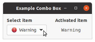
A
gtk-combo-box widget allows the user to choose from a list of valid choices. The
gtk-combo-box
widget displays the selected choice. When activated, the
gtk-combo-box widget displays a popup which
allows the user to make a new choice. The style in which the selected value is displayed, and the style
of the popup is determined by the current theme. It may be similar to a Windows-style combo box.
The
gtk-combo-box widget uses the model-view pattern; the list of valid choices is specified in the
form of a tree model, and the display of the choices can be adapted to the data in the model by using
cell renderers, as you would in a tree view. This is possible since the
gtk-combo-box widget
implements the
gtk-cell-layout interface. The tree model holding the valid choices is not restricted
to a flat list, it can be a real tree, and the popup will reflect the tree structure.
To allow the user to enter values not in the model, the
has-entry property allows the
gtk-combo-box widget to contain a
gtk-entry widget. This entry can be accessed by calling the
function
gtk-bin-child on the combo box.
For a simple list of textual choices, the model-view API of the
gtk-combo-box widget can be a bit
overwhelming. In this case, the
gtk-combo-box-text widget offers a simple alternative. Both
the
gtk-combo-box and the
gtk-combo-box-text widget can contain an entry.
;;;; Combo Box

(in-package :gtk-example)

(defparameter *icon-list*
              '(("gchararray" "gchararray")
                ("dialog-warning" "Warning")
                ("process-stop" "Stop")
                ("document-new" "New")
                ("edit-clear" "Clear")
                ("" "separator")
                ("document-open" "Open")))

(defun create-and-fill-list-store (data)
  (flet ((mklist (obj) (if (listp obj) obj (list obj))))
    (let ((model (apply #'gtk-list-store-new (mklist (first data)))))
      (dolist (entry (rest data))
        (let ((iter (gtk-list-store-append model)))
          (apply #'gtk-list-store-set model iter (mklist entry))))
      model)))

(defun set-sensitivity (layout cell model iter)
  (declare (ignore layout))
  (let* ((path (gtk-tree-model-path model iter))
         (pathstr (gtk-tree-path-to-string path)))
    (if (string= "1" pathstr)
        (setf (gtk-cell-renderer-sensitive cell) nil)
        (setf (gtk-cell-renderer-sensitive cell) t))))

(defun example-combo-box ()
  (within-main-loop
    (let* ((window (make-instance 'gtk-window
                                 :border-width 12
                                 :title "Example Combo Box"))
           (vbox1 (make-instance 'gtk-box
                                 :orientation :vertical
                                 :spacing 6))
           (vbox2 (make-instance 'gtk-box
                                 :orientation :vertical
                                 :spacing 6))
           (hbox (make-instance 'gtk-box
                                :orientation :horizontal
                                :spacing 24))
           (label (make-instance 'gtk-label :label "label"))
           (model (create-and-fill-list-store *icon-list*))
           (combo (make-instance 'gtk-combo-box
                                 :model model)))
      ;; Setup Cell Renderer for icon
      (let ((renderer (gtk-cell-renderer-pixbuf-new)))
        (setf (gtk-cell-renderer-xpad renderer) 6) ; More space between cells
        (gtk-cell-layout-pack-start combo renderer :expand nil)
        (gtk-cell-layout-set-attributes combo renderer "icon-name" 0)
        (gtk-cell-layout-set-cell-data-func combo renderer #'set-sensitivity))
      ;; Setup Cell Renderer for icon-name
      (let ((renderer (gtk-cell-renderer-text-new)))
        (gtk-cell-layout-pack-start combo renderer)
        (gtk-cell-layout-set-attributes combo renderer "text" 1)
        (gtk-cell-layout-set-cell-data-func combo renderer #'set-sensitivity))
      ;; Setup a Row Separator Function
      (gtk-combo-box-set-row-separator-func combo
          (lambda (object iter)
            (let ((value (gtk-tree-model-value object iter 1)))
              (string= value "separator"))))
      ;; Combo box selection has changed
      (g-signal-connect combo "changed"
          (lambda (object)
            (let ((value (gtk-combo-box-active-id object)))
              (gtk-label-set-markup label
                                    (format nil "<tt>~a</tt>" value)))))
      (setf (gtk-combo-box-id-column combo) 1)
      (setf (gtk-combo-box-active combo) 0)
      ;; Pack and show widgets
      (gtk-box-pack-start vbox1
                          (make-instance 'gtk-label
                                         :use-markup t
                                         :xalign 0
                                         :label "<b>Select item</b>")
                          :expand nil)
      (gtk-box-pack-start vbox1 combo)
      (gtk-box-pack-start vbox2
                          (make-instance 'gtk-label
                                         :use-markup t
                                         :xaling 0
                                         :label "<b>Activated item</b>")
                          :expand nil)
      (gtk-box-pack-start vbox2 label)
      (gtk-box-pack-start hbox vbox1)
      (gtk-box-pack-start hbox vbox2)
      (gtk-container-add window hbox)
      (gtk-widget-show-all window))))
A
gtk-combo-box-text widget is a simple variant of a
gtk-combo-box widget that hides the model-view
complexity for simple text-only use cases.
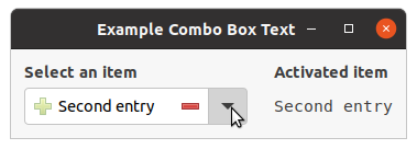
To create a
gtk-combo-box-text widget, use the functions
gtk-combo-box-text-new or
gtk-combo-box-text-new-with-entry. You can add items to a
gtk-combo-box-text widget with the
functions
gtk-combo-box-text-append-text,
gtk-combo-box-text-insert-text
or
gtk-combo-box-text-prepend-text and remove options with the function
gtk-combo-box-text-remove.
If the
gtk-combo-box-text widget contains an entry via the
has-entry property, its
contents can be retrieved using the function
gtk-combo-box-text-active-text. The entry itself can be
accessed by calling the function
gtk-bin-child on the combo box.
;;;; Combo Box Text

(in-package :gtk-example)

(defun example-combo-box-text ()
  (within-main-loop
    (let ((window (make-instance 'gtk-window
                                 :border-width 12
                                 :title "Example Combo Box Text"))
          (vbox1 (make-instance 'gtk-box
                                :orientation :vertical
                                :spacing 6))
          (vbox2 (make-instance 'gtk-box
                                :orientation :vertical
                                :spacing 6))
          (hbox (make-instance 'gtk-box
                               :orientation :horizontal
                               :spacing 24))
          (label (make-instance 'gtk-label :label "Label"))
          (combo (make-instance 'gtk-combo-box-text
                                :has-entry t)))
      ;; Setup the combo box
      (gtk-combo-box-text-append-text combo "First entry")
      (gtk-combo-box-text-append-text combo "Second entry")
      (gtk-combo-box-text-append-text combo "Third entry")
      ;; Combo box selection has changed
      (g-signal-connect combo "changed"
          (lambda (object)
            (let ((value (gtk-combo-box-text-active-text object)))
              (gtk-label-set-markup label
                                    (format nil "<tt>~a</tt>" value)))))
      ;; Select the first entry of the combo box
      (setf (gtk-combo-box-active combo) 0)
      ;; Setup the entry for the combo box
      (let ((entry (gtk-bin-child combo)))
        (setf (gtk-entry-primary-icon-name entry) "list-add")
        (setf (gtk-entry-primary-icon-tooltip-text entry) "Add to Combo Box")
        (setf (gtk-entry-secondary-icon-name entry) "list-remove")
        (setf (gtk-entry-secondary-icon-tooltip-text entry)
              "Remove from Combo Box")
        ;; Toggle the primary and secondary icons of the entry
        (g-signal-connect entry "focus-in-event"
            (lambda (widget event)
              (declare (ignore event))
              (setf (gtk-entry-primary-icon-sensitive widget) t)
              (setf (gtk-entry-secondary-icon-sensitive widget) nil)))
        (g-signal-connect entry "focus-out-event"
            (lambda (widget event)
              (declare (ignore event))
              (setf (gtk-entry-primary-icon-sensitive widget) nil)
              (setf (gtk-entry-secondary-icon-sensitive widget) t)))
        ;; One of the icons of the entry has been pressed
        (g-signal-connect entry "icon-press"
            (lambda (object pos event)
              (declare (ignore event))
              (if (eq :primary pos)
                  (let ((text (gtk-entry-text object)))
                    (gtk-combo-box-text-append-text combo text))
                  (let ((active (gtk-combo-box-active combo)))
                    (gtk-combo-box-text-remove combo active)
                    (setf (gtk-combo-box-active combo) active))))))
      ;; Pack and show widgets
      (gtk-box-pack-start vbox1 (make-instance 'gtk-label
                                               :xalign 0
                                               :use-markup t
                                               :label "<b>Select item</b>")
                                :expand nil)
      (gtk-box-pack-start vbox1 combo)
      (gtk-box-pack-start hbox vbox1)
      (gtk-box-pack-start vbox2 (make-instance 'gtk-label
                                               :xalign 0
                                               :use-markup t
                                               :label "<b>Activated item</b>")
                                 :expand nil)
      (gtk-box-pack-start vbox2 label)
      (gtk-box-pack-start hbox vbox2)
      (gtk-container-add window hbox)
      (gtk-widget-show-all window))))
13.6. Tool Palette
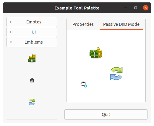
A
gtk-tool-palette widget is similar to a
gtk-toolbar widget but can contain a grid of items,
categorized into groups. The user may hide or expand each group. As in a toolbar, the items may be
displayed as only icons, as only text, or as icons with text.
The tool palette items might be dragged or simply activated. For instance, the user might drag objects to a canvas to create new items there. Or the user might click an item to activate a certain brush size in a drawing application.
A
gtk-tool-item-group widget should be added to the tool palette via the function
gtk-container-add,
for instance like this:
(let ((group-brushes (gtk-tool-item-group-new "Brushes")))
  (gtk-container-add palette group-brushes)
  ... )
gtk-tool-item widgets can then be added to the group. For instance, like this:
(let ((button (gtk-tool-button-new icon "Big")))
  (setf (gtk-tool-button-tooltip-text button) "Big Brush")
  (gtk-tool-item-group-insert group-brushes button -1)
  ... )
You might then handle the
gtk-tool-button widgets "clicked" signal. Alternatively, you could allow the
item to be dragged to another widget, by calling the function
gtk-tool-palette-add-drag-dest and then
using the function
gtk-tool-palette-drag-item in the other widget's "drag-data-received" signal handler.
Drag and Drop
Call the function
gtk-tool-palette-add-drag-dest to allow items or groups to be dragged from the tool
palette to a particular destination widget. You can then use the function
gtk-tool-palette-drag-item
to discover which
gtk-tool-item widget or
gtk-tool-item-group widget is being dragged. For instance,
you might use this in your "drag-data-received" signal handler, to add a dropped item, or to show a
suitable icon while dragging.
Example Tool Palette
This example adds a
gtk-tool-palette widget and a
gtk-drawing-area widget to a window and allows the
user to drag icons from the tool palette to the drawing area. The tool palette contains several groups of
items. The combo boxes allow the user to change the style and orientation of the tool palette.
;;;; Example Tool Palette
;;;;
;;;; A tool palette widget shows groups of toolbar items as a grid of icons or
;;;; a list of names.
;;;;
;;;; 2021-3-15
(in-package #:gtk-example)
(defun load-icon-items (palette)
(let* ((max-icons 24) ; Do not load too much icons.
(icon-theme (gtk-icon-theme-for-screen (gtk-widget-screen palette)))
(contexts (gtk-icon-theme-list-contexts icon-theme)))
(dolist (context contexts)
(let ((group (gtk-tool-item-group-new context))
(icons (gtk-icon-theme-list-icons icon-theme context)))
(dolist (icon-name (subseq icons 0 (min max-icons (length icons))))
(let ((item (make-instance 'gtk-tool-button
:icon-name icon-name
:label icon-name
:tooltip-text icon-name)))
(gtk-tool-item-group-insert group item -1)))
(gtk-container-add palette group)))))
;; Palette DnD
(defun palette-drop-item (drag-item drop-group x y)
(let ((drag-group (gtk-widget-parent drag-item))
(drop-item (gtk-tool-item-group-drop-item drop-group x y))
(drop-position -1))
(format t "PALETTE-DROP-ITEM~%")
(format t " drag-group : ~A~%" drag-group)
(format t " drop-item : ~A~%" drop-item)
(when drop-item
(setf drop-position
(gtk-tool-item-group-child-position drop-group drop-item)))
(format t " drop-pos : ~A~%" drop-position)
(if (not (equal drag-group drop-group))
(progn
(format t "DRAG-GROUP and DROP-GROUP are different~%")
(let ((child-props (gtk-container-child-get drag-group
drag-item
"homogeneous"
"expand"
"fill"
"new-row")))
(format t " child-props : ~A~%" child-props)
(gtk-container-remove drag-group drag-item)
(gtk-tool-item-group-insert drop-group drag-item drop-position)
;; FIXME: Does not work. Tries to assign NIL to a pointer.
;; This need to be fixed more general.
; (gtk-container-child-set drop-group
; drag-item
; "homogenous" (pop child-props)
; "expand" (pop child-props)
; "fill" (pop child-props)
; "new-row" (pop child-props))))
))
(setf (gtk-tool-item-group-child-position drop-group drag-item)
drop-position))))
(defun palette-drop-group (palette drag-group drop-group)
(let ((drop-position -1))
(format t "pos drag-group : ~a~%"
(gtk-tool-palette-group-position palette drag-group))
(format t "pos drop-group : ~a~%"
(gtk-tool-palette-group-position palette drop-group))
(when drop-group
(setf drop-position
(gtk-tool-palette-group-position palette drop-group)))
(format t "drop-position : ~a~%" drop-position)
;; FIXME: This does not work. The position is not changed.
;; Is this a bug in C Library? Does not work for the C gtk3-demo, too.
(setf (gtk-tool-palette-group-position palette drag-group) drop-position)))
(defun palette-drag-date-received (widget context x y selection info time)
(let ((drag-palette (gtk-drag-source-widget context)))
(format t "DRAG-DATA-RECEIVED~%")
(format t " widget : ~A~%" widget)
(format t " context : ~A~%" context)
(format t " x,y : ~A, ~A~%" x y)
(format t " selection : ~A~%" selection)
(format t " info : ~A~%" info)
(format t " time : ~A~%" time)
;; Get the tool palette CONTEXT belongs to, its a parent widget
(loop while (and drag-palette
(not (g-type-is-a (g-object-type drag-palette)
"GtkToolPalette")))
do (setf drag-palette
(gtk-widget-parent drag-palette)))
(format t " drag-palette : ~A~%~%" drag-palette)
(when drag-palette
(let ((drag-item (gtk-tool-palette-drag-item drag-palette selection))
(drop-group (gtk-tool-palette-drop-group widget x y)))
(format t " drag-item : ~A~%" drag-item)
(format t " drop-group : ~A~%" drop-group)
(cond ((g-type-is-a (g-object-type drag-item) "GtkToolItemGroup")
(format t "PALETTE DROP GROUP~%")
(palette-drop-group drag-palette drag-item drop-group))
((and drop-group
(g-type-is-a (g-object-type drag-item) "GtkToolItem"))
(format t "PALETTE DROP ITEM~%")
(let ((allocation (gtk-widget-allocation drop-group)))
(format t " allocation = ~A~%" allocation)
(palette-drop-item drag-item
drop-group
(- x (gdk-rectangle-x allocation))
(- y (gdk-rectangle-y allocation)))))
(t
(format t "NO VALID DRAG~%")))))))
;; Passive DnD
(defvar *canvas-items* nil)
(defstruct canvas-item
pixbuf
x
y)
(defun canvas-item-new (widget button x y)
(let* ((item (make-canvas-item))
(icon-theme (gtk-icon-theme-for-screen (gtk-widget-screen widget)))
(icon-name (gtk-tool-button-icon-name button))
(icon-size 48) ; workaround, better implementation needed
(pixbuf (gtk-icon-theme-load-icon icon-theme
icon-name
icon-size
:generic-fallback)))
(when pixbuf
(setf (canvas-item-pixbuf item) pixbuf)
(setf (canvas-item-x item) x)
(setf (canvas-item-y item) y))
item))
(defun canvas-item-draw (item cr preview)
(let ((cx (gdk-pixbuf-width (canvas-item-pixbuf item)))
(cy (gdk-pixbuf-height (canvas-item-pixbuf item))))
(gdk-cairo-set-source-pixbuf cr (canvas-item-pixbuf item)
(- (canvas-item-x item) (* 0.5d0 cx))
(- (canvas-item-y item) (* 0.5d0 cy)))
(if preview
(cairo-paint-with-alpha cr 0.6d0)
(cairo-paint cr))))
(defun canvas-draw (widget cr)
(declare (ignore widget))
(let ((cr (pointer cr)))
(cairo-set-source-rgb cr 1.0 1.0 1.0)
(cairo-paint cr)
(dolist (item *canvas-items*)
(canvas-item-draw item cr nil))
(cairo-destroy cr)))
(defun passive-canvas-drag-data-received (widget context x y selection info time)
(let ((palette (gtk-drag-source-widget context))
(tool-item nil))
(format t "DRAG-DATA-RECEIVED~%")
(format t " widget : ~A~%" widget)
(format t " context : ~A~%" context)
(format t " x,y : ~A, ~A~%" x y)
(format t " selection : ~A~%" selection)
(format t " info : ~A~%" info)
(format t " time : ~A~%" time)
;; Get the tool palette CONTEXT belongs to, its a parent widget
(loop while (and palette
(not (g-type-is-a (g-object-type palette)
"GtkToolPalette")))
do (setf palette
(gtk-widget-parent palette)))
(when palette
(setf tool-item
(gtk-tool-palette-drag-item palette selection)))
(when tool-item
(let ((canvas-item (canvas-item-new widget tool-item x y)))
(when canvas-item
(push canvas-item *canvas-items*)
(gtk-widget-queue-draw widget))))))
(defun example-tool-palette ()
(within-main-loop
(let* (;; Create a toplevel window.
(window (make-instance 'gtk-window
:type :toplevel
:title "Example Tool Palette"
:border-width 12))
;; A horizontal Box for the content of the window.
(content (make-instance 'gtk-grid
:orientation :horizontal
:column-spacing 24))
;; A scrollable
(scroller (make-instance 'gtk-scrolled-window
:hscrollbar-policy :never
:vscrollbar-policy :automatic
:hexpand t
:vexpand t
:default-width 300))
;; A tool palette
(palette (make-instance 'gtk-tool-palette
:default-width 300))
;; A vertical Grid for the actions.
(action (make-instance 'gtk-grid
:orientation :vertical
:row-spacing 6))
(contents (make-instance 'gtk-drawing-area
:app-paintable t))
(notebook (make-instance 'gtk-notebook
:border-width 6))
(page-1 (make-instance 'gtk-grid
:border-width 12
:orientation :vertical
:row-spacing 6))
; (page-2 (make-instance 'gtk-grid
; :border-width 12
; :orientation :vertical
; :row-spacing 6))
)
;; Signal handler for the window to handle the signal "destroy".
(g-signal-connect window "destroy"
(lambda (widget)
(declare (ignore widget))
(leave-gtk-main)))
;; Orientation combo box
(let ((combo (make-instance 'gtk-combo-box-text)))
(g-signal-connect combo "changed"
(lambda (combobox)
(let* ((text (gtk-combo-box-text-active-text combobox))
(orientation (cdr (assoc text
'(("Vertical" . :vertical)
("Horizontal" . :horizontal))
:test #'string=))))
(setf (gtk-orientable-orientation palette) orientation)
(if (eq orientation :horizontal)
(setf (gtk-scrolled-window-policy scroller)
'(:automatic :never))
(setf (gtk-scrolled-window-policy scroller)
'(:never :automatic))))))
(gtk-combo-box-text-append-text combo "Vertical")
(gtk-combo-box-text-append-text combo "Horizontal")
(setf (gtk-combo-box-active combo) 0)
(gtk-container-add page-1
(make-instance 'gtk-label
:use-markup t
:xalign 0.0
:margin-top 12
:label "<b>Orientation</b>"))
(gtk-container-add page-1 combo))
;; Style combo box
(let ((combo (make-instance 'gtk-combo-box-text)))
(g-signal-connect combo "changed"
(lambda (combobox)
(let* ((text (gtk-combo-box-text-active-text combobox))
(style (cdr (assoc text
'(("Icons" . :icons)
("Text" . :text)
("Both" . :both)
("Both Horizontal" . :both-horiz)
("Default" . :default))
:test #'string=))))
(if (eq style :default)
;; FIXME: This seems not to work as accepted.
(gtk-tool-palette-unset-style palette)
(setf (gtk-tool-palette-toolbar-style palette) style)))))
(gtk-combo-box-text-append-text combo "Icons")
(gtk-combo-box-text-append-text combo "Text")
(gtk-combo-box-text-append-text combo "Both")
(gtk-combo-box-text-append-text combo "Both Horizontal")
(gtk-combo-box-text-append-text combo "Default")
(setf (gtk-combo-box-active combo) 0)
(gtk-container-add page-1
(make-instance 'gtk-label
:use-markup t
:xalign 0.0
:margin-top 12
:label
"<b>Style</b>"))
(gtk-container-add page-1 combo))
;; Icon size combo box
(let ((combo (make-instance 'gtk-combo-box-text)))
(g-signal-connect combo "changed"
(lambda (combobox)
(let* ((text (gtk-combo-box-text-active-text combobox))
(size (cdr (assoc text
'(("Menu" . :menu)
("Small Toolbar" . :small-toolbar)
("Large Toolbar" . :large-toolbar)
("Button" . :button)
("Dnd" . :dnd)
("Dialog" . :dialog))
:test #'equal))))
(format t "Signal CHANGED text = ~A, size = ~A~%" text size)
(setf (gtk-tool-palette-icon-size palette) size))))
(gtk-combo-box-text-append-text combo "Menu")
(gtk-combo-box-text-append-text combo "Small Toolbar")
(gtk-combo-box-text-append-text combo "Large Toolbar")
(gtk-combo-box-text-append-text combo "Button")
(gtk-combo-box-text-append-text combo "Dnd")
(gtk-combo-box-text-append-text combo "Dialog")
(setf (gtk-combo-box-active combo) 1)
(gtk-container-add page-1
(make-instance 'gtk-label
:use-markup t
:xalign 0.0
:margin-top 12
:label
"<b>Icon Size</b>"))
(gtk-container-add page-1 combo))
(gtk-notebook-append-page notebook
page-1
(make-instance 'gtk-label
:label "Properties"))
;; Fill the tool palette
(load-icon-items palette)
;; Add the palette to the scrolled window
(gtk-container-add scroller palette)
;; Add the scrolled window to the content
(gtk-container-add content scroller)
;; DnD for tool items
(gtk-tool-palette-add-drag-dest palette
palette
'(:all)
'(:items :groups)
'(:move))
(g-signal-connect palette
"drag-data-received"
#'palette-drag-date-received)
;; Passive DnD dest
(g-signal-connect contents "draw" #'canvas-draw)
(g-signal-connect contents "drag-data-received"
#'passive-canvas-drag-data-received)
(gtk-tool-palette-add-drag-dest palette contents :all :items :copy)
(let ((page-2 (make-instance 'gtk-scrolled-window
:border-width 6
:hscrollbar-policy :automatic
:vscrollbar-policy :always)))
(gtk-container-add page-2 contents)
(gtk-notebook-append-page notebook
page-2
(make-instance 'gtk-label
:label "Passive DnD Mode")))
;; Add the notebook to the action container
(gtk-container-add action notebook)
;; A Quit button
(let ((button (make-instance 'gtk-button
:label "Quit"
:margin-top 12)))
(g-signal-connect button "clicked"
(lambda (widget)
(declare (ignore widget))
(gtk-widget-destroy window)))
;; Add the quit button to the action container
(gtk-container-add action button))
;; Add frame, content, and action to the window.
(gtk-container-add content action)
(gtk-container-add window content)
;; Show the window.
(gtk-widget-show-all window))))
Chapter 14. Printing
14.1. Print Operation
At the application development level, the GTK printing API provides dialogs that are consistent across applications and allows use of Cairo's common drawing API, with Pango-driven text rendering. In the implementation of this common API, platform-specific backends and printer-specific drivers are used.
The primary object is the
gtk-print-operation object, allocated for each print operation. To handle page
drawing connect to its signals, or inherit from it and override the default virtual signal handlers.
The
gtk-print-operation object automatically handles all the settings affecting the print loop.
Signals
The function
gtk-print-operation-run starts the print loop, during which various signals are emitted:
- "begin-print"
-
You must handle this signal, because this is where you create and set up a
pango-layoutobject using the providedgtk-print-contextobject, and break up your printing output into pages. - "paginate"
-
Pagination is potentially slow so if you need to monitor it you can call the function
gtk-print-operation-show-progressand handle this signal. -
For each page that needs to be rendered, the following signals are emitted:
- "request-page-setup"
-
Provides a
gtk-print-contextobject, page number andgtk-page-setupobject. Handle this signal if you need to modify page setup on a per-page basis. - "draw-page"
-
You must handle this signal, which provides a
gtk-print-contextobject and a page number. The print context should be used to create acairo-contextinstance into which the provided page should be drawn. To render text, iterate over thepango-layoutobject you created in the "begin-print" handler.
- "end-print"
-
A handler for it is a safe place to free any resources related to a print operaton. If you have your
custom class that inherits from the
gtk-print-operationclass, it is naturally simpler to do it in the destructor. - "done"
-
This signal is emitted when printing is finished, meaning when the print data is spooled. Note that the
provided
gtk-print-operation-resultvalue may indicate that an error occurred. In any case you probably want to notify the user about the final status. - "status-chanded"
-
Emitted whenever a print job's status changes, until it is finished. Call the function
gtk-print-operation-track-print-statusto monitor the job status after spooling. To see the status, use the functionsgtk-print-operation-statusorgtk-print-operation-status-string.
14.2. Page Setup
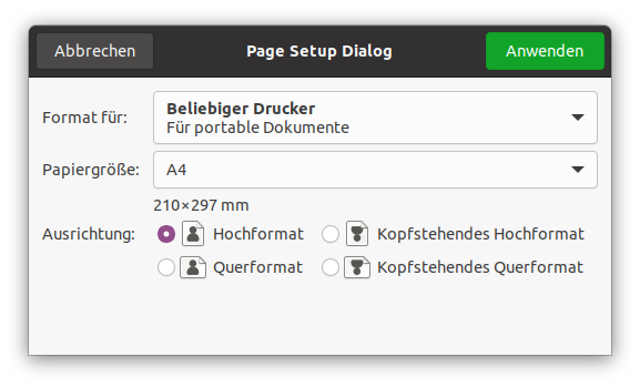
The
gtk-print-operation class has a method called
gtk-print-operation-default-page-setup which selects
the default paper size, orientation and margins. To show a page setup dialog from your application, use
the function
gtk-print-run-page-setup-dialog, which returns a
gtk-page-setup object with the chosen
settings. Use this object to update a
gtk-print-operation object and to access the selected
gtk-paper-size instance,
gtk-page-orientation value and printer-specific margins.
You should save the chosen
gtk-page-setup instance so you can use it again if the page setup dialog is
shown again.
The Cairo coordinate system, in the "draw-page" handler, is automatically rotated to the current page
orientation. It is normally within the printer margins, but you can change that via the function
gtk-print-operation-use-full-page. The default measurement unit is device pixels. To select other units,
use the function
gtk-print-operation-unit.
;;;; Create Page Setup Dialog (2021-3-17)

(in-package :gtk-example)

(defun create-page-setup-dialog ()
  (let ((page-setup (gtk-page-setup-new))
        (dialog (make-instance 'gtk-page-setup-unix-dialog
                               :title "Page Setup Dialog"
                               :default-height 250
                               :default-width 400)))
    ;; Load and set Page setup from file
    (if (gtk-page-setup-load-file page-setup (sys-path "page-setup.ini"))
        (format t "PAGE SETUP successfully loaded~%")
        (format t "PAGE SETUP cannot be loaded, use standard settings~%"))
    (setf (gtk-page-setup-unix-dialog-page-setup dialog) page-setup)
    ;; Run the dialog
    (when (eq :ok (gtk-dialog-run dialog))
      (setf page-setup (gtk-page-setup-unix-dialog-page-setup dialog))
      (gtk-page-setup-to-file page-setup (sys-path "page-setup.ini")))
    ;; Destroy the dialog
    (gtk-widget-destroy dialog)))
14.3. Rendering text
Text rendering is done using Pango. The
pango-layout object for printing should be created by calling
the function
gtk-print-context-create-pango-layout. The
gtk-print-context object also provides the
page metrics, via the functions
gtk-print-context-width and
gtk-print-context-height. The number of
pages can be set with the function
gtk-print-operation-n-pages. To actually render the Pango text in the
"on-draw-page" handler, get a
cairo-context object with the function
gtk-print-context-cairo-context
and show the
pango-layout-line instances that appear within the requested page number.
14.4. Asynchronous operations
By default, the function
gtk-print-operation-run returns when a print operation is completed. If you
need to run a non-blocking print operation, call the function
gtk-print-operation-allow-async. Note that
this function is not supported on all platforms, however the done signal will still be emitted.
The function
gtk-print-operation-run may return the value :in-progress of the
gtk-print-operation-result enumeration. To track status and handle the result or error you need to
implement signal handlers for the "done" and "status-changed" signals:
For instance,
(let ((operation (make-instance 'gtk-print-operation)))
  (g-signal-connect operation "done" #'on-print-operation-done)
  ;; Run the print operation
  ... )
Second, check for an error and connect to the "status-changed" signal. For instance:
(defun on-print-operation-done (operation result)
  (if (eq :error result)
      ;; Notify user
      (if (eq :apply result)
          ;; Update print settings with the ones used in this print operation
      ))
  (if (not (gtk-print-operation-is-finished operation))
      (g-signal-connect operation "status-changed" #'on-print-operation-status-changed))
  ... )
Finally, check the status. For instance,
(defun on-print-operaton-status-changed (operation)
  (if (gtk-print-operation-is-finished operation)
      ;; the print job is finished
      ;; get the status with gtk-print-operation-status or gtk-print-operation-status-string
  )
  ;; Update UI
  ... )
14.5. Export to PDF
The 'Print to file' option is available in the print dialog, without the need for extra implementation. However, it is sometimes useful to generate a PDF file directly from code. For instance,
(let ((operation (make-instance 'gtk-print-operation)))
  (setf (gtk-print-operation-export-filename operation) "test.pdf")
  (gtk-print-operation-run operation :export parent)
  ... )
14.6. Extending the print dialog
You may add a custom tab to the print dialog:
-
Set the title of the tab via the function
gtk-print-operation-custom-tab-label, create a new widget and return it from the "create-custom-widget" signal handler. You'll probably want this to be a container widget, packed with some others. - Get the data from the widgets in the "custom-widget-apply" signal handler.
The "custom-widget-apply" signal provides the widget you previously created, to simplify things you can
keep the widgets you expect to contain some user input as global to the signal handlers. For example,
let's say you have a
gtk-entry widget:
(let ((entry (make-instance 'gtk-entry)))

  (defun on-create-custom-widget (operation)
    (let ((hbox (make-instance 'gtk-box
                               :orientation :horizontal
                               :border-width 6))
          (label (make-instance 'gtk-label
                                :label "Enter some text: ")))
    (setf (gtk-print-operation-custom-label operation) "My custom tab")
    (gtk-box-pack-start hbox label :expand nil)
    (gtk-box-pack-start hbox entry :expand nil)
    (gtk-widget-show-all hbox)
    hbox))

  (defun on-custom-widget-apply (operation widget)
    (let* ((user-input (gtk-entry-text entry)))
      ... )))
The example in examples/book/printing/advanced demonstrates this.
14.7. Preview
The native GTK print dialog has a preview button, but you may also start a preview directly from an application:
(let ((operation (make-instance 'gtk-print-operation)))
  (gtk-print-operation-run operation :preview parent)
  ... )
On Unix, the default preview handler uses an external viewer program. On Windows, the native preview dialog will be shown. If necessary you may override this behaviour and provide a custom preview dialog.
14.8. Printing Example
The following example demonstrates how to print some input from a user interface. It shows how to implement the "begin-print" and "draw-page" handler, as well as how to track print status and update the print settings.
;;;; Print Operation - 2021-3-17
;;;;
;;;; GtkPrintOperation offers a simple API to support printing in a
;;;; cross-platform way.

(in-package :gtk-example)

(defstruct print-data
  filename
  header-height
  header-gap
  header-font-size
  font-size
  lines
  lines-per-page
  number-lines
  number-pages)

(defvar *data* (make-print-data :filename (sys-path "print-operation.lisp")
                                :font-size 10
                                :header-font-size 11
                                :header-height 22
                                :header-gap 11))

(defun begin-print (operation context)
  ;; Load and split the file to print into a list of lines
  (setf (print-data-lines *data*)
        (split-sequence #\linefeed (read-file (print-data-filename *data*))))
  ;; Calculate and save the number of lines to print
  (setf (print-data-number-lines *data*)
        (length (print-data-lines *data*)))
  ;; Calculate and save the number of lines per page
  (setf (print-data-lines-per-page *data*)
        (floor (/ (- (gtk-print-context-height context)
                     (print-data-header-height *data*)
                     (print-data-header-gap *data*))
                  (print-data-font-size *data*))))
  ;; Calculate and save the number of pages to print
  (setf (print-data-number-pages *data*)
        (ceiling (/ (print-data-number-lines *data*)
                 (print-data-lines-per-page *data*))))
  ;; Set the number of pages to the print operation
  (setf (gtk-print-operation-n-pages operation)
        (print-data-number-pages *data*)))

(defun draw-page (operation context page-nr)
  (declare (ignore operation))
  (let ((cr (gtk-print-context-cairo-context context))
        (width (floor (gtk-print-context-width context)))
        (layout (gtk-print-context-create-pango-layout context)))

    ;; 1. Print the header
    ;; Print a grey colored bar
    (cairo-rectangle cr 0 0 width (print-data-header-height *data*))
    (cairo-set-source-rgb cr 0.9 0.9 0.9)
    (cairo-fill cr)

    ;; Set the font for the header
    (let ((desc (pango-font-description-from-string "sans")))
      (setf (pango-font-description-size desc)
            (* (print-data-header-font-size *data*) +pango-scale+))
      (setf (pango-layout-font-description layout) desc))
    ;; Set the text for the header
    (setf (pango-layout-text layout) (print-data-filename *data*))
    (setf (pango-layout-width layout) (* width +pango-scale+))
    (setf (pango-layout-alignment layout) :center)

    ;; Print the filename in the header
    (multiple-value-bind (text-width text-height)
        (pango-layout-pixel-size layout)
      (declare (ignore text-width))
      ;; Set color to black and center the text in header
      (cairo-set-source-rgb cr 0.0 0.0 0.0)
      (cairo-move-to cr 0 (floor (/ (- (print-data-header-height *data*)
                                       text-height)
                                    2)))
      (pango-cairo-show-layout cr layout))

    ;; Print the page number in the header
    (setf (pango-layout-text layout)
          (format nil "~d/~d" (+ page-nr 1) (print-data-number-pages *data*)))
    (setf (pango-layout-width layout) -1)
    (multiple-value-bind (text-width text-height)
        (pango-layout-pixel-size layout)
      (cairo-move-to cr (floor (- width text-width 4))
                        (floor (/ (- (print-data-header-height *data*)
                                     text-height)
                                  2)))
      (pango-cairo-show-layout cr layout))

    ;; 2. Print the text on the page
    (setf layout (gtk-print-context-create-pango-layout context))
    ;; Set the font for the page
    (let ((desc (pango-font-description-from-string "monospace")))
      (setf (pango-font-description-size desc)
            (* (print-data-font-size *data*) +pango-scale+))
      (setf (pango-layout-font-description layout) desc))
    ;; Move to the start of the page
    (cairo-move-to cr 0 (+ (print-data-header-height *data*)
                           (print-data-header-gap *data*)))

    ;; Print the lines on the page
    (do ((i 0 (+ i 1))
         (line (* page-nr (print-data-lines-per-page *data*)) (+ line 1)))
        ((or (>= i (print-data-lines-per-page *data*))
             (>= line (print-data-number-lines *data*))))
      (setf (pango-layout-text layout)
            (pop (print-data-lines *data*)))
      (pango-cairo-show-layout cr layout)
      (cairo-rel-move-to cr 0 (print-data-font-size *data*)))))

(defun do-print-operation ()
  (let* ((response nil)
         (filename (sys-path "print-dialog.ini"))
         (settings (gtk-print-settings-new-from-file filename))
         (print (gtk-print-operation-new)))
    ;; Connect signal handlers for the print operation
    (g-signal-connect print "draw-page" #'draw-page)
    (g-signal-connect print "begin-print" #'begin-print)
    ;; Restore the print settings
    (when settings
      (setf (gtk-print-operation-print-settings print) settings))
    ;; Perform the print operation
    (setf response (gtk-print-operation-run print :print-dialog nil))
    ;; Check the response and save the print settings
    (when (eq :apply response)
      (format t "~&Save print settings to ~A~%" (sys-path "print-dialog.ini"))
      (setf settings (gtk-print-operation-print-settings print))
      (gtk-print-settings-to-file settings (sys-path "print-dialog.ini")))))
Chapter 15. Application Support
15.1. Application Class
The
gtk-application class handles many important aspects of a GTK application in a convenient fashion,
without enforcing a one-size-fits-all application model.
Currently, the
gtk-application class handles GTK initialization, application uniqueness, session
management, provides some basic scriptability and desktop shell integration by exporting actions and menus
and manages a list of toplevel windows whose life-cycle is automatically tied to the life-cycle of your
application.
While the
gtk-application class works fine with plain
gtk-window widgets, it is recommended to use it
together with the
gtk-application-window widget.
When GDK threads are enabled, the
gtk-application object will acquire the GDK lock when invoking actions
that arrive from other processes. The GDK lock is not touched for local action invocations. In order to
have actions invoked in a predictable context it is therefore recommended that the GDK lock be held while
invoking actions locally with the function
g-action-group-activate-action. The same applies to actions
associated with the
gtk-application-window widget and to the 'activate' and 'open' signals of the
g-application class.
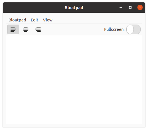
To set an application menu for a
gtk-application object, use the function
gtk-application-app-menu.
The
g-menu-model object that this function expects is usually constructed using the
gtk-builder
object, as seen in Example 15.1, “Simple GTK Application”. To specify a menubar that will be shown by
gtk-application-window widgets, use the function
gtk-application-menubar. Use the base
g-action-map
interface to add actions, to respond to the user selecting these menu items.
GTK displays these menus as expected, depending on the platform the application is running on.
The
gtk-application object optionally registers with a session manager of the users session, if you set
the
register-session property, and offers various functionality related to the session
life-cycle.
An application can block various ways to end the session with the function
gtk-application-inhibit.
Typical use cases for this kind of inhibiting are long-running, uninterruptible operations, such as
burning a CD or performing a disk backup. The session manager may not honor the inhibitor, but it can be
expected to inform the user about the negative consequences of ending the session while inhibitors are
present.
15.2. Application Window
The
gtk-application-window class is a
gtk-window subclass that offers some extra functionality for
better integration with
gtk-application features. Notably, it can handle both the application menu as
well as the menubar. See the functions
gtk-application-app-menu and
gtk-application-menubar.
This class implements the
g-action-group and
g-action-map interfaces, to let you add window-specific
actions that will be exported by the associated
gtk-application object, together with its
application-wide actions. Window-specific actions are prefixed with the "win." prefix and application-wide
actions are prefixed with the "app." prefix. Actions must be addressed with the prefixed name when
referring to them from a
g-menu-model object.
Note that widgets that are placed inside a
gtk-application-window widget can also activate these
actions, if they implement the
gtk-actionable interface.
As with
gtk-application objects, the GDK lock will be acquired when processing actions arriving from
other processes and should therefore be held when activating actions locally if GDK threads are enabled.
The
gtk-shell-shows-app-menu and
gtk-shell-shows-menubar settings tell GTK
whether the desktop environment is showing the application menu and menubar models outside the application
as part of the desktop shell. For instance, on OS X, both menus will be displayed remotely; on Windows
neither will be. gnome-shell (starting with version 3.4) will display the application menu, but not the
menubar.
If the desktop environment does not display the menubar, then the
gtk-application-window widget will
automatically show a
gtk-menu-bar widget for it. See the
gtk-application docs for some screenshots of
how this looks on different platforms. This behaviour can be overridden with the
show-menubar property. If the desktop environment does not display the
application menu, then it will automatically be included in the menubar.
The XML format understood by the
gtk-builder object for a
g-menu-model object consists of a toplevel
<menu> element, which contains one or more <item> elements. Each
<item> element contains <attribute> and <link>
elements with a mandatory name attribute. <link> elements have the same content model
as <menu>.
Attribute values can be translated using the function gettext(), like other
gtk-builder
content. <attribute> elements can be marked for translation with a translatable = "yes"
attribute. It is also possible to specify message context and translator comments, using the context and
comments attributes. To make use of this, the
gtk-builder object must have been given the
gettext domain to use.
;;;; Simple Application
(in-package #:gtk-example)
(defclass bloat-pad (gtk-application)
()
; (:g-type-name . "BloatPad")
(:metaclass gobject-class))
(register-object-type-implementation "BloatPad"
bloat-pad
"GtkApplication"
nil
nil)
(defun new-window (application file)
(declare (ignore file))
(let (;; Create the application window
(window (make-instance 'gtk-application-window
:application application
:title "Bloatpad"
:border-width 12
:default-width 500
:default-height 400))
(grid (make-instance 'gtk-grid))
(toolbar (make-instance 'gtk-toolbar)))
;; Connect signal "destroy" to the application window
(g-signal-connect window "destroy"
(lambda (widget)
(declare (ignore widget))
(leave-gtk-main)
(if (zerop gtk::*main-thread-level*)
(g-application-quit application))))
;; Add action "copy" to the application window
(let ((action (g-simple-action-new "copy" nil)))
(g-action-map-add-action window action)
(g-signal-connect action "activate"
(lambda (action parameter)
(declare (ignore action parameter))
(let ((view (gobject::get-g-object-for-pointer
(g-object-data window "bloatpad-text"))))
(gtk-text-buffer-copy-clipboard
(gtk-text-view-buffer view)
(gtk-widget-clipboard view "CLIPBOARD"))))))
;; Add action "paste" to the application window
(let ((action (g-simple-action-new "paste" nil)))
(g-action-map-add-action window action)
(g-signal-connect action "activate"
(lambda (action parameter)
(declare (ignore action parameter))
(let ((view (gobject::get-g-object-for-pointer
(g-object-data window "bloatpad-text"))))
(gtk-text-buffer-paste-clipboard
(gtk-text-view-buffer view)
(gtk-widget-clipboard view "CLIPBOARD")
:editable t)))))
;; Add action "fullscreen" to the application window
(let ((action (g-simple-action-new-stateful
"fullscreen"
nil
(g-variant-new-boolean nil))))
(g-action-map-add-action window action)
(g-signal-connect action "activate"
(lambda (action parameter)
(declare (ignore parameter))
(let* ((state (g-action-state action))
(value (g-variant-boolean state)))
(g-action-change-state action
(g-variant-new-boolean (not value))))))
(g-signal-connect action "change-state"
(lambda (action parameter)
(if (g-variant-boolean parameter)
(gtk-window-fullscreen window)
(gtk-window-unfullscreen window))
(setf (g-simple-action-state action) parameter))))
;; Add action "justify" to the application window
(let ((action (g-simple-action-new-stateful
"justify"
(g-variant-type-new "s")
(g-variant-new-string "left"))))
(g-action-map-add-action window action)
(g-signal-connect action "activate"
(lambda (action parameter)
(g-action-change-state action parameter)))
(g-signal-connect action "change-state"
(lambda (action parameter)
(let ((view (gobject::get-g-object-for-pointer
(g-object-data window "bloatpad-text")))
(str (g-variant-string parameter)))
(cond ((equal str "left")
(setf (gtk-text-view-justification view) :left))
((equal str "center")
(setf (gtk-text-view-justification view) :center))
(t
(setf (gtk-text-view-justification view) :right)))
(setf (g-simple-action-state action) parameter)))))
;; Left justify toggle tool button for the toolbar
(let ((button (make-instance 'gtk-toggle-tool-button
:icon-name "format-justify-left")))
(gtk-actionable-set-detailed-action-name button "win.justify::left")
(gtk-container-add toolbar button))
;; Center justify toggle tool button for the toolbar
(let ((button (make-instance 'gtk-toggle-tool-button
:icon-name "format-justify-center")))
(gtk-actionable-set-detailed-action-name button "win.justify::center")
(gtk-container-add toolbar button))
;; Right justify toggle tool button for the toolbar
(let ((button (make-instance 'gtk-toggle-tool-button
:icon-name "format-justify-right")))
(gtk-actionable-set-detailed-action-name button "win.justify::right")
(gtk-container-add toolbar button))
;; Invisible separator which shift the next tool item to the right
(let ((button (make-instance 'gtk-separator-tool-item
:draw nil)))
(setf (gtk-tool-item-expand button) t)
(gtk-container-add toolbar button))
;; A label and a switch on the right of the toolbar
(let ((button (make-instance 'gtk-tool-item))
(box (make-instance 'gtk-box
:orientation :horizontal
:spacing 6))
(label (make-instance 'gtk-label
:label "Fullscreen:"))
(switch (make-instance 'gtk-switch)))
(setf (gtk-actionable-action-name switch) "win.fullscreen")
(gtk-container-add box label)
(gtk-container-add box switch)
(gtk-container-add button box)
(gtk-container-add toolbar button))
;; Place the toolbar in the grid
(gtk-grid-attach grid toolbar 0 0 1 1)
(let ((scrolled (make-instance 'gtk-scrolled-window
:hexpand t
:vexpand t))
(view (make-instance 'gtk-text-view)))
(setf (g-object-data window "bloatpad-text") (pointer view))
(gtk-container-add scrolled view)
(gtk-grid-attach grid scrolled 0 1 1 1))
(gtk-container-add window grid)
(gtk-widget-show-all window)))
(defun bloat-pad-activate (application)
;; Create a new application window
(new-window application nil))
(defun create-about-dialog ()
(let (;; Create an about dialog
(dialog (make-instance 'gtk-about-dialog
:program-name "Simple Application"
:version "0.9"
:copyright "(c) Dieter Kaiser"
:website
"github.com/crategus/cl-cffi-gtk"
:website-label "Project web site"
:license "LLGPL"
:authors '("Dieter Kaiser")
:documenters '("Dieter Kaiser")
:artists '("None")
:logo-icon-name
"applications-development"
:wrap-license t)))
;; Run the about dialog
(gtk-dialog-run dialog)
;; Destroy the about dialog
(gtk-widget-destroy dialog)))
(defvar *menu*
"<interface>
<menu id='app-menu'>
<section>
<item>
<attribute name='label' translatable='yes'>_New Window</attribute>
<attribute name='action'>app.new</attribute>
<attribute name='accel'><Primary>n</attribute>
</item>
</section>
<section>
<item>
<attribute name='label' translatable='yes'>_About Bloatpad</attribute>
<attribute name='action'>app.about</attribute>
</item>
</section>
<section>
<item>
<attribute name='label' translatable='yes'>_Quit</attribute>
<attribute name='action'>app.quit</attribute>
<attribute name='accel'><Primary>q</attribute>
</item>
</section>
</menu>
<menu id='menubar'>
<submenu>
<attribute name='label' translatable='yes'>_Edit</attribute>
<section>
<item>
<attribute name='label' translatable='yes'>_Copy</attribute>
<attribute name='action'>win.copy</attribute>
<attribute name='accel'><Primary>c</attribute>
</item>
<item>
<attribute name='label' translatable='yes'>_Paste</attribute>
<attribute name='action'>win.paste</attribute>
<attribute name='accel'><Primary>v</attribute>
</item>
</section>
</submenu>
<submenu>
<attribute name='label' translatable='yes'>_View</attribute>
<section>
<item>
<attribute name='label' translatable='yes'>_Fullscreen</attribute>
<attribute name='action'>win.fullscreen</attribute>
<attribute name='accel'>F11</attribute>
</item>
</section>
</submenu>
</menu>
</interface>")
(defun bloat-pad-startup (application)
;; Add action "new" to the application
(let ((action (g-simple-action-new "new" nil)))
;; Connect a handler to the signal "activate"
(g-signal-connect action "activate"
(lambda (action parameter)
(declare (ignore action parameter))
;; ensure-gtk-main increases the thread level for the new window
(ensure-gtk-main)
(new-window application nil)))
;; Add the action to the action map of the application
(g-action-map-add-action application action))
;; Add action "about" to the application
(let ((action (g-simple-action-new "about" nil)))
;; Connect a handler to the signal "activate"
(g-signal-connect action "activate"
(lambda (action parameter)
(declare (ignore action parameter))
(create-about-dialog)))
;; Add the action to the action map of the application
(g-action-map-add-action application action))
;; Add action "quit" to the application
(let ((action (g-simple-action-new "quit" nil)))
;; Connect a handler to the signal activate
(g-signal-connect action "activate"
(lambda (action parameter)
(declare (ignore action parameter))
;; Destroy all windows of the application
(dolist (window (gtk-application-windows application))
(gtk-widget-destroy window))
;; Quit the main loop
(leave-gtk-main)
;; Quit the application
(g-application-quit application)))
;; Add the action to action map of the application
(g-action-map-add-action application action))
;; Intitialize the application menu and the menubar
(let ((builder (make-instance 'gtk-builder)))
;; Read the menus from a string
(gtk-builder-add-from-string builder *menu*)
;; Set the application menu
(setf (gtk-application-app-menu application)
(gtk-builder-object builder "app-menu"))
;; Set the menubar
(setf (gtk-application-menubar application)
(gtk-builder-object builder "menubar"))))
(defun bloat-pad-open (application)
(declare (ignore application))
;; Executed when the application is opened
nil)
(defun bloat-pad-shutdown (application)
(declare (ignore application))
;; Executed when the application is shut down
nil)
(defmethod initialize-instance :after
((app bloat-pad) &key &allow-other-keys)
(g-signal-connect app "activate" #'bloat-pad-activate)
(g-signal-connect app "startup" #'bloat-pad-startup)
(g-signal-connect app "open" #'bloat-pad-open)
(g-signal-connect app "shutdown" #'bloat-pad-shutdown))
(defun bloat-pad-new ()
(unless (string= "Bloatpad" (g-application-name))
(setf (g-application-name) "Bloatpad"))
(make-instance 'bloat-pad
:application-id "com.crategus.bloatpad"
:flags :handles-open
:inactivity-timeout 30000
:register-session t))
(defun bloatpad (&optional (argv nil))
(within-main-loop
(let (;; Create an instance of the application Bloat Pad
(bloat-pad (bloat-pad-new)))
;; Run the application
(g-application-run bloat-pad argv))))
Chapter 16. GTK and Cairo
This tutorial is taken from the offical Cairo website at cairographics.org/tutorial/ which has been derived from Michael Urman's Cairo tutorial for python programmers. The code snippets have been translated to Lisp and the text has only been changed as much as necessary.
Cairo is a powerful 2d graphics library. This document introduces you to how Cairo works and many of the functions you will use to create the graphic experience you desire.
16.1. Cairo's Drawing Model
In order to explain the operations used by cairo, we first delve into a model of how Cairo models drawing. There are only a few concepts involved, which are then applied over and over by the different methods. First I will describe the nouns: destination, source, mask, path, and context. After that I will describe the verbs which offer ways to manipulate the nouns and draw the graphics you wish to create.
16.1.1. Nouns
Cairo's nouns are somewhat abstract. To make them concrete I am including diagrams that depict how they interact. The first three nouns are the three layers in the diagrams you see in this section. The fourth noun, the path, is drawn on the middle layer when it is relevant. The final noun, the context, is not shown.
Destination

The destination is the surface on which you are drawing. It may be tied to an array of pixels like in this tutorial, or it might be tied to a SVG or PDF file, or something else. This surface collects the elements of your graphic as you apply them, allowing you to build up a complex work as though painting on a canvas.
Source

The source is the "paint" you are about to work with. I show this as it is - plain black for several examples - but translucent to show lower layers. Unlike real paint, it does not have to be a single color; it can be a pattern or even a previously created destination surface (see How do I paint from one surface to another?). Also unlike real paint it can contain transparency information - the Alpha channel.
Mask

The mask is the most important piece: it controls where you apply the source to the destination. I will show it as a yellow layer with holes where it lets the source through. When you apply a drawing verb, it is like you stamp the source to the destination. Anywhere the mask allows, the source is copied. Anywhere the mask disallows, nothing happens.
Path
The path is somewhere between part of the mask and part of the context. I will show it as thin green lines on the mask layer. It is manipulated by path verbs, then used by drawing verbs.
Context
The context keeps track of everything that verbs affect. It tracks one source, one destination, and one mask. It also tracks several helper variables like your line width and style, your font face and size, and more. Most importantly it tracks the path, which is turned into a mask by drawing verbs.
Before you can start to draw something with Cairo, you need to create the context. The context is
stored in Cairo's central data type, called cairo-t.
When you create a Cairo context, it must be tied to a specific surface - for example, an image surface
if you want to create a PNG file. There is also a data type for the surface, called
cairo-surface-t. You can initialize your Cairo
context with the functions
cairo-image-surface-create and
cairo-create like this:
(let* ((surface (cairo-image-surface-create :argb32 120 120))
       (cr (cairo-create surface)))
  ... )
The Cairo context in this example is tied to an image surface of dimension 120 x 120 and 32 bits per pixel to store RGB and Alpha information. Surfaces can be created specific to most Cairo backends, see the Cairo API documentation for details.
16.1.2. Verbs
The reason you are using Cairo in a program is to draw. Cairo internally draws with one fundamental drawing operation: the source and mask are freely placed somewhere over the destination. Then the layers are all pressed together and the paint from the source is transferred to the destination wherever the mask allows it. To that extent the following five drawing verbs, or operations, are all similar. They differ by how they construct the mask.
Stroke
The cairo-stroke operation takes a virtual pen along
the path. It allows the source to transfer through the mask in a thin (or thick) line around the path,
according to the pen's line width,
dash style, and
line caps.
(cairo-set-line-width cr 0.1)
(cairo-set-source-rgb cr 1.0 0.0 0.0)
(cairo-rectangle cr 0.25 0.25 0.5 0.5)
(cairo-stroke cr)
The following example shows the above code snippet in action and the code to produce the output:
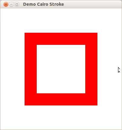
(defun demo-cairo-stroke ()
  (within-main-loop
    (let ((window (make-instance 'gtk-window
                                 :type :toplevel
                                 :title "Demo Cairo Stroke"
                                 :border-width 12
                                 :default-width 400
                                 :default-height 400)))
      (g-signal-connect window "destroy"
                        (lambda (widget)
                          (declare (ignore widget))
                          (leave-gtk-main)))
      ;; Signals used to handle the backing surface
      (g-signal-connect window "draw"
         (lambda (widget cr)
           (let ((cr (pointer cr))
                 ;; Get the GdkWindow for the widget
                 (window (gtk-widget-window widget)))
           ;; Clear surface
           (cairo-set-source-rgb cr 1.0 1.0 1.0)
           (cairo-paint cr)
           ;; Example is in 1.0 x 1.0 coordinate space
           (cairo-scale cr
                        (gdk-window-width window)
                        (gdk-window-height window))
           ;; Drawing code goes here
           (cairo-set-line-width cr 0.1)
           (cairo-set-source-rgb cr 1.0 0.0 0.0)
           (cairo-rectangle cr 0.25 0.25 0.5 0.5)
           (cairo-stroke cr)
           ;; Destroy the Cario context
           (cairo-destroy cr)
           t)))
      (gtk-widget-show-all window))))
Fill
The cairo-fill operation instead uses the path like the
lines of a coloring book, and allows the source through the mask within the hole whose boundaries are
the path. For complex paths (paths with multiple closed sub-paths - like a donut - or paths that
self-intersect) this is influenced by the fill rule. Note
that while stroking the path transfers the source for half of the line width on each side of the path,
filling a path fills directly up to the edge of the path and no further.
(cairo-set-source-rgb cr 1.0 0.0 0.0)
(cairo-rectangle cr 0.25 0.25 0.5 0.5)
(cairo-fill cr)
Show Text / Glyps

The cairo-show-text operation forms the mask from
text. It may be easier to think of cairo-show-text
as a shortcut for creating a path with
cairo-text-path and then using
cairo-fill to transfer it. Be aware
cairo-show-text caches glyphs so is much more efficient if you work with a lot of
text.
(cairo-set-source-rgb cr 0.0 0.0 0.0)
(cairo-select-font-face cr "Georgia" :normal :bold)
(cairo-set-font-size cr 1.2)
(let ((text-extents (cairo-text-extents cr "a")))
  (cairo-move-to cr
                 (- 0.5
                    (/ (cairo-text-extents-t-width text-extents) 2)
                    (cairo-text-extents-t-x-bearing text-extents))
                 (- 0.5
                    (/ (cairo-text-extents-t-height text-extents) 2)
                    (cairo-text-extents-t-y-bearing text-extents)))
  (cairo-show-text cr "a"))
Paint
The cairo-paint operation uses a mask that transfers
the entire source to the destination. Some people consider this an infinitely large mask, and others
consider it no mask; the result is the same. The related operation
cairo-paint-with-alpha similarly allows
transfer of the full source to destination, but it transfers only the provided percentage of the color.
(cairo-set-source-rgb cr 0.0 0.0 0.0)
(cairo-paint-with-alpha cr 0.5)
Mask

The cairo-mask and
cairo-mask-surface operations allow transfer according to the transparency/opacity
of a second source pattern or surface. Where the pattern or surface is opaque, the current source is
transferred to the destination. Where the pattern or surface is transparent, nothing is transferred.
(let ((linpat (cairo-pattern-create-linear 0 0 1 1))
      (radpat (cairo-pattern-create-radial 0.5 0.5 0.25 0.5 0.5 0.75)))

  (cairo-pattern-add-color-stop-rgb linpat 0 0 0.3 0.8)
  (cairo-pattern-add-color-stop-rgb linpat 1 0 0.8 0.3)

  (cairo-pattern-add-color-stop-rgba radpat 0 0 0 0 1)
  (cairo-pattern-add-color-stop-rgba radpat 0.5 0 0 0 0)

  (cairo-set-source cr linpat)
  (cairo-mask cr radpat))
16.2. Drawing with Cairo
In order to create an image you desire, you have to prepare the context for each of the drawing verbs.
To use cairo-stroke or
cairo-fill you first need a path. To use
cairo-show-text you must position your text by its insertion point. To use
cairo-mask you need a second source pattern or surface.
And to use any of the operations, including cairo-paint,
you need a primary source.
16.2.1. Preparing and Selecting a Source
There are three main kinds of sources in cairo: colors, gradients, and images. Colors are the simplest;
they use a uniform hue and opacity for the entire source. You can select these without any preparation
with cairo-set-source-rgb and
cairo-set-source-rgba. Using
(cairo-set-source-rgb cr r g b) is equivalent to using
(cairo-set-source-rgba cr r g b 1.0), and it sets your source color to use full opacity.
(cairo-set-source-rgb cr 0 0 0)
(cairo-move-to cr 0 0)
(cairo-line-to cr 1 1)
(cairo-move-to cr 1 0)
(cairo-line-to cr 0 1)
(cairo-set-line-width cr 0.2)
(cairo-stroke cr)

(cairo-rectangle cr 0 0 0.5 0.5)
(cairo-set-source-rgba cr 1 0 0 0.80)
(cairo-fill cr)

(cairo-rectangle cr 0 0.5 0.5 0.5)
(cairo-set-source-rgba cr 0 1 0 0.60)
(cairo-fill cr)

(cairo-rectangle cr 0.5 0 0.5 0.5)
(cairo-set-source-rgba cr 0 0 1 0.40)
(cairo-fill cr)
Gradients describe a progression of colors by setting a start and stop reference location and a series
of "stops" along the way. Linear gradients are built from two points which pass through parallel lines
to define the start and stop locations. Radial gradients are also built from two points, but each has
an associated radius of the circle on which to define the start and stop locations. Stops are added to
the gradient with
cairo-pattern-add-color-stop-rgb and
cairo-pattern-add-color-stop-rgba
which take a color like cairo-set-source-rgb*, as well as an offset to indicate where it
lies between the reference locations. The colors between adjacent stops are averaged over space to form
a smooth blend. Finally, the behavior beyond the reference locations can be controlled with
cairo-pattern-set-extend.
(let ((radpat (cairo-pattern-create-radial 0.25
                                           0.25 0.10 0.50 0.50 0.50))
      (linpat (cairo-pattern-create-linear 0.25 0.35 0.75 0.65)))
  (cairo-pattern-add-color-stop-rgb radpat 0.00 1.00 0.80 0.80)
  (cairo-pattern-add-color-stop-rgb radpat 1.00 0.90 0.00 0.00)
  (iter (for i from 1 below 10)
        (iter (for j from 1 below 10)
              (cairo-rectangle cr
                               (- (/ i 10.0) 0.04)
                               (- (/ j 10.0) 0.04)
                               0.08
                               0.08)))
  (cairo-set-source cr radpat)
  (cairo-fill cr)

  (cairo-pattern-add-color-stop-rgba linpat 0.00 1.0 1.0 1.0 0.0)
  (cairo-pattern-add-color-stop-rgba linpat 0.25 0.0 1.0 0.0 0.5)
  (cairo-pattern-add-color-stop-rgba linpat 0.50 1.0 1.0 1.0 0.0)
  (cairo-pattern-add-color-stop-rgba linpat 0.75 0.0 0.0 1.0 0.5)
  (cairo-pattern-add-color-stop-rgba linpat 1.00 1.0 1.0 1.0 0.0)

  (cairo-rectangle cr 0.0 0.0 1.0 1.0)
  (cairo-set-source cr linpat)
  (cairo-fill cr))
Images include both surfaces loaded from existing files with
cairo-image-surface-create-from-png and surfaces created from within Cairo as an
earlier destination. As of Cairo 1.2, the easiest way to make and use an earlier destination as a
source is with cairo-push-group and either
cairo-pop-group or
cairo-pop-group-to-source. Use
cairo-pop-group-to-source to use it just
until you select a new source, and cairo-pop-group
when you want to save it so you can select it over and over again with
cairo-set-source.
16.2.2. Creating a Path
Cairo always has an active path. If you call
cairo-stroke it will draw the path with your line settings. If you call
cairo-fill it will fill the inside of the path. But as
often as not, the path is empty, and both calls will result in no change to your destination. Why is it
empty so often? For one, it starts that way; but more importantly after each
cairo-stroke or
cairo-fill it is emptied again to let you start building your next path.
What if you want to do multiple things with the same path? For instance to draw a red rectangle with a black border, you would want to fill the rectangle path with a red source, then stroke the same path with a black source. A rectangle path is easy to create multiple times, but a lot of paths are more complex.
Cairo supports easily reusing paths by having alternate versions of its operations. Both draw the same
thing, but the alternate does not reset the path. For stroking, alongside
cairo-stroke there is
cairo-stroke-preserve; for filling,
cairo-fill-preserve joins
cairo-fill. Even setting the clip has a preserve variant. Apart from choosing when
to preserve your path, there are only a couple common operations.
16.2.3. Moving
Cairo uses a connect-the-dots style system when creating paths. Start at 1, draw a line to 2, then 3,
and so forth. When you start a path, or when you need to start a new sub-path, you want it to be like
point 1: it has nothing connecting to it. For this, use
cairo-move-to. This sets the current reference point without making the path
connect the previous point to it. There is also a relative coordinate variant,
cairo-rel-move-to, which sets the new reference a
specified distance away from the current reference instead. After setting your first reference point,
use the other path operations which both update the reference point and connect to it in some way.
(cairo-move-to cr 0.25 0.25)
Straight Lines
Whether with absolute coordinates cairo-line-to
(extend the path from the reference to this point), or relative coordinates
cairo-rel-line-to (extend the path from the
reference this far in this direction), the path connection will be a straight line. The new reference
point will be at the other end of the line.
(cairo-line-to cr 0.5 0.375)
(cairo-rel-line-to cr 0.25 -0.125)
Arcs
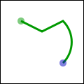
Arcs are parts of the outside of a circle. Unlike straight lines, the point you directly specify is not
on the path. Instead it is the center of the circle that makes up the addition to the path. Both a
starting and ending point on the circle must be specified, and these points are connected either
clockwise by cairo-arc or counter-clockwise by
cairo-arc-negative. If the previous reference
point is not on this new curve, a straight line is added from it to where the arc begins. The reference
point is then updated to where the arc ends. There are only absolute versions.
(cairo-arc cr 0.5 0.5 (* 0.25 (sqrt 2)) (* -0.25 pi) (* 0.25 pi))
Curves
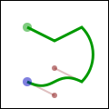
Curves in Cairo are cubic Bezier splines. They start at the current reference point and smoothly follow
the direction of two other points (without going through them) to get to a third specified point. Like
lines, there are both absolute cairo-curve-to and
relative cairo-rel-curve-to versions. Note that
the relative variant specifies all points relative to the previous reference point, rather than each
relative to the preceding control point of the curve.
(cairo-rel-curve-to cr -0.25 -0.125 -0.25 0.125 -0.5, 0)
Close the path

Cairo can also close the path by drawing a straight line to the beginning of the current sub-path. This straight line can be useful for the last edge of a polygon, but is not directly useful for curve-based shapes. A closed path is fundamentally different from an open path: it is one continuous path and has no start or end. A closed path has no line caps for there is no place to put them.
(cairo-close-path cr)
Text
Finally text can be turned into a path with
cairo-text-path. Paths created from text are like any other path, supporting stroke
or fill operations. This path is placed anchored to the current reference point, so
cairo-move-to your desired location before turning
text into a path. However there are performance concerns to doing this if you are working with a lot of
text; when possible you should prefer using the verb
cairo-show-text over
cairo-text-path and cairo-fill.
16.3. Understanding Text
To use text effectively you need to know where it will go. The methods
cairo-font-extents and
cairo-text-extents get you this information. Since this diagram is hard to see so
small, I suggest getting its source and bump the size up to 600. It shows the relation between the
reference point (red dot); suggested next reference point (blue dot); bounding box (dashed blue lines);
bearing displacement (solid blue line); and height, ascent, baseline, and descent lines (dashed green).
The reference point is always on the baseline. The descent line is below that, and reflects a rough bounding box for all characters in the font. However it is an artistic choice intended to indicate alignment rather than a true bounding box. The same is true for the ascent line above. Next above that is the height line, the artist-recommended spacing between subsequent baselines. All three of these are reported as distances from the baseline, and expected to be positive despite their differing directions.
The bearing is the displacement from the reference point to the upper-left corner of the bounding box. It is often zero or a small positive value for x displacement, but can be negative x for characters like j as shown; it is almost always a negative value for y displacement. The width and height then describe the size of the bounding box. The advance takes you to the suggested reference point for the next letter. Note that bounding boxes for subsequent blocks of text can overlap if the bearing is negative, or the advance is smaller than the width would suggest.
In addition to placement, you also need to specify a face, style, and size. Set the face and style
together with cairo-select-font-face, and the
size with cairo-set-font-size. If you need even
finer control, try getting a
cairo-font-options-t with
cairo-get-font-options, tweaking it, and setting it with
cairo-set-font-options.
16.4. Working with Transforms
Transforms have three major uses. First they allow you to set up a coordinate system that is easy to
think in and work in, yet have the output be of any size. Second they allow you to make helper functions
that work at or around a (0, 0) but can be applied anywhere in the output image. Thirdly they let you
deform the image, turning a circular arc into an elliptical arc, etc. Transforms are a way of setting
up a relation between two coordinate systems. The device-space coordinate system is tied to the surface,
and cannot change. The user-space coordinate system matches that space by default, but can be changed
for the above reasons. The helper functions
cairo-user-to-device and
cairo-user-to-device-distance tell you what the device-coordinates are for a
user-coordinates position or distance. Correspondingly
cairo-device-to-user and
cairo-device-to-user-distance tell you user-coordinates for a device-coordinates
position or distance. Remember to send positions through the non-distance variant, and relative moves
or other distances through the distance variant.
I leverage all of these reasons to draw the diagrams in this document. Whether I am drawing 120 x 120
or 600 x 600, I use cairo-scale to give me a 1.0 x 1.0
workspace. To place the results along the right column, such as in the discussion of cairo's drawing
model, I use cairo-translate. And to add the
perspective view for the overlapping layers, I set up an arbitrary deformation with
cairo-transform on a
cairo-matrix-t.
To understand your transforms, read them bottom to top, applying them to the point you are drawing. To figure out which transforms to create, think through this process in reverse. For example if I want my 1.0 x 1.0 workspace to be 100 x 100 pixels in the middle of a 120 x 120 pixel surface, I can set it up one of three ways:
1. (cairo-translate cr 10 10)
   (cairo-scale cr 100 100)

2. (cairo-scale cr 100 100)
   (cairo-translate cr 0.1 0.1)

3. (let ((mat (cairo-matrix-init 100 0 0 100 10 10)))
     (cairo-transform cr mat)
     ... )
Use the first when relevant because it is often the most readable; use the third when necessary to access additional control not available with the primary functions.
Be careful when trying to draw lines while under transform. Even if you set your line width while the
scale factor was 1, the line width setting is always in user-coordinates and is not modified by setting
the scale. While you are operating under a scale, the width of your line is multiplied by that scale.
To specify a width of a line in pixels, use
cairo-device-to-user-distance to turn a (1, 1) device-space distance into, for
example, a (0.01, 0.01) user-space distance. Note that if your transform deforms the image there is not
necessarily a way to specify a line with a uniform width.
16.5. Where to Go Next
This wraps up the tutorial. It does not cover all functions in Cairo, so for some "advanced" lesser-used features, you will need to look elsewhere. The code behind the examples (layer diagrams, drawing illustrations) uses a handful of techniques that are not described within, so analyzing them may be a good first step. Other examples on cairographics.org lead in different directions. As with everything, there is a large gap between knowing the rules of the tool, and being able to use it well. The final section of this document provides some ideas to help you traverse parts of the gap.
16.6. Tips and Tricks
In the previous sections you should have built up a firm grasp of the operations Cairo uses to create images. In this section I've put together a small handful of snippets I have found particularly useful or non-obvious. I am still new to Cairo myself, so there may be other better ways to do these things. If you find a better way, or find a cool way to do something else, let me know and perhaps I can incorporate it into these tips.
16.6.1. Line Width
When you are working under a uniform scaling transform, you can not just use pixels for the width of
your line. However it is easy to translate it with the help of
cairo-device-to-user-distance
(assuming that the pixel width is 1):
(muliple-value-bind (ux uy)
    (cairo-device-to-user-distance cr)
  (cairo-set-line-width cr (min ux uy)))
When you are working under a deforming scale, you may wish to still have line widths that are uniform in device space. For this you should return to a uniform scale before you stroke the path. In the image, the arc on the left is stroked under a deformation, while the arc on the right is stroked under a uniform scale.
(cairo-set-line-width cr 0.1)

(cairo-save cr)
(cairo-scale cr 0.5 1)
(cairo-arc cr 0.5 0.5 0.40 0 (* 2 pi))
(cairo-stroke cr)

(cairo-translate cr 1 0)
(cairo-arc cr 0.5 0.5 0.40 0 (* 2pi))
(cairo-restore cr)
(cairo-stroke cr)
16.6.2. Text Alignment
When you try to center text letter by letter at various locations, you have to decide how you want to center it. For example the following code will actually center letters individually, leading to poor results when your letters are of different sizes. (Unlike most examples, here I assume a 26 x 1 workspace.)
cairo_text_extents_t te;
char alphabet[] = "AbCdEfGhIjKlMnOpQrStUvWxYz";
char letter[2];

for (i=0; i < strlen(alphabet); i++) {
    *letter = '\0';
    strncat (letter, alphabet + i, 1);

    cairo_text_extents (cr, letter, &te);
    cairo_move_to (cr, i + 0.5 - te.x_bearing - te.width / 2,
            0.5 - te.y_bearing - te.height / 2);
    cairo_show_text (cr, letter);
}
Instead the vertical centering must be based on the general size of the font, thus keeping your baseline steady. Note that the exact positioning now depends on the metrics provided by the font itself, so the results are not necessarily the same from font to font.
cairo_font_extents_t fe;
cairo_text_extents_t te;
char alphabet[] = "AbCdEfGhIjKlMnOpQrStUvWxYz";
char letter[2];

cairo_font_extents (cr, &fe);
for (i=0; i < strlen(alphabet); i++) {
    *letter = '\0';
    strncat (letter, alphabet + i, 1);

    cairo_text_extents (cr, letter, &te);
    cairo_move_to (cr, i + 0.5 - te.x_bearing - te.width / 2,
            0.5 - fe.descent + fe.height / 2);
    cairo_show_text (cr, letter);
}
16.7. Writing a Widget Using Cairo and GTK
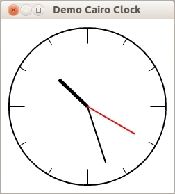
This demo shows a custom widget named egg-clock-face which draws a clock using
Cairo. This Cairo Clock example is inspired by the C code from Davyd Madeley.
egg-clock-face is defined as a subclass of the
gtk-drawing-area
class. Only the property time is added to
hold the actual time of the clock. The initialize-instance method installs a
timeout source with the function g-timeout-add
, which updates every second the time property of egg-clock-face
and requests the redrawing of the widget. The "draw" signal handler draws the clock
into the
gtk-drawing-area of the
egg-clock-face widget.
(asdf:load-system :cl-cffi-gtk)

(defpackage :cairo-clock
  (:use :gtk :gdk :gobject :glib :pango :cairo :cffi :iterate :common-lisp)
  (:export #:demo-cairo-clock))

(in-package :cairo-clock)

;; Class egg-clock-face is a subclass of a GtkDrawingArea

(defclass egg-clock-face (gtk-drawing-area)
  ((time :initarg :time
         :initform (multiple-value-list (get-decoded-time))
         :accessor egg-clock-face-time))
  (:metaclass gobject-class))

(defmethod initialize-instance :after
    ((clock egg-clock-face) &key &allow-other-keys)
  ;; A timeout source for the time
  (g-timeout-add 1000
                 (lambda ()
                   (setf (egg-clock-face-time clock)
                         (multiple-value-list (get-decoded-time)))
                   (gtk-widget-queue-draw clock)
                   +g-source-continue+))
  ;; Signal handler which draws the clock
  (g-signal-connect clock "draw"
     (lambda (widget cr)
       (let ((cr (pointer cr))
             ;; Get the GdkWindow for the widget
             (window (gtk-widget-window widget)))
       ;; Clear surface
       (cairo-set-source-rgb cr 1.0 1.0 1.0)
       (cairo-paint cr)
       (let* ((x (/ (gdk-window-width window) 2))
              (y (/ (gdk-window-height window) 2))
              (radius (- (min x y) 12)))
         ;; Clock back
         (cairo-arc cr x y radius 0 (* 2 pi))
         (cairo-set-source-rgb cr 1 1 1)
         (cairo-fill-preserve cr)
         (cairo-set-source-rgb cr 0 0 0)
         (cairo-stroke cr)
         ;; Clock ticks
         (let ((inset 0.0)
               (angle 0.0))
           (dotimes (i 12)
             (cairo-save cr)
             (setf angle (/ (* i pi) 6))
             (if (eql 0 (mod i 3))
                 (setf inset (* 0.2 radius))
                 (progn
                   (setf inset (* 0.1 radius))
                   (cairo-set-line-width cr
                                         (* 0.5 (cairo-get-line-width cr)))))
             (cairo-move-to cr
                            (+ x (* (- radius inset) (cos angle)))
                            (+ y (* (- radius inset) (sin angle))))
             (cairo-line-to cr
                            (+ x (* radius (cos angle)))
                            (+ y (* radius (sin angle))))
             (cairo-stroke cr)
             (cairo-restore cr)))
         (let ((seconds (first (egg-clock-face-time clock)))
               (minutes (second (egg-clock-face-time clock)))
               (hours (third (egg-clock-face-time clock))))
           ;; The hour hand is rotated 30 degrees (pi/6 r) per hour
           ;; + 1/2 a degree (pi/360 r) per minute
           (let ((hours-angle (* (/ pi 6) hours))
                 (minutes-angle (* (/ pi 360) minutes)))
             (cairo-save cr)
             (cairo-set-line-width cr (* 2.5 (cairo-get-line-width cr)))
             (cairo-move-to cr x y)
             (cairo-line-to cr
                            (+ x
                               (* (/ radius 2)
                                  (sin (+ hours-angle minutes-angle))))
                            (+ y
                               (* (/ radius 2)
                                  (- (cos (+ hours-angle minutes-angle))))))
             (cairo-stroke cr)
             (cairo-restore cr))
           ;; The minute hand is rotated 6 degrees (pi/30 r)
           ;; per minute
           (let ((angle (* (/ pi 30) minutes)))
             (cairo-move-to cr x y)
             (cairo-line-to cr
                            (+ x (* radius 0.75 (sin angle)))
                            (+ y (* radius 0.75 (- (cos angle)))))
             (cairo-stroke cr))
           ;; Seconds hand: Operates identically to the minute hand
           (let ((angle (* (/ pi 30) seconds)))
             (cairo-save cr)
             (cairo-set-source-rgb cr 1 0 0)
             (cairo-move-to cr x y)
             (cairo-line-to cr (+ x (* radius 0.7 (sin angle)))
                               (+ y (* radius 0.7 (- (cos angle)))))
             (cairo-stroke cr)
             (cairo-restore cr))))
       ;; Destroy the Cario context
       (cairo-destroy cr)
       t))))

(defun demo-cairo-clock ()
  (within-main-loop
    (let ((window (make-instance 'gtk-window
                                 :title "Demo Cairo Clock"
                                 :default-width 250
                                 :default-height 250))
          (clock (make-instance 'egg-clock-face)))
      (g-signal-connect window "destroy"
                        (lambda (widget)
                          (declare (ignore widget))
                          (leave-gtk-main)))
      (gtk-container-add window clock)
      (gtk-widget-show-all window))))
Chapter 17. Deprecated
17.1. Packing Using Tables
Tables are another way of packing widgets. Using tables a grid is created that widgets can placed in. The
widgets may take up as many spaces as specified. Tables can be created with the function
gtk-table-new.
The function takes the three arguments rows, columns, and
homogeneous which set the properties of a table. Alternatively, the table is created with the
function make-instance.
The first argument rows of the function
gtk-table-new is the number of rows to make in the
table, while the second argument columns is the number of columns. The last argument
homogeneous has to do with how the boxes of the table are sized. If homogeneous
is true, the table boxes are resized to the size of the largest widget in the table. If
homogeneous is false, the size of a table boxes is dictated by the tallest
widget in its same row, and the widest widget in its column. The rows and columns are laid out from
0 to n, where n is the number of specified rows or columns.
To place a widget into a table, the function
gtk-table-attach can be used. The first argument
table is the table you have created and the second argument child the widget
you wish to place into the table. The left and right attach arguments specify where to place the widget,
and how many boxes to use.
The keyword arguments :xoptions and :yoptions have values of the
gtk-attach-options flags and used to specify packing options. The packing options can be OR'ed together
to allow multiple options. In the Lisp binding a list of options is used to combine multiple options.
Padding is just like in boxes, creating a clear area around the widget specified in pixels and is
controlled with the keyword arguments :xpadding and :ypadding.
In the Lisp binding the keyword arguments :xoptions, :yoptions,
:xpadding, and :ypadding of the function
gtk-table-attach have default values.
In the C library this is realized with a second function gtk_table_attach_defaults().
The functions
gtk-table-set-row-spacing and
gtk-table-set-col-spacing places spacing between the rows
at the specified row or column. The first argument of the functions is a
gtk-table widget, the second
argument a row or a column number and the third argument the spacing. Note that for columns, the space
goes to the right of the column, and for rows, the space goes below the row.
You can also set a consistent spacing of all rows and columns with the functions
gtk-table-row-spacing
and
gtk-table-column-spacing. Both functions take a
gtk-table widget as the first argument and the
desired spacing as the second argument. Note that with these calls, the last row and last column do not
get any spacing.
Note
The
gtk-table widget has been deprecated since GTK 3.4. It is recommended to use the
gtk-grid widget
instead. The
gtk-grid widget provides the same capabilities as the
gtk-table widget for arranging
widgets in a rectangular grid, but does support height-for-width geometry management, which is newly
introduced for widgets in GTK 3.
Table Packing Example
Figure 17.1, “Table Packing” shows a window with three buttons in a 2 x 2 table. The first two buttons are placed in the upper row. A third, Quit button, is placed in the lower row, spanning both columns. The code of this example is shown Example 17.1, “Table Packing”.
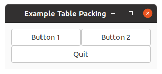
;;;; Example Table packing (2021-7-9)

(in-package :gtk-example)

(defun example-table-packing ()
  (within-main-loop
    (let ((window (make-instance 'gtk-window
                                 :type :toplevel
                                 :title "Example Table Packing"
                                 :border-width 12
                                 :default-width 300))
          (table (make-instance 'gtk-table
                                :n-columns 2
                                :n-rows 2
                                :homogeneous t))
          (button1 (make-instance 'gtk-button
                                  :label "Button 1"))
          (button2 (make-instance 'gtk-button
                                  :label "Button 2"))
          (quit (make-instance 'gtk-button
                               :label "Quit")))
      (g-signal-connect window "destroy"
                        (lambda (widget)
                          (declare (ignore widget))
                          (leave-gtk-main)))
      (g-signal-connect quit "clicked"
                        (lambda (widget)
                          (declare (ignore widget))
                          (gtk-widget-destroy window)))
      (gtk-table-attach table button1 0 1 0 1)
      (gtk-table-attach table button2 1 2 0 1)
      (gtk-table-attach table quit    0 2 1 2)
      (gtk-container-add window table)
      (gtk-widget-show-all window))))
Figure 17.2, “Table Packing with more spacing” is an extended example to show the possibility to increase the spacing of the rows and columns. This is implemented through two toggle buttons which increase and decrease the spacings. Toggle buttons are described in Section 3.2, “Toggle Button” in this tutorial. The code of the example is shown in Example 17.2, “Table Packing with more spacing”.
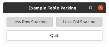
;;;; Example Table packing with more spacing (2021-7-9)

(in-package :gtk-example)

(defun example-table-packing-2 ()
  (within-main-loop
    (let ((window (make-instance 'gtk-window
                                 :type :toplevel
                                 :title "Example Table Packing"
                                 :border-width 12
                                 :default-width 300))
          (table (make-instance 'gtk-table
                                :n-columns 2
                                :n-rows 2
                                :homogeneous t))
          (button1 (make-instance 'gtk-toggle-button
                                  :label "More Row Spacing"))
          (button2 (make-instance 'gtk-toggle-button
                                  :label "More Col Spacing"))
          (quit (make-instance 'gtk-button
                               :label "Quit")))
      (g-signal-connect window "destroy"
                        (lambda (widget)
                          (declare (ignore widget))
                          (leave-gtk-main)))
      (g-signal-connect button1 "toggled"
         (lambda (widget)
           (if (gtk-toggle-button-active widget)
               (progn
                 (setf (gtk-table-row-spacing table) 12)
                 (setf (gtk-button-label widget) "Less Row Spacing"))
               (progn
                 (setf (gtk-table-row-spacing table) 0)
                 (setf (gtk-button-label widget) "More Row Spacing")))))
      (g-signal-connect button2 "toggled"
         (lambda (widget)
           (if (gtk-toggle-button-active widget)
               (progn
                 (setf (gtk-table-column-spacing table) 12)
                 (setf (gtk-button-label widget) "Less Col Spacing"))
               (progn
                 (setf (gtk-table-column-spacing table) 0)
                 (setf (gtk-button-label widget) "More Col Spacing")))))
      (g-signal-connect quit "clicked"
                        (lambda (widget)
                          (declare (ignore widget))
                          (gtk-widget-destroy window)))
      (gtk-table-attach table button1 0 1 0 1)
      (gtk-table-attach table button2 1 2 0 1)
      (gtk-table-attach table quit    0 2 1 2)
      (gtk-container-add window table)
      (gtk-widget-show-all window))))
17.2. Alignment Widget
The
gtk-alignment widget allows to place a widget within its window at a position and size relative to
the size of the alignment itself. For example, it can be useful for centering a widget within the window.
The alignment has the four properties xalign, yalign, xscale, and
yscale. The properties are floating point numbers. The align settings are used to place the
child widget within the available area. The values range from 0.0, top or left, to 1.0, bottom or right.
If the scale settings are both set to 1.0, the alignment settings have no effect. The scale settings are
used to specify how much the child widget should expand to fill the space allocated to the alignment. The
values can range from 0.0, meaning the child does not expand at all, to 1.0, meaning the child expands to
fill all of the available space.
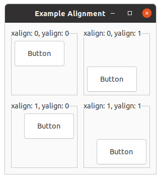
The properties are set when creating the alignment with the function
gtk-alignment-new. For an existing
alignment the properties can be set with the function
gtk-alignment-set. A child widget can be added to
the alignment using the function
gtk-container-add.
In addition, the alignment has the properties top-padding, bottom-padding,
left-padding, and right-padding. These properties control how many space is
added to the sides of the widget. The functions
gtk-alignment-set-padding and
gtk-alignment-get-padding are used to set or to retrieve the values of the padding properties.
Note
Note that the desired effect can in most cases be achieved by using the
halign,
valign and
margin properties on the child widget, so the
gtk-alignment
widget is deprecated and should not be used in new code.
;;;; Example Alignment (2021-6-5)

(in-package :gtk-example)

(defun example-alignment ()
  (within-main-loop
    (let ((window (make-instance 'gtk-window
                                 :type :toplevel
                                 :title "Example Alignment"
                                 :border-width 12
                                 :width-request 300
                                 :height-request 300))
          (grid (make-instance 'gtk-grid
                                :column-spacing 12
                                :column-homogeneous t
                                :row-spacing 12
                                :row-homogeneous t)))
      (g-signal-connect window "destroy"
                        (lambda (widget)
                          (declare (ignore widget))
                          (leave-gtk-main)))
      (let ((frame (make-instance 'gtk-frame
                                  :label "xalign: 0, yalign: 0"))
            (button (make-instance 'gtk-button
                                   :label "Button"))
            (alignment (make-instance 'gtk-alignment
                                      :xalign 0.00
                                      :yalign 0.00
                                      :xscale 0.50
                                      :yscale 0.25)))
        (gtk-alignment-set-padding alignment 6 6 6 6)
        (gtk-container-add alignment button)
        (gtk-container-add frame alignment)
        (gtk-grid-attach grid frame 0 1 1 1))
      (let ((frame (make-instance 'gtk-frame
                                  :label "xalign: 0, yalign: 1"))
            (button (make-instance 'gtk-button
                                   :label "Button"))
            (alignment (make-instance 'gtk-alignment
                                      :xalign 0.00
                                      :yalign 1.00
                                      :xscale 0.50
                                      :yscale 0.25)))
        (gtk-alignment-set-padding alignment 6 6 6 6)
        (gtk-container-add alignment button)
        (gtk-container-add frame alignment)
        (gtk-grid-attach grid frame 1 1 1 1))
      (let ((frame (make-instance 'gtk-frame
                                  :label "xalign: 1, yalign: 0"))
            (button (make-instance 'gtk-button
                                   :label "Button"))
            (alignment (make-instance 'gtk-alignment
                                      :xalign 1.00
                                      :yalign 0.00
                                      :xscale 0.50
                                      :yscale 0.25)))
        (gtk-alignment-set-padding alignment 6 6 6 6)
        (gtk-container-add alignment button)
        (gtk-container-add frame alignment)
        (gtk-grid-attach grid frame 0 2 1 1))
      (let ((frame (make-instance 'gtk-frame
                                  :label "xalign: 1, yalign: 1"))
            (button (make-instance 'gtk-button
                                   :label "Button"))
            (alignment (make-instance 'gtk-alignment
                                      :xalign 1.00
                                      :yalign 1.00
                                      :xscale 0.50
                                      :yscale 0.25)))
        (gtk-alignment-set-padding alignment 6 6 6 6)
        (gtk-container-add alignment button)
        (gtk-container-add frame alignment)
        (gtk-grid-attach grid frame 1 2 1 1))
      (gtk-container-add window grid)
      (gtk-widget-show-all window))))
17.3. GtkUIManager
A
gtk-ui-manager object can dynamically construct a user interface consisting of menus and toolbars from
a UI description. A UI description is a specification of what menu and toolbar widgets should be present
in an application and is described in an XML format. A
gtk-ui-manager object makes it possible to change
menus and toolbars dynamically using what is called UI merging.
17.3.1. Actions
The principal objects manipulated by a
gtk-ui-manager object are actions, which are instances of the
gtk-action class. Actions represent operations that the user can perform. Associated with an action
are:
- a callback function
- its name
- a label
- an accelerator
- a flag indicating whether the label is a stock ID
- a tooltip
- a toolbar label
- a flag indicating whether it is sensitive
- a flag indicating whether it is visible
The callback function is the function that is executed when the action is activated. The action name is
how it is referred to, not what appears in a menu item or toolbar button, which is its label. Actions
can have associated keyboard accelerators and tooltips. Their visibility and sensitivity can be
controlled as well. The idea is that you can create actions that the
gtk-ui-manager object can bind to
proxies such as menu items and toolbar buttons.
The
gtk-action class has methods to create icons, menu items and toolbar items representing itself, as
well as get and set methods for accessing and changing its properties. The
gtk-action class also has
two subclasses:
gtk-toggle-action and
gtk-recent-action. The
gtk-toggle-action class has a
gtk-radio-action subclass. These correspond to toggle buttons and radio buttons respectively.
17.3.2. Actions Groups
Actions are organized into
gtk-action-group objects. An action group is essentially a map from names
to
gtk-action objects. Action groups are the easiest means for adding actions to a UI manager object.
In general, related actions should be placed into a single group. More precisely, since the UI manager can add and remove actions as groups, if the interface is supposed to change dynamically, then all actions that should be available in the same state of the application should be in the same group. It is typical that multiple action groups are defined for a particular user interface. Most nontrivial applications will make use of multiple groups. For example, in an application that can play media files, when a media file is open, the playback actions (Play, Pause, Rewind, etc.) would be in a group that could be added and removed as needed.
17.3.3. UI Definitions
You can specify the set user interface action elements in your application with an XML description called
a UI definition. A UI definition is a textual description that represents the actions and the widgets
that will be associated with them. It must be bracketed by the pair of tags <ui> and
</ui>. Within these tags you describe your user interface in a hierarchical way, by
defining menubars, which would contain menus, which in turn contain menus and menu items, toolbars, which
would contain tool items, and pop-up menus, which can contain menus and menu items. The set of tags that
can be used in these UI definitions, with their descriptions and attributes, is shown in
Table 17.1, “UI definitions”.
| Tag | Description | Attributes | Closing Tag |
|---|---|---|---|
<menubar> |
gtk-menu-bar |
name, action | yes |
<toolbar> |
gtk-toolbar |
name, action | yes |
<popup> |
toplevel gtk-menu |
name, action, accelerators | yes |
<menu> |
gtk-menu attached to a menu item |
name, action, position | yes |
<menuitem> |
gtk-menu-item subclass, the exact type depends on the action |
name, action, position, always-show-image | no |
<toolitem> |
gtk-tool-item subclass, the exact type depends on the action |
name, action, position | no |
<separator> |
gtk-separator-menu-item or gtk-separator-tool-item |
name, action, expand | no |
<accelerator> |
keyboard accelerator | name, action | no |
<placeholder> |
placeholder for dynamically adding an item | name, action | yes |
Example
The following example shows a UI definition of a menubar and its submenus.
<ui>
  <menubar name='MainMenu'>
    <menu name='File' action='FileMenu'>
      <menuitem name='Open'action='Open' always-show-image='true'/>
      <menuitem name='Close' action='Close' always-show-image='true'/>
      <separator/>
      <menuitem name='Exit' action='Exit'/>
    </menu>
    <menu action='ViewMenu'>
      <menuitem name='ZoomIn' action='ZoomIn'/>
      <menuitem name='ZoomOut' action='ZoomOut'/>
      <separator/>
      <menuitem name='FullScreen' action='FullScreen'/>
      <separator/>
      <menuitem name='JustifyLeft' action='JustifyLeft'/>
      <menuitem name='JustifyCenter' action='JustifyCenter'/>
      <menuitem name='JustifyRight' action='JustifyRight'/>
      <menu action='IndentMenu'>
        <menuitem action='Indent'/>
        <menuitem action='Unindent'/>
      </menu>
    </menu>
  </menubar>
</ui>
Notes
-
Some tags must have a closing tag and some do not. Those with no closing tag are
<menuitem>,<toolitem>,<separator>, and<accelerator>. A tag that does not have a closing tag must have a forward slash preceding its right bracket:/>. All other tags can have content. - All attribute values are plain text strings.
- All UI elements have a name and action attribute. The name is optional. If a name is not specified, the action is used as its own name. If for some reason, neither the name nor the action attribute are specified, the name of the element is used when referring to it. The name and action attributes must not contain "/" characters after parsing, nor double quotes.
- Menus, menu items, and toolitems have a position attribute with two possible values: "top" and "bottom". If this attribute is missing, its default value of "bottom" is used. This attribute determines where the element is placed relative to its siblings. If the position is "top" then when it is added to the parent container, it will be placed before its siblings, meaning to the left in a horizontal container or above the siblings in a vertical container. If it is "bottom" then it will be placed to the right of the siblings or below them in horizontal and vertical containers respectively.
-
The elements are added to the UI interface in the order in which they appear in the XML string. In the
above example, the
JustifyLeftaction precedes theJustifyCenteraction, so the former will appear above the latter. If however, the UI was defined as follows:<menuitem name='JustifyLeft' action='JustifyLeft' position='top'/> <menuitem name='JustifyCenter action='JustifyCenter' position='top'/> <menuitem name='JustifyRight' action='JustifyRight' position='top'/>then they would appear in the orderJustifyRight JustifyCenter JustifyLeftbecause each time the element is inserted, the "top" position attribute forces it to be above its siblings. The "top" attribute converts the packing into a stack push operation in effect. -
Image menu items have a
always-show-imageattribute with two possible values:trueandfalse. If this attribute is true, then menu item icons will always be visible, overriding any user settings in the desktop environment. - Separators can have an expand attribute, with the value "true" or "false". If it is set to "true" then the separator will expand to take up extra space in the parent container and become invisible. Otherwise it is drawn as a thin line, depending on the theme.
-
Submenus are created in a different way using the XML than they are when constructing these
programmatically. Remember that submenus are attached to menu items, which are contained in the parent
menu. Here, a
<menu>element can be a direct child of a parent<menu>element. In the example above, the menu whose action is 'IndentMenu' is a child of the 'ViewMenu'. - Placeholders are merged into their parent containers invisibly. If a placeholder has child elements X, Y, and Z, these will be at the same level of the tree as the placeholder itself. An example later will illustrate the utility of this feature.
- Finally, observe the hierarchy implicit in the UI definition. As a matter of style, you should indent these using standard rules of indentation, to make them easier to read.
We can create a toolbar definition in a similar way:
<ui>
  <toolbar name='ToolBar' action="ToolBarAction">
    <placeholder name="ExtraToolItems">
      <separator/>
      <toolitem name="ZoomIn"action="ZoomIn"/>
      <toolitem name="ZoomOut"action="ZoomOut"/>
      <separator/>
      <toolitem name='FullScreen' action='FullScreen'/>
      <separator/>
      <toolitem name='JustifyLeft' action='JustifyLeft'/>
      <toolitem name='JustifyCenter' action='JustifyCenter'/>
      <toolitem name='JustifyRight' action='JustifyRight'/>
    </placeholder>
  </toolbar>
</ui>
Notice that the tool items have the same action names as some of the menu items. This is how you can
create multiple proxies for the same action. When the
gtk-ui-manager object loads these descriptions,
and you take the appropriate steps in your program, they will be connected to the same callback
functions.
Notice also that there is a placeholder in the toolbar defined above. We can use that placeholder to dynamically add more tool items in that position. It does not occupy space in the toolbar widget; it just marks a position to be accessed, so there is no downside to putting these placeholders into the UI definition.
17.3.4. Creating the UI
The basic steps in creating the UI are:
- Define the UI in an XML format, either in a separate file or in a constant string within the source code.
- Create the actions and action groups.
- Create a UI manager.
- Add the action groups to the UI manager.
- Extract the accelerators from the UI manager and add them to the toplevel window.
- Add the UI definition to the UI manager from the file or string.
- Get the menubar and toolbar widgets from the UI manager and pack them into the window.
- Create the callbacks referenced in the action objects created in step 2.
Creating Actions and Action Groups
The function to create an action group is
gtk-action-group-new. The argument name can be
used by various methods for accessing this particular action group. It should reflect what this
particular purpose or common feature of the group is. Actions are added to an action group in one of two
ways. You can add them one at a time with the function
gtk-action-group-add-action, or as a list of
related actions with the function
gtk-action-group-add-actions.
The problem with the first method is that it is tedious to add actions one by one, and that this method
does not provide a means to add the accelerators for the actions without additional steps. Even if there
is just a single action in the group, it is more convenient to use the second function. To use the
function
gtk-action-group-add-actions, you first have to create a list of action entries, which looks
like the following example:
(list
  (list <name> <stock-id> <label> <accelerator> <tooltip> <callback>)
  ... )
The members of the list have the following meanings:
- name
- The name of the action.
- stock-id
- The stock ID for the action, or the name of an icon from the icon theme.
- label
-
The label for the action. If
labelisnil, the label of the stock item with IDstock-idis used. - accelerator
-
The accelerator for the action, in the format understood by the function
gtk-accelerator-parse. - tooltip
- The tooltip for the action.
- callback
- The function to call when the action is activated.
The argument name must match the name of the action to which it corresponds in the UI
definition. The argument stock-id can be nil, as can the argument
label. The accelerator syntax is very flexible. You can specify control keys, function keys
and even ordinary characters, for example, using "<Control>a", "Ctrl>a","<ctrl>a", or
"<Shift><Alt>F1", "<Release>z", or "minus", to name a few. If you use a stock item, it is
not necessary to supply an accelerator, unless you want to override the default one. The argument
tooltip is a string that will appear when the cursor hovers over the proxy for this action
entry.
Below is an example of a declaration of a small list of action entries.
(defvar file-entries
        (list (list "FileMenu"
                    nil
                    "_File")
              (list "Open"
                    "gtk-open"
                    "_Open"
                    "<control>O"
                    "Open a file"
                    #'on-open-file)
              (list "Close"
                    "gtk-close"
                    "_Close"
                    "<control>W"
                    "Close a file" #'on-close-file)
              (list "Exit"
                    "gtk-quit"
                    "E_xit" "<control>Q"
                    "Exit the program"
                    #'(lambda (widget)
                        (declare (ignore widget))
                        (gtk-widget-destroy toplevel-window)))))
Notice that the FileMenu action does not have a tooltip nor a callback. The Open, Close, and
Exit actions have both a mnemonic label and an accelerator. Having defined this list, it can be added to
a group as follows:
(let ((action-group (gtk-action-group-new "common-actions")))
  (gtk-action-group-add-actions action-group file-entries)
  ... )
Multiple action entry lists can be added to a single action group. In fact, you probably will need to do
this, because toggle actions and radio actions must be defined differently. A
gtk-toggle-action entry
contains all of the members of a
gtk-action entry, as well as an additional boolean flag
is-active. The is-active flag indicates whether or not the action is active or
inactive. To add toggle action entries to an action group you need to use the function
gtk-action-group-add-toggle-actions designed for that purpose. The function differs from the function
gtk-action-group-add-actions only in that it expects a list of
gtk-toggle-action entries. To
illustrate, we could define a list with a single toggle action entry:
(defvar toggle-entries
        (list (list "FullScreen"
                    "gtk-fullscreen"
                    "_FullScreen"
                    "F11"
                    "Switch between full screen and windowed mode"
                    #'on-full-screen
                    nil)))
and add it to the same group as above with
(gtk-action-group-add-toggle-actions common-actions toggle-entries)
GTK defines radio action entries separately. Usually you use radio buttons when there are three or more alternatives. If there are just two, a toggle is the cleaner interface element. Because radio actions can have more than two values, the last element of the list is an integer instead of a boolean.
Unlike ordinary actions and toggle actions, which can have different callbacks for each action, radio action entries do not specify a callback function. Furthermore, the last member of this list is the value that that particular radio action has. If for example, there are three radio actions for how text is to be aligned, left, right, or centered, then one would have the value 0, the next, 1, and the third, 2. An example of a list of radio action entries is below.
(defvar radio-entries
        (list (list "JustifyLeft"
                    "gtk-justify-left"
                    "_Left"
                    nil
                    "Left justify text"
                    0)
              (list "JustifyCenter"
                    "gtk-justify-center"
                    "_Center"
                    nil
                    "Center the text"
                    1)
              (list "JustifyRight"
                    "gtk-justify-right"
                    "_Right"
                    nil
                    "Right justify the text"
                    2)))
Because radio action entries do not have a callback function as a member, the function
gtk-action-group-add-radio-actions to add radio actions to an action group specifies a single callback
function to be used for all of the actions in the list of radio actions being added. This is the callback
function that will be called in response to the "changed" signal.
Also, this function has another parameter that specifies the value that should be active initially. It is either one of the values in the individual radio action entries, or -1 to indicate that none should be active to start. We could add the radio action list to our group with the call
(gtk-action-group-add-radio-actions action-group
                                    radio-entries
                                    0
                                    #'on-change)
specifying that the JustifyLeft action is the initial value.
Creating the UIManager and Adding the Action Groups
A
gtk-ui-manager object is created with the function
gtk-ui-manager-new. This creates a UI manager
object that can then be used for creating and managing the user interface of the application. It is now
ready to be populated with the action groups that you already defined. To insert an action group into the
UI manager, use the function
gtk-ui-manager-insert-action-group.
The first argument is the object returned by the call to create the UI manager. The second is the group
to be inserted. The argument pos specifies the position in the list of action groups
managed by this UI manager. Action groups that are earlier in this list will be accessed before those
that are later in this list. A consequence of this is that, if an action with the same name, e.g.
"Open", is in two different groups, the entry in the group with smaller position will hide the one in
the group with larger position. For example, if an "Open" action is in groups named
action-group1 and action-group2, and action-group1 is inserted at
position 1, and action-group2 is at position 2, then the entry for the "Open" action in
action-group1 will be used by the UI manager when its proxy is activated. If it has a
different callback or label or accelerator, these will be associated with this action, not the one in
action-group2. You can use this feature if you need to change the semantics of a menu item
or toolbar button, but not the menu item or button itself.
While we are on the subject of inserting actions, we might as well look at how you can remove an action
group, if you have need to do that dynamically. That function is
gtk-ui-manager-remove-action-group.
This searches the list of action groups in the UI manager and deletes the one which is passed to it.
Extracting Accelerators and adding them to the Toplevel Window
Accelerators are key combinations that provide quick access to the actions in a window. They are usually
associated with the toplevel window so that key-presses while that window has focus can be handled by
the"key-press-event" handler of the toplevel window, which can propagate it through the chain of widgets.
The problem is that the accelerators are stored within the UI manager, not the toplevel window, when
you insert the action groups into it. The UI manager aggregates the accelerators into its private data
as action groups are added to it. However it provides a method of extracting them. The set of
accelerators can be extracted into a
gtk-accel-group object that can be added into a toplevel window.
The function that does this is
gtk-ui-manager-accel-group. The function that adds this group into a
toplevel window is
gtk-window-add-accel-group. The following code snippet will extract the accelerators
and add them to the toplevel window:
(let ((accel-group (gtk-ui-manager-accel-group ui-manager)))
  (gtk-window-add-accel-group window accel-group)
  ... )
Loading the UI Definition
If the UI definition is in a separate file, it can be loaded using the function
gtk-ui-manager-add-ui-from-file. The first argument is the UI manager object, the second, a filename
passed as a UTF-8 string. If this function is successful, it will return a positive integer called a
merge ID. If the function fails, for one reason or another, the return value will be zero. Therefore it
is a good idea to check the return value of the function. The following code fragment tests both
conditions and terminates the program with an error message if there is an error:
(let ((merge-id (gtk-ui-manager-add-ui-from-file ui-manager "menu-1.xml")))
  (when (= 0 merge-id)
    (error-message "Could not load UI Manager definition"))
  ... )
The function error-message displays a message dialog with a suitable message.
An alternative to storing the UI definition in a file in the source code tree is to store the UI
definition as a string within a source code file itself. If the UI definition is in a string, then it
can be added with the function
gtk-ui-manager-add-ui-from-string.
The argument buffer is the name of the string containing the UI definition. The return value
is also either a positive integer on success, in which case it is a valid merge ID, or zero on failure.
The following listing shows how to define a UI definition in a string.
(defparameter ui-constant
"<ui>
<menubar name='MainMenu'>
<menu action='FileMenu'>
<placeholder name='FilePlace'/>
<separator/>
<menuitem action='Exit'/>"
</menu>"
<menu action='ViewMenu'>"
<menuitem action='ZoomIn'/>"
<menuitem action='ZoomOut'/>"
<separator/>"
<menuitem action='FullScreen'/>"
<separator/>"
</menu>"
</menubar>"
</ui>")
This would then be added to the UI manager with the fragment
(let ((merge-id (gtk-ui-manager-add-ui-from-string manager ui-constant)))
(when (= 0 merge-id)
(error-message "Could not load UI Manager definition"))
... )
Getting the Widgets
The last step is to retrieve the widgets that the UI manager created when the UI definition was loaded into it, and pack those widgets into the window where you want them to be. This is where the names of the UI definition elements come into play. The UI manager can find a widget for you when you give it the absolute pathname of the element that you want to construct. The absolute pathname is a string starting with a forward slash '/', much like a absolute pathname of the file, with a sequence of the ancestor elements in the XML tree of that element.
Elements which do not have a name or action attribute in the XML (e.g. <popup>) can
be addressed by their XML element name (e.g. "popup"). The root element ("/ui") can be omitted in the
path.
As an example, the absolute pathname of the FileMenu in the UI definition above is
"/MainMenu/FileMenu".
The function
gtk-ui-manager-widget finds the widget that the UI manager constructed, whose name matches
the pathname that you give it. If you give it the name of a menubar, you get a menubar widget with its
entire subtree. If you give it the name of a menu, you get the menu item to which the menu is attached,
not the menu.
If our UI definition had a menubar and toolbar at the top level named "MainMenu" and "MainToolBar" respectively, we could get them from the UI manager using
(let ((menubar (gtk-ui-manager-widget ui-manager "/MainMenu"))
(toolbar (gtk-ui-manager-widget ui-manager "/MainToolBar")))
... )
We could then pack these into a
gtk-box widget one below the other in our main window, and we would be
finished, except of course for defining all of the required callback functions.
Note. The widgets that are constructed by a UI manager are not tied to the life-cycle of that UI manager. It does acquire a reference to them, but when you add the widgets returned by this function to a container or if you explicitly ref them, they will survive the destruction of the UI manager.
17.3.5. UI Merging
One of the most powerful features of the UI manager is its ability to dynamically change the menus and toolbars by overlaying or inserting menu items or toolbar items over others and removing them later. This feature is called UI merging. The ability to merge elements is based on the use of the pathnames to the UI elements defined in the UI definition, and merge IDs.
A merge ID is an unsigned integer value that is associated with a particular UI definition inside the UI
manager. The functions that add UI definitions into the UI manager, such as
gtk-ui-manager-add-ui-from-string and
gtk-ui-manager-add-ui-from-file, return a merge ID that can be
used at a later time, for example, to remove that particular UI definition. The function that removes a
UI definition is
gtk-ui-manager-remove-ui. This is given the merge ID of the UI definition to be
removed. For example, if I create a UI with the call
(let ((merge-id (gtk-ui-manager-add-ui-from-string ui_manager ui_toolbar)))
... )
and I later want to remove the toolbar from the window, I would call
(gtk-ui-manager-remove-ui ui-manger merge-id)
In order to add an element such as a toolbar in one part of the code, and later remove it in a callback function, you would need to make the merge ID either a shared variable, or attach it as a property to a widget that the callback function is passed.
There is a third function
gtk-ui-manager-add-ui for adding a new element to the user interface. This
function can add a single element to the UI definition, such as a menu item, a toolbar item, a menu, or
a menubar. It cannot add an entire UI definition such as the ones contained in the strings defined above.
Furthermore, it cannot be used to insert an element in a place where such an element cannot be inserted.
For example, you cannot insert a toolbar inside a menu, or a menu inside a menu, but you can insert a
menu item in a menu, or a menu in a menubar.
In order to use this function, you need a merge ID to give to it. It will assign associate the new UI
element to this merge ID so that it can be removed at a later time. New merge IDs are created with the
function
gtk-ui-manager-new-merge-id. The third parameter is the absolute path name to the position at
which you want to add the new UI element. For example, if you want to insert a new menu item at the top
of the File menu, the path would be "/MainMenu/FileMenu". The fourth parameter is a name that you want
this item to have for future access and the fifth is the name for the action, which must exist already,
that should be connected to this element.
The type must be a value of the
gtk-ui-manager-item-type flags. You can use :auto as
the type to let GTK decide the type of the element that can be inserted at the indicated path. Lastly,
if you want the element to be above the element that is currently in that position, you set top to
true, otherwise false.
As an example, suppose that I want to add a Print menu item in my File menu just below the Open menu item. I could use the following code fragment, assuming that I have already defined an action named Print:
(let ((merge-id (gtk-ui-manager-new-merge-id ui-manager)))
(gtk-ui-manager-add-ui ui-manager
merge-id
"/MainMenu/FileMenu/Open"
"Print"
"Print"
:menu-item
nil)
... )
This will insert the Print menu item into the proper position.
Assuming that your menu is to be changed dynamically, these steps will not be enough to make the menu elements appear dynamically. The UI manager does not handle the task of packing new toolbars or menubars into their places in the window. However, it does emit the "add-widget" signal for each generated menubar and toolbar. Your application can respond to this signal with a callback function that can pack the UI element into the appropriate position. Therefore, two additional steps are needed by a program that adds and removes menubars or toolbars:
- Create a callback function to pack these widgets into the parent container, and
- Connect the "add-widget" signal emitted by the UI manager to this callback.
The callback for this signal has the prototype
lambda (merge widget)
The first parameter is the UI manager emitting the signal, the second is the widget that has been added. For example
(g-signal-connect ui-manager "add-widget"
(lambda (merge widget)
(declare (ignore merge))
(gtk-box-pack-start menu-box widget :fill nil :expand nil)
(gtk-widget-show widget)))
This will pack the menubar or toolbar after any other widgets in the parent, assuming that
menu-box is a
gtk-box widget of some kind that the menu or toolbar should be packed into.
It must show the widget to realize it.
17.4. Arrow Widget
The
gtk-arrow widget draws an arrowhead, facing in a number of possible directions and having a number
of possible styles. It can be useful when placed on a button. Like the label widget, the arrow widget
emits no signals. There are only two functions for manipulating an arrow widget
gtk-arrow-new and
gtk-arrow-set. The first function creates a new arrow widget with the indicated type and appearance.
The second function allows these values to be altered retrospectively. The type of an arrow can be one of
of the values of the
gtk-arrow-type enumeration. Possible values are :up,
:down, :left and :right. These values obviously indicate the
direction in which the arrow will point.
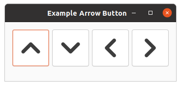
The shadow type argument is a value of the
gtk-shadow-type enumeration and may take one of the the
values :none, :in, :etched-in and :etched-out.
The amount of space used by the arrow is controlled by the arrow-scaling style property.
The arrow-scaling style property takes values of type double float in a range
of [0,1]. The default value is 0.7.
Example 17.4, “Arrow Button” shows a brief example to illustrate the use of arrows in buttons.
In addition, this example introduces the function
gtk-widget-tooltip-text, which attaches a tooltip to
the button. The tooltip pops up, when the mouse is over the button.
;;;; Example Arrow button (2021-6-10)
(in-package :gtk-example)
(defun create-arrow-button (arrow-type shadow-type)
(let (;; Create a button
(button (make-instance 'gtk-button
;; Add a small margin around the button
:margin 3
;; Make big buttons of size 75 x 75
:width-request 75
:height-request 75)))
;; Add an arrow to the button
(gtk-container-add button
(make-instance 'gtk-arrow
:arrow-type arrow-type
:shadow-type shadow-type))
;; Add a tooltip to the button
(setf (gtk-widget-tooltip-text button)
(format nil "Arrow of type ~A" (symbol-name arrow-type)))
button))
(defun example-arrow-button ()
(within-main-loop
(let ((;; Create the main window
window (make-instance 'gtk-window
:type :toplevel
:title "Example Arrow Button"
:default-width 280
:default-height 120
:border-width 12))
;; Create a grid for the buttons
(grid (make-instance 'gtk-grid
:orientation :horizontal
:column-homogeneous t)))
;; Connect a signal handler to the window
(g-signal-connect window "destroy"
(lambda (widget)
(declare (ignore widget))
(leave-gtk-main)))
;; Create buttons with an arrow and add the buttons to the grid
(gtk-container-add grid (create-arrow-button :up :in))
(gtk-container-add grid (create-arrow-button :down :out))
(gtk-container-add grid (create-arrow-button :left :etched-in))
(gtk-container-add grid (create-arrow-button :right :etched-out))
;; Add the grid to the window
(gtk-container-add window grid)
;; Show the window
(gtk-widget-show-all window))))
Appendix A. Licenses
The GTK 3 Tutorial for Lisp and the presented examples have been collected from different sources. The original sources have been modified to describe the Lisp binding. Numerous examples are taken from C code and translated to Lisp.
- GTK+ 2.0 Tutorial, Tony Gale, Ian Main & the GTK team, The GTK Tutorial is Copyright (C) 1997 Ian Main, Copyright (C) 1998-2002 Tony Gale.
- Multiline Text Editing Widget, Vijay Kumar B., Copyright (C) 2005 Vijay Kumar B.
- GTK+ 2.0 Tree View Tutorial by Tim-Philipp Mueller
- GTK+ 3 Reference Manual
- GDK 3 Reference Manual
- GObject Reference Manual, Copyright (C) 2005 - 2012 The GNOME Project, see http://www.gtk.org/
- Menus and Toolbars, Stewart Weiss, Menus and Toolbars in GTK+
- Foundations of PyGTK Development. W. David Ashley (w.david.ashley@gmail.com), Andrew Krause (mail@gtkbook.com)
Permission is granted to make and distribute verbatim copies of this manual provided the copyright notice and this permission notice are preserved on all copies. Permission is granted to copy and distribute modified versions of this document under the conditions for verbatim copying, provided that this copyright notice is included exactly as in the original, and that the entire resulting derived work is distributed under the terms of a permission notice identical to this one. Permission is granted to copy and distribute translations of this document into another language, under the above conditions for modified versions. If you are intending to incorporate this document into a published work, please contact the maintainer, and we will make an effort to ensure that you have the most up to date information available.
There is no guarantee that this document lives up to its intended purpose. This is simply provided as a free resource. As such, the authors and maintainers of the information provided within can not make any guarantee that the information is even accurate.