About gtk:
About gdk:
About gsk:
About gdk-pixbuf:
About glib:
This is the API documentation of a Lisp binding to the library GLib. Only a small part of GLib is implemented in Lisp which is necessary to implement GTK in Lisp.
About gobject:
About gio:
About pango:
This is the API documentation of a Lisp binding to Pango.
About cairo:
About graphene:
Contents
-
Package gtk
- Application support
- Interface builder
- Windows
- Layout Widgets
- Layout Managers
- Display Widgets
- Buttons and Toggles
- Numeric and Text Data Entry
- Multiline Text Editor
- Media Support
- GListModel support
- List-based Widgets
- Tree support
- Popovers
- Selector Widgets and Dialogs
- Widgets for custom drawing
- Scrolling
- Keyboard shortcuts
- Interfaces
- Abstract Base Classes
- Printing
- Accessibility
- Input Methods
- Recently Used Documents
- Gestures and event handling
- Data exchange, Clipboards, Drag and Drop
- Miscellaneous
- GTK Core Reference
- Theming in GTK
- Deprecated
- Package gdk
- Package gsk
- Package gdk-pixbuf
- Package glib
- Package gobject
- Package gio
- Package pango
- Package cairo
- Package graphene
Package gtk
Application support
GtkApplication
(gobject:define-gflags "GtkApplicationInhibitFlags" application-inhibit-flags (:export t :type-initializer "gtk_application_inhibit_flags_get_type") (:logout #.(ash 1 0)) (:switch #.(ash 1 1)) (:suspend #.(ash 1 2)) (:idle #.(ash 1 3)))
- :logout
- Inhibit ending the user session by logging out or by shutting down the computer.
- :switch
- Inhibit user switching.
- :suspend
- Inhibit suspending the session or computer.
- :idle
- Inhibit the session being marked as idle and possibly locked.
Currently, the gtk:application class handles GTK initialization, application uniqueness, session management, provides some basic scriptability and desktop shell integration by exporting actions and menus and manages a list of toplevel windows whose life cycle is automatically tied to the life cycle of the application.
While the gtk:application class works fine with plain gtk:window widgets, it is recommended to use it together with gtk:application-window widgets.
Note that automatic resource loading uses the resource base path that is set at construction time and will not work if the resource base path is changed at a later time.
The gtk:application instance will also automatically setup an icon search path for the default icon theme by appending "icons" to the resource base path. This allows your application to easily store its icons as resources. See the gtk:icon-theme-add-resource-path function for more information.
If there is a resource located at "gtk/help-overlay.ui" which defines a gtk:shortcuts-window widget with ID "help_overlay" then the gtk:application instance associates an instance of this shortcuts window with each gtk:application-window widget and sets up keyboard accelerators, Control-F1 and Control-?, to open it. To create a menu item that displays the shortcuts window, associate the menu item with the "win.show-help-overlay" action.
The gtk:application instance will also automatically set the application ID as the default window icon. Use the gtk:window-default-icon-name function or the icon-name property to override that behavior.
The gtk:application instance optionally registers with a session manager of the users session, if you set the register-session property, and offers various functionality related to the session life cycle.
An application can block various ways to end the session with the gtk:application-inhibit function. Typical use cases for this kind of inhibiting are long-running, uninterruptible operations, such as burning a CD or performing a disk backup. The session manager may not honor the inhibitor, but it can be expected to inform the user about the negative consequences of ending the session while inhibitors are present.
(defun application-simple (&rest argv)
(let (;; Create an application
(app (make-instance 'gtk:application
:flags :default-flags
:application-id "com.crategus.application-simple")))
;; Connect signal "activate" to the application
(g:signal-connect app "activate"
(lambda (application)
;; Create an application window
(let ((window (make-instance 'gtk:application-window
:application application
:title "Simple Application"
:default-width 480
:default-height 300)))
;; Present the application window
(gtk:window-present window))))
;; Run the application
(g:application-run app argv)))
A resource definition with menus, a shortcuts window and an icon for
automatically loading resources:
<?xml version="1.0" encoding="UTF-8"?>
<gresources>
<gresource prefix="/com/crategus/application/gtk">
<file>menus.ui</file>
<file>help-overlay.ui</file>
</gresource>
<gresource prefix="/com/crategus/application/icons">
<file>my-gtk-logo.png</file>
</gresource>
</gresources>
The application that automatically loads the resources:
(defun application-resources (&rest argv)
;; Register the resources
(g:with-resource (resource (glib-sys:check-and-create-resources
"gtk4-application.xml"
:package "gtk4-application"
:sourcedir "resource/"))
(let (;; Create an application
(app (make-instance 'gtk:application
:flags :default-flags
:application-id
"com.crategus.application")))
;; Connect "activate" signal
(g:signal-connect app "activate"
(lambda (application)
(g:application-hold application)
;; Create an application window
(let (;; Define action entries for the menu items
(entries '(("about")))
(accels '("win-show-help-overlay" "F1"
"win.about" "<Control>A"))
(window (make-instance 'gtk:application-window
:application application
:title "Application Resources"
:show-menubar t
:icon-name "gtk-logo"
:default-width 480
:default-height 300)))
;; Add accelerators for the application
(iter (for (name accel) on accels by #'cddr)
(setf (gtk:application-accels-for-action application name)
accel))
;; Add the action entries to the application window
(g:action-map-add-action-entries window entries)
;; Present the window
(gtk:window-present window)
(g:application-release application))))
;; Run the application
(g:application-run app argv)))) lambda (application) :run-first
- application
- The gtk:application instance that emitted the signal.
lambda (application window) :run-first
- application
- The gtk:application instance that emitted the signal.
- window
- The newly added gtk:window widget.
lambda (application window) :run-first
- application
- The gtk:application instance that emitted the signal.
- window
- The gtk:window widget that is being removed.
This is a menubar in the traditional sense. This can only be done in the primary instance of the application, after it has been registered. The handler for the "startup" signal is a good place to set the menubar.
Depending on the desktop environment, the menubar may appear at the top of each window, or at the top of the screen. In some environments, if both the application menu and the menubar are set, the application menu will be presented as if it were the first item of the menubar. Other environments treat the two as completely separate - for example, the application menu may be rendered by the desktop shell while the menubar, if set, remains in each individual window.
Use the base g:action-map interface to add actions, to respond to the user selecting these menu items.
Set the register-session property to true to register with the session mananger. This will make GTK track the session state, such as the screensaver-active property.
The screensaver-active property is true if GTK believes that the screensaver is currently active. GTK only tracks session state, including this, when the register-session property is set to true. Tracking the screensaver state is supported on Linux.
Concretely, the gtk:init function is called in the default handler for the "startup" signal. Therefore, gtk:application subclasses should always chain up in their "startup" handler before using any GTK API. Note that commandline arguments are not passed to the gtk:init function.
The application ID must be valid. See the g:application-id-is-valid function. If no application ID is given then some features, most notably application uniqueness, will be disabled.
(gtk:application-add-window application window) == (setf (gtk:window-application window) application)Normally, the connection between the application and the window will remain until the window is destroyed, but you can explicitly remove it with the gtk:application-remove-window function. GTK will keep the application running as long as it has any windows.
(gtk:application-remove-window application window) == (setf (gtk:window-application window) nil)The application may stop running as a result of a call to this function, if the window argument was the last window of the application.
(defun action-quit (application action parameter)
(declare (ignore action parameter))
(let ((windows (gtk:application-windows application)))
(dolist (window windows)
(gtk:window-destroy window)))) Applications should invoke this method when they begin an operation that should not be interrupted, such as creating a CD or DVD. The types of actions that may be blocked are specified by the flags argument. When the application completes the operation it should call the gtk:application-uninhibit function to remove the inhibitor. Note that an application can have multiple inhibitors, and all of them must be individually removed. Inhibitors are also cleared when the application exits.
Applications should not expect that they will always be able to block the action. In most cases, users will be given the option to force the action to take place.
Reasons should be short and to the point.
If the window argument is given, the session manager may point the user to this window to find out more about why the action is inhibited.
For the detailed action name, see the g:action-parse-detailed-name and g:action-print-detailed-name functions.
(let (...
;; List of accels
(accels '("win-show-help-overlay" "F1"
"win.about" "<Control>A"))
.. )
...
;; Add accelerators for the application
(iter (for (name accel) on accels by #'cddr)
(setf (gtk:application-accels-for-action application name) accel))
... ) This might be useful to discover if an accelerator already exists in order to prevent installation of a conflicting accelerator, from an accelerator editor or a plugin system, for example. Note that having more than one action per accelerator may not be a bad thing and might make sense in cases where the actions never appear in the same context.
In case there are no actions for a given accelerator, an empty list is returned.
It is a programmer error to pass an invalid accelerator string. If you are unsure, check it with the gtk:accelerator-parse function first.
GtkApplicationWindow
This class implements the g:action-group and g:action-map interfaces, to let you add window specific actions that will be exported by the associated gtk:application instance, together with its application-wide actions. Window specific actions are prefixed with the "win." prefix and application-wide actions are prefixed with the "app." prefix. Actions must be addressed with the prefixed name when referring to them from a g:menu-model object.
Note that widgets that are placed inside an application window can also activate these actions, if they implement the gtk:actionable interface.
The gtk-shell-shows-app-menu and gtk-shell-shows-menubar settings tell GTK whether the desktop environment is showing the application menu and menubar models outside the application as part of the desktop shell. For instance, on OS X, both menus will be displayed remotely. On Windows neither will be.
If the desktop environment does not display the menubar, then the application window will automatically show a menubar for it. This behaviour can be overridden with the show-menubar property. If the desktop environment does not display the application menu, then it will automatically be included in the menubar or in the windows client-side decorations.
See the gtk:popover-menu documentation for information about the XML language used by the gtk:builder object for menu models.
(defun do-application-window (&optional application)
(let ((menu
"<interface>
<menu id='menubar'>
<submenu>
<attribute name='label'>_Edit</attribute>
<item>
<attribute name='label'>_Copy</attribute>
<attribute name='action'>win.copy</attribute>
</item>
<item>
<attribute name='label'>_Paste</attribute>
<attribute name='action'>win.paste</attribute>
</item>
</submenu>
</menu>
</interface>")
(builder (make-instance 'gtk:builder))
(window (make-instance 'gtk:application-window
:application application
:title "Application Window"
:show-menubar t)))
;; Read the menu from a string
(gtk:builder-add-from-string builder menu)
;; Set the menubar
(setf (gtk:application-menubar application)
(gtk:builder-object builder "menubar"))
;; Present the application window
(gtk:window-present window))) Interface builder
GtkBuildable
The gtk:buildable interface is implemented by all widgets and many of the non-widget objects that are provided by GTK. The main user of this interface is the gtk:builder class. There should be very little need for applications to call any of these functions directly.
An object only needs to implement this interface if it needs to extend the gtk:builder format or run any extra routines at deserialization time.
GtkBuilder
The gtk:builder-scope instance may be used with multiple gtk:builder objects, even at once. By default, GTK will use its own implementation of the gtk:builder-scope instance for the C language.
If you implement the gtk:builder-scope instance for a language binding, you may want to (partially) derive from or fall back to the GtkBuilderCScope class, as that class implements support for automatic lookups from C symbols.
In the (unusual) case that you want to add user interface descriptions from multiple sources to the same gtk:builder object you can call the gtk:builder-new function to get an empty builder and populate it by (multiple) calls to the gtk:builder-add-from-file, gtk:builder-add-from-resource or gtk:builder-add-from-string functions.
The gtk:builder object holds a reference to all objects that it has constructed and drops these references when it is finalized. This finalization can cause the destruction of non-widget objects or widgets which are not contained in a toplevel window. For toplevel windows constructed by a builder, it is the responsibility of the user to call the gtk:window-destroy function to get rid of them and all the widgets they contain.
The gtk:builder-object and gtk:builder-objects functions can be used to access the widgets in the interface by the names assigned to them inside the UI description. Toplevel windows returned by these functions will stay around until the user explicitly destroys them with the gtk:window-destroy function. Other widgets will either be part of a larger hierarchy constructed by the builder, in which case you should not have to worry about their lifecycle, or without a parent, in which case they have to be added to some container to make use of them. Non-widget objects need to be reffed with the g:object-ref function to keep them beyond the lifespan of the builder.
<?xml version="1.0" encoding="UTF-8"> <interface domain="your-app"> ... </interface>
<?xml version="1.0" encoding="UTF-8"> <interface domain="your-app"> <requires lib="gtk" version="4.0" /> </interface>
Typically, the specific kind of object represented by an <object> element is specified by the "class" attribute. If the type has not been loaded yet, GTK tries to find the type initializer from the class name by applying heuristics. This works in most cases, but if necessary, it is possible to specify the name of the type initializer explicitly with the "type-func" attribute. If your UI definition is referencing internal types, you should make sure to call the g:type-ensure function for each object type before parsing the UI definition.
Objects may be given a name with the "id" attribute, which allows the application to retrieve them from the builder with the gtk:builder-object function. An ID is also necessary to use the object as property value in other parts of the UI definition. GTK reserves IDs starting and ending with "___" (three consecutive underscores) for its own purposes.
<object class="GtkButton"> <property name="label">Hello, world</property> </object>If the "translatable" attribute is set to a true value, GTK uses the gettext() function, or the dgettext() function if the builder has a translation domain set, to find a translation for the value. This happens before the value is parsed, so it can be used for properties of any type, but it is probably most useful for string properties. It is also possible to specify a context to disambiguate short strings, and comments which may help the translators. For example:
<object class="GtkButton">
<property name="label"
translatable="yes"
context="button">Hello, world</property>
</object> The gtk:builder object can parse textual representations for the most
common property types: - characters
- strings
- integers
- floating-point numbers
- booleans, strings like "TRUE", "t", "yes", "y", "1" are interpreted as true values, strings like "FALSE", "f", "no", "n", "0" are interpreted as false values
- enumeration types, can be specified by their full C identifier their short name used when registering the enumeration type, or their integer value
- flag types, can be specified by their C identifier, short name, integer value, and optionally combined with "|" for bitwise OR, for example, "GTK_INPUT_HINT_EMOJI|GTK_INPUT_HINT_LOWERCASE", or "emoji|lowercase"
- colors, in a format understood by the gdk:rgba-parse function
- g:variant parameters, can be specified in the format understood by the g:variant-parse function
- pixbufs, can be specified as an object ID, a resource path or a filename of an image file to load relative to the builder file or the current working directory if the gtk:builder-add-from-string function was used
- g:file objects like pixbufs, can be specified as an object ID, a URI or a filename of a file to load relative to the builder file or the current working directory if the gtk:builder-add-from-string function was used
<object class="GtkExpander">
<property name="child">
<object class="GtkLabel">
...
</object>
</property>
</object>
Generic containers that can contain an arbitrary number of children, such as the gtk:box widget instead use the <child> element. A <child> element contains an <object> element which describes
the child object. Most often, child objects are widgets inside a container,
but they can also be, for example, actions in an action group, or columns in
a tree model.Any object type that implements the gtk:buildable interface can specify how children may be added to it. Since many objects and widgets that are included with GTK already implement the gtk:buildable interface, typically child objects can be added using the <child> element without having to be concerned about the underlying implementation.
See the gtk:widget documentation for many examples of using the gtk:builder object with widgets, including setting child objects using the <child> element.
A noteworthy special case to the general rule that only objects implementing the gtk:buildable interface may specify how to handle the <child> element is that the gtk:builder object provides special support for adding objects to a g:list-store object by using the <child> element. For instance:
<object class="GListStore">
<property name="item-type">MyObject</property>
<child>
<object class="MyObject"/>
</child>
...
</object> For instance, in the example below the "label" property of the bottom_label widget is bound to the "label" property of the top_button widget:
<object class="GtkBox">
<property name="orientation">vertical</property>
<child>
<object class="GtkButton" id="top_button">
<property name="label">Hello, world</property>
</object>
</child>
<child>
<object class="GtkLabel" id="bottom_label">
<property name="label"
bind-source="top_button"
bind-property="label"
bind-flags="sync-create"/>
</object>
</child>
</object>
For more information, see the documentation of the g:object-bind-property method.Please note that another way to set up bindings between objects in .ui files is to use the gtk:expression methodology. See the gtk:expression documentation for more information.
<object class="GtkButton" id="hello_button"> <signal name="clicked" handler="hello_button__clicked" /> </object>The remaining attributes, "after", "swapped" and "object", have the following meaning:
- "after" matches the :after flag, and will ensure that the handler is called after the default class closure for the signal
- "swapped" matches the :swapped flag, and will swap the instance and closure arguments when invoking the signal handler
- "object" will bind the signal handler to the lifetime of the object referenced by the attribute
<interface>
<object class="GtkDialog" id=dialog1">
<child internal-child="content_area">
<object class="GtkBox">
<child internal-child="action_area">
<object class="GtkBox">
<child>
<object class="GtkButton" id="ok-button">
<property name="label" translatable="yes">_Ok</property>
<property name="use-underline">True</property>
<signal name="clicked" handler="ok-button-clicked" object="ok-button"/>
</object>
</child>
</object>
</child>
</object>
</child>
</object>
</interface> The gtk:widget-init-template function, for example, will set the current object to the widget the template is inited for. For functions like the gtk:builder-new-from-resource function, the current object will be nil.
The translation domain used when translating property values that have been marked as translatable in interface descriptions. If the translation domain is nil, the gtk:builder object uses the gettext() function, otherwise the d_dgettext() function.
If there is an error opening the file or parsing the description then the program will be aborted.
If there is an error locating the resource or parsing the description then the program will be aborted.
If there is an error parsing the string then the program will be aborted.
Windows
GtkRoot
To get the display to which a gtk:root widget belongs, use the gtk:root-display function. The gtk:root widget also maintains the location of keyboard focus inside its widget hierarchy, with the gtk:root-focus function.
If the widget argument is not the current focus widget, and is focusable, sets it as the focus widget for the root widget. If the widget argument is nil, unsets the focus widget for the root widget.
To set the focus to a particular widget in the root widget, it is usually more convenient to use the gtk:widget-grab-focus function instead of this function.
GtkNative
Every widget that is not itself a gtk:native widget is contained in one, and you can get it with the gtk:widget-native function. To get the surface of a gtk:native widget, use the gtk:native-surface function. It is also possible to find the gtk:native widget to which a surface belongs, with the gtk:native-for-surface function.
In addition to a gdk:surface object, a gtk:native widget also provides a gsk:renderer object for rendering on that surface. To get the renderer, use the gtk:native-renderer function.
GtkWindow
(gobject:define-genum "GtkWindowGravity" window-gravity (:export t :type-initializer "gtk_window_gravity_get_type") (:top-left 0) (:top 1) (:top-right 2) (:left 3) (:center 4) (:right 5) (:bottom-left 6) (:bottom 7) (:bottom-right 8) (:top-start 9) (:top-end 10) (:start 11) (:end 12) (:bottom-start 13) (:bottom-end 14))
- :top-left
- The top left corner.
- :top
- The top edge.
- :top-right
- The top right corner.
- :left
- The left edge.
- :center
- The center pointer.
- :right
- The right edge.
- :bottom-left
- The bottom left corner.
- :bottom
- The bottom edge.
- :bottom-right
- The bottom right corner.
- :top-start
- The top left or top right corner, depending on the text direction.
- :top-end
- The top right or top left corner, depending on the text direction.
- :start
- The left or right edge, depending on the text direction.
- :end
- The right or left edge, depending on the text direction.
- :bottom-start
- The bottom left or top right corner, depending on the text direction.
- :bottom-end
- The bottom right or top left corner, depending on the text direction.
Since 4.20
- gtk:window-application
- gtk:window-child
- gtk:window-decorated
- gtk:window-default-height
- gtk:window-default-widget
- gtk:window-default-width
- gtk:window-deletable
- gtk:window-destroy-with-parent
- gtk:window-display
- gtk:window-focus-visible
- gtk:window-focus-widget
- gtk:window-fullscreened
- gtk:window-gravity
- gtk:window-handle-menubar-accel
- gtk:window-hide-on-close
- gtk:window-icon-name
- gtk:window-is-active
- gtk:window-maximized
- gtk:window-mnemonics-visible
- gtk:window-modal
- gtk:window-resizable
- gtk:window-startup-id
- gtk:window-suspended
- gtk:window-title
- gtk:window-titlebar
- gtk:window-transient-for
Figure: GtkWindow
Windows normally have decorations that are under the control of the windowing system and allow the user to manipulate the window, for example, to resize it, move it, or close it.
window.background [.csd / .solid-csd / .ssd] [.maximized / .fullscreen / .tiled] ├── <child> ╰── <titlebar child>.titlebar [.default-decoration]The gtk:window implementation has a main CSS node with name window and .background style class. Style classes that are typically used with the main CSS node are .csd, when client-side decorations are in use, .solid-csd, for client-side decorations without invisible borders, .ssd, used by mutter when rendering server-side decorations. The gtk:window implementation also represents window states with the following style classes on the main node: .tiled, .maximized, .fullscreen. Specialized types of window often add their own discriminating style classes, such as .popup or .tooltip.
Generally, some CSS properties do not make sense on the toplevel window node, such as margins or padding. When client-side decorations without invisible borders are in use, that is, the .solid-csd style class is added to the main window node, the CSS border of the toplevel window is used for resize drags. In the .csd case, the shadow area outside of the window can be used to resize it.
The gtk:window implementation adds the .titlebar and .default-decoration style classes to the widget that is added as a titlebar child.
lambda (window) :action
- window
- The gtk:window widget that received the signal.
lambda (window) :action
- window
- The gtk:window widget that received the signal.
lambda (window) :run-last
- window
- The gtk:window widget on which the signal is emitted.
- Returns
- True to stop other handlers from being invoked for the signal.
lambda (window toggle) :action
- window
- The gtk:window widget on which the signal is emitted.
- toggle
- The boolean that toggles the debugger.
- Returns
- The boolean that is true if the key binding was handled.
lambda (window) :run-first
- window
- The gtk:window widget that received the signal.
Warning: Deprecated since 4.10. Use gtk:shortcut and gtk:event-controller objects to implement keyboard shortcuts.
The application will be kept alive for at least as long as it has any windows associated with it. See the g:application-hold function for a way to keep it alive without windows.
Normally, the connection between the application and the window will remain until the window is destroyed, but you can explicitly remove it by setting the application property to nil. This is equivalent to calling the gtk:application-remove-window function and/or the gtk:application-add-window function on the old/new applications as relevant.
By default, windows are decorated with a title bar, resize controls, and so on. Some window managers allow GTK to disable these decorations, creating a borderless window. If you set the decorated property to false using this function, GTK will do its best to convince the window manager not to decorate the window. Depending on the system, this function may not have any effect when called on a window that is already visible, so you should call it before calling the gtk:widget-visible function.
On Windows, this function always works, since there is no window manager policy involved.
The default widget is the widget that is activated when the user presses the Enter key in a dialog for example.
By default, windows have a Close button in the window frame. Some window managers allow GTK to disable this button. If you set the deletable property to false using this function, GTK will do its best to convince the window manager not to show a Close button. Depending on the system, this function may not have any effect when called on a window that is already visible, so you should call it before calling the gtk:widget-visible function.
On Windows, this function always works, since there is no window manager policy involved.
If the setting argument is true, then destroying the transient parent of the window will also destroy the window itself. This is useful for dialogs that should not persist beyond the lifetime of the main window they are associated with.
Note that this is the widget that would have the focus if the toplevel window focused. If the toplevel window is not focused then the gtk:widget-has-focus function will not return true for the widget.
If the widget argument is not the current focus widget, and is focusable, sets it as the focus widget for the window. If the widget argument is nil, unsets the focus widget for the window. To set the focus to a particular widget in the toplevel, it is usually more convenient to use the gtk:widget-grab-focus function instead of this function.
Setting this property is the equivalent of calling the gtk:window-fullscreen or gtk:window-unfullscreen functions. Either operation is asynchronous, which means you will need to connect to the "notify" signal in order to know whether the operation was successful.
If the window is not yet mapped, the value returned will show whether the initial requested state is fullscreen.
Gravity describes which point of the window we want to keep fixed, meaning that the window will grow in the opposite direction. For example, a gravity of :top-right means that we want the to fix top right corner of the window.
Since 4.20
Since 4.2
Note that this has nothing to do with the WM_ICON_NAME property which is mentioned in the Inter-Client Communication Conventions Manual (ICCCM).
Modal windows prevent interaction with other windows in the same application. To keep modal dialogs on top of main application windows, use the gtk:window-transient-for function to make the dialog transient for the parent. Most window managers will then disallow lowering the dialog below the parent.
Startup notification identifiers are used by the desktop environment to track application startup, to provide user feedback and other features. This function changes the corresponding property on the underlying gdk:surface object. Normally, startup identifier is managed automatically and you should only use this function in special cases like transferring focus from other processes. You should use this function before calling the gtk:window-present function or any equivalent function generating a window map event.
This function is only useful on X11, not with other GTK targets.
Since 4.12
The title of a window will be displayed in the title bar. On the X Window System, the title bar is rendered by the window manager, so exactly how the title appears to users may vary according to the exact configuration. The title should help a user distinguish this window from other windows they may have open. A good title might include the application name and current document filename.
A typical widget used here is the gtk:header-bar widget, as it provides various features expected of a titlebar while allowing the addition of child widgets to it.
If you set a custom titlebar, GTK will do its best to convince the window manager not to put its own titlebar on the window. Depending on the system, this function may not work for a window that is already visible, so you set the titlebar before calling the gtk:widget-visible function.
Since 4.6
Passing nil for the parent argument unsets the current transient window.
On Windows, this function puts the child window on top of the parent, much as the window manager would have done on X11.
To delete a window, call the gtk:window-destroy function.
(g:signal-connect cancelbutton "clicked"
(lambda (button)
(let ((toplevel (gtk:widget-root button)))
(gtk:window-destroy toplevel)))) Unlike the gtk:widget-size-request function, which sets a size request for a widget and thus would keep users from shrinking the window, this function only sets the initial size, just as if the user had resized the window themselves. Users can still shrink the window again as they normally would. Setting a default size of -1 means to use the "natural" default size, the size request of the window.
The default size of a window only affects the first time a window is shown. If a window is hidden and re-shown, it will remember the size it had prior to hiding, rather than using the default size.
Windows cannot actually be 0 x 0 in size, they must be at least 1 x 1, but passing 0 for width and height is fine, resulting in a 1 x 1 default size.
If you use this function to reestablish a previously saved window size, note that the appropriate size to save is the one returned by the gtk:window-default-size function. Using the window allocation directly will not work in all circumstances and can lead to growing or shrinking windows.
If the window is not yet mapped, the value returned will whether the initial requested state is maximized.
If the window is not yet mapped, the value returned will whether the initial requested state is fullscreen.
The timestamp should be gathered when the window was requested to be shown, when clicking a link for example, rather than once the window is ready to be shown.
It is permitted to call this function before showing a window, in which case the window will be minimized before it ever appears onscreen.
You can track the result of this operation via the state property.
You can track the result of this operation via the state property.
It is permitted to call this function before showing a window, in which case the window will be maximized when it appears onscreen initially.
You can track the result of this operation via the state property, or by listening to notifications on the maximized property.
You can track the result of this operation via the state property, or by listening to notifications on the maximized property.
You can track the result of this operation via the state property, or by listening to notifications of the fullscreened property.
You can track the result of this operation via the state property, or by listening to notifications of the fullscreened property.
You can track the result of this operation via the state property, or by listening to notifications of the fullscreened property.
In that example, you would disable startup notification temporarily, show your splash screen, then re-enable it so that showing the main window would automatically result in notification.
There is the "enable-debugging" signal which gets emitted when the user enables or disables interactive debugging. The default bindings are the Ctrl-Shift-I or Ctrl-Shift-D keys, which starts the GTK-Inspector.
Since 4.12
GtkAboutDialog
(gobject:define-genum "GtkLicense" license (:export t :type-initializer "gtk_license_get_type") (:unknown 0) (:custom 1) (:gpl-2-0 2) (:gpl-3-0 3) (:lgpl-2-1 4) (:lgpl-3-0 5) (:bsd 6) (:mit-x11 7) (:artistic 8) (:gpl-2-0-only 9) (:gpl-3-0-only 10) (:lgpl-2-1-only 11) (:lgpl-3-0-only 12) (:agpl-3-0 13) (:agpl-3-0-only 14) (:bsd-3 15) (:apache-2-0 16) (:mpl-2-0 17) #+gtk-4-14 (:0bsd 18))
- :unknown
- No license specified.
- :custom
- A license text is going to be specified by the developer.
- :gpl-2-0
- The GNU General Public License, version 2.0.
- :gpl-3-0
- The GNU General Public License, version 3.0.
- :lgpl-2-1
- The GNU Lesser General Public License, version 2.1.
- :lgpl-3-0
- The GNU Lesser General Public License, version 3.0.
- :bsd
- The BSD standard license.
- :mit-x11
- The MIT/X11 standard license.
- :artistic
- The Artistic License, version 2.0.
- :gpl-2-0-only
- The GNU General Public License, version 2.0 only.
- :gpl-3-0-only
- The GNU General Public License, version 3.0 only.
- :lgpl-2-1-only
- The GNU Lesser General Public License, version 2.1 only.
- :lgpl-3-0-only
- The GNU Lesser General Public License, version 3.0 only.
- :agpl-3-0
- The GNU Affero General Public License, version 3.0 or later.
- :agpl-3-0-only
- The GNU Affero General Public License, version 3.0 only.
- :bsd-3
- The 3-clause BSD license.
- :apache-2-0
- The Apache License, version 2.0.
- :mpl-2-0
- The Mozilla Public License, version 2.0.
- :0bsd
- Zero-clause BSD license. Since 4.14
- gtk:about-dialog-artists
- gtk:about-dialog-authors
- gtk:about-dialog-comments
- gtk:about-dialog-copyright
- gtk:about-dialog-documenters
- gtk:about-dialog-license
- gtk:about-dialog-license-type
- gtk:about-dialog-logo
- gtk:about-dialog-logo-icon-name
- gtk:about-dialog-program-name
- gtk:about-dialog-system-information
- gtk:about-dialog-translator-credits
- gtk:about-dialog-version
- gtk:about-dialog-website
- gtk:about-dialog-website-label
- gtk:about-dialog-wrap-license
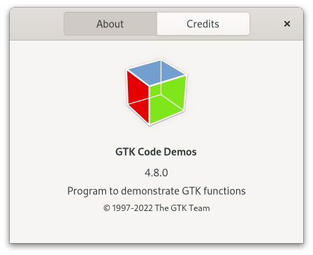
Figure: GtkAboutDialog
The about dialog often contain links and email addresses. The about dialog displays these as clickable links. By default, it calls the gtk:file-launcher-launch function when a user clicks one. The behaviour can be overridden with the "activate-link" signal.
To specify a person with an email address, use a string like "Edgar Allan Poe <edgar@poe.com>". To specify a website with a title, use a string like "GTK team https://www.gtk.org".
To make constructing an about dialog as convenient as possible, you can use the gtk:show-about-dialog function which constructs and shows an about dialog and keeps it around so that it can be shown again.
Note that GTK sets a default title of "About %s" on the about dialog window where %s is replaced by the name of the application, but in order to ensure proper translation of the title, applications should set the title property explicitly when constructing a gtk:about-dialog widget, as shown in the following example:
(gtk:show-about-dialog nil
:program-name "ExampleCode"
:logo example-logo
:title "About ExampleCode") - Escape
- Closes the window.
lambda (dialog uri) :run-last
- dialog
- The gtk:about-dialog widget on which the signal was emitted.
- uri
- The string for the URI that is activated.
- Returns
- True if the link has been activated.
(setq about (make-instance 'gtk:about-dialog))
=> #<GTK:ABOUT-DIALOG {1009A9FF83}>
(setf (gtk:about-dialog-artists about)
(list "first author" "second author"))
=> ("first author" "second author")
(gtk:about-dialog-artists about)
=> ("first author" "second author") The string is displayed in a label in the main dialog, thus it should be a short explanation of the main purpose of the program, not a detailed list of features.
The text may contain links in this format "<http://www.some.place/>" and email references in the form "<mail-to@some.body>", and these will be converted into clickable links.
The intended use for this string is to display the translator of the language which is currently used in the user interface. Using GNU gettext, a simple way to achieve that is to mark the string for translation:
gtk_about_dialog_set_translator_credits (about, _("translator-credits"));
It is a good idea to use the customary "translator-credits" msgid for this
purpose, since translators will already know the purpose of that msgid, and since the gtk:about-dialog widget will detect if the translator-credits property is untranslated and hide
the tab. GtkAlertDialog
If you do not need to wait for a button to be clicked, you can use the gtk:alert-dialog-show function.
Since 4.10
(defun create-alert-dialog (parent)
(let ((dialog (make-instance 'gtk:alert-dialog
:message "Alert"
:detail "The detail of the alert dialog."
:buttons '("Cancel" "OK")
:cancel-button 0
:default-button 1
:modal t))
(cancellable (g:cancellable-new)))
;; Cancel alert dialog after waiting 10 seconds for user response
(g:timeout-add-seconds 10
(lambda ()
(g:cancellable-cancel cancellable)
glib:+source-remove+))
;; Show alert dialog
(gtk:alert-dialog-choose dialog
parent
cancellable
;; The GAsyncReadyCallback function
(lambda (source result)
;; Get the result
(let ((result (gtk:alert-dialog-choose-finish source result)))
(format t "Alert dialog result is ~a~%" result)))))) Since 4.10
Since 4.10
Since 4.10
Since 4.10
Since 4.10
Since 4.10
It is fine to pass nil for the callback if the alert dialog does not have more than one button. A simpler API for this case is the gtk:alert-dialog-show function.
Since 4.10
Since 4.10
Since 4.10
GtkWindowGroup
A window can be a member in at most one window group at a time. Windows that have not been explicitly assigned to a window group are implicitly treated like windows of the default window group.
Window groups are referenced by each window in the window group. If the windows in the window group are subsequently destroyed, then they will be removed from the window group and drop their references on the window group. When all window have been removed, the window group will be freed.
GtkNativeDialog
The gtk:dialog functions cannot be used on such objects, but we need a similar API in order to drive them. The gtk:native-dialog object is an API that allows you to do this. It allows you to set various common properties on the dialog, as well as show and hide it and get a "response" signal when the user finished with the dialog.
Note that unlike the gtk:dialog widget, gtk:native-dialog objects are not toplevel widgets, and GTK does not keep them alive. It is your responsibility to keep a reference until you are done with the object.
lambda (dialog response) :run-last
- dialog
- The gtk:native-dialog object on which the signal is emitted.
- response
- The integer for the response ID.
Modal dialogs prevent interaction with other windows in the same application. To keep modal dialogs on top of main application windows, use the gtk:native-dialog-transient-for function to make the dialog transient for the parent. Most window managers will then disallow lowering the dialog below the parent.
Dialog windows should be set transient for the main application window they were spawned from. This allows window managers, for example, to keep the dialog on top of the main window, or center the dialog over the main window.
Passing nil for parent unsets the current transient window.
If the dialog is not visible this does nothing.
Note that this does not release any reference to the object, as opposed to destroying a gtk:window widget, because there is no reference from the windowing system to the gtk:native-dialog object.
Layout Widgets
GtkBox
Figure: GtkBox
Whether it is a row or column depends on the value of its orientation property. Within the other dimension, all children are allocated the same size. Of course, the halign and valign properties can be used on the children to influence their allocation.
Use repeated calls to the gtk:box-append function to pack widgets into a box from start to end. Use the gtk:box-remove function to remove widgets from the box. The gtk:box-insert-child-after function can be used to add a child widget at a particular position.
Use the gtk:box-homogeneous function to specify whether or not all children of the box are forced to get the same amount of space and the gtk:box-spacing function to determine how much space will be minimally placed between all children in the box. Note that spacing is added between the children.
Use the gtk:box-reorder-child-after function to move a child widget to a different place in the box.
Since 4.12
This affects only horizontal boxes with at least one baseline aligned child widget. If there is more vertical space available than requested, and the baseline is not allocated by the parent widget then the position value is used to allocate the baseline with respect to the extra space available.
GtkCenterBox
Figure: GtkCenterBox
To add children to the gtk:center-box widget, use the gtk:center-box-start-widget, gtk:center-box-center-widget and gtk:center-box-end-widget functions. The sizing and positioning of children can be influenced with the align and expand properties of the children.
This affects only horizontal boxes with at least one baseline aligned child widget. If there is more vertical space available than requested, and the baseline is not allocated by the parent widget then the position value is used to allocate the baseline with respect to the extra space available.
By default, when there is no space to give all three children their natural widths, the start and end widgets start shrinking and the center child keeps natural width until they reach minimum width. If set to false, start and end widgets keep natural width and the center widget starts shrinking instead.
Since 4.12
GtkGrid
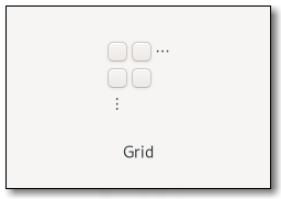
Figure: GtkGrid
Children are added using the gtk:grid-attach function. They can span multiple rows or columns. It is also possible to add a child widget next to an existing child widget, using the gtk:grid-attach-next-to function. To remove a child widget from the grid, use the gtk:grid-remove function. The behaviour of the gtk:grid widget when several children occupy the same grid cell is undefined.
It is implemented by the gtk:widget class using the gtk:layout-manager class.
To showcase it, here is a simple example:
<object class="GtkGrid" id="my_grid">
<child>
<object class="GtkButton" id="button1">
<property name="label">Button 1</property>
<layout>
<property name="column">0</property>
<property name="row">0</property>
</layout>
</object>
</child>
<child>
<object class="GtkButton" id="button2">
<property name="label">Button 2</property>
<layout>
<property name="column">1</property>
<property name="row">0</property>
</layout>
</object>
</child>
<child>
<object class="GtkButton" id="button3">
<property name="label">Button 3</property>
<layout>
<property name="column">2</property>
<property name="row">0</property>
<property name="row-span">2</property>
</layout>
</object>
</child>
<child>
<object class="GtkButton" id="button4">
<property name="label">Button 4</property>
<layout>
<property name="column">0</property>
<property name="row">1</property>
<property name="column-span">2</property>
</layout>
</object>
</child>
</object>
It organizes the first two buttons side-by-side in one cell each. The third
button is in the last column but spans across two rows. This is defined by the row-span property. The last button is
located in the second row and spans across two columns, which is defined by the column-span property. Each row in the grid can have its own local baseline, but only one of those is global, meaning it will be the baseline in the parent of the grid.
GtkRevealer
(gobject:define-genum "GtkRevealerTransitionType" revealer-transition-type (:export t :type-initializer "gtk_revealer_transition_type_get_type") (:none 0) (:crossfade 1) (:slide-right 2) (:slide-left 3) (:slide-up 4) (:slide-down 5) (:swing-right 6) (:swing-left 7) (:swing-up 8) (:swing-down 9))
- :none
- No transition
- :crossfade
- Fade in.
- :slide-right
- Slide in from the left.
- :slide-left
- Slide in from the right.
- :slide-up
- Slide in from the bottom.
- :slide-down
- Slide in from the top.
- :swing-right
- Floop in from the left.
- :swing-left
- Floop in from the right.
- :swing-up
- Floop in from the bottom.
- :swing-down
- Floop in from the top.
This function returns true as soon as the transition to the revealed state is started. To find out whether the child widget is fully revealed, that is, the transition is complete, use the gtk:revealer-child-revealed function. The transition will be animated with the current transition type of the revealer.
GtkListBoxRow
lambda (row) :action
- row
- The gtk:list-box-row widget on which the signal is emitted.
Note that calls to this method must be in sync with the data used for the row functions. For instance, if the list box is mirroring some external data set and two rows changed in the external data set, then when you call the gtk:list-box-row-changed function on the first row, the sort function must only read the new data for the first of the two changed rows, otherwise the resorting of the rows will be wrong.
This generally means that if you do not fully control the data model you have to duplicate the data that affects the list box row functions into the row widgets themselves. Another alternative is to call the gtk:list-box-invalidate-sort function on any model change, but that is more expensive.
The (setf gtk:list-box-row-header) function sets the current header. This is only allowed to be called from a gtk:list-box-update-header-func callback function. It will replace any existing header in the row, and be shown in front of the row in the list box.
GtkListBox
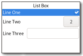
Figure: GtkListBox
Although a gtk:list-box widget must have only gtk:list-box-row children you can add any kind of widget to it via the gtk:list-box-prepend, gtk:list-box-append, and gtk:list-box-insert functions, and a gtk:list-box-row widget will automatically be inserted between the list and the widget.
The gtk:list-box-row widget can be marked as activatable or selectable. If a row is activatable, the "row-activated" signal will be emitted for it when the user tries to activate it. If it is selectable, the row will be marked as selected when the user tries to select it.
list ╰── row[.activatable]The gtk:list-box implementation uses a single CSS node named list. Each gtk:list-box-row widget uses a single CSS node named row. The row nodes get the .activatable style class added when appropriate.
lambda (listbox) :action
- listbox
- The gtk:list-box widget on which the signal is emitted.
lambda (listbox step count) :action
- listbox
- The gtk:list-box widget on which the signal is emitted.
- step
- The value of the gtk:movement-step enumeration.
- count
- The integer for the number of steps.
- ←, →, ↑, ↓ move by individual children,
- Home, End move to the ends of the box,
- PgUp, PgDn move vertically by pages.
lambda (listbox row) :run-last
- listbox
- The gtk:list-box widget on which the signal is emitted.
- row
- The activated gtk:list-box-row widget.
lambda (listbox row) :run-last
- listbox
- The gtk:list-box widget on which the signal is emitted.
- row
- The selected gtk:list-box-row widget.
lambda (listbox) :action
- listbox
- The gtk:list-box widget on which the signal is emitted.
lambda (listbox) :run-first
- listbox
- The gtk:list-box widget on which the signal is emitted.
lambda (listbox) :action
- listbox
- The gtk:list-box widget on which the signal is emitted.
lambda (listbox) :action
- listbox
- The gtk:list-box widget on which the signal is emitted.
Since 4.18
If the position is -1, or larger than the total number of items in the list box, then the child widget will be appended to the end.
Since 4.12
For instance, this is used to get the page size for PageUp/Down key handling. In the normal case when the list box is packed inside a gtk:scrolled-window widget the adjustment from that will be picked up automatically, so there is no need to manually do that.
The func callback function will be called for each row after the call, and it will continue to be called each time a row changes via the gtk:list-box-row-changed function, or when the gtk:list-box-invalidate-filter function is called.
Note that using a filter function is incompatible with using a model, see the gtk:list-box-bind-model function.
The func callback function can look at the current header widget using the gtk:list-box-row-header function and either update the state of the widget as needed, or set a new one using the (setf gtk:list-box-row-header) function. If no header is needed, set the header to nil.
Note that you may get many calls of the func callback function to this for a particular row when, for example, changing things that do not affect the header. In this case it is important for performance to not blindly replace an existing header with an identical one.
The func callback function will be called for each row after the call, and it will continue to be called each time a row changes via the gtk:list-box-row-changed function, and when the row before changes either by the gtk:list-box-row-changed function on the previous row, or when the previous row becomes a different row. It is also called for all rows when the gtk:list-box-invalidate-headers function is called.
The func callback function will be called for each row after the call, and will continue to be called each time a row changes via the gtk:list-box-row-changed function, and when the gtk:list-box-invalidate-sort function is called.
Note that using a sort function is incompatible with using a model. See the gtk:list-box-bind-model function.
The row will also be unhighlighted when the widget gets a drag leave event.
The contents of the list box are cleared and then filled with widgets that represent items from the model. The list box is updated whenever the model changes. If the model argument is nil, the list box is left empty.
It is undefined to add or remove widgets directly, for example, with the gtk:list-box-insert function, while the list box is bound to a model.
Note that using a model is incompatible with the filtering and sorting functionality in the list box. When using a model, filtering and sorting should be implemented by the model.
GtkFlowBoxChild
lambda (child) :action
- child
- The gtk:flow-box-child widget on which the signal is emitted.
Note that calls to this method must be in sync with the data used for the sorting and filtering functions. For instance, if the list is mirroring some external data set and two children changed in the external data set, then when you call the gtk:flow-box-child-changed function on the first child widget, the sort function must only read the new data for the first of the two changed children, otherwise the resorting of the children will be wrong.
This generally means that if you do not fully control the data model, you have to duplicate the data that affects the sorting and filtering functions into the widgets themselves. Another alternative is to call the gtk:flow-box-invalidate-sort function on any model change, but that is more expensive.
GtkFlowBox
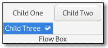
Figure: GtkFlowBox
For instance, with the horizontal orientation, the widgets will be arranged from left to right, starting a new row under the previous row when necessary. Reducing the width in this case will require more rows, so a larger height will be requested.
Likewise, with the vertical orientation, the widgets will be arranged from top to bottom, starting a new column to the right when necessary. Reducing the height will require more columns, so a larger width will be requested.
The size request of a gtk:flow-box widget alone may not be what you expect. If you need to be able to shrink it along both axes and dynamically reflow its children, you may have to wrap it in a gtk:scrolled-window widget to enable that.
The children of a gtk:flow-box widget can be dynamically sorted and filtered.
Although a gtk:flow-box widget must have only gtk:flow-box-child child widgets, you can add any kind of widget to it via the gtk:flow-box-insert function, and a gtk:flow-box-child widget will automatically be inserted between the flow box and the widget.
flowbox ├── flowboxchild │ ╰── <child> ├── flowboxchild │ ╰── <child> │ ╰── [rubberband]The gtk:flow-box implementation uses a single CSS node with name flowbox. The gtk:flow-box-child implementation uses a single CSS node with name flowboxchild. For rubberband selection, a subnode with name rubberband is used.
lambda (flowbox) :action
- flowbox
- The gtk:flow-box widget on which the signal is emitted.
lambda (flowbox child) :run-last
- flowbox
- The gtk:flow-box widget on which the signal is emitted.
- child
- The gtk:flow-box-child widget that is activated.
lambda (flowbox step count) :action
- flowbox
- The gtk:flow-box widget on which the signal is emitted.
- step
- The granularity to the move, as a value of the gtk:movement-step enumeration.
- count
- The integer for the number of step units to move.
- Returns
- True to stop other handlers from being invoked for the event. False to propagate the event further.
The default bindings for this signal come in two variants, the variant with the Shift modifier extends the selection, the variant without the Shift modifer does not. There are too many key combinations to list them all here. Arrow keys move by individual children. Home/End keys move to the ends of the box. PageUp/PageDown keys move vertically by pages.
lambda (flowbox) :action
- flowbox
- The gtk:flow-box widget on which the signal is emitted.
lambda (flowbox) :run-first
- box
- The gtk:flow-box on which the signal is emitted.
lambda (flowbox) :action
- flowbox
- The gtk:flow-box widget on which the signal is emitted.
lambda (flowbox) :action
- flowbox
- The gtk:flow-box widget on which the signal is emitted.
Setting the maximum number of children per line limits the overall natural size request to be no more than max children long in the given orientation.
If the position argument is -1, or larger than the total number of children in the flow box, then the child widget will be appended to the end.
Since 4.6
Since 4.6
Since 4.12
The adjustments have to be in pixel units and in the same coordinate system as the allocation for immediate children of the flow box.
The adjustments have to be in pixel units and in the same coordinate system as the allocation for immediate children of the box.
The func callback function will be called for each child widget after the call, and it will continue to be called each time a child changes, via the gtk:flow-box-child-changed function or when the gtk:flow-box-invalidate-filter function is called.
Note that using a filter function is incompatible with using a model. See the gtk:flow-box-bind-model function.
The func callback function will be called for each child after the call, and will continue to be called each time a child changes, via the gtk:flow-box-child-changed function, and when the gtk:flow-box-invalidate-sort function is called.
Note that using a sort function is incompatible with using a model. See the gtk:flow-box-bind-model function.
The contents of the flow box are cleared and then filled with widgets that represent items from the model. The flow box is updated whenever the model changes. If the model argument is nil, the flow box is left empty.
It is undefined to add or remove widgets directly, for example, with the gtk:flow-box-insert function, while the flow box is bound to a model.
Note that using a model is incompatible with the filtering and sorting functionality in the flow box. When using a model, filtering and sorting should be implemented by the model.
GtkStackPage
(gobject:define-genum "GtkStackTransitionType" stack-transition-type (:export t :type-initializer "gtk_stack_transition_type_get_type") (:none 0) (:crossfade 1) (:slide-right 2) (:slide-left 3) (:slide-up 4) (:slide-down 5) (:slide-left-right 6) (:slide-up-down 7) (:over-up 8) (:over-down 9) (:over-left 10) (:over-right 11) (:under-up 12) (:under-down 13) (:under-left 14) (:under-right 15) (:over-up-down 16) (:over-down-up 17) (:over-left-right 18) (:over-right-left 19) (:rotate-left 20) (:rotate-right 21) (:rotate-left-right 22))
- :none
- No transition
- :crossfade
- A cross fade.
- :slide-right
- Slide from left to right.
- :slide-left
- Slide from right to left.
- :slide-up
- Slide from bottom up.
- :slide-down
- Slide from top down.
- :slide-left-right
- Slide from left or right according to the children order.
- :slide-up-down
- Slide from top down or bottom up according to the order.
- :over-up
- Cover the old page by sliding up.
- :over-down
- Cover the old page by sliding down.
- :over-left
- Cover the old page by sliding to the left.
- :over-right
- Cover the old page by sliding to the right.
- :under-up
- Uncover the new page by sliding up.
- :under-down
- Uncover the new page by sliding down.
- :under-left
- Uncover the new page by sliding to the left.
- :under-right
- Uncover the new page by sliding to the right.
- :over-up-down
- Cover the old page sliding up or uncover the new page sliding down, according to order.
- :over-down-up
- Cover the old page sliding down or uncover the new page sliding up, according to order.
- :over-left-right
- Cover the old page sliding left or uncover the new page sliding right, according to order.
- :over-right-left
- Cover the old page sliding right or uncover the new page sliding left, according to order.
- :rotate-left
- Pretend the pages are sides of a cube and rotate that cube to the left.
- :rotate-right
- Pretend the pages are sides of a cube and rotate that cube to the right.
- :rotate-left-right
- Pretend the pages are sides of a cube and rotate that cube to the left or right according to the children order.
This is used by the gtk:stack-switcher widget to change the appearance of the corresponding button when a page needs attention and it is not the current one.
GtkStack
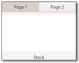
Figure: GtkStack
Transitions between pages can be animated as slides or fades. This can be controlled with the gtk:stack-transition-type function. These animations respect the gtk-enable-animations setting.
The gtk:stack widget maintains a gtk:stack-page object for each added child widget, which holds additional per-child properties. You obtain the gtk:stack-page object for a child widget with the gtk:stack-page function.
<object class="GtkStack" id="stack">
<child>
<object class="GtkStackPage">
<property name="name">page1</property>
<property name="title">In the beginning…</property>
<property name="child">
<object class="GtkLabel">
<property name="label">It was dark</property>
</object>
</property>
</object>
</child> If the stack is homogeneous, the stack will request the same width for all its children. If it is not, the stack may change width when a different child becomes visible.
If the interpolate-size property is set to true, the stack will interpolate its size between the current one and the one it will take after changing the visible child, according to the set transition duration.
The transition type can be changed without problems at runtime, so it is possible to change the animation based on the page that is about to become current.
If the stack is homogeneous, the stack will request the same height for all its children. If it is not, the stack may change height when a different child becomes visible.
If widget is different from the currently visible child widget, the transition between the two will be animated with the current transition type of stack.
Note that the child widget has to be visible itself, see the gtk:widget-visible function, in order to become the visible child of the stack.
If the child widget is different from the currently visible child, the transition between the two will be animated with the current transition type of stack.
Note that the child widget has to be visible itself, see the gtk:widget-visible function, in order to become the visible child of the stack.
GtkStackSwitcher
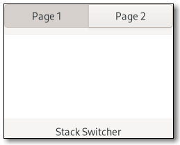
Figure: GtkStackSwitcher
All the content for the buttons comes from the child properties of the gtk:stack widget. The button visibility in a gtk:stack-switcher widget is controlled by the visibility of the child widget in the gtk:stack widget.
It is possible to associate multiple gtk:stack-switcher widgets with the same gtk:stack widget.
GtkStackSidebar
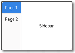
Figure: GtkStackSidebar
In order to use the gtk:stack-sidebar widget, you simply use the gtk:stack widget to organize your UI flow, and add the sidebar to your sidebar area. You can use the gtk:stack-sidebar-stack function to connect the gtk:stack-sidebar widget to the gtk:stack widget.
The stack sidebar will automatically update according to the order (packing) and items within the given stack.
GtkActionBar

Figure: GtkActionBar
It allows placing children at the start or the end. In addition, it contains an internal centered box which is centered with respect to the full width of the box, even if the children at either side take up different amounts of space.
actionbar
╰── revealer
╰── box
├── box.start
│ ╰── [start children]
├── [center widget]
╰── box.end
╰── [end children] The gtk:action-bar implementation has a single CSS node with name actionbar. It contains a revealer subnode, which contains a box
subnode, which contains two box subnodes at the start and end of the action bar, with start and end style classes respectively, as well
as a center node that represents the center child. Each of the boxes
contains children packed for that side. GtkHeaderBar
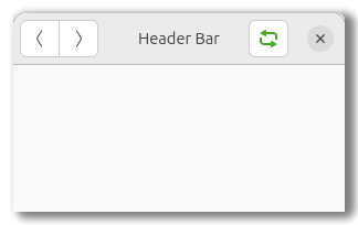
Figure: GtkHeaderBar
The title will be centered with respect to the width of the box, even if the children at either side take up different amounts of space.
The gtk:header-bar widget can add typical window frame controls, such as Minimize, Maximize and Close buttons, or the window icon.
For these reasons, the gtk:header-bar widget is the natural choice for use as the custom titlebar widget of a gtk:window widget, see the gtk:window-titlebar function, as it gives features typical of titlebars while allowing the addition of child widgets.
By default the gtk:header-bar widget uses a gtk:label widget displaying the title of the window it is contained in as the title widget, equivalent to the following UI definition:
<object class="GtkHeaderBar">
<property name="title-widget">
<object class="GtkLabel">
<property name="label" translatable="yes">Label</property>
<property name="single-line-mode">True</property>
<property name="ellipsize">end</property>
<property name="width-chars">5</property>
<style>
<class name="title"/>
</style>
</object>
</property>
</object>
headerbar
╰── windowhandle
╰── box
├── box.start
│ ├── windowcontrols.start
│ ╰── [other children]
├── [Title Widget]
╰── box.end
├── [other children]
╰── windowcontrols.end The gtk:header-bar implementation has a CSS node with the name headerbar. It contains a windowhandle subnode, which contains a box subnode, which contains two box subnodes at the start and end of the header bar, as well as a center node that represents
the title.Each of the boxes contains a windowcontrols subnode, see the gtk:window-controls widget for details, as well as other children.
There can be valid reasons for overriding the setting, such as a header bar design that does not allow for buttons to take room on the right, or only offers room for a single Close button. Split header bars are another example for overriding the setting.
The format of the string is button names, separated by commas. A colon separates the buttons that should appear on the left from those on the right. Recognized button names are "minimize", "maximize", "close", "icon" for the window icon and "menu" for a menu button for the fallback application menu.
For example, "menu:minimize,maximize,close" specifies a Menu on the left, and Minimize, Maximize and Close buttons on the right.
When set to nil, the header bar will display the title of the window it is contained in. The title should help a user identify the current view. To achieve the same style as the builtin title, use the title style class. You should set the title widget to nil, for the window title label to be visible again.
This option shows the "stoplight" buttons on macOS. For Linux, this option has no effect. See also Using GTK on Apple macOS.
Since 4.18
(let (...
(header (make-instance 'gtk:header-bar
:show-title-buttons nil))
(button (make-instance 'gtk:button
:label "_Done"
:use-underline t
:sensitive nil))
(cancel (make-instance 'gtk:button
:label "_Cancel"
:use-underline t))
...)
...
(gtk:header-bar-pack-start header cancel)
(gtk:header-bar-pack-end header button)
... ) GtkOverlay
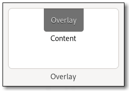
Figure: GtkOverlay
The position of each overlay widget is determined by its halign and valign properties. For example, an overlay widget with both alignments set to :start will be placed at the top left corner of the main widget, whereas an overlay widget with the halign property set to :center and the valign property set to :end will be placed a the bottom edge of the main widget, horizontally centered. The position can be adjusted by setting the margin properties of the overlay widget to non-zero values.
More complicated placement of overlay widgets is possible by connecting to the "get-child-position" signal.
The minimum and natural sizes of an overlay widget are those of its main child. The sizes of overlay children are not considered when measuring these preferred sizes.
lambda (overlay widget allocation) :run-last
- overlay
- The gtk:overlay widget that emitted the signal.
- widget
- The gtk:widget overlay widget to position.
- allocation
- Return location of type gdk:rectangle for the allocation.
- Returns
- True if allocation has been filled.
The overlay will request the size of the largest overlay widget that has this property set to true. Children who are not included may be drawn outside of the allocation of the overlay if they are too large.
GtkPaned
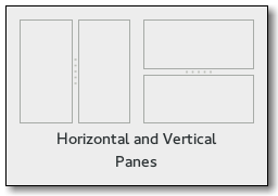
Figure: GtkPaned
Child widgets are added to the panes of the paned widget with the gtk:paned-start-child and gtk:paned-end-child functions. The division between the two children is set by default from the size requests of the children, but it can be adjusted by the user.
A paned widget draws a separator between the two child widgets and a small handle that the user can drag to adjust the division. It does not draw any relief around the children or around the separator. The space in which the separator is called the gutter. Often, it is useful to put each child widget inside a gtk:frame widget so that the gutter appears as a ridge. No separator is drawn if one of the children is missing.
Each child widget has two properties that can be set, the resize and shrink properties. If the resize property is true, then when the gtk:paned widget is resized, that child widget will expand or shrink along with the paned widget. If the shrink property is true, then that child widget can be made smaller than its requisition by the user. Setting the shrink property to false allows the application to set a minimum size. If the resize property is false for both children, then this is treated as if the resize property is true for both children.
The application can set the position of the slider as if it were set by the user, by calling the gtk:paned-position function.
paned ├── <child> ├── separator[.wide] ╰── <child>The gtk:paned implementation has a main CSS node with name paned, and a subnode for the separator with name separator. The subnode gets a .wide style class when the paned is supposed to be wide. In horizontal orientation, the nodes of the children are always arranged from left to right. So :first-child will always select the leftmost child widget, regardless of text direction.
(let ((frame1 (make-instance 'gtk:frame
:width-request 50))
(frame2 (make-instance 'gtk:frame
:width-request 50))
(paned (make-instance 'gtk:paned
:orientation :horizontal
:start-child frame1
:end-child frame2
:resize-start-child t
:width-request 250
:height-request 150)))
... ) lambda (widget) :action
- widget
- The gtk:paned widget that received the signal.
lambda (widget) :action
- widget
- The gtk:paned widget that received the signal.
lambda (widget reversed) :action
- widget
- The gtk:paned widget that received the signal.
- reversed
- The boolean whether cycling backward or forward.
lambda (widget reversed) :action
- widget
- The gtk:paned widget that received the signal.
- reversed
- The boolean whether cycling backward or forward.
lambda (widget scrolltype) :action
- widget
- The gtk:paned widget that received the signal.
- scrolltype
- The value of the gtk:scroll-type enumeration.
lambda (widget) :action
- widget
- The gtk:paned widget that received the signal.
GtkNotebookPage
(gobject:define-genum "GtkNotebookTab" notebook-tab (:export t :type-initializer "gtk_notebook_tab_get_type") (:tab-first 0) (:tab-last 1))
- :tab-first
- The first tab in the notebook.
- :tab-last
- The last tab in the notebook.
GtkNotebook
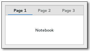
Figure: GtkNotebook
There are many configuration options for gtk:notebook widgets. Among other things, you can choose on which edge the notebook tabs appear, see the gtk:notebook-tab-pos function, whether, if there are too many notebook tabs to fit the notebook should be made bigger or scrolling arrows added, see the gtk:notebook-scrollable function, and whether there will be a popup menu allowing the users to switch pages, see the gtk:notebook-popup-enable function.
Example: A UI definition fragment with the gtk:notebook widget
<object class="GtkNotebook">
<child>
<object class="GtkLabel" id="notebook-content">
<property name="label">Content</property>
</object>
</child>
<child type="tab">
<object class="GtkLabel" id="notebook-tab">
<property name="label">Tab</property>
</object>
</child>
</object>
notebook
├── header.top
│ ├── [<action widget>]
│ ├── tabs
│ │ ├── [arrow]
│ │ ├── tab
│ │ │ ╰── <tab label>
│ │ │
│ │ ├── tab[.reorderable-page]
│ │ │ ╰── <tab label>
│ │ ╰── [arrow]
│ ╰── [<action widget>]
│
╰── stack
├── <child>
│
╰── <child> The gtk:notebook implementation has a main CSS node with name notebook, a subnode with name header and below that a subnode with name tabs which contains one subnode per notebook tab with name tab. If action widgets are present, their CSS nodes are placed next
to the notebook tabs node. If the notebook is scrollable, CSS nodes with name arrow are placed as first and last child of the notebook tabs node. The main node gets the .frame style class when the notebook has a border, see the gtk:notebook-show-border function. The header node gets one of the .top, .bottom, .left or .right
style classes, depending on where the notebook tabs are placed. For reorderable pages, the notebook tab node gets the .reorderable-page style class. A notebook tab node gets the .dnd style class while it
is moved with drag and drop. The nodes are always arranged from
left-to-right, regardless of text direction. - The :group role for the notebook widget.
- The :tab-list role for the list of notebook tabs.
- The :tab role for each notebook tab.
- The :tab-panel role for each page.
lambda (notebook page) :action
- notebook
- The gtk:notebook widget emitting the signal.
- page
- The integer for the page index.
- Returns
- Whether the page was changed.
lambda (notebook page) :run-last
- notebook
- The gtk:notebook widget emitting the signal.
- page
- The gtk:widget object for the notebook tab of notebook that is being detached.
- Returns
- The gtk:notebook widget that page should be added to, or nil.
lambda (notebook tab) :action
- notebook
- The gtk:notebook widget emitting the signal.
- tab
- The value of the gtk:notebook-tab enumeration.
- Returns
- Whether the notebook tab has been focused.
lambda (notebook direction) :action
- notebook
- The gtk:notebook widget emitting the signal.
- direction
- The gtk:direction-type value for the direction to move the focus.
lambda (notebook child num) :run-last
- notebook
- The gtk:notebook widget emitting the signal.
- child
- The gtk:widget child page affected.
- num
- The unsigned integer for the child page number.
lambda (notebook child num) :run-last
- notebook
- The gtk:notebook widget emitting the signal.
- child
- The gtk:widget child page affected.
- num
- The unsigned integer for the child page number.
lambda (notebook child num) :run-last
- notebook
- The gtk:notebook widget emitting the signal.
- child
- The gtk:widget child page affected.
- num
- The unsigned integer for the child page number.
lambda (notebook direction move-to-last) :action
- notebook
- The gtk:notebook widget emitting the signal.
- direction
- The value of the gtk:direction-type enumeration.
- move-to-last
- Whether to move to the last position.
- Returns
- Whether the notebook tab was moved.
lambda (notebook move-focus) :action
- notebook
- The gtk:notebook widget emitting the signal.
- move-focus
- Whether to move focus.
- Returns
- Whether the page was selected.
lambda (notebook page num) :run-last
- notebook
- The gtk:notebook widget emitting the signal.
- page
- The gtk:widget current page.
- num
- The unsigned integer for the index of the page.
Notebooks with the same group name will be able to exchange notebook tabs via drag and drop. A notebook with a nil group name will not be able to exchange notebook tabs with any other notebook.
This only has a visual effect when the notebook tabs are not shown. See the gtk:notebook-show-tabs function.
Note that due to historical reasons, the gtk:notebook widget refuses to switch to a page unless the child widget is visible. Therefore, it is recommended to show child widgets before adding them to a notebook.
- :start
-
Prepends a page to the notebook. This replaces the functions:
- gtk_notebook_prepend_page()
- gtk_notebook_prepend_page_menu()
- :end
-
Appends a page to the notebook. This replaces the functions:
- gtk_notebook_append_page()
- gtk_notebook_append_page_menu()
- otherwise
- Insert a page into the notebook at the given pos, which is an
integer for the index starting from 0. This replaces the functions:
- gtk_notebook_insert_page()
- gtk_notebook_insert_page_menu()
(defvar notebook (make-instance 'gtk:notebook)) => NOTEBOOK (defvar page (make-instance 'gtk:frame)) => PAGE (gtk:notebook-append-page notebook page nil) => 0 (gtk:notebook-remove-page notebook page) (gtk:notebook-append-page notebook page nil) => 0 (gtk:notebook-remove-page notebook 0)
Note that two notebooks must share a common group identifier, see the gtk:notebook-group-name function, to allow automatic notebook tabs interchange between them.
If you want a widget to interact with a notebook through DnD, that is, accept dragged notebook tabs from it, it must be set as a drop destination by adding to it a gtk:drop-target controller that accepts the GType "GtkNotebookPage". The :value value of said drop target will be preloaded with a gtk:notebook-page object that corresponds to the dropped notebook tab, so you can process the value via "accept" or "drop" signals.
Note that you should use the gtk:notebook-detach-tab function instead of the gtk:notebook-remove-page function if you want to remove the notebook tab from the source notebook as part of accepting a drop. Otherwise, the source notebook will think that the dragged tab was removed from underneath the ongoing drag operation, and will initiate a drag cancel animation.
If you want a notebook to accept drags from other widgets, you will have to set your own DnD code to do it.
static void
on_drag_data_received (GtkWidget *widget,
GdkDrop *drop,
GtkSelectionData *data,
guint time,
gpointer user_data)
{
GtkDrag *drag;
GtkWidget *notebook;
GtkWidget **child;
drag = gtk_drop_get_drag (drop);
notebook = g_object_get_data (drag, "gtk-notebook-drag-origin");
child = (void*) gtk_selection_data_get_data (data);
// process_widget (*child);
gtk_notebook_detach_tab (GTK_NOTEBOOK (notebook), *child);
} GtkExpander
Figure: GtkExpander
Normally you use an expander as you would use a frame. You create the child widget and use the gtk:expander-child function to add it to the expander. When the expander is toggled, it will take care of showing and hiding the child automatically.
(let ((expander (gtk:expander-new-with-mnemonic "_More Options")))
(g:signal-connect expander "notify::expanded"
(lambda (object param)
(if (gtk:expander-expanded object)
;; Show or create widgets
...
;; Hide or destroy widgets
... )))
... ) Example: A UI definition fragment with a gtk:expander widget.
<object class="GtkExpander">
<child type="label">
<object class="GtkLabel" id="expander-label"/>
</child>
<child>
<object class="GtkEntry" id="expander-content"/>
</child>
</object> expander ├── title │ ├── arrow │ ╰── <label widget> ╰── <child>The gtk:expander implementation has three CSS nodes, the main node with the name expander, a subnode with name title and node below it with name arrow. The arrow of an expander that is showing its child gets the :checked pseudoclass added to it.
lambda (expander) :action
- expander
- The gtk:expander widget that receives the signal.
GtkAspectFrame
GtkFixed
For most applications, you should not use this container. It keeps you from having to learn about the other GTK containers, but it results in broken applications. With the gtk:fixed widget, the following things will result in truncated text, overlapping widgets, and other display bugs:
- Themes, which may change widget sizes.
- Fonts other than the one you used to write the application will of course change the size of widgets containing text. Keep in mind that users may use a larger font because of difficulty reading the default, or they may be using a different OS that provides different fonts.
- Translation of text into other languages changes its size. Also, display of non-English text will use a different font in many cases.
Finally, fixed positioning makes it kind of annoying to add/remove GUI elements, since you have to reposition all the other elements. This is a long-term maintenance problem for your application.
If you know none of these things are an issue for your application, and prefer the simplicity of the gtk:fixed widget, by all means use the fixed widget. But you should be aware of the tradeoffs.
Layout Managers
GtkLayoutManager
Each gtk:widget object can only have one gtk:layout-manager object associated to it at any given time. It is possible, though, to replace the layout manager object using the gtk:widget-layout-manager function.
Each gtk:layout-child object storing the layout properties for a specific child widget is created through the gtk:layout-manager-layout-child function. A layout manager controls the creation of its gtk:layout-child objects by overriding the GtkLayoutManagerClass.create_layout_child() virtual function. The typical implementation should look like:
static GtkLayoutChild *
create_layout_child (GtkLayoutManager *manager,
GtkWidget *container,
GtkWidget *child)
{
return g_object_new (your_layout_child_get_type (),
"layout-manager", manager,
"child-widget", child,
NULL);
} The layout-manager and child-widget properties on the newly created gtk:layout-child object are mandatory. The gtk:layout-manager object will cache the newly created gtk:layout-child object until the
widget is removed from its parent, or the parent removes the layout manager.Each gtk:layout-manager object creating a gtk:layout-child object should use the gtk:layout-manager-layout-child function every time it needs to query the layout properties. Each gtk:layout-child object should call the gtk:layout-manager-layout-changed function every time a property is updated, in order to queue a new size measuring and allocation.
The gtk:layout-child object is owned by the gtk:layout-manager object, and is guaranteed to exist as long child is a child of the gtk:widget object using the given layout manager.
GtkLayoutChild
A gtk:layout-child instance is only ever valid while a widget is part of a layout.
GtkBinLayout
GtkBoxLayout
If you want all children to be assigned the same size, you can use the homogeneous property. If you want to specify the amount of space placed between each child, you can use the spacing property.
The baseline position affects only horizontal boxes with at least one baseline aligned child. If there is more vertical space available than requested, and the baseline is not allocated by the parent then the given position is used to allocate the baseline within the extra space available.
GtkCenterLayout
By default, when there is no space to give all three children their natural widths, the start and end widgets start shrinking and the center child keeps natural width until they reach minimum width. If set to false, start and end widgets keep natural width and the center widget starts shrinking instead.
Since 4.12
GtkFixedLayout
Most applications should never use this layout manager. Fixed positioning and sizing requires constant recalculations on where children need to be positioned and sized. Other layout managers perform this kind of work internally so that application developers do not need to do it. Specifically, widgets positioned in a fixed layout manager will need to take into account:
- Themes, which may change widget sizes.
- Fonts other than the one you used to write the application will of course change the size of widgets containing text. Keep in mind that users may use a larger font because of difficulty reading the default, or they may be using a different OS that provides different fonts.
- Translation of text into other languages changes its size. Also, display of non-English text will use a different font in many cases.
Finally, fixed positioning makes it kind of annoying to add/remove GUI elements, since you have to reposition all the other elements. This is a long-term maintenance problem for your application.
GtkGridLayout
Children have an "attach point" defined by the horizontal and vertical index of the cell they occupy. Children can span multiple rows or columns. The layout properties for setting the attach points and spans are set using the gtk:grid-layout-child object associated to each child widget.
The behaviour of the gtk:grid widget when several children occupy the same grid cell is undefined.
The gtk:grid-layout object can be used like a gtk:box-layout object if all children are attached to the same row or column. However, if you only ever need a single row or column, you should consider using the gtk:box-layout object.
Each row in the grid can have its own local baseline, but only one of those is global, meaning it will be the baseline in the parent of the grid widget.
GtkOverlayLayout
This is not a reusable layout manager, since it expects its widget to be a gtk:overlay widget. It only listed here so that its layout properties get documented.
GtkCustomLayout
A gtk:custom-layout object uses closures matching to the old gtk:widget virtual functions for size negotiation, as a convenience API to ease the porting towards the corresponding gtk:layout-manager virtual functions.
GtkConstraint
The typical equation for a constraint is:
target.target_attr = source.source_attr × multiplier + constantEach gtk:constraint object is part of a system that will be solved by a gtk:constraint-layout object in order to allocate and position each child widget.
The source and target widgets, as well as their attributes, of a gtk:constraint object are immutable after creation.
If the source property is set to nil, the constraint will use the gtk:constraint-layout object of the widget.
GtkConstraintGuide
Guides have a minimum, maximum and natural size. Depending on the constraints that are applied, they can act like a guideline that widgets can be aligned to, or like 'flexible space'.
GtkConstraintLayout
By taking multiple constraints and applying them to the children of a widget using the gtk:constraint-layout object, it is possible to describe complex layout policies. Each constraint applied to a child or to the parent widgets contributes to the full description of the layout, in terms of parameters for resolving the value of each attribute.
It is important to note that a layout is defined by the totality of constraints. Removing a child, or a constraint, from an existing layout without changing the remaining constraints may result in an unstable or unsolvable layout.
Constraints have an implicit "reading order". You should start describing each edge of each child, as well as their relationship with the parent container, from the top left (or top right, in RTL languages), horizontally first, and then vertically.
A constraint-based layout with too few constraints can become "unstable", that is: have more than one solution. The behavior of an unstable layout is undefined.
A constraint-based layout with conflicting constraints may be unsolvable, and lead to an unstable layout. You can use the strength property to "nudge" the layout towards a solution.
An example of a UI definition fragment specifying a constraint:
<object class="GtkConstraintLayout">
<constraints>
<constraint target="button" target-attribute="start"
relation="eq"
source="super" source-attribute="start"
constant="12"
strength="required" />
<constraint target="button" target-attribute="width"
relation="ge"
constant="250"
strength="strong" />
</constraints>
</object>
The definition above will add two constraints to the gtk:constraint-layout object: - a required constraint between the leading edge of "button" and the leading edge of the widget using the constraint layout, plus 12 pixels,
- a strong, constant constraint making the width of "button" greater than, or equal to 250 pixels.
The "source" and "source-attribute" attributes of the "constraint" element are optional. If they are not specified, the constraint is assumed to be a constant.
The "relation" attribute is optional. If not specified, the constraint is assumed to be an equality.
The "strength" attribute is optional. If not specified, the constraint is assumed to be required.
The "source" and "target" attributes can be set to "super" to indicate that the constraint target is the widget using the gtk:constraint-layout object.
There can be "constant" and "multiplier" attributes.
Additionally, the "constraints" element can also contain a description of the gtk:constraint-guide object used by the layout:
<constraints> <guide min-width="100" max-width="500" name="hspace"/> <guide min-height="64" nat-height="128" name="vspace" strength="strong"/> </constraints>The "guide" element has the following optional attributes:
- "min-width", "nat-width", and "max-width", describe the minimum, natural, and maximum width of the guide, respectively
- "min-height", "nat-height", and "max-height", describe the minimum, natural, and maximum height of the guide, respectively
- "strength" describes the strength of the constraint on the natural size of the guide, if not specified, the constraint is assumed to have a medium strength
- "name" describes a name for the guide, useful when debugging
The Visual Format Language describes all the constraints on a row or column, typically starting from the leading edge towards the trailing one. Each element of the layout is composed by "views", which identify a gtk:constraint-target object.
For instance:
[button]-[textField]Describes a constraint that binds the trailing edge of "button" to the leading edge of "textField", leaving a default space between the two.
Using VFL is also possible to specify predicates that describe constraints on attributes like width and height:
// Width must be greater than, or equal to 50 [button(>=50)]The default orientation for a VFL description is horizontal, unless otherwise specified:
// Width of button1 must be equal to width of button2 [button1(==button2)]
// horizontal orientation, default attribute: width H:[button(>=150)]It is also possible to specify multiple predicates, as well as their strength:
// vertical orientation, default attribute: height V:[button1(==button2)]
// minimum width of button must be 150 // natural width of button can be 250 [button(>=150@required, ==250@medium)]Finally, it is also possible to use simple arithmetic operators:
// width of button1 must be equal to width of button2 // divided by 2 plus 12 [button1(button2 / 2 + 12)]
- set to nil to indicate that the constraint refers to the widget using layout
- set to the gtk:widget object using layout
- set to a child of the gtk:widget object using layout
- set to a gtk:constraint-guide object that is part of layout
The layout acquires the ownership of guide after calling this function.
Display Widgets
GtkLabel
- gtk:label-attributes
- gtk:label-ellipsize
- gtk:label-extra-menu
- gtk:label-justify
- gtk:label-label
- gtk:label-lines
- gtk:label-max-width-chars
- gtk:label-mnemonic-keyval
- gtk:label-mnemonic-widget
- gtk:label-natural-wrap-mode
- gtk:label-selectable
- gtk:label-single-line-mode
- gtk:label-tabs
- gtk:label-use-markup
- gtk:label-use-underline
- gtk:label-width-chars
- gtk:label-wrap
- gtk:label-wrap-mode
- gtk:label-xalign
- gtk:label-yalign

Figure: GtkLabel
Mnemonics automatically activate any activatable widget the label is inside, such as a gtk:button widget. If the label is not inside the target widget of the mnemonic, you have to tell the label about the target using the mnemonic-widget property. Here is a simple example where the label is inside a button:
;; Pressing Alt+H will activate this button
(let* ((label (gtk:label-new-with-mnemonic "_Hello"))
(button (make-instance 'gtk:button
:child label)))
... )
There is a convenience function to create buttons with a mnemonic label
already inside: ;; Pressing Alt+H will activate this button (gtk:button-new-with-mnemonic "_Hello")To create a mnemonic for a widget alongside the label, such as a gtk:entry widget, you have to point the label at the text entry with the mnemonic-widget property:
;; Pressing Alt+H will focus the text entry
(let ((entry (make-instance 'gtk:entry))
(label (make-instance 'gtk:label
:use-underline t
:label "_Hello"
:mnemonic-widget entry)))
... )
(let ((label (make-instance 'gtk:label
:use-markup t
:label "<small>Small text</small>")))
... )
See complete documentation of available tags in the Pango manual.The markup passed to the gtk:label-set-markup function must be valid. For example, literal <, > and & characters must be escaped as <, > and &.
Markup strings are just a convenient way to set the pango:attr-list instance on a label. The attributes property may be a simpler way to set attributes in some cases. Be careful though, a pango:attr-list instance tends to cause internationalization problems, unless you are applying attributes to the entire string, that is, unless you set the range of each attribute to [0, G_MAXINT]). The reason is that specifying the start_index and end_index for a pango:attribute structure requires knowledge of the exact string being displayed, so translations will cause problems.
The justify property sets how the lines in a label align with one another. If you want to set how the label as a whole aligns in its available space, see the halign and valign properties.
The width-chars and max-width-chars properties can be used to control the size allocation of ellipsized or wrapped labels. For ellipsizing labels, if either is specified and less than the actual text size, it is used as the minimum width, and the actual text size is used as the natural width of the label. For wrapping labels, the width-chars property is used as the minimum width, if specified, and the max-width-chars property is used as the natural width. Even if the max-width-chars property specified, wrapping labels will be rewrapped to use all of the available width.
Note that the interpretation of the width-chars and max-width-chars properties has changed a bit with the introduction of "width-for-height" geometry management.
(gtk:label-set-markup label
"Go to <a href="http://gtk.org/">GTK Website</a> ...")
It is possible to implement custom handling for links and their tooltips with the "activate-link" signal and the gtk:label-current-uri function. Example: A UI definition fragment specifying Pango attributes
<object class="GtkLabel">
<attributes>
<attribute name="weight" value="PANGO_WEIGHT_BOLD"/>
<attribute name="background" value="red" start="5" end="10"/>"
</attributes>
</object> The start and end attributes specify the range of characters to which the Pango attribute applies. If start and end are not
specified, the attribute is applied to the whole text. Note that specifying
ranges does not make much sense with translatable attributes. Use markup
embedded in the translatable content instead. label ├── [selection] ├── [link] ┊ ╰── [link]The gtk:label implementation has a single CSS node with the name label. A wide variety of style classes may be applied to labels, such as the .title, .subtitle, .dim-label style classes. In the gtk:shortcuts-window widget, labels are used wth the .keycap style class.
If the label has a selection, it gets a subnode with name selection.
If the label has links, there is one subnode per link. These subnodes carry the link or visited state depending on whether they have been visited. In this case, the label node also gets a .link style class.
- Shift+F10 or Menu opens the context menu.
- Ctrl+A or Ctrl+/ selects all.
- Ctrl+Shift+A or Ctrl+ unselects all.
- GtkLabel::activate-current-link
- GtkLabel::copy-clipboard
- GtkLabel::move-cursor
- clipboard.copy
- Copies the text to the clipboard.
- clipboard.cut
- Does not do anything, since text in labels cannot be deleted.
- clipboard.paste
- Does not do anything, since text in labels cannot be edited.
- link.open
- Opens the link, when activated on a link inside the label.
- link.copy
- Copies the link to the clipboard, when activated on a link inside the label.
- menu.popup
- Opens the context menu.
- selection.delete
- Does not do anything, since text in labels cannot be deleted.
- selection.select-all
- Selects all of the text, if the label allows selection.
lambda (label) :action
- label
- The gtk:label widget on which the signal was emitted.
lambda (label uri) :run-last
- label
- The gtk:label widget on which the signal was emitted.
- uri
- The string for the URI that is activated.
- Returns
- True if the link has been activated.
lambda (label) :action
- label
- The gtk:label widget that received the signal.
lambda (label step count extend) :action
- label
- The gtk:label widget that received the signal.
- step
- The granularity for the move, as a value of the gtk:movement-step enumeration.
- count
- The integer for the number of step units to move.
- extend
- True if the move should extend the selection.
- Arrow keys move by individual characters/lines.
- Ctrl-arrow key combinations move by words/paragraphs.
- Home/End keys move to the ends of the buffer.
This function does not reflect attributes that come from the labels markup, see the gtk:label-set-markup function. If you want to get the effective attributes for the label, use
(pango:layout-attributes (gtk:label-layout label)) => attrs
The :left value is the default value when the widget is first created with the gtk:label-new function. If you instead want to set the alignment of the label as a whole, use the halign property instead. Setting the property has no effect on labels containing only a single line.
See also the gtk:label-text function, which fetches the text from a label, as displayed on the screen.
(setq label (gtk:label-new-with-mnemonic "_Print"))
=> #<gtk:label {1001A051E3}>
(gtk:label-mnemonic-keyval label) => 112 If the label has been set so that it has an mnemonic key, using the gtk:label-set-markup-with-mnemonic, gtk:label-set-text-with-mnemonic, gtk:label-new-with-mnemonic functions or the use-underline property, the label can be associated with a widget that is the target of the mnemonic.
When the label is inside a widget, like a gtk:button widget or a gtk:notebook tab, it is automatically associated with the correct widget, but sometimes, for example, when the target is a gtk:entry widget next to the label, you need to set it explicitly using this function.
The target widget will be accelerated by emitting the "mnemonic-activate" signal on it. The default handler for this signal will activate the widget if there are no mnemonic collisions and toggle focus between the colliding widgets otherwise.
This only affects the natural size requested, for the actual wrapping used, see the wrap-mode property.
Since 4.6
Since 4.8
If characters in text are preceded by an underscore, they are underlined. If you need a literal underscore character in a label, use '__' (two underscores). The first underlined character represents a keyboard accelerator called a mnemonic. The mnemonic key can be used to activate another widget, chosen automatically, or explicitly using the mnemonic-widget property.
If the mnemonic-widget property is not set, then the first activatable ancestor of the gtk:label widget will be chosen as the mnemonic widget. For instance, if the label is inside a button or menu item, the button or menu item will automatically become the mnemonic widget and be activated by the mnemonic.
If characters in text are preceded by an underscore, they are underlined indicating that they represent a keyboard accelerator called a mnemonic. The mnemonic key can be used to activate another widget, chosen automatically, or explicitly using the mnemonic-widget property.
(gtk:label-layout-offsets (gtk:label-new)) => 0 => -9 (gtk:label-layout-offsets (gtk:label-new "text")) => -14 => -9
This function is intended for use in a "activate-link" or in a "query-tooltip" signal handler.
GtkInscription
(gobject:define-genum "GtkInscriptionOverflow" inscription-overflow (:export t :type-initializer "gtk_inscription_overflow_get_type") (:clip 0) (:ellipsize-start 1) (:ellipsize-middle 2) (:ellipsize-end 3))
- :clip
- Clip the remaining text.
- :ellipsize-start
- Omit characters at the start of the text.
- :ellipsize-middle
- Omit characters at the middle of the text.
- :ellipsize-end
- Omit characters at the end of the text.
Since 4.8
While a gtk:label widget sizes itself depending on the text that is displayed, the gtk:inscription widget is given a size and inscribes the given text into that space as well as it can.
Users of this widget should take care to plan behaviour for the common case where the text does not fit exactly in the allocated space.
Since 4.8
Since 4.8
(defvar inscription (make-instance 'gtk:inscription))
=> INSCRIPTION
(setf (gtk:inscription-markup inscription) "<b>Bold Text</b>")
=> "<b>Bold Text</b>"
(gtk:inscription-text inscription)
=> "Bold Text"
(gtk:inscription-attributes inscription)
=> #<PANGO:ATTR-LIST {1002E2D353}>
(pango:attr-list-to-string *)
=> "0 9 weight bold" Since 4.8
Since 4.8
Since 4.8
Since 4.8
Since 4.8
Since 4.8
Since 4.8
Since 4.8
Since 4.8
Since 4.8
Since 4.8
GtkImage
(gobject:define-genum "GtkImageType" image-type (:export t :type-initializer "gtk_image_type_get_type") (:empty 0) (:icon-name 1) (:gicon 2) (:paintable 3))
- :empty
- There is no image displayed by the widget.
- :icon-name
- The widget contains a named icon.
- :gicon
- The widget contains a g:icon object.
- :paintable
- The widget contains a gdk:paintable object.

Figure: GtkImage
There is a convenience gtk:image-new-from-file function to do this, used as follows:
(let ((image (gtk:image-new-from-file "myfile.png"))) ... )If the file is not loaded successfully, the image will contain a "broken image" icon similar to that used in many web browsers. If you want to handle errors in loading the file yourself, for example by displaying an error message, then load the image with the gdk:texture-new-from-file function, then create the gtk:image widget with the gtk:image-new-from-paintable function.
Sometimes an application will want to avoid depending on external data files, such as image files. See the documentation of the g:resource API for details. In this case, the resource property, the gtk:image-new-from-resource and gtk:image-set-from-resource functions should be used.
The gtk:image widget displays its image as an icon, with a size that is determined by the application. See the gtk:picture widget if you want to show an image at is actual size.
If you need to detect failures to load the file, use the gdk:texture-new-from-file function to load the file yourself, then create the gtk:image widget from the texture.
The storage type, see the gtk:image-storage-type function, of the returned image is not defined, it will be whatever is appropriate for displaying the file.
If you need to detect failures to load the file, use the gdk-pixbuf:pixbuf-new-from-resource function to load the file yourself, then create the gtk:image widget from the pixbuf, or for animations, use the gdk-pixbuf:pixbuf-animation-new-from-resource function.
The storage type, see the gtk:image-storage-type function, of the returned image is not defined, it will be whatever is appropriate for displaying the file.
GtkPicture
(gobject:define-genum "GtkContentFit" content-fit (:export t :type-initializer "gtk_content_fit_get_type") (:fill 0) (:contain 1) (:cover 2) (:scale-down 3))
- :fill
- Make the content fill the entire allocation, without taking its aspect ratio in consideration. The resulting content will appear as stretched if its aspect ratio is different from the allocation aspect ratio.
- :contain
- Scale the content to fit the allocation, while taking its aspect ratio in consideration. The resulting content will appear as letterboxed if its aspect ratio is different from the allocation aspect ratio.
- :cover
- Cover the entire allocation, while taking the content aspect ratio in consideration. The resulting content will appear as clipped if its aspect ratio is different from the allocation aspect ratio.
- :scale-down
- The content is scaled down to fit the allocation, if needed, otherwise its original size is used.

Figure: GtkPicture
Many convenience functions are provided to make pictures simple to use. For example, if you want to load an image from a file, and then display that, there is a convenience function to do this:
(let ((picture (gtk:picture-new-for-filename "myfile.png"))) ... )If the file is not loaded successfully, the picture will contain a "broken image" icon similar to that used in many web browsers. If you want to handle errors in loading the file yourself, for example by displaying an error message, then load the image with the gdk:texture-new-from-file function, then create the gtk:picture widget with the gtk:picture-new-for-paintable function.
Sometimes an application will want to avoid depending on external data files, such as image files. See the documentation of the g:resource API for details. In this case, the gtk:picture-new-for-resource and gtk:picture-set-resource functions should be used.
It is equivalent to the "alt" attribute for images on websites. This text will be made available to accessibility tools.
If set to the true value, the picture can be made smaller than its contents. The contents will then be scaled down when rendering. If you want to still force a minimum size manually, consider using the gtk:widget-size-request function. Also of note is that a similar function for growing does not exist because the grow behavior can be controlled via the halign and valign properties.
Since 4.8
If you need to detect failures to load the file, use the gdk:texture-new-from-file function to load the file yourself, then create the picture from the texture.
GtkSpinner

Figure: GtkSpinner
It is often used as an alternative to the gtk:progress-bar widget for displaying indefinite activity, instead of actual progress.
To start the animation, use the gtk:spinner-start function, to stop it use the gtk:spinner-stop function.
GtkProgressBar

Figure: GtkProgressBar
When an application can determine how much work needs to take place, for example, read a fixed number of bytes from a file, and can monitor its progress, it can use the progress bar in percentage mode and the user sees a growing bar indicating the percentage of the work that has been completed. In this mode, the application is required to call the gtk:progress-bar-fraction function periodically to update the progress bar.
When an application has no accurate way of knowing the amount of work to do, it can use the progress bar in activity mode, which shows activity by a block moving back and forth within the progress area. In this mode, the application is required to call the gtk:progress-bar-pulse function periodically to update the progress bar.
There is quite a bit of flexibility provided to control the appearance of the progress bar. Functions are provided to control the orientation of the progress bar, optional text can be displayed along with the progress bar, and the step size used in activity mode can be set.
progressbar[.osd]
├── [text]
╰── trough[.empty][.full]
╰── progress[.pulse] The gtk:progress-bar implementation has a main CSS node with name progressbar and subnodes with names text and trough, of which the latter has a subnode named progress. The text subnode is only present if text is shown. The progress subnode has the .pulse style class when in activity mode. It gets the .left, .right, .top or .bottom style classes
added when the progress 'touches' the corresponding end of the progress bar. The .osd style class on the progress bar node is for use in overlays
like the one Epiphany has for page loading progress. To make a progress bar that is styled and sized suitably for containing text, even if the actual text is blank, set the show-text property to true and the text property to the empty string, not nil.
If the text argument is non-nil and the show-text property is true, the text will be displayed. In this case, it will not display the progress percentage. If text is the empty string, the progress bar will still be styled and sized suitably for containing text, as long as the show-text property is true.
Each call to the gtk:progress-bar-pulse function causes the block to move by a little bit, the amount of movement per pulse is determined by the pulse-step property.
GtkLevelBar
(gobject:define-genum "GtkLevelBarMode" level-bar-mode (:export t :type-initializer "gtk_level_bar_mode_get_type") (:continuous 0) (:discrete 1))
- :continuous
- The level bar has a continuous mode.
- :discrete
- The level bar has a discrete mode.

Figure: GtkLevelBar
Use the gtk:level-bar-value function to set the current value, and the gtk:level-bar-add-offset-value function to set the value offsets at which the level bar will be considered in a different state. GTK will add a few offsets by default on the level bar: "low", "high" and "full", with values 0.25, 0.75 and 1.0 respectively.
Note that it is your responsibility to update preexisting offsets when changing the minimum or maximum value. GTK will simply clamp them to the new range.
For instance, to build a lever bar rendered with five blocks, it is sufficient to set the minimum value to 0 and the maximum value to 5 after changing the indicator mode to discrete.
levelbar[.discrete]
╰── trough
├── block.filled.level-name
┊
├── block.empty
┊ The gtk:level-bar implementation has a main CSS node with name levelbar and one of the .discrete or .continuous style classes and a subnode with name trough. Below the trough node are a number of nodes with name block and .filled or .empty style class. In continuous mode, there is exactly one node of
each, in discrete mode, the number of filled and unfilled nodes corresponds to blocks that are drawn. The block.filled nodes also get a .level-name style class corresponding to the level for the current
value.In horizontal orientation, the nodes are always arranged from left to right, regardless of text direction.
(defun create-level-bar (orientation)
(let* ((levelbar (make-instance 'gtk:level-bar
:orientation orientation)))
;; This changes the value of the default low offset
(gtk:level-bar-add-offset-value levelbar "low" 0.10d0)
;; This adds a new offset to the bar. The application will
;; be able to change its color CSS like this:
;;
;; levelbar block.my-offset {
;; background-color: magenta;
;; border-style: solid;
;; border-color: black;
;; border-style: 1px;
;; }
(gtk:level-bar-add-offset-value levelbar "my-offset" 0.60d0)
;; Return the new level bar
levelbar)) lambda (levelbar name) :detailed
- levelbar
- The gtk:level-bar widget that received the signal.
- name
- The string for the name of the offset that changed value.
GtkCalendar
Figure: GtkCalendar
The selected date can be retrieved and altered from a gtk:calendar widget using the gtk:calendar-date accessor function.
To place a visual marker on a particular day, use the gtk:calendar-mark-day function and to remove the marker, the gtk:calendar-unmark-day function. Alternative, all marks can be cleared with the gtk:calendar-clear-marks function.
Users should be aware that, although the Gregorian calendar is the legal calendar in most countries, it was adopted progressively between 1582 and 1929. Display before these dates is likely to be historically incorrect.
- Scrolling up or down will switch to the previous or next month.
- Date strings can be dropped for setting the current day.
calendar.view
├── header
│ ├── button
│ ├── stack.month
│ ├── button
│ ├── button
│ ├── label.year
│ ╰── button
╰── grid
╰── label[.day-name][.week-number][.day-number][.other-month][.today] The gtk:calendar implementation has a main node with name calendar. It contains a subnode called header containing the widgets for switching between years and months. The grid subnode
contains all day labels, including week numbers on the left. marked with the .week-number style class, and day names on top, marked with the .day-name style class. Day labels that belong to the previous or next month get the .other-month style class. The label of the current day get the .today style class. Marked day labels get the :selected state assigned. lambda (calendar) :run-first
- calendar
- The gtk:calendar widget that received the signal.
lambda (calendar) :run-first
- calendar
- The gtk:calendar widget that received the signal.
lambda (calendar) :run-first
- calendar
- The gtk:calendar widget that received the signal.
lambda (calendar) :run-first
- calendar
- The gtk:calendar widget that received the signal.
lambda (calendar) :run-first
- calendar
- The gtk:calendar widget that received the signal.
Since 4.20
Buttons and Toggles
GtkButton
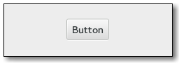
Figure: GtkButton
The gtk:button widget can hold any valid child widget. That is, it can hold almost any other standard gtk:widget object. The most commonly used child is the gtk:label widget.
Other style classes that are commonly used with the gtk:button implementation include the .suggested-action and .destructive-action style classes. In special cases, buttons can be made round by adding the .circular style class.
Button-like widgets like the gtk:toggle-button, gtk:menu-button, gtk:volume-button, gtk:lock-button, gtk:color-button or gtk:font-button widgets use style classes such as the .toggle, .popup, .scale, .lock, .color style classes on the button node to differentiate themselves from a plain gtk:button widget.
Since 4.12
Note that by using this API, you take full responsibility for setting up the proper accessibility label and description information for the button. Most likely, you will either set the accessibility label or description for the button explicitly, or you will set a labelled-by or described-by relation from the child widget to the button.
(defvar button (gtk:button-new-with-label "Save")) => BUTTON (gtk:label-label (gtk:button-child button)) => "Save"Create a button using a gtk:box widget with an image and a label:
(defvar button (gtk:button-new))
=> BUTTON
(defvar box (gtk:box-new :horizontal 9))
=> BOX
(gtk:box-append box (make-instance 'gtk:image :icon-name "edit-clear"))
(gtk:box-append box (make-instance 'gtk:label :label "Edit Clear"))
(setf (gtk:button-child button) box)
=> #<GTK:BOX {1003471C73}> If the icon name has not been set the return value will be nil. This will be the case if you create an empty button with the gtk:button-new function to use as a container. If the button already contains a child widget, that child widget will be removed and replaced with the image.
GtkToggleButton

Figure: GtkToggleButton
A toggle button is created by calling either the gtk:toggle-button-new or gtk:toggle-button-new-with-label functions. If using the former, it is advisable to pack a widget, such as a gtk:label or a gtk:image widget, into the container of the toggle button. See the gtk:button documentation for more information.
The state of a gtk:toggle-button widget can be set and retrieved using the gtk:toggle-button-active function.
(defun do-toggle-button-action (&optional application)
(let* ((vbox (make-instance 'gtk:box
:orientation :vertical
:spacing 12
:margin-top 12
:margin-bottom 12
:margin-start 48
:margin-end 48))
(window (make-instance 'gtk:window
:title "Toggle Buttons with Action"
:child vbox
:application application
:resizable nil))
(label (make-instance 'gtk:label
:margin-top 9
:margin-bottom 6
:label "<b>Button ? is active</b>"
:use-markup t
:use-underline t))
(action (g:simple-action-new-stateful "toggled"
(g:variant-type-new "s")
(g:variant-new-string "top")))
(button nil))
;; Configure the "toggled" action
(g:action-map-add-action application action)
(g:signal-connect action "activate"
(lambda (action parameter)
(g:action-change-state action parameter)))
(g:signal-connect action "change-state"
(lambda (action parameter)
(let ((str (g:variant-string parameter)))
(cond ((string= str "top")
(setf (gtk:label-label label)
"<b>Button Top is active</b>"))
((string= str "center")
(setf (gtk:label-label label)
"<b>Button Center is active</b>"))
(t
(setf (gtk:label-label label)
"<b>Button Bottom is active</b>")))
(setf (g:action-state action) parameter))))
;; Create three grouped toggle buttons
(setf button (gtk:toggle-button-new-with-mnemonic "Button _Top"))
(gtk:actionable-set-detailed-action-name button "app.toggled::top")
(gtk:box-append vbox button)
;; Create and add the second radio button to the group
(setf button (gtk:toggle-button-new-with-mnemonic "Button _Center"))
(gtk:actionable-set-detailed-action-name button "app.toggled::center")
(gtk:box-append vbox button)
;; Create and add the third toggle button to the group
(setf button (gtk:toggle-button-new-with-mnemonic "Button _Bottom"))
(gtk:actionable-set-detailed-action-name button "app.toggled::bottom")
(gtk:box-append vbox button)
;; Add a label which shows the status of the toggle buttons
(gtk:box-append vbox label)
;; Make the "app.toggled::center" action active
(g:action-activate (g:action-map-lookup-action application "toggled")
(g:variant-new-string "center"))
;; Present window
(gtk:window-present window))) If the status of the toggle button changes, this action causes the "toggled" signal to be emitted.
Note that the same effect can be achieved via the gtk:actionable API, by using the same action with parameter type and "s" state type for all buttons in the group, and giving each button its own target value.
GtkCheckButton
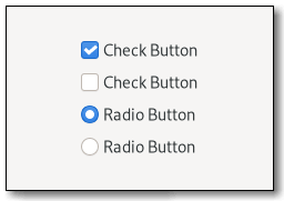
Figure: GtkCheckButton
The gtk:check-button widget is created by calling either the gtk:check-button-new or gtk:check-button-new-with-label functions. The state of a check button can be set specifically using the gtk:check-button-active function.
(defun do-check-button (&optional application)
(let* ((grid (make-instance 'gtk:grid
:column-spacing 24
:row-spacing 12
:halign :center
:margin-top 12
:margin-bottom 12
:margin-start 12
:margin-end 12))
(window (make-instance 'gtk:window
:title "Check Buttons"
:child grid
:application application
:resizable nil))
(group nil) (button nil))
;; Create three radio buttons and put the buttons into the grid
(setf button (gtk:check-button-new-with-label "Radio 1"))
(setf group button)
(gtk:grid-attach grid button 0 0 1 1)
;; Create and add the second radio button to the group
(setf button (gtk:check-button-new-with-label "Radio 2"))
(setf (gtk:check-button-group button) group)
(gtk:grid-attach grid button 0 1 1 1)
;; Make second radio button active
(setf (gtk:check-button-active button) t)
;; Create and add the third radio button to the group
(setf button (gtk:check-button-new-with-label "Radio 3"))
(setf (gtk:check-button-group button) group)
(gtk:grid-attach grid button 0 2 1 1)
;; Create three check buttons and put the buttons into the grid
(gtk:grid-attach grid
(gtk:check-button-new-with-mnemonic "Check _1")
1 0 1 1)
(gtk:grid-attach grid
(gtk:check-button-new-with-mnemonic "Check _2")
1 1 1 1)
(gtk:grid-attach grid
(gtk:check-button-new-with-mnemonic "Check _3")
1 2 1 1)
;; Make first check button active
(setf (gtk:check-button-active (gtk:grid-child-at grid 1 0)) t)
;; Present window
(gtk:window-present window))) checkbutton[.text-button] ├── check ╰── [label]The gtk:check-button implementation has a main node with name checkbutton. If the label property is set, it contains a label child. The indicator node is named check when no group is set, and radio if the check button is grouped together with other check buttons.
Note that by using this API, you take full responsibility for setting up the proper accessibility label and description information for the check button. Most likely, you will either set the accessibility label or description for the check button explicitly, or you will set a labelled-by or described-by relations from the child widget to the check button.
Since 4.8
Setting the group of a check button also changes the CSS name of the indicator widget's CSS node to radio. The behavior of a check button in a group is also commonly known as a "radio button".
Note that the same effect can be achieved via the gtk:actionable API, by using the same action with parameter type and "s" state type for all buttons in the group, and giving each button its own target value.
If the user has selected a range of elements, such as some text or spreadsheet cells, that are affected by a check button, and the current values in that range are inconsistent, you may want to display the toggle in an "in between" state. Normally you would turn off the inconsistent state again if the user checks the check button. This has to be done manually, the inconsistent property only affects visual appearance, not the semantics of the button.
If the use-underline property is true, an underscore in label is interpreted as mnemonic indicator, see the gtk:check-button-use-underline function for details on this behavior.
If the setting is true, an underscore character indicates a mnemonic accelerator key. This behavior is similar to the use-underline property of the gtk:label widget.
GtkMenuButton
(gobject:define-genum "GtkArrowType" arrow-type (:export t :type-initializer "gtk_arrow_type_get_type") (:up 0) (:down 1) (:left 2) (:right 3) (:none 4))
- :up
- Represents an upward pointing arrow.
- :down
- Represents a downward pointing arrow.
- :left
- Represents a left pointing arrow.
- :right
- Represents a right pointing arrow.
- :none
- No arrow.

Figure: GtkMenuButton
The gtk:menu-button widget can show either an icon, set with the icon-name property, or a label, set with the label property. If neither is explicitly set, a gtk:image widget is automatically created, using an arrow image oriented according to the direction property or the generic "open-menu-symbolic" icon if the direction is not set.
The positioning of the popup is determined by the direction property of the menu button.
For menus, the halign and valign properties of the menu are also taken into account. For example, when the direction is :down and the horizontal alignment is :start, the menu will be positioned below the button, with the starting edge, depending on the text direction, of the menu aligned with the starting edge of the button. If there is not enough space below the button, the menu is popped up above the button instead. If the alignment would move part of the menu offscreen, it is "pushed in".
menubutton
╰── button.toggle
╰── <content>
╰── [arrow] The gtk:menu-button implementation has a single CSS node with name menubutton which contains a button node with a .toggle style
class.If the menu button contains an icon, it will have the .image-button style class, if it contains text, it will have the .text-button style class. If an arrow is visible in addition to an icon, text or a custom child widget, it will also have the .arrow-button style class.
Inside the toggle button content, there is an arrow node for the indicator, which will carry one of the .none, .up, .down, .left or .right style classes to indicate the direction that the menu will appear in. The CSS is expected to provide a suitable image for each of these cases using the -gtk-icon-source property.
Optionally, the menubutton node can carry the .circular style class to request a round appearance.
Since 4.10
Since 4.4
Setting a child widget resets the label and icon-name properties. If the always-show-arrow property is set to true and the direction property is not :none, a dropdown arrow will be shown next to the child widget.
Since 4.6
If the popup does not fit in the available space in the given direction, GTK will its best to keep it inside the screen and fully visible.
If you pass the :none value for a direction, the popup will behave as if you passed the :down value, although you will not see any arrows.
A gtk:popover widget will be created from the menu model with the gtk:popover-menu-new-from-model function. Actions will be connected as documented for this function.
If the popover property is already set, it will be dissociated from the menu button, and the property is set to nil.
If the menu-model property is set, the menu model is dissociated from the menu button, and the property is set to nil.
Since 4.4
Using this function will not reset the menu widget attached to the menu button. Instead, this can be done manually in the callback function.
GtkLinkButton

Figure: GtkLinkButton
The URI bound to a gtk:link-button widget can be set specifically or retrieved using the gtk:link-button-uri function.
By default, the gtk:link-button widget calls the gtk:file-launcher-launch function when the button is clicked. This behaviour can be overridden by connecting to the "activate-link" signal and returning true from the signal handler.
The button becomes visited when it is clicked. If the URI is changed on the button, the visited state is unset again.
GtkScaleButton
Since: 4.10
Since 4.14
The names of the icons to be used by the scale button. The first item in the list will be used in the button when the current value is the lowest value, the second item for the highest value. All the subsequent icons will be used for all the other values, spread evenly over the range of values. If there is only one icon name in the icons list, it will be used for all the values. If only two icon names are in the icons array, the first one will be used for the bottom 50% of the scale, and the second one for the top 50%. It is recommended to use at least 3 icons so that the scale button reflects the current value of the scale better for the users.
If the value is outside the minimum or maximum values of the scale button adjustment, it will be clamped to fit inside them. The scale button emits the "value-changed" signal if the value changes.
GtkSwitch
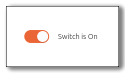
Figure: GtkSwitch
The user can control which state should be active by clicking the switch, or by dragging the handle.
The gtk:switch widget can also handle situations where the underlying state changes with a delay. See the "state-set" signal for details.
switch ├── label ├── label ╰── sliderThe gtk:switch implementation has four CSS nodes, the main node with the name switch and subnodes for the slider and the on and off labels. Neither of them is using any style classes.
lambda (switch) :action
- switch
- The gtk:switch widget that received the signal.
lambda (switch state) :run-last
- switch
- The gtk:switch widget that received the signal.
- state
- The boolean for the state of the switch.
- Returns
- True to stop the signal emission.
To implement delayed state change, applications can connect to this signal, initiate the change of the underlying state, and call the gtk:switch-state function when the underlying state change is complete. The signal handler should return true to prevent the default handler from running.
Visually, the underlying state is represented by the trough color of the switch, while the active property is represented by the position of the switch.
Normally, this is the same as the active property, unless the switch is set up for delayed state changes. This function is typically called from a "state-set" signal handler.
Numeric and Text Data Entry
GtkEditable
;; Handler for the "insert-text" signal
(setf handlerid
(g:signal-connect entry "insert-text"
(lambda (editable text length position)
(g:signal-handler-block editable handlerid)
(gtk:editable-insert-text editable
(string-upcase text)
(cffi:mem-ref position :intptr))
(g:signal-stop-emission editable "insert-text")
(g:signal-handler-unblock editable handlerid)))) lambda (editable) :run-last
- editable
- The gtk:editable widget that received the signal.
lambda (editable start end) :run-last
- editable
- The gtk:editable widget that received the signal.
- start
- The integer for the start position.
- end
- The integer for the end position.
lambda (editable text length position) :run-last
- editable
- The gtk:editable widget that received the signal.
- text
- The string for the new text to insert.
- length
- The integer for the length of the new text, in bytes, or -1 if text is null-terminated.
- position
- The pointer to an integer for the position, in characters, at which to insert the new text. This is an in-out parameter. After the signal emission is finished, it should point after the newly inserted text. The Lisp value of position is returned by the (cffi:mem-ref position :intptr) call.
If enabled, changes to the editable widget will be saved for undo/redo actions. This results in an additional copy of text changes and are not stored in secure memory. As such, undo is forcefully disabled when the visibility property of the gtk:text widget is set to false.
Note that it changes the size request, the size can still be affected by how you pack the widget into containers. If the width argument is -1, the size reverts to the default size.
GtkEntryBuffer
The gtk:entry-buffer class may be derived from. Such a derived class might allow text to be stored in an alternate location, such as non-pageable memory, useful in the case of important passwords. Or a derived class could integrate with an undo/redo concept of the application.
lambda (buffer pos nchars) :run-first
- buffer
- The gtk:entry-buffer object.
- pos
- The integer for the position the text was deleted at.
- nchars
- The integer for the number of characters that were deleted.
lambda (buffer pos chars nchars) :run-first
- buffer
- The gtk:entry-buffer object.
- pos
- The integer for the position the text was inserted at.
- chars
- The string for the text that was inserted.
- nchars
- The integer for the number of characters that were inserted.
If the pos or nchars arguments are out of bounds, then they are coerced to sane values. Note that the position is specified in characters, not bytes.
GtkText
- gtk:text-activates-default
- gtk:text-attributes
- gtk:text-buffer
- gtk:text-enable-emoji-completion
- gtk:text-extra-menu
- gtk:text-im-module
- gtk:text-input-hints
- gtk:text-input-purpose
- gtk:text-invisible-char
- gtk:text-invisible-char-set
- gtk:text-max-length
- gtk:text-overwrite-mode
- gtk:text-placeholder-text
- gtk:text-propagate-text-width
- gtk:text-scroll-offset
- gtk:text-tabs
- gtk:text-truncate-multiline
- gtk:text-visibility
When using a text entry for passwords and other sensitive information, it can be put into "password mode" using the gtk:text-visibility function. In this mode, entered text is displayed using an "invisible" character. By default, GTK picks the best invisible character that is available in the current font, but it can be changed with the gtk:text-invisible-char function.
If you are looking to add icons or progress display in a text entry, look at the gtk:entry widget. There other alternatives for more specialized use cases, such as the gtk:search-entry widget.
If you need multi-line editable text, look at the gtk:text-view widget.
text[.read-only] ├── placeholder ├── undershoot.left ├── undershoot.right ├── [selection] ├── [block-cursor] ╰── [window.popup]The gtk:text implementation has a main node with the name text. Depending on the properties of the widget, the .read-only style class may appear. When the text entry has a selection, it adds a subnode with the name selection. When the text entry is in overwrite mode, it adds a subnode with the name block-cursor that determines how the block cursor is drawn. The CSS node for a context menu is added as a subnode below text as well.
The undershoot nodes are used to draw the underflow indication when content is scrolled out of view. These nodes get the .left and .right style classes added depending on where the indication is drawn. When touch is used and touch selection handles are shown, they are using CSS nodes with name cursor-handle. They get the .top or .bottom style class depending on where they are shown in relation to the selection. If there is just a single handle for the text cursor, it gets the .insertion-cursor style class.
lambda (entry) :action
- entry
- The gtk:text widget on which the signal is emitted.
lambda (entry) :action
- entry
- The gtk:text widget that received the signal.
lambda (entry) :action
- entry
- The gtk:text widget that received the signal.
lambda (entry) :action
- entry
- The gtk:text widget that received the signal.
lambda (entry type count) :action
- entry
- The gtk:text widget that received the signal.
- type
- The granularity of the deletion as a value of the gtk:delete-type enumeration.
- count
- The integer for the number of type units to delete.
lambda (entry string) :action
- entry
- The gtk:text widget that received the signal.
- string
- The string to insert.
lambda (entry) :action
- entry
- The gtk:text widget that received the signal.
lambda (entry step count extend) :action
- entry
- The gtk:text widget that received the signal.
- step
- The granularity of the move as a value of the gtk:movement-step enumeration.
- count
- The integer for the number of step units to move.
- extend
- True if the move should extend the selection.
lambda (entry) :action
- entry
- The gtk:text widget that received the signal.
lambda (entry preedit) :action
- entry
- The gtk:text widget that received the signal.
- preedit
- The current preedit string.
lambda (entry) :action
- entry
- The gtk:text widget that received the signal.
- menu.popup}{Opens the context menu.} @entry[text.redo
- Redoes the last change to the contents.
- text.undo
- Undoes the last change to the contents.
- misc.toggle-visibility
- Toggles the “visibility” property.
- misc.insert-emoji
- Opens the Emoji chooser.
- selection.select-all
- Selects all of the widgets content.
- selection.delete
- Deletes the current selection.
- clipboard.paste
- Inserts the contents of the clipboard into the widget.
- clipboard.copy
- Copies the contents to the clipboard.
- clipboard.cut
- Copies the contents to the clipboard and deletes it from the widget.
By default, GTK picks the best invisible char available in the current font. If you set the invisible char to 0, then the user will get no feedback at all. There will be no text on the screen as they type.
If the current contents are longer than the given length, then they will be truncated to fit. This is equivalent to getting the gtk:entry-buffer object for the text entry and calling the (setf gtk:entry-buffer-max-length) function on it.
By default, GTK picks the best invisible character available in the current font, but it can be changed with the gtk:text-invisible-char function.
Note that you probably want to set the input-purpose property to the :password or :pin value to inform input methods about the purpose of the text entry, in addition to setting the visibility property to false.
Since 4.4
(graphene:with-rects (strong weak) (gtk:text-compute-cursor-extents text pos strong weak) ... )
GtkEntry
(gobject:define-genum "GtkEntryIconPosition" entry-icon-position (:export t :type-initializer "gtk_entry_icon_position_get_type") (:primary 0) (:secondary 1))
- :primary
- At the beginning of the text entry, depending on the text direction.
- :secondary
- At the end of the text entry, depending on the text direction.
- gtk:entry-activates-default
- gtk:entry-attributes
- gtk:entry-buffer
- gtk:entry-completion
- gtk:entry-enable-emoji-completion
- gtk:entry-extra-menu
- gtk:entry-has-frame
- gtk:entry-im-module
- gtk:entry-input-hints
- gtk:entry-input-purpose
- gtk:entry-invisible-char
- gtk:entry-invisible-char-set
- gtk:entry-max-length
- gtk:entry-menu-entry-icon-primary-text
- gtk:entry-menu-entry-icon-secondary-text
- gtk:entry-overwrite-mode
- gtk:entry-placeholder-text
- gtk:entry-primary-icon-activatable
- gtk:entry-primary-icon-gicon
- gtk:entry-primary-icon-name
- gtk:entry-primary-icon-paintable
- gtk:entry-primary-icon-sensitive
- gtk:entry-primary-icon-storage-type
- gtk:entry-primary-icon-tooltip-markup
- gtk:entry-primary-icon-tooltip-text
- gtk:entry-progress-fraction
- gtk:entry-progress-pulse-step
- gtk:entry-scroll-offset
- gtk:entry-secondary-icon-activatable
- gtk:entry-secondary-icon-gicon
- gtk:entry-secondary-icon-name
- gtk:entry-secondary-icon-paintable
- gtk:entry-secondary-icon-sensitive
- gtk:entry-secondary-icon-storage-type
- gtk:entry-secondary-icon-tooltip-markup
- gtk:entry-secondary-icon-tooltip-text
- gtk:entry-show-emoji-icon
- gtk:entry-tabs
- gtk:entry-text-length
- gtk:entry-truncate-multiline
- gtk:entry-visibility
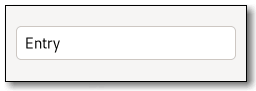
Figure: GtkEntry
When using a text entry for passwords and other sensitive information, it can be put into "password mode" using the gtk:entry-visibility function. In this mode, entered text is displayed using an 'invisible' character. By default, GTK picks the best invisible character that is available in the current font, but it can be changed with the gtk:entry-invisible-char function.
The gtk:entry widget has the ability to display progress or activity information behind the text. To make a text entry display such information, use the gtk:entry-progress-fraction or gtk:entry-progress-pulse-step functions.
Additionally, the gtk:entry widget can show icons at either side of the text entry. These icons can be activatable by clicking, can be set up as drag source and can have tooltips. To add an icon, use the gtk:entry-set-icon-from-gicon function or one of the various other functions that set an icon from an icon name or a paintable. To trigger an action when the user clicks an icon, connect to the "icon-press" signal. To allow DND operations from an icon, use the gtk:entry-set-icon-drag-source function. To set a tooltip on an icon, use the gtk:entry-icon-tooltip-text function or the corresponding function for markup.
Note that functionality or information that is only available by clicking on an icon in an text entry may not be accessible at all to users which are not able to use a mouse or other pointing device. It is therefore recommended that such functionality is also available by other means, such as the context menu of the text entry.
entry[.flat][.warning][.error] ├── text[.readonly] ├── image.left ├── image.right ╰── [progress[.pulse]]The gtk:entry implementation has a main node with the name entry. Depending on the properties of the text entry, the .read-only and .flat style classes may appear. The .warning and .error style classes may also be used with entries.
When the text entry shows icons, it adds subnodes with the name image and the .left or .right style class, depending on where the icon appears.
When the text entry shows progress, it adds a subnode with the name progress. The node has the .pulse style class when the shown progress is pulsing.
For all the subnodes added to the text node in various situations, see the gtk:text widget.
An example of a UI definition fragment specifying Pango attributes:
<object class="GtkEntry">
<attributes>
<attribute name="weight" value="PANGO_WEIGHT_BOLD"/>
<attribute name="background" value="red" start="5" end="10"/>
</attributes>
</object> The start and end attributes specify the range of characters to which the Pango attribute applies. If start and end are not
specified, the attribute is applied to the whole text. Note that specifying
ranges does not make much sense with translatable attributes. Use markup
embedded in the translatable content instead. lambda (entry) :action
- entry
- The gtk:entry widget on which the signal is emitted.
lambda (entry pos) :run-last
- entry
- The gtk:entry widget on which the signal is emitted.
- pos
- The position of the clicked icon as a gtk:entry-icon-position value.
lambda (entry pos) :run-last
- entry
- The gtk:entry widget on which the signal is emitted.
- pos
- The position of the clicked icon as a gtk:entry-icon-position value.
If the setting argument is true, pressing the Enter key in the text entry will activate the default widget for the window containing the text entry. This usually means that the dialog containing the text entry will be closed, since the default widget is usually one of the dialog buttons.
All further configuration of the completion mechanism is done on completion using the gtk:entry-completion API. Completion is disabled if the completion property is set to nil.
For example, this is the character used in "password mode" to show the user how many characters have been typed. By default, GTK picks the best invisible char available in the current font. If you set the invisible char to 0, then the user will get no feedback at all. There will be no text on the screen as they type.
(gtk:entry-buffer-max-length (gtk:entry-buffer object))and
(setf (gtk:entry-buffer-max-length (gtk:entry-buffer object)) max)
Note that since the placeholder text gets removed when the text entry received focus, using this feature is a bit problematic if the text entry is given the initial focus in a window. Sometimes this can be worked around by delaying the initial focus setting until the first key event arrives.
(gtk:entry-buffer-length (gtk:entry-buffer object))
When visibility is set to false, characters are displayed as the invisible char, and will also appear that way when the text in the text entry is copied elsewhere. By default, GTK picks the best invisible character available in the current font, but it can be changed with the gtk:entry-invisible-char function.
If the icon argument is nil, no icon will be shown in the specified position.
See also the gtk:widget-tooltip-text and gtk:entry-icon-tooltip-markup functions.
See also the gtk:widget-tooltip-markup and gtk:entry-icon-tooltip-text functions.
If the text entry is not realized or has no icon at the given position, area is filled with zeros. Otherwise, area will be filled with the allocation of the icon, relative to the allocation of the text entry.
GtkPasswordEntry
Since 4.4

Figure: GtkPasswordEntry
It does not show its contents in clear text, does not allow to copy it to the clipboard, and it shows a warning when the Caps Lock key is engaged. If the underlying platform allows it, the gtk:password-entry widget will also place the text in a non-pageable memory area, to avoid it being written out to disk by the operating system. Optionally, it can offer a way to reveal the contents in clear text.
The gtk:password-entry widget provides only minimal API and should be used with the gtk:editable API.
entry.password
╰── text
├── image.caps-lock-indicator
┊ The gtk:password-entry implementation has a single CSS node with name entry that carries a .passwordstyle style class. The text CSS node below it has a child with name image and .caps-lock-indicator style class for the Caps Lock icon, and
possibly other children. lambda (entry) :action
- entry
- The gtk:password-entry widget on which the signal is emitted.
If the setting argument is true, pressing the Enter key in the password entry will activate the default widget for the window containing the password entry. This usually means that the dialog containing the password entry will be closed, since the default widget is usually one of the dialog buttons.
Note that since the placeholder text gets removed when the password entry received focus, using this feature is a bit problematic if the password entry is given the initial focus in a window. Sometimes this can be worked around by delaying the initial focus setting until the first key event arrives.
GtkScale
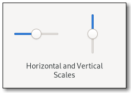
Figure: GtkScale
Note that using the same upper and lower bounds for the gtk:scale widget, through the gtk:range methods, will hide the slider itself. This is useful for applications that want to show an undeterminate value on the scale, without changing the layout of the application, such as movie or music players.
scale[.fine-tune][.marks-before][.marks-after]
├── [value][.top][.right][.bottom][.left]
├── marks.top
│ ├── mark
│ ┊ ├── [label]
│ ┊ ╰── indicator
┊ ┊
│ ╰── mark
├── marks.bottom
│ ├── mark
│ ┊ ├── indicator
│ ┊ ╰── [label]
┊ ┊
│ ╰── mark
╰── trough
├── [fill]
├── [highlight]
╰── slider The gtk:scale implementation has a main CSS node with name scale and a subnode for its contents, with subnodes named trough and slider. The main node gets the .fine-tune
style class added when the scale is in 'fine-tuning' mode.If the scale has an origin, see the gtk:scale-has-origin function, there is a subnode with name highlight below the trough node that is used for rendering the highlighted part of the trough.
If the scale is showing a fill level, see the gtk:range-show-fill-level function, there is a subnode with name fill below the trough node that is used for rendering the filled in part of the trough.
If marks are present, there is a marks subnode before or after the contents node, below which each mark gets a node with name mark. The marks nodes get either the .top or .bottom style class.
The mark node has a subnode named indicator. If the mark has text, it also has a subnode named label. When the mark is either above or left of the scale, the label subnode is the first when present. Otherwise, the indicator subnode is the first.
The main CSS node gets the marks-before and/or marks-after style classes added depending on what marks are present.
If the scale is displaying the value, see the draw-value property, there is subnode with name value. This node will get the .top or .bottom style classes similar to the marks node.
If the has-origin property is set to true, the default, the scale will highlight the part of the scale between the origin, bottom or left side, of the scale and the current value.
Note that the way in which the precision is derived works best if the step argument is a power of ten. If the resulting precision is not suitable for your needs, use the gtk:scale-digits function to correct it.
If nil is passed as func, the value will be displayed on its own, rounded according to the value of the digits property.
If the markup argument is not nil, text is shown next to the tick mark. To remove marks from a scale, use the gtk:scale-clear-marks function.
GtkSpinButton
(gobject:define-genum "GtkSpinButtonUpdatePolicy" spin-button-update-policy (:export t :type-initializer "gtk_spin_button_update_policy_get_type") (:always 0) (:if-valid 1))
- :always
- When refreshing the spin button, the value is always displayed
- :if-valid
- When refreshing the spin button, the value is only displayed if it is valid within the bounds of the spin button's adjustment.
(gobject:define-genum "GtkSpinType" spin-type (:export t :type-initializer "gtk_spin_type_get_type") (:step-forward 0) (:step-backward 1) (:page-forward 2) (:page-backward 3) (:home 4) (:end 5) (:user-defined 6))
- :step-forward
- Increment by the adjustments step increment.
- :step-backward
- Decrement by the adjustments step increment.
- :page-forward
- Increment by the adjustments page increment.
- :page-backward
- Decrement by the adjustments page increment.
- :home
- Go to the adjustments lower bound.
- :end
- Go to the adjustments upper bound.
- :user-defined
- Change by a specified amount.
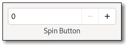
Figure: GtkSpinButton
The main properties of a gtk:spin-button widget are through an adjustment. See the gtk:adjustment class for more details about the properties of an adjustment.
Note that the gtk:spin-button widget will by default make its entry large enough to accommodate the lower and upper bounds of the adjustment. If this is not desired, the automatic sizing can be turned off by explicitly setting the width-chars property to a value not equal to -1.
spinbutton.horizontal ├── undershoot.left ├── undershoot.right ├── entry │ ╰── ... ├── button.down ╰── button.upThe gtk:spin-button implementation main CSS node has the name spinbutton. It creates subnodes for the text entry and the two buttons, with these names. The button nodes have the .up and .down style classes. The gtk:entry subnodes, if present, are put below the text entry node. The orientation of the spin button is reflected in the .vertical or .horizontal style class on the main node.
spinbutton.vertical ├── undershoot.left ├── undershoot.right ├── button.up ├── entry │ ╰── ... ╰── button.down
(let (...
(spinner (make-instance 'gtk:spin-button
:adjustment
(make-instance 'gtk:adjustment
:value 50.0
:lower 0.0
:upper 100.0
:step-increment 1.0
:page-increment 5.0
:page-size 0.0)
:climb-rate 0
:digits 0
:wrap t)))
(g:signal-connect spinner "value-changed"
(lambda (widget)
(let ((value (gtk:spin-button-value widget)))))
... )) Since 4.14
The way in which the precision is derived works best if step is a power of ten. If the resulting precision is not suitable for your needs, use the gtk:spin-button-digits function to correct it.
(defvar spinbutton (gtk:spin-button-new-with-range 5 15 5)) => SPINBUTTON ;; Get the adjustment of the spin button (defvar adjustment (gtk:spin-button-adjustment spinbutton)) => ADJUSTMENT ;; Get the slots of the adjustment of the spin button (gtk:adjustment-lower adjustment) => 5.0d0 (gtk:adjustment-page-increment adjustment) => 50.0d0 (gtk:adjustment-page-size adjustment) => 0.0d0 (gtk:adjustment-step-increment adjustment) => 5.0d0 (gtk:adjustment-upper adjustment) => 15.0d0 (gtk:adjustment-value adjustment) =>5.0d0
This affects how quickly the value changes when the arrows of the spin button are activated.
If the current value is outside this range, it will be adjusted to fit within the range, otherwise it will remain unchanged.
GtkSearchEntry

Figure: GtkSearchEntry
It will show an inactive symbolic find icon when the search entry is empty, and a symbolic clear icon when there is text. Clicking on the clear icon will empty the search entry.
To make filtering appear more reactive, it is a good idea to not react to every change in the search entry text immediately, but only after a short delay. To support this, the gtk:search-entry widget emits the "search-changed" signal which can be used instead of the "changed" signal.
The "previous-match", "next-match" and "stop-search" signals can be used to implement moving between search results and ending the search.
Often, the gtk:search-entry widget will be fed events by means of being placed inside a gtk:search-bar widget. If that is not the case, you can use the gtk:search-entry-key-capture-widget function to let it capture key input from another widget.
entry.search ╰── textThe gtk:search-entry implementation has a single CSS node with name entry that carries a .search style class, and the text node is a child of that.
lambda (entry) :action
- entry
- The gtk:search-entry widget on which the signal is emitted.
lambda (entry) :action
- entry
- The gtk:search-entry widget on which the signal is emitted.
lambda (entry) :action
- entry
- The gtk:search-entry widget on which the signal is emitted.
lambda (entry) :run-last
- entry
- The gtk:search-entry widget on which the signal is emitted.
lambda (entry) :action
- entry
- The gtk:search-entry widget on which the signal is emitted.
If the setting argument is true, pressing the Enter key in the search entry will activate the default widget for the window containing the search entry. This usually means that the dialog containing the search entry will be closed, since the default widget is usually one of the dialog buttons.
Since 4.14
Since 4.14
Note that since the placeholder text gets removed when the search entry received focus, using this feature is a bit problematic if the search entry is given the initial focus in a window. Sometimes this can be worked around by delaying the initial focus setting until the first key event arrives.
Since 4.8
If the search entry is part of a gtk:search-bar widget, it is preferable to call the gtk:search-bar-key-capture-widget function instead, which will reveal the text entry in addition to triggering the search entry.
GtkSearchBar

Figure: GtkSearchBar
For keyboard presses to start a search, the search bar must be told of a widget to capture key events from through the gtk:search-bar-key-capture-widget function. This widget will typically be the toplevel window, or a parent container of the search bar. Common shortcuts such as Ctrl+F should be handled as an application action, or through the menu items.
You will also need to tell the search bar about which entry you are using as your search entry using the gtk:search-bar-connect-entry function.
(defun do-search-bar (&optional application)
(let* ((box (make-instance 'gtk:box
:orientation :horizontal
:spacing 6))
(searchbar (make-instance 'gtk:search-bar
:child box
:valign :start))
(window (make-instance 'gtk:window
:title "Search Bar"
:application application
:child searchbar))
(entry (make-instance 'gtk:search-entry
:hexpand t))
(button (make-instance 'gtk:menu-button)))
(gtk:search-bar-connect-entry searchbar entry)
(setf (gtk:search-bar-key-capture-widget searchbar) window)
(gtk:box-append box entry)
(gtk:box-append box button)
(gtk:window-present window)))
searchbar
╰── revealer
╰── box
├── [child]
╰── [button.close] The gtk:search-bar implementation has a single CSS node with name searchbar. It has a child node with name revealer that contains a node with name box. The box node contains both the CSS
node of the child widget as well as an optional button node which gets the .close style class applied. If key events are handled by the search bar, the search bar will be shown, and the search entry populated with the entered text.
Applications that already have a search toggle button should not show a Close button in their search bar, as it duplicates the role of the toggle button.
GtkEditableLabel
Figure: GtkEditableLabel
The gtk:editable-label widget does not have API of its own, but it implements the gtk:editable interface.
The default bindings for activating the edit mode is to click or press the Enter key. The default bindings for leaving the edit mode are the Enter key, to save the results, or the Escape key, to cancel the editing.
- Enter starts editing.
- Escape stops editing.
- editing.starts switches the widget into editing mode.
- editing.stop switches the widget out of editing mode.
editablelabel[.editing]
╰── stack
├── label
╰── text The gtk:editable-label implementation has a main node with the name editablelabel. When the text entry is in editing mode, it gets the .editing style class. For all the subnodes added to the text node in various situations, see the gtk:text documentation. Multiline Text Editor
Conceptual Overview
One of the important things to remember about text in GTK is that it is in the UTF-8 encoding. This means that one character can be encoded as multiple bytes. Character counts are usually referred to as offsets, while byte counts are called indexes. If you confuse these two, things will work fine with ASCII, but as soon as your text buffer contains multibyte characters, bad things will happen.
Text in a text buffer can be marked with tags. A tag is an attribute that can be applied to some range of text. For example, a tag might be called "bold" and make the text inside the tag bold. However, the tag concept is more general than that. Tags do not have to affect appearance. They can instead affect the behavior of mouse and key presses, "lock" a range of text so the user cannot edit it, or countless other things. A tag is represented by a gtk:text-tag object. One gtk:text-tag object can be applied to any number of text ranges in any number of text buffers.
Each tag is stored in a gtk:text-tag-table object. A tag table defines a set of tags that can be used together. Each text buffer has one tag table associated with it. Only tags from that tag table can be used with the text buffer. A single tag table can be shared between multiple text buffers, however. Tags can have names, which is convenient sometimes. For example, you can name your tag that makes things bold "bold", but they can also be anonymous, which is convenient if you are creating tags on-the-fly.
Most text manipulation is accomplished with iterators, represented by a gtk:text-iter instance. An iterator represents a position between two characters in the text buffer. The gtk:text-iter structure is a structure designed to be allocated on the stack. It is guaranteed to be copiable by value and never contain any heap-allocated data. Iterators are not valid indefinitely. Whenever the text buffer is modified in a way that affects the number of characters in the text buffer, all outstanding iterators become invalid. Note that deleting 5 characters and then reinserting 5 still invalidates iterators, though you end up with the same number of characters you pass through a state with a different number.
Because of this, iterators cannot be used to preserve positions across buffer modifications. To preserve a position, the gtk:text-mark object is ideal. You can think of a mark as an invisible cursor or insertion point. It floats in the text buffer, saving a position. If the text surrounding the mark is deleted, the mark remains in the position the text once occupied. If text is inserted at the mark, the mark ends up either to the left or to the right of the new text, depending on its gravity. The standard text cursor in left-to-right languages is a mark with right gravity, because it stays to the right of inserted text.
Like tags, marks can be either named or anonymous. There are two marks built-in to the gtk:text-buffer class. These are named "insert" and "selection_bound" and refer to the insertion point and the boundary of the selection which is not the insertion point, respectively. If no text is selected, these two marks will be in the same position. You can manipulate what is selected and where the cursor appears by moving these marks around. If you want to place the cursor in response to a user action, be sure to use the gtk:text-buffer-place-cursor function, which moves both at once without causing a temporary selection. Moving one then the other temporarily selects the range in between the old and new positions.
Text buffers always contain at least one line, but may be empty, that is, buffers can contain zero characters. The last line in the text buffer never ends in a line separator (such as newline). The other lines in the text buffer always end in a line separator. Line separators count as characters when computing character counts and character offsets. Note that some Unicode line separators are represented with multiple bytes in UTF-8, and the two-character sequence "\r\n" is also considered a line separator.
(defun do-text-view-simple (&optional application)
(let* ((textview (make-instance 'gtk:text-view
:wrap-mode :word
:top-margin 6
:top-bottom 6
:left-margin 6
:right-margin 6))
(window (make-instance 'gtk:window
:application application
:child textview
:title "Simple Text View"
:default-width 350
:default-height 200))
(buffer (gtk:text-view-buffer textview)))
(g:signal-connect window "close-request"
(lambda (widget)
(declare (ignore widget))
(let ((start (gtk:text-buffer-start-iter buffer))
(end (gtk:text-buffer-end-iter buffer))
(include-hidden-chars t))
(print (gtk:text-buffer-get-text buffer
start
end
include-hidden-chars))
(terpri))))
(setf (gtk:text-buffer-text buffer) *lorem-ipsum-short*)
(gtk:window-present window)))
In many cases it is also convenient to first create the text buffer with the gtk:text-buffer-new function, then create a text view for that text buffer with the gtk:text-view-new-with-buffer function. Or you
can change the text buffer the text view displays after the text view is created with the gtk:text-view-buffer function.
(defun do-text-view-attributes (&optional application)
(let* ((textview (make-instance 'gtk:text-view
;; Change left margin throughout the widget
:left-margin 24
;; Change top margin
:top-margin 12))
(window (make-instance 'gtk:window
:application application
:child textview
:title "Text View Attributes"
:default-width 350
:default-height 200))
(provider (gtk:css-provider-new))
(buffer (gtk:text-view-buffer textview)))
(setf (gtk:text-buffer-text buffer) "Hello, this is some text.")
;; Load CSS from data into the provider and apply CSS
(gtk:css-provider-load-from-string provider
".viewstyle textview {
color : Green;
font : 20px Purisa; }")
(gtk:widget-add-css-class window "viewstyle")
(gtk:widget-add-provider window provider)
;; Use a tag to change the color for just one part of the text view
(let ((tag (gtk:text-buffer-create-tag buffer
"blue_foreground"
:foreground "blue"))
(start (gtk:text-buffer-iter-at-offset buffer 7))
(end (gtk:text-buffer-iter-at-offset buffer 12)))
;; Apply the tag to a region of the text in the buffer
(gtk:text-buffer-apply-tag buffer tag start end))
;; Show the window
(gtk:window-present window)))
The GTK4 demo that comes with GTK contains more example code for the gtk:text-view widget. GtkTextIter
(gobject:define-gflags "GtkTextSearchFlags" text-search-flags (:export t :type-initializer "gtk_text_search_flags_get_type") (:visible-only 1) (:text-only 2) (:case-insensitive 4))
- :visible-only
- Search only visible data. A search match may have invisible text interspersed.
- :text-only
- Search only text. A match may have pixbufs or child widgets mixed inside the matched range.
- :case-insensitive
- The text will be matched regardless of what case it is in.
(glib:define-gboxed-opaque text-iter "GtkTextIter" :export t :type-initializer "gtk_text_iter_get_type" :alloc (%text-iter-alloc))
Iterators are not valid indefinitely. Whenever the text buffer is modified in a way that affects the number of characters in the text buffer, all outstanding iterators become invalid. Note that deleting 5 characters and then reinserting 5 characters still invalidates iterators, though you end up with the same number of characters you pass through a state with a different number.
Each character in a text buffer has an offset, starting with 0 for the first character in the text buffer. Use the gtk:text-buffer-iter-at-offset function to convert an character offset back into an iterator.
Lines in a text buffer are numbered beginning with 0 for the first line in the text buffer. If the given line number is negative or larger than the number of lines in the text buffer, moves the iterator to the start of the last line in the text buffer.
The first character on the line has offset 0. The given character offset must be less than or equal to the number of characters in the line. If equal, the iterator moves to the start of the next line. See the gtk:text-iter-line-index function if you have a byte index rather than a character offset.
Remember that the text buffer encodes text in UTF-8, and that characters can require a variable number of bytes to represent. The given byte index must be at the start of a character, it cannot be in the middle of a UTF-8 encoded character.
A "slice" is a string of characters encoded in UTF-8 format, including the Unicode "unknown" character 0xFFFC for iterable non-character elements in the text buffer, such as images. Because images are encoded in the slice, byte and character offsets in the returned string will correspond to byte offsets in the text buffer. Note that the character 0xFFFC can occur in normal text as well, so it is not a reliable indicator that a pixbuf or widget is in the text buffer.
If the range contains non-text elements such as images, the character and byte offsets in the returned string will not correspond to character and byte offsets in the text buffer. If you want offsets to correspond, see the gtk:text-iter-slice function.
If toggled is true, the list contains tags that are toggled on. If a tag is toggled on at the iterator, then some non-empty range of characters following the iterator has that tag applied to it. If a tag is toggled off, then some non-empty range following the iterator does not have the tag applied to it.
Note that if the gtk:text-iter-starts-tag function returns true, it means that the iterator is at the beginning of the tagged range, and that the character at the iterator is inside the tagged range. In other words, unlike the gtk:text-iter-ends-tag function, if the gtk:text-iter-starts-tag function returns true, the gtk:text-iter-has-tag function will also return true for the same parameters.
(or (gtk:text-iter-starts-tag iter tag)
(gtk:text-iter-ends-tag iter tag)) You do not want to use this function to decide whether text can be inserted at the iterator, because for insertion you do not want to know whether the char at the iterator is inside an editable range, you want to know whether a new character inserted at the iterator would be inside an editable range. Use the gtk:text-iter-can-insert function to handle this case.
If text inserted at the iterator would be editable then the user should be allowed to insert text at the iterator. The gtk:text-buffer-insert function with the true value for the interactive argument uses this function to decide whether insertions are allowed at a given position.
Note that an iterator pointing to the \n of a \r\n pair will not be counted as the end of a line, the line ends before the \r. The end iterator is considered to be at the end of a line, even though there are no paragraph delimiter chars there.
The following operations are performed depending on the by keyword argument:
- :char
- Moves count characters if possible in the given direction, which is :forward or :backward. If count would move past
the start or end of the text buffer, moves to the start or end of the
text buffer.
The return value indicates whether the new position of the iterator is different from its original position, and dereferenceable, the last iterator in the text buffer is not dereferenceable. If count is 0, the function does nothing and returns false.
This replaces the functions:- gtk_text_iter_forward_char()
- gtk_text_iter_backward_char()
- gtk_text_iter_forward_chars()
- gtk_text_iter_backward_chars()
- :line
- Moves the iterator to the start of the next line for the :forward direction or to the start of the previous line for the :backward
direction.
If the the iterator is already on the last line of the text buffer for a :forward direction, moves the iterator to the end of the current line. If after the operation, the iterator is at the end of the text buffer and not dereferencable, returns false. Otherwise, returns true.
For the :backward direction returns true if the iterator could be moved, for example, if the iterator was at character offset 0, this function returns false. Therefore if the iterator was already on line 0, but not at the start of the line, the iterator is snapped to the start of the line and the function returns true. Note that this implies that in a loop calling this function, the line number may not change on every iteration, if your first iteration is on line 0.
This replaces the functions:- gtk_text_iter_forward_line()
- gtk_text_iter_backward_line()
- gtk_text_iter_forward_lines()
- gtk_text_iter_backward_lines()
- :word
- Moves forward up to count times for the :forward direction
to the next word end. If the iterator is currently on a word end, moves
forward to the next one after that.
Moves backward up to count times for the :backward direction to the previous word start. If the iterator is currently on a word start, moves backward to the next one after that.
Word breaks are determined by Pango and should be correct for nearly any language, if not, the correct fix would be to the Pango word break algorithms.
Returns true if the iterator moved and is not the end iterator.
This replaces the functions:- gtk_text_iter_forward_word_end()
- gtk_text_iter_backward_word_start()
- gtk_text_iter_forward_word_ends()
- gtk_text_iter_backward_word_starts()
- :cursor-position
- Moves the iterator up to count cursor positions forward or backward.
Cursor positions are (unsurprisingly) positions where the cursor can appear. Perhaps surprisingly, there may not be a cursor position between all characters. The most common example for European languages would be a carriage return/newline sequence. For some Unicode characters, the equivalent of say the letter "a" with an accent mark will be represented as two characters, first the letter then a "combining mark" that causes the accent to be rendered. So the cursor cannot go between those two characters. See also the pango:log-attr structure and the pango:default-break function.
Returns true if we moved and the new position is dereferenceable.
This replaces the functions:- gtk_text_iter_forward_cursor_position()
- gtk_text_iter_backward_cursor_position()
- gtk_text_iter_forward_cursor_positions()
- gtk_text_iter_backward_cursor_positions()
- :sentence
-
Moves backward to the previous sentence start or forward to the next
sentence end. If the iterator is already at the start of a sentence, moves
backward to the next one. If the iterator is at the end of a sentence,
moves to the next end of sentence.
Sentence boundaries are determined by Pango and should be correct for nearly any language, if not, the correct fix would be to the Pango text boundary algorithms.
This replaces the functions:- gtk_text_iter_forward_sentence_end()
- gtk_text_iter_backward_sentence_start()
- gtk_text_iter_forward_sentences_ends()
- gtk_text_iter_backward_sentence_starts()
- :visible-word
-
Moves forward to the next visible word end or backward to the previous
visible word start.
If the iterator is currently on a word start, moves backward to the next one after that. Word breaks are determined by Pango and should be correct for nearly any language. If not, the correct fix would be to the Pango word break algorithms.
This replaces the functions:- gtk_text_iter_forward_visible_word_end()
- gtk_text_iter_backward_visible_word_start()
- gtk_text_iter_forward_visible_word_ends()
- gtk_text_iter_backward_visible_word_starts()
- :visible-line
-
Moves the iterator to the start of the next visible line or to the start
of the previous visible line.
The return value indicates whether the iterator moved onto a dereferenceable position. If the iterator did not move, or moved onto the end iterator, then false is returned. If count is 0, the function does nothing and returns false.
This replaces the functions:- gtk_text_iter_forward_visible_line()
- gtk_text_iter_backward_visible_line()
- gtk_text_iter_forward_visible_lines()
- gtk_text_iter_backward_visible_lines()
- :visible-cursor-position
-
Moves the iterator forward to the next visible cursor position or forward
to the previous visible cursor position.
Returns true if we moved and the new position is dereferenceable.
This replaces the functions:- gtk_text_iter_forward_visible_cursor_position()
- gtk_text_iter_backward_visible_cursor_position()
- gtk_text_iter_forward_visible_cursor_positions()
- gtk_text_iter_backward_visible_cursor_positions()
If the iterator is already at the paragraph delimiter characters, moves to the paragraph delimiter characters for the next line. If the iterator is on the last line in the text buffer, which does not end in paragraph delimiters, moves to the end iterator (end of the last line), and returns false.
If the pred callback function returns true, returns true and stops scanning. If the pred callback function never returns true, the iterator is set to limit if limit is non-nil, otherwise to the end iterator. The limit keyword argument has the nil default value.
end -- a gtk:text-iter iterator for the end of the match
Any match is returned by returning start to the first character of the match and end to the first character after the match. The search will not continue past limit. Note that a search is a linear or O(n) operation, so you may wish to use limit to avoid locking up your UI on large text buffers.
The start value will never be set to an iterator located before iter, even if there is a possible end after or at iter.
GtkTextTag
- gtk:text-tag-accumulative-margin
- gtk:text-tag-allow-breaks
- gtk:text-tag-allow-breaks-set
- gtk:text-tag-background
- gtk:text-tag-background-full-height
- gtk:text-tag-background-full-height-set
- gtk:text-tag-background-rgba
- gtk:text-tag-background-set
- gtk:text-tag-direction
- gtk:text-tag-editable
- gtk:text-tag-editable-set
- gtk:text-tag-fallback
- gtk:text-tag-fallback-set
- gtk:text-tag-family
- gtk:text-tag-family-set
- gtk:text-tag-font
- gtk:text-tag-font-desc
- gtk:text-tag-font-features
- gtk:text-tag-font-features-set
- gtk:text-tag-foreground
- gtk:text-tag-foreground-rgba
- gtk:text-tag-foreground-set
- gtk:text-tag-indent
- gtk:text-tag-indent-set
- gtk:text-tag-insert-hyphens
- gtk:text-tag-insert-hyphens-set
- gtk:text-tag-invisible
- gtk:text-tag-invisible-set
- gtk:text-tag-justification
- gtk:text-tag-justification-set
- gtk:text-tag-language
- gtk:text-tag-language-set
- gtk:text-tag-left-margin
- gtk:text-tag-left-margin-set
- gtk:text-tag-letter-spacing
- gtk:text-tag-letter-spacing-set
- gtk:text-tag-line-height
- gtk:text-tag-line-height-set
- gtk:text-tag-name
- gtk:text-tag-overline
- gtk:text-tag-overline-rgba
- gtk:text-tag-overline-rgba-set
- gtk:text-tag-overline-set
- gtk:text-tag-paragraph-background
- gtk:text-tag-paragraph-background-rgba
- gtk:text-tag-paragraph-background-set
- gtk:text-tag-pixels-above-lines
- gtk:text-tag-pixels-above-lines-set
- gtk:text-tag-pixels-below-lines
- gtk:text-tag-pixels-below-lines-set
- gtk:text-tag-pixels-inside-wrap
- gtk:text-tag-pixels-inside-wrap-set
- gtk:text-tag-right-margin
- gtk:text-tag-right-margin-set
- gtk:text-tag-rise
- gtk:text-tag-rise-set
- gtk:text-tag-scale
- gtk:text-tag-scale-set
- gtk:text-tag-sentence
- gtk:text-tag-sentence-set
- gtk:text-tag-show-spaces
- gtk:text-tag-show-spaces-set
- gtk:text-tag-size
- gtk:text-tag-size-points
- gtk:text-tag-size-set
- gtk:text-tag-stretch
- gtk:text-tag-stretch-set
- gtk:text-tag-strikethrough
- gtk:text-tag-strikethrough-rgba
- gtk:text-tag-strikethrough-rgba-set
- gtk:text-tag-strikethrough-set
- gtk:text-tag-style
- gtk:text-tag-style-set
- gtk:text-tag-tabs
- gtk:text-tag-tabs-set
- gtk:text-tag-text-transform
- gtk:text-tag-text-transform-set
- gtk:text-tag-underline
- gtk:text-tag-underline-rgba
- gtk:text-tag-underline-rgba-set
- gtk:text-tag-underline-set
- gtk:text-tag-variant
- gtk:text-tag-variant-set
- gtk:text-tag-weight
- gtk:text-tag-weight-set
- gtk:text-tag-word
- gtk:text-tag-word-set
- gtk:text-tag-wrap-mode
- gtk:text-tag-wrap-mode-set
Tags should be in the gtk:text-tag-table object for a given gtk:text-buffer object before using them with that text buffer. The gtk:text-buffer-create-tag function is the best way to create tags.
For each property of the gtk:text-tag class, there is a set property, for example, font-set corresponds to font. These set properties reflect whether a property has been set or not. They are maintained by GTK and you should not set them independently.
(defvar tag (gtk:text-tag-new nil)) => TAG (setf (gtk:text-tag-background tag) "red") => "red" (gtk:text-tag-background-rgba tag) => #S(GDK:RGBA :RED 1.0 :GREEN 0.0 :BLUE 0.0 :ALPHA 1.0)
(defvar tag (gtk:text-tag-new nil)) => TAG (setf (gtk:text-tag-foreground tag) "red") => "red" (gtk:text-tag-foreground-rgba tag) => #S(GDK:RGBA :RED 1.0 :GREEN 0.0 :BLUE 0.0 :ALPHA 1.0)
Since 4.6
Since 4.6
Since 4.6
Since 4.6
Since 4.6
Since 4.6
Since 4.6
Since 4.6
(gtk:text-tag-new "font-italic" :font "fixed" :style :italic)
=> #<gtk:text-tag {1006C86E63}> Valid priorities start at 0 and go to one less than the value of the result of the gtk:text-tag-table-size function. Each tag in a gtk:text-tag-table object has a unique priority. Setting the priority of one tag shifts the priorities of all the other tags in the tag table to maintain a unique priority for each tag. Higher priority tags "win" if two tags both set the same text attribute. When adding a tag to a tag table, it will be assigned the highest priority in the tag table by default. So normally the precedence of a set of tags is the order in which they were added to the tag table, or created with the gtk:text-buffer-create-tag function, which adds the tag to the tag table of the text buffer automatically.
GtkTextTagTable
Example: A UI definition fragment specifying tags.
<object class="GtkTextTagTable"> <child type="tag"> <object class="GtkTextTag"/> </child> </object>
lambda (table tag) :run-last
- table
- The gtk:text-tag-table object which received the signal.
- tag
- The added gtk:text-tag object.
lambda (table tag changed) :run-last
- table
- The gtk:text-tag-table object which received the signal.
- tag
- The changed gtk:text-tag object.
- changed
- The boolean whether the size has been changed.
lambda (table tag) :run-last
- table
- The gtk:text-tag-table object which received the signal.
- tag
- The removed gtk:text-tag object.
GtkTextMark
Note that "left" and "right" here refer to logical direction. Left is toward the start of the buffer. In some languages such as Hebrew the logically leftmost text is not actually on the left when displayed.
Text marks are reference counted, but the reference count only controls the validity of the memory. Text marks can be deleted from the buffer at any time with the gtk:text-buffer-delete-mark function. Once deleted from the buffer, a text mark is essentially useless.
Text marks optionally have names. These can be convenient to avoid passing the gtk:text-mark object around. Text marks are typically created using the gtk:text-buffer-create-mark function.
The insertion point is normally visible, that is, you can see it as a vertical bar. Also, the text widget uses a visible text mark to indicate where a drop will occur when dragging-and-dropping text. Most other text marks are not visible. Text marks are not visible by default.
GtkTextBuffer
(gobject:define-gflags "GtkTextBufferNotifyFlags" text-buffer-notify-flags (:export t :type-initializer "gtk_text_buffer_notify_flags_get_type") (:before-insert #.(ash 1 0)) (:after-insert #.(ash 1 1)) (:before-delete #.(ash 1 2)) (:after-delete #.(ash 1 3)))
- :before-insert
- Be notified before text is inserted into the underlying text buffer.
- :after-insert
- Be notified after text has been inserted into the underlying text buffer.
- :before-delete
- Be notified before text is deleted from the underlying text buffer.
- :after-delete
- Be notified after text has been deleted from the underlying text buffer.
The gtk:text-buffer object can support undoing changes to the text buffer content, see the gtk:text-buffer-enable-undo function.
lambda (buffer tag start end) :run-last
- buffer
- The gtk:text-buffer object that received the signal.
- tag
- The gtk:text-tag applied tag.
- start
- The gtk:text-iter start iterator for the range the tag is applied to.
- end
- The gtk:text-iter end iterator for the range the tag is applied to.
lambda (buffer) :run-last
- buffer
- The gtk:text-buffer object that received the signal.
lambda (buffer) :run-last
- buffer
- The gtk:text-buffer object that received the signal.
lambda (buffer start end) :run-last
- buffer
- The gtk:text-buffer object that received the signal.
- start
- The gtk:text-iter start iterator for the range to be deleted.
- end
- The gtk:text-iter end iterator for the range to be deleted.
lambda (buffer) :run-last
- buffer
- The gtk:text-buffer object that received the signal.
lambda (buffer location anchor) :run-last
- buffer
- The gtk:text-buffer object that received the signal.
- location
- The gtk:text-iter position to insert anchor in buffer.
- anchor
- The gtk:text-child-anchor object to be inserted.
lambda (buffer location paintable) :run-last
- buffer
- The gtk:text-buffer object that received the signal.
- location
- The gtk:text-iter position to insert paintable in buffer.
- paintable
- The gdk:paintable object to be inserted.
lambda (buffer location text len) :run-last
- buffer
- The gtk:text-buffer object that received the signal.
- location
- The gtk:text-iter position to insert text in buffer.
- text
- The string for the UTF-8 text to be inserted.
- len
- The integer for the length of the inserted text in bytes.
lambda (buffer mark) :run-last
- buffer
- The gtk:text-buffer object that received the signal.
- mark
- The gtk:text-mark object that was deleted.
lambda (buffer location mark) :run-last
- buffer
- The gtk:text-buffer object that received the signal.
- location
- The gtk:text-iter location of mark in buffer.
- mark
- The gtk:text-mark object that is set.
lambda (buffer) :run-last
- buffer
- The gtk:text-buffer object that received the signal.
lambda (buffer clipboard) :run-last
- buffer
- The gtk:text-buffer object that received the signal.
- clipboard
- The gdk:clipboard object.
lambda (buffer) :run-last
- buffer
- The gtk:text-buffer object that received the signal.
lambda (buffer tag start end) :run-last
- buffer
- The gtk:text-buffer object that received the signal.
- tag
- The gtk:text-tag object to be removed.
- start
- The gtk:text-iter start iterator for the range the tag is removed from.
- end
- The gtk:text-iter end iterator for the range the tag is removed from.
lambda (buffer) :run-last
- buffer
- The gtk:text-buffer object that received the signal.
See the gtk:text-buffer-begin-irreversible-action and gtk:text-buffer-end-irreversible-action functions to create changes to the text buffer that cannot be undone.
If the interactive keyword argument is true, the insertion will not occur if the iterator is at a non-editable location in the text buffer. Usually you want to prevent insertions at ineditable locations if the insertion results from a user action (is interactive).
The editable keyword argument indicates the editability of text that does not have a tag affecting editability applied to it. Typically the result of the gtk:text-view-editable function is appropriate here.
Emits the "insert-text" signal. Insertion actually occurs in the default handler for the signal. The iterator is invalidated when insertion occurs, because the text buffer contents change, but the default signal handler revalidates it to point to the end of the inserted text.
Used instead of simply getting/inserting text because it preserves images and tags. If start and end are in a different text buffer from buffer, the two buffers must share the same tag table.
The interactive keyword argument with the true value is the same, but does nothing if the insertion point is not editable. The editable keyword argument indicates whether the text is editable at the iterator if no tags enclosing the iterator affect editability. Typically the result of the gtk:text-view-editable function is appropriate here.
Implemented via emissions of the "insert-text" and "apply-tag" signals, so expect those.
If the interactive keyword argument is true deletes all editable text for each editable sub range of [start, end). The start and end iterators are revalidated to point to the location of the last deleted range, or left untouched if no text was deleted. If the editable keyword argument is true deletes in addition the not editable text. This case is equivalent to calling the gtk:text-buffer-delete function with the nil value for the interactive keyword argument.
Because the text buffer is modified, all outstanding iterators become invalid after calling this function. However, the iterator will be re-initialized to point to the location where text was deleted.
The returned string includes a 0xFFFC character whenever the text buffer contains embedded images, so byte and character indexes into the returned string do correspond to byte and character indexes into the text buffer. Contrast with the gtk:text-buffer-get-text function. Note that 0xFFFC can occur in normal text as well, so it is not a reliable indicator that a paintable or widget is in the text buffer.
If the anchor argument is nil creates an anchor with the gtk:text-child-anchor-new function and inserts it into buffer with the gtk:text-buffer-insert-child-anchor function. The new anchor is owned by the text buffer.
The caller of this function does not own a reference to the returned gtk:text-mark object, so you can ignore the return value if you like. Marks are owned by the text buffer and go away when the text buffer does.
Emits the "mark-set" signal as notification of the initial placement of the mark.
Emits the "mark-set" signal as notification of the initial placement of the mark.
The currently selected text in the text buffer is the region between the "selection_bound" and "insert" marks. If the "selection_bound" and "insert" marks are in the same place, then there is no current selection. The gtk:text-buffer-selection-bounds function is another convenient function for handling the selection, if you just want to know whether there is a selection and what its bounds are.
If the name argument is nil, the tag is anonymous. If the name argument is non-nil, a tag called name must not already exist in the tag table for this text buffer.
The args argument is a list of properties and values to set on the tag.
(defvar buffer (gtk:text-buffer-new)) => BUFFER
(gtk:text-buffer-create-tag buffer "font-italic"
:font "fixed" :style :italic)
=> #<GTK:TEXT-TAG {1002193283}> If the line argument is greater than the number of lines in the text buffer, the end iterator is returned. And if the offset argument is off the end of the line, the iterator at the end of the line is returned.
(defun clear-buffer (buffer)
(multiple-value-bind (start end)
(gtk:text-buffer-bounds buffer)
(gtk:text-buffer-delete buffer start end))) Used to keep track of whether the text buffer has been modified since the last time it was saved. Whenever the text buffer is saved to disk, call the (setf gtk:text-buffer-modified) function with the false value. When the text buffer is modified, it will automatically toggle on the modified bit again. When the modified bit flips, the text buffer emits a "modified-changed" signal.
end -- a gtk:text-iter iterator for the selection end
nil -- if no text is selected
The "interactive" text buffer mutation functions automatically call begin/end user action around the text buffer operations they perform, so there is no need to add extra calls if the user action consists solely of a single call to one of those functions.
You may nest calls to the gtk:text-buffer-begin-irreversible-action and gtk:text-buffer-end-irreversible-action function pairs.
You may nest calls to the gtk:text-buffer-begin-irreversible-action and gtk:text-buffer-end-irreversible-action function pairs.
The gtk:text-buffer-commit-notify callback function may be used to be notified about changes to the underlying text buffer right before or after the changes are committed to the underlying B-Tree. This is useful if you want to observe changes to the text buffer without other signal handlers potentially modifying state on the way to the default signal handler.
When the flags argument is :before-insert, the pos argument is set to the offset in characters from the start of the text buffer where the insertion will occur. The len argument is set to the number of characters to be inserted. You may not yet retrieve the text until it has been inserted. You may access the text from :after-insert using the gtk:text-buffer-get-slice function.
When the flags argument is :after-insert, the pos argument is set to offset in characters where the insertion occurred and len is set to the number of characters inserted.
When the flags argument is :before-delete, the pos argument is set to offset in characters where the deletion will occur and len is set to the number of characters that will be removed. You may still retrieve the text from this handler using pos and len.
When the flags argument is :after-delete, the len argument is set to zero to denote that the delete-range has already been committed to the underlying B-Tree. You may no longer retrieve the text that has been deleted from the text buffer.
Since 4.16
It may be advantageous to use the gtk:text-buffer-commit-notify callback function over connecting to the "insert-text" signal or the "delete-range" signal to avoid ordering issues with other signal handlers which may further modify the text buffer.
Since 4.16
Since 4.16
GtkChildAnchor
Since 4.6
GtkTextView
(gobject:define-genum "GtkTextViewLayer" text-view-layer (:export t :type-initializer "gtk_text_view_layer_get_type") (:below-text 0) (:abvove-text 1))
- :below-text
- The layer rendered below the text, but above the background.
- :above-text
- The layer rendered above the text.
(gobject:define-genum "GtkTextWindowType" text-window-type (:export t :type-initializer "gtk_text_window_type_get_type") (:widget 1) (:text 2) (:left 3) (:right 4) (:top 5) (:bottom 6))
- :widget
- Window that floats over scrolling areas.
- :text
- Scrollable text window.
- :left
- Left side border window.
- :right
- Right side border window.
- :top
- Top border window.
- :bottom
- Bottom border window.
(gobject:define-genum "GtkTextExtendSelection" text-extend-selection (:export t :type-initializer "gtk_text_extend_selection_get_type") (:word 0) (:line 1))
- :word
- Selects the current word. It is triggered by a double click for example.
- :line
- Selects the current line. It is triggered by a triple click for example.
(cffi:defcstruct text-view-class ;; Parent class (:parent-class (:struct gtk:widget-class)) ;; Virtual functions (move-cursor :pointer) (set-anchor :pointer) (insert-at-cursor :pointer) (delete-from-cursor :pointer) (backspace :pointer) (cut-clipboard :pointer) (copy-clipboard :pointer) (paste-clipboard :pointer) (toggle-overwrite :pointer) (create-buffer :pointer) (snapshot-layer :pointer) (extend-selection :pointer) (insert-emoji :pointer) ;; Private (padding :pointer :count 8))
- parent-class
- The object class structure needs to be the first.
- move-cursor
- The class handler for the "move-cursor" keybinding signal.
- set-anchor
- The class handler for the "set-anchor" keybinding signal.
- insert-at-cursor
- The class handler for the "insert-at-cursor" keybinding signal.
- delete-from-cursor
- The class handler for the "delete-from-cursor" keybinding signal.
- backspace
- The class handler for the "backspace" keybinding signal.
- cut-clipboard
- The class handler for the "cut-clipboard" keybinding signal.
- copy-clipboard
- The class handler for the "copy-clipboard" keybinding signal.
- past-clipboard
- The class handler for the "paste-clipboard" keybinding signal.
- toggle-overwrite
- The class handler for the "toggle-overwrite" keybinding signal.
- create-buffer
- This virtual function is called to create the gtk:text-buffer object for the text view. The default implementation is to just call the gtk:text-buffer-new function.
- snapshot-layer
- This virtual function is called before and after the text view is drawing its own text. Applications can override this virtual function in a subclass to draw customized content underneath or above the text. In the :below-text and :above-text layers the drawing is done in the buffer coordinate space.
- extend-selection
- The class handler for the "extend-selection" signal.
- insert-emoji
- The class handler for the "insert-emoji" signal.
(gobject:define-vtable ("GtkTextView" text-view)
;; Parent class
(:skip parent-instance (:struct gtk:widget-class))
;; Virtual functions
(move-cursor (:void
(textview (g:object gtk:text-view))
(step gtk:movement-step)
(count :int)
(extend-selection :boolean)))
(set-anchor (:void (textview (g:object gtk:text-view))))
(insert-at-cursor (:void
(textview (g:object gtk:text-view))
(str :string)))
(delete-from-cursor (:void
(textview (g:object gtk:text-view))
(type gtk:delete-type)
(count :int)))
(backspace (:void (textview (g:object gtk:text-view))))
(cut-clipboard (:void (textview (g:object gtk:text-view))))
(copy-clipboard (:void (textview (g:object gtk:text-view))))
(paste-clipboard (:void (textview (g:object gtk:text-view))))
(toggle-overwrite (:void (textview (g:object gtk:text-view))))
(create-buffer ((g:object gtk:text-buffer)
(textview (g:object gtk:text-view))))
(snapshot-layer (:void
(textview (g:object gtk:text-view))
(layer gtk:text-view-layer)
(snapshot (g:object gtk:snapshot))))
(extend-selection (:boolean
(textview (g:object gtk:text-view))
(granularity gtk:text-extend-selection)
(location (g:boxed gtk:iter))
(start (g:boxed gtk:iter))
(end (g:boxed gtk:iter))))
(insert-emoji (:void (text-view (g:object gtk:text-view))))) - gtk:text-view-accepts-tab
- gtk:text-view-bottom-margin
- gtk:text-view-buffer
- gtk:text-view-cursor-visible
- gtk:text-view-editable
- gtk:text-view-extra-menu
- gtk:text-view-im-module
- gtk:text-view-indent
- gtk:text-view-input-hints
- gtk:text-view-input-purpose
- gtk:text-view-justification
- gtk:text-view-left-margin
- gtk:text-view-monospace
- gtk:text-view-overwrite
- gtk:text-view-pixels-above-lines
- gtk:text-view-pixels-below-lines
- gtk:text-view-pixels-inside-wrap
- gtk:text-view-right-margin
- gtk:text-view-tabs
- gtk:text-view-top-margin
- gtk:text-view-wrap-mode
Figure: GtkTextView
The primary objects involved in the process are the gtk:text-buffer object, which represents the text being edited, and the gtk:text-view widget, a widget that can display a gtk:text-buffer object. Each text buffer can be displayed by any number of views.
textview.view ├── border.top ├── border.left ├── text │ ╰── [selection] ├── border.right ├── border.bottom ╰── [window.popup]The gtk:text-view implementation has a main CSS node with name textview and .view style class, and subnodes for each of the border windows, and the main text area, with names border and text, respectively. The border nodes each get one of the .left, .right, .top or .bottom style classes.
A node representing the selection will appear below the text node. If a context menu is opened, the window node will appear as a subnode of the main node.
lambda (view) :action
- view
- The gtk:text-view widget that received the signal.
lambda (view) :action
- view
- The gtk:text-view widget that received the signal.
lambda (view) :action
- view
- The gtk:text-view widget that received the signal.
lambda (view granularity count) :action
- view
- The gtk:text-view widget that received the signal.
- granularity
- The granularity of the deletion as a value of the gtk:delete-type enumeration.
- count
- The integer for the number of type units to delete.
lambda (view granularity location start end) :run-last
- view
- The gtk:text-view widget that received the signal.
- granularity
- The granularity as a value of the gtk:text-extend-selection enumeration.
- location
- The gtk:text-iter iterator where to extend the selection.
- start
- The gtk:text-iter iterator where the selection should start.
- end
- The gtk:text-iter iterator where the selection should end.
- Returns
- True to stop other handlers from being invoked for the event, false to propagate the event further.
lambda (view text) :action
- view
- The gtk:text-view widget that received the signal.
- text
- The string for the text to insert.
lambda (view) :action
- view
- The gtk:text-view widget that received the signal.
lambda (view step count extend) :action
- view
- The gtk:text-view widget that received the signal.
- step
- The granularity of the move as a value of the gtk:movement-step enumeration.
- count
- The integer for the number of step units to move.
- extend
- True if the move should extend the selection.
lambda (view step count) :action
- view
- The gtk:text-view widget that received the signal.
- step
- The granularity of the move as a value of the gtk:movement-step enumeration.
- count
- The integer for the number of step units to move.
lambda (view) :action
- view
- The gtk:text-view widget that received the signal.
lambda (view preedit) :action
- view
- The gtk:text-view object that received the signal.
- preedit
- The string for the current preedit text.
lambda (view select) :action
- view
- The gtk:text-view widget that received the signal.
- select
- True to select, false to unselect.
lambda (view) :action
- view
- The gtk:text-view widget that received the signal.
lambda (view) :action
- view
- The gtk:text-view widget that received the signal.
lambda (view) :action
- view
- The gtk:text-view widget that received the signal.
If the accepts argument is true, a tab character is inserted. If the accepts argument is false the keyboard focus is moved to the next widget in the focus chain.
Note that this function is confusingly named. In CSS terms, the value set here is padding.
A text buffer with no editable text probably should not have a visible cursor, so you may want to turn the cursor off.
You can override this default setting with tags in the text buffer, using the editable attribute of tags.
Note that this function uses the currently computed height of the lines in the text buffer. Line heights are computed in an idle handler. So this function may not have the desired effect if it is called before the height computations. To avoid oddness, consider using the gtk:text-view-scroll-to-mark function which saves a point to be scrolled to after line validation.
You might want this when making ulterior widgets align with quantized device pixels of the text view contents such as line numbers.
Since 4.18
If the iter argument is nil, the actual cursor position is used.
Note that if the iter argument happens to be the actual cursor position, and there is currently an IM preedit sequence being entered, the returned locations will be adjusted to account for the offset of the preedit cursor within the preedit sequence.
The rectangle position is in text buffer coordinates. Use the gtk:text-view-buffer-to-window-coords function to convert these coordinates to coordinates for one of the windows in the text view.
Note that this is different from the gtk:text-view-iter-at-location function, which returns cursor locations, that is, positions between characters.
A display line is different from a paragraph. Paragraphs are separated by newlines or other paragraph separator characters. Display lines are created by line-wrapping a paragraph. If wrapping is turned off, display lines and paragraphs will be the same. Display lines are divided differently for each view, since they depend on the width of the text view. Paragraphs are the same in all text views, since they depend on the contents of the text buffer.
In the presence of bi-directional text, the correspondence between logical and visual order will depend on the direction of the current run, and there may be jumps when the cursor is moved off of the end of a run.
The wtype argument must be one of the values :left, :right, :top, or :bottom of the gtk:text-window-type enumeration.
The child widget will scroll with the text view. If instead you want a widget that will not move with the text view contents see the gtk:overlay widget.
Note that you are expected to call this function from your handler when overriding key event handling. This is needed in the case when you need to insert your own key handling between the input method and the default key event handling of the text view.
static gboolean
gtk_foo_bar_key_press_event (GtkWidget *widget,
GdkEventKey *event)
{
if ((key->keyval == GDK_KEY_Return || key->keyval == GDK_KEY_KP_Enter))
{
if (gtk_text_view_im_context_filter_keypress (GTK_TEXT_VIEW (view),
event))
return TRUE;
}
/* Do some stuff */
return GTK_WIDGET_CLASS (gtk_foo_bar_parent_class)
->key_press_event (widget, event);
} Since 4.4
Since 4.4
Media Support
GtkGraphicsOffload
(gobject:define-genum "GtkGraphicsOffloadEnabled" graphics-offload-enabled (:export t :type-initializer "gtk_graphics_offload_enabled_get_type") (:enabled 0) (:disabled 1))
- :enabled
- Graphics offloading is enabled.
- :disabled
- Graphics offloading is disabled.
Since 4.14
Graphics offload is most efficient if there are no controls drawn on top of the video content. You should consider using graphics offload for your main widget if it shows frequently changing content, such as a video, or a VM display, and you provide the content in the form of dma-buf textures, see the gdk:dmabuf-texture-builder documentation, in particular if it may be fullscreen.
Numerous factors can prohibit graphics offload:
- Unsupported platforms. Currently, graphics offload only works on Linux with Wayland.
- Clipping, such as rounded corners that cause the video content to not be rectangular.
- Unsupported dma-buf formats, see the gdk:display-dmabuf-formats function.
- Translucent video content, content with an alpha channel, even if it is not used.
- Transforms that are more complex than translations and scales.
- Filters such as opacity, grayscale or similar.
Since 4.14
A main use case for this is letterboxing where black bars are visible next to the content if the aspect ratio of the content does not match the dimensions of the monitor. Using this property for letterboxing instead of CSS allows compositors to show content with maximum efficiency, using direct scanout to avoid extra copies in the compositor.
On Wayland, this is implemented using the single-pixel buffer protocol.
Since 4.16
Since 4.14
Since 4.14
GtkVideo

Figure: GtkVideo
The controls are available separately as the gtk:media-controls widget. If you just want to display a video without controls, you can treat it like any other paintable and, for example, put it into a gtk:picture widget.
The gtk:video widget aims to cover use cases such as previews, embedded animations, and so on. It supports autoplay, looping, and simple media controls. It does not have support for video overlays, multichannel audio, device selection, or input. If you are writing a full-fledged video player, you may want to use the gdk:paintable API and a media framework such as GStreamer directly.
Since 4.14
If you want to display a file, consider using the gtk:video-file function instead.
GtkMediaControls
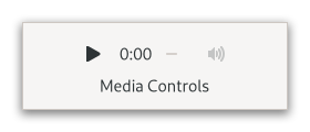
Figure: GtkMediaControls
Usually, the gtk:media-controls widget is used as part of the gtk:video widget.
GtkMediaStream
- gtk:media-stream-duration
- gtk:media-stream-ended
- gtk:media-stream-error
- gtk:media-stream-has-audio
- gtk:media-stream-has-video
- gtk:media-stream-loop
- gtk:media-stream-muted
- gtk:media-stream-playing
- gtk:media-stream-prepared
- gtk:media-stream-seekable
- gtk:media-stream-seeking
- gtk:media-stream-timestamp
- gtk:media-stream-volume
Apart from application-facing API for stream playback, the gtk:media-stream object has a number of APIs that are only useful for implementations and should not be used in applications.
A media stream in an error cannot be operated on, calls like the gtk:media-stream-play or gtk:media-stream-seek functions will not have any effect.
The gtk:media-stream object itself does not provide a way to unset an error, but implementations may provide options. For example, a gtk:media-file object will unset errors when a new source is set, for example, with the (setf gtk:media-file-file) function.
Not all streams may support looping, in particular non-seekable streams. Those streams will ignore the loop setting and just end.
If the stream has no audio, calling this function will still work but it will not have an audible effect.
The given volume should range from 0.0 for silence to 1.0 for as loud as possible. Values outside of this range will be clamped to the nearest value.
If the stream has no audio or is muted, calling this function will still work but it will not have an immediate audible effect. When the stream is unmuted, the new volume setting will take effect.
It is allowed to call the gtk:media-stream-seek function on a non seekable stream, though it will not do anything.
Seek operations may not finish instantly. While a seek operation is in process, the seeking property will be set.
When calling gtk:media-stream-seek function during an ongoing seek operation, the new seek will override any pending seek.
Whoever calls this function is responsible for calling the gtk:media-stream-unrealize function before either the stream or surface get destroyed.
Multiple calls to this function may happen from different users of the video, even with the same surface . Each of these calls must be followed by its own call to the gtk:media-stream-unrealize function.
It is not required to call this function to make a media stream work.
See the gtk:media-stream-seek-failed function for the other way of ending a seek.
See the gtk:media-stream-seek-success function for the other way of ending a seek.
GtkMediaFile
GTK provides a GIO extension point for gtk:media-file implementations to allow for external implementations using various media frameworks. GTK itself includes implementations using GStreamer and ffmpeg.
GListModel support
GtkBitset
(glib:define-gboxed-opaque bitset "GtkBitset" :export t :type-initializer "gtk_bitset_get_type" :alloc (%bitset-new-empty))
A bitset allows adding a set of integers and provides support for set operations like unions, intersections and checks for equality or if a value is contained in the bitset. The gtk:bitset implementation also contains various functions to query metadata about the bitset, such as the minimum or maximum values or its size.
The fastest way to iterate values in a bitset is a gtk:bitset-iter iterator.
The main use case for the gtk:bitset structure is implementing complex selections for the gtk:selection-model class.
(defvar bitset (gtk:bitset-new-range 100 50)) => BITSET (gtk:bitset-contains bitset 99) => NIL (gtk:bitset-contains bitset 100) => T (gtk:bitset-contains bitset 149) => T (gtk:bitset-contains bitset 150) => NIL
(defvar bitset (gtk:bitset-new-range 100 50)) => BITSET (gtk:bitset-minimum bitset) => 100 (gtk:bitset-maximum bitset) => 149 (gtk:bitset-minimum (gtk:bitset-new-empty)) => 4294967295 (gtk:bitset-maximum (gtk:bitset-new-empty)) => 0
(defvar bitset (gtk:bitset-new-range 100 50)) => BITSET (gtk:bitset-size bitset) => 50
(defvar bitset (gtk:bitset-new-range 100 50)) => BITSET (gtk:bitset-size bitset) => 50 (gtk:bitset-nth bitset 0) => 100 (gtk:bitset-nth bitset 49) => 149
(dotimes (i height) (gtk:bitset-add-range bitset (+ (* i stride) start) width))
(dotimes (i height) (gtk:bitset-remove-range bitset (+ (* i stride) start) width))
GtkBitsetIter
(cffi:defctype bitset-iter :pointer)
GtkExpression
An expression needs to be "evaluated" to obtain the value that it currently refers to. An evaluation always happens in the context of a current object called this (it mirrors the behavior of object-oriented languages), which may or may not influence the result of the evaluation. Use the gtk:expression-evaluate function for evaluating an expression.
Various methods for defining expressions exist, from simple constants via the gtk:constant-expression-new function to looking up properties in a GObject (even recursively) via the gtk:property-expression-new function or providing custom functions to transform and combine expressions via the gtk:closure-expression-new function.
Here is an example of a complex expression:
(setf color (gtk:property-expression-new "GtkListItem" nil "item")) (setf expression (gtk:property-expression-new "GtkColor" color "name"))when evaluated with this being a gtk:list-item object, it will obtain the item property from the gtk:list-item object, and then obtain the name property from the resulting object, which is assumed to be of type "GtkColor". A more concise way to describe this would be
this->item->nameThe most likely place where you will encounter expressions is in the context of list models and list widgets using them. For example, the gtk:drop-down widget is evaluating a gtk:expression instance to obtain strings from the items in its model that it can then use to match against the contents of its search entry. The gtk:string-filter object is using a gtk:expression instance for similar reasons.
By default, expressions are not paying attention to changes and evaluation is just a snapshot of the current state at a given time. To get informed about changes, an expression needs to be "watched" via a gtk:expression-watch instance, which will cause a callback to be called whenever the value of the expression may have changed. The gtk:expression-watch function starts watching an expression, and the gtk:expression-watch-unwatch function stops.
Watches can be created for automatically updating the property of an object, similar to GObject's GBinding mechanism, by using the gtk:expression-bind function.
To create an property expression, use the <lookup> element. It can have a type attribute to specify the object type, and a name attribute to specify the property to look up. The content of <lookup> can either be an element specfiying the expression to use the object, or a string that specifies the name of the object to use.
<lookup name='search'>string_filter</lookup>To create a constant expression, use the <constant> element. If the type attribute is specified, the element content is interpreted as a value of that type. Otherwise, it is assumed to be an object. For instance:
<constant>string_filter</constant> <constant type='gchararray'>Hello, world</constant>To create a closure expression, use the <closure> element. The type and function attributes specify what function to use for the closure, the content of the element contains the expressions for the parameters. For instance:
<closure type='gchararray' function='combine_args_somehow'> <constant type='gchararray'>File size:</constant> <lookup type='GFile' name='size'>myfile</lookup> </closure>
It is possible that expressions cannot be evaluated - for example when the expression references objects that have been destroyed. In that case false will be returned.
See the gtk:expression-evaluate-value function for a variant that does not need an g:value instance, but returns the value.
If expression's evaluation fails, target's property is not updated. You can ensure that this does not happen by using a fallback expression.
Note that this function takes ownership of expression. If you want to keep it around, you should use the gtk:expression-ref function beforehand.
(glib:define-gboxed-opaque expression-watch "GtkExpressionWatch" :export t :type-initializer "gtk_expression_watch_get_type" :alloc (error "GtkExpressionWatch cannot be created from the Lisp side."))
See the gtk:expression-watch-evaluate-value function which returns the value and does not need a g:value instance.
This function is a variant of the gtk:expression-watch-evaluate function that avoids the usage of a g:value instance to get the value of the expression.
(let ((expr (gtk:constant-expression-new "gint" 100)))
(prog1
(g:value-int (gtk:constant-expression-value expr))
(gtk:expression-unref expr)))
=> 100 GtkFilter
(gobject:define-genum "GtkFilterMatch" filter-match (:export t :type-initializer "gtk_filter_match_get_type") :some :none :all)
- :some
- The filter matches some items, the gtk:filter-match function may return true or false.
- :none
- The filter does not match any item, the gtk:filter-match function will always return false.
- :all
- The filter matches all items, the gtk:filter-match function will always return true.
(gobject:define-genum "GtkFilterChange" filter-change (:export t :type-initializer "gtk_filter_change_get_type") :different :less-strict :more-strict)
- :different
- The filter change cannot be described with any of the other enumeration values.
- :less-strict
- The filter is less strict than it was before. All items that it used to return true for still return true, others now may, too.
- :more-strict
- The filter is more strict than it was before. All items that it used to return false for still return false, others now may, too.
- :different-rewatch
- Similar to :different, but signs that item watches should be recreated. This is used by the gtk:filter-list-model object to keep the list up-to-date when items change. Since 4.20
- :less-strict-rewatch
- Similar to :less-strict, but signs that item watches should be recreated. This is used by the gtk:filter-list-model object to keep the list up-to-date when items change. Since 4.20
- :more-strict-rewatch
- Similar to :more-strict, but signs that item watches should be recreated. This is used by the gtk:filter-list-model object to keep the list up-to-date when items change. Since 4.20
Filters may change what items they match through their lifetime. In that case, they will emit the "changed" signal to notify that previous filter results are no longer valid and that items should be checked again via the gtk:filter-match function.
GTK provides various pre-made filter implementations for common filtering operations. These filters often include properties that can be linked to various widgets to easily allow searches. However, in particular for large lists or complex search methods, it is also possible to subclass the gtk:filter class and provide one's own filter.
lambda (filter change) :run-last
- filter
- The gtk:filter object.
- change
- The gtk:filter-change value.
GtkCustomFilter
GtkMultiFilter
Since 4.8
Since 4.8
GtkBoolFilter
GtkStringFilter
(gobject:define-genum "GtkStringFilterMatchMode" string-filter-match-mode (:export t :type-initializer "gtk_string_filter_match_mode_get_type") (:exact 0) (:substring 1) (:prefix 2))
- :exact
- The search string and text must match exactly.
- :substring
- The search string must be contained as a substring inside the text.
- :prefix
- The text must begin with the search string.
GtkFileFilter
Filtering by MIME types handles aliasing and subclassing of MIME types. For example, a filter for text/plain also matches a file with MIME type application/rtf, since application/rtf is a subclass of text/plain. Note that the gtk:file-filter object allows wildcards for the subtype of a MIME type, so you can, for example, filter for image/*.
Normally, file filters are used by adding them to a file chooser, see the gtk:file-dialog-filters function, but it is also possible to manually use a file filter on any gtk:filter-list-model object containing g:file-info objects.
<object class="GtkFileFilter">
<property name="name" translatable="yes">Text and Images</property>
<mime-types>
<mime-type>text/plain</mime-type>
<mime-type>image/ *</mime-type>
</mime-types>
<patterns>
<pattern>*.txt</pattern>
</patterns>
<suffixes>
<suffix>png</suffix>
</suffixes>
</object> (let ((filter (gtk:file-filter-new))) (gtk:file-filter-add-pattern filter "*") ... )
Since 4.4
GtkSorter
(gobject:define-genum "GtkSorterOrder" sorter-order (:export t :type-initializer "gtk_sorter_order_get_type") (:partial 0) (:none 1) (:total 2))
- :partial
- A partial order, any value of the gtk:ordering enumeration is possible.
- :none
- No order, all elements are considered equal. The gtk:sorter-compare function will only return the :equal value of the gtk:ordering enumeration.
- :total
- A total order, the gtk:sorter-compare function will only return the :equal value of the gtk:ordering enumeration if an item is compared with itself. Two different items will never cause this value to be returned.
(gobject:define-genum "GtkSorterChange" sorter-change (:export t :type-initializer "gtk_sorter_change_get_type") (:different 0) (:inverted 1) (:less-strict 2) (:more-strict 3))
- :different
- The sorter change cannot be described by any of the other enumeration values.
- :inverted
- The sort order was inverted. Comparisons that returned the :smaller value now return the :larger value of the gtk:ordering enumeration and vice versa. Other comparisons return the same values as before.
- :less-strict
- The sorter is less strict. Comparisons may now return the :equal value of the gtk:ordering enumeration that did not do so before.
- :more-strict
- The sorter is more strict. Comparisons that did return the :equal value of the gtk:ordering enumeration may not do so anymore.
Sorters may change their sorting behavior through their lifetime. In that case, they will emit the "changed" signal to notify that the sort order is no longer valid and should be updated by calling the gtk:sorter-compare function again.
GTK provides various pre-made sorter implementations for common sorting operations. The gtk:column-view widget has built-in support for sorting lists via the sorter property, where the user can change the sorting by clicking on list headers.
Of course, in particular for large lists, it is also possible to subclass the gtk:sorter object and provide one's own sorter.
lambda (sorter change) :run-last
- sorter
- The gtk:sorter object.
- change
- How the sorter changed as a gtk:sorter-change value.
Sorters implement a partial order:
- It is reflexive, that is a = a.
- It is antisymmetric, that is if a < b and b < a, then a = b.
- It is transitive, that is given any 3 objects with a ≤ b and b ≤ c, then a ≤ c.
Depending on the change parameter, it may be possible to update the sort order without a full resorting. Refer to the gtk:sorter-change documentation for details.
This function is intended for implementors of gtk:sorter subclasses and should not be called from other functions.
Since 4.2
(mapcar #'gtk:ordering-from-cmpfunc '(-1 0 +1)) => (:SMALLER :EQUAL :LARGER)
GtkCustomSorter
GtkMultiSorter
Since 4.8
Since 4.8
GtkStringSorter
(gobject:define-genum "GtkCollation" collation (:export t :type-initializer "gtk_collation_get_type") (:none 0) (:unicode 1) (:filename 2))
- :none
- Do not do any collation.
- :unicode
- Use the g_utf8_collate_key() function.
- :filename
- Use the g_utf8_collate_key_for_filename() function.
Since 4.10
To obtain the strings to compare, this sorter evaluates a gtk:expression instance.
Since 4.10
GtkNumericSorter
Unless an expression is set on object, the sorter will always compare items as invalid. The expression must have a return type that can be compared numerically.
GtkSelectionModel
GTK provides default implementations of the most common selection modes such as the gtk:single-selection implementation, so you will only need to implement this interface if you want detailed control about how selections should be handled.
The gtk:selection-model object supports a single boolean per item indicating if an item is selected or not. This can be queried via the gtk:selection-model-is-selected function. When the selected state of one or more items changes, the model will emit the "selection-changed" signal by calling the gtk:selection-model-selection-changed function. The positions given in that signal may have their selection state changed, though that is not a requirement. If new items added to the model via the "items-changed" signal are selected or not is up to the implementation.
Note that items added via the "items-changed" signal may already be selected and no "selection-changed" signal will be emitted for them. So to track which items are selected, it is necessary to listen to both signals.
Additionally, the interface can expose functionality to select and unselect items. If these functions are implemented, list widgets will allow users to select and unselect items. However, the gtk:selection-model implementations are free to only implement them partially or not at all. In that case the widgets will not support the unimplemented operations.
When selecting or unselecting is supported by a model, the return values of the selection functions do not indicate if selection or unselection happened. They are only meant to indicate complete failure, like when this mode of selecting is not supported by the model.
Selections may happen asynchronously, so the only reliable way to find out when an item was selected is to listen to the signals that indicate selection.
lambda (model pos nitems) :run-last
- model
- The gtk:selection-model object.
- pos
- The unsigned integer for the first item that may have changed.
- nitems
- The unsigned integer for the number of items with changes.
The (setf gtk:selection-model-selection) function is the most advanced selection updating method that allows the most fine-grained control over selection changes. If you can, you should try the simpler versions, as implementations are more likely to implement support for those.
Requests that the selection state of all positions set in mask be updated to the respective value in the selected bitmask. In pseudocode, it would look something like this:
for (i = 0; i < n_items; i++)
{
// don't change values not in the mask
if (!gtk_bitset_contains (mask, i))
continue;
if (gtk_bitset_contains (selected, i))
select_item (i);
else
unselect_item (i);
}
gtk_selection_model_selection_changed (model, first_changed_item,
n_changed_items); The mask and selected parameters must not be modified. They may
refer to the same bitset, which would mean that every item in the set should
be selected. This function is an optimization for the gtk:selection-model-selection function when you are only interested in part of the model's selected state. A common use case is in response to the "selection-changed" signal.
GtkNoSelection
Since 4.8
Since 4.8
GtkSingleSelection
Refer to each function's documentation for if this value is allowed and what it does.
Note that the selection is *persistent* -- if the selected item is removed and re-added in the same "items-changed" signal emission, it stays selected. In particular, this means that changing the sort order of an underlying sort model will preserve the selection.
If autoselect is true, object will enforce that an item is always selected. It will select a new item when the currently selected item is deleted and it will disallow unselecting the current item.
Since 4.8
If the list does not have an item at pos or the gtk:+invalid-list-position+ value is given, the behavior depends on the value of the autoselect property. If it is set, no change will occur and the old item will stay selected. If it is unset, the selection will be unset and no item will be selected.
GtkMultiSelection
Since 4.8
GtkSectionModel
Many GTK list models support sections inherently, or they pass through the sections of a model they are wrapping.
When the section groupings of a model change, the model will emit the "sections-changed" signal by calling the gtk:section-model-sections-changed function. All sections in the given range then need to be queried again. The "items-changed" signal has the same effect, all sections in that range are invalidated, too.
Since 4.12
lambda (model pos n-items) :run-last
- model
- The gtk:section-model object that emitted the signal.
- pos
- The unsigned integer for the first item that may have changed.
- n-items
- The unsigned integer for the number of items with changes.
If the position is larger than the number of items, a single range from n-items to G_MAXUINT will be returned.
Since 4.12
GtkFilterListModel
The model can be set up to do incremental searching, so that filtering long lists does not block the UI. See the gtk:filter-list-model-incremental function for details. The model passes through sections from the underlying model.
When incremental filtering is enabled, the gtk:filter-list-model object will not run filters immediately, but will instead queue an idle handler that incrementally filters the items and adds them to the list. This of course means that items are not instantly added to the list, but only appear incrementally.
When your filter blocks the UI while filtering, you might consider turning this on. Depending on your model and filters, this may become interesting around 10,000 to 100,000 items. By default, incremental filtering is disabled.
See the gtk:filter-list-model-pending function for progress information about an ongoing incremental filtering operation.
Since 4.8
Note that GTK makes no effort to ensure that model conforms to the item type of object. It assumes that the caller knows what they are doing and have set up an appropriate filter to ensure that item types match.
You can use this value to check if object is busy filtering by comparing the return value to 0 or you can compute the percentage of the filter remaining by dividing the return value by the total number of items in the underlying model:
(let ((percentage (/ (gtk:filter-list-model-pending object)
(gtk:filter-list-model-n-items object))))
... )
If no filter operation is ongoing - in particular when the incremental property is false - this
function returns 0. Since 4.20
GtkFlattenListModel
Since 4.8
GtkMapListModel
(let* (...
(widgets (gtk:widget-observe-children widget))
(controllers (gtk:map-list-model-new widgets
(lambda (item)
(gtk:widget-observe-controllers item))))
(model (gtk:flatten-list-model-new controllers)))
... ) The gtk:map-list-model object will attempt to discard the mapped
objects as soon as they are no longer needed and recreate them if necessary. Since 4.8
GTK makes no effort to ensure that the model conforms to the item type expected by the map function. It assumes that the caller knows what they are doing and have set up an appropriate map function.
Note that the gtk:map-list-model object may call this function multiple times on the same item, because it may delete items it does not need anymore.
GTK makes no effort to ensure that func conforms to the item type of model. It assumes that the caller knows what they are doing and the map function returns items of the appropriate type.
GtkSliceListModel
Since 4.8
GtkSortListModel
The model is a stable sort. If two items compare equal according to the sorter, the one that appears first in the original model will also appear first after sorting. Note that if you change the sorter, the previous order will have no influence on the new order. If you want that, consider using a gtk:multi-sorter object and appending the previous sorter to it.
The model can be set up to do incremental sorting, so that sorting long lists does not block the UI. See the gtk:sort-list-model-incremental function for details.
The gtk:sort-list-model object is a generic model and because of that it cannot take advantage of any external knowledge when sorting. If you run into performance issues with the gtk:sort-list-model object, it is strongly recommended that you write your own sorting list model.
The gtk:sort-list-model object allows sorting the items into sections. It implements the gtk:section-model interface and when the section-sorter is set, it will sort all items with that sorter and items comparing equal with it will be put into the same section. The sorter property will then be used to sort items inside their sections.
When incremental sorting is enabled, the sort list model will not do a complete sort immediately, but will instead queue an idle handler that incrementally sorts the items towards their correct position. This of course means that items do not instantly appear in the right place. It also means that the total sorting time is a lot slower.
When your filter blocks the UI while sorting, you might consider turning this on. Depending on your model and sorters, this may become interesting around 10.000 to 100.000 items.
By default, incremental sorting is disabled. See the gtk:sort-list-model-pending function for progress information about an ongoing incremental sorting operation.
Since 4.8
The estimate is the number of items that would still need to be sorted to finish the sorting operation if this was a linear algorithm. So this number is not related to how many items are already correctly sorted.
If you want to estimate the progress, you can use code like this:
(let* ((pending (gtk:sort-list-model-pending model))
(store (gtk:sort-list-model-model model))
(progress (- 1.0 (/ pending
(max 1 (g:list-model-n-items store))))))
... )
If no sort operation is ongoing, in particular when the incremental property is false, this function
returns 0. GtkSelectionFilterModel
Since 4.8
Note that GTK makes no effort to ensure that model conforms to the item type of object. It assumes that the caller knows what they are doing and have set up an appropriate filter to ensure that item types match.
GtkBookmarkList
The g:file-info objects in the list have some attributes in the recent namespace added: recent::private (boolean) and recent:applications (stringv).
If the attributes argument is nil, no attributes will be queried, but a list of g:file-info objects will still be created.
(cffi:foreign-funcall "g_get_user_data_dir" :string)
Since 4.8
GtkDirectoryList
While the gtk:directory-list object is being filled, the loading property will be set to true. You can listen to that property if you want to show information like a gtk:spinner widget or a "Loading..." text.
If loading fails at any point, the error property will be set to give more indication about the failure.
The g:file-info objects returned from a gtk:directory-list object have the "standard::file" attribute set to the g:file object they refer to. This way you can get the file that is referred to in the same way you would via the g_file_enumerator_child() function. This means you do not need access to the gtk:directory-list object but can access the g:file object directly from the g:file-info object when operating with a gtk:list-view widget or similar.
If the attributes argument is nil, no attributes will be queried, but a list of g:file-info objects will still be created.
If an error occurs during the loading process, the loading process will finish and this property allows querying the error that happened. This error will persist until a file is loaded again. An error being set does not mean that no files were loaded, and all successfully queried files will remain in the list.
Setting the priority while object is loading will reprioritize the ongoing load as soon as possible. The default IO priority is the g:+priority-default+ value, which is higher than the GTK redraw priority. If you are loading a lot of directories in parallel, lowering it to something like the g:+priority-default-idle+ value may increase responsiveness.
Since 4.8
When monitoring is turned on after the initial creation of the directory list, the directory is reloaded to avoid missing files that appeared between the initial loading and when monitoring was turned on.
GtkStringObject
(gtk:string-object-new "abcdef") => #<GTK:STRING-OBJECT {1003E79813}>
(gtk:string-object-string *) => "abcdef"
(gtk:string-object-new nil) => #<GTK:STRING-OBJECT {1003E79813}>
(gtk:string-object-string *) => nil GtkStringList
<object class="GtkStringList">
<items>
<item translatable="yes">Factory</item>
<item translatable="yes">Home</item>
<item translatable="yes">Subway</item>
</items>
</object>
(create-list-of-gtk-symbols ()
(let ((model (gtk:string-list-new '())))
(do-external-symbols (symbol (find-package "GTK"))
(gtk:string-list-append model
(string-downcase (format nil "~a" symbol))))
...)) Since 4.14
(gtk:string-list-new '("Factory" "Home" "Subway"))
=> #<GTK:STRING-LIST {1003E7BC63}>
(gtk:string-list-string * 0) => "Factory" The pos and n parameters must be correct, that is, pos + n must be less than or equal to the length of the string list at the time this function is called.
Since 4.18
List-based Widgets
List Widget Overview
Lists are perfectly fine to be used for very short list of only 2 or 3 elements, but generally scale to millions of items. Of course, the larger the list grows, the more care needs to be taken to choose the right data structures to keep things running well. Lists are meant to be used with changing data, both with the items itself changing as well as the list adding and removing items. Of course, they work just as well with static data.
Views or list widgets are the widgets that hold and manage the lists. Examples of these widgets would be the gtk:list-view or gtk:grid-view widgets.
Views display data from a model. Models implement the g:list-model interface and can be provided in a variety of ways:
- List model implementations for many specific types of data already exist, for example the gtk:directory-list or gtk:string-list objects.
- There are generic list model implementations like the g:list-store object that allow building lists of arbitrary objects.
- Wrapping list models like gtk:filter-list-model or gtk:sort-list-model objects modify, adapt or combine other models.
- Last but not least, developers are encouraged to create their own g:list-model implementations. The interface is kept deliberately small to make this easy.
The elements in a model are called items. All items are g:object instances. Every item in a model has a position which is the unsigned integer that describes where in the model the item is located. The first item in a model is at position 0. The position of an item can change as other items are added or removed from the model.
It is important to be aware of the difference between items and positions because the mapping from position to item is not permanent, so developers should think about whether they want to track items or positions when working with models. Oftentimes some things are really hard to do one way but very easy the other way.
The other important part of a view is a factory. Each factory is a gtk:list-item-factory implementation that takes care of mapping the items of the model to widgets that can be shown in the view.
The way factories do this is by creating a list item for each item that is currently in use. List items are always gtk:list-item instances. They are only ever created by GTK and provide information about what item they are meant to display.
Different factory implementations use various different methods to allow developers to add the right widgets to list items and to link those widgets with the item managed by the list item. Finding a suitable factory implementation for the data displayed, the programming language and development environment is an important task that can simplify setting up the view tremendously.
Views support selections via a selection model. A selection model is an implementation of the gtk:selection-model interface on top of the g:list-model interface that allows marking each item in a model as either selected or not selected. Just like regular models, this can be implemented either by implementing the gtk:selection-model interface directly or by wrapping a model with one of the GTK models provided for this purposes, such as the gtk:no-selection or gtk:single-selection models.
The behavior of selection models - that is, which items they allow selecting and what effect this has on other items - is completely up to the selection model. As such, single-selections, multi-selections or sharing selection state between different selection models and/or views is possible. The selection state of an item is exposed in the list item via the selected property.
Views and list items also support activation. Activation means that double clicking or pressing enter while inside a focused row will cause the view to emit a signal such as the GtkListView::activate signal. This provides an easy way to set up lists, but can also be turned off on list items if undesired.
Both selections and activation are supported among other things via widget actions. This allows developers to add widgets to their lists that cause selections to change or to trigger activation via the gtk:actionable interface. For a list of all supported actions see the relevant documentation.
While this behavior allows views to scale effortlessly to huge lists, it has a few implications for what can be done with views. For example, it is not possible to query a view for a list item used for a certain position - there might not be one and even if there is, that list item might soon be recycled for a new position.
It is also important that developers save state they care about in the item and do not rely on the widgets they created as those widgets can be recycled for a new position at any time causing any state to be lost.
Another important requirement for views is that they need to know which items are not visible so they can be recycled. Views achieve that by implementing the gtk:scrollable interface and expecting to be placed directly into a gtk:scrolled-window widget.
Of course, if you are only using models with few items, this is not important and you can treat views like any other widget. But if you use large lists and your performance suffers, you should be aware of this. Views also allow tuning the number of list items they create such as with the gtk:grid-view-max-columns function, and developers running into performance problems should definitely study the tradeoffs of those and experiment with them.
The g:list-store object is backed by a balanced tree and has performance characteristics that are expected for that data structure. It works reasonably well for dataset sizes in the 1,000,000 range, and can handle insertions and deletions. It uses a cached iterator to make linear access to the items fast.
The gtk:string-list object is not a general store - it can only handle strings. It is backed by an dynamically allocated array and has performance characteristics that are expected for that data structure. The gtk:string-list object is a good fit for any place where you would otherwise use char*[] and works best if the dataset is not very dynamic.
The gtk:directory-list object is a list model that wraps the g_file_enumerate_children_async() function. It presents a g:list-model object and fills it asynchronously with the GFiles returned from that function.
If these models do not fit your use case or scalability requirements, you should make a custom g:list-model implementation. It is a small interface and not very hard to implement.
However, GTK provides functionality to make lists look and behave like trees for use cases that require trees. This is achieved by using the gtk:tree-list-model model to flatten a tree into a list. The gtk:tree-expander widget can then be used inside a list item to allow users to expand and collapse rows and provide a similar experience to the gtk:tree-view widget. Developers should refer to those objects’ API reference for more discussion on the topic.
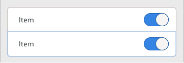
Figure: Rich list
This rich list style is low density, spacious and uses an outline focus ring. It is suitable for lists of controls, for example, in preference dialogs or settings panels. Use the .rich-list style class.
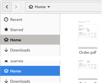
Figure: Navigation sidebar
The sidebar style of list is medium density, using a full background to indicate focus and selection. Use the .navigation-sidebar style class.
Figure: Data table
The data table style of list is a high density table, similar in style to a traditional tree view. Individual cells can be selectable and editable. Use the .data-table style class.
Many GTK list models support section inherently, or they pass through the section of a model they are wrapping.
This new approach tries to provide roughly the same functionality as the old approach but often uses a very different way to achieve these goals. The main difference and one of the primary reasons for this new development is that items can be displayed using regular widgets and the separate cell renderer machinery is no longer necessary. This allows all benefits that widgets provide, such as complex layout, animations and CSS styling.
The other big difference is the massive change to the data model. The gtk:tree-model interface was a rather complex interface for a tree data structure. The g:list-model interface is deliberately designed to be a very simple data structure for lists only. See above for how to still do trees with this new model. Another big change is that the new model allows for bulk changes via the "items-changed" signal while the gtk:tree-model interface only allows a single item to change at once. The goal here is of course to encourage implementation of custom list models.
Another consequence of the new model is that it is now easily possible to refer to the contents of a row in the model directly by keeping the item, while the gtk:tree-row-reference implementation was a very slow mechanism to achieve the same. And because the items are real objects, developers can make them emit change signals causing list items and their children to update, which was not possible with the gtk:tree-model implementation.
The selection handling is also different. While selections used to be managed via custom code in each widget, selection state is now meant to be managed by the selection models. In particular this allows for complex use cases with specialized requirements.
Finally here is a quick comparison chart of equivalent functionality to look for when transitioning code:
Old New ------------------------------------------------------- GtkTreeModel GListModel GtkTreePath guint position, GtkTreeListRow GtkTreeIter guint position GtkTreeRowReference GObject item GtkListStore GListStore GtkTreeStore GtkTreeListModel, GtkTreeExpander GtkTreeSelection GtkSelectionModel GtkTreeViewColumn GtkColumnView GtkTreeView GtkListView, GtkColumnView GtkCellView GtkListItem GtkComboBox GtkDropDown GtkIconView GtkGridView GtkTreeSortable GtkColumnView GtkTreeModelSort GtkSortListModel GtkTreeModelFilter GtkFilterListModel GtkCellLayout GtkListItemFactory GtkCellArea GtkWidget GtkCellRenderer GtkWidget
GtkListItem
The gtk:list-item objects are managed by the list widget, with its factory, and cannot be created by applications, but they need to be populated by application code. This is done by calling the gtk:list-item-child function.
The gtk:list-item objects exist in 2 stages:
Since 4.12
Since 4.12
If a list item is activatable, double-clicking on the list item, using the Return key or calling the gtk:widget-activate function will activate the list item. Activating instructs the containing view to handle activation. The gtk:list-view widget for example will be emitting the "activate" signal.
By default, list items are activatable
Note that if list items are not focusable, the keyboard cannot be used to activate them and selecting only works if one of the children of the list item is focusable. By default, list items are focusable.
Since 4.12
Note that this means that making an item non-selectable has no influence on the selected state at all. A non-selectable item may still be selected.
By default, list items are selectable. When rebinding them to a new item, they will also be reset to be selectable by GTK.
GtkListItemFactory
The gtk:list-item-factory object is tasked with creating widgets for items taken from the model when the views need them and updating them as the items displayed by the view change. A view is usually only able to display anything after both a factory and a model have been set on the view. So it is important that you do not skip this step when setting up your first view.
Because views do not display the whole list at once but only a few items, they only need to maintain a few widgets at a time. They will instruct the gtk:list-item-factory object to create these widgets and bind them to the items that are currently displayed. As the list model changes or the user scrolls to the list, the items will change and the view will instruct the factory to bind the widgets to those new items. The actual widgets used for displaying those widgets is provided by you.
When the factory needs widgets created, it will create a gtk:list-item and hand it to your code to set up a widget for. This list item will provide various properties with information about what item to display and provide you with some opportunities to configure its behavior. See the gtk:list-item documentation for further details.
Various implementations of the gtk:list-item-factory object exist to allow you different ways to provide those widgets. The most common implementations are the gtk:builder-list-item-factory object which takes a gtk:builder UI file and then creates widgets and manages everything automatically from the information in that file and the gtk:signal-list-item-factory object which allows you to connect to signals with your own code and retain full control over how the widgets are setup and managed.
The gtk:list-item-factory object is supposed to be final - that means its behavior should not change and the first widget created from it should behave the same way as the last widget created from it. If you intend to do changes to the behavior, it is recommended that you create a new gtk:list-item-factory object which will allow the views to recreate its widgets.
Once you have chosen your factory and created it, you need to set it on the view widget you want to use it with, such as via the gtk:list-view-factory function. Reusing factories across different views is allowed, but very uncommon.
GtkSignalListItemFactory
Signals are emitted for every list item in the same order:
- The "setup" signal is emitted to set up permanent things on the list item. This usually means constructing the widgets used in the row and adding them to the list item.
- The "bind" signal is emitted to bind the item passed via the item property to the widgets that have been created in step 1 or to add item specific widgets. Signals are connected to listen to changes - both to changes in the item to update the widgets or to changes in the widgets to update the item. After this signal has been called, the list item may be shown in a list widget.
- The "unbind" signal is emitted to undo everything done in step 2. Usually this means disconnecting signal handlers. Once this signal has been called, the list item will no longer be used in a list widget.
- The "bind" and "unbind" signals may be emitted multiple times again to bind the list item for use with new items. By reusing list items, potentially costly setup can be avoided. However, it means code needs to make sure to properly clean up the list item in step 3 so that no information from the previous use leaks into the next use.
- The "teardown" signal is emitted to allow undoing the effects of the "setup" signal. After this signal was emitted on a list item, the list item will be destroyed and not be used again.
For tracking changes in other properties in the list item, the "notify" signal is recommended. The signal can be connected in the "setup" signal and removed again during the "teardown" signal.
lambda (factory item) :run-first
- factory
- The gtk:signal-list-item-factory object.
- item
- The gtk:list-item object to bind.
lambda (factory item) :run-first
- factory
- The gtk:signal-list-item-factory object.
- item
- The gtk:list-item object to set up.
lambda (factory item) :run-first
- factory
- The gtk:signal-list-item-factory object.
- item
- The gtk:list-item object to teardown.
lambda (factory item) :run-first
- factory
- The gtk:signal-list-item-factory object.
- item
- The gtk:list-item object to unbind.
GtkBuilderListItemFactory
The templates must be extending the gtk:list-item object, and typically use gtk:expression instances to obtain data from the items in the model.
<interface>
<template class="GtkListItem">
<property name="child">
<object class="GtkLabel">
<property name="xalign">0</property>
<binding name="label">
<lookup name="name" type="SettingsKey">
<lookup name="item">GtkListItem</lookup>
</lookup>
</binding>
</object>
</property>
</template>
</interface> GtkScrollInfo
(glib:define-gboxed-opaque scroll-info "GtkScrollInfo" :export t :type-initializer "gtk_scroll_info_get_type" :alloc (%scroll-info-new))
Since 4.12
Since 4.12
Since 4.12
Since 4.12
GtkListHeader
The gtk:list-header objects are managed just like gtk:list-item objects through their factory, but provide a different set of properties suitable for managing the header instead of individual items.
Since 4.12
Since 4.12
Since 4.12
Since 4.12
Since 4.12
Since 4.12
GtkListView
(gobject:define-genum "GtkListTabBehavior" list-tab-behavior (:export t :type-initializer "gtk_list_tab_behavior_get_type") (:all 0) (:item 1) (:cell 2))
- :all
- Cycle through all focusable items of the list.
- :item
- Cycle through a single list element, then move focus out of the list. Moving focus between items needs to be done with the arrow keys.
- :cell
- Cycle only through a single cell, then move focus out of the list. Moving focus between cells needs to be done with the arrow keys. This is only relevant for cell-based widgets like the gtk:column-view widget, otherwise it behaves like :item.
Since 4.12
(gobject:define-gflags "GtkListScrollFlags" list-scroll-flags (:export t :type-initializer "gtk_list_scroll_flags_get_type") (:none 0) (:focus #.(ash 1 0)) (:select #.(ash 1 1)))
- :none
- Do not do anything extra.
- :focus
- Focus the target item.
- :select
- Select the target item and unselect all other items.
Since 4.12
The gtk:list-view widget allows the user to select items according to the selection characteristics of the model. For models that allow multiple selected items, it is possible to turn on rubberband selection, using the enable-rubberband property.
If you need multiple columns with headers, see the gtk:column-view widget.
To learn more about the list widget framework, see the List Widget Overview section.
(defun create-application-list ()
(let ((store (g:list-store-new "GAppInfo"))
(apps (g:app-info-all)))
(dolist (app apps)
(g:list-store-append store app))
store))
(defun do-list-view-applauncher (&optional application)
(let* ((factory (gtk:signal-list-item-factory-new))
(model (create-application-list))
(listview (gtk:list-view-new (gtk:single-selection-new model) factory))
(scrolled (gtk:scrolled-window-new))
(window (make-instance 'gtk:window
:title "Application launcher"
:application application
:child scrolled
:default-width 600
:default-height 380)))
(g:signal-connect factory "setup"
(lambda (factory item)
(declare (ignore factory))
(let ((box (gtk:box-new :horizontal 12))
(image (make-instance 'gtk:image
:icon-size :large)))
(gtk:box-append box image)
(gtk:box-append box (gtk:label-new ""))
(setf (gtk:list-item-child item) box))))
(g:signal-connect factory "bind"
(lambda (factory item)
(declare (ignore factory))
(let* ((image (gtk:widget-first-child (gtk:list-item-child item)))
(label (gtk:widget-next-sibling image))
(appinfo (gtk:list-item-item item)))
(gtk:image-set-from-gicon image (g:app-info-icon appinfo))
(setf (gtk:label-label label)
(g:app-info-display-name appinfo)))))
(g:signal-connect listview "activate"
(lambda (listview pos)
(let* ((model (gtk:list-view-model listview))
(appinfo (g:list-model-item model pos))
(display (gtk:widget-display listview))
(context (gdk:display-app-launch-context display)))
(unless (g:app-info-launch appinfo nil context)
(let* ((message (format nil "Could not launch ~a"
(g:app-info-display-name appinfo)))
(dialog (make-instance 'gtk:alert-dialog
:message message)))
(gtk:alert-dialog-show dialog (gtk:widget-root listview)))))))
(setf (gtk:scrolled-window-child scrolled) listview)
(gtk:window-present window))) - list.activate-item
- Activates the item at given position by emitting the GtkListView::activate signal.
listview[.separators][.rich-list][.navigation-sidebar][.data-table] ├── row[.activatable] │ ├── row[.activatable] │ ┊ ╰── [rubberband]The gtk:list-view implementation uses a single CSS node named listview. It may carry the .separators style class, when the show-separators property is set. Each child widget uses a single CSS node named row. For rubberband selection, a node with name rubberband is used. The main listview node may also carry .rich-list, .navigation-sidebar or .data-table style classes to select the style of list presentation.
lambda (listview position) :run-last
- listview
- The gtk:list-view widget.
- position
- The unsigned integer for the position of the item to activate.
Since 4.12
Since 4.12
Since 4.12
GtkGridView
The gtk:grid-view widget allows the user to select items according to the selection characteristics of the model. For models that allow multiple selected items, it is possible to turn on rubberband selection, using the enable-rubberband property.
To learn more about the list widget framework, see the list widget overview.
- list.activate-item
- Activates the item at given position by emitting the GtkListView::activate signal.
gridview ├── child │ ├── child │ ┊ ╰── [rubberband]The gtk:grid-view implementation uses a single CSS node with name gridview. Each child uses a single CSS node with name child. If the activatable property is set, the corresponding row will have the .activatable style class. For rubberband selection, a subnode with name rubberband is used.
lambda (gridview position) :run-last
- gridview
- The gtk:grid-view widget.
- position
- The unsigned integer for the position of the item to activate.
Since 4.12
GtkColumnView
- gtk:column-view-columns
- gtk:column-view-enable-rubberband
- gtk:column-view-header-factory
- gtk:column-view-model
- gtk:column-view-reorderable
- gtk:column-view-row-factory
- gtk:column-view-show-column-separators
- gtk:column-view-show-row-separators
- gtk:column-view-single-click-activate
- gtk:column-view-sorter
- gtk:column-view-tab-behavior
The gtk:column-view widget allows the user to select items according to the selection characteristics of the model. For models that allow multiple selected items, it is possible to turn on rubberband selection, using the enable-rubberband property.
The column view supports sorting that can be customized by the user by clicking on column headers. To set this up, the gtk:sorter object returned by the gtk:column-view-sorter function must be attached to a sort model for the data that the view is showing, and the columns must have sorters attached to them by calling (setf gtk:column-view-column-sorter) function. The initial sort order can be set with the gtk:column-view-sort-by-column function.
The column view also supports interactive resizing and reordering of columns, via Drag-and-Drop of the column headers. This can be enabled or disabled with the reorderable and resizable properties.
To learn more about the list widget framework, see the list widget overview.
lambda (columnview position) :run-last
- columnview
- The gtk:column-view widget.
- position
- The unsigned integer for the position of the item to activate.
Since 4.12
If this factory is not set - which is the default - then the defaults will be used. This factory is not used to set the widgets displayed in the individual cells. For that see the gtk:column-view-column-factory function and the gtk:column-view-cell object.
Since 4.12
(let* (;; Get the special sorter from the column view
(sorter (gtk:column-view-sorter view))
;; Create a new selection model from a new sort list model
(model (gtk:sort-list-model-new store sorter))
(selection (gtk:no-selection-new model)))
;; Set the selection as model for the column view
(setf (gtk:column-view-model view) selection)
... ) This call only has an effect if the sorter returned by the gtk:column-view-sorter function is set on a sort model, and the (setf gtk:column-view-column-sorter) function has been called on column to associate a sorter with the column.
If column is nil, the column view will be unsorted.
GtkColumnViewColumn
- gtk:column-view-column-column-view
- gtk:column-view-column-expand
- gtk:column-view-column-factory
- gtk:column-view-column-fixed-width
- gtk:column-view-column-header-menu
- gtk:column-view-column-id
- gtk:column-view-column-resizable
- gtk:column-view-column-sorter
- gtk:column-view-column-title
- gtk:column-view-column-visible
A sorter can be associated with a column using the gtk:column-view-column-sorter function, to let users influence sorting by clicking on the column header.
Setting a fixed width overrides the automatically calculated width. Interactive resizing also sets the fixed-width property.
Since 4.10
See the gtk:column-view-sorter function for the necessary steps for setting up customizable sorting for the column view.
GtkColumnViewCell
The gtk:column-view-cell objects are managed by the gtk:column-view widget with its factory and cannot be created by applications, but they need to be populated by application code. This is done by calling the gtk:column-view-cell-child function.
The gtk:column-view-cell object exist in 2 stages: Since 4.12
This function is typically called by applications when setting up a list item so that the widget can be reused when binding it multiple times.
Since 4.12
Note that if items are not focusable, the keyboard cannot be used to activate them and selecting only works if one of the children of the listitem is focusable. By default, list items are focusable.
Since 4.12
Since 4.12
Since 4.12
Since 4.12
GtkColumnViewRow
Since 4.12
Since 4.12
Since 4.12
If a row is activatable, double-clicking on the row, using the Return key or calling the gtk:widget-activate function will activate the row. Activating instructs the containing columnview to emit the "activate" signal.
By default, the rows are activatable.
Since 4.12
Note that if rows are not focusable, the contents of cells can still be focused if they are focusable.
By default, rows are focusable.
Since 4.12
Since 4.12
Since 4.12
If a row is selectable, clicking on the row or using the keyboard will try to select or unselect the row. Whether this succeeds is up to the model to determine, as it is managing the selected state.
Note that this means that making a row non-selectable has no influence on the selected state at all. A non-selectable row may still be selected.
By default, rows are selectable.
Since 4.12
Since 4.12
GtkColumnViewSorter
In column views, sorting can be configured by associating sorters with columns, and users can invert sort order by clicking on column headers. The gtk:column-view-sorter API is designed to allow saving and restoring this configuration.
If you are only interested in the primary sort column, that is, the column where a sort indicator is shown in the header, then you can just look at the primary-sort-column and primary-sort-order properties.
If you want to store the full sort configuration, including secondary sort columns that are used for tie breaking, then you can use the gtk:column-view-sorter-nth-sort-column function. To get notified about changes, use the "changed" signal.
Since 4.10
(let ((sorter (gtk:column-view-sorter view)))
(dotimes (pos (gtk:column-view-sorter-n-sort-columns sorter))
(multiple-value-bind (column order)
(gtk:column-view-sorter-nth-sort-column sorter pos)
(gtk:column-view-sort-by-column view column order)
... ))) Since 4.10
Since 4.10
Since 4.10
Since 4.10
GtkDropDown
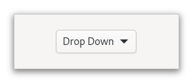
Figure: GtkDropDown
The options are given to the gtk:drop-down widget in the form of a g:list-model object, and how the individual options are represented is determined by a gtk:list-item-factory object. The default factory displays simple strings.
The gtk:drop-down widget knows how to obtain strings from the items in a gtk:string-list object. For other models, you have to provide an expression to find the strings via the gtk:drop-down-expression function.
The gtk:drop-down widget can optionally allow search in the popup, which is useful if the list of options is long. To enable the search entry, use the gtk:drop-down-enable-search function.
<object class="GtkDropDown">
<property name="model">
<object class="GtkStringList">
<items>
<item translatable="yes">Factory</item>
<item translatable="yes">Home</item>
<item translatable="yes">Subway</item>
</items>
</object>
</property>
</object> lambda (dropdown) :action
- dropdown
- The gtk:drop-down widget.
Note that the expression property must be set for search to work.
Since 4.12
Since 4.12
Since 4.6
Tree support
GtkTreeListRow
The gtk:tree-list-row instances are created by a gtk:tree-list-model object only when the passthrough property is not set.
There are various support objects that can make use of gtk:tree-list-row objects, such as the gtk:tree-expander widget that allows displaying an icon to expand or collapse a row or the gtk:tree-list-row-sorter object that makes it possible to sort trees properly.
GtkTreeListModel
If set to true the model will recursively expand all rows that get added to the model. This can be either rows added by changes to the underlying models or via the gtk:tree-list-row-expanded function.
Since 4.8
If true, the values of the child models are passed through in their original state. You then need to call the gtk:tree-list-model-row function to get the custom gtk:tree-list-row objects.
This row object is persistent and will refer to the current item as long as the row is present in model, independent of other rows being added or removed. If model is set to not be passthrough, this function is equivalent to calling the g:list-model-item function. Do not confuse this function with the gtk:tree-list-model-child-row function.
GtkTreeListRowSorter
column_sorter = gtk_column_view_get_sorter (view); sorter = gtk_tree_list_row_sorter_new (g_object_ref (column_sorter)); sort_model = gtk_sort_list_model_new (tree_model, sorter); selection = gtk_single_selection_new (sort_model); gtk_column_view_set_model (view, G_LIST_MODEL (selection));
GtkTreeExpander
On top of this, the "listitem.expand", "listitem.collapse" and "listitem.toggle-expand" actions are provided to allow adding custom UI for managing expanded state.
It is important to mention that you want to set the focusable property to false when using this widget, as you want the keyboard focus to be in the treexpander, and not inside the list to make use of the keybindings.
The gtk:tree-list-model object must be set to not be passthrough. Then it will provide gtk:tree-list-row items which can be set via the gtk:tree-expander-list-row function on the expander. The expander will then watch that row item automatically. The gtk:tree-expander-child function sets the widget that displays the actual row contents.
The gtk:tree-expander widget can be modified with properties such as indent-for-icon, indent-for-depth, and hide-expander properties to achieve a different appearance. This can even be done to influence individual rows, for example by binding the hide-expander property to the item count of the model of the treelistrow, to hide the expander for rows without children, even if the row is expandable.
Since 4.10
Since 4.10
Since 4.6
This call is essentially equivalent to calling:
(gtk:tree-list-row-item (gtk:tree-expander-list-row object))
Popovers
GtkPopover
Figure: GtkPopover
The position of a popover relative to the widget it is attached to can also be changed through the gtk:popover-position function.
By default, the gtk:popover widget performs a GTK grab, in order to ensure input events get redirected to it while it is shown, and also so the popover is dismissed in the expected situations, clicks outside the popover, or the Escape key being pressed. If no such modal behavior is desired on a popover, the gtk:popover-autohide function may be called on it to tweak its behavior.
<section>
<attribute name="display-hint">horizontal-buttons</attribute>
<item>
<attribute name="label">Cut</attribute>
<attribute name="action">app.cut</attribute>
<attribute name="verb-icon">edit-cut-symbolic</attribute>
</item>
<item>
<attribute name="label">Copy</attribute>
<attribute name="action">app.copy</attribute>
<attribute name="verb-icon">edit-copy-symbolic</attribute>
</item>
<item>
<attribute name="label">Paste</attribute>
<attribute name="action">app.paste</attribute>
<attribute name="verb-icon">edit-paste-symbolic</attribute>
</item>
</section> Particular uses of the gtk:popover widget, such as touch selection popups or magnifiers in gtk:entry or gtk:text-view widgets get style classes like .touch-selection or .magnifier to differentiate from plain popovers.
When styling a popover directly, the popover node should usually not have any background. The visible part of the popover can have a shadow. To specify it in CSS, set the box-shadow of the contents node.
Note that, in order to accomplish appropriate arrow visuals, the gtk:popover widget uses custom drawing for the arrow node. This makes it possible for the arrow to change its shape dynamically, but it also limits the possibilities of styling it using CSS. In particular, the arrow gets drawn over the content node's border so they look like one shape, which means that the border-width of the content node and the arrow node should be the same. The arrow also does not support any border shape other than solid, no border-radius, only one border width, border-bottom-width is used, and no box-shadow.
lambda (popover) :action
- popover
- The gtk:popover widget that received the signal.
lambda (popover) :run-last
- popover
- The gtk:popover widget that received the signal.
A modal popover will grab the keyboard focus on it when being displayed. Clicking outside the popover area or pressing the Esc key will dismiss the popover.
Called this function on an already showing popup with a new autohide value different from the current one, will cause the popup to be hidden.
The default widget is the widget that is activated when the user presses the Enter key in a dialog, for example.
This preference will be respected where possible, although on lack of space, for example, if close to the window edges, the gtk:popover widget may choose to appear on the opposite side.
To make a popover appear on screen, use the gtk:popover-popup function.
GtkPopoverMenu
(gobject:define-gflags "GtkPopoverMenuFlags" popover-menu-flags (:export t :type-initializer "gtk_popover_menu_flags_get_type") (:none 0) (:nested #.(ash 1 0)))
- :sliding
- Submenus are presented as sliding submenus that replace the main menu. Since 4.14
- :nested
- Create submenus as nested popovers. Without this flag, submenus are created as sliding pages that replace the main menu.

Figure: GtkPopoverMenu
The gtk:popover-menu widget is meant to be used primarily with menu models, using the gtk:popover-menu-new-from-model function. If you need to put other widgets such as gtk:spin-button or gtk:switch widgets into a popover, use a plain gtk:popover widget.
<menu id='app-menu'>
<section>
<item>
<attribute name='label' translatable='yes'>_New Window</attribute>
<attribute name='action'>app.new</attribute>
</item>
<item>
<attribute name='label' translatable='yes'>_About Sunny</attribute>
<attribute name='action'>app.about</attribute>
</item>
<item>
<attribute name='label' translatable='yes'>_Quit</attribute>
<attribute name='action'>app.quit</attribute>
</item>
</section>
</menu> Attribute values can be translated using GNU gettext, like other GtkBuilder content. <attribute> elements can be marked for translation with a translatable="yes" attribute. It is also possible to specify
message context and translator comments, using the context and comments
attributes. To make use of this, the GtkBuilder must have been given the GNU gettext domain to use.The following attributes are used when constructing menu items:
- "label"
- a user-visible string to display
- "action"
- the prefixed name of the action to trigger
- "target"
- the parameter to use when activating the action
- "icon", "verb-icon"
- names of icons that may be displayed
- "submenu-action"
- name of an action that may be used to determine if a submenu can be opened
- "hidden-when"
- a string used to determine when the item will be hidden. Possible values include "action-disabled", "action-missing", "macos-menubar". This is mainly useful for exported menus, see the gtk:application-menubar function.
- "custom"
- a string used to match against the ID of a custom child added with the gtk:popover-menu-add-child, gtk:popover-menu-bar-add-child functions, or in the UI file with <child type="ID">.
- "label"
- a user-visible string to use as section heading
- "display-hint"
- a string used to determine special formatting for the section. Possible values include "horizontal-buttons", "circular-buttons" and "inline-buttons". They all indicate that section should be displayed as a horizontal row of buttons.
- "text-direction"
- a string used to determine the GtkTextDirection to use when "display-hint" is set to "horizontal-buttons". Possible values include "rtl", "ltr", and "none".
- "label"
- a user-visible string to display
- "icon"
- icon name to display
If a model is set and the flags change, contents are rebuilt, so if setting properties individually, set flags before model to avoid a redundant rebuild.
Since 4.14
This function creates menus with sliding submenus. See the gtk:popover-menu-new-from-model-full function for a way to control this.
GtkPopoverMenuBar

Figure: GtkPopoverMenuBar
menubar
├── item[.active]
┊ ╰── popover
╰── item
╰── popover The gtk:popover-menu-bar implementation has a single CSS node with name menubar, below which each item has its CSS node, and below that
the corresponding popover. The item whose popover is currently open gets the .active style class. Selector Widgets and Dialogs
GtkColorDialog
The dialog is shown with the gtk:color-dialog-choose-rgba function. This API follows the GIO async pattern, and the result can be obtained by calling the gtk:color-dialog-choose-rgba-finish function.
See the gtk:color-dialog-button widget for a convenient control that uses the gtk:color-dialog object and presents the results.
Since 4.10
Since 4.10
Since 4.10
Since 4.10
Since 4.10
GtkColorDialogButton
Figure: GtkColorDialogButton
It is a suitable widget for selecting a color in a preference dialog.
Since 4.10
colorbutton
╰── button.color
╰── [content] The gtk:color-dialog-button implementation has a single CSS node with name colorbutton which contains a button node. To differentiate it from a plain gtk:button widget, it gets the .color style
class. Since 4.10
This function is what should be used to obtain the color that was chosen by the user. To get informed about changes, listen to the "notify::color" signal.
Since 4.10
GtkFileDialog
The dialog is shown with the gtk:file-dialog-open function, the gtk:file-dialog-save function, and so on. These APIs follow the GIO async pattern, and the result can be obtained by calling the corresponding finish function, for example the gtk:file-dialog-open-finish function.
Since 4.10
Leaving the accept label unset or setting it as nil will fall back to a default label, depending on what API is used to launch the file chooser dialog.
Since 4.10
If set to nil, the first item in filters will be used as the default filter. If that list is empty, the dialog will be unfiltered.
Since 4.10
Since 4.10
This function is a shortcut for calling both the gtk:file-dialog-initial-folder and gtk:file-dialog-initial-name functions with the directory and name of file respectively.
Since 4.10
Since 4.10
If a file with this name already exists in the directory set via the initial-folder property, the dialog should preselect it.
Since 4.10
Since 4.10
Since 4.10
Since 4.10
Since 4.10
Since 4.10
Since 4.10
Since 4.10
Since 4.10
Since 4.10
Since 4.10
GtkFileLauncher
The operation is started with the gtk:file-launcher-launch function. This API follows the GIO async pattern, and the result can be obtained by calling the gtk:file-launcher-launch-finish function.
To launch uris that do not represent files, use the gtk:uri-launcher class.
Since 4.10
Since 4.12
Since 4.10
Since 4.14
The callback will be called when the operation is completed. It should call the gtk:file-launcher-launch-finish function to obtain the result.
Since 4.10
The callback function will be called when the operation is completed. It should call the gtk:file-launcher-open-containing-folder-finish function to obtain the result.
Since 4.10
Since 4.10
GtkUriLauncher
The operation is started with the gtk:uri-launcher-launch function. This API follows the GIO async pattern, and the result can be obtained by calling the gtk:uri-launcher-launch-finish function.
To launch a file, use the gtk:file-launcher object.
Since 4.10
(g:signal-connect picker "clicked"
(lambda (button)
(let* ((parent (gtk:widget-root button))
(uri (gtk:button-label button))
(launcher (gtk:uri-launcher-new uri)))
(gtk:uri-launcher-launch launcher parent nil
(lambda (source result)
(let ((success (gtk:uri-launcher-launch-finish source result)))
(if success
(format t "URI ~a successfully launched.~%" uri)
(format t "URI ~a not launched.~%" uri)))))))) Since 4.10
Since 4.20
The callback will be called when the operation is completed. It should call the gtk:uri-launcher-launch-finish function to obtain the result.
Since 4.10
GtkFontDialog
The dialog is shown with the gtk:font-dialog-choose-font function or its variants. This API follows the GIO async pattern, and the result can be obtained by calling the corresponding finish function, such as the gtk:font-dialog-choose-font-finish function.
See the gtk:font-dialog-button widget for a convenient control that uses the gtk:font-dialog object and presents the results.
Since 4.10
The gtk:filter object must be able to handle both pango:font-family and pango:font-face objects.
Since 4.10 pango-font-face
Since 4.10
Since 4.10
Since 4.10
Since 4.10
Since 4.10
Since 4.10
Since 4.10
Since 4.10
If you want to let the user select font features as well, use the gtk:font-dialog-choose-font-and-features function instead.
Since 4.10
Since 4.10
The callback will be called when the dialog is dismissed. It should call the gtk:font-dialog-choose-font-and-features-finish function to obtain the result.
Since 4.10
Since 4.10
GtkFontDialogButton
(gobject:define-genum "GtkFontLevel" font-level (:export t :type-initializer "gtk_font_level_get_type") (:family 0) (:face 1) (:font 2) (:features 3))
- :family
- Select a font family.
- :face
- Select a font face, that is a family and a style.
- :font
- Select a font, that is, a face with a size, and possibly font variations.
- :features
- Select a font and font features.
Since 4.10

Figure: GtkFontButton
It is the suitable widget for selecting a font in a preference dialog.
Since 4.10
fontbutton
╰── button.font
╰── [content] The gtk:font-dialog-button widget has a single CSS node with name fontbutton which contains a button node with the .font style
class. Since 4.10
Since 4.10
This function is what should be used to obtain the font features that were chosen by the user. To get informed about changes, listen to the "notify::font-features" signal.
Note that the button will only let users choose font features if the level property is set to :features.
Since 4.10
Since 4.10
Since 4.10
Since 4.10
Since 4.10
Since 4.10
GtkEmojiChooser

Figure: GtkEmojiChooser
The gtk:emoji-chooser widget emits the "emoji-picked" signal when an Emoji is selected.
- Ctrl+N
- scrolls to the next section.
- Ctrl+P
- scrolls to the previous section.
- scroll.section
- scrolls to the next or previous section.
popover
├── box.emoji-searchbar
│ ╰── entry.search
╰── box.emoji-toolbar
├── button.image-button.emoji-section
├── ...
╰── button.image-button.emoji-section Every gtk:emoji-chooser widget consists of a main node called popover. The contents of the popover are largely implementation
defined and supposed to inherit general styles. The top searchbar used to search emoji and gets the .emoji-searchbar style class itself. The
bottom toolbar used to switch between different emoji categories consists of buttons with the .emoji-section style class and gets the .emoji-toolbar style class itself. lambda (chooser text) :run-last
- chooser
- The gtk:emoji-chooser widget.
- text
- The string for the Unicode sequence for the picked Emoji, in UTF-8.
Widgets for custom drawing
GtkDrawingArea
Figure: GtkDrawingArea
After creating a drawing area, the application may want to connect to:
- The "realize" signal to take any necessary actions when the widget is instantiated on a particular display. Create GDK resources in response to this signal.
- The "resize" signal to take any necessary actions when the widget changes size.
- Call the gtk:drawing-area-set-draw-func function to handle redrawing the contents of the widget.
The available routines for drawing are documented in the Cairo documentation. GDK offers additional API to integrate with Cairo, like the gdk:cairo-set-source-rgba or gdk:cairo-set-source-pixbuf functions.
To receive mouse events on a drawing area, you will need to use event controllers. To receive keyboard events, you will need to set the can-focus property on the drawing area, and you should probably draw some user-visible indication that the drawing area is focused.
If you need more complex control over your widget, you should consider creating your own GtkWidget subclass.
(defun do-drawing-area (&optional application)
(let* ((area (make-instance 'gtk:drawing-area))
(window (make-instance 'gtk:window
:application application
:child area
:title "Drawing Area"
:default-width 400
:default-height 300)))
;; Set a drawing function
(gtk:drawing-area-set-draw-func area
(lambda (widget cr width height)
(let ((color (gtk:widget-color widget)))
(gdk:cairo-set-source-rgba cr color)
;; Draw and fill a circle on the drawing area
(cairo:arc cr
(/ width 2.0)
(/ height 2.0)
(- (/ (min width height) 2.0) 12)
0.0
(* 2.0 pi))
(cairo:fill cr))))
;; Present the window
(gtk:window-present window))) lambda (area width height) :run-last
- area
- The gtk:drawing-area widget that emitted the signal.
- width
- The integer for the width of the viewport.
- height
- The integer for the height of the viewport.
Note that because widgets may be allocated larger sizes than they requested, it is possible that the actual height passed to your draw function is larger than the height set here. You can use the gtk:widget-valign function to avoid that.
If the height is set to 0, the default, the drawing area may disappear.
Note that because widgets may be allocated larger sizes than they requested, it is possible that the actual height passed to your draw function is larger than the height set here. You can use the gtk:widget-halign function to avoid that.
If the height is set to 0, the default, the drawing area may disappear.
The draw function will be called during the drawing stage of GTK. In the drawing stage it is not allowed to change properties of any GTK widgets or call any functions that would cause any properties to be changed. You should restrict yourself exclusively to drawing your contents in the draw function.
If what you are drawing does change, call the gtk:widget-queue-draw function on the drawing area. This will cause a redraw and will call the draw function again.
GtkGlArea
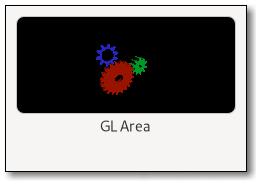
Figure: GtkGLArea
The gtk:gl-area widget sets up its own gdk:gl-context object for the window it creates, and creates a custom GL framebuffer that the widget will do GL rendering onto. It also ensures that this framebuffer is the default GL rendering target when rendering.
In order to draw, you have to connect to the "render" signal, or subclass the gtk:gl-area widget and override the render() virtual function.
The gtk:gl-area widget ensures that the gdk:gl-context object is associated with the drawing area of the widget, and it is kept updated when the size and position of the drawing area changes.
The render() function will be called when the gtk:gl-area widget is ready for you to draw its content:
static gboolean
render (GtkGLArea *area, GdkGLContext *context)
{
// inside this function it's safe to use GL; the given
// GdkGLContext has been made current to the drawable
// surface used by the `GtkGLArea` and the viewport has
// already been set to be the size of the allocation
// we can start by clearing the buffer
glClearColor (0, 0, 0, 0);
glClear (GL_COLOR_BUFFER_BIT);
// draw your object
// draw_an_object ();
// we completed our drawing; the draw commands will be
// flushed at the end of the signal emission chain, and
// the buffers will be drawn on the window
return TRUE;
}
void setup_glarea (void)
{
// create a GtkGLArea instance
GtkWidget *gl_area = gtk_gl_area_new ();
// connect to the "render" signal
g_signal_connect (gl_area, "render", G_CALLBACK (render), NULL);
}
If you need to initialize OpenGL state, for example buffer objects or shaders, you should use the "realize" signal. You can use the "unrealize" signal to clean up. Since the gdk:gl-context object creation and initialization may fail, you will need to check for errors, using the gtk:gl-area-error function. An
example of how to safely initialize the GL state is:
static void
on_realize (GtkGLarea *area)
{
// We need to make the context current if we want to
// call GL API
gtk_gl_area_make_current (area);
// If there were errors during the initialization or
// when trying to make the context current, this
// function will return a GError for you to catch
if (gtk_gl_area_get_error (area) != NULL)
return;
// You can also use gtk_gl_area_set_error() in order
// to show eventual initialization errors on the
// GtkGLArea widget itself
GError *internal_error = NULL;
init_buffer_objects (&error);
if (error != NULL)
{
gtk_gl_area_set_error (area, error);
g_error_free (error);
return;
}
init_shaders (&error);
if (error != NULL)
{
gtk_gl_area_set_error (area, error);
g_error_free (error);
return;
}
} If you need to change the options for creating the gdk:gl-context object you should use the "create-context" signal. lambda (area) :run-last
- area
- The gtk:gl-area widget that emitted the signal.
- Returns
- The newly created gdk:gl-context object. The gtk:gl-area widget will take ownership of the returned value.
lambda (area context) :run-last
- area
- The gtk:gl-area widget that emitted the signal.
- context
- The gdk:gl-context object used by area.
- Returns
- True to stop other handlers from being invoked for the event. False to propagate the event further.
lambda (area width height) :run-last
- area
- The gtk:gl-area widget that emitted the signal.
- width
- The integer for the width of the viewport.
- height
- The integer for the height of the viewport.
Since 4.12
Since 4.12
If setting is true the "render" signal will be emitted every time the widget draws. This is the default and is useful if drawing the widget is faster. If setting is false the data from previous rendering is kept around and will be used for drawing the widget the next time, unless the window is resized. In order to force a rendering the gtk:gl-area-queue-render function must be called. This mode is useful when the scene changes seldom, but takes a long time to redraw.
If setting is true the widget will allocate and enable a depth buffer for the target framebuffer. Otherwise there will be none.
If setting is true the widget will allocate and enable a stencil buffer for the target framebuffer. Otherwise there will be none.
Scrolling
GtkScrollable
(gobject:define-genum "GtkScrollablePolicy" scrollable-policy (:export t :type-initializer "gtk_scrollable_policy_get_type") (:minimum 0) (:natural 1))
- :minimum
- Scrollable adjustments are based on the minimum size.
- :natural
- Scrollable adjustments are based on the natural size.
- When a parent widget sets the adjustments of the scrollable child widget the widget should populate the lower, upper, step-increment, page-increment and page-size properties of the adjustment and connect to the "value-changed" signal.
- Because its preferred size is the size for a fully expanded widget, the scrollable widget must be able to cope with underallocations. This means that it must accept any value passed to its GtkWidgetClass.size_allocate() function.
- When the parent allocates space to the scrollable child widget, the widget should update the properties of the adjustments with new values.
- When any of the adjustments emits the "value-changed" signal, the scrollable widget should scroll its contents.
GtkScrollbar

Figure: GtkScrollbar
Its position and movement are controlled by the adjustment that is passed to or created by the gtk:scrollbar-new function. See the gtk:adjustment documentation for more details. The value property sets the position of the thumb and must be between the lower and upper - page-size values. The page-size property represents the size of the visible scrollable area. The step-increment and page-increment properties are added to or subtracted from the value property when the user asks to move by a step, using, for example, the cursor arrow keys, or by a page, using, for example, the Page Down/Page Up keys.
scrollbar
╰── range[.fine-tune]
╰── trough
╰── slider The gtk:scrollbar implementation has a main CSS node with name scrollbar and a subnode for its contents. The main node gets the .horizontal or .vertical style classes applied, depending
on the orientation of the scrollbar. The range node gets the .fine-tune style class added when the scrollbar is in 'fine-tuning'
mode.Other style classes that may be added to scrollbars inside the gtk:scrolled-window widget include the .left, .right, .top, .bottom positional classes and .overlay-indicator, .dragging, .hovering style classes related to overlay scrolling.
GtkScrolledWindow
(gobject:define-genum "GtkPolicyType" policy-type (:export t :type-initializer "gtk_policy_type_get_type") (:always 0) (:automatic 1) (:never 2) (:external 3))
- :always
- The scrollbar is always visible. The view size is independent of the content.
- :automatic
- The scrollbar will appear and disappear as necessary. For example, when all of a gtk:tree-view widget cannot be seen.
- :never
- The scrollbar should never appear. In this mode the content determines the size.
- :external
- Do not show a scrollbar, but do not force the size to follow the content. This can be used, for example, to make multiple scrolled windows share a scrollbar.
(gobject:define-genum "GtkCornerType" corner-type (:export t :type-initializer "gtk_corner_type_get_type") (:top-left 0) (:bottom-left 1) (:top-right 2) (:bottom-right 3))
- :top-left
- Place the scrollbars on the right and bottom of the widget (default behaviour).
- :bottom-left
- Place the scrollbars on the top and right of the widget.
- :top-right
- Place the scrollbars on the left and bottom of the widget.
- :bottom-right
- Place the scrollbars on the top and left of the widget.
- gtk:scrolled-window-child
- gtk:scrolled-window-hadjustment
- gtk:scrolled-window-has-frame
- gtk:scrolled-window-hscrollbar-policy
- gtk:scrolled-window-kinetic-scrolling
- gtk:scrolled-window-max-content-height
- gtk:scrolled-window-max-content-width
- gtk:scrolled-window-min-content-height
- gtk:scrolled-window-min-content-width
- gtk:scrolled-window-overlay-scrolling
- gtk:scrolled-window-propagate-natural-height
- gtk:scrolled-window-propagate-natural-width
- gtk:scrolled-window-vadjustment
- gtk:scrolled-window-vscrollbar-policy
- gtk:scrolled-window-window-placement
Figure: GtkScrolledWindow
Widgets with native scrolling support, that is, those whose classes implement the gtk:scrollable interface, are added directly. For other types of widgets, the gtk:viewport class acts as an adaptor, giving scrollability to other widgets. The gtk:scrolled-window-child function intelligently accounts for whether or not the added child is a gtk:scrollable widget. If it is not, then it wraps the child in a gtk:viewport widget. Therefore, you can just add any child widget and not worry about the details.
If the gtk:scrolled-window-child function has added a gtk:viewport widget for you, you can remove both your added child widget from the gtk:viewport widget, and the gtk:viewport widget from the gtk:scrolled-window widget, like this:
(let ((window (make-instance 'gtk:scrolled-window))
(child (make-instance 'gtk:button)))
;; GtkButton is not a GtkScrollable, so GtkScrolledWindow will
;; automatically add a GtkViewport.
(setf (gtk:scrolled-window window) child)
;; Either of these will result in child being unparented:
(setf (gtk:scrolled-window-child window) nil)
;; or
(setf (gtk:viewport-child (gtk:scrolled-window-child window)) nil)
... ) Unless the hscrollbar-policy and vscrollbar-policy properties are :never or :external, the gtk:scrolled-window widget adds internal gtk:scrollbar widgets around its child. The scroll position of the
child, and if applicable the scrollbars, is controlled by the hadjustment and vadjustment properties that are associated with the gtk:scrolled-window widget. See the docs on the gtk:scrollbar widget for the details, but note that the step-increment and page-increment properties are only effective if the
policy causes scrollbars to be present.If a gtk:scrolled-window widget does not behave quite as you would like, or does not have exactly the right layout, it is very possible to set up your own scrolling with the gtk:scrollbar widget and for example a gtk:grid widget.
The gtk:scrolled-window widget also displays visual 'overshoot' indication when the content is pulled beyond the end, and this situation can be captured with the "edge-overshot" signal.
If no mouse device is present, the scrollbars will overlayed as narrow, auto-hiding indicators over the content. If traditional scrollbars are desired although no mouse is present, this behaviour can be turned off with the overlay-scrolling property.
The gtk:scrolled-window implementation also sets the .left, .right, .top, .bottom positional style classes and .overlay-indicator, .dragging, .hovering style classes related to overlay scrolling on its scrollbars.
If both scrollbars are visible, the area where they meet is drawn with a subnode named junction.
lambda (window pos) :run-last
- window
- The gtk:scrolled-window widget that received the signal.
- pos
- The edge side as a value of the gtk:position-type enumeration that was hit.
lambda (window pos) :run-last
- window
- The gtk:scrolled-window widget that received the signal.
- pos
- The edge side as a value of the gtk:position-type enumeration that was hit.
lambda (window direction) :action
- window
- The gtk:scrolled-window widget that received the signal.
- direction
- Either the :tab-forward or :tab-backward value of the gtk:direction-type enumeration.
lambda (window scroll horizontal) :action
- window
- The gtk:scrolled-window widget that received the signal.
- scroll
- The value of the gtk:scroll-type enumeration describing how much to scroll.
- horizontal
- The boolean whether the keybinding scrolls the child horizontally or not.
- Returns
- The boolean whether the scroll happened.
It is a programming error to set the maximum content height to a value smaller than the min-content-height value.
It is a programming error to set the maximum content width to a value smaller than the min-content-width value.
The policy determines when the scrollbar should appear. It is a value from the gtk:policy-type enumeration. If :always, the scrollbar is always present. If :never, the scrollbar is never present. If :automatic, the scrollbar is present only if needed, that is, if the slider part of the scrollbar would be smaller than the trough - the display is larger than the page size.
The default is :top-left, meaning the child is in the top left, with the scrollbars underneath and to the right. Other values in the gtk:corner-type enumeration are :top-right, :bottom-left, and :bottom-right.
See also the gtk:scrolled-window-unset-placement function.
See also the gtk:scrolled-window-placement function.
GtkViewport
The gtk:viewport widget will start scrolling content only if allocated less than the minimum size of the child widget in a given orientation.
Since 4.12
Keyboard shortcuts
Utilities for accelerators
The parser is fairly liberal and allows lower or upper case, and also abbreviations such as <Ctl> and <Ctrl>. Key names are parsed using the gdk:keyval-from-name function. For character keys the name is not the symbol, but the lowercase name, for example, one would use <Ctrl>minus instead of <Ctrl>-.
If the parse fails, the key argument will be set to 0.
(gtk:accelerator-parse "<Control>a") => 97 => (:CONTROL-MASK) (gtk:accelerator-parse "<Shift><Alt>F1") => 65470 => (:SHIFT-MASK :ALT-MASK) (gtk:accelerator-parse "<Control>minus") => 45 => (:CONTROL-MASK) (gtk:accelerator-parse "not valid") => 0 => NIL
(gtk:accelerator-name 65470 '(:shift-mask :alt-mask)) => "<Shift><Alt>F1"
(gtk:accelerator-label 65470 '(:shift-mask :mod1-mask)) => "Shift+Alt+F1"
GtkShortcutManager
Every widget that implements the gtk:shortcut-manager interface will be used with the :managed value of the gtk:shortcut-scope enumeration.
Examples for widgets implementing the gtk:shortcut-manager interface are the gtk:window and gtk:popover widgets.
GtkShortcut
The actual work is usually done via the gtk:shortcut-controller object, which decides if and when to activate a shortcut. Using that controller directly however is rarely necessary as various higher level convenience APIs exist on gtk:widget objects that make it easier to use shortcuts in GTK.
The gtk:shortcut class does provide functionality to make it easy for users to work with shortcuts, either by providing informational strings for display purposes or by allowing shortcuts to be configured.
GtkShortcutTrigger
The gtk:shortcut-trigger implementation contains functions that allow easy presentation to end users as well as being printed for debugging.
All gtk:shortcut-trigger objects are immutable, you can only specify their properties during construction. If you want to change a trigger, you have to replace it with a new one.
- never: for a gtk:never-trigger object
- a string parsed by the gtk:accelerator-parse function, for a gtk:keyval-trigger object, for example <Control>C
- underscore, followed by a single character, for a gtk:mnemonic-trigger object, for example _l
- two valid trigger strings, separated by a | character, for a gtk:alternative-trigger object, for example <Control>q|<Control>w
The display in use may influence the resulting string in various forms, such as resolving hardware keycodes or by causing display-specific modifier names. The form of the representation may change at any time and is not guaranteed to stay identical.
GtkShortcutAction
(gobject:define-gflags "GtkShortcutActionFlags" shortcut-action-flags (:export t :type-initializer "gtk_shortcut_action_flags_get_type") (:exclusive #.(ash 1 0)))
- :exclusive
- The action is the only action that can be activated. If this flag is not set, a future activation may select a different action.
The gtk:shortcut-action implementation contain functions that allow easy presentation to end users as well as being printed for debugging.
All gtk:shortcut-action objects are immutable, you can only specify their properties during construction. If you want to change an action, you have to replace it with a new one. If you need to pass arguments to an action, these are specified by the higher-level gtk:shortcut object.
GTK provides various actions:
- GtkMnemonicAction
- A shortcut action that calls the gtk:widget-mnemonic-activate function.
- GtkCallbackAction
- A shortcut action that invokes a given callback.
- GtkSignalAction
- A shortcut action that emits a given signal.
- GtkActivateAction
- A shortcut action that calls the gtk:widget-activate function.
- GtkNamedAction
- A shortcut action that calls the gtk:widget-activate-action function.
- GtkNothingAction
- A shortcut action that does nothing.
- nothing
- for a gtk:nothing-action object
- activate
- for a gtk:activate-action object
- mnemonic-activate
- for a gtk:mnenomic-action object
- action(name)
- for a gtk:named-action object for the action named name
- signal(name)
- for a gtk:signal-action object for the signal name
Activation of an action can fail for various reasons. If the action is not supported by the widget, if the args do not match the action or if the activation otherwise had no effect, false will be returned.
Interfaces
GtkActionable
The action will be looked up in action groups that are found among the widgets ancestors. Most commonly, these will be the actions with the "win." or "app." prefix that are associated with the gtk:application-window widget or the gtk:application instance, but other action groups that are added with the gtk:widget-insert-action-group function will be consulted as well.
Names are of the form "win.save" or "app.quit" for actions on the containing gtk:application-window widget or its associated gtk:application instance, respectively. This is the same form used for actions in the g:menu object associated with the window.
(let ((button (make-instance 'gtk:button))) (setf (gtk:actionable-action-name button) "win.save") (gtk:actionable-action-name button)) => "win.save"
The target value has two purposes. First, it is used as the parameter to activation of the action associated with the gtk:actionable widget. Second, it is used to determine if the widget should be rendered as "active". The widget is active if the state is equal to the given target.
Consider the example of associating a set of buttons with a g:action object with string state in a typical radio button situation. Each button will be associated with the same action, but with a different target value for that action. Clicking on a particular button will activate the action with the target of that button, which will typically cause the state of the action to change to that value. Since the state of the action is now equal to the target value of the button, the button will now be rendered as active and the other buttons, with different targets, rendered inactive.
(let ((button (make-instance 'gtk:button))) (setf (gtk:actionable-action-target button) (g:variant-new-int16 128)) (g:variant-int16 (gtk:actionable-action-target button))) => 128
The name argument is a string of the form "action::target" where "action" is the action name and "target" is the string to use as the target.
(setq button (make-instance 'gtk:button))
=> #<GTK-BUTTON {1004A8C973}>
(gtk:actionable-set-detailed-action-name button "win.justify::left")
(values (gtk:actionable-action-name button)
(g:variant-string (gtk:actionable-action-target button)))
=> "win.justify"
=> "left" GtkOrientable
Abstract Base Classes
GtkWidget
(glib:define-gboxed-cstruct requisition "GtkRequisition" (:export t :type-initializer "gtk_requistion_get_type") (width :int :initform 0) (height :int :initform 0))
- width
- The integer for the desired width of the widget.
- height
- The integer for the desired height of the widget.
(defvar requisition (gtk:requisition-new)) => REQUISITION (setf (gtk:requisition-width requisition) 100) => 100 (gtk:requisition-width requisition) => 100
(defvar requisition (gtk:requisition-new)) => REQUISITION (setf (gtk:requisition-height requisition) 100) => 100 (gtk:requisition-height requisition) => 100
(cffi:defcstruct widget-class ;; Parent class (:parent-class (:struct gobject:object-class)) ;; Virtual functions (show :pointer) (hide :pointer) (map :pointer) (unmap :pointer) (realize :pointer) (unrealize :pointer) (root :pointer) (unroot :pointer) (size-allocate :pointer) (state-flags-changed :pointer) (direcion-changed :pointer) (get-request-mode :pointer) (measure :pointer) (mnemonic-activate :pointer) (grab-focus :pointer) (focus :pointer) (set-focus-child :pointer) (move-focus :pointer) (keynav-failed :pointer) (query-tooltip :pointer) (compute-expand :pointer) (css-changed :pointer) (system-setting-changed :pointer) (snapshot :pointer) (contains :pointer) ;; Private (priv :pointer) (padding :pointer :count 8))
- parent-class
- The object class structure needs to be the first element in the widget class structure in order for the class mechanism to work correctly.
- show
- Signal emitted when the widget is shown.
- hide
- Signal emitted when the widget is hidden.
- map
- Signal emitted when the widget is going to be mapped, that is when the widget is visible, which is controlled with the gtk:widget-visible function and all its parents up to the toplevel widget are also visible.
- unmap
- Signal emitted when the widget is going to be unmapped, which means that either it or any of its parents up to the toplevel widget have been set as hidden.
- realize
- Signal emitted when the widget is associated with a gdk:surface object, which means that the gtk:widget-realize function has been called or the widget has been mapped, that is, it is going to be drawn.
- unrealize
- Signal emitted when the gdk:surface object associated with the widget is destroyed, which means that the gtk:widget-unrealize function has been called or the widget has been unmapped, that is, it is going to be hidden.
- root
- Called when the widget gets added to a gtk:root widget. Must chain up.
- unroot
- Called when the widget is about to be removed from its gtk:root widget. Must chain up.
- size-allocate
- Called to set the allocation, if the widget does not have a layout manager.
- state-flags-changed
- Signal emitted when the widget state changes, see the gtk:widget-state-flags function.
- direction-changed
- Signal emitted when the text direction of a widget changes.
- get-request-mode
- Called to get the request mode, if the widget does not have a layout manager. This allows a widget to tell its parent container whether it prefers to be allocated in :height-for-width or :width-for-height mode. The :height-for-width value means the widget prefers to have GtkWidgetClass.measure() called first to get the default width (passing a for-size of -1), then again to get the height for said default width. The :constant-size value disables any height-for-width or width-for-height geometry management for said widget and is the default return. It is important to note that any widget which trades height-for-width or width-for-height must respond properly to a for-size value >= -1 passed to GtkWidgetClass.measure, for both possible orientations.
- measure
- Called to obtain the minimum and natural size of the widget, if the widget does not have a layout manager. Depending on the orientation parameter, the passed for-size can be interpreted as width or height. A widget will never be allocated less than its minimum size.
- mnemonic-activate
- Activates the widget if cycling is false, and just grabs the focus if cycling is true.
- grab-focus
- Causes the widget to have the keyboard focus for the GtkWindow it is inside.
- focus
- Virtual function for the gtk:widget-child-focus function.
- set-focus-child
- Sets the focused child of the widget. Must chain up.
- move-focus
- Signal emitted when a change of focus is requested.
- keynav-failed
- Signal emitted if keyboard navigation fails.
- query-tooltip
- Signal emitted when the has-tooltip is true and the hover timeout has expired with the cursor hovering "above" widget; or emitted when widget got focus in keyboard mode.
- compute-expand
- Computes whether a container should give the widget extra space when possible.
- css-changed
- Called when the CSS used by the widget was changed. Widgets should then discard their caches that depend on CSS and queue resizes or redraws accordingly. The default implementation will take care of this for all the default CSS properties, so implementations must chain up.
- system-setting-changed
- Emitted when a system setting was changed. Must chain up.
- snapshot
- Called when a new snapshot of the widget has to be taken.
- contains
- Virtual function for the gtk:widget-contains function.
(gobject:define-vtable ("GtkWidget" widget)
;; Parent class
(:skip parent-instance (:struct gobject:object-class))
;; Virtual functions
(show (:void (widget (g:object gtk:widget))))
(hide (:void (widget (g:object gtk:widget))))
(map (:void (widget (g:object gtk:widget))))
(unmap (:void (widget (g:object gtk:widget))))
(realize (:void (widget (g:object gtk:widget))))
(unrealize (:void (widget (g:object gtk:widget))))
(root (:void (widget (g:object gtk:widget))))
(unroot (:void (widget (g:object gtk:widget))))
(size-allocate (:void
(widget (g:object gtk:widget))
(width :int)
(height :int)
(baseline :int)))
(state-flags-changed (:void
(widget (g:object gtk:widget))
(previous gtk:state-flags)))
(direction-changed (:void
(widget (g:object gtk:widget))
(previous gtk:text-direction)))
(get-request-mode (gtk:size-request-mode
(widget (g:object gtk:widget))))
(measure (:void
(widget (g:object gtk:widget))
(orientation gtk:orientation)
(for-size :int)
(minimum :int)
(natural :int)
(minimum-baseline :int)
(natural-baseline :int)))
(mnemonic-activate (:boolean
(widget (g:object gtk:widget))
(cycling :boolean)))
(grab-focus (:boolean (widget (g:object gtk:widget))))
(focus (:boolean
(widget (g:object gtk:widget))
(direction gtk:direction-type)))
(set-focus-child (:void
(widget (g:object gtk:widget))
(child (g:object gtk:widget))))
(move-focus (:void
(widget (g:object gtk:widget))
(direction gtk:direction-type)))
(keynav-failed (:boolean
(widget (g:object gtk:widget))
(direction gtk:direction-type)))
(query-tooltip (:boolean
(widget (g:object gtk:widget))
(x :int)
(y :int)
(keyboard-tooltip :boolean)
(tooltip (g:object gtk:tooltip))))
(compute-expand (:void
(widget (g:object gtk:widget))
(hexpand-p :boolean)
(vexpand-p :boolean)))
(css-changed (:void
(widget (g:object gtk:widget))
(change gtk:css-style-change)))
(system-setting-changed (:void
(widget (g:object gtk:widget))
(settings gtk:system-setting)))
(snapshot (:void
(widget (g:object gtk:widget))
(snapshot (g:object gtk:snapshot))))
(contains (:boolean
(widget (g:object gtk:widget))
(x :double)
(y :double)))) - gtk:widget-can-focus
- gtk:widget-can-target
- gtk:widget-css-classes
- gtk:widget-css-name
- gtk:widget-cursor
- gtk:widget-focus-on-click
- gtk:widget-focusable
- gtk:widget-halign
- gtk:widget-has-default
- gtk:widget-has-focus
- gtk:widget-has-tooltip
- gtk:widget-height-request
- gtk:widget-hexpand
- gtk:widget-hexpand-set
- gtk:widget-layout-manager
- gtk:widget-limit-events
- gtk:widget-margin-bottom
- gtk:widget-margin-end
- gtk:widget-margin-start
- gtk:widget-margin-top
- gtk:widget-name
- gtk:widget-opacity
- gtk:widget-overflow
- gtk:widget-parent
- gtk:widget-receives-default
- gtk:widget-root
- gtk:widget-scale-factor
- gtk:widget-sensitive
- gtk:widget-tooltip-markup
- gtk:widget-tooltip-text
- gtk:widget-valign
- gtk:widget-vexpand
- gtk:widget-vexpand-set
- gtk:widget-visible
- gtk:widget-width-request
GTK also supports baseline vertical alignment of widgets. This means that widgets are positioned such that the typographical baseline of widgets in the same row are aligned. This happens if a widget supports baselines, has a vertical alignment of :baseline-center, and is inside a container that supports baselines and has a natural "row" that it aligns to the baseline, or a baseline assigned to it by the grandparent.
If a widget ends up baseline aligned it will be allocated all the space in the parent as if it was :fill, but the selected baseline can be found via the gtk:widget-allocated-baseline function. If this has a value other than -1 you need to align the widget such that the baseline appears at the position.
If the widget uses a gtk:layout-manager object, the gtk:widget implementation supports a custom <layout> element, used to define layout properties:
<object class="GtkGrid" id="my_grid">
<child>
<object class="GtkLabel" id="label1">
<property name="label">Description</property>
<layout>
<property name="column">0</property>
<property name="row">0</property>
<property name="row-span">1</property>
<property name="column-span">1</property>
</layout>
</object>
</child>
<child>
<object class="GtkEntry" id="description_entry">
<layout>
<property name="column">1</property>
<property name="row">0</property>
<property name="row-span">1</property>
<property name="column-span">1</property>
</layout>
</object>
</child>
</object> The gtk:widget implementation allows style information such as style classes to be associated with widgets, using the custom <style>
element:
<object class="GtkButton" id="button1">
<style>
<class name="my-special-button-class"/>
<class name="dark-button"/>
</style>
</object> The gtk:widget implementation allows defining accessibility
information, such as properties, relations, and states, using the custom <accessibility> element:
<object class="GtkButton" id="button1">
<accessibility>
<property name="label">Download</property>
<relation name="labelled-by">label1</relation>
</accessibility>
</object> To create composite widgets with gtk:builder XML, one must associate the interface description with the widget class at class initialization time using the gtk:widget-class-set-template function.
The interface description semantics expected in composite template descriptions is slightly different from regulare gtk:builder XML. Unlike regular interface descriptions, the gtk:widget-class-set-template function will expect a <template> tag as a direct child of the toplevel <interface> tag. The <template> tag must specify the "class" attribute which must be the type name of the widget. Optionally, the "parent" attribute may be specified to specify the direct parent type of the widget type, this is ignored by the gtk:builder object but can be used by UI design tools to introspect what kind of properties and internal children exist for a given type when the actual type does not exist.
The XML which is contained inside the <template> tag behaves as if it were added to the <object> tag defining the widget itself. You may set properties on the widget by inserting <property> tags into the <template> tag, and also add <child> tags to add children and extend the widget in the normal way you would with <object> tags.
Additionally, <object> tags can also be added before and after the initial <template> tag in the normal way, allowing one to define auxilary objects which might be referenced by other widgets declared as children of the <template> tag.
Example: A gtk:builder template definition
<interface>
<template class="FooWidget" parent="GtkBox">
<property name="orientation">GTK_ORIENTATION_HORIZONTAL</property>
<property name="spacing">4</property>
<child>
<object class="GtkButton" id="hello_button">
<property name="label">Hello World</property>
</object>
</child>
<child>
<object class="GtkButton" id="goodbye_button">
<property name="label">Goodbye World</property>
</object>
</child>
</template>
</interface> lambda (widget) :no-hooks
- widget
- The gtk:widget object that received the signal.
lambda (widget direction) :run-first
- widget
- The gtk:widget object that received the signal.
- direction
- The previous gtk:text-direction value for the text direction of the widget.
lambda (widget) :run-first
- widget
- The gtk:widget object that received the signal.
lambda (widget) :run-first
- widget
- The gtk:widget object that received the signal.
lambda (widget cycling) :run-last
- widget
- The gtk:widget object that received the signal.
- cycling
- True if there are other widgets with the same mnemonic.
- Returns
- True to stop other handlers from being invoked for the event, false to propagate the event further.
lambda (widget direction) :action
- widget
- The gtk:widget object that received the signal.
- direction
- The gtk:direction-type value for the direction.
lambda (widget x y mode tooltip) :run-last
- widget
- The gtk:widget object that received the signal.
- x
- The integer for the x coordinate of the cursor position where the request has been emitted, relative to the left side of the widget.
- y
- The integer for the y coordinate of the cursor position where the request has been emitted, relative to the top of the widget.
- mode
- True if the tooltip was trigged using the keyboard.
- tooltip
- The gtk:tooltip object.
- Returns
- True if the tooltip should be shown right now, false otherwise.
lambda (widget) :run-first
- widget
- The gtk:widget object that received the signal.
lambda (widget)
- widget
- The gtk:widget object that received the signal.
lambda (widget flags) :run-first
- widget
- The gtk:widget object that received the signal.
- flags
- The previous gtk:state-flags value for the state flags.
lambda (widget) :run-first
- widget
- The gtk:widget object that received the signal.
lambda (widget) :run-last
- widget
- The gtk:widget object that received the signal.
See the gtk:widget-grab-focus function for actually setting the input focus on a widget.
Making mouse clicks not grab focus is useful in places like toolbars where you do not want the keyboard focus removed from the main area of the application.
Widget implementations should set the focusable property to true in their init function if they want to receive keyboard input. Note that having the focusable property be true is only one of the necessary conditions for being focusable. A widget must also have the sensitive and can-focus properties be true and not have an ancestor that has the can-focus property set to false in order to receive input focus. See the gtk:widget-grab-focus function for actually setting the input focus on a widget.
See the gtk:widget-is-focus function for the difference between having the global input focus, and only having the focus within a toplevel.
By default, widgets automatically expand if any of their children want to expand. To see if a widget will automatically expand given its current children and state, call the gtk:widget-compute-expand function. A container can decide how the expandability of children affects the expansion of the container by overriding the compute_expand virtual method on the gtk:widget class.
Setting the hexpand property explicitly with this function will override the automatic expand behavior. This function forces the widget to expand or not to expand, regardless of children. The override occurs because the gtk:widget-hexpand function sets the hexpand-set property, which causes the hexpand property of the widget to be used, rather than looking at children and widget state.
The hexpand-set property will be set automatically when you call the gtk:widget-hexpand function to set the hexpand property, so the most likely reason to use the (setf gtk:widget-hexpand-set) function would be to unset an explicit expand flag.
If the hexpand property is set, then it overrides any computed expand value based on child widgets. If the hexpand property is not set, then the expand value depends on whether any children of the widget would like to expand. There are few reasons to use this function, but it is here for completeness and consistency.
(gtk:widget-layout-manager (make-instance 'gtk:button))
=> #<GTK:BIN-LAYOUT {1005DDB073}>
(gtk:widget-layout-manager (make-instance 'gtk:grid))
=> #<GTK:GRID-LAYOUT {1005DD9863}> Widgets can be named, which allows you to refer to them from a CSS file. You can apply a style to widgets with a particular name in the CSS file. Note that the CSS syntax has certain special characters to delimit and represent elements in a selector (period, #, >, *...), so using these will make your widget impossible to match by name. Any combination of alphanumeric symbols, dashes and underscores will suffice.
Note that the opacity is inherited through inclusion. If you set a toplevel widget to be partially translucent, all of its content will appear translucent, since it is ultimatively rendered on that toplevel widget. The opacity value itself is not inherited by child widgets, since that would make widgets deeper in the hierarchy progressively more translucent. As a consequence, gtk:popover and other gtk:native widgets with their own surface will use their own opacity value, and thus by default appear non-translucent, even if they are attached to a toplevel widget that is translucent.
This setting is provided for widget implementations and should not be used by application code. The default value is :visible.
The effective sensitivity of a widget is however determined by both its own and its parent sensitivity of the widget. See the gtk:widget-is-sensitive function.
See also the tooltip-markup property and the gtk:tooltip-set-markup function.
See also the tooltip-text property and the gtk:tooltip-set-text function.
See the gtk:widget-hexpand function for more details.
See the gtk:widget-hexpand-set function for more details.
If you want to take into account whether the parent of the widget is also marked as visible, use the gtk:widget-is-visible function.
Realizing a widget requires all the parent widgets of the widget to be realized. Calling the gtk:widget-realize function realizes the parents of the widget in addition to the widget itself. If a widget is not yet inside a toplevel window when you realize it, bad things will happen.
This function is primarily used in widget implementations, and is not very useful otherwise. Many times when you think you might need it, a better approach is to connect to a signal that will be called after the widget is realized automatically, such as the "realize" signal.
This function is only for use in widget implementations.
This function is only for use in widget implementations.
The gdk:frame-clock-request-phase function will result in a new frame on the clock, but will not necessarily repaint any widgets. To repaint a widget, you have to use the gtk:widget-queue-draw function which invalidates the widget, thus scheduling it to receive a draw on the next frame. The gtk:widget-queue-draw function will also end up requesting a frame on the appropriate frame clock.
A frame clock of the widget will not change while the widget is mapped. Reparenting a widget, which implies a temporary unmap, can change the frame clock of the widget.
Unrealized widgets do not have a frame clock.
The gdk:frame-clock-frame-time function should generally be used for timing continuous animations and the gdk:frame-timings-predicted-presentation-time function if you are trying to display isolated frames at particular times.
This is a more convenient alternative to connecting directly to the "update" signal of the gdk:frame-clock object, since you do not have to worry about when the gdk:frame-clock object is assigned to a widget.
Shortcuts added this way will be triggered in the :bubble propagation phase, which means they may also trigger if child widgets have focus.
This function must only be used in class initialization functions otherwise it is not guaranteed that the shortcut will be installed.
(gtk:widget-class-layout-manager-type "GtkBox") => #<GTYPE :name "GtkBoxLayout" :id 99175136080768> (gtk:widget-class-layout-manager-type "GtkButton") => #<GTYPE :name "GtkBinLayout" :id 99175136080464> (gtk:widget-class-layout-manager-type "GtkWindow") => NIL
If the widget is not focusable, or its grab_focus() implementation cannot transfer the focus to a descendant of the widget that is focusable, it will not take focus and false will be returned.
Calling the gtk:widget-grab-focus function on an already focused widget is allowed, should not have an effect, and returns true.
This function is useful only when implementing subclasses of the gtk:widget object.
Note that unlike the gtk:widget-is-ancestor function, the gtk:widget-ancestor function considers the widget to be an ancestor of itself.
Widgets will remove all event controllers automatically when they are destroyed, there is normally no need to call this function.
This direction controls the primary direction for widgets containing text, and also the direction in which the children of a container are packed. The ability to set the direction is present in order so that correct localization into languages with right-to-left reading directions can be done. Generally, applications will let the default reading direction present, except for containers where the containers are arranged in an order that is explicitely visual rather than logical, such as buttons for text justification.
If the direction is set to the :none value, then the value set by the gtk:widget-default-direction function will be used.
If you keep a Pango layout created in this way around, you need to re-create it when the Pango context of the widget is replaced. This can be tracked by listening to changes of the root property on the widget.
On top of that, this function allows name to be nil, which will do the same as calling the gtk:widget-cursor function with a nil cursor.
This function calls the Gtk.WidgetClass.focus() virtual function. Widgets can override the virtual function in order to implement appropriate focus behavior.
The default Gtk.WidgetClass.focus() virtual function for a widget should return true if moving in direction left the focus on a focusable location inside that widget, and false if moving in direction moved the focus outside the widget. When returning true, widgets normally call the gtk:widget-grab-focus function to place the focus accordingly. When returning false, they do not modify the current focus location.
This function is used by custom widget implementations. If you are writing an application, you would use the gtk:widget-grab-focus function to move the focus to a particular widget.
Note that changing the child visibility of a widget does not queue a resize on the widget. Most of the time, the size of a widget is computed from all visible children, whether or not they are mapped. If this is not the case, the container can queue a resize itself.
This function is only useful for widget implementations and should never be called by an application.
The (setf gtk:widget-size-request) function sets the minimum size of a widget. That is, the size request of the widget will be width by height. You can use this function to force a widget to be either larger or smaller than it normally would be.
In most cases, the gtk:window-default-size function is a better choice for toplevel windows than this function. Setting the default size will still allow users to shrink the window. Setting the size request will force them to leave the window at least as large as the size request.
Note the inherent danger of setting any fixed size - themes, translations into other languages, different fonts, and user action can all change the appropriate size for a given widget. So, it is basically impossible to hardcode a size that will always be correct.
The size request of a widget is the smallest size a widget can accept while still functioning well and drawing itself correctly. However in some strange cases a widget may be allocated less than its requested size, and in many cases a widget may be allocated more space than it requested.
If the size request in a given direction is -1 (unset), then the "natural" size request of the widget will be used instead.
The size request set here does not include any margin from the margin-start, margin-end, margin-top, and margin-bottom properties, but it does include pretty much all other padding or border properties set by any subclass of the gtk:widget class.
(setq button (gtk:button-new-with-mnemonic "_Hello"))
=> #<GTK-BUTTON {C2794C9}>
(gtk:widget-list-mnemonic-labels button)
=> (#<GTK-LABEL {C292FE1}>) Note the list of mnemonic labels for the widget is cleared when the widget is destroyed, so the caller must make sure to update its internal state at this point as well.
Note that the effect of the gdk:surface-beep function can be configured in many ways, depending on the windowing backend and the desktop environment or window manager that is used.
The return value of this function should be interpreted in a way similar to the return value of gtk:widget-child-focus function. When true is returned, stay in the widget, the failed keyboard navigation is OK and/or there is nowhere we can/should move the focus to. When false is returned, the caller should continue with keyboard navigation outside the widget, for example, by calling the gtk:widget-child-focus function on the toplevel of the widget.
The default "keynav-failed" signal handler returns false for the :tab-forward and :tab-backward values of the gtk:direction-type enumeration. For the other values of the gtk:direction-type enumeration it returns true.
Whenever the default handler returns true, it also calls the gtk:widget-error-bell function to notify the user of the failed keyboard navigation.
A use case for providing an own implementation of the "keynav-failed" signal handler (either by connecting to it or by overriding it) would be a row of gtk:entry widgets where the user should be able to navigate the entire row with the cursor keys, as for example, known from user interfaces that require entering license keys.
(gdk:rectangle-width (gtk:widget-allocation widget))
(gdk:rectangle-height (gtk:widget-allocation widget))
So a layout container is guaranteed that its children stay inside the assigned bounds, but not that they have exactly the bounds the container assigned.
Since 4.12
If the operation is successful, bounds is returned. If widget has no bounds or the bounds cannot be expressed in the coordinate space of target, for example, if both widgets are in different windows, nil is returned and bounds is set to the zero rectangle.
It is valid for widget and target to be the same widget.
Usually widgets will return nil if the given coordinate is not contained in widget checked via the gtk:widget-contains function. Otherwise they will recursively try to find a child that does not return nil. Widgets are however free to customize their picking algorithm.
This function is used on the toplevel to determine the widget below the mouse cursor for purposes of hover highlighting and delivering events.
This function is only suitable for widget implementations. If you want a certain widget to get the input focus, call the gtk:widget-grab-focus function on it.
Also note that if you are looking for a way to obtain the gtk:state-flags values to pass to a gtk:style-context function, you should look at the gtk:style-context-state function.
This function is for use in widget implementations. Turns on flag values in the current widget state, insensitive, prelighted, and so on.
This function is for use in widget implementations.
To find out if the widget has the global input focus, use the gtk:widget-has-focus function.
The gtk:widget-snapshot-child function takes care of translating the origin of snapshot, and deciding whether the child needs to be snapshot.
This function does nothing for children that implement the gtk:native interface.
After calling this function, the gtk:widget-next-sibling function will return next. If parent is already set as the parent widget of widget, this function can also be used to reorder widget in the child widget list of parent.
This API is primarily meant for widget implementations. If you are just using a widget, you must use its own API for adding children.
After calling this function, the gtk:widget-prev-sibling function will return prev. If parent is already set as the parent widget of widget, this function can also be used to reorder widget in the child widget list of parent.
This API is primarily meant for widget implementations. If you are just using a widget, you must use its own API for adding children.
Since 4.10
(defvar dialog (make-instance 'gtk:about-dialog)) => DIALOG
(gtk:widget-css-classes dialog)
=> ("background" "csd" "aboutdialog")
(gtk:widget-add-css-class dialog "mystyle")
(gtk:widget-css-classes dialog)
=> ("background" "csd" "aboutdialog" "mystyle")
(gtk:widget-remove-css-class dialog "mystyle")
(gtk:widget-css-classes dialog)
=> ("background" "csd" "aboutdialog") (gtk:widget-class-css-name "GtkButton") => "button" (setf (gtk:widget-class-css-name "GtkButton") "new") => "new" (gtk:widget-class-css-name "GtkButton") => "new"There is no class of "unknown" type:
(gtk:widget-class-css-name "unknown") => NIL (setf (gtk:widget-class-css-name "unknown") "name") => NIL
The lower the priority of the style provider is, the earlier it will be used in the style construction. Typically this will be in the range between the gtk:+priority-fallback+ and gtk:+priority-user+ priorities. The default value is gtk:+priority-application+. See the gtk:style-context-add-provider documentation for more information.
This is used to retrieve a suitable size by container widgets which do not impose any restrictions on the child placement. It can be used to deduce toplevel window and menu sizes as well as child widgets in free-form containers such as the gtk:fixed widget.
Use the gtk:widget-measure function if you want to support baseline alignment.
This function already checks whether the widget is visible, so visibility does not need to be checked separately. Non-visible widgets are not expanded.
The computed expand value uses either the expand setting explicitly set on the widget itself, or, if none has been explicitly set, the widget may expand if some of its children do.
It is important to call this function in the instance initializer of a gtk:widget subclass. One reason is that generally derived widgets will assume that parent class composite widgets have been created in their instance initializers. Another reason is that when calling the g:object-new function on a widget with composite templates, it is important to build the composite widgets before the construct properties are set. Properties passed to the g:object-new function should take precedence over properties set in the private template XML.
;; Subclass from GtkApplicationWindow (gobject:define-gobject-subclass "MyAppWindow" my-app-window (:superclass gtk:application-window :export t :interfaces nil) nil)
;; Set template and bindings during class initialization (defmethod gobject:object-class-init :after ((subclass (eql (find-class 'my-app-window))) class data) (declare (ignorable subclass class data)) ;; Load template from file, this is a Lisp extension (let ((path (glib-sys:sys-path "resource/widget-template.ui"))) (gtk:widget-class-set-template-from-file "MyAppWindow" path)) ;; Set builder scope (gtk:widget-class-set-template-scope "MyAppWindow" (make-instance 'gtk:builder-cl-scope)) ;; Bind objects from the template (gtk:widget-class-bind-template-child "MyAppWindow" "button1") (gtk:widget-class-bind-template-child "MyAppWindow" "button2") (gtk:widget-class-bind-template-child "MyAppWindow" "button3") (gtk:widget-class-bind-template-child "MyAppWindow" "button4"))
;; Init usage of template in instance initialization (defmethod gobject:object-instance-init :after ((subclass (eql (find-class 'my-app-window))) instance data) (declare (ignorable subclass data)) (gtk:widget-init-template instance))
;; Signal handlers for the buttons in the template (defun button-clicked (button) (format t " Button is clicked: ~a~%" button)) (defun button1-clicked (button) (format t " Button 1 is clicked: ~a~%" button)) (defun button2-clicked (button) (format t " Button 2 is clicked: ~a~%" button))
(defun do-widget-template (&optional application) (let* ((window (make-instance 'my-app-window :application application :title "Application Window" :show-menubar t))) ;; Present the application window (gtk:window-present window)))
You should call this function inside the GObjectClass.dispose() implementation of any widget that called the gtk:widget-init-template function. Typically, you will want to call this function last, right before chaining up to the parent type’s dispose implementation.
Since 4.8
Note that any class that installs templates must call the gtk:widget-init-template function in the instance initializer of the widget. See its documentation for an example.
Note that any class that installs templates must call the gtk:widget-init-template function in the instance initializer of the widget. See its documentation for an example.
See the gtk:widget-init-template documentation for an example.
Note that this must be called from a composite widget class initializer after calling the gtk:widget-class-set-template function. See the gtk:widget-init-template documentation for an example.
Calling this function will enable extra internal bookkeeping to track children and emit signals on the returned list model. It may slow down operations a lot. Applications should try hard to avoid calling this function because of the slowdowns.
Calling this function will enable extra internal bookkeeping to track controllers and emit signals on the returned list model. It may slow down operations a lot. Applications should try hard to avoid calling this function because of the slowdowns.
GtkRange
Apart from signals for monitoring the parameters of the adjustment, the gtk:range class provides properties and methods for influencing the sensitivity of the "steppers". It also provides properties and methods for setting a "fill level" on range widgets. See the gtk:range-fill-level function.
lambda (range value) :run-last
- range
- The gtk:range widget that received the signal.
- value
- The double float for the value before we clamp.
lambda (range scroll value) :run-last
- range
- The gtk:range widget that received the signal.
- scroll
- The gtk:scroll-type value of scroll action that was performed.
- value
- The double float resulting from the scroll action.
- Returns
- True to prevent other handlers from being invoked for the signal, false to propagate the signal further.
lambda (range step) :action
- range
- The gtk:range widget that received the signal.
- step
- The gtk:scroll-type value how to move the slider.
lambda (range) :run-last
- range
- The gtk:range widget that received the signal.
The adjustment indicates the current range value, the minimum and maximum range values, the step/page increments used for keybindings and scrolling, and the page size. The page size is normally 0 for the gtk:scale widget, and indicates the size of the visible area of the widget being scrolled.
The "fill level" is probably best described by its most prominent use case, which is an indicator for the amount of pre-buffering in a streaming media player. In that use case, the value of the range would indicate the current play position, and the fill level would be the position up to which the file/stream has been downloaded.
This amount of prebuffering can be displayed on the trough of the range and is themeable separately from the trough. To enable fill level display, use the gtk:range-show-fill-level function. The range defaults to not showing the fill level.
Additionally, it is possible to restrict the slider position of the range to values which are smaller than the fill level. This is controller by the gtk:range-restrict-to-fill-level function and is by default enabled.
Ranges normally move from lower to higher values as the slider moves from top to bottom or left to right. Inverted ranges have higher values at the top or on the right rather than on the bottom or left.
Printing
GtkPrintOperationPreview
By default the gtk:print-operation object uses an external application to do print preview. To implement a custom print preview, an application must connect to the "preview" signal. The gtk:print-operation-preview-render-page, gtk:print-operation-preview-end-preview and gtk:print-operation-preview-is-selected functions are useful when implementing a print preview.
lambda (preview context pagesetup) :run-last
- preview
- The gtk:print-operation-preview object on which the signal is emitted.
- context
- The current gtk:print-context object.
- pagesetup
- The gtk:page-setup object for the current page.
lambda (preview context) :run-last
- preview
- The gtk:print-operation-preview object on which the signal is emitted.
- context
- The current gtk:print-context object.
GtkPrintOperation
(gobject:define-genum "GtkPrintStatus" print-status (:export t :type-initializer "gtk_print_status_get_type") (:initial 0) (:preparing 1) (:generating-data 2) (:sending-data 3) (:pending 4) (:pending-issue 5) (:printing 6) (:finished 7) (:finished-aborted 8))
- :initial
- The printing has not started yet. This status is set initially, and while the print dialog is shown.
- :preparing
- This status is set while the "begin-print" signal is emitted and during pagination.
- :generating-data
- This status is set while the pages are being rendered.
- :sending-data
- The print job is being sent off to the printer.
- :pending
- The print job has been sent to the printer, but is not printed for some reason, for example, the printer may be stopped.
- :pending-issue
- Some problem has occurred during printing, for example a paper jam.
- :printing
- The printer is processing the print job.
- :finished
- The printing has been completed successfully.
- :finished-aborted
- The printing has been aborted.
(gobject:define-genum "GtkPrintOperationAction" print-operation-action (:export t :type-initializer "gtk_print_operation_action_get_type") (:print-dialog 0) (:print 1) (:preview 2) (:export 3))
- :print-dialog
- Show the print dialog.
- Start to print without showing the print dialog, based on the current print settings.
- :preview
- Show the print preview.
- :export
- Export to a file. This requires the export-filename property of the gtk:print-operation object to be set.
(gobject:define-genum "GtkPrintOperationResult" print-operation-result (:export t :type-initializer "gtk_print_operation_result_get_type") (:error 0) (:apply 1) (:cancel 2) (:in-progress 3))
- :error
- An error has occured.
- :apply
- The print settings should be stored.
- :cancel
- The print operation has been canceled, the print settings should not be stored.
- :in-progress
- The print operation is not complete yet. This value will only be returned when running asynchronously.
- gtk:print-operation-allow-async
- gtk:print-operation-current-page
- gtk:print-operation-custom-tab-label
- gtk:print-operation-default-page-setup
- gtk:print-operation-embed-page-setup
- gtk:print-operation-export-filename
- gtk:print-operation-has-selection
- gtk:print-operation-job-name
- gtk:print-operation-n-pages
- gtk:print-operation-n-pages-to-print
- gtk:print-operation-print-settings
- gtk:print-operation-show-progress
- gtk:print-operation-status
- gtk:print-operation-status-string
- gtk:print-operation-support-selection
- gtk:print-operation-track-print-status
- gtk:print-operation-unit
- gtk:print-operation-use-full-page
The typical way to use the high-level printing API is to create a gtk:print-operation object with the gtk:print-operation-new function when the user selects to print. Then you set some properties on it, for example the page size, any gtk:print-settings settings from previous print operations, the number of pages, the current page, and so on.
Then you start the print operation by calling the gtk:print-operation-run function. It will then show a dialog, let the user select a printer and options. When the user finished the dialog various signals will be emitted on the gtk:print-operation object, the main one being the "draw-page" signal, which you are supposed to catch and render the page on the provided the gtk:print-context object using Cairo.
By default the gtk:print-operation object uses an external application to do print preview. To implement a custom print preview, an application must connect to the "preview" signal. The gtk:print-operation-preview-render-page, gtk:print-operation-preview-end-preview and gtk:print-operation-preview-is-selected functions are useful when implementing a print preview.
(defvar *print-settings* nil)
(defun do-print-operation (window) (let ((response nil) (print (gtk:print-operation-new))) ;; Connect signal handlers for the print operation (g:signal-connect print "draw-page" #'draw-page) (g:signal-connect print "begin-print" #'begin-print) ;; Restore the print settings (when *print-settings* (setf (gtk:print-operation-print-settings print) *print-settings*)) ;; Perform the print operation (setf response (gtk:print-operation-run print :print-dialog window)) ;; Check the response and save the print settings (when (eq :apply response) (setf *print-settings* (gtk:print-operation-print-settings print)))))
lambda (operation context) :run-last
- operation
- The gtk:print-operation object on which the signal was emitted.
- context
- The gtk:print-context object for the current operation.
lambda (operation) :run-last
- operation
- The gtk:print-operation object on which the signal was emitted.
- Returns
- The gtk:widget custom widget that gets embedded in the print dialog, or nil.
lambda (operation widget) :run-last
- operation
- The gtk:print-operation object on which the signal was emitted.
- widget
- The gtk:widget custom widget added in a "create-custom-widget" signal handler.
lambda (operation result) :run-last
- operation
- The gtk:print-operation object on which the signal was emitted.
- result
- The result of type gtk:print-operation-result for the print operation.
lambda (operation context page) :run-last
- operation
- The gtk:print-operation object on which the signal was emitted.
- context
- The gtk:print-context object for the current operation.
- page
- The 0-based number for the currently printed page.
(defun draw-page (operation context page)
(declare (ignore operation page))
(let ((text-height 0)
(cr (gtk:print-context-cairo-context context))
(width (floor (gtk:print-context-get-width context)))
(layout (gtk:print-context-create-pango-layout context)))
;; Print a grey colored header
(cairo:rectangle cr 0 0 width *header-height*)
(cairo:set-source-rgb cr 0.9 0.9 0.9)
(cairo:fill cr)
;; Set the font and text to print
(setf (pango:layout-font-description layout)
(pango:font-description-from-string "sans 14"))
(setf (pango:layout-text layout) "Title")
(setf (pango:layout-width layout) (* width pango:+scale+))
(setf (pango:layout-alignment layout) :center)
;; Get the height of the text
(multiple-value-bind (width height)
(pango:layout-size layout)
(setf text-height (/ height pango:+scale+)))
;; Set color to black and center the text in header
(cairo:set-source-rgb cr 0.0 0.0 0.0)
(cairo:move-to cr 0 (floor (/ (- *header-height* text-height) 2)))
(pango:cairo-show-layout cr layout))) lambda (operation context) :run-last
- operation
- The gtk:print-operation object on which the signal was emitted.
- context
- The gtk:print-context object for the current operation.
lambda (operation context) :run-last
- operation
- The gtk:print-operation object on which the signal was emitted.
- context
- The gtk:print-context object for the current operation.
lambda (operation preview context parent) :run-last
- operation
- The gtk:print-operation object on which the signal was emitted.
- preview
- The gtk:print-operation-preview object for the current operation.
- context
- The gtk:print-context object that will be used.
- parent
- The gtk:window widget to use as window parent, or nil.
- Returns
- True if the listener wants to take over control of the preview.
lambda (operation context page setup) :run-last
- operation
- The gtk:print-operation object on which the signal was emitted.
- context
- The gtk:print-context object for the current operation.
- page
- The 0-based number for the currently printed page.
- setup
- The gtk:page-setup object.
lambda (operation) :run-last
- operation
- The gtk:print-operation object on which the signal was emitted.
lambda (operation widget setup settings) :run-last
- operation
- The gtk:print-operation object on which the signal was emitted.
- widget
- The gtk:widget custom widget added in the "create-custom-widget" signal handler.
- setup
- The actual gtk:page-setup object.
- settings
- The actual gtk:print-settings object.
This function is often implemented using some form of polling, so it should not be enabled unless needed.
If you call the gtk:print-operation-allow-async function the operation will run asynchronously if this is supported on the platform. The "done" signal will be emitted with the result of the operation when the it is done, that is, when the dialog is canceled, or when the print succeeds or fails.
Note that the gtk:print-operation-run function can only be called once on a given gtk:print-operation object.
(defun do-print-operation (window)
(let ((response nil)
(print (gtk:print-operation-new)))
;; Connect signal handlers for the print operation
(g:signal-connect print "draw-page" #'draw-page)
(g:signal-connect print "begin-print" #'begin-print)
;; Restore the print settings
(when *print-settings*
(setf (gtk:print-operation-print-settings print) *print-settings*))
;; Restore the page setup
(when *page-setup*
(setf (gtk:print-operation-page-setup print) *page-setup*))
;; Perform the print operation
(setf response (gtk:print-operation-run print :print-dialog window))
;; Check the response and save the print settings
(when (eq :apply response)
(setf *print-settings* (gtk:print-operation-print-settings print))))) Note that this function may use a recursive main loop to show the page setup dialog. See the gtk:print-run-page-setup-dialog-async function if this is a problem.
GtkPrintContext
The gtk:print-context object gets passed to the "begin-print", "end-print", "request-page-setup" and "draw-page" signal handlers on the print operation.
(defun draw-page (operation context pagenr)
(declare (ignore operation pagenr))
(let ((cr (gtk:print-context-cairo-context context))
(layout (gtk:print-context-create-pango-layout context)))
;; Draw a red rectangle, as wide as the paper (inside the margins)
(cairo:set-source-rgb cr 1.0 0 0)
(cairo:rectangle cr 0 0 (gtk:print-context-width context) 50)
(cairo:fill cr)
;; Draw some lines
(cairo:move-to cr 20 10)
(cairo:line-to cr 40 20)
(cairo:arc cr 60 60 20 0 3.14)
(cairo:line-to cr 80 20)
(cairo:set-source-rgb cr 0 0 0)
(cairo:set-line-width cr 5)
(cairo:set-line-cap cr :round)
(cairo:set-line-join cr :round)
(cairo:stroke cr)
;; Draw some text
(setf (pango:layout-text layout) "Hello World! Printing is easy")
(setf (pango:layout-font-description layout)
(pango:font-description-from-string "sans 28"))
(cairo:move-to cr 30 20)
(pango:cairo-layout-path cr layout)
;; Font Outline
(cairo:set-source-rgb cr 0.93 1.0 0.47)
(cairo:set-line-width cr 0.5)
(cairo:stroke-preserve cr)
;; Font Fill
(cairo:set-source-rgb cr 0 0.0 1.0)
(cairo:fill cr))) GtkPaperSize
(gobject:define-genum "GtkUnit" unit (:export t :type-initializer "gtk_unit_get_type") (:none 0) (:points 1) (:inch 2) (:mm 3))
- :none
- No units.
- :points
- Dimensions in points.
- :inch
- Dimensions in inches.
- :mm
- Dimensions in millimeters.
(glib:define-gboxed-opaque paper-size "GtkPaperSize"
:type-initializer "gtk_paper_size_get_type"
:alloc (cffi:foreign-funcall "gtk_paper_size_new"
:pointer (cffi:null-pointer)
:pointer)) The gtk:paper-size instance stores not only the dimensions (width and height) of a paper size and its name, it also provides default print margins.
(gtk:paper-size-default) => "iso_a4"
(gtk:paper-size-to-gvariant (gtk:paper-size-new))
=> #.(SB-SYS:INT-SAP #X00F02070)
(g:variant-print * nil)
=> "{'PPDName': <'A4'>, 'DisplayName': <'A4'>, 'Width': <210.0>, 'Height': <297.0>}" GtkPrintSettings
(gobject:define-genum "GtkPageOrienation" page-orientation (:export t :type-initializer "gtk_page_orientation_get_type") :portrait :landscape :reverse-portrait :reverse-landscape)
- :portrait
- Portrait mode.
- :landscape
- Landscape mode.
- :reverse-portrait
- Reverse portrait mode.
- :reverse-landscape
- Reverse landscape mode.
(gobject:define-genum "GtkPrintDuplex" print-duplex (:export t :type-initializer "gtk_print_duplex_get_type") :simplex :horizontal :vertical)
- :simplex
- No duplex.
- :horizontal
- Horizontal duplex.
- :vertical
- Vertical duplex.
(gobject:define-genum "GtkPrintQuality" print-quality (:export t :type-initializer "gtk_print_quality_get_type") :low :normal :high :draft)
- :low
- Low quality.
- :normal
- Normal quality.
- :high
- High quality.
- :draft
- Draft quality.
(gobject:define-genum "GtkNubmerUpLayout" number-up-layout (:export t :type-initializer "gtk_number_up_layout_get_type") (:left-to-right-top-to-bottom 0) (:left-to-right-bottom-to-top 1) (:right-to-left-bottom-to-top 2) (:right-to-left-top-to-bottom 3) (:top-to-bottom-left-to-right 4) (:top-to-bottom-right-to-left 5) (:bottom-to-top-left-to-right 6) (:bottom-to-top-right-to-left 7))
- :left-to-right-top-to-bottom
- :left-to-right-bottom-to-top
- :right-to-left-bottom-to-top
- :right-to-left-top-to-bottom
- :top-to-bottom-left-to-right
- :top-to-bottom-right-to-left
- :bottom-to-top-left-to-right
- :bottom-to-top-right-to-left
(gobject:define-genum "GtkPrintPages" print-pages (:export t :type-initializer "gtk_print_pages_get_type") (:all 0) (:current 1) (:ranges 2) (:selection 3))
- :all
- All pages.
- :current
- Current page.
- :ranges
- Range of pages.
- :selection
- Selected pages.
(gobject:define-genum "GtkPageSet" page-set (:export t :type-initializer "gtk_page_set_get_type") (:all 0) (:even 1) (:odd 2))
- :all
- All pages.
- :even
- Even pages.
- :odd
- Odd pages.
Its also possible to enumerate the settings so that you can easily save the settings for the next time your application runs, or even store them in a document. The predefined keys try to use shared values as much as possible so that moving such a document between systems still works.
The list of keys for a print setting:
"printer" "orientation" "paper-format" "paper-width" "paper-height" "use-color" "collate" "reverse" "duplex" "quality" "n-copies" "number-up" "number-up-layout" "resolution" "resolution-x" "resolution-y" "printer-lpi" "scale" "print-pages" "page-ranges" "page-set" "default-source" "media-type" "dither" "finishings" "output-bin" "output-dir" "output-basename" "output-file-format" "output-uri" "win32-driver-extra" "win32-driver-version"
(let* ((variant (g:variant-parse "a{sv}"
"{'scale': <'100'>,
'number-up': <'1'>,
'n-copies': <'1'>,
'page-ranges': <'0-11'>,
'page-set': <'all'>,
'printer': <'In Datei drucken'>,
'print-pages': <'ranges'>,
'reverse': <'false'>,
'collate': <'false'>,
'output-file-format': <'pdf'>}"))
(settings (gtk:print-settings-new-from-gvariant variant)))
(g:variant-print (gtk:print-settings-to-gvariant settings) nil))
=> "{'scale': <'100'>, 'number-up': <'1'>, 'n-copies': <'1'>,
'page-ranges': <'0-11'>, 'page-set': <'all'>,
'printer': <'In Datei drucken'>, 'print-pages': <'ranges'>,
'reverse': <'false'>, 'collate': <'false'>,
'output-file-format': <'pdf'>}"
(setq settings (make-instance 'gtk:print-settings))
=> #<gtk:print-settings {1004A34623}>
(setf (gtk:print-settings-length settings "paper-width" :mm) 100.0d0)
(gtk:print-settings-length settings "paper-width" :mm)
=> 100.0d0
(setq settings (make-instance 'gtk:print-settings))
=> #<gtk:print-settings {1001A0F643}>
(setf (gtk:print-settings-paper-size settings) (gtk:paper-size-new "iso_a4"))
=> #<GTK-PAPER-SIZE {1001A244C3}>
(gtk:print-settings-paper-size settings)
=> #<GTK-PAPER-SIZE {1001A24B63}>
(setq settings (gtk:print-settings-new))
=> #<gtk:print-settings {1001929323}>
(setf (gtk:print-settings-page-ranges settings) '((1) (15 20) (25)))
=> ((1) (15 20) (25))
(gtk:print-settings-page-ranges settings)
=> ((1) (15 20) (25)) GtkPageSetup
The margins specified in this object are the "print margins". These are the parts of the page that the printer cannot print on. These are different from the layout margins used by a word processor. They are typically used to determine the minimal size for the layout margins.
To obtain a gtk:page-setup object use the function gtk:page-setup-new to get the defaults, or use the function gtk:print-run-page-setup-dialog to show the page setup dialog and receive the resulting page setup.
(defun do-page-setup (settings page-setup)
(when (not settings)
;; Set default print settings
(setf settings (gtk:print-settings-new)))
;; Return the new page setup from the dialog
(gtk:print-run-page-setup-dialog window page-setup settings)) (let ((setup (gtk:page-setup-new))) (gtk:page-setup-orientation setup)) => :PORTRAIT
GtkPrinter
The gtk:printer object allows to get status information about the printer, such as its description, its location, the number of queued jobs, and so on. Most importantly, the gtk:printer object can be used to create a gtk:print-job object, which lets you print to the printer.
lambda (printer success) :run-last
- printer
- The gtk:printer object on which the signal is emitted.
- success
- True if the details were successfully acquired.
This will return 0 unless the details of the printer are available, see the gtk:printer-has-details and gtk:printer-request-details functions.
GtkPrintJob
Use the gtk:print-job-surface function to obtain the Cairo surface onto which the pages must be drawn. Use the gtk:print-job-send function to send the finished job to the printer. If you are not using Cairo, the gtk:print-job object also supports printing of manually generated PostScript. This can be done using the gtk:print-job-set-source-file function.
lambda (job) :run-last
- job
- The gtk:print-job object on which the signal was emitted.
This can allow your application to show things like "out of paper" issues, and when the print job actually reaches the printer. This function is often implemented using some form of polling, so it should not be enabled unless needed.
GtkPrintUnixDialog
(gobject:define-gflags "GtkPrintCapabilities" print-capabilities (:export t :type-initializer "gtk_print_capabilities_get_type") (:page-set #.(ash 1 0)) (:copies #.(ash 1 1)) (:collate #.(ash 1 2)) (:reverse #.(ash 1 3)) (:scale #.(ash 1 4)) (:generate-pdf #.(ash 1 5)) (:generate-ps #.(ash 1 6)) (:preview #.(ash 1 7)) (:number-up #.(ash 1 8)) (:number-up-layout #.(ash 1 9)))
- :page-set
- Print dialog will offer printing even/odd pages.
- :copies
- Print dialog will allow to print multiple copies.
- :collate
- Print dialog will allow to collate multiple copies.
- :reverse
- Print dialog will allow to print pages in reverse order.
- :scale
- Print dialog will allow to scale the output.
- :generate-pdf
- The program will send the document to the printer in PDF format.
- :generate-ps
- The program will send the document to the printer in Postscript format.
- :preview
- Print dialog will offer a preview.
- :number-up
- Print dialog will offer printing multiple pages per sheet.
- :up-layout
- Print dialog will allow to rearrange pages when printing multiple pages per sheet.
Figure: GtkPrintUnixDialog
In order to print something with the gtk:print-unix-dialog widget, you need to use the gtk:print-unix-dialog-selected-printer function to obtain a gtk:printer object and use it to construct a gtk:print-job object using the gtk:print-job-new function.
The gtk:print-unix-dialog widget uses the following response values:
- :ok
- For the "Print" button.
- :apply
- For the "Preview" button.
- :cancel
- For the "Cancel" button.
Example: A gtk:print-unix-dialog UI definition fragment.
<object class="GtkPrintUnixDialog" id="dialog1">
<child internal-child="notebook">
<object class="GtkNotebook" id="notebook">
<child>
<object class="GtkLabel" id="tabcontent">
<property name="label">Content on notebook tab</property>
</object>
</child>
<child type="tab">
<object class="GtkLabel" id="tablabel">
<property name="label">Tab label</property>
</object>
<packing>
<property name="tab_expand">False</property>
<property name="tab_fill">False</property>
</packing>
</child>
</object>
</child>
</object> Typically, this is used to restore saved print settings from a previous print operation before the print dialog is shown.
Typically, this is used to restore saved print settings from a previous print operation before the print dialog is shown.
GtkPageSetupUnixDialog
Figure: GtkPageSetupUnixDialog
It can be used very much like any other GTK dialog, at the cost of the portability offered by the high-level printing API in the gtk:print-operation implementation.
(defun create-page-setup-dialog (&optional parent)
(let* ((path (glib-sys:sys-path "resource/page-setup.ini"))
(dialog (gtk:page-setup-unix-dialog-new "Page Setup Dialog" parent))
(pagesetup (gtk:page-setup-new)))
;; Connect a handler to the "response" signal
(g:signal-connect dialog "response"
(lambda (widget response)
(when (= -5 response) ; response type is :ok
(format t "Update page setup and print settings.~%")
;; Get page setup and store it
(setf pagesetup
(gtk:page-setup-unix-dialog-page-setup dialog))
(gtk:page-setup-to-file pagesetup path))
(gtk:window-destroy widget)))
;; Load and set page setup from file
(if (gtk:page-setup-load-file pagesetup path)
(format t "Page setup successfully loaded.~%")
(format t "Page setup cannot be loaded.~%"))
(setf (gtk:page-setup-unix-dialog-page-setup dialog) pagesetup)
;; Present dialog
(gtk:window-present dialog))) GtkPrintSetup
(glib:define-gboxed-opaque print-setup "GtkPrintSetup" :export t :type-initializer "gtk_print_setup_get_type" :alloc (error "GtkPrintSetup cannot be created from the Lisp side."))
Print setups can be reused for multiple print calls.
Applications may wish to store the page setup and print settings from the print setup and copy them to the print dialog if they want to keep using them.
Since 4.14
Since 4.14
Since 4.14
GtkPrintDialog
The dialog is shown with the gtk:print-dialog-setup function. The actual printing can be done with the gtk:print-dialog-print-file function. These APIs follows the GIO async pattern, and the results can be obtained by calling the corresponding finish methods.
Since 4.14
Since 4.14
Since 4.14
Since 4.14
Since 4.14
Since 4.14
Since 4.14
This method completes asynchronously. Use the gtk:print-dialog-print-file-finish function inside the g:async-ready-callback callback function to obtain the result of the operation.
Since 4.14
One possible use for this method is to have the user select a printer, then show a page setup UI in the application, for example, to arrange images on a page, then call the gtk:print-dialog-print-file function on dialog to do the printing without further user interaction.
This method completes asynchronously. Use the gtk:print-dialog-setup-finish function inside the g:async-ready-callback callback function to obtain the result of the operation.
Since 4.14
Since 4.14
Accessibility
GtkAccessibleRange
- :meter
- :progress-bar
- :scrollbar
- :slider
- :spin-button
In addition to this interface, its implementors are expected to provide the correct values for the following properties of the gtk:accessible-property enumeration:
- :value-max
- :value-min
- :value-now
- :value-text
GtkAccessibleText
(gobject:define-genum "GtkAccessibleTextContentChange"
accessible-text-content-change
(:export t
:type-initializer "gtk_accessible_text_content_change_get_type")
(:insert 0)
(:remove 1)) - :insert
- Contents change as the result of an insert operation.
- :remvve
- Contents change as the result of a remove operation.
(gobject:define-genum "GtkAccessibleTextGranularity" accessible-text-granularity (:export t :type-initializer "gtk_accessible_text_granularity_get_type") (:character 0) (:word 1) (:sentence 2) (:line 3) (:paragraph 4))
You should use the :label or the :description values of the gtk:accessible-property enumeration for accessible objects containing simple, unformatted text.
Since 4.14
Since 4.14
Since 4.14
Since 4.16
Since 4.14
Since 4.14
GtkAccessibleList
(glib:define-gboxed-opaque accessible-list "GtkAccessibleList" :export t :type-initializer "gtk_accessible_list_get_type" :alloc (error "GtkAccessibleList cannot be created from the Lisp side."))
Since 4.14 gtk:accessible-list-new-from-list
Since 4.14
Since 4.14
GtkAccessible
(gobject:define-genum "GtkAccessibleRole" accessible-role (:export t :type-initializer "gtk_accessible_role_get_type") :alert :alert-dialog :banner :button :caption :cell :checkbox :column-header :combo-box :command :composite :dialog :document :feed :form :generic :grid :grid-cell :group :heading :img :input :label :landmark :legend :link :list :list-box :list-item :log :main :marquee :math :meter :menu :menu-bar :menu-item :menu-item-checkbox :menu-item-radio :navigation :none :note :option :presentation :progress-bar :radio :radio-group :range :region :row :row-group :row-header :scrollbar :search :search-box :section :section-head :select :separator :slider :spin-button :status :structure :switch :tab :table :tab-list :tab-panel :text-box :time :timer :toolbar :tooltip :tree :tree-grid :tree-item :widget :window #+gtk-4-10 :toggle-button #+gtk-4-12 :application #+gtk-4-14 :paragraph #+gtk-4-14 :block-quote #+gtk-4-14 :article #+gtk-4-14 :comment #+gtk-4-14 :terminal)
- :alert
- An element with important, and usually time-sensitive, information.
- :alert-dialog
- A type of dialog that contains an alert message.
- :banner
- Unused
- :button
- An input element that allows for user-triggered actions when clicked or pressed.
- :caption
- Unused
- :cell
- Unused
- :checkbox
- A checkable input element that has three possible values: "true", "false", or "mixed".
- :column-header
- A header in a columned list.
- :combo-box
- An input that controls another element, such as a list or a grid, that can dynamically pop up to help the user set the value of the input.
- :command
- Abstract role.
- :composite
- Abstract role.
- :dialog
- A dialog is a window that is designed to interrupt the current processing of an application in order to prompt the user to enter information or require a response.
- :document
- Unused
- :feed
- Unused
- :form
- Unused
- :generic
- Unused
- :grid
- A grid of items.
- :grid-cell
- An item in a grid or tree grid.
- :group
- An element that groups multiple widgets. GTK uses this role for various containers, like the gtk:box, gtk:viewport, and gtk:header-bar widgets.
- :heading
- Unused
- :img
- An image.
- :input
- Abstract role.
- :label
- A visible name or caption for a user interface component.
- :landmark
- Abstract role.
- :legend
- Unused
- :link
- A clickable link.
- :list
- A list of items.
- :list-box
- Unused
- :list-item
- An item in a list.
- :log
- Unused
- :main
- Unused
- :marquee
- Unused
- :math
- Unused
- :meter
- An element that represents a value within a known range.
- :menu
- A menu.
- :menu-bar
- A menubar.
- :menu-item
- An item in a menu.
- :menu-item-checkbox
- A check item in a menu.
- :menu-item-radio
- A radio item in a menu.
- :navigation
- Unused
- :none
- An element that is not represented to accessibility technologies.
- :note
- Unused
- :option
- Unused
- :presentation
- An element that is not represented to accessibility technologies.
- :progress-bar
- An element that displays the progress status for tasks that take a long time.
- :radio
- A checkable input in a group of radio roles, only one of which can be checked at a time.
- :radio-group
- Unused
- :range
- Abstract role.
- :region
- Unused
- :row
- A row in a columned list.
- :row-group
- Unused
- :row-header
- Unused
- :scrollbar
- A graphical object that controls the scrolling of content within a viewing area, regardless of whether the content is fully displayed within the viewing area.
- :search
- Unused
- :search-box
- A type of textbox intended for specifying search criteria.
- :section
- Abstract role.
- :section-head
- Abstract role.
- :select
- Abstract role.
- :separator
- A divider that separates and distinguishes sections of content or groups of menuitems.
- :slider
- A user input where the user selects a value from within a given range.
- :spin-button
- A form of range that expects the user to select from among discrete choices.
- :status
- Unused
- :structure
- Abstract role.
- :switch
- A type of checkbox that represents on/off values, as opposed to checked/unchecked values.
- :tab
- An item in a list of tab used for switching pages.
- :table
- Unused
- :tab-list
- A list of tabs for switching pages.
- :tab-panel
- A page in a notebook or stack.
- :text-box
- A type of input that allows free-form text as its value.
- :time
- Unused
- :timer
- Unused
- :toolbar
- Unused
- :tooltip
- Unused
- :tree
- Unused
- :tree-grid
- A treeview-like, columned list.
- :tree-item
- Unused
- :widget
- An interactive component of a graphical user interface. This is the role that GTK uses by default for widgets.
- :window
- An application window.
- :toggle-button
- A type of push button which stays pressed until depressed by a second activation. Since: 4.10
- :application
- A toplevel element of a graphical user interface. This is the role that GTK uses by default for windows. Since 4.12
- :paragraph
- A paragraph of content. Since 4.14
- :block-quote
- A section of content that is quoted from another source. Since 4.14
- :article
- A section of a page that consists of a composition that forms an independent part of a document, page, or site. Since 4.14
- :comment
- A comment contains content expressing reaction to other content. Since 4.14
- :terminal
- A virtual terminal. Since 4.14
(gobject:define-genum "GtkAccessibleState" gtk:accessible-state (:export t :type-initializer "gtk_accessible_state_get_type") :busy :checked :disabled :expanded :hidden :invalid :pressed :selected #+gtk-4-12 :visited)
- :busy
- A "busy" state. This state has boolean values.
- :checked
- A "checked" state. Indicates the current state of a gtk:check-button widget. Value type: gtk:accessible-tristate enumeration
- :disabled
- A "disabled" state. Corresponds to the sensitive property on the gtk:widget object. It indicates a UI element that is perceivable, but not editable or operable. Value type: boolean
- :expanded
- An "expanded" state. Corresponds to the expanded property on the gtk:expander widget. Value type: boolean or undefined
- :hidden
- A "hidden" state. Corresponds to the visible property on the gtk:widget object. You can use this state explicitly on UI elements that should not be exposed to an assistive technology. See also the :disabled value. Value type: boolean
- :invalid
- An "invalid" state. Set when a widget is showing an error. Value type: gtk:accessible-invalid-state enumeration
- :pressed
- A "pressed" state. Indicates the current state of a gtk:toggle-button widget. Value type: gtk:accessible-tristate enumeration
- :selected
- A "selected" state. Set when a widget is selected. Value type: boolean or undefined
- :visited
- Indicates that a widget with the :link role has been visited. Value type: boolean. Since 4.12
(gobject:define-genum "GtkAccessibleProperty" accessible-property (:export t :type-initializer "gtk_accessible_property_get_type") :autocomplete :description :has-popup :key-shortcuts :label :level :modal :multi-line :multi-selectable :orientation :placeholder :read-only :required :role-description :sort :value-max :value-min :value-now :value-text :help-text)
- :auto-complete
- Indicates whether inputting text could trigger display of one or more predictions of the user's intended value for a combobox, searchbox, or textbox and specifies how predictions would be presented if they were made. Value type: gtk:accessible-autocomplete enumeration
- :description
- Defines a string value that describes or annotates the current element. Value type: string
- :has-popup
- Indicates the availability and type of interactive popup element, such as menu or dialog, that can be triggered by an element.
- :key-shortcuts
- Indicates keyboard shortcuts that an author has implemented to activate or give focus to an element. Value type: string
- :label
- Defines a string value that labels the current element. Value type: string
- :level
- Defines the hierarchical level of an element within a structure. Value type: integer
- :modal
- Indicates whether an element is modal when displayed. Value type: boolean
- :multi-line
- Indicates whether a text box accepts multiple lines of input or only a single line. Value type: boolean
- :multi-selectable
- Indicates that the user may select more than one item from the current selectable descendants. Value type: boolean
- :orientation
- Indicates whether the orientation of the element is horizontal, vertical, or unknown/ambiguous. Value type: gtk:orientation enumeration
- :placeholder
- Defines a short hint (a word or short phrase) intended to aid the user with data entry when the control has no value. A hint could be a sample value or a brief description of the expected format. Value type: string
- :read-only
- Indicates that the element is not editable, but is otherwise operable. Value type: boolean
- :required
- Indicates that user input is required on the element before a form may be submitted. Value type: boolean
- :role-description
- Defines a human-readable, author-localized description for the role of an element. Value type: string
- :sort
- Indicates if items in a table or grid are sorted in ascending or descending order. Possible property values are in the gtk:accessible-sort enumeration. Value type: gtk:accessible-sort enumeration
- :value-max
- Defines the maximum allowed value for a range widget. Value type: double
- :value-min
- Defines the minimum allowed value for a range widget. Value type: double
- :value-now
- Defines the current value for a range widget. Value type: double
- :value-text
- Defines the human readable text alternative of aria-valuenow for a range widget. Value type: string
- :help-text
- Defines a string value that provides a description of non-standard keyboard interactions of the current element. Value type: string. Since 4.16
(gobject:define-genum "GtkAccessibleRelation" accessible-relation (:export t :type-initializer "gtk_accessible_relation_get_type") :active-descendant :col-count :col-index :col-index-text :col-span :controls :described-by :details :error-message :flow-to :labelled-by :owns :pos-in-set :row-count :row-index :row-index-text :row-span :set-size :label-for :description-for :controlled-by :details-for :error-message-for :flow-error)
- :active-descendant
- Identifies the currently active element when focus is on a composite widget, combobox, textbox, group, or application. Value type: reference
- :col-count
- Defines the total number of columns in a table, grid, or treegrid. Value type: integer
- :col-index
- Defines a column index of the element or position with respect to the total number of columns within a table, grid, or treegrid. Value type: integer
- :col-index-text
- Defines a human readable text alternative of the :col-index value. Value type: string
- :col-span
- Defines the number of columns spanned by a cell or gridcell within a table, grid, or treegrid. Value type: integer
- :controls
- Identifies the element (or elements) whose contents or presence are controlled by the current element. Value type: reference
- :described-by
- Identifies the element (or elements) that describes the object. Value type: reference
- :details
- Identifies the element (or elements) that provide additional information related to the object. Value type: reference
- :error-message
- Identifies the element that provides an error message for an object. Value type: reference
- :flow-to
- Identifies the next element (or elements) in an alternate reading order of content which, at the user's discretion, allows assistive technology to override the general default of reading in document source order. Value type: reference
- :labelled-by
- Identifies the element (or elements) that labels the current element. Value type: reference
- :owns
- Identifies an element (or elements) in order to define a visual, functional, or contextual parent/child relationship between elements where the widget hierarchy cannot be used to represent the relationship. Value type: reference
- :pos-in-set
- Defines a number or position of the element in the current set of listitems or treeitems. Value type: integer
- :row-count
- Defines the total number of rows in a table, grid, or treegrid. Value type: integer
- :row-index
- Defines a row index or position of the element with respect to the total number of rows within a table, grid, or treegrid. Value type: integer
- :row-index-text
- Defines a human readable text alternative of aria-rowindex. Value type: string
- :row-span
- Defines the number of rows spanned by a cell or gridcell within a table, grid, or treegrid. Value type: integer
- :set-size
- Defines the number of items in the current set of listitems or treeitems. Value type: integer
- :label-for
- Identifies the element (or elements) that are labeled by the current element. This relation is managed by GTK and should not be set from application code. Value type: reference. Since 4.18
- :description-for
- Identifies the element (or elements) that are described by the current element. This relation is managed by GTK and should not be set from application code. Value type: reference. Since 4.18
- :controlled-by
- Identifies the element (or elements) that the current element is controlled by. This relation is managed by GTK and should not be set from application code. Value type: reference. Since 4.18
- :details-for
- Identifies the element (or elements) for which the current element provides additional information. This relation is managed by GTK and should not be set from application code. Value type: reference. Since 4.18
- :error-message-for
- Identifies the element (or elements) for which the current element provides an error message. This relation is managed by GTK and should not be set from application code. Value type: reference. Since 4.18
- :flow-from
- Identifies the previous element (or elements) in an alternate reading order of content which, at the user’s discretion, allows assistive technology to override the general default of reading in document source order. This relation is managed by GTK and should not be set from application code. Value type: reference. Since 4.18
(gobject:define-genum "GtkAccessibleTristate" accessible-tristate (:export t :type-initializer "gtk_accessible_tristate_get_type") :false :true :mixed)
- :false
- The state is "false".
- :true
- The state is "true".
- :mixed
- The state is "mixed".
(gobject:define-genum "GtkAccessibleInvalidState" accessible-invalid-state (:export t :type-initializer "gtk_accessible_invalid_state_get_type") :false :true :grammar :spelling)
- :false
- There are no detected errors in the value.
- :true
- The value entered by the user has failed validation.
- :grammar
- A grammatical error was detected.
- :spelling
- A spelling error was detected.
(gobject:define-genum "GtkAccessibleAutocomplete" accessible-autocomplete (:export t :type-initializer "gtk_accessible_autocomplete_get_type") :none :inline :list :both)
- :none
- Automatic suggestions are not displayed.
- :inline
- When a user is providing input, text suggesting one way to complete the provided input may be dynamically inserted after the caret.
- :list
- When a user is providing input, an element containing a collection of values that could complete the provided input may be displayed.
- :both
- When a user is providing input, an element containing a collection of values that could complete the provided input may be displayed. If displayed, one value in the collection is automatically selected, and the text needed to complete the automatically selected value appears after the caret in the input.
(gobject:define-genum "GtkAccessibleSort" accessible-sort (:export t :type-initializer "gtk_accessible_sort_get_type") :none :ascending :descending :other)
- :none
- There is no defined sort applied to the column.
- :ascending
- Items are sorted in ascending order by this column.
- :descending
- Items are sorted in descending order by this column.
- :other
- A sort algorithm other than ascending or descending has been applied.
(gobject:define-genum "GtkAccessiblePlatformState" accessible-platform-state (:export t :type-initializer "gtk_accessible_platform_state_get_type") (:focusable 0) (:focused 1) (:active 2))
- :focusable
- Whether the accessible can be focused.
- :focused
- Whether the accessible has focus.
- :active
- Whether the accessible is active.
Since 4.10
(gobject:define-genum "GtkAccessibleAnnouncementPriority"
accessible-announcement-priority
(:export t
:type-initializer "gtk_accessible_announcement_priority_get_type")
:low
:medium
:high) - :low
- The announcement is low priority, and might be read only on the request of the user.
- :medium
- The announcement is of medium priority, and is usually spoken at the next opportunity, such as at the end of speaking the current sentence or when the user pauses typing.
- :hight
- The announcement is of high priority, and is usually spoken immediately. Because an interruption might disorient users or cause them to not complete their current task, authors should not use high priority announcements unless the interruption is imperative. An example would be a notification about a critical battery power level.
- a "role", represented by a value of the gtk:accessible-role enumeration
- an "attribute", represented by a set of gtk:accessible-state, gtk:accessible-property and gtk:accessible-relation values
The attributes are updated every time a state of a UI element changes in a way that should be reflected by assistive technologies. For instance, if a widget visibility changes, the :hidden state will also change to reflect the visible property of the widget.
Every accessible implementation is part of a tree of accessible objects. Normally, this tree corresponds to the widget tree, but can be customized by reimplementing the Gtk.AccessibleInterface.get_accessible_parent, Gtk.AccessibleInterface.get_first_accessible_child and Gtk.AccessibleInterface.get_next_accessible_sibling virtual functions. Note that you can not create a top-level accessible object as of now, which means that you must always have a parent accessible object. Also note that when an accessible object does not correspond to a widget, and it has children, whose implementation you do not control, it is necessary to ensure the correct shape of the a11y tree by calling the gtk:accessible-accessible-parent function and updating the sibling by the gtk:accessible-update-next-accessible-sibling function.
This function is meant to be used by accessible implementations that are not part of the widget hierarchy, but act as a logical bridge between widgets. For instance, if a widget creates an object that holds metadata for each child, and you want that object to implement the gtk:accessible interface, you will use this function to ensure that the parent of each child widget is the metadata object, and the parent of each metadata object is the container widget.
Since 4.10
Since 4.10
If the bounds are not valid, nil is returned.
Since 4.10
Since 4.10
Since 4.10
This functionality can be overridden by the gtk:accessible implementations, for example, to get platform state from an ignored child widget, as is the case for gtk:text wrappers.
Since 4.10
Since 4.10
This function should be called by gtk:widget types whenever an accessible property change must be communicated to assistive technologies.
This function should be called by gtk:widget types whenever an accessible relation change must be communicated to assistive technologies.
This function should be called by gtk:widget types whenever an accessible state change must be communicated to assistive technologies.
Also, by using this API, you can ensure that the message does not interrupts the user’s current screen reader output.
Since 4.14
GtkATContext
lambda (context) :run-first
- context
- The gtk:at-context object.
Input Methods
GtkIMContext
An input method may consume multiple key events in sequence before finally outputting the composed result. This is called preediting, and an input method may provide feedback about this process by displaying the intermediate composition states as preedit text. To do so, the gtk:im-context object will emit the "preedit-start", "preedit-changed" and "preedit-end" signals.
For instance, the built-in GTK gtk:im-context-simple input method implements the input of arbitrary Unicode code points by holding down the Control and Shift keys and then typing u followed by the hexadecimal digits of the code point. When releasing the Control and Shift keys, preediting ends and the character is inserted as text. For example,
Ctrl+Shift+u 2 0 A Cresults in the € sign.
Additional input methods can be made available for use by GTK widgets as loadable modules. An input method module is a small shared library which provides a GIOExtension for the extension point named gtk-im-module.
To connect a widget to the users preferred input method, you should use the gtk:im-multicontext class.
lambda (context str) :run-last
- context
- The gtk:im-context object on which the signal is emitted.
- str
- The string for the completed character(s) entered by the user.
lambda (context offset n-chars) :run-last
- context
- The gtk:im-context object on which the signal is emitted.
- offset
- The integer for the character offset from the cursor position of the text to be deleted. A negative value indicates a position before the cursor.
- n-chars
- The integer for the number of characters to be deleted.
- Returns
- True if the signal was handled.
lambda (context) :run-last
- context
- The gtk:im-context object on which the signal is emitted.
lambda (context) :run-last
- context
- The gtk:im-context object on which the signal is emitted.
lambda (context) :run-last
- context
- The gtk:im-context object on which the signal is emitted.
lambda (context) :run-last
- context
- The gtk:im-context object on which the signal is emitted.
- Returns
- True if the signal was handled.
GtkIMContextSimple
If none of these files is found, the gtk:im-context-simple class uses a built-in table of compose sequences that is derived from the X11 Compose files.
Note that compose sequences typically start with the Compose_key, which is often not available as a dedicated key on keyboards. Keyboard layouts may map this keysym to other keys, such as the right Control key.
dead_acute ayields U+00E! LATIN SMALL LETTER_A WITH ACUTE, that is the á character. Note that this depends on the keyboard layout including dead keys.
GtkIMMulticontext
Recently Used Documents
GtkRecentInfo
(glib:define-gboxed-opaque gtk:recent-info "GtkRecentInfo" :type-initializer "gtk_recent_info_get_type" :alloc (error "GtkRecentInfo cannot be created from the Lisp side."))
GtkRecentManager
The gtk:recent-manager object acts like a database of all the recently used files. You can create new gtk:recent-manager objects, but it is more efficient to use the default manager created by GTK. Adding a new recently used file is as simple as:
(let ((uri "file:///home/ ... uri to add ...")
(manager (gtk:recent-manager-default)))
(gtk:recent-manager-add-item manager uri)
... ) The gtk:recent-manager will try to gather all the needed information
from the file itself through GIO. Looking up the meta-data associated with a
recently used file given its URI requires calling the gtk:recent-manager-lookup-item function:
(let* ((uri "file:///home/ ... uri to look up ...")
(manager (gtk:recent-manager-default))
(info (gtk:recent-manager-lookup-item manager uri)))
(when info
;; Use the object
... ))
In order to retrieve the list of recently used files, you can use the gtk:recent-manager-items function, which returns a list of gtk:recent-info instances.Note that the maximum age of the recently used files list is controllable through the gtk-recent-files-max-age setting of the gtk:settings object.
lambda (manager) :run-first
- manager
- The gtk:recent-manager object that received the signal.
The gtk:recent-manager object is expensive. Be sure to create it only when needed. You should use the gtk:recent-manager-default function instead.
Gestures and event handling
GtkEventController
(gobject:define-genum "GtkPropagationPhase" propagation-phase (:export t :type-initializer "gtk_propagation_phase_get_type") (:none 0) (:capture 1) (:bubble 2) (:target 3))
- :none
- Events are not delivered.
- :capture
- Events are delivered in the capture phase. The capture phase happens before the bubble phase, runs from the toplevel down to the event widget. This option should only be used on containers that might possibly handle events before their children do.
- :bubble
- Events are delivered in the bubble phase. The bubble phase happens after the capture phase, and before the default handlers are run. This phase runs from the event widget, up to the toplevel.
- :target
- Events are delivered in the default widget event handlers, note that widget implementations must chain up on button, motion, touch and grab broken handlers for controllers in this phase to be run.
(gobject:define-genum "GtkPropagationLimit" propagation-limit (:export t :type-initializer "gtk_propagation_limit_get_type") (:none 0) (:same-native 1))
- :none
- Events are handled regardless of what their target is.
- :same-native
- Events are only handled if their target is in the same gtk:native widget as the event controllers widget. Note that some event types have two targets (origin and destination).
Event controllers are added to a widget with the gtk:widget-add-controller function. It is rarely necessary to explicitly remove a controller with the gtk:widget-remove-controller function.
See the GTK documentation on input handling for an overview of the basic concepts, such as the capture and bubble phases of even propagation.
If the limit is set to :same-native, the controller will not handle events that are targeted at widgets on a different surface, such as popovers.
If phase is :none, no automatic event handling will be performed, but other additional gesture maintenance will.
GtkEventControllerKey
lambda (controller) :run-last
- controller
- The gtk:event-controller-key object that received the signal.
lambda (controller keyval keycode state) :run-last
- controller
- The gtk:event-controller-key object that received the signal.
- keyval
- The unsigned integer for the pressed key.
- keycode
- The unsigned integer for the raw code of the pressed key.
- state
- The gdk:modifier-type bitmask representing the state of modifier keys and pointer buttons.
- Returns
- True if the key press was handled, false otherwise.
lambda (controller keyval keycode state) :run-last
- controller
- The gtk:event-controller-key object that received the signal.
- keyval
- The unsigned integer for the released key.
- keycode
- The unsigned integer for the raw code of the released key.
- state
- The gdk:modifier-type bitmask representing the state of modifier keys and pointer buttons.
lambda (controller state) :run-last
- controller
- The gtk:event-controller-key object on which received the signal.
- state
- The gdk:modifier-type bitmask, representing the state of modifier keys and pointer buttons.
- Returns
- The boolean whether to ignore modifiers.
GtkEventControllerFocus
The event controller offers the "enter" and "leave" signals, as well as the is-focus and contains-focus properties which are updated to reflect focus changes inside the widget hierarchy that is rooted at the controllers widget.
lambda (controller) :run-last
- controller
- The gtk:event-controller-focus object that received the signal.
lambda (controller) :run-last
- controller
- The gtk:event-controller-focus object that received the signal.
GtkEventControllerLegacy
lambda (controller event) :run-last
- controller
- The gtk:event-controller-legacy object that received the signal.
- event
- The gdk:event instance that triggered the signal.
- Returns
- True to stop other handlers from being invoked for the event and the emission of this signal. False to propagate the event further.
GtkEventControllerScroll
(gobject:define-gflags "GtkEventControllerScrollFlags" event-controller-scroll-flags (:export t :type-initializer "gtk_event_controller_scroll_flags_get_type") (:none 0) (:vertical 1) (:horizontal 2) (:discrete 4) (:kinetic 8) (:physical-direction 16) (:both-axes 3))
- :none
- Do not emit scroll.
- :vertical
- Emit scroll with vertical deltas.
- :horizontal
- Emit scroll with horizontal deltas.
- :discrete
- Only emit deltas that are multiples of 1.
- :kinetic
- Emit the "decelerate" signal after continuous scroll finishes.
- :physical-direction
- A value to prefer physical direction over logical direction, that is oblivious to natural scroll. Since 4.20
- :both-axes
- Emit scroll on both axes.
The behavior of the event controller can be modified by the flags given at creation time, or modified at a later point through the gtk:event-controller-scroll-flags function, for example, because the scrolling conditions of the widget changed.
The controller can be set up to emit motion for either/both vertical and horizontal scroll events through :vertical, :horizontal and :both-axes. If any axis is disabled, the respective "scroll" delta will be 0. Vertical scroll events will be translated to horizontal motion for the devices incapable of horizontal scrolling.
The event controller can also be forced to emit discrete events on all devices through the :discrete flag. This can be used to implement discrete actions triggered through scroll events, for example, switching across combobox options.
The :kinetic flag toggles the emission of the "decelerate" signal, emitted at the end of scrolling with two X/Y velocity arguments that are consistent with the motion that was received.
lambda (controller xvel yvel) :run-first
- controller
- The gtk:event-controller-scroll object that received the signal.
- xvel
- The double float for the x velocity
- yvel
- The double float for the y velocity
lambda (controller dx dy) :run-first
- controller
- The gtk:event-controller-scroll object that received the signal.
- dx
- The double float for the x delta
- dy
- The double float for the y delta
lambda (controller) :run-first
- controller
- The gtk:event-controller-scroll object that received the signal.
lambda (controller) :run-first
- controller
- The gtk:event-controller-scroll object that received the signal.
Since 4.8
GtkEventControllerMotion
lambda (controller x y) :run-first
- controller
- The gtk:event-controller-motion object which received the signal.
- x
- The double float for the x coordinate.
- y
- The double float for the y coordinate.
lambda (controller) :run-first
- controller
- The gtk:event-controller-motion object that received the signal.
lambda (controller x y) :run-first
- controller
- The gtk:event-controller-motion object which received the signal.
- x
- The double float for the x coordinate.
- y
- The double float for the y coordinate.
GtkGesture
(gobject:define-genum "GtkEventSequenceState" event-sequence-state (:export t :type-initializer "gtk_event_sequence_state_get_type") (:none 0) (:claimed 1) (:denied 2))
- :none
- The sequence is handled, but not grabbed.
- :claimed
- The sequence is handled and grabbed.
- :denied
- The sequence is denied.
The number of touches that a gtk:gesture object need to be recognized is controlled by the n-points property, if a gesture is keeping track of less or more than that number of sequences, it will not check whether the gesture is recognized.
As soon as the gesture has the expected number of touches, it will check regularly if it is recognized, the criteria to consider a gesture as "recognized" is left to gtk:gesture subclasses.
A recognized gesture will then emit the following signals:
- The "begin" signal when the gesture is recognized.
- A number of "update" signals, whenever an input event is processed.
- The "end" signal when the gesture is no longer recognized.
In the capture phase, events are propagated from the toplevel down to the target widget, and gestures that are attached to containers above the widget get a chance to interact with the event before it reaches the target.
In the bubble phase, events are propagated up from the target widget to the toplevel, and gestures that are attached to containers above the widget get a chance to interact with events that have not been handled yet.
Within a widget, gestures can be grouped through the gtk:gesture-group function, grouped gestures synchronize the state of sequences, so calling the gtk:gesture-set-state function on one will effectively propagate the state throughout the group.
By default, all sequences start out in the :none state, sequences in this state trigger the gesture event handler, but event propagation will continue unstopped by gestures.
If a sequence enters into the :denied state, the gesture group will effectively ignore the sequence, letting events go unstopped through the gesture, but the "slot" will still remain occupied while the touch is active.
If a sequence enters in the :claimed state, the gesture group will grab all interaction on the sequence, by:
- Setting the same sequence to :denied on every other gesture group within the widget, and every gesture on parent widgets in the propagation chain.
- Calling the "cancel" signal on every gesture in widgets underneath in the propagation chain.
- Stopping event propagation after the gesture group handles the event.
Sequence states can not be changed freely, see the gtk:gesture-set-state function to know about the possible lifetimes of a gdk:event-sequence instance.
- If the gesture has the :none value of the gtk:propagation-phase enumeration, ensuring events of type :touchpad-swipe and :touchpad-pinch are handled by the gtk:gesture object.
lambda (gesture sequence) :run-last
- gesture
- The gtk:gesture object that received the signal.
- sequence
- The gdk:event-sequence event that made the gesture to be recognized.
lambda (gesture sequence) :run-last
- gesture
- The gtk:gesture object that received the signal.
- sequence
- The gdk:event-sequence instance that was cancelled.
lambda (gesture sequence) :run-last
- gesture
- The gtk:gesture object that received the signal.
- sequence
- The gdk:event-sequence instance that made gesture recognition to finish.
lambda (gesture sequence state) :run-last
- gesture
- The gtk:gesture object that received the signal.
- sequence
- The gdk:event-sequence instance that was cancelled.
- state
- The new gtk:event-sequence-state value.
lambda (gesture sequence) :run-last
- gesture
- The gtk:gesture object that received the signal.
- sequence
- The gdk:event-sequence instance that was updated.
- None
- None → Denied
- None → Claimed
- None → Claimed → Denied
static void
first_gesture_begin_cb (GtkGesture *first_gesture,
GdkEventSequence *sequence,
gpointer user_data)
{
gtk_gesture_set_sequence_state (first_gesture,
sequence, GTK_EVENT_SEQUENCE_CLAIMED);
gtk_gesture_set_sequence_state (second_gesture,
sequence, GTK_EVENT_SEQUENCE_DENIED);
}
static void
second_gesture_begin_cb (GtkGesture *second_gesture,
GdkEventSequence *sequence,
gpointer user_data)
{
if (gtk_gesture_get_sequence_state (first_gesture, sequence)
== GTK_EVENT_SEQUENCE_CLAIMED)
gtk_gesture_set_sequence_state (second_gesture,
sequence, GTK_EVENT_SEQUENCE_DENIED);
}
If both gestures are in the same group, just set the state on the gesture
emitting the event, the sequence will be already be initialized to the
group's global state when the second gesture processes the event. Note: This function will yield unexpected results on touchpad gestures. Since there is no correlation between physical and pixel distances, these will look as if constrained in an infinitely small area, rect width and height will thus be 0 regardless of the number of touchpoints.
When gestures are grouped, the state of the gdk:event-sequence instances is kept in sync for all of those, so calling the gtk:gesture-sequence-state function, on one will transfer the same value to the others.
Groups also perform an "implicit grabbing" of sequences, if a gdk:event-sequence instance is set to :claimed on one group, every other gesture group attached to the same gtk:widget object will switch the state for that sequence to :denied.
GtkGestureSingle
By default gestures react to both the button primary and touch events. The gtk:gesture-single-touch-only function can be used to change the touch behavior. Callers may also specify a different mouse button number to interact with through the gtk:gesture-single-button function, or react to any mouse button by setting 0. While the gesture is active, the button being currently pressed can be known through the gtk:gesture-single-current-button function.
GtkGestureDrag
lambda (gesture xstart ystart) :run-last
- gesture
- The gtk:gesture-drag object that received the signal.
- xstart
- The double float for the x coordinate, relative to the widget allocation.
- ystart
- The double float for the y coordinate, relative to the widget allocation.
lambda (gesture xoffset yoffset) :run-last
- gesture
- The gtk:gesture-drag object that received the signal.
- xoffset
- The double float for the x offset, relative to the start point.
- yoffset
- The double float for the y offset, relative to the start point.
lambda (gesture xoffset yoffset) :run-last
- gesture
- The gtk:gesture-drag object that received the signal.
- xoffset
- The double float for the x offset, relative to the start point.
- yoffset
- The double float for the y offset, relative to the start point.
GtkGestureLongPress
When the timeout is exceeded, the gesture is triggering the "pressed" signal. If the touchpoint is lifted before the timeout passes, or if it drifts too far of the initial press point, the "cancelled" signal will be emitted. How long the timeout is before the "pressed" signal gets emitted is determined by the gtk-long-press-time setting. It can be modified by the delay-factor property.
lambda (gesture) :run-last
- gesture
- The gtk:gesture-long-press object that received the signal.
lambda (gesture x y) :run-last
- gesture
- The gtk:gesture-long-press object that received the signal.
- x
- The double float for the x coordinate where the press happened, relative to the widget allocation.
- y
- The double float for the y coordinate where the press happened, relative to the widget allocation.
GtkGestureClick
lambda (gesture n x y) :run-last
- gesture
- The gtk:gesture-click object that received the signal.
- n
- The integer of how many touch/button press happened with this one.
- x
- The double float for the x coordinate, in widget allocation coordinates.
- y
- The double float for the y coordinate, in widget allocation coordinates.
lambda (gesture n x y) :run-last
- gesture
- The gtk:gesture-click object that received the signal.
- n
- The integer for the number of presses that is paired with this release.
- x
- The double float for the x coordinate, in widget allocation coordinates.
- y
- The double float for the y coordinate, in widget allocation coordinates.
lambda (gesture) :run-last
- gesture
- The gtk:gesture-click object that received the signal.
lambda (gesture x y button sequence) :run-last
- gesture
- The gtk:gesture-click object that received the signal.
- x
- The double float for the x coordinate of the event.
- y
- The double float for the y coordinate of the event.
- button
- The unsigned integer for the button being released.
- sequence
- The gdk:event-sequence instance being released.
GtkGesturePan
(gobject:define-genum "GtkPanDirection" pan-direction (:export t :type-initializer "gtk_pan_direction_get_type") :left :right :up :down)
- :left
- Panned towards the left.
- :right
- Panned towards the right.
- :up
- Panned upwards.
- :down
- Panned downwards.
The axis that a gtk:gesture-pan object handles is defined at construct time, and can be changed through the gtk:gesture-pan-orientation function. When the gesture starts to be recognized, the gtk:gesture-pan object will attempt to determine as early as possible whether the sequence is moving in the expected direction, and denying the sequence if this does not happen. Once a panning gesture along the expected axis is recognized, the "pan" signal will be emitted as input events are received, containing the offset in the given axis.
lambda (gesture direction offset) :run-last
- gesture
- The gtk:gesture-pan object that received the signal.
- direction
- The current gtk:pan-direction value of the pan gesture.
- offset
- The double float for the offset along the gesture orientation.
GtkGestureSwipe
If the velocity is desired in intermediate points, the gtk:gesture-swipe-velocity function can be called in a "update" signal handler for the gdk:frame-clock object. All velocities are reported in pixels/sec units.
lambda (gesture xvel yvel) :run-last
- gesture
- The gtk:gesture-swipe object that received the signal.
- xvel
- The double float for the velocity in the x axis, in pixels/sec.
- yvel
- The double float for the velocity in the y axis, in pixels/sec.
GtkGestureRotate
lambda (gesture angle delta) :run-first
- gesture
- The gtk:gesture-rotate object that received the signal.
- angle
- The double float for the current angle in radians.
- delta
- The double float for the difference with the starting angle, in radians.
GtkGestureZoom
lambda (gesture scale) :run-first
- gesture
- The gtk:gesture-zoom object on which the signal is emitted.
- scale
- The double float for the scale delta, taking the initial state as 1:1.
GtkGestureStylus
lambda (gesture x y) :run-last
- gesture
- The gtk:gesture-stylus object on which the signal is emitted.
- x
- The double float for the x coordinate of the stylus event.
- y
- The double float for the y coordinate of the stylus event.
lambda (gesture x y) :run-last
- gesture
- The gtk:gesture-stylus object on which the signal is emitted.
- x
- The double float for the x coordinate of the stylus event.
- y
- The double float for the y coordinate of the stylus event.
lambda (gesture x y) :run-last
- gesture
- The gtk:gesture-stylus object on which the signal is emitted.
- x
- The double float for the x coordinate of the stylus event.
- y
- The double float for the y coordinate of the stylus event.
lambda (gesture x y) :run-last
- gesture
- The gtk:gesture-stylus object on which the signal is emitted.
- x
- The double float for the x coordinate of the stylus event.
- y
- The double float for the y coordinate of the stylus event.
Since 4.10
This function may only be called within a "motion" signal handler, the state given in this signal and obtainable through the gtk:gesture-stylus-axis function call express the latest (most up-to-date) state in motion history.
The backlog is provided in chronological order.
GtkPadController
(gobject:define-genum "GtkPadActionType" pad-action-type (:export t :type-initializer "gtk_pad_action_type_get_type") :button :ring :strip :dial)
- :button
- Action is triggered by a pad button.
- :ring
- Action is triggered by a pad ring.
- :strip
- Action is triggered by a pad strip.
- :dial
- Action is triggered by a pad dial. Since 4.20
These buttons and sensors have no implicit meaning, and by default they perform no action, this event controller is provided to map those to g:action objects, thus letting the application give those a more semantic meaning.
Buttons and sensors are not constrained to triggering a single action, some :tablet-pad devices feature multiple "modes", all these input elements have one current mode, which may determine the final action being triggered. Pad devices often divide buttons and sensors into groups, all elements in a group share the same current mode, but different groups may have different modes. See the gdk:device-pad-n-groups and gdk:device-pad-group-n-modes functions.
Each of the actions that a given button/strip/ring performs for a given mode is defined by the arguments of the gtk:pad-controller-set-action function, it contains an action name that will be looked up in the given g:action-group instance and activated whenever the specified input element and mode are triggered.
GtkPadActionEntry *pad_actions = {
{ GTK_PAD_ACTION_BUTTON, 1, -1, "Invert selection",
"pad-actions.invert-selection" },
...
};
...
action_group = g_simple_action_group_new ();
action = g_simple_action_new ("pad-actions.invert-selection", NULL);
g_signal_connect (action, "activate", on_invert_selection_activated, NULL);
g_action_map_add_action (G_ACTION_MAP (action_group), action);
...
pad_controller = gtk_pad_controller_new (action_group, NULL);
The actions belonging to rings/strips will be activated with a parameter of "d" variant type bearing the value of the given axis, it is
required that those are made stateful and accepting this g:variant-type type. The gtk:pad-controller object is created with no mapped actions. In order to map pad events to actions, use the gtk:pad-controller-set-action-entries or gtk:pad-controller-set-action functions.
Be aware that pad events will only be delivered to gtk:window widgets so adding a pad controller to any other type of widget will not have an effect.
The given label should be considered user visible, so internationalization rules apply. Some windowing systems may be able to use those for user feedback.
GtkShortcutController
(gobject:define-genum "GtkShortcutScope" shortcut-scope (:export t :type-initializer "gtk_shortcut_scope_get_type") :local :managed :global)
- :local
- Shortcuts are handled inside the widget the controller belongs to.
- :managed
- Shortcuts are handled by the first ancestor that is a gtk:shortcut-manager object.
- :global
- Shortcuts are handled by the root widget.
The gtk:shortcut-controller class implements the g:list-model interface for querying the shortcuts that have been added to it.
<object class='GtkButton'>
<child>
<object class='GtkShortcutController'>
<property name='scope'>managed</property>
<child>
<object class='GtkShortcut'>
<property name='trigger'><Control>k</property>
<property name='action'>activate</property>
</object>
</child>
</object>
</child>
</object> This example creates a gtk:activate-action object for triggering the activate signal of the gtk:button widget. See the gtk:shortcut-action-parse-string function for the syntax for other kinds of gtk:shortcut-action objects. See the gtk:shortcut-trigger-parse-string function to learn more about the
syntax for triggers. Since 4.8
This value is only relevant for local shortcut controllers. Global and managed shortcut controllers will have their shortcuts activated from other places which have their own modifiers for activating mnemonics.
Since 4.8
With the :local value, shortcuts will only be activated when the widget has focus.
Data exchange, Clipboards, Drag and Drop
GtkDragSource
Setting up the content provider and icon ahead of time only makes sense when the data does not change. More commonly, you will want to set them up just in time. To do so, the gtk:drag-source object has "prepare" and "drag-begin" signals. The "prepare" signal is emitted before a drag is started, and can be used to set the content provider and actions that the drag should be started with. The "drag-begin" signal is emitted after the gdk:drag object has been created, and can be used to set up the drag icon.
During the DND operation, the gtk:drag-source object emits signals that can be used to obtain updates about the status of the operation, but it is not normally necessary to connect to any signals, except for one case. When the supported actions include the :move value of the gdk:drag-action flags, you need to listen for the "drag-end" signal and delete the data after it has been transferred.
lambda (source drag) :run-last
- source
- The gtk:drag-source object.
- drag
- The gdk:drag object.
lambda (source drag reason) :run-last
- source
- The gtk:drag-source object.
- drag
- The gdk:drag object.
- reason
- The gdk:drag-cancel-reason value for the information on why the drag failed.
- Returns
- True if the failed drag operation has been already handled.
lambda (source drag delete) :run-last
- source
- The gtk:drag-source object.
- drag
- The gdk:drag object.
- delete
- True if the drag was performing :move, and the data should be deleted.
- Returns
- True if the failed drag operation has been already handled.
lambda (source x y) :run-last
- source
- The gtk:drag-source object.
- x
- The double float for the x coordinate of the drag starting point.
- y
- The double float for the y coordinate of the drag starting point.
- Returns
- The gdk:content-provider object, or nil.
During a DND operation, the actions are offered to potential drop targets. If actions include :move, you need to listen to the "drag-end" signal and handle the delete argument being true.
This function can be called before a drag is started, or in a handler for the "prepare" signal.
This function can be called before a drag is started, or in a handler for the "prepare" signal. You may consider setting the content provider back to nil in a "drag-end" signal handler.
This function can be called before a drag is started, or in a "prepare" or "drag-begin" signal handler.
GtkDragIcon
To set up a drag icon and associate it with an ongoing drag operation, use the gtk:drag-icon-for-drag function to get the icon for a drag. You can then use it like any other widget and use the gtk:drag-icon-child function to set whatever widget should be used for the drag icon.
Keep in mind that drag icons do not allow user input.
This method is used to set the default drag icon on drag and drop operations started by the gtk:drag-source object, so you do not need to set a drag icon using this function there.
GtkDropTarget
The gtk:drop-target object supports more options, such as:
- rejecting potential drops via the "accept" signal and the gtk:drop-target-reject function to let other drop targets handle the drop
- tracking an ongoing drag operation before the drop via the "enter", "motion" and "leave" signals
- configuring how to receive data by setting the preload property and listening for its availability via the value property
While a pointer is dragged over the drop target's widget and the drop has not been rejected, that widget will receive the :drop-active state, which can be used to style the widget.
lambda (target drop) :run-last
- target
- The gtk:drop-target object.
- drop
- The gdk:drop object.
- Returns
- True if drop is accepted.
The default handler for this signal decides whether to accept the drop based on the formats provided by drop.
If the decision whether the drop will be accepted or rejected needs inspecting the data, this function should return true, the preload property should be set and the value should be inspected via the "notify::value" signal and then call the gtk:drop-target-reject function.
lambda (target value x y) :run-last
- target
- The gtk:drop-target object.
- value
- The g:value instance being dropped.
- x
- The double float for the x coordinate of the current pointer position.
- y
- The double float for the x coordinate of the current pointer position.
- Returns
- Whether the drop was accepted at the given pointer position.
lambda (target x y) :run-last
- target
- The gtk:drop-target object.
- x
- The double float for the x coordinate of the current pointer position.
- y
- The double float for the x coordinate of the current pointer position.
- Returns
- The gdk:drag-action value for the preferred action for this drag operation or 0 if dropping is not supported at the current x,y location.
lambda (target) :run-last
- target
- The gtk:drop-target object.
lambda (target x y) :run-last
- target
- The gtk:drop-target object.
- x
- The double float for the x coordinate of the current pointer position.
- y
- The double float for the x coordinate of the current pointer position.
- Returns
- The gdk:drag-action value for the preferred action for this drag operation or 0 if dropping is not supported at the current x,y location.
Since 4.4
Deprecated 4.4
This function should be used when delaying the decision on whether to accept a drag or not until after reading the data.
GtkDropTargetAsync
To use a gtk:drop-target-async object to receive drops on a widget, you create a gtk:drop-target-async object, configure which data formats and actions you support, connect to its signals, and then attach it to the widget with the gtk:widget-add-controller function.
During a drag operation, the first signal that a gtk:drop-target-async object emits is the "accept" signal, which is meant to determine whether the target is a possible drop site for the ongoing drop. The default handler for the "accept" signal accepts the drop if it finds a compatible data format and an action that is supported on both sides.
If it is, and the widget becomes a target, you will receive a "drag-enter" signal, followed by "drag-motion" signals as the pointer moves, optionally a "drop" signal when a drop happens, and finally a "drag-leave" signal when the pointer moves off the widget.
The "drag-enter" and "drag-motion" handler return a gdk:drag-action value to update the status of the ongoing operation. The "drop" signal handler should decide if it ultimately accepts the drop and if it does, it should initiate the data transfer and finish the operation by calling the gdk:drop-finish function.
Between the "drag-enter" and "drag-leave" signals the widget is a current drop target, and will receive the :drop-active state of the gtk:state-flags flags, which can be used by themes to style the widget as a drop target.
lambda (target drop) :run-last
- target
- The gtk:drop-target-async object.
- drop
- The gdk:drop object.
- Returns
- True if the drop is accepted.
lambda (target drop x y) :run-last
- target
- The gtk:drop-target-async object.
- drop
- The gdk:drop object.
- x
- The double float for the x coordinate of the current pointer position.
- y
- The double float for the y coordinate of the current pointer position.
- Returns
- The boolean for the preferred action for this drag operation.
lambda (target drop) :run-last
- target
- The gtk:drop-target-async object.
- drop
- The gdk:drop object.
lambda (target drop x y) :run-last
- target
- The gtk:drop-target-async object.
- drop
- The gdk:drop object.
- x
- The double float for the x coordinate of the current pointer position.
- y
- The double float for the y coordinate of the current pointer position.
- Returns
- The boolean for the preferred action for this drag operation.
lambda (target drop x y) :run-last
- target
- The gtk:drop-target-async object.
- drop
- The gdk:drop object.
- x
- The double float for the x coordinate of the current pointer position.
- y
- The double float for the y coordinate of the current pointer position.
- Returns
- Whether the drop is accepted at the given pointer position.
GtkDropControllerMotion
lambda (controller x y) :run-last
- controller
- The gtk:drop-controller-motion object.
- x
- The double float for the x coordinate of the pointer location.
- y
- The double float for the y coordinate of the pointer location.
lambda (controller) :run-last
- controller
- The gtk:drop-controller-motion object.
lambda (controller x y) :run-first
- controller
- The gtk:drop-controller-motion object.
- x
- The double float for the x coordinate of the pointer location.
- y
- The double float for the y coordinate of the pointer location.
Miscellaneous
GtkAdjustment
The gtk:adjustment object does not update the value itself. Instead it is left up to the owner of the object to control the value.
lambda (adjustment) :no-recurse
- adjustment
- The gtk:adjustment object which received the signal.
lambda (adjustment) :no-recurse
- adjustment
- The gtk:adjustment object which received the signal.
When setting multiple adjustment properties via their individual setters, multiple "changed" signals will be emitted. However, since the emission of the "changed" signal is tied to the emission of the "notify" signals of the changed properties, it is possible to compress the "changed" signals into one by calling the g:object-freeze-notify and g:object-thaw-notify functions around the calls to the individual setters.
Alternatively, using the gtk:adjustment-configure function has the same effect of compressing "changed" emissions.
See the gtk:adjustment-lower function about how to compress multiple emissions of the "changed" signal when setting multiple adjustment properties.
See the gtk:adjustment-lower function about how to compress multiple emissions of the "changed" signal when setting multiple adjustment properties.
See the gtk:adjustment-lower function about how to compress multiple emissions of the "changed" signal when setting multiple adjustment properties.
See the gtk:adjustment-lower function about how to compress multiple emissions of the "changed" signal when setting multiple adjustment properties.
Note that for adjustments which are used in a gtk:scrollbar widget, the effective range of allowed values goes from the lower to (upper - page-size) values.
GtkSizeGroup
(gobject:define-genum "GtkSizeGroupMode" size-group-mode (:export t :type-initializer "gtk_size_group_mode_get_type") (:none 0) (:horizontal 1) (:vertical 2) (:both 3))
- :none
- Group has no effect.
- :horizontal
- Group affects horizontal requisition.
- :vertical
- Group affects vertical requisition.
- :both
- Group affects both horizontal and vertical requisition.
In detail, the size requested for each widget in a size group is the maximum of the sizes that would have been requested for each widget in the size group if they were not in the size group. The mode of the size group, see the gtk:size-group-mode function, determines whether this applies to the horizontal size, the vertical size, or both sizes.
Note that size groups only affect the amount of space requested, not the size that the widgets finally receive. If you want the widgets in a size group to actually be the same size, you need to pack them in such a way that they get the size they request and not more. In particular it does not make a lot of sense to set the expand flags on the widgets that are members of a size group.
Widgets can be part of multiple size groups. GTK will compute the horizontal size of a widget from the horizontal requisition of all widgets that can be reached from the widget by a chain of size groups of type :horizontal or :both, and the vertical size from the vertical requisition of all widgets that can be reached from the widget by a chain of size groups of type :vertical or :both.
A size group with :horizontal or :vertival mode only consults non-contextual sizes of widgets other than the one being measured, since it has no knowledge of what size a widget will get allocated in the other orientation. This can lead to widgets in a size group actually requesting different contextual sizes, contrary to the purpose of the gtk:size-group widget.
In contrast, a size group with :both mode can properly propagate the available size in the opposite orientation when measuring widgets in the size group, which results in consistent and accurate measurements.
In case some mechanism other than a size group is already used to ensure that widgets in a size group all get the same size in one orientation, for example, some common ancestor is known to allocate the same width to all its children, and the size group is only really needed to also make the widgets request the same size in the other orientation, it is beneficial to still set the mode of the size group to the :both value. This lets the size group assume and count on sizes of the widgets in the former orientation being the same, which enables it to propagate the available size as described above.
Various container widgets and layout managers support a homogeneous layout mode, where they will explicitly give the same size to their children, see the homogeneous property. Using homogeneous mode can also have large performance benefits compared to either the same container in non-homogeneous mode, or to size groups.
The gtk:grid widget can be used to position widgets into rows and columns. Members of each column will have the same width among them. Likewise, members of each row will have the same height. On top of that, the heights can be made equal between all rows with the row-homogeneous property, and the widths can be made equal between all columns with the column-homogeneous property.
<object class="GtkSizeGroup">
<property name="mode">GTK_SIZE_GROUP_HORIZONTAL</property>
<widgets>
<widget name="radio1"/>
<widget name="radio2"/>
</widgets>
</object> The mode of the size group determines whether the widgets in the size group should all have the same horizontal requisition, :horizontal, all have the same vertical requisition, :vertical, or should all have the same requisition in both directions, :both.
When the widget is destroyed or no longer referenced elsewhere, it will be removed from the size group.
GtkFrame
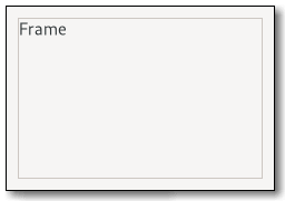
Figure: GtkFrame
If present, the label is drawn inside the top edge of the frame. The horizontal position of the label can be controlled with the gtk:frame-label-xalign function.
The gtk:frame widget clips its child widget. You can use this to add rounded corners to widgets, but be aware that it also cuts off shadows. See the gtk:aspect-frame widget for a frame that constrains its child to a particular aspect ratio.
Example: A UI definition fragment with a gtk:frame widget
<object class="GtkFrame"> <child type="label"> <object class="GtkLabel" id="frame-label"/> </child> <child> <object class="GtkEntry" id="frame-content"/> </child> </object>
frame ├── <label widget> ╰── <child>The gtk:frame implementation has a main CSS node with name frame, which is used to draw the visible border. You can set the appearance of the border using CSS properties like border-style on this node.
The frame will have a gtk:label widget for the label widget if a non-nil argument was passed to the gtk:frame-new function.
GtkSeparator
Figure: GtkSeparator
The gtk:separator widget can be used to group the widgets within a window. It displays a line with a shadow to make it appear sunken into the interface.
GtkSnapshot
The node at the top of the stack is the the one that the snapshot functions operate on. Use the gtk:snapshot-push-... functions and gtk:snapshot-pop function to change the current node.
The typical way to obtain a gtk:snapshot object is as an argument to the gtk:widget-snapshot virtual function. If you need to create your own gtk:snapshot object, use the gtk:snapshot-new function.
After calling this function, it is no longer possible to add more nodes to snapshot.
pixel = transpose(matrix) * pixel + offsetfor every pixel. The transformation operates on unpremultiplied colors, with color components ordered R, G, B, A.
The image is recorded until the next call to the gtk:snapshot-pop function.
Calling this function requires two subsequent calls to the gtk:snapshot-pop function.
Calling this function requires two subsequent calls to the gtk:snapshot-pop function.
Calling this function requires two subsequent calls to the gtk:snapshot-pop function.
Since 4.10
Since 4.14
Note that the strokes are subject to the same transformation as everything else, so uneven scaling will cause horizontal and vertical strokes to have different widths.
If you want to stroke the path with a color, the gtk:snapshot-append-stroke function may be more convenient.
Since 4.14
It is necessary to clear all saved states with corresponding calls to the gtk:snapshot-restore function.
To rotate around axes other than the Z axis, use the gsk:transform-rotate-3d function.
(defmethod color-swatch-snapshot-impl ((swatch color-swatch) snapshot)
(let ((width (gtk:widget-width swatch))
(height (gtk:widget-height swatch))
(color (color-swatch-color swatch)))
(graphene:with-rect (bounds 0 0 width height)
(gtk:snapshot-append-color snapshot color bounds)))) Note that if the layout does not produce any visible output, then nodes may not be added to the snapshot.
Since 4.10
Since 4.14
Since 4.14
GtkTooltip
When you need a tooltip with a little more fancy contents, like adding an image, or you want the tooltip to have different contents per gtk:tree-view row or cell, you will have to do a little more work:
- Set the has-tooltip property to true, this will make GTK monitor the widget for motion and related events which are needed to determine when and where to show a tooltip.
- Connect to the "query-tooltip" signal. The signal will be emitted when a tooltip is supposed to be shown. One of the arguments passed to the signal handler is a gtk:tooltip object. This is the object that we are about to display as a tooltip, and can be manipulated in your callback function using functions like the gtk:tooltip-set-icon function. There are functions for setting the markup of the tooltip, setting an image from a stock icon, or even putting in a custom widget.
- Return true from your "query-tooltip" signal handler. This causes the tooltip to be show. If you return false, it will not be shown.
For setting tooltips on the gtk:tree-view widget, please refer to the gtk:tree-view-set-tooltip-row and gtk:tree-view-set-tooltip-cell convenience functions for this.
GtkWidgetPaintable
The gtk:widget-paintable object will also take care of the widget not being in a state where it can be drawn, like when it is not shown, and just draw nothing or where it does not have a size, like when it is hidden, and report no size in that case.
The gtk:widget-paintable object allows you to monitor widgets for size changes by emitting the "invalidate-size" signal whenever the size of the widget changes as well as for visual changes by emitting the "invalidate-contents" signal whenever the widget changes.
You can use a gtk:widget-paintable object everywhere a gdk:paintable object is allowed, including using it on a gtk:picture widget, or one of its parents, that it was set on itself via the gtk:picture-paintable function. The paintable will take care of recursion when this happens. If you do this however, ensure the can-shrink property is set to true or you might end up with an infinitely growing widget.
GtkWindowControls
Figure: GtkWindowControls
The gtk:window-controls widget only displays start or end side of the controls, see the side property, so it is intended to be always used in pair with another gtk:window-controls widget using the opposite side, for example:
<object class="GtkBox">
<child>
<object class="GtkWindowControls">
<property name="side">start</property>
</object>
</child>
...
<child>
<object class="GtkWindowControls">
<property name="side">end</property>
</object>
</child>
</object> windowcontrols ├── [image.icon] ├── [button.minimize] ├── [button.maximize] ╰── [button.close]The gtk:window-controls implementation has a CSS node called windowcontrols. It contains subnodes corresponding to each title button. Which of the title buttons exist and where they are placed exactly depends on the desktop environment and the decoration-layout property. When the empty property is true, it gets the .empty style class.
The format of the string is button names, separated by commas. A colon separates the buttons that should appear on the left from those on the right. Recognized button names are minimize, maximize, close and icon (the window icon).
For example, "icon:minimize,maximize,close" specifies a icon on the left, and Minimize, Maximize and Close buttons on the right.
If the side property is the :start value from the gtk:pack-type enumeration, object will display the part before the colon, otherwise after that.
Since 4.18
GtkWindowHandle
GTK Core Reference
Library initialization and main loop
Like most GUI toolkits, GTK uses an event-driven programming model. When the application is doing nothing, GTK sits in the "main loop" and waits for input. If the user performs some action - say, a mouse click - then the main loop "wakes up" and delivers an event to GTK. GTK forwards the event to one or more widgets.
When widgets receive an event, they frequently emit one or more "signals". Signals notify your program that something interesting happened by invoking functions you have connected to the signal with the g:signal-connect function. Functions connected to a signal are often called "callbacks".
When your callbacks are invoked, you would typically take some action - for example, when an Open button is clicked you might display a gtk:file-chooser-dialog widget. After a callback finishes, GTK will return to the main loop and await more user input.
It is important to note that if you use the gtk:application class, the application class will take care of initializing GTK for you, as well as spinning the main loop.
Functions for library initialization
If you are using the gtk:application class, you do not have to call the gtk:init or gtk:init-check functions. The "startup" handler does it for you.
This function will terminate your program if it was unable to initialize the windowing system for some reason. If you want your program to fall back to a textual interface you want to call the gtk:init-check function instead.
GTK calls signal(SIGPIPE, SIG_IGN) during initialization, to ignore SIGPIPE signals, since these are almost never wanted in graphical applications. If you do need to handle SIGPIPE for some reason, reset the handler after the gtk:init call, but notice that other libraries, for example, libdbus or gvfs, might do similar things.
This way the application can fall back to some other means of communication with the user - for example a curses or command line interface.
Most programs should not need to call this function.
This function is equivalent to the pango:language-default function. See that function for details.
(setq lang (gtk:default-language))
=> #<PANGO-LANGUAGE {C7B3C51}>
(pango:language-to-string lang)
=> "de-de" GTK sets the default text direction according to the locale during the gtk:init function, and you should normally use the gtk:widget-direction or gtk:widget-default-direction functions to obtain the current direction.
This function is only needed rare cases when the locale is changed after GTK has already been initialized.
(setf (gtk:widget-default-direction) (gtk:locale-direction)) => :LTR
Version Information
Functions for version information
(gtk:cl-cffi-gtk-build-info) => cl-cffi-gtk version: 0.9.0 cl-cffi-gtk build date: 15:1 2/28/2025 GTK version: 4.16.3 GLIB version: 2.82.1 GDK-Pixbuf version: 2.42.12 Pango version: 1.54.0 Cairo version: 1.18.2 Machine type: X86-64 Machine version: NIL Software type: Win32 Software version: 6.2.9200 Lisp implementation type: SBCL Lisp implementation version: 2.0.0 NIL
GtkSettings
(gobject:define-genum "GtkSystemSetting" system-setting (:export t :type-initializer "gtk_system_setting_get_type") :dpi :font-name :font-config :display :icon-theme)
- :dpi
- The gtk-xft-dpi setting has changed.
- :font-name
- The gtk-font-name setting has changed.
- :font-config
- The font configuration has changed in a way that requires text to be redrawn. This can be any of the gtk-xft-antialias, gtk-xft-hinting, gtk-xft-hintstyle gtk-xft-rgba or gtk-fontconfig-timestamp settings.
- :display
- The display has changed.
- :icon-theme
- The icon theme has changed in a way that requires icons to be looked up again.
(gobject:define-genum "GtkFontRendering" font-rendering (:export t :type-initializer "gtk_font_rendering_get_type") (:automatic 0) (:manual 1))
- :automatic
- Set up font rendering automatically, taking factors like screen resolution and scale into account.
- :manual
- Follow low-level font-related settings when configuring font rendering.
- gtk:settings-gtk-alternative-button-order
- gtk:settings-gtk-alternative-sort-arrows
- gtk:settings-gtk-application-prefer-dark-theme
- gtk:settings-gtk-cursor-aspect-ratio
- gtk:settings-gtk-cursor-blink
- gtk:settings-gtk-cursor-blink-time
- gtk:settings-gtk-cursor-blink-timeout
- gtk:settings-gtk-cursor-theme-name
- gtk:settings-gtk-cursor-theme-size
- gtk:settings-gtk-decoration-layout
- gtk:settings-gtk-dialogs-use-header
- gtk:settings-gtk-dnd-drag-threshold
- gtk:settings-gtk-double-click-distance
- gtk:settings-gtk-double-click-time
- gtk:settings-gtk-enable-accels
- gtk:settings-gtk-enable-animations
- gtk:settings-gtk-enable-event-sounds
- gtk:settings-gtk-enable-input-feedback-sounds
- gtk:settings-gtk-enable-primary-paste
- gtk:settings-gtk-entry-password-hint-timeout
- gtk:settings-gtk-entry-select-on-focus
- gtk:settings-gtk-error-bell
- gtk:settings-gtk-font-name
- gtk:settings-gtk-font-rendering
- gtk:settings-gtk-fontconfig-timestamp
- gtk:settings-gtk-icon-theme-name
- gtk:settings-gtk-im-module
- gtk:settings-gtk-interface-color-scheme
- gtk:settings-gtk-interface-contrast
- gtk:settings-gtk-keynav-use-caret
- gtk:settings-gtk-label-select-on-focus
- gtk:settings-gtk-long-press-time
- gtk:settings-gtk-overlay-scrolling
- gtk:settings-gtk-primary-button-warps-slider
- gtk:settings-gtk-print-backends
- gtk:settings-gtk-print-preview-command
- gtk:settings-gtk-recent-files-enabled
- gtk:settings-gtk-recent-files-max-age
- gtk:settings-gtk-shell-shows-app-menu
- gtk:settings-gtk-shell-shows-desktop
- gtk:settings-gtk-shell-shows-menubar
- gtk:settings-gtk-show-status-shapes
- gtk:settings-gtk-sound-theme-name
- gtk:settings-gtk-split-cursor
- gtk:settings-gtk-theme-name
- gtk:settings-gtk-titlebar-double-click
- gtk:settings-gtk-titlebar-middle-click
- gtk:settings-gtk-titlebar-right-click
- gtk:settings-gtk-xft-antialias
- gtk:settings-gtk-xft-dpi
- gtk:settings-gtk-xft-hinting
- gtk:settings-gtk-xft-hintstyle
- gtk:settings-gtk-xft-rgba
On the X window system, this sharing is realized by an XSettings manager that is usually part of the desktop environment, along with utilities that let the user change these settings. On Wayland, the settings are obtained either via a settings portal, or by reading desktop settings from DConf.
In the absence of these sharing mechanisms, GTK reads default values for settings from settings.ini files in /etc/gtk-4.0, $XDG_CONFIG_DIRS/gtk-4.0 and $XDG_CONFIG_HOME/gtk-4.0. These files must be valid key files, see the g:key-file API, and have a section called "Settings". Themes can also provide default values for settings by installing a settings.ini file next to their gtk.css file.
Applications can override system-wide settings with the accessor functions of the slots. This should be restricted to special cases though. The gtk:settings settings are not meant as an application configuration facility.
There is one gtk:settings instance per display. It can be obtained with the gtk:settings-for-display function, but in many cases, it is more convenient to use the gtk:widget-settings function.
The format of the string is button names, separated by commas. A colon separates the buttons that should appear on the left from those on the right. Recognized button names are "minimize", "maximize", "close", "icon" (the window icon) and "menu" (a menu button for the fallback app menu).
For example, "menu:minimize,maximize,close" specifies a menu on the left, and Minimize, Maximize and Close buttons on the right.
Note that buttons will only be shown when they are meaningful. For example, a menu button only appears when the desktop shell does not show the app menu, and a Close button only appears on a window that can be closed.
Also note that the setting can be overridden with the decoration-layout property of the header bar.
Since 4.6
Since 4.20
Since 4.20
Since 4.14
Standard Enumerations
(gobject:define-genum "GtkAlign" align (:export t :type-initializer "gtk_align_get_type") (:fill 0) (:start 1) (:end 2) (:center 3) #+gtk-4-12 (:baseline-fill 4) #-gtk-4-12 (:baseline 4) #+gtk-4-12 (:baseline-center 5))
- :fill
- Stretch to fill all space if possible, center if no meaningful way to stretch.
- :start
- Snap to left or top side, leaving space on right or bottom.
- :end
- Snap to right or bottom side, leaving space on left or top.
- :center
- Center natural width of widget inside the allocation.
- :baseline-fill
- A different name for :baseline. Since 4.12
- :baseline
- Align the widget according to the baseline. Deprecated 4.12: Use :baseline-fill instead.
- :baseline-center
- Stretch to fill all space, but align the baseline. Since 4.12
Note that in horizontal context the :start and :end values are interpreted relative to text direction.
The :baseline support is optional for containers and widgets, and it is only supported for vertical alignment. The :baseline-center and :baseline-fill values are treated similar to the :center and :fill values, except that it positions the widget to line up the baselines, where that is supported.
(gobject:define-genum "GtkBaselinePosition" baseline-position (:export t :type-initializer "gtk_baseline_position_get_type") (:top 0) (:center 1) (:bottom 2))
- :top
- Align the baseline at the top.
- :center
- Center the baseline.
- :bottom
- Align the baseline at the bottom.
(gobject:define-genum "GtkDeleteType" delete-type (:export t :type-initializer "gtk_delete_type_get_type") (:chars 0) (:word-ends 1) (:words 2) (:display-lines 3) (:display-line-ends 4) (:paragraph-ends 5) (:paragraphs 6) (:whitespace 7))
- :chars
- Delete characters.
- :word-ends
- Delete only the portion of the word to the left/right of cursor if we are in the middle of a word.
- :words
- Delete words.
- :display-lines
- Delete display-lines. Display-lines refers to the visible lines, with respect to to the current line breaks. As opposed to paragraphs, which are defined by line breaks in the input.
- :display-line-ends
- Delete only the portion of the display-line to the left/right of cursor.
- :paragraph-ends
- Delete to the end of the paragraph. Like C-k in Emacs (or its reverse).
- :paragraphs
- Delete entire line. Like C-k in pico.
- :whitespace
- Delete only whitespace. Like M-\ in Emacs.
(gobject:define-genum "GtkDirectionType" direction-type (:export t :type-initializer "gtk_direction_type_get_type") (:tab-forward 0) (:tab-backward 1) (:up 2) (:down 3) (:left 4) (:right 5))
- :tab-forward
- Move forward.
- :tab-backward
- Move backward.
- :up
- Move up.
- :down
- Move down.
- :left
- Move left.
- :right
- Move right.
(gobject:define-genum "GtkIconSize" icon-size (:export t :type-initializer "gtk_icon_size_get_type") (:inherit 0) (:normal 1) (:large 2))
- :inherit
- Keep the size of the parent element.
- :normal
- Size similar to text size.
- :large
- Large size, for example in an icon view.
All widgets which use the gtk:icon-size enumeration set the .normal-icons or .large-icons style classes correspondingly, and let themes determine the actual size to be used with the -gtk:icon-size CSS property.
(gobject:define-genum "GtkResponseType" response-type (:export t :type-initializer "gtk_response_type_get_type") (:none -1) (:reject -2) (:accept -3) (:delete-event -4) (:ok -5) (:cancel -6) (:close -7) (:yes -8) (:no -9) (:apply -10) (:help -11))
- :none
- Returned if an action widget has no response ID, or if the dialog gets programmatically hidden or destroyed.
- :reject
- Generic response ID, not used by GTK dialog.
- :accept
- Generic response ID, not used by GTK dialog.
- :delete-event
- Returned if the dialog is deleted.
- :ok
- Returned by OK buttons in GTK dialog.
- :cancel
- Returned by Cancel buttons in GTK dialog.
- :close
- Returned by Close buttons in GTK dialog.
- :yes
- Returned by Yes buttons in GTK dialog.
- :no
- Returned by No buttons in GTK dialog.
- :apply
- Returned by Apply buttons in GTK dialog.
- :help
- Returned by Help buttons in GTK dialog.
(gobject:define-genum "GtkSensitivityType" sensitivity-type (:export t :type-initializer "gtk_sensitivity_type_get_type") (:auto 0) (:on 1) (:off 2))
- :auto
- The control is made insensitive if no action can be triggered.
- :on
- The control is always sensitive.
- :off
- The control is always insensitive.
(gobject:define-genum "GtkTextDirection" text-direction (:export t :type-initializer "gtk_text_direction_get_type") (:none 0) (:ltr 1) (:rtl 2))
- :none
- No direction.
- :ltr
- Left to right text direction.
- :rtl
- Right to left text direction.
(gobject:define-genum "GtkJustification" justification (:export t :type-initializer "gtk_justification_get_type") (:left 0) (:right 1) (:center 2) (:fill 3))
- :left
- The text is placed at the left edge of the label.
- :right
- The text is placed at the right edge of the label.
- :center
- The text is placed in the center of the label.
- :fill
- The text is distributed across the label.
(gobject:define-genum "GtkMessageType" message-type (:export t :type-initializer "gtk_message_type_get_type") (:info 0) (:warning 1) (:question 2) (:error 3) (:other 4))
- :info
- Informational message.
- :warning
- Non-fatal warning message.
- :question
- Question requiring a choice.
- :error
- Fatal error message.
- :other
- None of the above.
(gobject:define-genum "GtkMovementStep" movement-step (:export t :type-initializer "gtk_movement_step_get_type") (:logical-positions 0) (:visual-positions 1) (:words 2) (:display-lines 3) (:display-line-ends 4) (:paragraphs 5) (:paragraph-ends 6) (:pages 7) (:buffer-ends 8) (:horizontal-pages 9))
- :logical-positions
- Move forward or back by graphemes.
- :visual-positions
- Move left or right by graphemes.
- :words
- Move forward or back by words.
- :display-lines
- Move up or down lines (wrapped lines).
- :display-line-ends
- Move to either end of a line.
- :paragraphs
- Move up or down paragraphs (newline-ended lines).
- :paragraph-ends
- Move to either end of a paragraph.
- :pages
- Move by pages.
- :buffer-ends
- Move to ends of the buffer.
- :horizontal-pages
- Move horizontally by pages.
(gobject:define-genum "GtkNaturalWrapMode" natural-wrap-mode (:export t :type-initializer "gtk_natural_wrap_mode_get_type") (:inherit 0) (:none 1) (:word 2))
- :inherit
- Inherit the minimum size request. In particular, this should be used with the :char value of the pango:wrap-mode enumeration.
- :none
- Try not to wrap the text. This mode is the closest to the behavior of GTK 3 but can lead to a wide label leaving lots of empty space below the text.
- :word
- Attempt to wrap at word boundaries. This is useful in particular when using the :word-char value of the pango:wrap-mode enumeration as the wrap mode.
Since 4.6
(gobject:define-genum "GtkOrientation" orientation (:export t :type-initializer "gtk_orientation_get_type") (:horizontal 0) (:vertical 1))
- :horizontal
- The object is in horizontal orientation.
- :vertical
- The object is in vertical orientation.
(gobject:define-genum "GtkOverflow" overflow (:export t :type-initializer "gtk_overflow_get_type") (:visible 0) (:hidden 1))
- :visible
- No change is applied. Content is drawn at the specified position.
- :hidden
- Content is clipped to the bounds of the area. Content outside the area is not drawn and cannot be interacted with.
(gobject:define-genum "GtkPackType" pack-type (:export t :type-initializer "gtk_pack_type_get_type") (:start 0) (:end 1))
- :start
- The child is packed into the start of the widget.
- :end
- The child is packed into the end of the widget.
(gobject:define-genum "GtkPositionType" position-type (:export t :type-initializer "gtk_position_type_get_type") (:left 0) (:right 1) (:top 2) (:bottom 3))
- :left
- The feature is at the left edge.
- :right
- The feature is at the right edge.
- :top
- The feature is at the top edge.
- :bottom
- The feature is at the bottom edge.
(gobject:define-genum "GtkScrollType" scroll-type (:export t :type-initializer "gtk_scroll_type_get_type") (:none 0) (:jump 1) (:step-backward 2) (:step-forward 3) (:page-backward 4) (:page-forward 5) (:step-up 6) (:step-down 7) (:page-up 8) (:page-down 9) (:step-left 10) (:step-right 11) (:page-left 12) (:page-right 13) (:start 14) (:end 15))
(gobject:define-genum "GtkSelectionMode" gtk:selection-mode (:export t :type-initializer "gtk_selection_mode_get_type") (:none 0) (:single 1) (:browse 2) (:multiple 3))
- :none
- No selection is possible.
- :single
- Zero or one element may be selected.
- :browse
- Exactly one element is selected. In some circumstances, such as initially or during a search operation, it is possible for no element to be selected with the :browse value. What is really enforced is that the user cannot deselect a currently selected element except by selecting another element.
- :multiple
- Any number of elements may be selected. The Ctrl key may be used to enlarge the selection, and the Shift key to select between the focus and the child pointed to. Some widgets may also allow Click-drag to select a range of elements.
(gobject:define-genum "GtkWrapMode" wrap-mode (:export t :type-initializer "gtk_wrap_mode_get_type") (:none 0) (:char 1) (:word 2) (:word-char 3))
- :none
- Do not wrap lines, just make the text area wider.
- :char
- Wrap text, breaking lines anywhere the cursor can appear between characters, usually. If you want to be technical, between graphemes, see the pango:log-attrs function.
- :word
- Wrap text, breaking lines in between words.
- :word-char
- Wrap text, breaking lines in between words, or if that is not enough, also between graphemes.
(gobject:define-genum "GtkSortType" sort-type (:export t :type-initializer "gtk_sort_type_get_type") (:ascending 0) (:descending 1))
- :ascending
- Sorting is in ascending order.
- :descending
- Sorting is in descending order.
(gobject:define-genum "GtkOrdering" ordering (:export t :type-initializer "gtk_ordering_get_type") (:smaller -1) (:equal 0) (:larger 1))
- :smaller
- The first value is smaller than the second.
- :equal
- The two values are equal.
- :larger
- The first value is larger than the second.
(gobject:define-genum "GtkSizeRequestMode" size-request-mode (:export t :type-initializer "gtk_size_request_mode_get_type") (:height-for-width 0) (:width-for-height 1) (:constant-size 2))
- :height-for-width
- Prefer height-for-width geometry management.
- :width-for-height
- Prefer width-for-height geometry management.
- :constant-size
- Do not trade height-for-width or width-for-height geometry management.
(gobject:define-gflags "GtkStateFlags" state-flags (:export t :type-initializer "gtk_state_flags_get_type") (:normal 0) (:active #.(ash 1 0)) (:prelight #.(ash 1 1)) (:selected #.(ash 1 2)) (:insensitive #.(ash 1 3)) (:inconsistent #.(ash 1 4)) (:focused #.(ash 1 5)) (:backdrop #.(ash 1 6)) (:dir-ltr #.(ash 1 7)) (:dir-rtl #.(ash 1 8)) (:link #.(ash 1 9)) (:visited #.(ash 1 10)) (:checked #.(ash 1 11)) (:drop-active #.(ash 1 12)) (:focus-visible #.(ash 1 13)) (:focus-within #.(ash 1 14)))
- :normal
- State during normal operation.
- :active
- Widget is active.
- :prelight
- Widget has a mouse pointer over it.
- :selected
- Widget is selected.
- :insensitive
- Widget is insensitive.
- :inconsistent
- Widget is inconsistent.
- :focused
- Widget has the keyboard focus.
- :backdrop
- Widget is in a background toplevel window.
- :dir-ltr
- Widget is in left-to-right text direction.
- :dir-rtl
- Widget is in right-to-left text direction.
- :link
- Widget is a link.
- :visited
- The location the widget points to has already been visited.
- :checked
- Widget is checked.
- :drop-active
- Widget is highlighted as a drop target for DND.
- :focus-visible
- Widget has the visible focus.
- :focus-within
- Widget contains the keyboard focus.
(gobject:define-genum "GtkBorderStyle" border-style (:export t :type-initializer "gtk_border_style_get_type") :none :hidden :solid :inset :outset :dotted :dashed :double :groove :ridge)
- :none
- No visible border.
- :hidden
- Same as the :none value.
- :solid
- A single line segment.
- :inset
- Looks as if the content is sunken into the canvas.
- :outset
- Looks as if the content is coming out of the canvas.
- :dotted
- A series of round dots.
- :dashed
- A series of square-ended dashes.
- :double
- Two parrallel lines with some space between them.
- :groove
- Looks as if it were carved in the canvas.
- :ridge
- Looks as if it were coming out of the canvas.
(gobject:define-genum "GtkInputPurpose" input-purpose (:export t :type-initializer "gtk_input_purpose_get_type") (:free-form 0) (:alpha 1) (:digits 2) (:number 3) (:phone 4) (:url 5) (:email 6) (:name 7) (:password 8) (:pin 9) (:terminal 10))
- :free-form
- Allow any character.
- :alpha
- Allow only alphabetic characters.
- :digits
- Allow only digits.
- :number
- Edited field expects numbers.
- :phone
- Edited field expects phone number.
- :url
- Edited field expects URL.
- Edited field expects email address.
- :name
- Edited field expects the name of a person.
- :password
- Like :free-form, but characters are hidden.
- :pin
- Like :digits, but characters are hidden.
- :terminal
- Allow any character, in addition to control codes.
Note that the purpose is not meant to impose a totally strict rule about allowed characters, and does not replace input validation. It is fine for an on-screen keyboard to let the user override the character set restriction that is expressed by the purpose. The application is expected to validate the text entry contents, even if it specified a purpose.
The difference between the :digits and :number values is that the former accepts only digits while the latter also some punctuation, like commas or points, plus, minus, and 'e' or 'E' as in 3.14E+000.
This enumeration may be extended in the future. Input methods should interpret unknown values as 'free form'.
(gobject:define-gflags "GtkInputHints" input-hints (:export t :type-initializer "gtk_input_hints_get_type") (:none 0) (:spellcheck #.(ash 1 0)) (:no-spellcheck #.(ash 1 1)) (:word-completion #.(ash 1 2)) (:lowercase #.(ash 1 3)) (:uppercase-chars #.(ash 1 4)) (:uppercase-words #.(ash 1 5)) (:uppercase-sentences #.(ash 1 6)) (:inhibit-osk #.(ash 1 7)) (:vertical-writing #.(ash 1 8)) (:emoji #.(ash 1 9)) (:no-emoji #.(ash 1 10)) (:private #.(ash 1 11)))
- :none
- No special behaviour suggested.
- :spellcheck
- Suggest checking for typos.
- :no-spellcheck
- Suggest not checking for typos.
- :word-completion
- Suggest word completion.
- :lowercase
- Suggest to convert all text to lowercase.
- :uppercase-chars
- Suggest to capitalize all text.
- :uppercase-words
- Suggest to capitalize the first character of each word.
- :uppercase-sentences
- Suggest to capitalize the first word of each sentence.
- :inhibit-osk
- Suggest to not show an onscreen keyboard, for example, for a calculator that already has all the keys.
- :vertical-writing
- The text is vertical.
- :emoji
- Suggest offering Emoji support.
- :no-emoji
- Suggest not offering Emoji support.
- :private
- Request that the input method should not update personalized data (like typing history).
Some common sense is expected when using these flags - mixing :lowercase with any of the uppercase hints makes no sense.
This flags may be extended in the future. Input methods should ignore unknown values.
(gobject:define-gflags "GtkPickFlags" pick-flags (:export t :type-initializer "gtk_pick_flags_get_type") (:default 0) (:insensitive #.(ash 1 0)) (:non-targetable #.(ash 1 1)))
- :default
- The default behavior, include widgets that are receiving events.
- :insensitive
- Include widgets that are insensitive.
- :non-targetable
- Include widgets that are marked as non-targetable. See the can-target property.
(gobject:define-genum "GtkConstraintRelation" constraint-relation (:export t :type-initializer "gtk_constraint_relation_get_type") (:le -1) (:eq 0) (:ge 1))
- :le
- Less than, or equal
- :eq
- Equal
- :ge
- Greater than, or equal
(gobject:define-genum "GtkConstraintStrength" constraint-strength (:export t :type-initializer "gtk_constraint_strength_get_type") (:required 1001001000) (:strong 1000000000) (:medium 1000) (:weak 1))
- :required
- The constraint is required towards solving the layout.
- :strong
- A strong constraint.
- :medium
- A medium constraint.
- :weak
- A weak constraint.
(gobject:define-genum "GtkConstraintAttribute" constraint-attribute (:export t :type-initializer "gtk_constraint_attribute_get_type") :none :left :right :top :bottom :start :end :width :height :center-x :center-y :baseline)
- :none
- No attribute, used for constant relations.
- :left
- The left edge of a widget, regardless of text direction.
- :right
- The right edge of a widget, regardless of text direction.
- :top
- The top edge of a widget.
- :bottom
- The bottom edge of a widget.
- :start
- The leading edge of a widget, depending on text direction. Equivalent to the :left value for LTR languages, and the :right value for RTL ones.
- :end
- The trailing edge of a widget, depending on text direction. Equivalent to the :right value for LTR languages, and the :left value for RTL ones.
- :width
- The width of a widget.
- :height
- The height of a widget.
- :center-x
- The center of a widget, on the horizontal axis.
- :center-y
- The center of a widget, on the vertical axis.
- :baseline
- The baseline of a widget.
(gobject:define-genum "GtkConstraintVflParserError" constraint-vfl-parser-error (:export t :type-initializer "gtk_constraint_vfl_parser_error") :invalid-symbol :invalid-attribute :invalid-view :invalid-metric :invalid-priority :invalid-relation)
- :invalid-symbol
- Invalid or unknown symbol.
- :invalid-attribute
- Invalid or unknown attribute.
- :invalid-view
- Invalid or unknown view.
- :invalid-metric
- Invalid or unknown metric.
- :invalid-priority
- Invalid or unknown priority.
- :invalid-relation
- Invalid or unknown relation.
(gobject:define-genum "GtkSymbolicColor" symbolic-color (:export t :type-initializer "gtk_symbolic_color_get_type") (:foreground 0) (:error 1) (:warning 2) (:success 3))
- :foreground
- The default foreground color.
- :error
- Indication color for errors.
- :warning
- Indication color for warnings.
- :success
- Indication color for success.
Since 4.6
Theming in GTK
GtkStyleProvider
GTK uses the gtk:style-provider implementation for CSS in the gtk:css-provider implementation.
lambda (provider) :run-last
- provider
- The gtk:style-provider object that received the signal.
GtkCssLocation
(cffi:defcstruct css-location (bytes :size) (chars :size) (lines :size) (line-bytes :size) (line-chars :size))
- bytes
- Number of bytes parsed since the beginning.
- chars
- Number of characters parsed since the beginning.
- lines
- Number of full lines that have been parsed. If you want to display this as a line number, you need to add 1 to this.
- line-bytes
- Number of bytes parsed since the last line break.
- line-chars
- Number of characters parsed since the last line break.
Note that the lines parameter starts from 0 and is increased whenever a CSS line break is encountered. CSS defines the C character sequences "\r\n", "\r", "\n" and "\f" as newlines. If your document uses different rules for line breaking, you might want run into problems here. See the gtk:css-section documentation for an example.
GtkCssSection
(glib:define-gboxed-opaque css-section "GtkCssSection" :export t :type-initializer "gtk_css_section_get_type" :alloc (error "GtkCssSection cannot be created from the Lisp side"))
(g:signal-connect provider "parsing-error"
(lambda (provider section err)
(declare (ignore provider err))
(let* ((startloc (gtk:css-section-start-location section))
(start (gtk:text-buffer-iter-at-line-index
text
(gtk:css-location-lines startloc)
(gtk:css-location-line-bytes startloc)))
(endloc (gtk:css-section-end-location section))
(end (gtk:text-buffer-iter-at-line-index
text
(gtk:css-location-lines endloc)
(gtk:css-location-line-bytes endloc))))
(gtk:text-buffer-apply-tag text "error" start end)
gdk:+event-stop+))) Since 4.16
Since 4.16
GtkCssProvider
(gobject:define-genum "GtkInterfaceColorScheme" interface-color-scheme (:export t :type-initializer "gtk_interface_color_scheme_get_type") (:unsupported 0) (:default 1) (:dark 2) (:light 3))
- :unsupported
- The system does not support color schemes.
- :default
- The default color scheme is used.
- :dark
- A dark color scheme is used.
- :light
- A light color scheme is used.
More values may be added to this enumeration. Unknown values should be treated the same as the :default value.
Since 4.20
(gobject:define-genum "GtkInterfaceContrast" interface-contrast (:export t :type-initializer "gtk_interface_contrast_get_type") (:unsupported 0) (:no-preference 1) (:more 2) (:less 3))
- :unsupported
- The system does not support contrast levels.
- :no-preference
- No particular preference for contrast.
- :more
- More contrast is preferred.
- :less
- Less contrast is preferred.
More values may be added to this enumeration. Unknown values should be treated the same as the :no-preference value.
Since 4.20
An application can make GTK parse a specific CSS style sheet by calling the gtk:css-provider-load-from-file or gtk:css-provider-load-from-resource functions and adding the provider with the gtk:style-context-add-provider or gtk:style-context-add-provider-for-display functions.
In addition, certain files will be read when GTK is initialized. First, the $XDG_CONFIG_HOME/gtk-4.0/gtk.css file is loaded if it exists. Then, GTK loads the first existing file among XDG_DATA_HOME/themes/THEME/gtk-VERSION/gtk-VARIANT.css, $HOME/.themes/THEME/gtk-VERSION/gtk:VARIANT.css, $XDG_DATA_DIRS/themes/THEME/gtk-VERSION/gtk-VARIANT.css and DATADIR/share/themes/THEME/gtk-VERSION/gtk-VARIANT.css, where THEME is the name of the current theme, see the gtk-icon-theme-name setting, VARIANT is the variant to load, see the gtk-application-prefer-dark-theme setting, DATADIR is the prefix configured when GTK was compiled (unless overridden by the GTK_DATA_PREFIX environment variable), and VERSION is the GTK version number. If no file is found for the current version, GTK tries older versions all the way back to 4.0.
To track errors while loading CSS, connect to the "parsing-error" signal.
lambda (provider section error) :run-last
- provider
- The gtk:css-provider object that had a parsing error.
- section
- The gtk:css-section instance the error happened in.
- error
- The glib:error instance for the parsing error.
Note that this signal may be emitted at any time as the CSS provider may opt to defer parsing parts or all of the input to a later time than when a loading function was called.
This setting is be available for media queries in CSS:
@media (prefers-color-scheme: dark) {
// some dark mode styling
}
Changing this setting will reload the style sheet.Since 4.20
When set to :more or :less, the UI is rendered in high or low contrast. When set to :no-preference (the default), the user interface will be rendered in default mode.
This setting is be available for media queries in CSS:
@media (prefers-contrast: more) {
// some style with high contrast
}
Changing this setting will reload the style sheet.Since 4.20
Since 4.12
Since 4.12
GtkIconPaintable
These 4 colors are the foreground color, and the colors to use for errors, warnings and success information in that order. More colors may be added in the future.
Since 4.6
Since 4.6
When an icon looked up in the icon theme was not available, the icon theme may use fallback icons - either those specified to the gtk:icon-theme-lookup-icon function or the always-available "image-missing". The icon chosen is returned by this function.
If the icon was created without an icon theme, this function returns nil.
GtkIconTheme
(gobject:define-gflags "GtkIconLookupFlags" icon-lookup-flags (:export t :type-initializer "gtk_icon_lookup_flags_get_type") (:none 0) (:force-regular #.(ash 1 0)) (:force-symbolic #.(ash 1 1)) (:preload #.(ash 1 2)))
- :none
- Perform a regular lookup. Since 4.18
- :force-regular
- Try to always load regular icons, even when symbolic icon names are given.
- :force-symbolic
- Try to always load symbolic icons, even when regular icon names are given.
- :preload
- Starts loading the texture in the background so it is ready when later needed.
In many cases, named themes are used indirectly, via the gtk:image widget rather than directly, but looking up icons directly is also simple. The gtk:icon-theme object acts as a database of all the icons in the current theme. You can create new gtk:icon-theme objects, but it is much more efficient to use the standard icon theme of the gtk:widget widget so that the icon information is shared with other people looking up icons.
(let* ((theme (gtk:icon-theme-for-display (gdk:display-default)))
(paintable (gtk:icon-theme-lookup-icon theme
"gtk-ok" ; icon name
nil ; fallbacks
48 ; size
1 ; scale
:none))) ; no flags
... ) lambda (theme) :run-last
- theme
- The gtk:icon-theme object that received the signal.
The resources are considered as part of the hicolor icon theme and must be located in subdirectories that are defined in the hicolor icon theme, such as @path/16x16/actions/run.png or @path/scalable/actions/run.svg.
Icons that are directly placed in the resource path instead of a subdirectory are also considered as ultimate fallback, but they are treated like unthemed icons.
In addition if an icon found is not found either in the current icon theme or the default icon theme, and an image file with the right name is found directly in one of the elements of path, then that image will be used for the icon name. This is legacy feature, and new icons should be put into the fallback icon theme, which is called hicolor, rather than directly on the icon path.
This function cannot be called on the icon theme objects returned from the gtk:icon-theme-for-display function.
If the icon name is not available and fallbacks are provided, they will be tried in order.
If no matching icon is found, then a paintable that renders the "missing icon" icon is returned. If you need to do something else for missing icons you need to use the gtk:icon-theme-has-icon function.
Note that you probably want to listen for icon theme changes and update the icon.
Deprecated
Deprecated since GTK 4.10
GtkDialog
(gobject:define-gflags "GtkDialogFlags" dialog-flags (:export t :type-initializer "gtk_dialog_flags_get_type") (:modal #.(ash 1 0)) (:destroy-with-parent #.(ash 1 1)) (:use-header-bar #.(ash 1 2)))
- :modal
- Make the constructed dialog modal.
- :destroy-with-parent
- Destroy the dialog when its parent is destroyed.
- :use-header-bar
- Create the dialog with actions in the header bar instead of an action area.
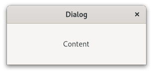
Figure: GtkDialog
The main area of a gtk:dialog widget is called the "content area", and is yours to populate with widgets such a gtk:label or a gtk:entry widget, to present your information, questions, or tasks to the user.
In addition, dialogs allow you to add "action widgets". Most commonly, action widgets are buttons. Depending on the platform, action widgets may be presented in the header bar at the top of the window, or at the bottom of the window. To add action widgets, create your gtk:dialog widget using the gtk:dialog-new-with-buttons function, or use the gtk:dialog-add-button, gtk:dialog-add-buttons, or gtk:dialog-add-action-widget functions.
The gtk:dialog widgets uses some heuristics to decide whether to add a Close button to the window decorations. If any of the action buttons use the :close or :cancel response ID, the Close button is omitted.
Clicking a button that was added as an action widget will emit the "response" signal with a response ID that you specified. GTK will never assign a meaning to positive response IDs. These are entirely user-defined. But for convenience, you can use the response IDs in the gtk:response-type enumeration, these all have values less than zero. If a dialog receives a delete event, the "response" signal will be emitted with the :delete-event response ID.
Dialogs are created with a call to the gtk:dialog-new function or the gtk:dialog-new-with-buttons function. The latter is recommended. It allows you to set the dialog title, some convenient flags, and add buttons.
A "modal" dialog, that is, one which freezes the rest of the application from user input, can be created by calling the gtk:window-modal function on the dialog. When using the gtk:dialog-new-with-buttons function, you can also pass the :modal flag to make a dialog modal.
;; Function to open a dialog to display the message provided.
(defun create-quick-message (parent msg)
(let ((dialog (gtk:dialog-new-with-buttons "Message"
parent
'(:destroy-with-parent :modal)
"OK"
:ok)))
(g:signal-connect dialog "response"
(lambda (widget response)
(declare (ignore response))
(gtk:window-destroy widget)))
(gtk:box-append (gtk:dialog-content-area dialog)
(make-instance 'gtk:label
:label msg
:margin-top 12
:margin-bottom 12
:margin-start 12
:margin-end 12))
(gtk:window-present dialog))) The gtk:dialog implementation supports a custom <action-widgets> element, which can contain multiple <action-widget> elements. The "response" attribute specifies a numeric response, and the content of the element is the ID of the widget, which should be a child of the action area of the dialog. To mark a response as default, set the "default" attribute of the <action-widget> element to true.
The gtk:dialog implementation supports adding action widgets by specifying "action" as the "type" attribute of a <child> element. The widget will be added either to the action area or the headerbar of the dialog, depending on the use-header-bar property. The response ID has to be associated with the action widget using the <action-widgets> element.
Example: A gtk:dialog UI definition fragment.
<object class="GtkDialog" id="dialog1">
<child type="action">
<object class="GtkButton" id="button_cancel"/>
</child>
<child type="action">
<object class="GtkButton" id="button_ok">
<property name="can-default">True</property>
</object>
</child>
<action-widgets>
<action-widget response="cancel">button_cancel</action-widget>
<action-widget response="ok" default="true">button_ok</action-widget>
</action-widgets>
</object> lambda (dialog) :action
- dialog
- The gtk:dialog widget on which the signal is emitted.
lambda (dialog response) :run-last
- dialog
- The gtk:dialog widget on which the signal is emitted.
- response
- The integer for the response ID.
Builtin gtk:dialog subclasses such as the gtk:color-chooser-dialog widget set the use-header-bar property according to platform conventions, using the gtk-dialogs-use-header setting.
Here is how you can achieve the same:
(let* ((settings (gtk:settings-default))
(setting (g:object-property settings "gtk-dialogs-use-header"))
(dialog (make-instance 'gtk:dialog
:use-header-bar setting)))
... ) After the flags argument, button text/response ID pairs should be listed. Button text can be arbitrary text. A response ID can be any positive number, or one of the values in the gtk:response-type enumeration. If the user clicks one of these dialog buttons, the gtk:dialog widget will emit the "response" signal with the corresponding response ID. If a gtk:dialog widget receives a delete event, it will emit the "response" signal with a :delete-event response ID. However, destroying a dialog does not emit the "response" signal. So be careful relying on the "response" signal when using the :destroy-with-parent flag. Buttons are from left to right, so the first button in the list will be the leftmost button in the dialog.
(let ((dialog (gtk:dialog-new-with-buttons "My dialog"
main-app-window
'(:modal :destroy-with-parent)
"_OK"
:accept
"_Cancel"
:reject)))
... ) GtkMessageDialog
(gobject:define-genum "GtkButtonsType" buttons-type (:export t :type-initializer "gtk_buttons_type_get_type") (:none 0) (:ok 1) (:close 2) (:cancel 3) (:yes-no 4) (:ok-cancel 5))
- :none
- No buttons at all.
- :ok
- An OK button.
- :close
- A Close button.
- :cancel
- A Cancel button.
- :yes-no
- Yes and No buttons.
- :ok-cancel
- OK and Cancel buttons.
Please note that the :ok, :yes-no and :ok-cancel values are discouraged by the GNOME Human Interface Guidelines.

Figure: GtkMessageDialog
The easiest way to do a modal message dialog is to use the :modal flag of the gtk:dialog-flags flags. The message dialog will prevent interaction with the parent window until it is hidden or destroyed. You can use the "response" signal to know when the user dismissed the message dialog.
(defun create-message-dialog (parent)
(let ((dialog (make-instance 'gtk:message-dialog
:transient-for parent
:modal t
:message-type :info
:buttons :ok
:text "Message Dialog"
:secondary-text "The secondary text.")))
;; Handler for the "response" signal of the dialog
(g:signal-connect dialog "response"
(lambda (dialog response)
(gtk:window-destroy dialog)))
(gtk:window-present dialog))) This is a variant that uses the gtk:message-dialog-new function. The
first example is more lispy and its implementation preferable.
(defun create-message-dialog-2 (parent)
(let ((dialog (gtk:message-dialog-new parent
'(:modal)
:info
:ok-cancel
"Message Dialog"
parent)))
;; Set secondary text with the accessor
(setf (gtk:message-dialog-secondary-text dialog)
"Created with constructor and with two buttons.")
;; Handler for the "response" signal of the dialog
(g:signal-connect dialog "response"
(lambda (dialog response)
(gtk:window-destroy dialog)))
(gtk:window-present dialog))) You can add your own extra content to that box and it will appear below those labels. See the gtk:dialog-content-area function for the corresponding function in the parent gtk:dialog class.
Special XML characters in the message arguments passed to this function will automatically be escaped as necessary. Usually this is what you want, but if you have an existing Pango markup string that you want to use literally as the label, then you need to use the gtk:message-dialog-set-markup function instead, since you cannot pass the markup string either as the format, it might contain '%' characters, or as a string argument.
(defun create-message-dialog-new-with-markup (parent filename)
(let ((dialog (gtk:message-dialog-new-with-markup
parent
'(:modal :destroy-with-parent)
:error
:close
"<b>Error loading file ~s</b>"
filename)))
(g:signal-connect dialog "response"
(lambda (dialog response)
(declare (ignore response))
(gtk:window-destroy dialog)))
(gtk:window-present dialog))) GtkAssistant
(gobject:define-genum "GtkAssistantPageType" assistant-page-type (:export t :type-initializer "gtk_assistant_page_type_get_type") (:content 0) (:intro 1) (:confirm 2) (:summary 3) (:progress 4) (:custom 5))
- :content
- The page has regular contents. Both the Back and Forward buttons will be shown.
- :intro
- The page contains an introduction to the assistant task. Only the Forward button will be shown if there is a Next page.
- :confirm
- The page lets the user confirm or deny the changes. The Back and Apply buttons will be shown.
- :summary
- The page informs the user of the changes done. Only the Close button will be shown.
- :progress
- Used for tasks that take a long time to complete, blocks the assistant until the page is marked as complete. Only the Back button will be shown.
- :custom
- Used for when other page types are not appropriate. No buttons will be shown, and the application must add its own buttons through the gtk:assistant-add-action-widget function.
Note that an assistant needs to end its page flow with a page of :confirm, :summary or :progress type to be correct. The Cancel button will only be shown if the page is not "committed". See the gtk:assistant-commit function for details.
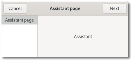
Figure: GtkAssistant
The gtk:assistant widget handles which buttons to show and to make sensitive based on page sequence knowledge and the type of each page in addition to state information like the completion and committed page statuses.
If you have a case that does not quite fit in the gtk:assistant widgets way of handling buttons, you can use the :custom value of the gtk:assistant-page-type enumeration and handle buttons yourself.
The gtk:assistant widget maintains a gtk:assistant-page object for each added child, which holds additional per-child properties. You obtain the gtk:assistant-page object for the child widget with the gtk:assistant-page function.
lambda (assistant) :run-last
- assistant
- The gtk:assistant widget that received the signal.
lambda (assistant) :run-last
- assistant
- The gtk:assistant widget that received the signal.
lambda (assistant) :run-last
- assistant
- The gtk:assistant widget that received the signal.
lambda (assistant) :action
- assistant
- The gtk:assistant widget that received the signal.
lambda (assistant page) :run-last
- assistant
- The gtk:assistant widget that received the signal.
- page
- The gtk:widget object for the current page.
GtkInfoBar

Figure: GtkInfoBar
The API of the gtk:info-bar widget is very similar to the gtk:dialog widget, allowing you to add buttons to the action area with the gtk:info-bar-add-button or gtk:info-bar-new-with-buttons functions. The sensitivity of action widgets can be controlled with the gtk:info-bar-set-response-sensitive function. To add widgets to the main content area of an info bar, use the gtk:info-bar-add-child function.
Similar to the gtk:message-dialog widget, the contents of an info bar can by classified as error message, warning, informational message, and so on, by using the gtk:info-bar-message-type function. GTK may use the message type to determine how the message is displayed.
(defun create-info-bar (msg type)
(let ((infobar (make-instance 'gtk:info-bar
:message-type type
:show-close-button t))
(message (make-instance 'gtk:label :label msg)))
;; Add a label with the message to the content of the info bar
(gtk:info-bar-add-child infobar message)
;; Connect a signal handler to the info bar
(g:signal-connect infobar "response"
(lambda (widget response)
(declare (ignore response))
(setf (gtk:widget-visible widget) nil)))
infobar)) The gtk:info-bar implementation supports a custom <action-widgets> element, which can contain multiple <action-widget> elements. The response attribute specifies a numeric response, and the content of the element is the ID of the widget, which should be a child of the dialogs action area.
lambda (infobar) :action
- infobar
- The gtk:info-bar widget on which the signal is emitted.
lambda (infobar response) :run-last
- infobar
- The gtk:info-bar widget on which the signal is emitted.
- response
- The integer for the response ID.
Changing this will make the info bar reveal or conceal itself by means of a sliding transition. Note: this does not show or hide the info bar in the visible sense, so revealing has no effect if the visible property is false.
Note that this function currently requires the info bar to be added to a widget hierarchy.
GtkStatusbar

Figure: GtkStatusbar
Statusbars in GTK maintain a stack of messages. The message at the top of the stack of the statusbar is the one that will currently be displayed.
Any messages added to the stack of the statusbar must specify a context ID that is used to uniquely identify the source of a message. This context ID can be generated by the gtk:statusbar-context-id function, given a message and the statusbar that it will be added to. Note that messages are stored in a stack, and when choosing which message to display, the stack structure is adhered to, regardless of the context identifier of a message.
One could say that a statusbar maintains one stack of messages for display purposes, but allows multiple message producers to maintain sub-stacks of the messages they produced (via context IDs).
Statusbars are created using the gtk:statusbar-new function. Messages are added to the stack of the statusbar with the gtk:statusbar-push function. The message at the top of the stack can be removed using the gtk:statusbar-pop function. A message can be removed from anywhere in the stack if its message ID was recorded at the time it was added. This is done using the gtk:statusbar-remove function.
lambda (statusbar context text) :run-last
- statusbar
- The gtk:statusbar widget that received the signal.
- context
- The unsigned integer for the context ID of the relevant message/statusbar.
- text
- The string for the message that was just popped.
lambda (statusbar context text) :run-last
- statusbar
- The gtk:statusbar widget that received the signal.
- context
- The unsigned integer for the context ID of the relevant message/statusbar.
- text
- The string for the message that was pushed.
GtkLockButton

Figure: GtkLockButton
The required authorization is represented by a g:permission object. Concrete implementations of the g:permission class may use the PolicyKit library or some other authorization framework. To obtain a PolicyKit-based g:permission object, use the polkit_permission_new() function.
GtkVolumeButton

Figure: GtkVolumeButton
GtkEntryCompletion
- gtk:entry-completion-cell-area
- gtk:entry-completion-inline-completion
- gtk:entry-completion-inline-selection
- gtk:entry-completion-minimum-key-length
- gtk:entry-completion-model
- gtk:entry-completion-popup-completion
- gtk:entry-completion-popup-set-width
- gtk:entry-completion-popup-single-match
- gtk:entry-completion-text-column
"Completion functionality" means that when the user modifies the text in the text entry, the gtk:entry-completion object checks which rows in the model match the current content of the text entry, and displays a list of matches. By default, the matching is done by comparing the text case-insensitively against the text column of the model, see the gtk:entry-completion-text-column function, but this can be overridden with a custom match function, see the gtk:entry-completion-set-match-func function.
When the user selects a completion, the content of the text entry is updated. By default, the content of the text entry is replaced by the text column of the model, but this can be overridden by connecting to the "match-selected" signal and updating the text entry in the signal handler. Note that you should return true from the signal handler to suppress the default behaviour.
To add completion functionality to a text entry, use the gtk:entry-completion function.
The gtk:entry-completion object uses a gtk:tree-model-filter model to represent the subset of the entire model that is currently matching. While the gtk:entry-completion widget "match-selected" and "cursor-on-match" signals take the original model and an iterator pointing to that model as arguments, other callbacks and signals, such as a gtk:cell-layout-data-func function or the "apply-attributes" signal, will generally take the filter model as argument. As long as you are only calling the gtk:tree-model-get function, this will make no difference to you. If for some reason, you need the original model, use the gtk:tree-model-filter-model function. Do not forget to use the gtk:tree-model-filter-convert-iter-to-child-iter function to obtain a matching iterator.
lambda (widget model iter) :run-last
- widget
- The gtk:entry-completion object that received the signal.
- model
- The gtk:tree-model object containing the matches.
- iter
- The gtk:tree-iter instance positioned at the selected match.
- Returns
- True if the signal has been handled.
lambda (widget prefix) :run-last
- widget
- The gtk:entry-completion object that received the signal.
- prefix
- The string for the common prefix of all possible completions.
- Returns
- True if the signal has been handled.
lambda (widget model iter) :run-last
- widget
- The gtk:entry-completion object that received the signal.
- model
- The gtk:tree-model object containing the matches.
- iter
- The gtk:tree-iter instance positioned at the selected match.
- Returns
- True if the signal has been handled.
lambda (widget) :run-last
- widget
- The gtk:entry-completion object that received the signal.
This is useful for long lists, where completing using a small key takes a lot of time and will come up with meaningless results anyway, that is, a too large dataset.
This functions creates and adds a gtk:cell-renderer-text object for the selected column. If you need to set the text column, but do not want the cell renderer, use the g:object-property function to set the text-column property directly.
GtkTreePath
(glib:define-gboxed-cstruct tree-iter "GtkTreeIter" (:export t :type-initializer "gtk_tree_iter_get_type") (stamp :int :initform 0) (user-data pointer-as-integer :initform 0) (user-data-2 pointer-as-integer :initform 0) (user-data-3 pointer-as-integer :initform 0))
- stamp
- The unique stamp to catch invalid iterators.
- user-data
- Model specific data.
- user-data-2
- Model specific data.
- user-data-3
- Model specific data.
(glib:define-gboxed-opaque tree-path "GtkTreePath" :export t :type-initializer "gtk_tree_path_get_type" :alloc (%tree-path-new))
GtkTreeRowReference
(glib:define-gboxed-opaque gtk:tree-row-reference "GtkTreeRowReference" :export t :type-initializer "gtk_tree_row_reference_get_type" :alloc (error "GtkTreeRowReference cannot be created from the Lisp side."))
GtkTreeModel
(gobject:define-gflags "GtkTreeModelFlags" tree-model-flags (:export t :type-initializer "gtk_tree_model_flags_get_type") (:iters-persist 1) (:list-only 2))
- :iters-persist
- Iterators survive all signals emitted by the model.
- :list-only
- The model is a list only, and never has children.
The model is represented as a hierarchical tree of strongly typed, columned data. In other words, the model can be seen as a tree where every node has different values depending on which column is being queried. The type of data found in a column is determined by using the GType system, that is "gint", "GtkButton", "gpointer", and so on. The types are homogeneous per column across all nodes. It is important to note that this interface only provides a way of examining a model and observing changes. The implementation of each individual model decides how and if changes are made.
In order to make life simpler for programmers who do not need to write their own specialized model, two generic models are provided - the gtk:tree-store and the gtk:list-store classes. To use these, the developer simply pushes data into these models as necessary. These models provide the data structure as well as all appropriate tree interfaces. As a result, implementing drag and drop, sorting, and storing data is trivial. For the vast majority of trees and lists, these two models are sufficient.
Models are accessed on a node/column level of granularity. One can query for the value of a model at a certain node and a certain column on that node. There are two structures used to reference a particular node in a model. They are the gtk:tree-path and the gtk:tree-iter structures. Most of the interface consists of operations on a gtk:tree-iter iterator.
A tree path is essentially a potential node. It is a location on a model that may or may not actually correspond to a node on a specific model. The gtk:tree-path structure can be converted into either an array of unsigned integers or a string. The string form is a list of numbers separated by a colon. Each number refers to the offset at that level. Thus, the path '0' refers to the root node and the path '2:4' refers to the fifth child of the third node.
By contrast, a gtk:tree-iter iterator is a reference to a specific node on a specific model. It is a generic structure with an integer and three generic pointers. These are filled in by the model in a model-specific way. One can convert a path to an iterator by calling the gtk:tree-model-iter function. These iterators are the primary way of accessing a model and are similar to the iterators used by the gtk:text-buffer class. They are generally statically allocated on the stack and only used for a short time. The model interface defines a set of operations using them for navigating the model.
It is expected that models fill in the iterator with private data. For example, the gtk:list-store model, which is internally a simple linked list, stores a list node in one of the pointers. The gtk:tree-model-sort class stores an array and an offset in two of the pointers. Additionally, there is an integer field. This field is generally filled with a unique stamp per model. This stamp is for catching errors resulting from using invalid iterators with a model.
The life cycle of an iterator can be a little confusing at first. Iterators are expected to always be valid for as long as the model is unchanged (and does not emit a signal). The model is considered to own all outstanding iterators and nothing needs to be done to free them from the user's point of view. Additionally, some models guarantee that an iterator is valid for as long as the node it refers to is valid (most notably the gtk:tree-store and gtk:list-store models). Although generally uninteresting, as one always has to allow for the case where iterators do not persist beyond a signal, some very important performance enhancements were made in the sort model. As a result, the :iters-persist flag was added to indicate this behavior.
;; Three ways of getting the iter pointing to the location (let (path iter parent) ;; Get the iterator from a string (setf iter (gtk:tree-model-iter-from-string model "3:2:5"))The second example shows a quick way of iterating through a list and getting a value from each row.
;; Get the iterator from a path (setf path (gtk:tree-path-new-from-string "3:2:5")) (setf iter (gtk:tree-model-iter model path))
;; Walk the tree to find the iterator (setf parent (gtk:tree-model-iter-nth-child model nil 3)) (setf parent (gtk:tree-model-iter-nth-child model parent 2)) (setf iter (gtk:tree-model-iter-nth-child model parent 5)) ... )
(do* ((model (gtk:tree-view-model view)) ; get the model
(iter (gtk:tree-model-iter-first model) ; get first iter
(gtk:tree-model-iter-next model iter))) ; get next iter
((not iter)) ; until iter is nil
;; Get a value and do something with the data
(let ((value (gtk:tree-model-value model iter col-yearborn)))
(gtk:list-store-set-value model iter
col-yearborn
(1+ value)))) lambda (model path iter) :run-last
- model
- The gtk:tree-model object on which the signal is emitted.
- path
- The gtk:tree-path instance identifying the changed row.
- iter
- The valid gtk:tree-iter iterator pointing to the changed row.
lambda (model path) :run-first
- model
- The gtk:tree-model object on which the signal is emitted.
- path
- The gtk:tree-path instance identifying the row.
lambda (model path iter) :run-last
- model
- The gtk:tree-model object on which the signal is emitted.
- path
- The gtk:tree-path instance identifying the row.
- iter
- The valid gtk:tree-iter iterator pointing to the row.
lambda (model path iter) :run-first
- model
- The gtk:tree-model object on which the signal is emitted.
- path
- The gtk:tree-path instance identifying the new row.
- iter
- The valid gtk:tree-iter iterator pointing to the new row.
lambda (model path iter order) :run-first
- model
- The gtk:tree-model object on which the signal is emitted.
- path
- The gtk:tree-path instance identifying the tree node whose children have been reordered.
- iter
- The valid gtk:tree-iter iterator pointing to the node whose children have been reordered.
- order
- The array of integers mapping the current position of each child to its old position before the re-ordering, that is order[newpos] = oldpos.
If parent is nil returns the first node. This is equivalent to:
(gtk:tree-model-iter-first model)
(gtk:tree-model-get model iter 1 3)
Nodes that are deleted are not unreffed, this means that any outstanding references on the deleted node should not be released.
GtkTreeSelection
The gtk:tree-selection object is gotten from a gtk:tree-view widget by calling the gtk:tree-view-selection function. It can be manipulated to check the selection status of the tree view, as well as select and deselect individual rows. Selection is done completely tree view side. As a result, multiple tree views of the same model can have completely different selections. Additionally, you cannot change the selection of a row on the model that is not currently displayed by the tree view without expanding its parents first.
One of the important things to remember when monitoring the selection of a tree view is that the "changed" signal is mostly a hint. That is, it may only emit one signal when a range of rows is selected. Additionally, it may on occasion emit a "changed" signal.
lambda (selection) :run-first
- selection
- The gtk:tree-selection object that received the signal.
(let* ((model (gtk:tree-view-model view))
(selection (gtk:tree-view-selection view))
;; This will only work in single or browse selection mode
(iter (gtk:tree-selection-selected selection)))
(if iter
;; A row is selected
...
;; No row is selected
...
... ) GtkTreeViewColumn
(gobject:define-genum "GtkTreeViewColumnSizing" tree-view-column-sizing (:export t :type-initializer "gtk_tree_view_column_sizing_get_type") (:grow-only 0) (:autosize 1) (:fixed 2))
- :grow-only
- Columns only get bigger in reaction to changes in the model.
- :autosize
- Columns resize to be the optimal size everytime the model changes.
- :fixed
- Columns are a fixed numbers of pixels wide.
- gtk:tree-view-column-alignment
- gtk:tree-view-column-cell-area
- gtk:tree-view-column-clickable
- gtk:tree-view-column-expand
- gtk:tree-view-column-fixed-width
- gtk:tree-view-column-max-width
- gtk:tree-view-column-min-width
- gtk:tree-view-column-reorderable
- gtk:tree-view-column-resizable
- gtk:tree-view-column-sizing
- gtk:tree-view-column-sort-column-id
- gtk:tree-view-column-sort-indicator
- gtk:tree-view-column-sort-order
- gtk:tree-view-column-spacing
- gtk:tree-view-column-title
- gtk:tree-view-column-visible
- gtk:tree-view-column-widget
- gtk:tree-view-column-width
- gtk:tree-view-column-x-offset
Please refer to the tree view widget conceptual overview for an overview of all the objects and data types related to the tree view and how they work together.
lambda (column) :run-last
- column
- The gtk:tree-view-column object that emitted the signal.
If resizable is true, then the user can explicitly resize the tree view column by grabbing the outer edge of the column button. If resizable is true and the sizing mode of the tree view column is :autosize, then the sizing mode is changed to :grow-only.
The sort indicator changes direction to indicate normal sort or reverse sort. Note that you must have the sort indicator enabled to see anything when calling this function. See the gtk:tree-view-column-sort-indicator function.
(let* ((renderer (gtk:cell-renderer-text-new))
(column (gtk:tree-view-column-new-with-attributes "Example"
renderer
"text" 0
"foreground" 1)))
... ) GtkTreeView
(gobject:define-genum "GtkTreeViewDropPosition" tree-view-drop-position (:export t :type-initializer "gtk_tree_view_drop_position_get_type") (:before 0) (:after 1) (:into-or-before 2) (:into-or-after 3))
- :before
- Dropped row is inserted before.
- :after
- Dropped row is inserted after.
- :into-or-before
- Dropped row becomes a child or is inserted before.
- :into-or-after
- Dropped row becomes a child or is inserted after.
(gobject:define-genum "GtkTreeViewGridLines" tree-view-grid-lines (:export t :type-initializer "gtk_tree_view_grid_lines_get_type") (:none 0) (:horizontal 1) (:vertical 2) (:both 3))
- :none
- No grid lines.
- :horizontal
- Horizontal grid lines.
- :vertical
- Vertical grid lines.
- :both
- Horizontal and vertical grid lines.
- gtk:tree-view-activate-on-single-click
- gtk:tree-view-enable-grid-lines
- gtk:tree-view-enable-search
- gtk:tree-view-enable-tree-lines
- gtk:tree-view-expander-column
- gtk:tree-view-fixed-height-mode
- gtk:tree-view-headers-clickable
- gtk:tree-view-headers-visible
- gtk:tree-view-hover-expand
- gtk:tree-view-hover-selection
- gtk:tree-view-level-indentation
- gtk:tree-view-model
- gtk:tree-view-reorderable
- gtk:tree-view-rubber-banding
- gtk:tree-view-search-column
- gtk:tree-view-show-expanders
- gtk:tree-view-tooltip-column
Figure: GtkTreeView
Please refer to the tree widget conceptual overview for an overview of all the objects and data types related to the tree widget and how they work together.
Several different coordinate systems are exposed in the gtk:tree-view API. These are:
Figure: Tree view coordinates
Coordinate systems in the gtk:tree-view API:
- Widget coordinates
- Coordinates relative to the widget.
- Bin window coordinates
- Coordinates relative to the window that the gtk:tree-view widget renders to.
- Tree coordinates
- Coordinates relative to the entire scrollable area of the gtk:tree-view widget. These coordinates start at (0, 0) for row 0 of the tree.
Example: A UI definition fragment with the gtk:tree-view widget
<object class="GtkTreeView" id="treeview">
<property name="model">liststore1</property>
<child>
<object class="GtkTreeViewColumn" id="test-column">
<property name="title">Test</property>
<child>
<object class="GtkCellRendererText" id="test-renderer"/>
<attributes>
<attribute name="text">1</attribute>
</attributes>
</child>
</object>
</child>
<child internal-child="selection">
<object class="GtkTreeSelection" id="selection">
<signal name="changed" handler="on_treeview_selection_changed"/>
</object>
</child>
</object> treeview.view ├── header │ ├── <column header> ┊ ┊ │ ╰── <column header> │ ╰── [rubberband]The gtk:tree-view implementation has a main CSS node with name treeview and .view style class. It has a subnode with name header, which is the parent for all the column header widgets' CSS nodes. For rubberband selection, a subnode with name rubberband is used.
lambda (view) :run-last
- view
- The gtk:tree-view widget on which the signal is emitted.
lambda (view) :run-last
- view
- The gtk:tree-view widget on which the signal is emitted.
lambda (view arg1 arg2) :run-last
- view
- The gtk:tree-view widget on which the signal is emitted.
- arg1
- a boolean without description
- arg2
- a boolean without description
- Returns
- a boolean without description
lambda (view step direction) :action
- view
- The gtk:tree-view widget on which the signal is emitted.
- step
- The granularity for the move as a value of the gtk:movement-step enumeration. The :logical-positions, :visual-positions, :display-lines, :pages and :buffer-ends values are supported. The :logical-positions and :visual-positions values are treated identically.
- direction
- The integer for the direction to move: +1 to move forwards, -1 to move backwards. The resulting movement is undefined for all other values.
- Returns
- True if step is supported, false otherwise.
lambda (view path column) :action
- view
- The gtk:tree-view widget on which the signal is emitted.
- path
- The gtk:tree-path instance for the activated row.
- column
- The gtk:tree-view-column object in which the activation occurred.
lambda (view iter path) :run-last
- view
- The gtk:tree-view widget on which the signal is emitted.
- iter
- The gtk:tree-iter iterator for the collapsed row.
- path
- The gtk:tree-path instance that points to the row.
lambda (view iter path) :run-last
- view
- The gtk:tree-view widget on which the signal is emitted.
- iter
- The gtk:tree-iter iterator for the expanded row.
- path
- The gtk:tree-path instance that points to the row.
lambda (view) :action
- view
- The gtk:tree-view widget on which the signal is emitted.
lambda (view) :action
- view
- The gtk:tree-view widget on which the signal is emitted.
lambda (view arg) :action
- view
- The gtk:tree-view widget on which the signal is emitted.
- arg
- a boolean without description
- Returns
- a boolean without description
lambda (view) :action
- view
- The gtk:tree-view widget on which the signal is emitted.
lambda (view iter path) :run-last
- view
- The gtk:tree-view widget on which the signal is emitted.
- iter
- The gtk:tree-iter iterator for the row to collapsed.
- path
- The gtk:tree-path instance that points to the row.
- Returns
- False to allow collapsing, true to reject.
lambda (view iter path) :run-last
- view
- The gtk:tree-view widget on which the signal is emitted.
- iter
- The gtk:tree-iter iterator for the row to expand.
- path
- The gtk:tree-path instance that points to the row.
- Returns
- False to allow expansion, true to reject.
lambda (view) :action
- view
- The gtk:tree-view widget on which the signal is emitted.
lambda (view) :action
- view
- The gtk:tree-view widget on which the signal is emitted.
If you do not want expander arrow to appear in your tree, set the expander column to a hidden column.
Fixed height mode speeds up the tree view by assuming that all rows have the same height. Only enable this option if all rows are the same height and all columns have the :fixed value of the gtk:tree-view-column-sizing enumeration.
The value should be specified in pixels, a value of 0 disables this feature and in this case only the default indentation will be used. This does not have any visible effects for lists.
Both the gtk:tree-store and the gtk:list-store classes support these. If the reorderable argument is true, then the user can reorder the model by dragging and dropping rows. The developer can listen to these changes by connecting to the model's "row-inserted" and "row-deleted" signals. The reordering is implemented by setting up the tree view as a drag source and destination. Therefore, drag and drop can not be used in a reorderable view for any other purpose.
This function does not give you any degree of control over the order - any reordering is allowed. If more control is needed, you should probably handle drag and drop manually.
If the search column is set, users can use the "start-interactive-search" key binding to bring up search popup. The enable-search property controls whether simply typing text will also start an interactive search.
Note that the column argument refers to a column of the current model. The search column is reset to -1 when the model is changed.
If you only plan to have simple (text-only) tooltips on full rows, you can use this function to have the gtk:tree-view widget handle these automatically for you. The column argument should be set to the column in the tree view's model containing the tooltip texts, or -1 to disable this feature.
When enabled, the has-tooltip property will be set to true and the tree view will connect a "query-tooltip" signal handler.
Note that the signal handler sets the text with the gtk:tooltip-set-markup function, so &, <, and so on, have to be escaped in the text.
If either tx or ty are -1, then that direction is not scrolled.
If the cell is currently visible on the screen, nothing is done.
This function only works if the model is set, and path is a valid row on the model. If the model changes before the tree view is realized, the centered path will be modified to reflect this change.
If the path argument is invalid for the model, the current cursor (if any) will be unset and the function will return without failing.
If the path argument is invalid for the model, the current cursor (if any) will be unset and the function will return without failing.
For converting widget coordinates, for example, the ones you get from the "query-tooltip" signal, please see the gtk:tree-view-convert-widget-to-bin-window-coords function.
The x and y coordinates that are provided must be relative to the bin window coordinates. Widget relative coordinates must be converted using the gtk:tree-view-convert-widget-to-bin-window-coords function.
For converting widget coordinates, for example, the ones you get from the "query-tooltip" signal, please see the gtk:tree-view-convert-widget-to-bin-window-coords function.
The path, column, xcell and ycell arguments will be returned likewise as for the gtk:tree-view-path-at-pos function.
Gets or sets the search entry that is currently in use as interactive search entry for the tree view. In case the built-in entry is being used, nil will be returned.
This is useful when you want to provide a search entry in your interface at all time at a fixed position. Passing nil for entry will make the interactive search code use the built-in popup entry again.
Note that if the path argument is not specified and renderer is set and part of a column containing the expander, the tooltip might not show and hide at the correct position. In such cases path must be set to the current node under the mouse cursor for this function to operate correctly.
See also the gtk:tree-view-tooltip-column function for a simpler alternative.
The return value indicates whether there is a tree view row at the given coordinates (true) or not (false) for mouse tooltips. For keyboard tooltips the row returned will be the cursor row. When true, then any of model, path and iter which have been provided will be set to point to that row and the corresponding model. x and y will always be converted to be relative to view's "bin window" if tip is false.
GtkTreeView Drag & Drop
GtkCellLayout
One of the notable features provided by implementations of the gtk:cell-layout interface are attributes. Attributes let you set the properties in flexible ways. They can just be set to constant values like regular properties. But they can also be mapped to a column of the underlying tree model with the gtk:cell-layout-add-attribute function, which means that the value of the attribute can change from cell to cell as they are rendered by the cell renderer. Finally, it is possible to specify a function with the gtk:cell-layout-set-cell-data-func function that is called to determine the value of the attribute for each cell that is rendered.
Example: A UI definition fragment specifying attributes
<object class="GtkCellView">
<child>
<object class="GtkCellRendererText"/>
<attributes>
<attribute name="text">0</attribute>
</attributes>
</child>
</object> Furthermore for implementations of the gtk:cell-layout interface that use a gtk:cell-area object to lay out cells, all gtk:cell-layout objects in GTK use a gtk:cell-area object,
cell properties can also be defined in the format by specifying the custom <cell-packing> attribute which can contain multiple <property>
elements defined in the normal way.Example: A UI definition fragment specifying cell properties
<object class="GtkTreeViewColumn">
<child>
<object class="GtkCellRendererText"/>
<cell-packing>
<property name="align">True</property>
<property name="expand">False</property>
</cell-packing>
</child>
</object> GtkCellView
The gtk:cell-view widget is a gtk:orientable widget in order to decide in which orientation the underlying gtk:cell-area-context object should be allocated. Taking the gtk:combo-box menu as an example, cell views should be oriented horizontally if the menus are listed top-to-bottom and thus all share the same width but may have separate individual heights (left-to-right menus should be allocated vertically since they all share the same height but may have variable widths).
The (setf gtk:cell-view-displayed-row) function sets the row of the model that is currently displayed by the cell view. If the path is unset, then the contents of the cell view "stick" at their last value. This is not normally a desired result, but may be a needed intermediate state if say, the model for the cell view becomes temporarily empty.
GtkIconView
(gobject:define-genum "GtkIconViewDropPosition" icon-view-drop-position (:export t :type-initializer "gtk_icon_view_drop_position_get_type") (:no-drop 0) (:drop-into 1) (:drop-left 2) (:drop-right 3) (:drop-above 4) (:drop-below 5))
- :no-drop
- No drop possible.
- :drop-into
- Dropped item replaces the item.
- :drop-left
- Droppped item is inserted to the left.
- :drop-right
- Dropped item is inserted to the right.
- :drop-above
- Dropped item is inserted above.
- :drop-below
- Dropped item is inserted below.
- gtk:icon-view-activate-on-single-click
- gtk:icon-view-cell-area
- gtk:icon-view-column-spacing
- gtk:icon-view-columns
- gtk:icon-view-item-orientation
- gtk:icon-view-item-padding
- gtk:icon-view-item-width
- gtk:icon-view-margin
- gtk:icon-view-markup-column
- gtk:icon-view-model
- gtk:icon-view-pixbuf-column
- gtk:icon-view-reorderable
- gtk:icon-view-row-spacing
- gtk:icon-view-selection-mode
- gtk:icon-view-spacing
- gtk:icon-view-text-column
- gtk:icon-view-tooltip-column
Figure: GtkIconView
Note that if the tree model is backed by an actual tree store, as opposed to a flat list where the mapping to icons is obvious, the gtk:icon-view widget will only display the first level of the tree and ignore the tree's branches.
lambda (view) :action
- view
- The gtk:icon-view widget on which the signal is emitted.
lambda (view path) :run-last
- view
- The gtk:icon-view widget on which the signal is emitted.
- path
- The gtk:tree-path instance for the activated item.
lambda (view step count extent modify) :action
- view
- The gtk:icon-view widget that received the signal.
- step
- The granularity of the move as a value of the gtk:movement-step enumeration.
- count
- The integer for the number of step units to move.
- extend
- The boolean whether to extend the selection.
- modify
- The boolean whether to modify the selection.
- Arrow keys which move by individual steps.
- Home/End keys which move to the first/last item.
- PageUp/PageDown which move by "pages".
lambda (view) :action
- view
- The gtk:icon-view widget on which the signal is emitted.
lambda (view) :action
- view
- The gtk:icon-view widget on which the signal is emitted.
lambda (view) :run-first
- view
- The gtk:icon-view widget on which the signal is emitted.
lambda (view) :action
- view
- The gtk:icon-view widget on which the signal is emitted.
lambda (view) :action
- view
- The gtk:icon-view widget on which the signal is emitted.
The markup column must be of "gchararray" type. If the markup column is set to something, it overrides the text column set by the gtk:icon-view-text-column function.
If the icon view already has a model set, it will remove it before setting the new model. If model is nil, then it will unset the old model.
Both gtk:tree-store and gtk:list-store objects support these. If reorderable is true, then the user can reorder the model by dragging and dropping rows. The developer can listen to these changes by connecting to the model's "row-inserted" and "row-deleted" signals. The reordering is implemented by setting up the icon view as a drag source and destination. Therefore, drag and drop can not be used in a reorderable view for any other purpose.
This function does not give you any degree of control over the order - any reordering is allowed. If more control is needed, you should probably handle drag and drop manually.
If you only plan to have simple (text-only) tooltips on full items, you can use this function to have the gtk:icon-view widget handle these automatically for you. The column argument should be set to the column in the icon view's model containing the tooltip texts, or -1 to disable this feature.
When enabled, the has-tooltip property will be set to true and the icon view will connect a "query-tooltip" signal handler. Note that the signal handler sets the text with the gtk:tooltip-set-markup function, so &, <, and so on, have to be escaped in the text.
cell -- a gtk:cell-renderer object responsible for the cell at (x,y), or nil if no item exists at the specified position
This function is often followed by a call of the gtk:widget-grab-focus function in order to give keyboard focus to the widget. Please note that editing can only happen when the widget is realized.
cell -- a current gtk:cell-renderer focus cell, or nil if the cursor is not set
If both row-align and col-align arguments are nil, then the alignment arguments are ignored, and the tree does the minimum amount of work to scroll the item onto the screen. This means that the item will be scrolled to the edge closest to its current position. If the item is currently visible on the screen, nothing is done.
This function only works if the model is set, and path is a valid row on the model. If the model changes before the view is realized, the centered path will be modified to reflect this change.
The return value indicates whether there is an icon view item at the given coordinates, true) or not false for mouse tooltips. For keyboard tooltips the item returned will be the cursor item. When true, then any of model, path and iter will be set to point to that row and the corresponding model. x and y will always be converted to be relative to the bin window of view if tip is false.
GtkTreeSortable
Deprecated 4.20
Deprecated 4.20
lambda (sortable) : Run Last
- sortable
- The gtk:tree-sortable object on which the signal is emitted.
The sortable will resort itself to reflect this change, after emitting a "sort-column-changed" signal. The column argument may either be a regular column ID, or one of the following special values: gtk:+tree-sortable-default-sort-column-id+ or gtk:+tree-sortable-unsorted-sort-column-id+.
If func is nil, then there will be no default comparison function. This means that once the model has been sorted, it cannot go back to the default state. In this case, when the current sort column ID of sortable is gtk:+tree-sortable-default-sort-column-id+, the model will be unsorted.
GtkTreeModelSort
(let* (;; Get the child model
(child-model (gtk:my-model()))
;; Create the first tree view
(sort-model1 (gtk:tree-model-sort-new-with-model child-model))
(tree-view1 (gtk:tree-view-with-model sort-model1))
;; Create the second tree view
(sort-model2 (gtk:tree-vmodel-sort-new-with-model child-model))
(tree-view2 (gtk:tree-view-new-with-model sort-model2)))
;; Now we can sort the two models independently
(setf (gtk:tree-sortable-sort-column-id sort-model1) col1)
(setf (gtk:tree-sortable-sort-column-id sort-model1) '(col1 :descending))
... )
To demonstrate how to access the underlying child model from the sort model,
the next example will be a callback for the "changed" signal of the gtk:tree-selection object. In this callback, we get a string from col1 of the model. We
then modify the string, find the same selected row on the child model, and
change the row there.
(defun selection-changed (selection)
(let* ((view (gtk:tree-selection-tree-view selection))
;; Get the current selected row and the model
(sort-model (gtk:tree-view-model view))
(sort-iter (gtk:tree-selection-selected selection))
;; Look up the current value on the selected row and get a new value
(value (gtk:tree-model-value sort-model sort-iter col1))
(new-value (change-the-value value))
;; Get the child model and an iterator on the child model
(model (gtk:tree-model-sort-model sort-model))
(iter (gtk:tree-model-sort-convert-iter-to-child-iter sort-model
sort-iter)))
;; Change the value of the row in the child model
(gtk:list-store-set-value model iter col1 new-value))) GtkTreeModelFilter
- Filter specific rows, based on data from a "visible column", a column storing booleans indicating whether the row should be filtered or not, or based on the return value of a "visible function", which gets a model, iterator and returns a boolean indicating whether the row should be filtered or not.
- Modify the "appearance" of the model, using a modify function. This is extremely powerful and allows for just changing some values and also for creating a completely different model based on the given child model.
- Set a different root node, also known as a "virtual root". You can pass in a gtk:tree-path instance indicating the root node for the filter at construction time.
When using the gtk:tree-model-filter object, it is important to realize that the gtk:tree-model-filter object maintains an internal cache of all nodes which are visible in its clients. The cache is likely to be a subtree of the tree exposed by the child model. The gtk:tree-model-filter object will not cache the entire child model when unnecessary to not compromise the caching mechanism that is exposed by the reference counting scheme. If the child model implements reference counting, unnecessary signals may not be emitted because of reference counting, see the gtk:tree-model documentation. Note that, for example; the gtk:tree-store object does not implement reference counting and will always emit all signals, even when the receiving node is not visible.
Because of this, limitations for possible visible functions do apply. In general, visible functions should only use data or properties from the node for which the visibility state must be determined, its siblings or its parents. Usually, having a dependency on the state of any child node is not possible, unless references are taken on these explicitly. When no such reference exists, no signals may be received for these child nodes. See reference counting in the gtk:tree-model documentation.
Determining the visibility state of a given node based on the state of its child nodes is a frequently occurring use case. Therefore, the gtk:tree-model-filter object explicitly supports this. For example, when a node does not have any children, you might not want the node to be visible. As soon as the first row is added to the node's child level, or the last row removed, the node's visibility should be updated.
This introduces a dependency from the node on its child nodes. In order to accommodate this, the gtk:tree-model-filter object must make sure the necesary signals are received from the child model. This is achieved by building, for all nodes which are exposed as visible nodes to the gtk:tree-model-filter objects clients, the child level (if any) and take a reference on the first node in this level. Furthermore, for every "row-inserted", "row-changed" or "row-deleted" signal, also these which were not handled because the node was not cached, the gtk:tree-model-filter object will check if the visibility state of any parent node has changed.
Beware, however, that this explicit support is limited to these two cases. For example, if you want a node to be visible only if two nodes in a child's child level (2 levels deeper) are visible, you are on your own. In this case, either rely on the gtk:tree-store object to emit all signals because it does not implement reference counting, or for models that do implement reference counting, obtain references on these child levels yourself.
If the condition calculated by the function changes over time, for example, because it depends on some global parameters, you must call the gtk:tree-model-filter-refilter function to keep the visibility information of the model uptodate.
Note that func is called whenever a row is inserted, when it may still be empty. The visible function should therefore take special care of empty rows.
Since this function is called for each data access, it is not a particularly efficient operation.
GtkCellArea
The cell area handles events, focus navigation, drawing and size requests and allocations for a given row of data.
Usually users do not have to interact with the gtk:cell-area object directly unless they are implementing a cell-layouting widget themselves.
When requesting the size of a cell area one needs to calculate the size for a handful of rows, and this will be done differently by different layouting widgets. For instance a gtk:tree-view-column object always lines up the areas from top to bottom while a gtk:icon-view widget on the other hand might enforce that all areas received the same width and wrap the areas around, requesting height for more cell areas when allocated less width.
It is also important for areas to maintain some cell alignments with areas rendered for adjacent rows, cells can appear "columnized" inside an area even when the size of cells are different in each row. For this reason the gtk:cell-area object uses a gtk:cell-area-context object to store the alignments and sizes along the way, as well as the overall largest minimum and natural size for all the rows which have been calculated with the said context.
The gtk:cell-area-context object is an opaque object specific to the gtk:cell-area object which created it, see the gtk:cell-area-create-context function. The owning cell-layouting widget can create as many contexts as it wishes to calculate sizes of rows which should receive the same size in at least one orientation, horizontally or vertically. However, it is important that the same gtk:cell-area-context object which was used to request the sizes for a given gtk:tree-model row be used when rendering or processing events for that row.
In order to request the width of all the rows at the root level of a gtk:tree-model object one would do the following:
Example: Requesting the width of a handful of gtk:tree-model rows
GtkTreeIter iter; gint minimum_width; gint natural_width;Note that in this example it is not important to observe the returned minimum and natural width of the area for each row unless the cell-layouting object is actually interested in the widths of individual rows. The overall width is however stored in the accompanying gtk:cell-area-context object and can be consulted at any time.
valid = gtk_tree_model_get_iter_first (model, &iter); while (valid) { gtk_cell_area_apply_attributes (area, model, &iter, FALSE, FALSE); gtk_cell_area_get_preferred_width (area, context, widget, NULL, NULL);
valid = gtk_tree_model_iter_next (model, &iter); } gtk_cell_area_context_get_preferred_width (context, &minimum_width, &natural_width);
This can be useful since gtk:cell-layout widgets usually have to support requesting and rendering rows in treemodels with an exceedingly large amount of rows. The gtk:cell-layout widget in that case would calculate the required width of the rows in an idle or timeout source, see the g:timeout-add function, and when the widget is requested its actual width in get_preferred_width() it can simply consult the width accumulated so far in the gtk:cell-area-context object.
A simple example where rows are rendered from top to bottom and take up the full width of the layouting widget would look like:
Example: A typical get_preferred_width() implementation
static void
foo_get_preferred_width (GtkWidget *widget,
gint *minimum_size,
gint *natural_size)
{
Foo *foo = FOO (widget);
FooPrivate *priv = foo->priv;
foo_ensure_at_least_one_handfull_of_rows_have_been_requested (foo);
gtk_cell_area_context_get_preferred_width (priv->context, minimum_size,
natural_size);
} In the above example the Foo widget has to make sure that some row sizes have been calculated, the amount of rows that Foo judged was
appropriate to request space for in a single timeout iteration, before
simply returning the amount of space required by the area via the gtk:cell-area-context object.Requesting the height for width, or width for height, of an area is a similar task except in this case the gtk:cell-area-context object does not store the data, actually, it does not know how much space the layouting widget plans to allocate it for every row. It is up to the layouting widget to render each row of data with the appropriate height and width which was requested by the gtk:cell-area object.
In order to request the height for width of all the rows at the root level of a gtk:tree-model object one would do the following:
Example: Requesting the height for width of a handful of gtk:tree-model rows
GtkTreeIter iter; gint minimum_height; gint natural_height; gint full_minimum_height = 0; gint full_natural_height = 0;Note that in the above example we would need to cache the heights returned for each row so that we would know what sizes to render the areas for each row. However we would only want to really cache the heights if the request is intended for the layouting widgets real allocation.
valid = gtk_tree_model_get_iter_first (model, &iter); while (valid) { gtk_cell_area_apply_attributes (area, model, &iter, FALSE, FALSE); gtk_cell_area_get_preferred_height_for_width (area, context, widget, width, &minimum_height, &natural_height);
if (width_is_for_allocation) cache_row_height (&iter, minimum_height, natural_height);
full_minimum_height += minimum_height; full_natural_height += natural_height;
valid = gtk_tree_model_iter_next (model, &iter); }
In some cases the layouting widget is requested the height for an arbitrary for_width, this is a special case for layouting widgets who need to request size for tens of thousands of rows. For this case it is only important that the layouting widget calculate one reasonably sized chunk of rows and return that height synchronously. The reasoning here is that any layouting widget is at least capable of synchronously calculating enough height to fill the screen height, or scrolled window height, in response to a single call to the get_preferred_height_for_width() function. Returning a perfect height for width that is larger than the screen area is inconsequential since after the layouting receives an allocation from a scrolled window it simply continues to drive the the scrollbar values while more and more height is required for the row heights that are calculated in the background.
Rendering Areas Once area sizes have been aquired at least for the rows in the visible area of the layouting widget they can be rendered at draw() time.
A crude example of how to render all the rows at the root level runs as follows:
Example: Requesting the width of a handful of gtk:tree-model rows
GtkAllocation allocation;
GdkRectangle cell_area = { 0, };
GtkTreeIter iter;
gint minimum_width;
gint natural_width;
gtk_widget_get_allocation (widget, &allocation);
cell_area.width = allocation.width;
valid = gtk_tree_model_get_iter_first (model, &iter);
while (valid)
{
cell_area.height = get_cached_height_for_row (&iter);
gtk_cell_area_apply_attributes (area, model, &iter, FALSE, FALSE);
gtk_cell_area_render (area, context, widget, cr,
&cell_area, &cell_area, state_flags, FALSE);
cell_area.y += cell_area.height;
valid = gtk_tree_model_iter_next (model, &iter);
}
Note that the cached height in this example really depends on how the
layouting widget works. The layouting widget might decide to give every row
its minimum or natural height or, if the model content is expected to fit
inside the layouting widget without scrolling, it would make sense to
calculate the allocation for each row at "size-allocate" time using the gtk_distribute_natural_allocation() function.The gtk:cell-area object drives keyboard focus from cell to cell in a way similar to gtk:widget object. For layouting widgets that support giving focus to cells it is important to remember to pass the GTK_CELL_RENDERER_FOCUSED value to the area functions for the row that has focus and to tell the area to paint the focus at render time.
Layouting widgets that accept focus on cells should implement the focus() virtual method. The layouting widget is always responsible for knowing where gtk:tree-model rows are rendered inside the widget, so at focus() time the layouting widget should use the gtk:cell-area methods to navigate focus inside the area and then observe the gtk:direction-type value to pass the focus to adjacent rows and areas.
A basic example of how the focus() virtual method should be implemented:
Example: Implementing keyboard focus navigation
static gboolean
foo_focus (GtkWidget *widget,
GtkDirectionType direction)
{
Foo *foo = FOO (widget);
FooPrivate *priv = foo->priv;
gint focus_row;
gboolean have_focus = FALSE;
focus_row = priv->focus_row;
if (!gtk_widget_has_focus (widget))
gtk_widget_grab_focus (widget);
valid = gtk_tree_model_iter_nth_child (priv->model, &iter, NULL,
priv->focus_row);
while (valid)
{
gtk_cell_area_apply_attributes (priv->area, priv->model, &iter,
FALSE, FALSE);
if (gtk_cell_area_focus (priv->area, direction))
{
priv->focus_row = focus_row;
have_focus = TRUE;
break;
}
else
{
if (direction == GTK_DIR_RIGHT ||
direction == GTK_DIR_LEFT)
break;
else if (direction == GTK_DIR_UP ||
direction == GTK_DIR_TAB_BACKWARD)
{
if (focus_row == 0)
break;
else
{
focus_row--;
valid = gtk_tree_model_iter_nth_child (priv->model,
&iter, NULL,
focus_row);
}
}
else
{
if (focus_row == last_row)
break;
else
{
focus_row++;
valid = gtk_tree_model_iter_next (priv->model, &iter);
}
}
}
}
return have_focus;
}
Note that the layouting widget is responsible for matching the gtk:direction-type values to the way it lays out its cells.Use the gtk_cell_area_class_install_cell_property() function to install cell properties for a cell area class and the gtk:cell-area-class-find-cell-property or gtk:cell-area-class-list-cell-properties functions to get information about existing cell properties.
To set or get the value of a cell property, use the gtk:cell-area-cell-property, gtk:cell-area-cell-get, and gtk:cell-area-cell-set functions.
lambda (area renderer editable cell-area path) :run-first
- area
- The gtk:cell-area object where editing started.
- renderer
- The gtk:cell-renderer object that started the edited.
- editable
- The gtk:cell-editable widget to add.
- cell-area
- The gtk:widget object relative gdk:rectangle coordinates where editable should be added.
- path
- The gtk:tree-path string this edit was initiated for.
lambda (area model iter is-expander is-expanded) :run-first
- area
- The gtk:cell-area object to apply the attributes to.
- model
- The gtk:tree-model object to apply the attributes from.
- iter
- The gtk:tree-iter instance indicating which row to apply the attributes of.
- is-expander
- Whether the view shows children for this row.
- is-expanded
- Whether the view is currently showing the children of this row.
lambda (area renderer path) :run-first
- area
- The gtk:cell-area object where focus changed.
- renderer
- The gtk:cell-renderer object that has focus.
- path
- The current gtk:tree-path string set for area.
lambda (area renderer editable) :run-first
- area
- The gtk:cell-area object where editing finished.
- renderer
- The gtk:cell-renderer object that finished editeding.
- editable
- The gtk:cell-editable widget to remove.
This is generally called by implementations of the GtkCellAreaClass.focus() or GtkCellAreaClass.event() functions, however it can also be used to implement functions such as the gtk:tree-view-set-cursor-on-cell function.
For instance, the gtk:icon-view widget creates all icons (rows) to have the same width and the cells theirin to have the same horizontal alignments. However each row of icons may have a separate collective height. The gtk:icon-view widget uses this to request the heights of each row based on a context which was already used to request all the row widths that are to be displayed.
If at some point, the width of a single row changes, it should be requested with the gtk:cell-area-preferred-width function again and then the full width of the requested rows checked again with the gtk:cell-area-context-preferred-width function.
If at some point, the height of a single row changes, it should be requested with the gtk:cell-area-preferred-height function again and then the full height of the requested rows checked again with the gtk:cell-area-context-preferred-height function.
Implementing gtk:cell-area classes should implement this method to receive and navigate focus in its own way particular to how it lays out cells.
Events handled by focus siblings can also activate the given focusable renderer.
This is handy for gtk:cell-area subclasses when handling events, after determining the cell renderer at the event location it can then chose to activate the focus cell for which the event cell may have been a sibling.
See the gtk:cell-area-edited-cell and gtk:cell-area-edit-widget functions.
GtkCellAreaBox
Alignments of gtk:cell-renderer objects rendered in adjacent rows can be configured by configuring the align child cell property with the gtk:cell-area-cell-property function or by specifying the align argument to the gtk:cell-area-box-pack-start and gtk:cell-area-box-pack-end functions.
GtkCellAreaContext
The gtk:cell-layout widget can create any number of contexts in which to request and render groups of data rows. However its important that the same context which was used to request sizes for a given gtk:tree-model row also be used for the same row when calling other gtk:cell-area APIs such as the gtk:cell-renderer-* and gtk:cell-area-event functions.
This is generally unneeded by layouting widgets. However it is important for the context implementation itself to fetch information about the area it is being used for. For instance at GtkCellAreaContextClass.allocate() time its important to know details about any cell spacing that the cell area is configured with in order to compute a proper allocation.
When the new overall size of the context requires that the allocated size changes, or whenever this allocation changes at all, the variable row sizes need to be re-requested for every row.
For instance, if the rows are displayed all with the same width from top to bottom then a change in the allocated width necessitates a recalculation of all the displayed row heights using the gtk:cell-area-preferred-height-for-width function.
GtkCellEditable
lambda (editable) :run-last
- editable
- The gtk:cell-editable object on which the signal was emitted.
lambda (editable) :run-last
- editable
- The gtk:cell-editable object on which the signal was emitted.
The gtk:cell-editable-start-editing function can then set up the editable argument suitably for editing a cell, for example, making the Esc key emit the "editing-done" signal.
Note that the editable argument is created on-demand for the current edit. Its lifetime is temporary and does not persist across other edits and/or cells.
GtkCellRenderer
(gobject:define-gflags "GtkCellRendererState" cell-renderer-state (:export t :type-initializer "gtk_cell_renderer_state_get_type") (:selected #.(ash 1 0)) (:prelit #.(ash 1 1)) (:insensitive #.(ash 1 2)) (:sorted #.(ash 1 3)) (:focused #.(ash 1 4)) (:expandable #.(ash 1 5)) (:expanded #.(ash 1 6)))
- :selected
- The cell is currently selected, and probably has a selection colored background to render to.
- :prelit
- The mouse is hovering over the cell.
- :insensitive
- The cell is drawn in an insensitive manner.
- :sorted
- The cell is in a sorted row.
- :focused
- The cell is in the focus row.
- :expandable
- The cell is in a row that can be expanded.
- :expanded
- The cell is in a row that is expanded.
(gobject:define-genum "GtkCellRendererMode" cell-renderer-mode (:export t :type-initializer "gtk_cell_renderer_mode_get_type") (:inert 0) (:activatable 1) (:editable 2))
- :inert
- The cell is just for display and cannot be interacted with. Note that this does not mean that the row being drawn cannot be selected - just that a particular element of it cannot be individually modified.
- :activatable
- The cell can be clicked.
- :editable
- The cell can be edited or otherwise modified.
- gtk:cell-renderer-cell-background
- gtk:cell-renderer-cell-background-rgba
- gtk:cell-renderer-cell-background-set
- gtk:cell-renderer-editing
- gtk:cell-renderer-height
- gtk:cell-renderer-is-expanded
- gtk:cell-renderer-is-expander
- gtk:cell-renderer-mode
- gtk:cell-renderer-sensitive
- gtk:cell-renderer-visible
- gtk:cell-renderer-width
- gtk:cell-renderer-xalign
- gtk:cell-renderer-xpad
- gtk:cell-renderer-yalign
- gtk:cell-renderer-ypad
The primary use of a gtk:cell-renderer object is for drawing a certain graphical elements on a Cairo context. Typically, one cell renderer is used to draw many cells on the screen. To this extent, it is not expected that a gtk:cell-renderer object keep any permanent state around. Instead, any state is set just prior to use using GObjects property system. Then, the cell is measured using the gtk:cell-renderer-preferred-size function. Finally, the cell is rendered in the correct location using the gtk:cell-renderer-snapshot function.
There are a number of rules that must be followed when writing a new gtk:cell-renderer class. First and formost, its important that a certain set of properties will always yield a cell renderer of the same size, barring a style change. The gtk:cell-renderer also has a number of generic properties that are expected to be honored by all children.
Beyond merely rendering a cell, cell renderers can optionally provide active user interface elements. A cell renderer can be "activatable" like the gtk:cell-renderer-toggle object, which toggles when it gets activated by a mouse click, or it can be "editable" like the gtk:cell-renderer-text object, which allows the user to edit the text using a widget implementing the gtk:cell-editable interface, for example the gtk:entry widget. To make a cell renderer activatable or editable, you have to implement the GtkCellRendererClass.activate or GtkCellRendererClass.start_editing virtual functions, respectively.
Many properties of the gtk:cell-renderer class and its subclasses have a corresponding set property, for example, cell-background-set corresponds to cell-background. These set properties reflect whether a property has been set or not. You should not set them independently.
lambda (renderer) :run-first
- renderer
- The gtk:cell-renderer object that received the signal.
lambda (renderer editable path) :run-first
- renderer
- The gtk:cell-renderer object that received the signal.
- editable
- The gtk:cell-editable widget.
- path
- The string for the path identifying the edited cell.
This function should be called by cell renderer implementations in response to the "editing-done" signal of the gtk:cell-editable widget.
GtkCellRendererText
- gtk:cell-renderer-text-align-set
- gtk:cell-renderer-text-alignment
- gtk:cell-renderer-text-attributes
- gtk:cell-renderer-text-background
- gtk:cell-renderer-text-background-rgba
- gtk:cell-renderer-text-background-set
- gtk:cell-renderer-text-editable
- gtk:cell-renderer-text-editable-set
- gtk:cell-renderer-text-ellipsize
- gtk:cell-renderer-text-ellipsize-set
- gtk:cell-renderer-text-family
- gtk:cell-renderer-text-family-set
- gtk:cell-renderer-text-font
- gtk:cell-renderer-text-font-desc
- gtk:cell-renderer-text-foreground
- gtk:cell-renderer-text-foreground-rgba
- gtk:cell-renderer-text-foreground-set
- gtk:cell-renderer-text-language
- gtk:cell-renderer-text-language-set
- gtk:cell-renderer-text-markup
- gtk:cell-renderer-text-max-width-chars
- gtk:cell-renderer-text-placeholder-text
- gtk:cell-renderer-text-rise
- gtk:cell-renderer-text-rise-set
- gtk:cell-renderer-text-scale
- gtk:cell-renderer-text-scale-set
- gtk:cell-renderer-text-single-paragraph-mode
- gtk:cell-renderer-text-size
- gtk:cell-renderer-text-size-points
- gtk:cell-renderer-text-size-set
- gtk:cell-renderer-text-stretch
- gtk:cell-renderer-text-stretch-set
- gtk:cell-renderer-text-strikethrough
- gtk:cell-renderer-text-strikethrough-set
- gtk:cell-renderer-text-style
- gtk:cell-renderer-text-style-set
- gtk:cell-renderer-text-text
- gtk:cell-renderer-text-underline
- gtk:cell-renderer-text-underline-set
- gtk:cell-renderer-text-variant
- gtk:cell-renderer-text-variant-set
- gtk:cell-renderer-text-weight
- gtk:cell-renderer-text-weight-set
- gtk:cell-renderer-text-width-chars
- gtk:cell-renderer-text-wrap-mode
- gtk:cell-renderer-text-wrap-width
lambda (renderer path text) :run-last
- renderer
- The gtk:cell-renderer-text object which received the signal.
- path
- The string for the path identifying the edited cell.
- text
- The string for the new text.
GtkCellRendererAccel
(gobject:define-genum "GtkCellRendererAccelMode" cell-renderer-accel-mode (:export t :type-initializer "gtk_cell_renderer_accel_mode_get_type") (:gtk 0) (:other 1))
- :gtk
- GTK accelerators mode.
- :other
- Other accelerator mode.
lambda (accel path) :run-last
- accel
- The gtk:cell-renderer-accel object reveiving the signal.
- path
- The string for the path identifying the row of the edited cell.
lambda (accel path key mods keycode) :run-last
- accel
- The gtk:cell-renderer-accel object reveiving the signal.
- path
- The string for the path identifying the row of the edited cell.
- key
- The unsigned integer for the new accelerator keyval.
- mods
- The gdk:modifier-type value for the new acclerator modifier mask.
- keycode
- The unsigned integer for the keycode of the new accelerator.
GtkCellRendererCombo
The combo cell renderer takes care of adding a text cell renderer to the combo box and sets it to display the column specified by its text-column property. Further properties of the combo box can be set in a handler for the "editing-started" signal.
lambda (combo path iter) :run-last
- combo
- The gtk:cell-renderer-combo object on which the signal is emitted.
- path
- The string of the path identifying the edited cell, relative to the tree view model.
- iter
- The gtk:tree-iter instance selected in the combo box, relative to the combo box model.
GtkCellRendererPixbuf
To support the tree view, the gtk:cell-renderer-pixbuf object also supports rendering two alternative pixbufs, when the is-expander property is true. If the is-expanded property is true and the pixbuf-expander-open property is set to a pixbuf, it renders that pixbuf, if the is-expanded property is false and the pixbuf-expander-closed property is set to a pixbuf, it renders that one.
GtkCellRendererProgress
GtkCellRendererSpin
The range of the spin button is taken from the adjustment property of the cell renderer, which can be set explicitly or mapped to a column in the tree model, like all properties of cell renders. The gtk:cell-renderer-spin object also has the climb-rate and digits properties. Other gtk:spin-button properties can be set in a handler for the "editing-started" signal.
GtkCellRendererToggle
lambda (renderer path) :run-last
- renderer
- The gtk:cell-renderer-toggle object which received the signal.
- path
- String representation of the gtk:tree-path instance describing the event location.
This can be set globally for the cell renderer, or changed just before rendering each cell in the model, for the gtk:tree-view widget, you set up a per-row setting using a gtk:tree-view-column object to associate model columns with cell renderer properties.
GtkCellRendererSpinner
To start the animation in a cell, set the active property to true and increment the pulse property at regular intervals. The usual way to set the cell renderer properties for each cell is to bind them to columns in your tree model using, for example, the gtk:tree-view-column-add-attribute function.
GtkListStore
The gtk:list-store object can accept most GObject types as a column type, though it cannot accept all custom types. Internally, it will keep a copy of data passed in, such as a string or a boxed pointer. Columns that accept GObjects are handled a little differently. The gtk:list-store object will keep a reference to the object instead of copying the value. As a result, if the object is modified, it is up to the application writer to call the gtk:tree-model-row-changed function to emit the "row-changed" signal. This most commonly affects lists with gdk:texture objects stored.
(defun create-and-fill-model ()
(let ((listdata '("Name1" "Name2" "Name3" "Name4" "Name5"))
;; Create new list store with three columns
(store (make-instance 'gtk:list-store
:column-types
'("gint" "gchararray" "gboolean"))))
;; Fill in some data
(iter (for data in listdata)
(for i from 0)
;; Add a new row to the model
(gtk:list-store-set store
(gtk:list-store-append store)
i
data
nil))
;; Modify particular row
(let ((path (gtk:tree-path-new-from-string "2")))
(gtk:list-store-set-value store
(gtk:tree-model-iter store path)
2
t))
;; Return new list store
store)) Additionally, it is possible to specify content for the list store in the UI definition, with the <data> element. It can contain multiple <row> elements, each specifying to content for one row of the list model. Inside a <row>, the <col> elements specify the content for individual cells.
Note that it is probably more common to define your models in the code, and one might consider it a layering violation to specify the content of a list store in a UI definition, data, not presentation, and common wisdom is to separate the two, as far as possible.
Example: A UI Definition fragment for a list store
<object class="GtkListStore">
<columns>
<column type="gchararray"/>
<column type="gchararray"/>
<column type="gint"/>
</columns>
<data>
<row>
<col id="0">John</col>
<col id="1">Doe</col>
<col id="2">25</col>
</row>
<row>
<col id="0">Johan</col>
<col id="1">Dahlin</col>
<col id="2">50</col>
</row>
</data>
</object> (gtk:list-store-new "gint" "gchararray" "GdkPixbuf")Note that in the Lisp binding a second implementation is
(make-instance 'gtk:list-store
:column-types '("gint" "gchararray" "GdkPixbuf"))
(let ((model (gtk:list-store-new "gchararray" "gchararray" "guint")))
;; Append a row and fill in some data
(gtk:list-store-set model
(gtk:list-store-append model)
"Hans" "Müller" 1961)
... ) Calling the gtk:list-store-insert-with-values function has the same effect as calling
(let ((iter (gtk:list-store-insert model pos))) (gtk:list-store-set model iter ...) )with the difference that the former will only emit a "row-inserted" signal, while the latter will emit "row-inserted", "row-changed" and, if the list store is sorted, "rows-reordered" signals. Since emitting the "rows-reordered" signal repeatedly can affect the performance of the program, the gtk:list-store-insert-with-values function should generally be preferred when inserting rows in a sorted list store.
GtkTreeStore
Example: A UI Definition fragment for a tree store
<object class="GtkTreeStore">
<columns>
<column type="gchararray"/>
<column type="gchararray"/>
<column type="gint"/>
</columns>
</object> (gtk:tree-store-new "gint" "gchararray" "GdkPixbuf")
(let ((model (gtk:tree-store-new "gchararray" "gchararray" "guint")))
;; First Book
(let ((iter (gtk:tree-store-append model nil))) ; Toplevel iterator
;; Set the toplevel row
(gtk:tree-store-set model
iter
"The Art of Computer Programming"
"Donald E. Knuth"
2011)
;; Append and set three child rows
(gtk:tree-store-set model
(gtk:tree-store-append model iter) ; Child iterator
"Volume 1: Fundamental Algorithms"
""
1997)
... )) The returned iterator point to this new row. The row will be empty after this function is called. To fill in values, you need to call the gtk:tree-store-set or gtk:tree-store-set-value functions.
The returned iterator point to this new row. The row will be empty after this function is called. To fill in values, you need to call the gtk:tree-store-set or gtk:tree-store-set-value functions.
Calling this function has the same effect as calling
(let ((iter (gtk:tree-store-insert store iter position))) (gtk:tree-store-set store iter values) .. )with the different that the former will only emit a "row-inserted" signal, while the latter will emit "row-inserted", "row-changed" and if the tree store is sorted, "rows-reordered". Since emitting the "rows-reordered" signal repeatedly can affect the performance of the program, the gtk:tree-store-insert-with-values function should generally be preferred when inserting rows in a sorted tree store.
GtkComboBox
The gtk:combo-box widget uses the model-view pattern. The list of valid choices is specified in the form of a tree model, and the display of the choices can be adapted to the data in the model by using cell renderers, as you would in a tree view. This is possible since the gtk:combo-box class implements the gtk:cell-layout interface. The tree model holding the valid choices is not restricted to a flat list, it can be a real tree, and the popup will reflect the tree structure.
To allow the user to enter values not in the model, the has-entry property allows the gtk:combo-box widget to contain a gtk:entry widget. This entry can be accessed by calling the gtk:combo-box-child function on the combo box.
For a simple list of textual choices, the model-view API of the gtk:combo-box widget can be a bit overwhelming. In this case, the gtk:combo-box-text widget offers a simple alternative. Both the gtk:combo-box widget and the gtk:combo-box-text widget can contain an entry.
CSS nodes combobox ├── box.linked │ ╰── button.combo │ ╰── box │ ├── cellview │ ╰── arrow ╰── window.popupA normal combobox contains a box with the .linked class, a button with the .combo class and inside those buttons, there are a cellview and an arrow.
combobox ├── box.linked │ ├── entry.combo │ ╰── button.combo │ ╰── box │ ╰── arrow ╰── window.popupA gtk:combo-box widget with an entry has a single CSS node with name combobox. It contains a box with the .linked class. That box contains an entry and a button, both with the .combo class added. The button also contains another node with name arrow.
lambda (combo) :action
- combo
- The gtk:combo-box widget that received the signal.
lambda (combo) :run-last
- combo
- The gtk:combo-box widget that received the signal.
lambda (combo pathstr) :run-last
- combo
- The gtk:combo-box widget that received the signal.
- pathstr
- The string representing the gtk:tree-path instance from the combo box's current model to format text for.
- Returns
- The string representing the value at pathstr for the current gtk:combo-box model.
(defun format-entry-text-callback (combo pathstr)
(let* ((model (gtk:combo-box-model combo))
(iter (gtk:tree-model-iter-from-string model pathstr))
(value (gtk:tree-model-value model iter col-value)))
(format nil "~a" value))) lambda (combo scroll) :action
- combo
- The gtk:combo-box widget that received the signal.
- scroll
- The value of the gtk:scroll-type enumeration.
lambda (combo) :action
- combo
- The gtk:combo-box widget that received the signal.
lambda (combo) :action
- combo
- The gtk:combo-box widget that received the signal.
If the model is a non-flat tree model, and the active item is not an immediate child of the root of the tree, this function returns (first (gtk:tree-path-indices path)), where path is the gtk:tree-path instance of the active item.
If the id-column property of the combo box is unset or if no row has the given ID then the function does nothing and returns nil.
The :on value if the dropdown button is sensitive when the model is empty, the :off value if the button is always insensitive or the :auto value if it is only sensitive as long as the model has one item to be selected.
The column value in the model of the combo box must be of type gchararray. This is only relevant if the combo box has been created with the has-entry property as true.
The column value in the model of the combo box must be of type gchararray.
Note that this function does not clear the cell renderers, you have to call the gtk:cell-layout-clear function yourself if you need to set up different cell renderers for the new model.
GtkComboBoxText
You can add items to a gtk:combo-box-text widget with the gtk:combo-box-text-append-text, gtk:combo-box-text-insert-text or gtk:combo-box-text-prepend-text functions and remove options with the gtk:combo-box-text-remove function.
If the gtk:combo-box-text widget contains an entry via the has-entry property, its contents can be retrieved using the gtk:combo-box-text-active-text function. The entry itself can be accessed by calling the gtk:combo-box-child function on the combo box.
You should not call the gtk:combo-box-model function or attempt to pack more cells into this combo box via its gtk:cell-layout interface.
Example: A UI definition fragment specifying gtk:combo-box-text items
<object class="GtkComboBoxText">
<items>
<item translatable="yes">Factory</item>
<item translatable="yes">Home</item>
<item translatable="yes">Subway</item>
</items>
</object>
combobox
╰── box.linked
├── entry.combo
├── button.combo
╰── window.popup The gtk:combo-box-text implementation has a single CSS node with name combobox. It adds the .combo style class to the main CSS nodes of its entry and button children, and the .linked class to the
node of its internal box. GtkAppChooser
Applications are represented by GIO g:app-info objects here. GIO has a concept of recommended and fallback applications for a given content type. Recommended applications are those that claim to handle the content type itself, while fallback also includes applications that handle a more generic content type. GIO also knows the default and last-used application for a given content type. The gtk:app-chooser-widget widget provides detailed control over whether the shown list of applications should include default, recommended or fallback applications.
To obtain the application that has been selected in a gtk:app-chooser widget, use the gtk:app-chooser-app-info function.
GtkAppChooserWidget
The gtk:app-chooser-widget widget offers detailed control over what applications are shown, using the show-default, show-recommended, show-fallback, show-other and show-all properties. See the gtk:app-chooser documentation for more information about these groups of applications.
To keep track of the selected application, use the "application-selected" and "application-activated" signals.
lambda (widget application) :run-first
- widget
- The gtk:app-chooser-widget widget that received the signal.
- application
- The activated g:app-info object.
lambda (widget application) :run-first
- widget
- The gtk:app-chooser-widget widget that received the signal.
- application
- The selected g:app-info object.
GtkAppChooserDialog

Figure: GtkAppChooserDialog
Note that the gtk:app-chooser-dialog widget does not have any interesting methods of its own. Instead, you should get the embedded gtk:app-chooser-widget class using the gtk:app-chooser-dialog-widget function and call its methods if the gtk:app-chooser interface is not sufficient for your needs.
To set the heading that is shown above the gtk:app-chooser-widget widget, use the gtk:app-chooser-dialog-heading function.
GtkAppChooserButton

Figure: GtkAppChooserButton
Initially, a gtk:app-chooser-button widget selects the first application in its list, which will either be the most-recently used application or, if the show-default-item property is true, the default application.
The list of applications shown in a gtk:app-chooser-button widget includes the recommended applications for the given content type. When the show-default-item property is set, the default application is also included. To let the user chooser other applications, you can set the show-dialog-item property, which allows to open a full gtk:app-chooser-dialog widget.
It is possible to add custom items to the list, using the gtk:app-chooser-button-append-custom-item function. These items cause the "custom-item-activated" signal to be emitted when they are selected.
To track changes in the selected application, use the "changed" signal.
If the heading is not set, the dialog displays a default text.
GtkColorChooser
The main widgets that implement this interface are the gtk:color-button, gtk:color-chooser-widget, and gtk:color-chooser-dialog widgets.
lambda (chooser color) :run-first
- chooser
- The gtk:color-chooser widget that received the signal.
- color
- The gdk:rgba color.
The default color palette of the color chooser widget has 34 colors, organized in columns of 5 colors. This includes some grays. The layout of the color chooser widget works best when the palettes have 9-10 columns.
Calling this function for the first time has the side effect of removing the default color and gray palettes from the color chooser. If colors is nil, removes all previously added palettes.
GtkColorChooserWidget
The chooser automatically remembers the last selection, as well as custom colors. To change the initially selected color or to get the selected color use the gtk:color-chooser-rgba function.
The gtk:color-chooser-widget widget is used in the gtk:color-chooser-dialog widget to provide a dialog for selecting colors.
(defun do-color-chooser-widget (&optional application)
(let* ((color-chooser (make-instance 'gtk:color-chooser-widget
:margin-top 12
:margin-bottom 12
:margin-start 12
:margin-end 12))
(window (make-instance 'gtk:window
:application application
:child color-chooser
:title "Color Chooser Widget"
:border-width 12
:default-width 400)))
(g:signal-connect color-chooser "color-activated"
(lambda (chooser color)
(declare (ignore chooser))
(format t "Selected color is ~a~%" (gdk:rgba-to-string color))))
(gtk:window-present window))) GtkColorChooserDialog
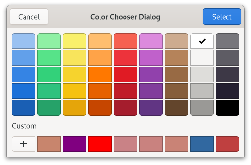
Figure: GtkColorChooserDialog
To create a gtk:color-chooser-dialog widget, use the gtk:color-chooser-dialog-new function. To get or change the initially selected color, use the gtk:color-chooser-rgba function.
(let ((message "Click to change the background color.")
(bg-color (gdk:rgba-parse "White"))
;; Color palette with 9 Red RGBA colors
(palette1 (list (gdk:rgba-parse "IndianRed")
(gdk:rgba-parse "LightCoral")
(gdk:rgba-parse "Salmon")
(gdk:rgba-parse "DarkSalmon")
(gdk:rgba-parse "LightSalmon")
(gdk:rgba-parse "Crimson")
(gdk:rgba-parse "Red")
(gdk:rgba-parse "FireBrick")
(gdk:rgba-parse "DarkRed")))
;; Gray palette with 9 gray RGBA colors
(palette2 (list (gdk:rgba-parse "Gainsboro")
(gdk:rgba-parse "LightGray")
(gdk:rgba-parse "Silver")
(gdk:rgba-parse "DarkGray")
(gdk:rgba-parse "Gray")
(gdk:rgba-parse "DimGray")
(gdk:rgba-parse "LightSlateGray")
(gdk:rgba-parse "SlateGray")
(gdk:rgba-parse "DarkSlateGray"))))
(defun do-color-chooser-dialog (&optional application)
(let* ((area (make-instance 'gtk:drawing-area))
(window (make-instance 'gtk:window
:title "Color Chooser Dialog"
:application application
:child area
:default-width 400))
(gesture (make-instance 'gtk:gesture-click)))
;; Draw the background color and a hint on the drawing area
(gtk:drawing-area-set-draw-func area
(lambda (widget cr width height)
(declare (ignore widget width height))
(let ((red (gdk:rgba-red bg-color))
(green (gdk:rgba-green bg-color))
(blue (gdk:rgba-blue bg-color)))
;; Paint the current color on the drawing area
(cairo:set-source-rgb cr red green blue)
(cairo:paint cr)
;; Print a hint on the drawing area
(cairo:set-source-rgb cr (- 1 red)
(- 1 green)
(- 1 blue))
(cairo:select-font-face cr "Sans")
(cairo:set-font-size cr 12)
(cairo:move-to cr 12 24)
(cairo:show-text cr message))))
;; Add the controller to the drawing area
(gtk:widget-add-controller area gesture)
;; Create and run a color chooser dialog to select a background color
(g:signal-connect gesture "pressed"
(lambda (gesture n x y)
(declare (ignore gesture n x y))
(let ((dialog (make-instance 'gtk:color-chooser-dialog
:transient-for window
:use-alpha nil)))
;; Add a custom palette to the dialog
(gtk:color-chooser-add-palette dialog :vertical 1 palette1)
;; Add a second coustom palette to the dialog
(gtk:color-chooser-add-palette dialog :vertical 1 palette2)
;; Set the actual background color for the color chooser
(setf (gtk:color-chooser-rgba dialog) bg-color)
;; Connect handler to the response signal of the dialog
(g:signal-connect dialog "response"
(lambda (dialog response)
(when (= -5 response) ; the :ok value
;; Change the background color for the drawing area
(format t "new color is ~a~%"
(gtk:color-chooser-rgba dialog))
(setf bg-color (gtk:color-chooser-rgba dialog))
(gtk:widget-queue-draw area))
(gtk:window-destroy dialog)))
(gtk:window-present dialog))))
;; Show the window
(gtk:window-present window)))) GtkColorButton
Figure: GtkColorButton
colorbutton
╰── button.color
╰── [content] The gtk:color-button implementation has a single CSS node with name colorbutton which contains a button node. To differentiate it from a plain gtk:button widget, it gets the .color style class.
(defun do-color-button (&optional application)
(let* ((button (make-instance 'gtk:color-button
:rgba (gdk:rgba-parse "Blue")
:title "Choose a color from the palette"
:margin-top 48
:margin-bottom 48
:margin-start 48
:margin-end 48))
(window (make-instance 'gtk:window
:title "Color Button"
:application application
:child button
:default-width 270
:default-height 210)))
(g:signal-connect button "color-set"
(lambda (widget)
(let ((rgba (gtk:color-chooser-rgba widget)))
(format t "Selected color is ~a~%" (gdk:rgba-to-string rgba)))))
(gtk:window-present window))) GtkFileChooser
(gobject:define-genum "GtkFileChooserAction" gtk:file-chooser-action (:export t :type-initializer "gtk_file_chooser_action_get_type") (:open 0) (:save 1) (:select-folder 2))
- :open
- Indicates Open mode. The file chooser will only let the user pick an existing file.
- :save
- Indicates Save mode. The file chooser will let the user pick an existing file, or type in a new filename.
- :select-folder
- Indicates an Open mode for selecting folders. The file chooser will let the user pick an existing folder.
The gtk:file-chooser interface allows for shortcuts to various places in the filesystem. In the default implementation these are displayed in the left pane. It may be a bit confusing at first that these shortcuts come from various sources and in various flavours, so lets explain the terminology here:
- Bookmarks
- are created by the user, by dragging folders from the right pane to the left pane, or by using the "Add". Bookmarks can be renamed and deleted by the user.
- Shortcuts
- can be provided by the application or by the underlying filesystem abstraction, for example, both the gnome-vfs and the Windows filesystems provide "Desktop" shortcuts. Shortcuts cannot be modified by the user.
- Volumes
- are provided by the underlying filesystem abstraction. Volumes are the "roots" of the filesystem.
(defun create-file-chooser-dialog (parent)
(let ((filter-all (gtk:file-filter-new))
(filter-picture (gtk:file-filter-new))
(dialog (gtk:file-chooser-dialog-new "File Chooser Dialog"
parent
:open
"Open" 100
"Cancel" :cancel)))
(setf (gtk:window-modal dialog) t)
(g:signal-connect dialog "response"
(lambda (dialog response)
(format t " Response is ~a~%" response)
(unless (eq :cancel
(gtk:response-type-keyword response))
(format t "Selected file is ~a~%"
(gtk:file-chooser-namestring dialog)))
(gtk:window-destroy dialog)))
;; Add a file filter
(setf (gtk:file-filter-name filter-all) "All Files")
(gtk:file-filter-add-pattern filter-all "*")
(gtk:file-chooser-add-filter dialog filter-all)
;; Add a second file filter for pictures
(setf (gtk:file-filter-name filter-picture) "All Pictures")
(gtk:file-filter-add-pixbuf-formats filter-picture)
(gtk:file-chooser-add-filter dialog filter-picture)
;; Present the dialog
(gtk:window-present dialog))) If the user selectable list of filters is non-empty, then the filter should be one of the filters in that list. Setting the current filter when the list of filters is empty is useful if you want to restrict the displayed set of files without letting the user change it.
This is meant to be used in save dialogs, to get the currently typed filename when the file itself does not exist yet. For example, an application that adds a custom extra widget to the file chooser for "file format" may want to change the extension of the typed filename based on the chosen format, say, from ".jpg" to ".png".
Note that the name passed in here is a UTF-8 string rather than a filename. This function is meant for such uses as a suggested name in a "Save As..." dialog. You can pass "Untitled.doc" or a similarly suitable suggestion for the name.
If you want to preselect a particular existing file, you should use the gtk:file-chooser-file function instead. Please see the documentation for this function for an example of using the gtk:file-chooser-current-name function as well.
The (setf gtk:file-chooser-file) function sets file as the current filename for the file chooser, by changing to the parent folder of the file and actually selecting the file. If the file chooser is in :save mode, the base name of the file will also appear in the file name entry of the dialog.
If the file name is not in the current folder of the file chooser, then the current folder of the file chooser will be changed to the folder containing file.
Note that the file must exist, or nothing will be done except for the directory change.
(if document-is-new
(progn
;; the user just created a new document
(setf (gtk:file-chooser-current-folder-file chooser)
default-file-for-saving)
(setf (gtk:file-chooser-current-name chooser) "Untitled document"))
(progn
;; the user edited an existing document
(setf (gtk:file-chooser-file chooser) existing-file))) The (setf gtk:file-chooser-namestring) function sets namestring as the current file for the file chooser, by changing to the file's parent folder and actually selecting the file in list. If the chooser is in :save mode, the file's base name will also appear in the dialog's file name entry.
The user will be shown the full contents of the current folder, plus user interface elements for navigating to other folders.
Note that this is the folder that the file chooser is currently displaying, for example, /home/username/Documents, which is not the same as the currently selected folder if the chooser is in :select-folder mode, for example, /home/username/Documents/selected-folder/.
In general, you should not use this function. See the section on setting up a file chooser dialog for the rationale behind this.
GtkFileChooserWidget
lambda (widget) :action
- widget
- The gtk:file-chooser-widget object that received the signal.
lambda (widget) :action
- widget
- The gtk:file-chooser-widget object that received the signal.
lambda (widget) :action
- widget
- The gtk:file-chooser-widget object that received the signal.
lambda (widget path) :action
- widget
- The gtk:file-chooser-widget object that received the signal.
- path
- The string that gets put in the text entry for the file name.
lambda (widget) :action
- widget
- The gtk:file-chooser-widget object that received the signal.
lambda (widget) :action
- widget
- The gtk:file-chooser-widget object that received the signal.
lambda (widget) :action
- widget
- The gtk:file-chooser-widget object that received the signal.
lambda (widget index) :action
- widget
- The gtk:file-chooser-widget object that received the signal.
- index
- The integer for the number of the bookmark to switch to.
lambda (widget) :action
- widget
- The gtk:file-chooser-widget object that received the signal.
lambda (widget) :action
- widget
- The gtk:file-chooser-widget object that received the signal.
lambda (widget) :action
- widget
- The gtk:file-chooser-widget object that received the signal.
Since 4.10
GtkFileChooserDialog
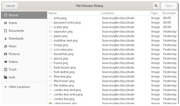
Figure: GtkFileChooserDialog
Note that the gtk:file-chooser-dialog widget does not have any methods of its own. Instead, you should use the functions that work on a gtk:file-chooser interface.
If you want to integrate well with the platform you should use the gtk:file-chooser-native API, which will use a platform-specific dialog if available and fall back to the gtk:file-chooser-dialog widget otherwise.
- To select a file for opening, as for a File/Open command. Use :open.
- To save a file for the first time, as for a File/Save command. Use :save, and suggest a name such as "Untitled" with the gtk:file-chooser-current-name function.
- To save a file under a different name, as for a File/Save As command. Use :save, and set the existing filename with the gtk:file-chooser-file function.
- To choose a folder instead of a file. Use :select-folder.
(let ((dialog (gtk:file-chooser-dialog-new "Open File"
parent-window
:open
"Cancel" :cancel
"Open" :accept)))
... )
This will create buttons for "Cancel" and "Open" that identifiers from the gtk:response-type enumeration. For most dialogs you can use your
own custom response codes rather than the ones in the gtk:response-type enumeration, but the gtk:file-chooser-dialog
widget assumes that its "accept"-type action, for example, an "Open" or
"Save" button, will have one of the following response codes: :accept :ok :yes :applyThis is because the gtk:file-chooser-dialog widget must intercept responses and switch to folders if appropriate, rather than letting the dialog terminate - the implementation uses these known response codes to know which responses can be blocked if appropriate.
To summarize, make sure you use a predefined response code when you use the gtk:file-chooser-dialog widget to ensure proper operation.
(defun create-file-chooser-dialog-open (window)
(let ((dialog (gtk:file-chooser-dialog-new "Open File"
window
:open
"Cancel" :cancel
"Open" :accept)))
(if (eq :accept (gtk:dialog-run dialog))
(let ((filename (gtk:file-chooser-filename dialog)))
...
))
(gtk:window-destroy dialog)))
To use a dialog for saving, you can use this:
(defun create-file-chooser-dialog-save (window filename)
(let ((dialog (gtk:file-chooser-dialog-new "Save File"
window
:save
"Cancel" :cancel
"Save" :accept)))
(setf (gtk:file-chooser-do-overwrite-confirmation dialog) t)
(if filename
(setf (gtk:file-chooser-filename dialog) filename)
(setf (gtk:file-chooser-current-name dialog) "Untitled document"))
(if (eq :accept (gtk:dialog-run dialog))
(let ((filename (gtk:file-chooser-filename dialog)))
...
))
(gtk:window-destroy dialog))) GtkFileChooserNative
While the API of the gtk:file-chooser-native object closely mirrors the gtk:file-chooser-dialog widget, the main difference is that there is no access to any gtk:window or gtk:widget object for the dialog. This is required, as there may not be one in the case of a platform native dialog.
Showing, hiding and running the dialog is handled by the gtk:native-dialog functions.
No operations that change the dialog work while the dialog is visible. Set all the properties that are required before showing the dialog.
- Any GtkFileFilter added using a mimetype.
- Shortcut folders.
(defun create-file-chooser-native (&optional parent)
(let ((native (gtk:file-chooser-native-new "Open File"
parent
:open
"_Open"
"_Cancel")))
;; Connect a signal handler
(g:signal-connect native "response"
(lambda (dialog response)
(when (eq :accept
(gtk:response-type-keyword response))
(let* ((file (gtk:file-chooser-file dialog))
(launcher (gtk:file-launcher-new file)))
;; Open the file
(gtk:file-launcher-launch launcher parent nil
(lambda (source result)
(declare (ignore source result))
(format t "Opened the file ~a~%"
(g:file-basename file))))))))
;; Show the native file chooser
(gtk:native-dialog-show native)))
For more information on how to best set up a file dialog, see the gtk:file-chooser-dialog widget. If characters in label are preceded by an underscore, they are underlined. If you need a literal underscore character in a label, use "__" (two underscores). The first underlined character represents a keyboard accelerator called a mnemonic. Pressing Alt and that key activates the button.
If characters in label are preceded by an underscore, they are underlined. If you need a literal underscore character in a label, use "__" (two underscores). The first underlined character represents a keyboard accelerator called a mnemonic. Pressing Alt and that key activates the button.
GtkFontChooser
(gobject:define-gflags "GtkFontChooserLevel" font-chooser-level (:export t :type-initializer "gtk_font_chooser_level_get_type") (:family 0) (:style #.(ash 1 0)) (:size #.(ash 1 1)) (:variations #.(ash 1 2)) (:features #.(ash 1 3)))
- :family
- Allow selecting a font family.
- :style
- Allow selecting a specific font face.
- :size
- Allow selecting a specific font size.
- :variations
- Allow changing OpenType font variation axes.
- :features
- Allow selecting specific OpenType font features.
lambda (fontchooser fontname) :run-first
- fontchooser
- The gtk:font-chooser widget that received the signal.
- fontname
- The string for the font name.
Note that this can be a different string than what you set with the (setf gtk:font-chooser-font) function, as the font chooser widget may normalize the font names and thus return a string with a different structure. For example, "Helvetica Italic Bold 12" could be normalized to "Helvetica Bold Italic 12".
Use the pango:font-description-equal function if you want to compare two font descriptions.
Use the pango:font-description-equal function if you want to compare two Pango font descriptions.
(gtk:font-chooser-language (make-instance 'gtk:font-button)) => "de-de"
(defvar fontbutton (make-instance 'gtk:font-button :font "Serif Bold 10"))
=> FONTBUTTON
(gtk:font-chooser-font-family fontbutton)
=> #<PANGO-FONT-FAMILY {1002728D63}>
(pango:font-family-name *)
=> "Sans"
;; Define the callback function
(defun font-filter (family face)
(declare (ignore face))
(member (pango:font-family-name family)
'("Sans" "Serif")
:test #'equal))
;; Set the function FONT-FILTER as the callback function
(gtk:font-chooser-set-filter-func button #'font-filter)
;; Remove the filter function from the font button
(gtk:font-chooser-set-filter-func button nil) (setf (pango:context-font-map (gtk:widget-pango-context label)) fontmap)
GtkFontChooserWidget
To set or to get the font which is initially selected, use the gtk:font-chooser-font or gtk:font-chooser-font-desc functions.
To change the text which is shown in the preview area, use the gtk:font-chooser-preview-text function.
GtkFontChooserDialog
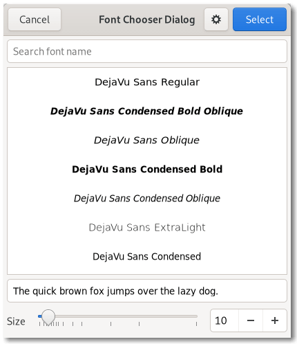
Figure: GtkFontChooserDialog
GtkFontButton
Figure: GtkFontButton
GtkStyleContext
(gobject:define-gflags "GtkStyleContextPrintFlags" style-context-print-flags (:export t :type-initializer "gtk_style_context_print_flags_get_type") (:none 0) (:recurse #.(ash 1 0)) (:show-style #.(ash 1 1)) (:show-change #.(ash 1 2)))
- :none
- :recurse
- Print the entire tree of CSS nodes starting at the node of the style context.
- :show-style
- Show the values of the CSS properties for each node.
- :show-change
- Show information about what changes affect the styles.
For GTK widgets, any gtk:style-context object returned by the gtk:widget-style-context function will already have a gdk:display instance and a text direction information set. The style context will be also updated automatically if any of these settings change on the widget.
If you are using custom styling on an application, you probably want then to make your style information prevail to the style information of the theme, so you must use a gtk:style-provider object with the gtk:+priority-application+ priority. Keep in mind that the user settings in XDG_CONFIG_HOME/gtk-4.0/gtk.css will still take precedence over your changes, as it uses the gtk:+priority-user+ priority.
The display is used to add style information from 'global' style providers, such as the gtk:settings instance of the display. If you are using a gtk:style-context object returned from the gtk:widget-style-context function, you do not need to call this yourself.
Note that a style provider added by this function only affects the style of the widget to which context belongs. If you want to affect the style of all widgets, use the gtk:style-context-add-provider-for-display function.
(let ((provider (gtk:css-provider-new)))
(gtk:css-provider-load-from-string provider
".viewstyle textview {
color : Green;
font : 20px Purisa; }")
(gtk:widget-add-css-class window "viewstyle")
(gtk:style-context-add-provider-for-display (gtk:widget-display window)
provider)
... )
GtkEntry.entry { ... } While any widget defining an "entry" class would be matched by:
.entry { ... } This function is intended for testing and debugging of the CSS implementation in GTK. There are no guarantees about the format of the returned string, it may change.
(setq context
(gtk:widget-style-context (make-instance 'gtk:dialog)))
=> #<GTK:STYLE-CONTEXT {1001C70663}>
(gtk:style-context-to-string context :recurse)
=>
"[window.background.dialog:dir(ltr)]
box.dialog-vbox.vertical:dir(ltr)
box.vertical:dir(ltr)
box.dialog-action-box.horizontal:dir(ltr)
box.dialog-action-area.horizontal:dir(ltr)
" (glib:define-gboxed-cstruct border "GtkBorder" (:export t :type-initializer "gtk_border_get_type") (left :int16 :initform 0) (right :int16 :initform 0) (top :int16 :initform 0) (bottom :int16 :initform 0))
- left
- The width of the left border.
- right
- The width of the right border.
- top
- The width of the top border.
- bottom
- The width of the bottom border.
Typical arrow rendering at 0, 1/2 Pi, Pi, and 3/2 Pi:
Typical background rendering, showing the effect of background-image, border-width and border-radius:
Typical checkmark rendering:
Typical expander rendering:

Typical focus rendering:

Examples of frame rendering, showing the effect of border-image, border-color, border-width, border-radius and junctions:
Handles rendered for the paned and grip classes:

Typical option mark rendering:
Deprecated since GTK 4.18
GtkShortcutsWindow
Additionally, the shortcuts can be filtered by the current view, to avoid showing information that is not relevant in the current application context.
The recommended way to construct a shortcuts window is with a gtk:builder UI definition, by populating a shortcuts window with one or more gtk:shortcuts-section objects, which contain gtk:shortcuts-group objects that in turn contain objects of the gtk:shortcuts-shortcut class.
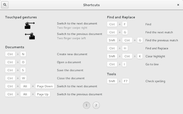
Figure: GEdit shortcuts
An example with multiple views: This example shows a shortcuts window that has been configured to show only the shortcuts relevant to the "stopwatch" view. The .ui file for this example can be found here.
Figure: Clock shortcuts
An example with multiple sections: This example shows a shortcuts window with two sections, "Editor Shortcuts" and "Terminal Shortcuts". The .ui file for this example can be found here.
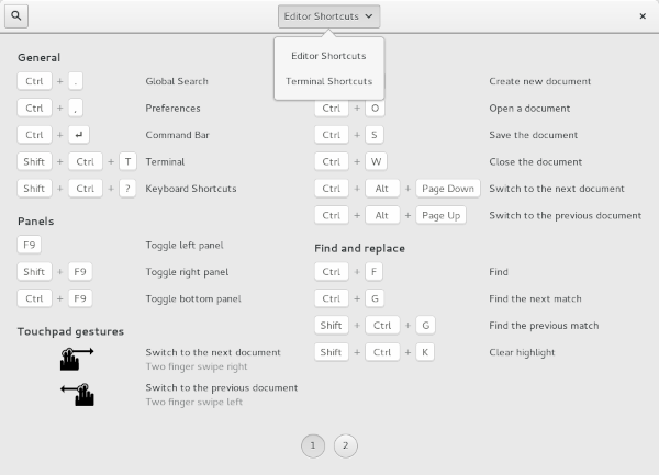
Figure: Builder shortcuts
lambda (shortcutswindow) :action
- shortcutswindow
- The gtk:shortcuts-window object.
lambda (shortcutswindow) :action
- shortcutswindow
- The gtk:shortcuts-window object.
Since 4.14
GtkShortcutsSection
The max-height property can be used to influence how the groups in the section are distributed over pages and columns.
This widget is only meant to be used with gtk:shortcuts-window widgets.
lambda (section offset data) :action
- section
- The gtk:shortcuts-section widget.
- offset
- The integer for the offset.
- data
- The foreign pointer to user data.
- Return
- The boolean whether the page was changed.
Since 4.14
GtkShortcutsGroup
This widget is only meant to be used with the gtk:shortcuts-window widget.
Since 4.14
GtkShortcutsShortcut
(gobject:define-genum "GtkShortcutType" gtk:shortcut-type (:export t :type-initializer "gtk_shortcut_type_get_type") :accelerator :gesture-pinch :gesture-stretch :gesture-rotate-clockwise :gesture-rotate-conterclockwise :gesture-two-finger-swipe-left :gesture-two-finger-swipe-right :gesture :gesture-swipe-left :gesture-swipe-right)
- :accelerator
- The shortcut is a keyboard accelerator. The accelerator property will be used.
- :gesture-pinch
- The shortcut is a pinch gesture. GTK provides an icon and subtitle.
- :gesture-stretch
- The shortcut is a stretch gesture. GTK provides an icon and subtitle.
- :gesture-rotate-clockwise
- The shortcut is a clockwise rotation gesture. GTK provides an icon and subtitle.
- :gesture-rotate-counter-clockwise
- The shortcut is a counterclockwise rotation gesture. GTK provides an icon and subtitle.
- :gesture-two-finger-swipe-left
- The shortcut is a two-finger swipe gesture. GTK provides an icon and subtitle.
- :gesture-two-finger-swipe-right
- The shortcut is a two-finger swipe gesture. GTK provides an icon and subtitle.
- :gesture
- The shortcut is a gesture. The icon property will be used.
- :gesture-swipe-left
- The shortcut is a swipe gesture. GTK provides an icon and subtitle.
- :gesture-swipe-right
- The shortcut is a swipe gesture. GTK provides an icon and subtitle.
- gtk:shortcuts-shortcut-accel-size-group
- gtk:shortcuts-shortcut-accelerator
- gtk:shortcuts-shortcut-action-name
- gtk:shortcuts-shortcut-direction
- gtk:shortcuts-shortcut-icon
- gtk:shortcuts-shortcut-icon-set
- gtk:shortcuts-shortcut-shortcut-type
- gtk:shortcuts-shortcut-subtitle
- gtk:shortcuts-shortcut-subtitle-set
- gtk:shortcuts-shortcut-title
- gtk:shortcuts-shortcut-title-size-group
Two alternative shortcuts: <shift>a Home
A range of shortcuts: <alt>1...<alt>9
Several keys pressed together: Control_L&Control_R
A sequence of shortcuts or keys: <ctl>c+<ctl>x
Use + instead of & when the keys may or have to be pressed sequentially, e.g use t+t for 'press the t key twice'.
Note that <, > and & need to be escaped as <, > and & when used in .ui files.
GtkShortcutLabel
Other Functions in gtk
Package gdk
General
Enumerations
(gobject:define-genum "GdkGravity" gravity (:export t :type-initializer "gdk_gravity_get_type") (:north-west 1) (:north 1) (:north-east 3) (:west 4) (:center 5) (:east 6) (:south-west 7) (:south 8) (:south-east 9) (:static 10))
- :north-west
- The reference point is at the top left corner.
- :north
- The reference point is in the middle of the top edge.
- :north-east
- The reference point is at the top right corner.
- :west
- The reference point is at the middle of the left edge.
- :center
- The reference point is at the center of the surface.
- :east
- The reference point is at the middle of the right edge.
- :south-west
- The reference point is at the lower left corner.
- :south
- The reference point is at the middle of the lower edge.
- :sout-east
- The reference point is at the lower right corner.
- :static
- The reference point is at the top left corner of the surface itself, ignoring window manager decorations.
(gobject:define-gflags "GdkModifierType" modifier-type (:export t :type-initializer "gdk_modifier_type_get_type") #-gtk-4-14 (:none 0) #+gtk-4-14 (:no-modifier-mask 0) (:shift-mask #.(ash 1 0)) (:lock-mask #.(ash 1 1)) (:control-mask #.(ash 1 2)) (:alt-mask #.(ash 1 3)) (:button1-mask #.(ash 1 8)) (:button2-mask #.(ash 1 9)) (:button3-mask #.(ash 1 10)) (:button4-mask #.(ash 1 11)) (:button5-mask #.(ash 1 12)) (:super-mask #.(ash 1 26)) (:hyper-mask #.(ash 1 27)) (:meta-mask #.(ash 1 28)))
- :no-modifier-mask
- No modifier key. Since 4.14
- :shift-mask
- The Shift key.
- :lock-mask
- The Lock key, depending on the modifier mapping of the X server this may either be the CapsLock or ShiftLock key.
- :control-mask
- The Control key.
- :alt-mask
- The fourth modifier key. It depends on the modifier mapping of the X server which key is interpreted as this modifier, but normally it is the Alt key.
- :button1-mask
- The first mouse button.
- :button2-mask
- The second mouse button.
- :button3-mask
- The third mouse button.
- :button4-mask
- The fourth mouse button.
- :button5-mask
- The fifth mouse button.
- :super-mask
- The Super modifier.
- :hyper-mask
- The Hyper modifier.
- :meta-mask
- The Meta modifier.
Note that GDK may add internal values to events which include values outside this enumeration. Your code should preserve and ignore them. You can use the gdk:+modifier-mask+ value to remove all private values.
GdkRectangle
(glib:define-gboxed-cstruct rectangle "GdkRectangle" (:export t :type-initializer "gdk_rectangle_get_type") (x :int :initform 0) (y :int :initform 0) (width :int :initform 0) (height :int :initform 0))
- x
- The x coordinate of the top left corner.
- y
- The y coordinate of the top left corner.
- width
- The width of the rectangle.
- height
- The height of the rectangle.
The intersection of two rectangles can be computed with the gdk:rectangle-intersect function. To find the union of two rectangles use the gdk:rectangle-union function.
The cairo:region-t type provided by Cairo is usually used for managing non-rectangular clipping of graphical operations.
The Graphene library has a number of other data types for regions and volumes in 2D and 3D.
GdkRGBA
(glib:define-gboxed-cstruct rgba "GdkRGBA" (:export t :type-initializer "gdk_rgba_get_type") (red :float :initform 0.0) (green :float :initform 0.0) (blue :float :initform 0.0) (alpha :float :initform 0.0))
- red
- The intensity of the red channel from 0.0 to 1.0 inclusive.
- green
- The intensity of the green channel from 0.0 to 1.0 inclusive.
- blue
- The intensity of the blue channel from 0.0 to 1.0 inclusive.
- alpha
- The opacity of the color from 0.0 for completely translucent to 1.0 for opaque.
(gdk:rgba-new :red 0.0 :green 0.0 :blue 0.0 :alpha 0.0)represents transparent black and
(gdk:rgba-new :red 1.0 :green 1.0 :blue 1.0 :alpha 1.0)is opaque white. Other values will be clamped to this range when drawing.
- A standard name taken from the X11 rgb.txt file.
- A hex value in the form rgb, rrggbb, rrrgggbbb or rrrrggggbbbb.
- A RGB color in the form rgb(r,g,b). In this case the color will have full opacity.
- A RGBA color in the form rgba(r,g,b,a).
(gdk:rgba-parse "LightGreen")
=> #S(GDK-RGBA :RED 0.5647059
:GREEN 0.93333334
:BLUE 0.5647059
:ALPHA 1.0)
(gdk:rgba-parse "#90ee90")
=> #S(GDK-RGBA :RED 0.5647059
:GREEN 0.93333334
:BLUE 0.5647059
:ALPHA 1.0)
(gdk:rgba-parse "unknown") => NIL These string forms are supported by the CSS3 colors module, and can be parsed by the gdk:rgba-parse function.
Note that this string representation may loose some precision, since r, g and b are represented as 8-bit integers. If this is a concern, you should use a different representation.
(gdk:rgba-to-string (gdk:rgba-new :red 1.0)) => "rgba(255,0,0,0)" (gdk:rgba-parse *) => #S(GDK-RGBA :RED 1.0 :GREEN 0.0 :BLUE 0.0 :ALPHA 0.0)
Key Values
GdkDmabufFormats
(glib:define-gboxed-opaque dmabuf-formats "GdkDmabufFormats" :export t :type-initializer "gdk_dmabuf_formats_get_type" :alloc (error "GdkDmabufFormats cannot be created from the Lisp side"))
The list of supported formats is sorted by preference, with the best formats coming first. The list may contain (format, modifier) pairs where the modifier is DMA_FORMAT_MOD_INVALID, indicating that implicit modifiers may be used with this format.
See the gdk:dmabuf-texture-builder documentation for more information about DMA buffers. Note that DMA buffers only exist on Linux.
Since 4.14
Since 4.14
Since 4.14
Since 4.14
Since 4.14
GdkColorState
(glib:define-gboxed-opaque color-state "GdkColorState" :export t :type-initializer "gdk_color_state_get_type" :alloc (error "GdkColorState cannot be created from the Lisp side"))
Crucially, GTK knows how to convert colors from one color state to another. The gdk:color-state instances are immutable and therefore threadsafe.
Since 4.16
Since 4.16
Since 4.16
Since 4.16
Since 4.16
Since 4.16
Since 4.16
GdkCicpParams
(gobject:define-genum "GdkCicpRange" cicp-range (:export t :type-initializer "gdk_cicp_range_get_type") :narrow :full)
- :narrow
- The values use the range of 16-235 (for Y) and 16-240 for u and v.
- :full
- The values use the full range.
In digital broadcasting, it is common to reserve the lowest and highest values. Typically the allowed values for the narrow range are 16-235 for Y and 16-240 for u,v (when dealing with YUV data).
Since 4.16
The 'unspecified' value (2) is not treated in any special way, and must be replaced by a different value before creating a color state.
The gdk:cicp-params object can be used as a builder object to construct a color state from Cicp data with the gdk:cicp-params-build-color-state function. The function will return an error if the given parameters are not supported.
You can obtain a gdk:cicp-params object from a color state with the gdk:color-state-create-cicp-params function. This can be used to create a variant of a color state, by changing just one of the Cicp parameters, or just to obtain information about the color state.
Since 4.16
Supported values are:
- 1: BT.709 / sRGB
- 2: unspecified
- 5: PAL
- 6,7: BT.601 / NTSC
- 9: BT.2020
- 12: Display P3
Supported values are:
- 0: RGB
- 2: unspecified
Supported values are:
- 1,6,14,15: BT.709, BT.601, BT.2020
- 2: unspecified
- 4: gamma 2.2
- 5: gamma 2.8
- 8: linear
- 13: sRGB
- 16: BT.2100 PQ
- 18: BT.2100 HLG
Since 4.16
Since 4.16
Displays, Devices, Monitors, and Seats
GdkDisplayManager
The GDK library can be built with support for multiple backends. The gdk:display-manager object determines which backend is used at runtime.
lambda (manager display) :run-last
- manager
- The gdk:display-manager object on which the signal is emitted.
- display
- The opened gdk:display object.
(gdk:display-manager-default-display (gdk:display-manager-get))
=> #<GDK:DISPLAY {1001F9A233}>
(gdk:display-manager-get)
=> #<GDK:DISPLAY-MANAGER {1001CFF103}> (gdk:set-allowed-backends "wayland,quartz,*")instructs GDK to try the Wayland backend first, followed by the Quartz backend, and then all others.
If the GDK_BACKEND environment variable is set, it determines what backends are tried in what order, while still respecting the set of allowed backends that are specified by this function.
The possible backend names are x11, win32, quartz, broadway, wayland. You can also include a * in the list to try all remaining backends.
This call must happen prior to the gdk:display-open, gtk:init, or gtk:init-check functions in order to take effect.
GdkDisplay
- To manage and provide information about input devices, for example, pointers and keyboards.
- To manage and provide information about output devices, for example, monitors and projectors.
Output devices are represented by gdk:monitor objects, which can be accessed with the gdk:display-monitor-at-surface function and similar APIs.
lambda (display is-error) :run-last
- display
- The gdk:display object on which the signal is emitted.
- is-error
- The boolean that is true if display was closed due to an error.
lambda (display) :run-last
- display
- The gdk:display object on which the signal is emitted.
lambda (display seat) :run-last
- display
- The gdk:display object on which the signal is emitted.
- seat
- The gdk:seat object that was just added.
lambda (display seat) :run-last
- display
- The gdk:display object on which the signal is emitted.
- seat
- The gdk:seat object that was just removed.
lambda (display setting) :run-last
- display
- The gdk:display object on which the signal is emitted.
- setting
- The string for the name of the setting that changed.
On X11 this function returns whether a compositing manager is compositing on display. On modern displays, this value is always true.
The formats returned by this function can be used for negotiating buffer formats with producers such as v4l, pipewire or GStreamer. To learn more about dma-buf formats, see the gdk:dmabuf-texture-builder documentation.
Since 4.14
On modern displays, this value is always true.
Even if a true is returned, it is possible that the alpha channel of the surface will not be honored when displaying the surface on the screen. In particular, for X an appropriate windowing manager and compositing manager must be running to provide appropriate display. Use the gdk:display-is-composited function to check if that is the case.
On modern displays, this value is always true.
Since 4.14
(gdk:display-manager-default-display (gdk:display-manager-get))
(gdk:display-default)
=> #<GDK:DISPLAY {1007501013}>
(eq (gdk:display-default)
(gdk:display-manager-default-display (gdk:display-manager-get)))
=> T This is most useful for X11. On windowing systems where requests are handled synchronously, this function will do nothing.
This is most useful for X11. On windowing systems where requests are handled synchronously, this function will do nothing.
Even if a true value is returned, it is possible that the alpha channel of the surface will not be honored when displaying the surface on the screen. In particular, for X an appropriate windowing manager and compositing manager must be running to provide appropriate display. Use the gdk:display-is-composited function to check if that is the case. On modern displays, this value is always true.
Check the value of the gdk:display-is-rgba function for whether the display supports an alpha channel. On X11 this function returns whether a compositing manager is compositing on display. On modern displays, this value is always true.
(let ((display (gdk:display-default))) (gdk:display-setting display "gtk-double-click-time" "gint")) => 400
On US keyboards, the shift key changes the keyboard level, and there are no groups. A group switch key might convert a keyboard between Hebrew to English modes, for example.
(gdk:display-map-keyval (gdk:display-default) (char-code #a)) => ((65 0 0) (65 0 3) (65 0 15) (65 0 2))
The effective value is the group that was actually used for the translation. Some keys such as Enter are not affected by the active keyboard group. The level value is derived from state.
The consumed value gives modifiers that should be masked out from state when comparing this key press to a keyboard shortcut. For instance, on a US keyboard, the plus symbol is shifted, so when comparing a key press to a <Control>plus accelerator <Shift> should be masked out.
Note that even if this function succeeds, creating a gdk:gl-context object may still fail. This function is idempotent. Calling it multiple times will just return the same value or error.
You never need to call this function, GDK will call it automatically as needed. But you can use it as a check when setting up code that might make use of OpenGL.
Since 4.4
If the creation of the OpenGL context failed, an error will be set. Before using the returned OpenGL context, you will need to call the gdk:gl-context-make-current or gdk:gl-context-realize functions.
Since 4.6
GdkDeviceTool
(gobject:define-genum "GdkDeviceToolType" device-tool-type (:export t :type-initializer "gdk_device_tool_type_get_type") :unknown :pen :eraser :brush :pencil :airbrush :mouse :lens)
- :unkown
- Tool is of an unknown type.
- :pen
- Tool is a standard tablet stylus.
- :eraser
- Tool is standard tablet eraser.
- :brush
- Tool is a brush stylus.
- :pencil
- Tool is a pencil stylus.
- :airbrush
- Tool is an airbrush stylus.
- :mouse
- Tool is a mouse.
- :lens
- Tool is a lens cursor.
This is a more concrete and device specific method to identify a device tool than the gdk:device-tool-tool-type function, as a tablet may support multiple devices with the same gdk:device-tool-type value, but having different hardware identificators.
GdkDevice
(gobject:define-genum "GdkInputSource" input-source (:export t :type-initializer "gdk_input_source_get_type") :mouse :pen :keyboard :touchscreen :touchpad :trackpoint :tablet-pad)
- :mouse
- The device is a mouse. This will be reported for the core pointer, even if it is something else, such as a trackball.
- :pen
- The device is a stylus of a graphics tablet or similar device.
- :keyboard
- The device is a keyboard.
- :touchscreen
- The device is a direct-input touch device, such as a touchscreen or tablet.
- :touchpad
- The device is an indirect touch device, such as a touchpad.
- :trackpoint
- The device is a trackpoint.
- :tablet-pad
- The device is a "pad", a collection of buttons, rings and strips found in drawing tablets.
(gobject:define-genum "GdkAxisUse" gdk-axis-use (:export t :type-initializer "gdk_axis_use_get_type") :ignore :x :y :delta-x :delty-y :pressure :xtilt :ytilt :wheel :distance :rotation :slider :last)
- :ignore
- The axis is ignored.
- :x
- The axis is used as the x axis.
- :y
- The axis is used as the y axis.
- :delta-x
- The axis is used as the scroll x delta.
- :delta-y
- The axis is used as the scroll y delta.
- :pressure
- The axis is used for pressure information.
- :xtilt
- The axis is used for x tilt information.
- :ytilt
- The axis is used for y tilt information.
- :wheel
- The axis is used for wheel information.
- :distance
- The axis is used for pen/tablet distance information.
- :rotation
- The axis is used for pen rotation information.
- :slider
- The axis is used for pen slider information.
- :last
- The constant equal to the numerically highest axis value.
(gobject:define-gflags "GdkAxisFlags" axis-flags (:export t :type-initializer "gdk_axis_flags_get_type") (:x #.(ash 1 1)) (:y #.(ash 1 2)) (:delta-x #.(ash 1 3)) (:delta-y #.(ash 1 4)) (:pressure #.(ash 1 5)) (:xtilt #.(ash 1 6)) (:ytilt #.(ash 1 7)) (:wheel #.(ash 1 8)) (:distance #.(ash 1 9)) (:rotation #.(ash 1 10)) (:slider #.(ash 1 11)))
- :x
- x axis is present.
- :y
- y axis is present.
- :delta-x
- Scroll X delta axis is present.
- :delta-y
- Scroll Y delta axis is present
- :pressure
- Pressure axis is present.
- :xtilt
- x tilt axis is present.
- :ytilt
- y tilt axis is present.
- :wheel
- Wheel axis is present.
- :distance
- Distance axis is present.
- :rotation
- z-axis rotation is present.
- :slider
- Slider axis is present.
(defstruct time-coord time flags axes)
- time
- an unsigned integer for the timestamp of the event
- flags
- an gdk:axis-flags value indicating what axes are present
- axes
- an array for 12 double floats for the axis values
- gdk:device-active-layout-index
- gdk:device-caps-lock-state
- gdk:device-direction
- gdk:device-display
- gdk:device-has-bidi-layouts
- gdk:device-has-cursor
- gdk:device-layout-names
- gdk:device-modifier-state
- gdk:device-n-axes
- gdk:device-name
- gdk:device-num-lock-state
- gdk:device-num-touches
- gdk:device-product-id
- gdk:device-scroll-lock-state
- gdk:device-seat
- gdk:device-source
- gdk:device-tool
- gdk:device-vendor-id
lambda (device) :run-last
- device
- The gdk:device object that changed.
lambda (device tool) :run-last
- device
- The gdk:device object that changed.
- tool
- The new gdk:device-tool current device tool.
Since 4.18
Since 4.18
Since 4.2
GdkDevicePad
(gobject:define-genum "GdkDevicePadFeature" device-pad-feature (:export t :type-initializer "gdk_device_pad_feature_get_type") :button :ring :strip)
- :button
- A button.
- :ring
- A ring-shaped interactive area.
- :strip
- A straight interactive area.
Tablet pads may contain one or more groups, each containing a subset of the buttons/rings/strips available. The gdk:device-pad-n-groups function can be used to obtain the number of groups, the gdk:device-pad-n-features and gdk:device-pad-feature-group functions can be combined to find out the number of buttons/rings/strips the device has, and how are they grouped.
Each of those groups have different modes, which may be used to map each individual pad feature to multiple actions. Only one mode is effective (current) for each given group, different groups may have different current modes. The number of available modes in a group can be found out through the gdk:device-pad-group-n-modes function, and the current mode for a given group will be notified through events of :pad-group-mode type of the gdk:event-type enumeration.
GdkMonitor
(gobject:define-genum "GdkSubpixelLayout" subpixel-layout (:export t :type-initializer "gdk_subpixel_layout_get_type") (:unknown 0) (:none 1) (:horizontal-rgb 2) (:horizontal-bgr 3) (:vertical-rgb 3) (:vertical-brg 4))
- :unknown
- The layout is not known.
- :none
- Not organized in this way.
- :horizontal-rgb
- The layout is horizontal, the order is RGB.
- :horizontal-bgr
- The layout is horizontal, the order is BGR.
- :vertical-rgb
- The layout is vertical, the order is RGB.
- :vertical-bgr
- The layout is vertical, the order is BGR.
lambda (monitor) :run-first
- monitor
- The gdk:monitor object on which this signal was emitted.
Since 4.14
This can be used if you want to create pixel based data for a particular monitor, but most of the time you are drawing to a surface where it is better to use the gdk:surface-scale-factor function instead.
GdkSeat
(gobject:define-gflags "GdkSeatCapabilities" seat-capabilities (:export t :type-initializer "gdk_seat_capabilities_get_type") (:none 0) (:pointer #.(ash 1 0)) (:touch #.(ash 1 1)) (:tablet-stylus #.(ash 1 2)) (:keyboard #.(ash 1 3)) (:tablet-pad #.(ash 1 4)) (:all-pointing 7) (:all 31))
- :none
- No input capabilities.
- :pointer
- The seat has a pointer,for example, mouse.
- :touch
- The seat has touchscreen(s) attached.
- :tablet-stylus
- The seat has drawing tablet(s) attached.
- :keyboard
- The seat has keyboard(s) attached.
- :tablet-pad
- The seat has drawing tablet pad(s) attached.
- :all-pointing
- The union of all pointing capabilities.
- :all
- The union of all capabilities.
lambda (seat device) :run-last
- seat
- The gdk:seat object on which the signal is emitted.
- device
- The newly added gdk:device object.
lambda (seat device) :run-last
- seat
- The gdk:seat object on which the signal is emitted.
- device
- The just removed gdk:device object.
lambda (seat tool) :run-last
- seat
- The gdk:seat object on which the signal is emitted.
- tool
- The new gdk:device-tool object known to the seat.
lambda (seat tool) :run-last
- seat
- The gdk:seat object on which the signal is emitted.
- tool
- The just removed gdk:device-tool object.
Paintables
GdkPaintable
(gobject:define-gflags "GdkPaintableFlags" paintable-flags (:export t :type-initializer "gdk_paintable_flags_get_type") (:static-size #.(ash 1 0)) (:static-contents #.(ash 1 1)))
- :static-size
- The size is immutable. The "invalidate-size" signal will never be emitted.
- :static-contents
- The content is immutable. The "invalidate-contents" signal will never be emitted.
A gdk:paintable object can be snapshot at any time and size using the gdk:paintable-snapshot function. How the paintable interprets that size and if it scales or centers itself into the given rectangle is implementation defined, though if you are implementing a gdk:paintable object and do not know what to do, it is suggested that you scale your paintable ignoring any potential aspect ratio.
The contents that a gdk:paintable object produces may depend on the gdk:snapshot object passed to it. For example, paintables may decide to use more detailed images on higher resolution screens or when OpenGL is available. A gdk:paintable object will however always produce the same output for the same snapshot.
A gdk:paintable object may change its contents, meaning that it will now produce a different output with the same snapshot. Once that happens, it will call the gdk:paintable-invalidate-contents function which will emit the "invalidate-contents" signal. If a paintable is known to never change its contents, it will set the :static-contents flag. If a consumer cannot deal with changing contents, it may call the gdk:paintable-current-image function which will return a static paintable and use that.
A paintable can report an intrinsic (or preferred) size or aspect ratio it wishes to be rendered at, though it does not have to. Consumers of the interface can use this information to layout thepaintable appropriately. Just like the contents, the size of a paintable can change. A paintable will indicate this by calling the gdk:paintable-invalidate-size function which will emit the "invalidate-size" signal. And just like for contents, if a paintable is known to never change its size, it will set the :static-size flag.
Besides API for applications, there are some functions that are only useful for implementing subclasses and should not be used by applications: gdk:paintable-invalidate-contents, gdk:paintable-invalidate-size, gdk:paintable-new-empty.
lambda (paintable) :run-last
- paintable
- The gdk:paintable object.
lambda (paintable) :run-last
- paintable
- The gdk:paintable object.
(gobject:define-vtable ("GdkPaintable" paintable)
(:skip parent-instance (:struct g:type-interface))
;; Methods of the GdkPaintable interface
(snapshot (:void (paintable (g:object paintable))
(snapshot (g:object snapshot))
(width :double)
(height :double)))
(get-current-image ((g:object paintable) (paintable (g:object paintable))))
(get-flags (paintable-flags (paintable (g:object paintable))))
(get-intrinsic-width (:int (paintable (g:object paintable))))
(get-intrinsic-height (:int (paintable (g:object paintable))))
(get-intrinsic-aspect-ratio (:double (paintable (g:object paintable))))) - snapshot
- Virtual function called by the gdk:paintable-snapshot function. You must implement the gdk:paintable-snapshot-impl method, when subclassing from the gdk:paintable interface.
- get-current-image
- Virtual function called by the gdk:paintable-current-image function. You must implement the gdk:paintable-get-current-image-impl method, when subclassing from the gdk:paintable interface.
- get-flags
- Virtual function called by the gdk:paintable-flags function. You must implement the gdk:paintable-get-flags-impl method, when subclassing from the gdk:paintable interface.
- get-intrinsic-width
- Virtual function called by the gdk:paintable-intrinsic-width function. You must implement the gdk:paintable-get-intrinsic-width-impl method, when subclassing from the gdk:paintable interface.
- get-intrinsic-height
- Virtual function called by the gdk:paintable-intrinsic-height function. You must implement the gdk:paintable-get-intrinsic-height-impl method, when subclassing from the gdk:paintable interface.
- get-intrinsic-aspect-ratio-impl
- Virtual function called by the gdk:paintable-intrinsic-aspect-ratio function. You must implement the gdk:paintable-get-intrinsic-aspect-ratio-impl method, when subclassing from the gdk:paintable interface.
Note that apart from the gdk:paintable-snapshot-impl method, no method of this interface is mandatory to implement, though it is a good idea to implement the gdk:paintable-get-current-image-impl method for non-static paintables and the gdk:paintable-get-flags-impl method if the paintable is not dynamic as the default implementation returns no flags and that will make the implementation likely quite slow.
;; Implementation of a NUCLEAR-ICON subclass
(gobject:define-gobject-subclass "NuclearIcon" nuclear-icon
(:superclass g:object
:export t
:interfaces ("GdkPaintable"))
((rotation
nuclear-icon-rotation
"rotation" "gdouble" t t)))
;; This is the function that draws the actual icon
(defun nuclear-snapshot (snapshot foreground background width height rotation)
(let ((size (min width height))
(radius 0.3)
(cr nil))
(graphene:with-rects ((rect1 0 0 width height)
(rect2 (/ (- width size) 2.0)
(/ (- height size) 2.0)
size size))
(gtk:snapshot-append-color snapshot background rect1)
(setf cr (gtk:snapshot-append-cairo snapshot rect2))
(cairo-set-source-rgba cr foreground)
(cairo:translate cr (/ width 2.0) (/ height 2.0))
(cairo:scale cr size size)
(cairo:rotate cr rotation)
(cairo:arc cr 0 0 0.1 (- pi) pi)
(cairo:fill cr)
(setf (cairo:line-width cr) radius)
(setf (cairo:dash cr 0.0) (list (/ (* radius pi) 3)))
(cairo:arc cr 0 0 radius (- pi) pi)
(cairo:stroke cr)
(cairo:destroy cr))))
;; Here, we implement the methods required by the GdkPaintable interface
(defmethod paintable-snapshot-impl
((paintable nuclear-icon) snapshot width height)
(nuclear-snapshot snapshot
(rgba-new :red 0 :green 0 :blue 0 :alpha 1)
(rgba-new :red 0.9 :green 0.75 :blue 0.15 :alpha 1)
width
height
(nuclear-icon-rotation paintable)))
(defmethod paintable-get-flags-impl ((paintable nuclear-icon))
(list :static-contents :static-size))
(defmethod paintable-snapshot-impl ((paintable paintable) snapshot width height)
(error "Paintable of type ~a does not implement GDK:PAINTABLE-SNAPSHOT-IMPL"
(g:type-name (g:type-from-instance paintable))))
This method must be implemented for a subclass which implements the gdk:paintable interface. The default implementation signals an error. See the gdk:paintable-snapshot function for the syntax. The gdk:paintable documentation shows a complete example of implementing
the interface.
(defmethod paintable-get-current-image-impl ((paintable paintable))
(if (not (set-difference '(:static-size :static-contents)
(paintable-get-flags-impl paintable)))
;; Paintable is immutable, return it
paintable
;; Create a new paintable object
(let ((width (paintable-get-intrinsic-width-impl paintable))
(height (paintable-get-intrinsic-height-impl paintable)))
(if (or (<= width 0) (<= height 0))
(paintable-new-empty width height)
(let ((snapshot (g:object-new "GtkSnapshot")))
(paintable-snapshot paintable snapshot width height)
;; The GTK package is not availabe at this point. We call the
;; C function directly.
(cffi:foreign-funcall "gtk_snapshot_free_to_paintable"
(g:object snapshot) snapshot
:pointer (cffi:null-pointer)))))))
The implementation of this method is not mandatory. The default
implementation returns the paintable itself, when it is a static paintable.
Otherwise, the default method returns an empty paintable or creates a
paintable for the intrinsic width and height. (defmethod paintable-get-flags-impl ((paintable paintable)) '())The default method returns no flags set.
(defmethod paintable-get-intrinsic-width-impl ((paintable paintable)) 0)The default method returns 0 for the intrinsic width.
(defmethod paintable-get-intrinsic-height-impl ((paintable paintable)) 0)The default method returns 0 for the intrinsic height.
(defmethod paintable-get-intrinsic-aspect-ratio-impl ((paintable paintable))
(let ((width (paintable-get-intrinsic-width-impl paintable))
(height (paintable-get-intrinsic-height-impl paintable)))
(if (or (<= width 0) (<= height 0))
0.0d0
(coerce (/ width height) 'double-float))))
The default method returns 0.0d0 or the width to height ratio as a double
float. This is a purely informational value and does not in any way limit the values that may be passed to the gdk:paintable-snapshot function.
If the paintable does not have a preferred width, it returns 0. Negative values are never returned.
This is a purely informational value and does not in any way limit the values that may be passed to the gdk:paintable-snapshot function.
If the paintable does not have a preferred height, it returns 0. Negative values are never returned.
This is a purely informational value and does not in any way limit the values that may be passed to the gdk:paintable-snapshot function.
Usually when a paintable returns nonzero values from the gdk:paintable-intrinsic-width and gdk:paintable-intrinsic-height functions the aspect ratio should conform to those values, though that is not required.
If the paintable does not have a preferred aspect ratio, it returns 0. Negative values are never returned.
It is not necessary to call this function when both swidth and sheight are known, but it is useful to call this function in GtkWidget:measure implementations to compute the other dimension when only one dimension is given.
This function will emit the "invalidate-contents" signal. If a paintable reports the :static-contents value of the gdk:paintable-flags flags, it must not call this function.
This function will emit the "invalidate-size" signal. If a paintable reports the :static-size flag, it must not call this function.
GdkTexture
Be aware that this format is different for different endianness.
(gobject:define-genum "GdkMemoryFormat" memory-format (:export t :type-initializer "gdk_memory_format_get_type") :B8G8R8A8-PREMULTIPLIED :A8R8G8B8-PREMULTIPLIED :R8G8B8A8-PREMULTIPLIED :B8G8R8A8 :A8R8G8B8 :R8G8B8A8 :A8B8G8R8 :R8G8B8 :B8G8R8 :R16G16B16 :R16G16B16A16-PREMULTIPLIED :R16G16B16A16 :R16G16B16-FLOAT :R16G16B16A16-FLOAT-PREMULTIPLIED :R16G16B16A16-FLOAT :R32G32B32-FLOAT :R32G32B32A32-FLOAT-PREMULTIPLIED :R32G32B32A32-FLOAT :8A8-PREMULTIPLIED :G8A8 :G8 :G16A16-PREMULTIPLIED :G16A16 :G16 :A8 :A16 :A16-FLOAT :A32-FLOAT :A8B8G8R8-PREMULTIPLIED :B8G8R8X8 :X8R8G8B8 :R8G8B8X8 :X8B8G8R8 :G8-B8R8-420 :G8-R8B8-420 :G8-B8R8-422 :G8-R8B8-422 :G8-B8R8-444 :G8-R8B8-444 :G10X6-B10X6R10X6-420 :G12X4-B12X4R12X4-420 :G16-B16R16-420 :G8-B8-R8-410 :G8-R8-B8-410 :G8-B8-R8-411 :G8-R8-B8-411 :G8-B8-R8-420 :G8-R8-B8-420 :G8-B8-R8-422 :G8-R8-B8-422 :G8-B8-R8-444 :G8-R8-B8-444 :G8B8G8R8-422 :G8R8G8B8-422 :R8G8B8G8-422 :B8G8R8G8-422 :X6G10-X6B10-X6R10-420 :X6G10-X6B10-X6R10-422 :X6G10-X6B10-X6R10-444 :X4G12-X4B12-X4R12-420 :X4G12-X4B12-X4R12-422 :X4G12-X4B12-X4R12-444 :G16-B16-R16-420 :G16-B16-R16-422 :G16-B16-R16-444 :N-FORMATS)
- :B8G8R8A8-PREMULTIPLIED
- 4 bytes for blue, green, red, alpha. The color values are premultiplied with the alpha value. This is the default memory format for little endianness.
- :A8R8G8B8-PREMULTIPLIED
- 4 bytes for alpha, red, green, blue. The color values are premultiplied with the alpha value. This is the default memory format for big endianness.
- :R8G8B8A8-PREMULTIPLIED
- 4 bytes for red, green, blue, alpha The color values are premultiplied with the alpha value.
- :B8G8R8A8
- 4 bytes for blue, green, red, alpha.
- :A8R8G8B8
- 4 bytes for alpha, red, green, blue.
- :R8G8B8A8
- 4 bytes for red, green, blue, alpha.
- :A8B8G8R8
- 4 bytes for alpha, blue, green, red.
- :R8G8B8
- 3 bytes for red, green, blue. The data is opaque.
- :B8G8R8
- 3 bytes for blue, green, red. The data is opaque.
- :R16G16B16
- 3 guint16 values for red, green, blue. Since 4.6
- :R16G16B16A16-PREMULTIPLIED
- 4 guint16 values for red, green, blue, alpha. The color values are premultiplied with the alpha value. Since 4.6
- :R16G16B16A16
- 4 guint16 values for red, green, blue, alpha. Since 4.6
- :R16G16B16-FLOAT
- 3 half-float values for red, green, blue. The data is opaque. Since 4.6
- :R16G16B16A16-FLOAT-PREMULTIPLIED
- 4 half-float values for red, green, blue and alpha. The color values are premultiplied with the alpha value. Since 4.6
- :R16G16B16A16-FLOAT
- 4 half-float values for red, green, blue and alpha. Since 4.6
- :R32G32B32-FLOAT
- 3 float values for red, green, blue.
- :R32G32B32A32-FLOAT-PREMULTIPLIED
- 4 float values for red, green, blue and alpha. The color values are premultiplied with the alpha value. Since 4.6
- :R32G32B32A32-FLOAT
- 4 float values for red, green, blue and alpha. Since 4.6
- :8A8-PREMULTIPLIED
- 2 bytes for grayscale, alpha. The color values are premultiplied with the alpha value. Since 4.12
- :G8A8
- 2 bytes for grayscale, alpha. Since 4.12
- :G8
- One byte for grayscale. The data is opaque. Since 4.12
- :G16A16-PREMULTIPLIED
- 2 guint16 values for grayscale, alpha. The color values are premultiplied with the alpha value. Since 4.12
- :G16A16
- 2 guint16 values for grayscale, alpha. Since 4.12
- :G16
- One guint16 value for grayscale. The data is opaque. Since 4.12
- :A8
- One byte for alpha. Since 4.12
- :A16
- One guint16 value for alpha. Since 4.12
- :A16-FLOAT
- One half-float value for alpha. Since 4.12
- :A32-FLOAT
- One float value for alpha. Since 4.12
- :A8B8G8R8-PREMULTIPLIED
- 4 bytes for alpha, blue, green, red. The color values are premultiplied with the alpha value. Since 4.14
- :B8G8R8X8
- 4 bytes for blue, green, red, unused. Since 4.14
- :X8R8G8B8
- 4 bytes for unused, red, green, blue. Since 4.14
- :R8G8B8X8
- 4 bytes for red, green, blue, unused. Since 4.14
- :X8B8G8R8
- 4 bytes for unused, blue, green, red. Since 4.14
- :G8-B8R8-420
- Multiplane format with 2 planes. The first plane contains the first channel, usually containing luma values. The second plane with interleaved chroma values, Cb followed by Cr. Subsampled in both the X and Y direction. Commonly known by the fourcc NV12. Since 4.20
- :G8-R8B8-420
- Multiplane format with 2 planes. The first plane contains the first channel, usually containing luma values. The second plane with interleaved chroma values, Cr followed by Cb. Subsampled in both the X and Y direction. Commonly known by the fourcc NV21. Since 4.20
- :G8-B8R8-422
- Multiplane format with 2 planes. The first plane contains the first channel, usually containing luma values. The second plane with interleaved chroma values, Cb followed by Cr. Subsampled in the X direction. Commonly known by the fourcc NV16. Since 4.20
- :G8-R8B8-422
- Multiplane format with 2 planes. The first plane contains the first channel, usually containing luma values. The second plane with interleaved chroma values, Cr followed by Cb. Subsampled in the X direction. Commonly known by the fourcc NV61. Since 4.20
- :G8-B8R8-444
- Multiplane format with 2 planes. The first plane contains the first channel, usually containing luma values. The second plane with interleaved chroma values, Cb followed by Cr. This format is not subsampled. Commonly known by the fourcc NV24. Since 4.20
- :G8-R8B8-444
- Multiplane format with 2 planes. The first plane contains the first channel, usually containing luma values. The second plane with interleaved chroma values, Cr followed by Cb. This format is not subsampled. Commonly known by the fourcc NV42. Since 4.20
- :G10X6-B10X6R10X6-420
- Multiplane format with 2 planes. Each channel is a 16 bit integer, but only the highest 10 bits are used. The first plane contains the first channel, usually containing luma values. The second plane with interleaved chroma values, Cr followed by Cb. This format is not subsampled. Commonly known by the fourcc P010. Since 4.20
- :G12X4-B12X4R12X4-420
- Multiplane format with 2 planes. Each channel is a 16 bit integer, but only the highest 10 bits are used. The first plane contains the first channel, usually containing luma values. The second plane with interleaved chroma values, Cr followed by Cb. This format is not subsampled. Commonly known by the fourcc P012. Since 4.20
- :G16-B16R16-420
- Multiplane format with 2 planes. Each channel is a 16 bit integer. The first plane contains the first channel, usually containing luma values. The second plane with interleaved chroma values, Cr followed by Cb. This format is not subsampled. Commonly known by the fourcc P016. Since 4.20
- :G8-B8-R8-410
- Multiplane format with 3 planes. Each channel is a 8 bit integer. The first plane usually contains the luma channel. It is mapped into the 2nd channel. The second plane usually contains the first chroma chanel. Subsampled in both the X and Y direction with 4:1 ratio. It is mapped into the 3rd channel. The third plane usually contains the second chroma channel. Subsampled in both the X and Y direction with 4:1 ratio. It is mapped into the 1st channel. Commonly known by the fourcc YUV410. Since 4.20
- :G8-R8-B8-410
- Multiplane format with 3 planes. Each channel is a 8 bit integer. The first plane usually contains the luma channel. It is mapped into the 2nd channel. The second plane usually contains the second chroma chanel. Subsampled in both the X and Y direction with 4:1 ratio. It is mapped into the 1st channel. The third plane usually contains the first chroma channel. Subsampled in both the X and Y direction with 4:1 ratio. It is mapped into the 3rd channel. Commonly known by the fourcc YVU410. Since 4.20
- :G8-B8-R8-411
- Multiplane format with 3 planes. Each channel is a 8 bit integer. The first plane usually contains the luma channel. It is mapped into the 2nd channel. The second plane usually contains the first chroma chanel. Subsampled in the X direction with 4:1 ratio. It is mapped into the 3rd channel. The third plane usually contains the second chroma channel. Subsampled in the X direction with 4:1 ratio. It is mapped into the 1st channel. Commonly known by the fourcc YUV411. Since 4.20
- :G8-R8-B8-411
- Multiplane format with 3 planes. Each channel is a 8 bit integer. The first plane usually contains the luma channel. It is mapped into the 2nd channel. The second plane usually contains the second chroma chanel. Subsampled in the X direction with 4:1 ratio. It is mapped into the 1st channel. The third plane usually contains the first chroma channel. Subsampled in the X direction with 4:1 ratio. It is mapped into the 3rd channel. Commonly known by the fourcc YVU411. Since 4.20
- :G8-B8-R8-420
- Multiplane format with 3 planes. Each channel is a 8 bit integer. The first plane usually contains the luma channel. It is mapped into the 2nd channel. The second plane usually contains the first chroma chanel. Subsampled in both the X and Y direction. It is mapped into the 3rd channel. The third plane usually contains the second chroma channel. Subsampled in both the X and Y direction. It is mapped into the 1st channel. Commonly known by the fourcc YUV420. Since 4.20
- :G8-R8-B8-420
- Multiplane format with 3 planes. Each channel is a 8 bit integer. The first plane usually contains the luma channel. It is mapped into the 2nd channel. The second plane usually contains the second chroma chanel. Subsampled in both the X and Y direction. It is mapped into the 1st channel. The third plane usually contains the first chroma channel. Subsampled in both the X and Y direction. It is mapped into the 3rd channel. Commonly known by the fourcc YVU420. Since 4.20
- :G8-B8-R8-422
- Multiplane format with 3 planes. Each channel is a 8 bit integer. The first plane usually contains the luma channel. It is mapped into the 2nd channel. The second plane usually contains the first chroma chanel. Subsampled in the X direction. It is mapped into the 3rd channel. The third plane usually contains the second chroma channel. Subsampled in the X direction. It is mapped into the 1st channel. Commonly known by the fourcc YUV422. Since 4.20
- :G8-R8-B8-422
- Multiplane format with 3 planes. Each channel is a 8 bit integer. The first plane usually contains the luma channel. It is mapped into the 2nd channel. The second plane usually contains the second chroma chanel. Subsampled in the X direction. It is mapped into the 1st channel. The third plane usually contains the first chroma channel. Subsampled in the X direction. It is mapped into the 3rd channel. Commonly known by the fourcc YVU422.
- :G8-B8-R8-444
- Multiplane format with 3 planes. Each channel is a 8 bit integer. The first plane usually contains the luma channel. It is mapped into the 2nd channel. The second plane usually contains the first chroma chanel. It is mapped into the 3rd channel. The third plane usually contains the second chroma channel. It is mapped into the 1st channel. Commonly known by the fourcc YUV444. Since 4.20
- :G8-R8-B8-444
- Multiplane format with 3 planes. Each channel is a 8 bit integer. The first plane usually contains the luma channel. It is mapped into the 2nd channel. The second plane usually contains the second chroma chanel. Subsampled in the X direction. It is mapped into the 1st channel. The third plane usually contains the first chroma channel. Subsampled in the X direction. It is mapped into the 3rd channel. Commonly known by the fourcc YVU444. Since 4.20
- :G8B8G8R8-422
- Packed format with subsampled channels. Each channel is a 8 bit integer. The red and blue/chroma channels are subsampled and interleaved with the green/luma channel. Each block contains 2 pixels, so the width must be a multiple of 2. Commonly known by the fourcc YUYV. Since 4.20
- :G8R8G8B8-422
- Packed format with subsampled channels. Each channel is a 8 bit integer. The red and blue/chroma channels are subsampled and interleaved with the green/luma channel. Each block contains 2 pixels, so the width must be a multiple of 2. Commonly known by the fourcc YVYU. Since 4.20
- :R8G8B8G8-422
- Packed format with subsampled channels. Each channel is a 8 bit integer. The red and blue/chroma channels are subsampled and interleaved with the green/luma channel. Each block contains 2 pixels, so the width must be a multiple of 2. Commonly known by the fourcc VYUY. Since 4.20
- :B8G8R8G8-422
- Packed format with subsampled channels. Each channel is a 8 bit integer. The red and blue/chroma channels are subsampled and interleaved with the green/luma channel. Each block contains 2 pixels, so the width must be a multiple of 2. Commonly known by the fourcc UYVY. Since 4.20
- :X6G10-X6B10-X6R10-420
- Multiplane format with 3 planes. Each channel is a 16 bit integer. Only the 10 lower bits are used. The remaining ones must be set to 0 by the producer. The first plane usually contains the luma channel. It is mapped into the 2nd channel. The second plane usually contains the first chroma chanel. Subsampled in both the X and Y direction. It is mapped into the 3rd channel. The third plane usually contains the second chroma channel. Subsampled in both the X and Y direction. It is mapped into the 1st channel. Commonly known by the fourcc S010. Since 4.20
- :X6G10-X6B10-X6R10-422
- Multiplane format with 3 planes. Each channel is a 16 bit integer. Only the 10 lower bits are used. The remaining ones must be set to 0 by the producer. The first plane usually contains the luma channel. It is mapped into the 2nd channel. The second plane usually contains the first chroma chanel. Subsampled in the X direction. It is mapped into the 3rd channel. The third plane usually contains the second chroma channel. Subsampled in the X direction. It is mapped into the 1st channel. Commonly known by the fourcc S210. Since 4.20
- :X6G10-X6B10-X6R10-444
- Multiplane format with 3 planes. Each channel is a 16 bit integer. Only the 10 lower bits are used. The remaining ones must be set to 0 by the producer. The first plane usually contains the luma channel. It is mapped into the 2nd channel. The second plane usually contains the first chroma chanel. It is mapped into the 3rd channel. The third plane usually contains the second chroma channel. It is mapped into the 1st channel. Commonly known by the fourcc S410. Since 4.20
- :X4G12-X4B12-X4R12-420
- Multiplane format with 3 planes. Each channel is a 16 bit integer. Only the 12 lower bits are used. The remaining ones must be set to 0 by the producer. The first plane usually contains the luma channel. It is mapped into the 2nd channel. The second plane usually contains the first chroma chanel. Subsampled in both the X and Y direction. It is mapped into the 3rd channel. The third plane usually contains the second chroma channel. Subsampled in both the X and Y direction. It is mapped into the 1st channel. Commonly known by the fourcc S012. Since 4.20
- :X4G12-X4B12-X4R12-422
- Multiplane format with 3 planes. Each channel is a 16 bit integer. Only the 12 lower bits are used. The remaining ones must be set to 0 by the producer. The first plane usually contains the luma channel. It is mapped into the 2nd channel. The second plane usually contains the first chroma chanel. Subsampled in the X direction. It is mapped into the 3rd channel. The third plane usually contains the second chroma channel. Subsampled in the X direction. It is mapped into the 1st channel. Commonly known by the fourcc S212. Since 4.20
- :X4G12-X4B12-X4R12-444
- Multiplane format with 3 planes. Each channel is a 16 bit integer. Only the 12 lower bits are used. The remaining ones must be set to 0 by the producer. The first plane usually contains the luma channel. It is mapped into the 2nd channel. The second plane usually contains the first chroma chanel. It is mapped into the 3rd channel. The third plane usually contains the second chroma channel. It is mapped into the 1st channel. Commonly known by the fourcc S412. Since 4.20
- :G16-B16-R16-420
- Multiplane format with 3 planes. Each channel is a 16 bit integer. The first plane usually contains the luma channel. It is mapped into the 2nd channel. The second plane usually contains the first chroma chanel. Subsampled in both the X and Y direction. It is mapped into the 3rd channel. The third plane usually contains the second chroma channel. Subsampled in both the X and Y direction. It is mapped into the 1st channel. Commonly known by the fourcc S016. Since 4.20
- :G16-B16-R16-422
- Multiplane format with 3 planes. Each channel is a 16 bit integer. The first plane usually contains the luma channel. It is mapped into the 2nd channel. The second plane usually contains the first chroma chanel. Subsampled in the X direction. It is mapped into the 3rd channel. The third plane usually contains the second chroma channel. Subsampled in the X direction. It is mapped into the 1st channel. Commonly known by the fourcc S216. Since 4.20
- :G16-B16-R16-444
- Multiplane format with 3 planes. Each channel is a 16 bit integer. The first plane usually contains the luma channel. It is mapped into the 2nd channel. The second plane usually contains the first chroma chanel. It is mapped into the 3rd channel. The third plane usually contains the second chroma channel. It is mapped into the 1st channel. Commonly known by the fourcc S416. Since 4.20
- :N-FORMATS
- The number of formats. This value will change as more formats get added, so do not rely on its concrete integer.
Its naming is modelled after VkFormat.
There are various ways to create gdk:texture objects from a gdk-pixbuf:pixbuf object, or from bytes stored in memory, a file, or a g:resource instance.
The ownership of the pixel data is transferred to the gdk:texture instance. You can only make a copy of it, with the gdk:texture-download function.
The gdk:texture object is an immutable object: That means you cannot change anything about it other than increasing the reference count with the g:object-ref function.
Since 4.16
It is a fatal error if path does not specify a valid image resource and the program will abort if that happens. If you are unsure about the validity of a resource, use the gdk:texture-new-from-file function to load it.
This function is threadsafe, so that you can, for example, use the g:task object and the g:task-run-in-thread function to avoid blocking the main thread while loading a big image.
Since 4.6
This function is threadsafe, so that you can, for example, use the g:task object and the g:task-run-in-thread function to avoid blocking the main thread while loading a big image.
Since 4.6
The data format of the downloaded data is equivalent to the :argb32 value of the cairo:format-t enumeration, so every downloaded pixel requires 4 bytes of memory.
(let ((surface (cairo:image-surface-create :argb32
(gdk:texture-width texture)
(gdk:texture-height texture))))
(gdk:texture-download texture
(cairo:image-surface-data surface)
(cairo:image-surface-stride surface))
(cairo:surface-mark-dirty surface)
... ) If you want to serialize a texture, this is a convenient and portable way to do that. If you need more control over the generated image, such as attaching metadata, you should look into an image handling library such as the GdkPixbuf library. If you are dealing with high dynamic range float data, you might also want to consider the gdk:texture-save-to-tiff-bytes function instead.
Since 4.6
Since 4.6
This function is intended to store a representation of the texture’s data that is as accurate as possible. This is particularly relevant when working with high dynamic range images and floating-point texture data.
If that is not your concern and you are interested in a smaller size and a more portable format, you might want to use the gdk:texture-save-to-png-bytes function.
Since 4.6
The format can give an indication about the bit depth and opacity of the texture and is useful to determine the best format for downloading the texture.
Since 4.10
GdkTextureDownloader
(glib:define-gboxed-opaque texture-download "GdkTextureDownloader" :export t :type-initializer "gdk_texture_downloader_get_type" :alloc (error "GdkTextureDownloader cannot be created from the Lisp side."))
The gdk:texture-downloader structure can be used to convert data between different formats. Create a gdk:texture object for the existing format and then download it in a different format.
Since 4.10
Since 4.10
Since 4.10
This function will abort if it tries to download a large texture and fails to allocate memory. If you think that may happen, you should handle memory allocation yourself and use the gdk:texture-downloader-download-into function once allocation succeeded.
Since 4.10
Since 4.10
Since 4.16
Since 4.10
Since 4.10
GdkDmabufTexture
Dma-buf textures can only be created on Linux.
Since 4.14
DMA buffers are a feature of the Linux kernel to enable efficient buffer and memory sharing between hardware such as codecs, GPUs, displays, cameras and the kernel drivers controlling them. For example, a decoder may want its output to be directly shared with the display server for rendering without a copy.
Any device driver which participates in DMA buffer sharing, can do so as either the exporter or importer of buffers (or both).
The memory that is shared via DMA buffers is usually stored in non-system memory (maybe in device’s local memory or something else not directly accessible by the CPU), and accessing this memory from the CPU may have higher-than-usual overhead.
In particular for graphics data, it is not uncommon that data consists of multiple separate blocks of memory, for example one block for each of the red, green and blue channels. These blocks are called planes. DMA buffers can have up to four planes. Even if the memory is a single block, the data can be organized in multiple planes, by specifying offsets from the beginning of the data.
DMA buffers are exposed to user-space as file descriptors allowing to pass them between processes. If a DMA buffer has multiple planes, there is one file descriptor per plane.
The format of the data (for graphics data, essentially its colorspace) is described by a 32-bit integer. These format identifiers are defined in the header file drm_fourcc.h and commonly referred to as fourcc values, since they are identified by 4 ASCII characters. Additionally, each DMA buffer has a modifier, which is a 64-bit integer that describes driver-specific details of the memory layout, such as tiling or compression.
For historical reasons, some producers of dma-bufs do not provide an explicit modifier, but instead return DMA_FORMAT_MOD_INVALID to indicate that their modifier is implicit. GTK tries to accommodate this situation by accepting DMA_FORMAT_MOD_INVALID as modifier.
The operation of the gdk:dmabuf-texture-builder object is quite simple: Create a texture builder, set all the necessary properties, and then call the gdk:dmabuf-texture-builder-build object to create the new texture.
The required properties for a dma-buf texture are
- The width and height in pixels.
- The fourcc code and modifier which identify the format and memory layout of the dma-buf.
- The file descriptor, offset and stride for each of the planes.
For further information, see the Linux kernel Linux kernel documentation and the drm_fourcc.h header file.
Since 4.14
Since 4.14
The format must be set before calling the gdk:dmabuf-texture-builder-build function.
Since 4.14
The height must be set before calling the gdk:dmabuf-texture-builder-build function.
Since 4.14
Since 4.14
Since 4.14
Unless otherwise specified, all formats including alpha channels are assumed to be premultiplied.
Since 4.14
When rendering animations of large textures, it is possible that consecutive textures are only updating contents in parts of the texture. It is then possible to describe this update via these two properties, so that GTK can avoid rerendering parts that did not change. An example would be a screen recording where only the mouse pointer moves.
Since 4.14
See the gdk:dmabuf-texture-builder-update-region function for an explanation.
The width must be set before calling the gdk:dmabuf-texture-builder-build function.
Since 4.14
Since 4.14
Not all formats defined in the drm_fourcc.h header are supported. You can use the gdk:display-dmabuf-formats function to get a list of supported formats. If the format is not supported by GTK, nil will be returned.
It is the responsibility of the caller to keep the file descriptors for the planes open until the created texture is no longer used, and close them afterwards (possibly using the destroy notify).
It is possible to call this function multiple times to create multiple textures, possibly with changing properties in between.
Since 4.14
Since 4.14
Since 4.14
Since 4.14
Surfaces, Toplevels, Popups
Surfaces
The surfaces you see in practice are either gdk:toplevel or gdk:popup objects, and those interfaces provide much of the required API to interact with these surfaces. Other, more specialized surface types exist, but you will rarely interact with them directly.
lambda (surface monitor) :run-first
- surface
- The gdk:surface object.
- monitor
- The gdk:monitor object.
lambda (surface event) :run-last
- surface
- The gdk:surface object.
- event
- The gdk:event instance to an input event.
- Returns
- True to indicate that the event has been handled.
lambda (surface width height) :run-first
- surface
- The gdk:surface object.
- width
- The integer for the current width.
- height
- The integer for the current height.
lambda (surface monitor) :run-first
- surface
- The gdk:surface object.
- monitor
- The gdk:monitor object.
lambda (surface region) :run-last
- surface
- The gdk:surface object.
- region
- The cairo:region-t instance that needs to be redrawn.
- Returns
- True to indicate that the signal has been handled.
Use the gdk:cursor-new-from-name function or the gdk:cursor-new-from-texture function to create the cursor. To make the cursor invisible, use a blank cursor. Passing nil for the cursor argument means that the surface will use the cursor of its parent surface. Most surfaces should use this default.
Compare with the gdk:surface-scale-factor function, which returns the next larger integer.
The scale may change during the lifetime of the surface.
Since 4.12
A higher value means that drawing is automatically scaled up to a higher resolution, so any code doing drawing will automatically look nicer. However, if you are supplying pixel-based data the scale value can be used to determine whether to use a pixel resource with higher resolution data.
The scale of a surface may change during runtime.
Note that a surface will not be destroyed automatically when its reference count reaches zero. You must call this function yourself before that happens.
The function returns nil, if the coordinates were not successfully translated.
GTK will update this property automatically if the surface background is opaque, as we know where the opaque regions are. If your surface background is not opaque, please update this property in your GtkWidgetClass.css_changed() handler.
Before using the returned OpenGL context, you will need to call the gdk:gl-context-make-current or gdk:gl-context-realize function.
Initially the surface contents are all 0, transparent if contents have transparency, black otherwise.
An input region is typically used with RGBA surfaces. The alpha channel of the surface defines which pixels are invisible and allows for nicely antialiased borders, and the input region controls where the surface is "clickable".
Use the gdk:display-supports-input-shapes function to find out if a particular backend supports input regions.
Use the gdk:cursor-new-from-name or gdk:cursor-new-from-texture functions to create the cursor. To make the cursor invisible, use a blank cursor. Passing nil for the cursor argument means that surface will use the cursor of its parent surface. Most surfaces should use this default.
GdkToplevelSize
(cffi:defcstruct toplevel-size ;; no available fields )
The minimum size should be within the bounds. see the gdk:toplevel-size-bounds function.
GdkToplevelLayout
(glib:define-gboxed-opaque toplevel-layout "GdkToplevelLayout" :type-initializer "gdk_toplevel_layout_get_type" :alloc (%toplevel-layout-new))
The size is in "application pixels", not "device pixels", see the gdk:surface-scale-factor function.
GdkToplevel
(gobject:define-gflags "GdkToplevelState" toplevel-state (:export t :type-initializer "gdk_toplevel_state_get_type") (:none 0) (:minimized #.(ash 1 0)) (:maximized #.(ash 1 1)) (:sticky #.(ash 1 2)) (:fullscreen #.(ash 1 3)) (:above #.(ash 1 4)) (:below #.(ash 1 5)) (:focused #.(ash 1 6)) (:tiled #.(ash 1 7)) (:top-tiled #.(ash 1 8)) (:top-resizable #.(ash 1 9)) (:right-tiled #.(ash 1 10)) (:right-resizable #.(ash 1 11)) (:bottom-tiled #.(ash 1 12)) (:bottom-resizable #.(ash 1 13)) (:left-tiled #.(ash 1 14)) (:left-resizable #.(ash 1 15)))
- :none
- No flags set.
- :minimized
- The surface is minimized.
- :maximized
- The surface is maximized.
- :sticky
- The surface is sticky.
- :fullscreen
- The surface is maximized without decorations.
- :above
- The surface is kept above other surfaces.
- :below
- The surface is kept below other surfaces.
- :focused
- The surface is presented as focused (with active decorations).
- :tiled
- The surface is in a tiled state.
- :top-tiled
- Whether the top edge is tiled.
- :top-resizable
- Whether the top edge is resizable.
- :right-tiled
- Whether the right edge is tiled.
- :right-resizable
- Whether the right edge is resizable.
- :bottom-tiled
- Whether the bottom edge is tiled.
- :bottom-resizable
- Whether the bottom edge is resizable.
- :left-tiled
- Whether the left edge is tiled.
- :left-resizable
- Whether the left edge is resizable.
(gobject:define-genum "GdkFullscreenMode" fullscreen-mode (:export t :type-initializer "gdk_fullscreen_mode_get_type") (:on-current-monitor 0) (:on-all-monitor 1))
- :on-current-monitor
- Fullscreen on current monitor only.
- :on-all-monitor
- Span across all monitors when fullscreen.
(gobject:define-genum "GdkSurfaceEdge" surface-edge (:export t :type-initializer "gdk_surface_edge_get_type") (:north-west 0) (:north 1) (:north-east 2) (:west 3) (:east 4) (:south-west 5) (:south 6) (:south-east 7))
- :north-west
- The top left corner.
- :north
- The top edge.
- :north-east
- The top right corner.
- :west
- The left edge.
- :east
- The right edge.
- :south-west
- The lower left corner.
- :south
- The lower edge.
- :south-east
- The lower right corner.
(gobject:define-genum "GdkTitlebarGesture" titlebar-gesture (:export t :type-initializer "gdk_titlebar_gesture_get_type") (:double-click 0) (:right-click 1) (:middle-click 2))
- :double-click
- Double click gesture.
- :right-click
- Right click gesture.
- :middle-click
- Middle click gesture.
(gobject:define-gflags "GdkToplevelCapabilites" toplevel-capabilities (:export t :type-initializer "gdk_toplevel_capabilities_get_type") (:edge-constraints 1) (:inhibit-shortcuts 2) (:titlebar-gestures 4) (:window-menu 8) (:maximize 16) (:fullscreen 32) (:minimize 64) (:lower 128))
- :edge-constraints
- Whether tiled window states are supported.
- :inhibit-shortcuts
- Whether inhibiting system shortcuts is supported. See the gdk:toplevel-inhibit-system-shortcuts function.
- :titlebar-gestures
- Whether titlebar gestures are supported. See the gdk:toplevel-titlebar-gesture function.
- :window-menu
- Whether showing the window menu is supported. See the gdk:toplevel-show-window-menu function.
- :maximize
- Whether the toplevel can be maximized.
- :fullscreen
- Whether the toplevel can be made fullscreen.
- :minimize
- Whether the toplevel can be minimized. See the gdk:toplevel-minimize function.
- :lower
- Whether the toplevel can be lowered. See the gdk:toplevel-lower function.
lambda (toplevel size) :run-last
- toplevel
- The gdk:toplevel object.
- size
- The gdk:toplevel-size instance.
Since 4.20
Since 4.20
Note that some platforms do not support surface icons.
You should only use this on surfaces for which you have previously called the gdk:toplevel-transient-for function.
See the gtk:window-transient-for function if you are using gtk:window or gtk:dialog widgets.
GDK may emits the "compute-size" signal to let the user of this toplevel compute the preferred size of the toplevel surface. See "compute-size" signal for details.
Presenting is asynchronous and the specified layout parameters are not guaranteed to be respected.
If granted, the rerouting remains active until the default shortcuts processing is restored with the gdk:toplevel-restore-system-shortcuts function, or the request is revoked by the desktop environment, windowing system or the user.
A typical use case for this API is remote desktop or virtual machine viewers which need to inhibit the default system keyboard shortcuts so that the remote session or virtual host gets those instead of the local environment.
The windowing system or desktop environment may ask the user to grant or deny the request or even choose to ignore the request entirely.
The caller can be notified whenever the request is granted or revoked by listening to the shortcuts-inhibited property.
Since 4.4
GdkPopupLayout
(gobject:define-gflags "GdkAnchorHints" anchor-hints (:export t :type-initializer "gdk_anchor_hints_get_type") (:flip-x #.(ash 1 0)) (:flip-y #.(ash 1 1)) (:slide-x #.(ash 1 2)) (:slide-y #.(ash 1 3)) (:resize-x #.(ash 1 4)) (:resize-y #.(ash 1 5)) (:flip #.(+ (ash 1 0) (ash 1 1))) (:slide #.(+ (ash 1 2) (ash 1 3))) (:resize #.(+ (ash 1 4) (ash 1 5))))
- :flip-x
- Allow flipping anchors horizontally.
- :flip-y
- Allow flipping anchors vertically.
- :slide-x
- Allow sliding surface horizontally.
- :slide-y
- Allow sliding surface vertically.
- :resize-x
- Allow resizing surface horizontally.
- :resize-y
- Allow resizing surface vertically.
- :flip
- Allow flipping anchors on both axes.
- :slide
- Allow sliding surface on both axes.
- :resize
- Allow resizing surface on both axes.
For example, the :flip-x value will replace the :north-west gravity with the :north-east gravity and vice versa if the surface extends beyond the left or right edges of the monitor.
If the :slide-x value is set, the surface can be shifted horizontally to fit on-screen. If the :resize-x value is set, the surface can be shrunken horizontally to fit.
In general, when multiple flags are set, flipping should take precedence over sliding, which should take precedence over resizing.
The basic ingredients are a rectangle on the parent surface, and the anchor on both that rectangle and the popup. The anchors specify a side or corner to place next to each other.
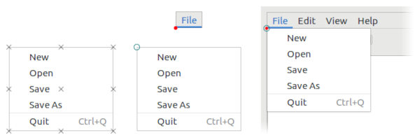
Figure: Popup anchors
For cases where placing the anchors next to each other would make the popup extend offscreen, the layout includes some hints for how to resolve this problem. The hints may suggest to flip the anchor position to the other side, or to 'slide' the popup along a side, or to resize it. These hints may be combined.
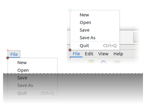
Figure: Flipping popups
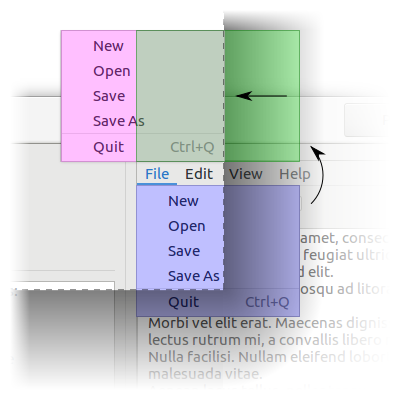
Figure: Sliding popups
Ultimatively, it is up to the windowing system to determine the position and size of the popup. You can learn about the result by calling the gdk:popup-position-x, gdk:popup-position-y, gdk:popup-rect-anchor and gdk:popup-surface-anchor functions after the popup has been presented. This can be used to adjust the rendering. For example, the gtk:popover object changes its arrow position accordingly. But you have to be careful avoid changing the size of the popover, or it has to be presented again.
The rectangle is relative to the top-left corner of the parent of the surface. The rect-anchor and surface-anchor values determine anchor points on the rectangle and surface to pin together.
The position of the anchor point of the rectangle can optionally be offset using the gdk:popup-layout-offset function, which is equivalent to offsetting the position of surface.
The shadow width corresponds to the part of the computed surface size that would consist of the shadow margin surrounding the window, would there be any.
Since 4.2
GdkPopup
After calling this function, the result should be handled in response to the "layout" signal being emitted. The resulting popup position can be queried using the gdk:popup-position-x, gdk:popup-position-y functions, and the resulting size will be sent as parameters in the layout signal. Use the gdk:popup-rect-anchor and gdk:popup-surface-anchor function to get the resulting anchors.
Presenting may fail, for example if the popup is set to autohide and is immediately hidden upon being presented. If presenting failed, the "layout" signal will not me emitted.
Draw contexts
GdkDrawContext
A gdk:draw-context object is always associated with a single toplevel surface.
A call to this function is a requirement for drawing and must be followed by a call to the gdk:draw-context-end-frame function, which will complete the drawing operation and ensure the contents become visible on screen.
Note that the region passed to this function is the minimum region that needs to be drawn and depending on implementation, windowing system and hardware in use, it might be necessary to draw a larger region. Drawing implementation must use the gdk:draw-context-frame-region function to query the region that must be drawn.
When using GTK, the widget system automatically places calls to the gdk:draw-context-begin-frame and gdk:draw-context-end-frame functions via the use of gsk:renderer objects, so application code does not need to call these functions explicitly.
When using a gdk:gl-context object, this function may call the glFlush() function implicitly before returning. It is not recommended to call the glFlush() function explicitly before calling this function.
After a call to the gdk:draw-context-begin-frame function this function will return a union of the region passed to that function and the area of the surface that the draw context determined needs to be repainted.
If context is not in between calls to the gdk:draw-context-begin-frame and gdk:draw-context-end-frame functions, cffi:null-pointer will be returned.
GdkGLContext
(gobject:define-gflags "GdkGLAPI" gl-api (:export t :type-initializer "gdk_gl_api_get_type") (:none 0) (:gl #.(ash 1 0)) (:gles #.(ash 1 1)))
- :none
- No API.
- :gl
- The OpenGL API.
- :gles
- The OpenGL ES API.
The gdk:gl-context object is not tied to any particular normal framebuffer. For instance, it cannot draw to the gdk:surface back buffer. The GDK repaint system is in full control of the painting to that. Instead, you can create render buffers or textures and use the gdk:cairo-draw-from-gl function in the draw function of your widget to draw them. Then GDK will handle the integration of your rendering with that of other widgets.
Support for the gdk:gl-context object is platform specific, context creation can fail, returning a NULL context.
The gdk:gl-context object has to be made "current" in order to start using it, otherwise any OpenGL call will be ignored.
The gdk:gl-context object is not realized until either the gdk:gl-context-make-current function, or until it is realized using the gdk:gl-context-realize function. It is possible to specify details of the GL context like the OpenGL version to be used, or whether the GL context should have extra state validation enabled after calling the gdk:surface-create-gl-context function by calling the gdk:gl-context-realize function. If the realization fails you have the option to change the settings of the gdk:gl-context object and try again.
(gdk:gl-context-make-current context)You can now perform your drawing using OpenGL commands.
You can check which gdk:gl-context object is the current one by using the gdk:gl-context-current function. You can also unset any gdk:gl-context object that is currently set by calling the gdk:gl-context-clear-current function.
If you set it on a realized context, the property will not have any effect. It is only relevant during the gdk:gl-context-realize function.
By default, all APIs are allowed.
Since 4.6
Since 4.6
Deprecated since 4.6
The gdk:gl-context object must not be realized or made current prior to calling this function.
The gdk:gl-context object must not be realized or made current prior to calling this function.
Forward compatible GL contexts must not support OpenGL functionality that has been marked as deprecated in the requested version. Non-forward compatible GL contexts, on the other hand, must support both deprecated and non deprecated functionality.
The gdk:gl-context object must not be realized or made current prior to calling this function.
By default, GDK will attempt to automatically detect whether the underlying GL implementation is OpenGL or OpenGL ES once the context is realized.
You should check the return value of the gdk:gl-context-use-es function after calling the gdk:gl-context-realize function to decide whether to use the OpenGL or OpenGL ES API, extensions, or shaders.
When realizing a GL context, GDK will try to use the OpenGL 3.2 core profile. This profile removes all the OpenGL API that was deprecated prior to the 3.2 version of the specification. If the realization is successful, this function will return false.
If the underlying OpenGL implementation does not support core profiles, GDK will fall back to a pre-3.2 compatibility profile, and this function will return true.
You can use the value returned by this function to decide which kind of OpenGL API to use, or whether to do extension discovery, or what kind of shader programs to load.
Contexts created for the same display with the same properties will always be compatible, even if they are created for different surfaces. For other contexts it depends on the GL backend.
Both contexts must be realized for this check to succeed. If either one is not, this function will return false.
Since 4.4
GdkCairoContext
Clipboard, Drag and Drop
Content Formats
(glib:define-gboxed-opaque content-formats "GdkContentFormats" :export t :type-initializer "gdk_content_formats_get_type" :alloc (error "GdkContentFormats must be created with gdk:content-formats-new"))
GDK supports content in two forms: GType and MIME type. Using GTypes is meant only for in-process content transfers. MIME types are meant to be used for data passing both in-process and out-of-process. The details of how data is passed is described in the documentation of the actual implementations. To transform between the two forms, the gdk:content-serializer and gdk:content-deserializer objects are used.
A gdk:content-formats instance describes a set of possible formats content can be exchanged in. It is assumed that this set is ordered. GTypes are more important than MIME types. Order between different GTypes or MIME types is the order they were added in, most important first. Functions that care about order, such as the gdk:content-formats-union function, will describe in their documentation how they interpret that order, though in general the order of the first argument is considered the primary order of the result, followed by the order of further arguments.
For debugging purposes, the gdk:content-formats-to-string function exists. It will print a comma-separated list of formats from most important to least important.
The gdk:content-formats structure is an immutable structure. After creation, you cannot change the types it represents. Instead, new gdk:content-formats instances have to be created. The gdk:content-formats-builder structure is meant to help in this endeavor.
If str does not describe valid content formats, nil is returned.
Since 4.4
GdkContentProvider
GDK knows how to handle common text and image formats out-of-the-box. See the gdk:content-serializer and gdk:content-deserializer objects if you want to add support for application specific data formats.
lambda (provider) :run-last
- provider
- The gdk:content-provider object.
(g:signal-connect source "prepare"
(lambda (source x y)
(declare (ignore source x y))
(g:with-value (gvalue "GdkRGBA" (color-swatch-color swatch))
(gdk:content-provider-new-for-value gvalue))))
(g:with-values ((gitem "BibItem" item)
(gstring "gchararray" (item-key item)))
(gdk:content-provider-new-union
(gdk:content-provider-new-for-value gitem)
(gdk:content-provider-new-for-value gstring))
...) GdkContentSerializer
GTK provides serializers and deserializers for common data types such as text, colors, images or file lists. To register your own serialization functions, use the gdk:content-register-serializer function.
Also see the gdk:content-deserializer object.
GdkContentDeserializer
GTK provides serializers and deserializers for common data types such as text, colors, images or file lists. To register your own deserialization functions, use the gdk:content-register-deserializer function.
Also see the gdk:content-serializer object.
Clipboards
To get a gdk:clipboard object, use the gdk:display-clipboard or gdk:display-primary-clipboard functions. You can find out about the data that is currently available in a clipboard using the gdk:clipboard-formats function.
To make text or image data available in a clipboard, use the gdk:clipboard-set-text or gdk:clipboard-set-texture functions. For other data, you can use the gdk:clipboard-set-content function, which takes a gdk:content-provider object.
To read textual or image data from a clipboard, use the gdk:clipboard-read-text-async or gdk:clipboard-read-texture-async functions.
lambda (clipboard) :run-last
- clipboard
- The gdk:clipboard object on which the signal was emitted.
This function is called automatically when the gtk:application object exit, so you likely do not need to call it.
For local clipboard contents that are available in the given gtype, the value will be copied directly. Otherwise, GDK will try to use the gdk:content-deserialize-async function to convert the clipboard's data.
This is a simple wrapper around the gdk:clipboard-read-value-async function. Use that function directly if you need more control over the operation.
This is a simple wrapper around the gdk:clipboard-read-value-async function. Use that function directly if you need more control over the operation.
In the rare case of a failure, this function will return false. The clipboard will then continue reporting its old contents and ignore provider.
If the contents are read by either an external application or the read functions of the clipboard, clipboard will select the best format to transfer the contents and then request that format from provider.
GdkDrag
(gobject:define-genum "GdkDragCancelReason" drag-cancel-reason (:export t :type-initializer "gdk_drag_cancel_reason_get_type") :no-target :user-cancelled :error)
- :no-target
- There is no suitable drop target.
- :user-cancelled
- Drag cancelled by the user.
- :error
- Unspecified error.
(gobject:define-gflags "GdkDragAction" drag-action (:export t :type-initializer "gdk_drag_action_get_type") (:none 0) (:copy #.(ash 1 0)) (:move #.(ash 1 1)) (:link #.(ash 1 2)) (:ask #.(ash 1 3)))
- :none
- No action.
- :copy
- Copy the data.
- :move
- Move the data, that is, first copy it, then delete it from the source using the DELETE target of the X selection protocol.
- :link
- Add a link to the data. Note that this is only useful if source and destination agree on what it means, and is not supported on all platforms.
- :ask
- Ask the user what to do with the data.
GTK provides a higher level abstraction based on top of these functions, and so they are not normally needed in GTK applications. See the "Drag and Drop" section of the GTK documentation for more information.
lambda (drag reason) :run-last
- drag
- The gdk:drag object on which the signal is emitted.
- reason
- The gdk:drag-cancel-reason value with the reason the drag was cancelled.
lambda (drag) :run-last
- drag
- The gdk:drag object on which the signal is emitted.
lambda (drag) :run-last
- drag
- The gdk:drag object on which the signal is emitted.
The gdk:drag object will only take the first gdk:drag-drop-done function call as effective, if this function is called multiple times, all subsequent calls will be ignored.
This function returns a reference to the gdk:drag object, but GTK keeps its own reference as well, as long as the DND operation is going on.
Note: If actions include :move, you need to listen for the "dnd-finished" signal and delete the data at the source if the gdk:drag-selected-action function returns :move.
GdkDrop
The actual data transfer is initiated from the target side via an async read, using one of the gdk:drop functions for this purpose: the gdk:drop-read-async or gdk:drop-read-value-async functions.
GTK provides a higher level abstraction based on top of these functions, and so they are not normally needed in GTK applications. See the Drag and Drop section of the GTK documentation for more information.
This value may change over the lifetime of the drop object both as a response to source side actions as well as to calls to the gdk:drop-status function or the gdk:drop-finish function. The source side will not change this value anymore once a drop has started.
The preferred action is a hint to the drag'n'drop mechanism about which action to use when multiple actions are possible.
This function should be called by drag destinations in response to :drag-enter or :drag-motion events. If the destination does not yet know the exact actions it supports, it should set any possible actions first and then later call this function again.
For local drag'n'drop operations that are available in the given gtype, the value will be copied directly. Otherwise, GDK will try to use the gdk:content-deserialize-async to convert the data.
GdkDragSurface
Since 4.12
Since 4.12
lambda (surface size) :run-last
- surface
- The gdk:drag-surface object.
- size
- The gdk:drag-surface-size instance for the size of the drag surface.
Application launching
GdkAppLaunchContext
(let* ((display (gdk:display-default))
(context (gdk:display-app-launch-context display)))
(unless (g:app-info-launch-default-for-uri "http://www.gtk.org" context)
(warn "Launching failed"))) GDK Miscellaneous
Events
(g:signal-connect window "close-request"
(lambda (widget event)
(declare (ignore widget event))
gdk:+event-stop+)) (gobject:define-genum "GdkEventType" event-type (:export t :type-initializer "gdk_event_type_get_type") (:nothing -1) :delete :motion-notify :button-press :button-release :key-press :key-release :enter-notify :leave-notify :focus-change :proximity-in :proximity-out :drag-enter :drag-leave :drag-motion :drop-start :scroll :grab-broken :touch-begin :touch-update :touch-end :touch-cancel :touchpad-swipe :touchpad-pinch :pad-button-press :pad-button-release :pad-ring :pad-strip :pad-group-mode :touchpad-hold :pad-dial :event-last)
- :nothing
- The special code to indicate a null event.
- :delete
- The window manager has requested that the toplevel window be hidden or destroyed, usually when the user clicks on a special icon in the title bar.
- :motion-notify
- The pointer, usually a mouse, has moved.
- :button-press
- The mouse button has been pressed.
- :button-release
- The mouse button has been released.
- :key-press
- The key has been pressed.
- :key-release
- The key has been released.
- :enter-notifiy
- The pointer has entered the window.
- :leave-notify
- The pointer has left the window.
- :focus-change
- The keyboard focus has entered or left the window.
- :proximity-in
- The input device has moved into contact with a sensing surface, for example, a touchscreen or graphics tablet.
- :proximity-out
- The input device has moved out of contact with a sensing surface.
- :drag-enter
- The mouse has entered the window while a drag is in progress.
- :drag-leave
- The mouse has left the window while a drag is in progress.
- :drag-motion
- The mouse has moved in the window while a drag is in progress.
- :drop-start
- The drop operation onto the window has started.
- :scroll
- The scroll wheel was turned.
- :grab-broken
- The pointer or keyboard grab was broken.
- :touch-begin
- The new touch event sequence has just started.
- :touch-update
- The touch event sequence has been updated.
- :touch-end
- The touch event sequence has finished.
- :touch-cancel
- The touch event sequence has been canceled.
- :touchpad-swipe
- The touchpad swipe gesture event, the current state is determined by its phase field.
- :touchpad-pinch
- The touchpad pinch gesture event, the current state is determined by its phase field.
- :pad-button-press
- The tablet pad button press event.
- :pad-button-release
- The tablet pad button release event.
- :pad-ring
- The tablet pad axis event from a "ring".
- :pad-strip
- The tablet pad axis event from a "strip".
- :pad-group-mode
- The tablet pad group mode change.
- :touchpad-hold
- The touchpad hold gesture event, the current state is determined by its phase field. Since 4.6
- :pad-dial
- A tablet pad axis event from a "dial". Since 4.20
- :event-last
- Marks the end of the gdk:event-type enumeration.
(gobject:define-genum "GdkKeyMatch" key-match (:export t :type-initializer "gdk_key_match_get_type") (:none 0) (:partial 1) (:exact 2))
- :none
- The key event does not match.
- :partial
- The key event matches if keyboard state (specifically, the currently active group) is ignored.
- :exact
- The key event matches.
(gobject:define-genum "GdkTouchpadGesturePhase" touchpad-gesture-phase (:export t :type-initializer "gdk_touchpad_gesture_phase_get_type") (:begin 0) (:update 1) (:end 2) (:cancel 3))
- :begin
- The gesture has begun.
- :update
- The gesture has been updated.
- :end
- The gesture was finished, changes should be permanently applied.
- :cancel
- The gesture was cancelled, all changes should be undone.
A finished gesture may have 2 possible outcomes, an event with :end phase will be emitted when the gesture is considered successful, this should be used as the hint to perform any permanent changes.
Cancelled gestures may be so for a variety of reasons, due to hardware or the compositor, or due to the gesture recognition layers hinting the gesture did not finish resolutely, for example, a 3rd finger being added during a pinch gesture. In these cases, the last event will report the :cancel phase, this should be used as a hint to undo any visible/permanent changes that were done throughout the progress of the gesture.
(gobject:define-genum "GdkScrollDirection" scroll-direction (:export t :type-initializer "gdk_scroll_direction_get_type") (:up 0) (:down 1) (:left 2) (:right 3) (:smooth 4))
- :up
- The window is scrolled up.
- :down
- The window is scrolled down.
- :left
- The window is scrolled to the left.
- :right
- The window is scrolled to the right.
- :smooth
- The scrolling is determined by the delta values in the gdk:scroll-event event. See the gdk:scroll-event-deltas function.
(gobject:define-genum "GdkCrosssingMode" crossing-mode (:export t :type-initializer "gdk_crossing_mode_get_type") :normal :grab :ungrab :gtk-grab :gtk-ungrab :state-changed :touch-begin :touch-end :device-switch)
- :normal
- Crossing because of pointer motion.
- :grab
- Crossing because a grab is activated.
- :ungrab
- Crossing because a grab is deactivated.
- :gtk-grab
- Crossing because a GTK grab is activated.
- :gtk-ungrab
- Crossing because a GTK grab is deactivated.
- :state-changed
- Crossing because a GTK widget changed state, for example, sensitivity.
- :touch-begin
- Crossing because a touch sequence has begun, this event is synthetic as the pointer might have not left the window.
- :touch-end
- Crossing because a touch sequence has ended, this event is synthetic as the pointer might have not left the window.
- :device-switch
- Crossing because of a device switch, that is, a mouse taking control of the pointer after a touch device, this event is synthetic as the pointer did not leave the window.
(gobject:define-genum "GdkScrollUnit" scroll-unit (:export t :type-initializer "gdk_scroll_unit_get_type") :wheel :surface)
- :wheel
- The delta is in number of wheel clicks.
- :surface
- The delta is in surface pixels to scroll directly on screen.
If you get the :surface value, are managing a scrollable view and get a value of 123, you have to scroll 123 surface logical pixels right if it is delta_x or down if it is delta_y. This is the same logic for negative values but you have to scroll left instead of right if it is delta_x and up instead of down if it is delta_y.
1 surface logical pixel is equal to 1 real screen pixel multiplied by the final scale factor of your graphical interface, the product of the desktop scale factor and eventually a custom scale factor in your application.
Since 4.8
(gobject:define-genum notify-type (:export t :type-initializer "gdk_notify_type_get_type") (:ancestor 0) :virtual :inferior :nonlinear :nonlinear-virtual :unknown)
- :ancestor
- The window is entered from an ancestor or left towards an ancestor.
- :virtual
- The pointer moves between an ancestor and an inferior of the window.
- :inferior
- The window is entered from an inferior or left towards an inferior.
- :nonlinear
- The window is entered from or left towards a window which is neither an ancestor nor an inferior.
- :nonlinear-virtual
- The pointer moves between two windows which are not ancestors of each other and the window is part of the ancestor chain between one of these windows and their least common ancestor.
- :unknown
- An unknown type of enter/leave event occurred.
(glib:define-gboxed-opaque event-sequence "GdkEventSequence" :export t :type-initializer "gdk_event_sequence_get_type" :alloc (error "GdkEventSequence cannot be created from the Lisp side"))
The rotation direction for positive angles is from the positive X axis towards the positive Y axis.
Stop scroll events always have a delta of 0/0.
Since 4.8
Note that we ignore the Caps Lock key for matching.
Cursors
Cursors by themselves are not very interesting, they must be bound to a window for users to see them. This is done with the gdk:surface-cursor or the gdk:surface-device-cursor functions. Applications will typically use higher-level GTK functions such as the gtk:widget-cursor function instead.
Cursors are not bound to a given gdk:display object, so they can be shared. However, the appearance of cursors may vary when used on different platforms.
Another option to create a cursor is to use the gdk:cursor-new-from-texture function and provide an image to use for the cursor.
To ease work with unsupported cursors, a fallback cursor can be provided. If a gdk:surface object cannot use a cursor because of the reasons mentioned above, it will try the fallback cursor. Fallback cursors can themselves have fallback cursors again, so it is possible to provide a chain of progressively easier to support cursors. If none of the provided cursors can be supported, the default cursor will be the ultimate fallback.
For named cursors, this can happen when using nonstandard names or when using an incomplete cursor theme. For textured cursors, this can happen when the texture is too large or when the gdk:display object it is used on does not support textured cursors.
Note that named cursors may have a nonzero hotspot, but this function will only return the hotspot position for cursors created with the gdk:cursor-new-from-texture function.
Note that named cursors may have a nonzero hotspot, but this function will only return the hotspot position for cursors created with the gdk:cursor-new-from-texture function.
- "none"
- "default"

- "help"

- "pointer"

- "context-menu"

- "progress"

- "wait"

- "cell"

- "crosshair"

- "text"

- "vertical-text"

- "alias"

- "copy"

- "no-drop"

- "move"

- "not-allowed"

- "grab"

- "grabbing"

- "all-scroll"

- "col-resize"

- "row-resize"

- "n-resize"

- "e-resize"

- "s-resize"

- "w-resize"

- "ne-resize"

- "nw-resize"

- "sw-resize"

- "se-resize"

- "ew-resize"

- "ns-resize"

- "nesw-resize"

- "nwse-resize"

- "zoom-in"

- "zoom-out"

(gdk:cursor-new-from-name "wait")
=> #<GDK:CURSOR {1013383A73}> This function may fail and return nil, in which case the fallback cursor will be used.
Since 4.16
Since 4.16
GdkFrameTimings
(glib:define-gboxed-opaque frame-timings "GdkFrameTimings" :export t :type-initializer "gdk_frame_timings_get_type" :alloc (error "GdkFrameTimings cannot be created from the Lisp side."))
GdkFrameClock
(gobject:define-gflags "GdkFrameClockPhase" frame-clock-phase (:export t :type-initializer "gdk_frame_clock_phase_get_type") (:none 0) (:flush-events #.(ash 1 0)) (:before-paint #.(ash 1 1)) (:update #.(ash 1 2)) (:layout #.(ash 1 3)) (:paint #.(ash 1 4)) (:resmue-events #.(ash 1 5)) (:after-paint #.(ash 1 6)))
- :none
- No phase.
- :flush-events
- Corresponds to "flush-events" signals. Should not be handled by applications.
- :before-paint
- Corresponds to "before-paint" signals. Should not be handled by applications.
- :update
- Corresponds to the "update" signal.
- :layout
- Corresponds to the "layout" signal. Should not be handled by applications.
- :paint
- Corresponds to the "paint" signal.
- :resume-events
- Corresponds to the "resume-events" signal. Should not be handled by applications.
- :after-paint
- Corresponds to the "after-paint" signal. Should not be handled by applications.
The gdk:frame-clock object is designed to be compatible with an OpenGL based implementation or with mozRequestAnimationFrame in Firefox, for example.
A frame clock is idle until someone requests a frame with the gdk:frame-clock-request-phase function. At some later point that makes sense for the synchronization being implemented, the clock will process a frame and emit signals for each phase that has been requested. See the signals of the gdk:frame-clock class for documentation of the phases. The :update value of the gdk:frame-clock-phase enumeration and the "update" signal are most interesting for application writers, and are used to update the animations, using the frame time given by the gdk:frame-clock-frame-time function.
The frame time is reported in microseconds and generally in the same timescale as the system monotonic time. The frame time does not advance during the time a frame is being painted, and outside of a frame, an attempt is made so that all calls to the gdk:frame-clock-frame-time function that are called at a "similar" time get the same value. This means that if different animations are timed by looking at the difference in time between an initial value from the gdk:frame-clock-frame-time function and the value inside the "update" signal of the clock, they will stay exactly synchronized.
lambda (clock) :run-last
- clock
- The gdk:frame-clock object emitting the signal.
lambda (clock) :run-last
- clock
- The gdk:frame-clock object emitting the signal.
lambda (clock) :run-last
- clock
- The gdk:frame-clock object emitting the signal.
lambda (clock) :run-last
- clock
- The gdk:frame-clock object emitting the signal.
lambda (clock) :run-last
- clock
- The gdk:frame-clock object emitting the signal.
lambda (clock) :run-last
- clock
- The gdk:frame-clock object emitting the signal.
lambda (clock) :run-last
- clock
- The gdk:frame-clock object emitting the signal.
Pixbuf, Pango, and Backends interaction
Introduction to GdkPixbuf Interaction
Functions for GDKPixbuf Interaction
This function will create an RGB pixbuf with 8 bits per channel. The pixbuf will contain an alpha channel if the surface contains one.
Introduction to Pango Interaction
Creating a pango:layout object is the first step in rendering text, and requires getting a handle to a pango:context object. For GTK programs, you will usually want to use the gtk:widget-pango-context function, or the gtk:widget-create-pango-layout function. Once you have a pango:layout object, you can set the text and attributes of it with Pango functions like the pango:layout-text function and get its size with the pango:layout-size function. Note that Pango uses a fixed point system internally, so converting between Pango units and pixels using the pango:+scale+ value or the pango:pixels function.
Rendering a Pango layout is done most simply with the pango:cairo-show-layout function. You can also draw pieces of the layout with the pango:cairo-show-layout-line function.
Functions for Pango Interaction
Note that the regions returned correspond to logical extents of the text ranges, not ink extents. So the drawn layout may in fact touch areas out of the clip region. The clip region is mainly useful for highlightling parts of text, such as when text is selected.
Note that the regions returned correspond to logical extents of the text ranges, not ink extents. So the drawn layout may in fact touch areas out of the clip region. The clip region is mainly useful for highlightling parts of text, such as when text is selected.
Introduction to Cairo Interaction
Functions for Cairo Interaction
(gtk:drawing-area-set-draw-func area
(lambda (widget cr width height)
(declare (ignore widget width height))
(let ((rgba (gdk:rgba-parse color)))
(when rgba
(gdk:cairo-set-source-rgba cr rgba)
(cairo:paint cr))))) This will work for all Cairo contexts, as long as surface is realized, but the fallback implementation that reads back the pixels from the buffer may be used in the general case. In the case of direct drawing to a surface with no special effects applied to cr it will however use a more efficient approach.
For GL_RENDERBUFFER the code will always fall back to software for buffers with alpha components, so make sure you use GL_TEXTURE if using alpha.
Calling this may change the current GL context.
Other Functions in gdk
Since 4.18
Package gsk
GskRenderer
It is necessary to realize a gsk:renderer instance using the gsk:renderer-realize function before calling the gsk:renderer-render function, in order to create the appropriate windowing system resources needed to render the scene.
The renderer will be realized before it is returned.
Since GTK 4.6, the surface may be nil, which allows using renderers without having to create a surface. Since GTK 4.14, it is recommended to use the gsk:renderer-realize-for-display function for this case.
Note that it is mandatory to call the gsk:renderer-unrealize function before destroying the renderer.
Since 4.14
The renderer will acquire a reference on the gsk:render-node tree while the rendering is in progress.
If you want to apply any transformations to node, you should put it into a transform node and pass that node instead.
The Cairo renderer is incomplete. It cannot render 3D transformed content and will instead render an error marker. Its usage should be avoided.
GskPathMeasure
(glib:define-gboxed-opaque path-measure "GskPathMeasure" :export t :type-initializer "gsk_path_measure_get_type" :alloc (error "GSK:PATH-MEASURE cannot be created from the Lisp side"))
Since 4.14
Since 4.14
Since 4.14
Since 4.14
Since 4.14
Since 4.14
Since 4.14
GtkPathPoint
(gobject:define-genum "GskPathDirection" path-direction (:export t :type-initializer "gsk_path_direction_get_type") :from-start :to-start :to-end :from-end)
- :from-start
- The tangent in path direction of the incoming side of the path.
- :to-start
- The tangent against path direction of the incoming side of the path.
- :to-end
- The tangent in path direction of the outgoing side of the path.
- :from-end
- The tangent against path direction of the outgoing side of the path.
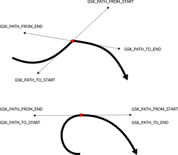
Figure: GtkPathDirection
Since 4.14
(glib:define-gboxed-opaque path-point "GskPathPoint" :export t :type-initializer "gsk_path_point_get_type" :alloc (error "GSK:PATH-POINT cannot be created from the Lisp side"))
To obtain a gsk:path-point instance, use the gsk:path-closest-point, gsk:path-start-point, gsk:path-end-point or gsk:path-measure-point functions.
Note that gsk:path-point instances are meant to be stack-allocated, and do not hold a reference to the path object they are obtained from. It is the callers responsibility to keep a reference to the path as long as the gsk:path-point instance is used.
Since 4.14
Lines have a curvature of zero, indicating an osculating circle of infinite radius. In this case, the center is not modified. Circles with a radius of zero have INFINITY as curvature.
Note that certain points on a path may not have a single curvature, such as sharp turns. At such points, there are two curvatures - the limit of the curvature of the path going into the point, and the limit of the curvature of the path coming out of it. The direction argument lets you choose which one to get.
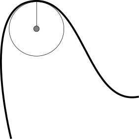
Figure: Curvature at point
Since 4.14
Since 4.14
Since 4.14
If the path is just a single point, for example, a circle with radius zero, then tangent is set to 0, 0.
If you want to orient something in the direction of the path, the gsk:path-point-rotation function may be more convenient to use.
Since 4.14
Since 4.14
Since 4.14
GskStroke
(gobject:define-genum "GskLineCap" line-cap (:export t :type-initializer "gsk_line_cap_get_type") :butt :round :square)
- :butt
- Start and stop the line exactly at the start and end point.
- :round
- Use a round ending, the center of the circle is the start or end point.
- :square
- Use squared ending, the center of the square is the start or end point.
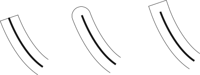
Figure: GskLineCap
Since 4.16
(gobject:define-genum "GskLineJoin" line-join (:export t :type-initializer "gsk_line_join_get_type") :miter :round :bevel)
- :miter
- Use a sharp angled corner.
- :round
- Use a round join, the center of the circle is the join point.
- :bevel
- Use a cut-off join, the join is cut off at half the line width from the joint point.
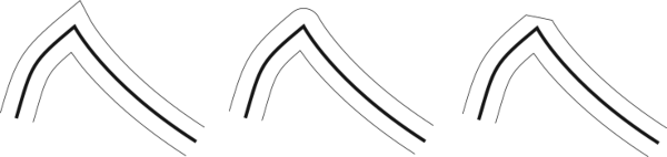
Figure: GskLineJoin
Since 4.14
(glib:define-gboxed-opaque stroke "GskStroke" :export t :type-initializer "gsk_stroke_get_type" :alloc (error "GSK:STROKE cannot be created from the Lisp side"))
Since 4.14
A dash pattern is specified by a list of alternating non-negative values. Each value provides the length of alternate 'on' and 'off' portions of the stroke. Each 'on' segment will have caps applied as if the segment were a separate contour. In particular, it is valid to use an 'on' length of 0 with :round or :square to draw dots or squares along a path.
If dash is empty, if all elements in dash are 0, or if there are negative values in dash, then dashing is disabled. If dash has one element, an alternating 'on' and 'off' pattern with the single dash length provided is assumed. If dash has uneven elements, the dash list will be used with the first element in dash defining an 'on' or 'off' in alternating passes through the list.
You can specify a starting offset into the dash with the gsk:stroke-dash-offset function.
Since 4.14
This is an offset into the length of the path, not an index into the list values of the dash list. See the gsk:stroke-dash function for more details on dashing.
Since 4.14
Since 4.14
Since 4.14
Since 4.14
The miter limit is in units of line width and must be non-negative. For joins of type :miter that exceed the miter limit, the join gets rendered as if it was of the :bevel type.
Since 4.14
Since 4.14
GskPath
(gobject:define-gflags "GskPathForeachFlags" path-foreach-flags (:export t :type-initializer "gsk_path_foreach_flags_get_type") (:allow-only-lines 0) (:allow-quad #.(ash 1 0)) (:allow-cubic #.(ash 1 1)) (:allow-conic #.(ash 1 2)))
- :allow-only-lines
- The default behavior, only allow lines.
- :allow-quad
- Allow emission of :quad operations.
- :allow-cubic
- Allow emission of :cubic operations.
- :allow-conic
- Allow emission of :conic operations.
Since 4.14
(gobject:define-genum "GskPathOperation" path-operation (:export t :type-initializer "gsk_path_operation_get_type") :move :close :line :quad :cubic :conic)
- :move
- A move-to operation, with 1 point describing the target point.
- :close
- A close operation ending the current contour with a line back to the starting point. Two points describe the start and end of the line.
- :line
- A line-to operation, with 2 points describing the start and end point of a straight line.
- :quad
- A curve-to operation describing a quadratic Bézier curve with 3 points describing the start point, the control point and the end point of the curve.
- :cubic
- A curve-to operation describing a cubic Bézier curve with 4 points describing the start point, the two control points and the end point of the curve.
- :conic
- A rational quadratic Bézier curve with 3 points describing the start point, control point and end point of the curve. A weight for the curve will be passed, too.
(gobject:define-genum "GskFillRule" fill-rule (:export t :type-initializer "gsk_fill_rule_get_type") :winding :even-odd)
- :winding
- If the path crosses the ray from left-to-right, counts +1. If the path crosses the ray from right to left, counts -1. (Left and right are determined from the perspective of looking along the ray from the starting point.) If the total count is non-zero, the point will be filled.
- :even-odd
- Counts the total number of intersections, without regard to the orientation of the contour. If the total number of intersections is odd, the point will be filled.
Note that filling is not actually implemented in this way. This is just a description of the rule that is applied.
Since 4.14
(glib:define-gboxed-opaque path "GskPath" :export t :type-initializer "gsk_path_get_type" :alloc (error "GSK:PATH cannot be created from the Lisp side"))
The gsk:path structure is an immutable, opaque, reference-counted structure. After creation, you cannot change the types it represents. Instead, new gsk:path instances have to be created. The gsk:path-builder structure is meant to help in this endeavor.
Conceptually, a path consists of zero or more contours (continuous, connected curves), each of which may or may not be closed. Contours are typically constructed from Bézier segments.
Figure: GskPath
Since 4.14
A high-level summary of the syntax:
- M x y
- Move to (x,y)
- L x y
- Add a line from the current point to (x,y)
- Q x1 y1 x2 y2
- Add a quadratic Bézier from the current point to (x2,y2), with control point (x1,y1)
- C x1 y1 x2 y2 x3 y3
- Add a cubic Bézier from the current point to (x3,y3), with control points (x1,y1) and (x2,y2)
- Z
- Close the contour by drawing a line back to the start point
- H x
- Add a horizontal line from the current point to the given x value
- V y
- Add a vertical line from the current point to the given y value
- T x2 y2
- Add a quadratic Bézier, using the reflection of the previous segments’ control point as control point
- S x2 y2 x3 y3
- Add a cubic Bézier, using the reflection of the previous segments’ second control point as first control point
- A rx ry r l s x y
- Add an elliptical arc from the current point to (x,y) with radii rx and ry. See the SVG documentation for how the other parameters influence the arc.
- O x1 y1 x2 y2 w
- Add a rational quadratic Bézier from the current point to (x2,y2) with control point (x1,y1) and weight w.
Since 4.14
Each contour of the path starts with a :move operation. Closed contours end with a :close operation.
Since 4.14
This function serves two purposes:
- When the flags allow everything, it provides access to the raw, unmodified data of the path.
- When the flags disallow certain operations, it provides an approximation of the path using just the allowed operations.
It is possible that the returned rectangle has 0 width and/or height. This can happen when the path only describes a point or an axis-aligned line.
If the path is empty, false is returned and bounds are set to the graphene:rect-zero value. This is different from the case where the path is a single point at the origin, where the bounds will also be set to the zero rectangle but true will be returned.
Since 4.14
Since 4.14
Since 4.14
Since 4.14
Since 4.14
Since 4.14
This function does not clear the existing Cairo path. Call the cairo:new-path function if you want this.
Since 4.14
Since 4.14
GskPathBuilder
(glib:define-gboxed-opaque path-builder "GskPathBuilder" :export t :type-initializer "gsk_path_builder_get_type" :alloc (%path-builder-new))
A path is constructed like this:
GskPath *
construct_path (void)
{
GskPathBuilder *builder;
builder = gsk_path_builder_new ();
// add contours to the path here
return gsk_path_builder_free_to_path (builder);
Adding contours to the path can be done in two ways. The easiest option is to use the gsk:path-builder_add-* group of functions that add predefined
contours to the current path, either common shapes like a circle with the gsk:path-builder-add-circle function or by adding from other paths like a path with the gsk:path-builder-add-path function. The gsk:path-builder-add-* methods always add complete contours, and do not
use or modify the current point.The other option is to define each line and curve manually with the gsk:path-builder-*-to group of functions. You start with a call to the gsk:path-builder-move-to function to set the starting point and then use multiple calls to any of the drawing functions to move the pen along the plane. Once you are done, you can call the gsk:path-builder-close function to close the path by connecting it back with a line to the starting point. This is similar to how paths are drawn in Cairo.
Note that the gsk:path-builder instance will reduce the degree of added Bézier curves as much as possible, to simplify rendering.
Since 4.14
Since 4.14
Since 4.14
When the builder is created, the default current point is set to (0, 0). Note that this is different from Cairo, which starts out without a current point.
Since 4.14
Since 4.14
If the the width or height are 0, the path will be a closed horizontal or vertical line. If both are 0, it will be a closed dot.
Since 4.14
Since 4.14
Since 4.14
Since 4.14
Since 4.14
Since 4.14
Note that this method always adds a path with the given start point and end point. To add a closed path, use the gsk:path-builder-add-path functin.
Since 4.14
Since 4.14
Since 4.14
Since 4.14
Figure: Draw line
Since 4.14
Note: Two points and their tangents do not determine a unique ellipse, so GSK just picks one. If you need more precise control, use the gsk:path-builder-conic-to or gsk:path-builder-svg-arc-to functions.
Figure: Draw arc
Since 4.14
Since 4.14
Conic curves can be used to draw ellipses and circles. They are also known as rational quadratic Bézier curves.
After this, x2, y2 will be the new current point.
Figure: Draw conic curve
Since 4.14
Since 4.14
Figure: Draw cubic
Figure: Draw quad
After this, the current point will be the point where the circle with the given radius touches the line from x1, y1 to x2, y2.
Since 4.14
Since 4.14
Since 4.14
Since 4.14
GskRenderNode
(gobject:define-genum "GskRenderNodeType" render-node-type (:export t :type-initializer "gsk_render_node_type_get_type") :not-a-render-node :container-node :cairo-node :color-node :linear-gradient-node :repeating-linear-gradient-node :radial-gradient-node :repeating-radial-gradient-node :conic-gradient-node :border-node :texture-node :inset-shadow-node :outset-shadow-node :transform-node :opacity-node :color-matrix-node :reapeat-node :clip-node :rounded-clip-node :shadow-node :blend-node :cross-fade-node :text-node :blur-node :debug-node :gl-shader-node #+gtk-4-10 :texture-scale-node #+gtk-4-10 :mask-node #+gtk-4-14 :fill-node #+gtk-4-14 :stroke-node #+gtk-4-14 :subsurface-node #+gtk-4-20 :component-transfer-node)
- :not-a-render-node
- Error type. No node will ever have this type.
- :container-node
- A node containing a stack of children.
- :cairo-node
- A node drawing a `cairo_surface_t`
- :color-node
- A node drawing a single color rectangle.
- :linear-gradient-node
- A node drawing a linear gradient.
- :repeating-linear-gradient-node
- A node drawing a repeating linear gradient.
- :radial-gradient-node
- A node drawing a radial gradient.
- :repeating-radial-gradient-node
- A node drawing a repeating radial gradient.
- :conic-gradient-node
- A node drawing a conic gradient.
- :border-node
- A node stroking a border around an area.
- :texture-node
- A node drawing a `GdkTexture`.
- :inset-shadow-node
- A node drawing an inset shadow.
- :outset-shadow-node
- A node drawing an outset shadow.
- :transform-node
- A node that renders its child after applying a matrix transform.
- :opacity-node
- A node that changes the opacity of its child.
- :color-matrix-node
- A node that applies a color matrix to every pixel.
- :repeat-node
- A node that repeats the child's contents.
- :clip-node
- A node that clips its child to a rectangular area.
- :rounded-clip-node
- A node that clips its child to a rounded rectangle.
- :shadow-node
- A node that draws a shadow below its child.
- :blend-node
- A node that blends two children together.
- :cross-fade-node
- A node that cross-fades between two children.
- :text-node
- A node containing a glyph string.
- :blur-node
- A node that applies a blur.
- :debug-node
- Debug information that does not affect the rendering.
- :gl-shader-node
- A node that uses OpenGL fragment shaders to render.
- :texture-scale-node
- A node drawing a gdk:texture object scaled and filtered. Since 4.10
- :mask-node
- A node that masks one child with another. Since 4.10
- :fill-node
- A node that fills a path. Since 4.14
- :stroke-node
- A node that strokes a path. Since 4.14
- :subsurface-node
- A node that possibly redirects part of the scene graph to a subsurface. Since 4.14
- :component-transfer-node
- A node that applies some function to each color component. Since 4.20
(gobject:define-genum "GskScalingFilter" scaling-filter (:export t :type-initializer "gsk_scaling_filter_get_type") (:linear 0) (:nearest 1) (:trilinear 2))
- :linear
- Linear interpolation filter.
- :nearest
- Nearest neighbor interpolation filter.
- :trilinear
- Linear interpolation along each axis, plus mipmap generation, with linear interpolation along the mipmap levels.
(gobject:define-genum "GskBlendMode" blend-mode (:export t :type-initializer "gsk_blend_mode_get_type") (:default 0) (:multiply 1) (:screen 2) (:overlay 3) (:darken 4) (:ligthen 5) (:color-dodge 6) (:color-burn 7) (:hard-light 8) (:soft-ligth 9) (:difference 10) (:exclusion 11) (:color 12) (:hue 13) (:saturation 14) (:luminosity 15))
- :default
- The default blend mode, which specifies no blending.
- :multiply
- The source color is multiplied by the destination and replaces the destination.
- :screen
- Multiplies the complements of the destination and source color values, then complements the result.
- :overlay
- Multiplies or screens the colors, depending on the destination color value. This is the inverse of hard-list.
- :darken
- Selects the darker of the destination and source colors.
- :ligthen
- Selects the lighter of the destination and source colors.
- :color-dodge
- Brightens the destination color to reflect the source color.
- :color-burn]{Darkens the destination color to reflect the source color.
- :hard-ligth
- Multiplies or screens the colors, depending on the source color value.
- :soft-ligth
- Darkens or lightens the colors, depending on the source color value.
- :difference
- Subtracts the darker of the two constituent colors from the lighter color.
- :exclusion
- Produces an effect similar to that of the difference mode but lower in contrast.
- :color
- Creates a color with the hue and saturation of the source color and the luminosity of the destination color.
- :hue
- Creates a color with the hue of the source color and the saturation and luminosity of the destination color.
- :saturation
- Creates a color with the saturation of the source color and the hue and luminosity of the destination color.
- :luminosity
- Creates a color with the luminosity of the source color and the hue and saturation of the destination color.
(gobject:define-genum "GskMaskMode" mask-mode (:export t :type-initializer "gsk_mask_mode_get_type") (:alpha 0) (:inverted-alpha 1) (:luminance 2) (:inverted-luminace 3))
- :alpha
- Use the alpha channel of the mask.
- inverted-alpha
- Use the inverted alpha channel of the mask.
- :luminance
- Use the luminance of the mask, multiplied by mask alpha.
- :inverted-luminance
- Use the inverted luminance of the mask, multiplied by mask alpha.
(glib:define-gboxed-opaque component-transfer "GskComponentTransfer" :export t :type-initializer "gsk_component_transfer_get_type" :alloc (error "GskComponentTransfer: Use constructor function"))
Note that the transfer function is applied to un-premultiplied values, and all results are clamped to the [0, 1] range.
Since 4.20
C' = values[k]where k is the smallest value such that
k / n <= C < (k + 1) / n
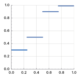
Figure: gsk:component-transfer-new-discrete
Since 4.20
C' = amp * pow (C, exp) + ofs
Figure: gsk:component-transfer-new-gamma
Since 4.20
Figure: gsk:component-transfer-new-identity
Since 4.20
C' = (floor (C * n) + 0.5) / n
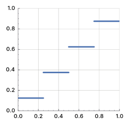
Figure: gsk:component-transfer-new-levels
Since 4.20
C' = C * m + b
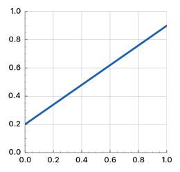
Figure: gsk:component-transfer-new-levels
Since 4.20
C' = values[k] + (C - k / (n - 1)) * n * (values[k + 1] - values[k])where k is the smallest value such that
k / (n - 1) <= C < (k + 1) / (n - 1)
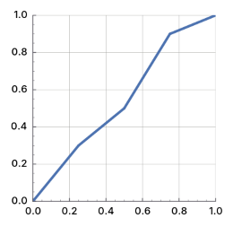
Figure: gsk:component-transfer-new-levels
Since 4.20
Since 4.20
Since 4.20
Each node has an associated drawing surface, which has the size of the rectangle set when creating it.
Render nodes are meant to be transient. Once they have been associated to a gsk:renderer object it is safe to release any reference you have on them. All gsk:render-node instances are immutable, you can only specify their properties during construction.
For advanced nodes that cannot be supported using Cairo, in particular for nodes doing 3D operations, this function may fail.
The intended use of this functions is testing, benchmarking and debugging. The format is not meant as a permanent storage format.
color {
bounds: 0 0 10 20;
color: rgb(255,0,0);
} The offsets of all color stops must be increasing. The first stop's offset must be >= 0 and the last stop's offset must be <= 1.
The offsets of all color stops must be increasing. The first stop's offset must be >= 0 and the last stop's offset must be <= 1.
The offsets of all color stops must be increasing. The first stop's offset must be >= 0 and the last stop's offset must be <= 1.
The offsets of all color stops must be increasing. The first stop's offset must be >= 0 and the last stop's offset must be <= 1.
pixel = transpose(matrix) * pixel + offsetfor every pixel. The transformation operates on unpremultiplied colors, with color components ordered R, G, B, A.
This node is intended for tight control over scaling applied to a texture, such as in image editors and requires the application to be aware of the whole render tree as further transforms may be applied that conflict with the desired effect of this node.
Since 4.10
Since 4.10
Since 4.10
Since 4.10
Since 4.10
Since 4.10
Since 4.14
Since 4.14
Since 4.14
Since 4.14
Since 4.14
Since 4.14
Since 4.14
Since 4.14
Since 4.14
Since 4.14
Since 4.14
Since 4.14
Since 4.14
Since 4.14
Since 4.20
Since 4.20
Since 4.20
Since 4.20
GskRoundedRect
(gobject:define-genum "GskCorner" corner (:export t :type-initializer "gsk_corner_get_type") (:top-left 0) (:top-right 1) (:bottom-right 2) (:bottom-left 3))
- :top-left
- The top left corner.
- :top-right
- The top right corner.
- :bottom-right
- The bottom right corner.
- :bottom-left
- The bottom left corner.
(cffi:defcstruct rounded-rect (bounds (:struct graphene:rect-t)) (corner (:struct graphene:size-t) :count 4))
- bounds
- The graphene:rect-t instance for the bounds of the rounded rectangle.
- corner
- The array of graphene:size-t instances for the size of the 4 rounded corners.
All functions taking a gsk:rounded-rect instance as an argument will internally operate on a normalized copy. All functions returning a gsk:rounded-rect instance will always return a normalized one.
The algorithm used for normalizing corner sizes is described in the CSS specification.
If no argument is given the components of the rounded rectangle are uninitialized. The initialization with one argument uses the gsk:rounded-rect-init-copy function, which initializes the rounded from another rounded rect. The initialization from a graphene:rect-t instance and a number uses the gsk:rounded-rect-init-from-rect function. If six arguments are given, the rounded rectangle is initialized with the gsk:rounded-rect-init function.
Each box can be initialized with values using the syntax for the gsk:with-rounded-rect macro. See also the gsk:rounded-rect documentation.
This function also works for growing rounded rectangles if you pass negative values for the arguments.
GskTransform
(gobject:define-genum "GskTransformCategory" transform-category (:export t :type-initializer "gsk_transform_category_get_type") :unknown :any :3d :2d :2d-affine :2d-translate :identity)
- :unknown
- The category of the matrix has not been determined.
- :any
- Analyzing the matrix concluded that it does not fit in any other category.
- :3d
- The matrix is a 3D matrix. This means that the w column (the last column) has the values (0, 0, 0, 1).
- :2d
- The matrix is a 2D matrix. This is equivalent to the graphene:matrix-is-2d function returning true. In particular, this means that Cairo can deal with the matrix.
- :2d-affine
- The matrix is a combination of 2D scale and 2D translation operations. In particular, this means that any rectangle can be transformed exactly using this matrix.
- :2d-translate
- The matrix is a 2D translation.
- :identity
- The matrix is the identity matrix.
Also keep in mind that rounding errors may cause matrices to not conform to their categories. Otherwise, matrix operations done via multiplication will not worsen categories. So for the matrix multiplication C = A * B the result has the category category(C) = (MIN (category(A), category(B)).
(defun category-value (category) (cffi:convert-to-foreign category 'gsk:transform-category))you can check if a matrix with category is a 2D matrix with
(>= (category-value category) (category-value :2d))
(glib:define-gboxed-opaque transform ¸"GskTransform" :export t :type-initializer "gsk_transform_get_type" :alloc (%transform-new))
The gsk:transform instances are immutable and cannot be changed after creation. This means code can safely expose them as properties of objects without having to worry about others changing them.
(gsk:transform-parse "translate(1,2)")
=> #<GSK:TRANSFORM {100A325D83}>
(gsk:transform-to-translate *)
=> (1.0 2.0)
(gsk:transform-parse "translate(1,2) scale(3)")
=> #<GSK:TRANSFORM {100A327283}>
(gsk:transform-to-2d *)
=> (3.0 0.0 0.0 3.0 1.0 2.0)
(gsk:transform-parse "xxxx") => NIL
(gsk:transform-to-string (gsk:transform-new)) => "none"
(graphene:with-point (p 1/2 2)
(let ((transform (gsk:transform-translate (gsk:transform-new) p)))
(gsk:transform-to-string transform)))
=> "translate(0.5, 2)"
(gsk:transform-to-string (gsk:transform-parse "translate(1,2)"))
=> "translate(1, 2)" The returned values have the following layout:
| xx yx | | a b 0 | | xy yy | = | c d 0 | | dx dy | | tx ty 1 |This function can be used to convert between a gsk:transform instance and a matrix from other 2D drawing libraries, in particular Cairo.
Since 4.6
(graphene:with-point (p)
(gsk:transform-skew
(gsk:transform-scale
(gsk:transform-rotate
(gsk:transform-translate (gsk:transform-new)
(graphene:point-init p dx dy))
angle)
xscale yscale)
xskew yskew)) Since 4.20
Since 4.6
Package gdk-pixbuf
Library version numbers
The GdkPixbuf object
(gobject:define-genum "GdkColorspace" colorspace (:export t :type-initializer "gdk_colorspace_get_type") :rgb)
- :rgb
- Indicates a red/green/blue additive color space.
(defun put-pixel (pixbuf x y red green blue alpha)
(let ((n-channels (gdk-pixbuf:pixbuf-n-channels pixbuf))
(rowstride (gdk-pixbuf:pixbuf-rowstride pixbuf))
(pixels (gdk-pixbuf:pixbuf-pixels pixbuf)))
;; Add offset to the pointer pixels into the pixbuf
(cffi:incf-pointer pixels (+ (* y rowstride) (* x n-channels)))
;; Set the color of the point and the alpha value
(setf (cffi:mem-aref pixels :uchar 0) red)
(setf (cffi:mem-aref pixels :uchar 1) green)
(setf (cffi:mem-aref pixels :uchar 2) blue)
(setf (cffi:mem-aref pixels :uchar 3) alpha)))
This function will not work for pixbufs with images that are other than
8 bits per sample or channel, but it will work for most of the pixbufs that
GTK uses. For instance, the ANI loader provides "Title" and "Artist" options. The ICO, XBM, and XPM loaders provide "x_hot" and "y_hot" hot-spot options for cursor definitions. The PNG loader provides the tEXt ancillary chunk key/value pairs as options. Since 2.12, the TIFF and JPEG loaders return an "orientation" option string that corresponds to the embedded TIFF/Exif orientation tag (if present). Since 2.32, the TIFF loader sets the "multipage" option string to "yes" when a multi-page TIFF is loaded. Since 2.32 the JPEG and PNG loaders set "x-dpi" and "y-dpi" if the file contains image density information in dots per inch.
File Loading
Introduction to fileloading
This interface can be used by applications in which blocking is acceptable while an image is being loaded. It can also be used to load small images in general. Applications that need progressive loading can use the gdk-pixbuf:pixbuf-loader API functionality instead.
Functions for file loading
The image will be scaled to fit in the requested size, preserving the aspect ratio of the image. Note that the returned pixbuf may be smaller than width x height, if the aspect ratio requires it. To load an image at the requested size, regardless of the aspect ratio, use the gdk-pixbuf:pixbuf-new-from-file-at-scale function.
When preserving the aspect ratio, a width of -1 will cause the image to be scaled to the exact given height, and a height of -1 will cause the image to be scaled to the exact given width. When not preserving the aspect ratio, a width or height of -1 means to not scale the image at all in that dimension.
The image will be scaled to fit in the requested size, optionally preserving the aspect ratio of the image. When preserving the aspect ratio, a width of -1 will cause the image to be scaled to the exact given height, and a height of -1 will cause the image to be scaled to the exact given width. When not preserving the aspect ratio, a width or height of -1 means to not scale the image at all in that dimension.
width -- an integer for the width of the image, or nil
height -- an integer for the height of the image, or nil
When the operation is finished, the func callback function will be called in the main thread. You can then call the gdk-pixbuf:pixbuf-file-info-finish function to get the result of the operation.
width -- an integer for the width of the image
height -- an integer for the height of the image
File Saving
Introduction to file saving
Functions for file saving
void add_if_writable (GdkPixbufFormat *data, GSList **list)
{
if (gdk_pixbuf_format_is_writable (data))
*list = g_slist_prepend (*list, data);
}
GSList *formats = gdk_pixbuf_get_formats ();
GSList *writable_formats = NULL;
g_slist_foreach (formats, add_if_writable, &writable_formats);
g_slist_free (formats); If error is set, nil will be returned. Possible errors include those in the GDK_PIXBUF_ERROR domain and those in the G_FILE_ERROR
domain.The variable argument list should be NULL-terminated; if not empty, it should contain pairs of strings that modify the save parameters. For example:
gdk_pixbuf_save (pixbuf, handle, "jpeg", &error,
"quality", "100", NULL);
Currently only few parameters exist. JPEG images can be saved with a
"quality" parameter; its value should be in the range [0,100]. JPEG and PNG
density can be set by setting the "x-dpi" and "y-dpi" parameters to the
appropriate values in dots per inch.Text chunks can be attached to PNG images by specifying parameters of the form "tEXt::key", where key is an ASCII string of length 1-79. The values are UTF-8 encoded strings. The PNG compression level can be specified using the "compression" parameter; it's value is in an integer in the range of [0,9].
ICC color profiles can also be embedded into PNG and TIFF images. The "icc-profile" value should be the complete ICC profile encoded into base64.
gchar *contents;
gchar *contents_encode;
gsize length;
g_file_get_contents ("/home/hughsie/.color/icc/L225W.icm",
&contents, &length, NULL);
contents_encode = g_base64_encode ((const guchar *) contents, length);
gdk_pixbuf_save (pixbuf, handle, "png", &error,
"icc-profile", contents_encode,
NULL);
TIFF images recognize: (1) a "bits-per-sample" option (integer) which can
be either 1 for saving bi-level CCITTFAX4 images, or 8 for saving 8-bits per
sample; (2) a "compression" option (integer) which can be 1 for no
compression, 2 for Huffman, 5 for LZW, 7 for JPEG and 8 for DEFLATE (see the
libtiff documentation and tiff.h for all supported codec values); (3) an
"icc-profile" option (zero-terminated string) containing a base64 encoded
ICC color profile.ICO images can be saved in depth 16, 24, or 32, by using the "depth" parameter. When the ICO saver is given "x_hot" and "y_hot" parameters, it produces a CUR instead of an ICO.
Image Data in Memory
Introduction to image data in memory
The gdk-pixbuf:pixbuf-new function can be used as a convenience to create a pixbuf with an empty buffer. This is equivalent to allocating a data buffer using malloc() and then wrapping it with the gdk-pixbuf:pixbuf-new-from-data function. The gdk-pixbuf:pixbuf-new function will compute an optimal rowstride so that rendering can be performed with an efficient algorithm.
You can also copy an existing pixbuf with the gdk-pixbuf:pixbuf-copy function. The copy function will actually duplicate the pixel data in memory and create a new gdk-pixbuf:pixbuf instance for it.
Functions for image data in memory
Scaling
Introduction to scaling
Since the full-featured gdk-pixbuf:pixbuf-scale, gdk-pixbuf:pixbuf-composite, and gdk-pixbuf:pixbuf-composite-color functions are rather complex to use and have many arguments, two simple convenience functions are provided, the gdk-pixbuf:pixbuf-scale-simple and gdk-pixbuf:pixbuf-composite-color-simple functions which create a new pixbuf of a given size, scale an original image to fit, and then return the new pixbuf.
If the destination pixbuf was created from a readonly source, these operations will force a copy into a mutable buffer.
Scaling and compositing functions take advantage of MMX hardware acceleration on systems where MMX is supported. If the gdk-pixbuf:pixbuf library is built with the Sun mediaLib library, these functions are instead accelerated using mediaLib, which provides hardware acceleration on Intel, AMD, and Sparc chipsets. If desired, mediaLib support can be turned off by setting the GDK_DISABLE_MEDIALIB environment variable.
The following example demonstrates handling an expose event by rendering the appropriate area of a source image, which is scaled to fit the widget, onto the window of the widget. The source image is rendered against a checkerboard, which provides a visual representation of the alpha channel if the image has one. If the image does not have an alpha channel, calling the gdk-pixbuf:pixbuf-composite-color function has exactly the same effect as calling the gdk-pixbuf:pixbuf-scale function.
Example: Handling an expose event.
gboolean
expose_cb (GtkWidget *widget, GdkEventExpose *event, gpointer data)
{
GdkPixbuf *dest;
dest = gdk_pixbuf_new (GDK_COLORSPACE_RGB, FALSE, 8,
event->area.width, event->area.height);
gdk_pixbuf_composite_color (pixbuf, dest,
0, 0,
event->area.width, event->area.height,
-event->area.x, -event->area.y,
(double) widget->allocation.width / gdk_pixbuf_get_width (pixbuf),
(double) widget->allocation.height / gdk_pixbuf_get_height (pixbuf),
GDK_INTERP_BILINEAR, 255,
event->area.x, event->area.y, 16, 0xaaaaaa, 0x555555);
gdk_draw_pixbuf (widget->window, widget->style->fg_gc[GTK_STATE_NORMAL],
dest, 0, 0,
event->area.x, event->area.y,
event->area.width, event->area.height,
GDK_RGB_DITHER_NORMAL, event->area.x, event->area.y);
gdk_pixbuf_unref (dest);
return TRUE;
} Functions for scaling
(gobject:define-genum "GdkInterpType" pixbuf-interp-type (:export t :type-initializer "gdk_interp_type_get_type") (:nearest 0) (:tiles 0) (:bilinear 0) (:hyper 0))
- :nearest
- Nearest neighbor sampling: This is the fastest and lowest quality mode. Quality is normally unacceptable when scaling down, but may be fine when scaling up.
- :tiles
- This is an accurate simulation of the PostScript image operator without any interpolation enabled. Each pixel is rendered as a tiny parallelogram of solid color, the edges of which are implemented with antialiasing. It resembles nearest neighbor for enlargement, and bilinear for reduction.
- :bilinear
- Bilinear interpolation: Best quality/speed balance. Use this mode by default. For enlargement, it is equivalent to point-sampling the ideal bilinear-interpolated image. For reduction, it is equivalent to laying down small tiles and integrating over the coverage area.
- :hyper
- This is the slowest and highest quality reconstruction function. It is derived from the hyperbolic filters in Wolberg's "Digital Image Warping", and is formally defined as the hyperbolic-filter sampling the ideal hyperbolic-filter interpolated image. The filter is designed to be idempotent for 1:1 pixel mapping. Deprecated: This interpolation filter is deprecated since 2.38, as in reality it has a lower quality than the :bilinear filter.
(gobject:define-genum "GdkPixbufRotation" pixbuf-rotation (:export t :type-initializer "gdk_pixbuf_rotation_get_type") (:none 0) (:counterclockwise 90) (:upsidedown 180) (:clockwise 270))
- :none
- No rotation.
- :counterclockwise
- Rotate by 90 degrees.
- :upsidedown
- Rotate by 180 degrees.
- :clockwise
- Rotate by 270 degrees.
You can scale a sub-portion of src by creating a sub-pixbuf pointing into src, see the gdk-pixbuf:pixbuf-new-subpixbuf function.
For more complicated scaling/compositing see the gdk-pixbuf:pixbuf-scale and gdk-pixbuf:pixbuf-composite functions.
Try to use the gdk-pixbuf:pixbuf-scale-simple function first, this function is the industrial-strength power tool you can fall back to if the gdk-pixbuf:pixbuf-scale-simple function is not powerful enough.
If the source rectangle overlaps the destination rectangle on the same pixbuf, it will be overwritten during the scaling which results in rendering artifacts.
When the destination rectangle contains parts not in the source image, the data at the edges of the source image is replicated to infinity.
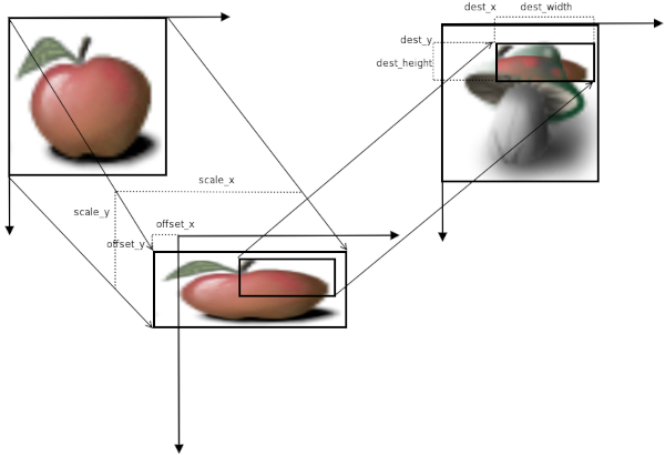
Figure: Composite
See the gdk-pixbuf:pixbuf-composite-color-simple function for a simpler variant of this function suitable for many tasks.
Utilities
Introduction to utilities
Functions for utilities
If the substitute argument is true, then the color specified by red, green, blue will be assigned zero opacity. That is, if you pass (255, 255, 255) for the substitute color, all white pixels will become fully transparent.
If the source rectangle overlaps the destination rectangle on the same pixbuf, it will be overwritten during the copy operation. Therefore, you can not use this function to scroll a pixbuf.
Animations
GdkPixbufAnimationIter
The caller of this function does not own a reference to the returned pixbuf. The returned pixbuf will become invalid when the iterator advances to the next frame, which may happen anytime you call the gdk-pixbuf:pixbuf-animation-iter-advance function. Copy the pixbuf to keep it, do not just add a reference, as it may get recycled as you advance the iterator.
The time argument would normally come from the g_get_current_time() function, and must be greater than or equal to the time passed to the gdk-pixbuf:pixbuf-animation-iter function, and must increase or remain unchanged each time the gdk-pixbuf:pixbuf-animation-iter-pixbuf function is called. That is, you cannot go backward in time, animations only play forward.
As a shortcut, pass 0 for the current time and the g_get_current_time() function will be invoked on your behalf. So you only need to explicitly pass time if you are doing something odd like playing the animation at double speed.
If this function returns false, there is no need to update the animation display, assuming the display had been rendered prior to advancing. If true, you need to call the gdk-pixbuf:pixbuf-animation-iter-pixbuf function and update the display with the new pixbuf.
GdkPixbufAnimation
The time argument would normally come from the g_get_current_time() function, and marks the beginning of animation playback. After creating an iterator, you should immediately display the pixbuf returned by the gdk-pixbuf:pixbuf-animation-iter-pixbuf function. Then, you should install a timeout, with the g:timeout-add function, or by some other mechanism ensure that you will update the image after gdk-pixbuf:pixbuf-animation-iter-delay-time milliseconds. Each time the image is updated, you should reinstall the timeout with the new, possibly changed delay time.
As a shortcut, if the time argument is 0, the result of the g_get_current_time() function will be used automatically.
To update the image, that is possibly change the result of the gdk-pixbuf:pixbuf-animation-iter-pixbuf function to a new frame of the animation, call the gdk-pixbuf:pixbuf-animation-iter-advance function.
If you are using the gdk-pixbuf:pixbuf-loader API, in addition to updating the image after the delay time, you should also update it whenever you receive the "area-updated" signal and the gdk-pixbuf:pixbuf-animation-iter-on-currently-loading-frame function returns true. In this case, the frame currently being fed into the loader has received new data, so needs to be refreshed. The delay time for a frame may also be modified after an "area-updated" signal, for example, if the delay time for a frame is encoded in the data after the frame itself. So your timeout should be reinstalled after any "area-updated" signal.
A delay time of -1 is possible, indicating 'infinite'.
GdkPixbufSimpleAnim
GdkPixbufLoader
To use the gdk-pixbuf:pixbuf-loader class to load an image, just create a new one, and call the gdk-pixbuf:pixbuf-loader-write function to send the data to it. When done, the gdk-pixbuf:pixbuf-loader-close function should be called to end the stream and finalize everything. The loader will emit three important signals throughout the process. The first, the "size-prepared" signal, will be called as soon as the image has enough information to determine the size of the image to be used. If you want to scale the image while loading it, you can call the gdk-pixbuf:pixbuf-loader-set-size function in response to this signal.
The second signal, the "area-prepared" signal, will be called as soon as the pixbuf of the desired has been allocated. You can obtain it by calling the gdk-pixbuf:pixbuf-loader-pixbuf function. In addition, no actual information will be passed in yet, so the pixbuf can be safely filled with any temporary graphics (or an initial color) as needed. You can also call the gdk-pixbuf:pixbuf-loader-pixbuf function later and get the same pixbuf.
The last signal, the "area-updated" signal gets called every time a region is updated. This way you can update a partially completed image. Note that you do not know anything about the completeness of an image from the area updated. For example, in an interlaced image, you need to make several passes before the image is done loading.
lambda (loader) :run-last
- loader
- The gdk-pixbuf:pixbuf-loader object that received the signal.
lambda (loader x y width height) :run-last
- loader
- The gdk-pixbuf:pixbuf-loader object that received the signal.
- x
- The integer for the x offset of upper-left corner of the updated area.
- y
- The integer for the y offset of upper-left corner of the updated area.
- width
- The integer for the width of updated area.
- height
- The integer for the height of updated area.
lambda (loader) :run-last
- loader
- The gdk-pixbuf:pixbuf-loader object that received the signal.
lambda (loader width height) :run-last
- loader
- The gdk-pixbuf:pixbuf-loader object that received the signal.
- width
- The integer for the original width of the image.
- height
- The integer for the original height of the image.
;; Create the image stream and the GdkPixbufLoader
(setf stream
(open (sys-path "alphatest.png")
:element-type '(unsigned-byte 8)))
(setf loader (gdk-pixbuf:pixbuf-loader-new))
...
(let* ((buffer (make-array 128 :element-type '(unsigned-byte 8)))
(len (read-sequence buffer stream)))
...
;; Load the buffer into GdkPixbufLoader
(gdk-pixbuf:pixbuf-loader-write loader buffer 128)
... ) Attempts to set the desired image size are ignored after the emission of the "size-prepared" signal.
Module Interface
(mapcar #'gdk-pixbuf:pixbuf-format-name (gdk-pixbuf:pixbuf-formats))
=> ("wmf" "ani" "bmp" "gif" "icns" "ico" "jpeg" "png" "pnm"
"qtif" "svg" "tga" "tiff" "xbm" "xpm") Package glib
This is the API documentation of a Lisp binding to the library GLib. Only a small part of GLib is implemented in Lisp which is necessary to implement GTK in Lisp.
Version Information
(glib:check-version 2 84 0) => NIL (glib:check-version 2 99 0) => "GLib version too old (micro mismatch)"
* (g:cl-cffi-glib-build-info) cl-cffi-glib build date: 20:12 5/17/2025 GLIB version: 2.84.1 Machine type: X86-64 Machine version: Intel(R) Core(TM) i5-5200U CPU @ 2.20GHz Software type: Linux Software version: 6.14.0-15-generic Lisp implementation type: SBCL Lisp implementation version: 2.2.9.debian NIL
Miscellaneous
String Utility Functions
(setq str (cffi:convert-to-foreign (list "Hello" "World") 'g:strv-t))
=> #.(SB-SYS:INT-SAP #X01541998)
(cffi:convert-from-foreign str 'g:strv-t)
=> ("Hello" "World") The names property of the g:themed-icon class is an example for the use of the g:strv-t type specifier. The g:themed-icon-new-from-names function creates a themed icon from strings. The accessor for the names property returns
the names of the themed icon as a list of strings. Internally, the list
list of strings is converted to and from a C array of strings via the g:strv-t type specifier.
(let ((icon (g:themed-icon-new-from-names "gnome-dev-cdrom-audio"
"gnome-dev-cdrom"
"gnome-dev"
"gnome")))
(g:themed-icon-names icon))
=> ("gnome-dev-cdrom-audio" "gnome-dev-cdrom" "gnome-dev" "gnome") Doubly-Linked Lists
(cffi:convert-to-foreign (list "a" "b" "c") '(g:list-t :string))
=> #.(SB-SYS:INT-SAP #X03B92220)
(cffi:convert-from-foreign * '(g:list-t :string))
=> ("a" "b" "c") The g:content-types-registered function is an example for the use of the g:list-t type specifier in the Lisp implementation. It returns a list of strings which is converted from a C GList instance.
(g:content-types-registered)
=> ("application/x-sc" "application/vnd.squashfs" ... ) Singly-Linked Lists
The gtk:builder-objects and gtk:size-group-widgets functions are examples for the use of the g:slist-t type specifier in the Lisp implementation. These functions return a list of g:object instances which are converted from C GSList instances.
(cffi:convert-to-foreign (list "a" "b" "c") '(g:slist-t :string))
=> #.(SB-SYS:INT-SAP #X03B92220)
(cffi:convert-from-foreign * '(g:slist-t :string))
=> ("a" "b" "c") Quarks
If the Lisp string does not currently has an associated GQuark, a new GQuark is created. A GQuark value of zero is associated to nil in Lisp.
See the g:type-qdata function for attaching a GQuark identifier to a g:type-t type ID.
(cffi:convert-to-foreign "GtkWidget" 'g:quark-as-string) => 91 (cffi:convert-to-foreign "gboolean" 'g:quark-as-string) => 9 (cffi:convert-to-foreign nil 'g:quark-as-string) => 0Translate a GQuark identifier to a Lisp string:
(cffi:convert-from-foreign 91 'g:quark-as-string) => "GtkWidget" (cffi:convert-from-foreign 9 'g:quark-as-string) => "gboolean" (cffi:convert-from-foreign 0 'g:quark-as-string) => NIL
GDateTime
(cffi:convert-to-foreign 0 'g:date-time) => #.(SB-SYS:INT-SAP #X558E3298CE40) (cffi:convert-from-foreign * 'g:date-time) => 0
Unicode manipulation
(cffi:convert-to-foreign #A 'g:unichar) => 65 (cffi:convert-to-foreign #0 'g:unichar) => 48 (cffi:convert-to-foreign #return 'g:unichar) => 13 (cffi:convert-to-foreign #space 'g:unichar) => 32Convert a C gunichar value to a Lisp character:
(cffi:convert-from-foreign 65 'g:unichar) => #A (cffi:convert-from-foreign 48 'g:unichar) => #0 (cffi:convert-from-foreign 13 'g:unichar) => #return (cffi:convert-from-foreign 32 'g:unichar) => #spaceAn integer argument is passed through:
(cffi:convert-to-foreign 65 'g:unichar) => 65
GError
(define-gboxed-opaque error "GError" :export t :type-initializer "g_error_get_type" :alloc (cl:error "GError cannot be created from the Lisp side."))
Memory Allocation
(g:malloc 100) => #.(SB-SYS:INT-SAP #X559FB7283340) (g:malloc 0) => #.(SB-SYS:INT-SAP #X00000000) (cffi:null-pointer-p (g:malloc 0)) => T
Utility Functions
The g:prgname function will be called automatically by gtk_init(), but the g:application-name function will not. Note that for thread safety reasons, this function can only be called once.
The application name will be used in contexts such as error messages, or when displaying the name of an application in the task list.
Since GLib 2.72, this function can be called multiple times and is fully thread safe. Prior to GLib 2.72, this function could only be called once per process.
The Main Event Loop
GMainLoop
(cffi:defcstruct main-loop)
To allow multiple independent sets of sources to be handled in different threads, each source is associated with a g:main-context instance. A g:main-context instance can only be running in a single thread, but sources can be added to it and removed from it from other threads. All functions which operate on a g:main-context instance or a built-in g:source instance are thread-safe.
Each event source is assigned a priority. The g:+priority-default+ default priority, is 0. Values less than 0 denote higher priorities. Values greater than 0 denote lower priorities. Events from high priority sources are always processed before events from lower priority sources.
Idle functions can also be added, and assigned a priority. These will be run whenever no events with a higher priority are ready to be processed.
The g:main-loop structure represents a main event loop. A g:main-loop instance is created with the g:main-loop-new function. After adding the initial event sources, the g:main-loop-run function is called. This continuously checks for new events from each of the event sources and dispatches them. Finally, the processing of an event from one of the sources leads to a call to the g:main-loop-quit funcion to exit the main loop, and the g:main-loop-run function returns.
It is possible to create new instances of the g:main-loop structure recursively. This is often used in GTK applications when showing modal dialog boxes. Note that event sources are associated with a particular g:main-context instance, and will be checked and dispatched for all main loops associated with that g:main-context instance.
(setq mainloop (g:main-loop-new nil t)) => #.(SB-SYS:INT-SAP #X0808DF88) (g:main-loop-is-running mainloop) => T (g:main-loop-quit mainloop) (g:main-loop-is-running mainloop) => NIL
GMainContext
(cffi:defcstruct main-context)
Note that even when the block argument is true, it is still possible for the g:main-context-iteration function to return false, since the wait may be interrupted for other reasons than an event source becoming ready.
GSource
(cffi:defcstruct source)
Note that timeout functions may be delayed, due to the processing of other event sources. Thus they should not be relied on for precise timing. After each call to the timeout function, the time of the next timeout is recalculated based on the current time and the given interval. It does not try to 'catch up' time lost in delays.
If you want to have a timer in the "seconds" range and do not care about the exact time of the first call of the timer, use the g:timeout-add-seconds function. This function allows for more optimizations and more efficient system power usage.
This internally creates a main loop source using the g:timeout-source-new function and attaches it to the main loop context using the g:source-attach function. You can do these steps manually if you need greater control.
This internally creates a main loop source using the g:timeout-source-new-seconds function and attaches it to the main loop context using the g:source-attach function. You can do these steps manually if you need greater control.
Note that the first call of the timer may not be precise for timeouts of one second. If you need finer precision and have such a timeout, you may want to use the g:timeout-add function instead.
This internally creates a main loop source using the g:idle-source-new function and attaches it to the main loop context using the g:source-attach function. You can do these steps manually if you need greater control.
It is permitted to call this function multiple times, but is not recommended due to the potential performance impact. For example, one could change the name in the g:source-func callback function to include details like the event type in the source name.
(let ((counter 0) (max 10))
(defun timeout-callback (loop)
(incf counter)
(if (>= counter max)
(progn
;; Reset the counter
(setf counter 0)
;; Stop the main loop from running
(g:main-loop-quit loop)
;; Stop the source
g:+source-remove+)
;; Continue the source
g:+source-continue+)))
(defun example-timeout-source ()
(let* ((context (g:main-context-new))
(mainloop (g:main-loop-new context nil))
;; Create a new timeout source
(source (g:timeout-source-new 10)))
;; Attach source to context
(g:source-attach source context)
;; Set the callback for source
(g:source-set-callback source
(lambda ()
(timeout-callback mainloop)))
;; Start the main loop
(g:main-loop-run mainloop)
(g:main-loop-unref mainloop))) The source instance will hold a reference on child while child is attached to it.
Note that if you have a pair of sources where the ready time of one suggests that it will be delivered first but the priority for the other suggests that it would be delivered first, and the ready time for both sources is reached during the same main context iteration then the order of dispatch is undefined.
GBytes
(define-gboxed-opaque bytes "GBytes" :export t :type-initializer "g_bytes_get_type" :alloc (%bytes-new (cffi:null-pointer) 0))
A g:bytes instance can come from many different origins that may have different procedures for freeing the memory region. Examples are memory from the g:malloc function.
(multiple-value-bind (data len)
(cffi:foreign-string-alloc "A test string.")
(defvar bytes (g:bytes-new data len)))
=> BYTES
(g:bytes-size bytes)
=> 15
(g:bytes-data bytes)
=> #.(SB-SYS:INT-SAP #X55EBB2C1DB70)
=> 15
(cffi:foreign-string-to-lisp (g:bytes-data bytes))
=> "A test string."
=> 14 Using a g:bytes instance to allocate the memory for a paintable
with 110 x 80 pixels and 4 bytes per pixel.
(let* ((size (* 4 110 80))
(data (cffi:foreign-alloc :uchar :count size :initial-element #xff))
(bytes (g:bytes-new data size))
(texture (gdk:memory-texture-new 110 70
:B8G8R8A8-PREMULTIPLIED
bytes
(* 4 110)))
(picture (gtk:picture-new-for-paintable texture)))
... ) A cffi:null-pointer value may be returned if the size value is 0. This is not guaranteed, as the g:bytes instance may represent an empty string for data not a cffi:null-pointer value and the size value as 0. A cffi:null-pointer value will not be returned if the size value is non-zero.
Command line option parser
(cffi:defcenum option-arg :none :string :int :callback :filename :string-array :filename-array :double :int64)
- :none
- No extra argument. This is useful for simple flags.
- :string
- The option takes a string argument.
- :int
- The option takes an integer argument.
- :callback
- The option provides a callback function to parse the extra argument.
- :filename
- The option takes a filename as argument.
- :string-array
- The option takes a string argument, multiple uses of the option are collected into a list of strings.
- :filename-array
- The option takes a filename as argument, multiple uses of the option are collected into a list of filenames.
- :double
- The option takes a double float argument. The argument can be formatted either for the locale of the user or for the C locale.
- :int64
- The option takes a 64-bit integer. Like the :int value but for larger numbers.
(cffi:defbitfield option-flags (:none 0) (:hidden #.(ash 1 0)) (:in-main #.(ash 1 1)) (:reverse #.(ash 1 2)) (:no-arg #.(ash 1 3)) (:filename #.(ash 1 4)) (:optional-arg #.(ash 1 5)) (:noalias #.(ash 1 6)) (:deprecated #.(ash 1 7)))
- :none
- No flags.
- :hidden
- The option does not appear in --help output.
- :in-main
- The option appears in the main section of the --help output, even if it is defined in a group.
- :reverse
- For options of the :none kind, this flag indicates that the sense of the option is reversed.
- :no-arg
- For options of the :callback kind, this flag indicates that the callback function does not take any argument, like a :none option.
- :filename
- For options of the :callback kind, this flag indicates that the argument should be passed to the callback function in the GLib filename encoding rather than UTF-8.
- :optional-arg
- For options of the :callback kind, this flag indicates that the argument supply is optional. If no argument is given then data of the GOptionParseFunc callback function will be set to NULL.
- :noalias
- This flag turns off the automatic conflict resolution which prefixes long option names with a group name, if there is a conflict. This option should only be used in situations where aliasing is necessary to model some legacy command line interface. It is not safe to use this option, unless all option groups are under your direct control.
- :deprecated
- This flag marks the option as deprecated in --help output. You should update the description of the option to describe what the user should do in response to the deprecation, for instance remove the option, or replace it with another one. Since 2.84
(cffi:defcstruct option-context)
testtreemodel -r 1 --max-size 20 --rand --display=:1.0 -vb -- file1 file2The example demonstrates a number of features of the GOption command line parser:
- Options can be single letters, prefixed by a single dash.
- Multiple short options can be grouped behind a single dash.
- Long options are prefixed by two consecutive dashes.
- Options can have an extra argument, which can be a number, a string or a filename. For long options, the extra argument can be appended with an equals sign after the option name, which is useful if the extra argument starts with a dash, which would otherwise cause it to be interpreted as another option.
- Non-option arguments are returned to the application as rest arguments.
- An argument consisting solely of two dashes turns off further parsing, any remaining arguments, even those starting with a dash, are returned to the application as rest arguments.
Usage: testtreemodel [OPTION...] - test tree model performanceGOption groups options in a g:option-group instance, which makes it easy to incorporate options from multiple sources. The intended use for this is to let applications collect option groups from the libraries it uses, add them to their g:option-context instance, and parse all options by a single call to the g:option-context-parse function.
Help Options: -h, --help Show help options
Application Options: -r, --repeats=N Average over N repetitions -m, --max-size=M Test up to 2^M items --display=DISPLAY X display to use -v, --verbose Be verbose -b, --beep Beep when done --rand Randomize the data
If an option is declared to be of type string or filename, GOption takes care of converting it to the right encoding. Strings are returned in UTF-8, filenames are returned in the GLib filename encoding. Note that this only works if the setlocale() function has been called before the g:option-context-parse function.
Here is a complete example of setting up GOption to parse the example command line above and produce the example help output.
(defvar repeats (cffi:foreign-alloc :int :initial-element 2)) (defvar max-size (cffi:foreign-alloc :int :initial-element 0)) (defvar verbose (cffi:foreign-alloc :boolean :initial-element nil)) (defvar beep (cffi:foreign-alloc :boolean :initial-element nil)) (defvar randomize (cffi:foreign-alloc :boolean :initial-element nil))On UNIX systems, the argv argument that is passed to the main function has no particular encoding, even to the extent that different parts of it may have different encodings. In general, normal arguments and flags will be in the current locale and filenames should be considered to be opaque byte strings. Proper use of the :filename versus :string option arguments is therefore important.
(defun main (&rest argv) (let ((entries '(("repeats" ; long-name #\r ; short-name :none ; flags :int ; arg repeats ; arg-data "Average over N repetitions" ; description "N") ; arg-description ("max-size" #\m 0 :int max-size "Test up to 2^M items" "M") ("verbose" #\v 0 :none verbose "Be verbose" nil) ("beep" #\b 0 :none beep "Beep when done" nil) ("rand" #\Nul 0 :none randomize "Randomize the data" nil))) (context (g:option-context-new "- test tree model performance"))) ;; Add the option entries to the option context (g:option-context-add-main-entries context entries nil) ;; Parse the commandline argumentens and show the result (if (g:option-context-parse context argv) (progn (format t "Option parsing failed.~%") ;; Print the Help Usage (format t "~&~%~a~%" (g:option-context-help context t))) (progn ;; Print the parsed arguments (format t "~&Parsed arguments~%") (format t " repeats : ~a~%" (cffi:mem-ref repeats :int)) (format t " max-size : ~a~%" (cffi:mem-ref max-size :int)) (format t " verbose : ~a~%" (cffi:mem-ref verbose :boolean)) (format t " beep : ~a~%" (cffi:mem-ref beep :boolean)) (format t " randomize : ~a~%" (cffi:mem-ref randomize :boolean)))) ... ))
Note that on Windows, filenames do have an encoding, but using a g:option-context instance with the argv argument as passed to the main function will result in a program that can only accept command line arguments with characters from the system codepage. This can cause problems when attempting to deal with filenames containing Unicode characters that fall outside of the codepage.
A solution to this is to use the g_win32_get_command_line() and g:option-context-parse-strv functions which will properly handle full Unicode filenames. If you are using a g:application instance, this is done automatically for you.
Another usage is to give a short summary of the program functionality, like "- frob the strings", which will be displayed in the same line as the usage. For a longer description of the program functionality that should be displayed as a paragraph below the usage line, use the g:option-context-summary function.
Note that the parameter argument is translated using the function set with the g:option-context-set-translate-func function, so it should normally be passed untranslated.
(g:option-context-new "This is an example for a description.") => #.(SB-SYS:INT-SAP #X0817EB48) (g:option-context-help * nil) => "Aufruf: sbcl [OPTION …] This is an example for a description.
Hilfeoptionen: -h, --help Hilfeoptionen anzeigen "
Note that the summary is translated. See the g:option-context-set-translate-func and g:option-context-set-translation-domain functions.
(setq context (g:option-context-new "A short description.")) => #.(SB-SYS:INT-SAP #X561C3BDDC430) (setf (g:option-context-summary context) "This is the summary.") => "This is the summary." (g:option-context-help context nil) => "Aufruf: sbcl [OPTION …] A short description.
This is the summary.
Hilfeoptionen: -h, --help Hilfeoptionen anzeigen "
Note that the summary is translated. See the g:option-context-set-translate-func function.
(setq context (g:option-context-new "A short description")) => #.(SB-SYS:INT-SAP #X55637A1CF6D0) (setf (g:option-context-description context) "More descriptions.") => "More descriptions." (g:option-context-help context nil) "Aufruf: sbcl [OPTION …] A short description
Hilfeoptionen: -h, --help Hilfeoptionen anzeigen
More descriptions. "
Note that option groups have their own translation functions, this function only affects the parameter argument of the g:option-context-new function, the summary argument of the g:option-context-summary function, and the description argument of the g:option-context-description function.
If you are using GNU gettext, you only need to set the translation domain, see the g:option-context-set-translation-domain function.
If the parsing is successful, any parsed arguments are removed from the list and argv is updated accordingly. A -- option is stripped from argv unless there are unparsed options before and after it, or some of the options after it start with -. In case of an error, argv is left unmodified.
If automatic --help support is enabled, see the g:option-context-help-enabled function, and the argv list contains one of the recognized help options, this function will produce help output to stdout and call exit(0).
Note that function depends on the current locale for automatic character set conversion of string and filename arguments.
In particular, strings that are removed from the arguments list will be freed using the g_free() function.
On Windows, the strings are expected to be in UTF-8. This is in contrast to the g:option-context-parse function which expects them to be in the system codepage, which is how they are passed as the command line arguments to the main function. See the g_win32_get_command_line() function for a solution.
This function is useful if you are trying to use a g:option-context instance with a g:application instance.
This setting does not affect non-option arguments, that is, arguments that do not start with a dash. But note that GOption cannot reliably determine whether a non-option belongs to a preceding unknown option.
(g:option-context-help context t)To obtain the text produced by --help-all, call
(g:option-context-help context nil)To obtain the help text for an option group, call
(g:option-context-help context nil group)
In strict POSIX mode, the first non-argument parameter encountered, for example, filename, terminates argument processing. Remaining arguments are treated as non-options and are not attempted to be parsed.
If strict POSIX mode is disabled then parsing is done in the GNU way where option arguments can be freely mixed with non-options.
As an example, consider ls foo -l. With GNU style parsing, this will list foo in long mode. In strict POSIX style, this will list the files named foo and -l.
It may be useful to force strict POSIX mode when creating "verb style" command line tools. For example, the gsettings command line tool supports the global option --schemadir as well as many subcommands, get, set, etc., which each have their own set of arguments. Using strict POSIX mode will allow parsing the global options up to the verb name while leaving the remaining options to be parsed by the relevant subcommand, which can be determined by examining the verb name, which should be present in the second command line argument after parsing.
The list of option entries has the following syntax. See the g:option-context documentation for a complete example.
(let ((entries '((long-name
short-name
flags
arg
arg-data
description
arg-description)
(<next option>)
)))
...) - long-name
- The string for the long name of an option can be used to specify it in a command line as --long-name. Every option must have a long name. To resolve conflicts if multiple option groups contain the same long name, it is also possible to specify the option as --groupname-long-name.
- short-name
- If an option has a short name, it can be specified -short-name in a command line. The argument short-name must be a printable ASCII character different from '-', or #Nul if the option has no short name.
- flags
- Flags from the g:option-flags bitfield.
- arg
- The type of the option, as a g:option-arg value.
- arg-data
- If the arg type is :callback, then arg-data must point to a GOptionArgFunc callback function, which will be called to handle the extra argument. Otherwise, arg-data is a pointer to a location to store the value, the required type of the location depends on the arg type. If the arg type is :string or :filename the location will contain a newly allocated string if the option was given.
- description
- The string for the description for the option in --help output. The description is translated using the translate-func callback function of the group, see the g:option-group-set-translation-domain function.
- arg-description
- The string for the placeholder to use for the extra argument parsed by the option in --help output. The arg-description argument is translated using the translate-func callback function of the group, see the g:option-group-set-translation-domain function.
(cffi:defcstruct option-group)
All options in a group share the same translation function. Libraries which need to parse command line options are expected to provide a function for getting a g:option-group instance holding their options, which the application can then add to its g:option-context instance.
(let ((entries '((long-name
short-name
flags
arg
arg-data
description
arg-description)
(<next option>)
)))
...) - long-name
- The string for the long name of an option can be used to specify it in a command line as --long-name. Every option must have a long name. To resolve conflicts if multiple option groups contain the same long name, it is also possible to specify the option as --groupname-long-name.
- short-name
- If an option has a short name, it can be specified -short-name in a command line. The argument short-name must be a printable ASCII character different from '-', or #Nul if the option has no short name.
- flags
- Flags from the g:option-flags bitfield.
- arg
- The type of the option, as a g:option-arg value.
- arg-data
- If the arg type is :callback, then arg-data must point to a GOptionArgFunc callback function, which will be called to handle the extra argument. Otherwise, arg-data is a pointer to a location to store the value, the required type of the location depends on the arg type. If arg type is :string or :filename the location will contain a newly allocated string if the option was given.
- description
- The string for the description for the option in --help output. The description is translated using the translate-func of the group, see the g:option-group-set-translation-domain function.
- arg-description
- The string for the placeholder to use for the extra argument parsed by the option in --help output. The arg-description is translated using the translate-func of the group, see the g:option-group-set-translation-domain function.
If you are using GNU gettext, you only need to set the translation domain, see the g:option-group-set-translation-domain function.
Key-value file parser
(cffi:defbitfield key-file-flags (:none 0) (:keep-comments #.(ash 1 0)) (:keep-translations #.(ash 1 1)))
- :none
- No flags, default behaviour.
- :keep-coments
- Use this flag if you plan to write the possibly modified contents of the key file back to a file. Otherwise all comments will be lost when the key file is written back.
- :keep-translations
- Use this flag if you plan to write the possibly modified contents of the key file back to a file. Otherwise only the translations for the current language will be written back.
(cffi:defcstruct key-file)
The syntax of key files is described in detail in the Desktop Entry Specification, here is a quick summary. Key files consists of groups of key-value pairs, interspersed with comments.
# this is just an example # there can be comments before the first groupLines beginning with a '#' and blank lines are considered comments. Groups are started by a header line containing the group name enclosed in '[' and ']', and ended implicitly by the start of the next group or the end of the file. Each key-value pair must be contained in a group.
[First Group] Name=Key File Example this value shows escaping
# localized strings are stored in multiple key-value pairs Welcome=Hello Welcome[de]=Hallo Welcome[fr_FR]=Bonjour Welcome[it]=Ciao Welcome[be@latin]=Hello
[Another Group] Numbers=2;20;-200;0 Booleans=true;false;true;true
Key-value pairs generally have the form key=value, with the exception of localized strings, which have the form key[locale]=value, with a locale identifier of the form lang_COUNTRY@MODIFIER where COUNTRY and MODIFIER are optional. Space before and after the '=' character are ignored. Newline, tab, carriage return and backslash characters in value are escaped as n, t, r, and \, respectively. To preserve leading spaces in values, these can also be escaped as s.
Key files can store strings, possibly with localized variants, integers, booleans and lists of these. Lists are separated by a separator character, typically ';' or ','. To use the list separator character in a value in a list, it has to be escaped by prefixing it with a backslash.
This syntax is obviously inspired by the .ini files commonly met on Windows, but there are some important differences:
- .ini files use the ';' character to begin comments, key files use the '#' character.
- Key files do not allow for ungrouped keys meaning only comments can precede the first group.
- Key files are always encoded in UTF-8.
- Key and Group names are case-sensitive. For example, a group called [GROUP] is a different from [group].
- .ini files do not have a strongly typed boolean entry type, they only have GetProfileInt(). In key files, only true and false (in lower case) are allowed.
(glib:with-key-file (keyfile)
(let ((path (glib-sys:sys-path "test/resource/key-file.ini")))
;; Load key file
(unless (g:key-file-load-from-file keyfile path :none)
(error "Error loading the key file: KEY-FILE.INI"))
;; Read string from the key file
(let ((value (g:key-file-string keyfile "First Group" "Welcome")))
(unless value
(setf value "default value"))
... )))
Here is an example of creating and saving a key file:
(glib:with-key-file (keyfile)
(let ((path (glib-sys:sys-path "test/resource/key-file.ini")))
;; Load existing key file
(g:key-file-load-from-file keyfile path :none)
;; Add string to the First Group
(setf (g:key-file-string keyfile "First Group" "SomeKey") "New Value"))
;; Save to a file
(let ((path (glib-sys:sys-path "test/out/key-file.ini")))
(unless (g:key-file-save-to-file keyfile path)
(error "Error saving key file.")))
;; Or save to data for use elsewhere
(let ((data (g:key-file-to-data keyfile)))
(unless data
(error "Error saving key file."))
... )) The key file is created using the g:key-file-new function. Use the g:key-file-load-from-file or g:key-file-load-from-data functions to read an existing key file. Alternatively, use the g:with-key-file-from-file or g:with-key-file-from-data macros to create and load the key file in one step.
The key file is created using the g:key-file-new function and loaded using the g:key-file-load-from-file function. If the key file cannot be loaded then an error condition is thrown.
The key file is created using the g:key-file-new function and loaded using the g:key-file-load-from-data function. If the key file cannot be loaded then an error condition is thrown.
As an alternative, you can use the with:key-file macro to create a key file. This macro releases the memory after the key file is used. See the documentation for this macro for more information.
Use the g:with-key-file-from-file macro to create and load the key file in one step.
Use the g:with-key-file-from-data macro to create and load the key file in one step.
The (setf g:key-file-value) function associates a new value with key under group. If key cannot be found then it is created. If group cannot be found then it is created. To set an UTF-8 string which may contain characters that need escaping (such as newlines or spaces), use the g:key-file-string function.
The (setf g:key-file-locale-string) function associates a string value for key and locale under group. If the translation for key cannot be found then it is created.
If calling the g:key-file-locale-string or g:key-file-locale-string-list function with exactly the same keyfile, group, key and locale, the result of those functions will have originally been tagged with the locale that is the result of this function.
This is similar to the g:key-file-integer function but can return 64-bit results without truncation.
This is similar to the g:key-file-integer function but can return 64-bit results without truncation.
The (setf g:key-file-locale-string-list) function associates a list of string values for key and locale under group. If the translation for key cannot be found then it is created.
If the locale argument is to be not nil, or if the current locale will change over the lifetime of the g:key-file instance, it must be loaded with the :keep-translations value for the g:key-file-flags flags in order to load strings for all locales.
If the key argument cannot be found then nil is returned. If the values associated with key cannot be interpreted or no suitable translations can be found then the untranslated values are returned.
If key cannot be found then nil is returned. Likewise, if the values associated with key cannot be interpreted as booleans then nil is returned.
If key cannot be found then nil is returned. Likewise, if the values associated with key cannot be interpreted as integers then nil is returned.
If key cannot be found then nil is returned. Likewise, if the values associated with key cannot be interpreted as double floats then nil is returned.
The (setf g:key-file-comment) function places a comment above key from group. If key is nil then the comment will be written above group. If both key and group are nil, then the comment will be written above the first group in the file.
Variant Datatype
GVariantType
(define-gboxed-opaque variant-type "GVariantType" :export t :type-initializer "g_variant_type_get_gtype" :alloc (cl:error "GVariantType cannot be created from the Lisp side."))
The first major change with respect to the D-Bus type system is the introduction of maybe (or "nullable") types. Any type in the GVariant type system can be converted to a maybe type, in which case, "nothing" (or "null") becomes a valid value. Maybe types have been added by introducing the character "m" to type strings.
The second major change is that the GVariant type system supports the concept of "indefinite types" - types that are less specific than the normal types found in D-Bus. For example, it is possible to speak of "an array of any type" in the GVariant type system, where the D-Bus type system would require you to speak of "an array of integers" or "an array of strings". Indefinite types have been added by introducing the characters "*", "?" and "r" to type strings.
Finally, all arbitrary restrictions relating to the complexity of types are lifted along with the restriction that dictionary entries may only appear nested inside of arrays.
Just as in D-Bus, GVariant types are described with type strings. Subject to the differences mentioned above, these strings are of the same form as those found in D-Bus. Note, however: D-Bus always works in terms of messages and therefore individual type strings appear nowhere in its interface. Instead, "signatures" are a concatenation of the strings of the type of each argument in a message. The GVariant type system deals with single values directly so GVariant type strings always describe the type of exactly one value. This means that a D-Bus signature string is generally not a valid GVariant type string - except in the case that it is the signature of a message containing exactly one argument.
An indefinite type is similar in spirit to what may be called an abstract type in other type systems. No value can exist that has an indefinite type as its type, but values can exist that have types that are subtypes of indefinite types. That is to say, the g:variant-type function will never return an indefinite type, but calling the g:variant-is-of-type function with an indefinite type may return true. For example, you cannot have a value that represents "an array of no particular type", but you can have an "array of integers" which certainly matches the type of "an array of no particular type", since "array of integers" is a subtype of "array of no particular type".
This is similar to how instances of abstract classes may not directly exist in other type systems, but instances of their non-abstract subtypes may. For example, in GTK, no object that has the GtkWidget type can exist, since the GtkWidget class is an abstract class, but a GtkButton object can certainly be instantiated, and you would say that the GtkButton is a GtkWidget object, since the GtkButton class is a subclass of the GtkWidget class.
Two types may not be compared by value. Use the g:variant-type-equal or g:variant-type-is-subtype-of functions.
- any basic type string (listed below)
- "v", "r" or "*"
- one of the characters "a" or "m", followed by another type string
- the character "(", followed by a concatenation of zero or more other type strings, followed by the character ")"
- the character "{", followed by a basic type string (see below), followed by another type string, followed by the character "}"
The above definition is recursive to arbitrary depth. The "aaaaai" and "(ui(nq((y)))s)" type strings are both valid type strings, as is the "a(aa(ui)(qna{ya(yd)}))" type string.
The meaning of each of the characters is as follows:
- b
- The type string of a boolean value.
- y
- The type string of a byte.
- n
- The type string of a signed 16 bit integer.
- q
- The type string of an unsigned 16 bit integer.
- i
- The type string of a signed 32 bit integer.
- u
- The type string of an unsigned 32 bit integer.
- x
- The type string of a signed 64 bit integer.
- t
- The type string of an unsigned 64 bit integer.
- h
- The type string of a signed 32 bit value that, by convention, is used as an index into an array of file descriptors that are sent alongside a D-Bus message.
- d
- The type string of a double precision floating point value.
- s
- The type string of a string.
- o
- The type string of a string in the form of a D-Bus object path.
- g
- The type string of a string in the form of a D-Bus type signature.
- ?
- The type string of an indefinite type that is a supertype of any of the basic types.
- v
- The type string of a container type that contain any other type of value.
- a
- Used as a prefix on another type string to mean an array of that type. The "ai" type string, for example, is the type of an array of 32 bit signed integers.
- m
- Used as a prefix on another type string to mean a "maybe", or "nullable", version of that type. The "ms" type string, for example, is the type of a value that maybe contains a string, or maybe contains nothing.
- ()
- Used to enclose zero or more other concatenated type strings to create a tuple type. The "(is)" type string, for example, is the type of a pair of an integer and a string.
- r
- The type string of an indefinite type that is a supertype of any tuple type, regardless of the number of items.
- {}
- Used to enclose a basic type string concatenated with another type string to create a dictionary entry type, which usually appears inside of an array to form a dictionary. The "a{sd}" type string, for example, is the type of a dictionary that maps strings to double precision floating point values. The first type (the basic type) is the key type and the second type is the value type. The reason that the first type is restricted to being a basic type is so that it can easily be hashed.
- *
- The type string of the indefinite type that is a supertype of all types. Note that, as with all type strings, this character represents exactly one type. It cannot be used inside of tuples to mean "any number of items".
The "a{?*}" type string is an indefinite type that is a supertype of all arrays containing dictionary entries where the key is any basic type and the value is any type at all. This is, by definition, a dictionary. Note that, due to the restriction that the key of a dictionary entry must be a basic type. The "{**}" type string is not a valid type string.
Two types may not be compared by value. Use the g:variant-type-equal or g:variant-type-is-subtype-of functions. May be copied using the g:variant-type-copy function. g:variant-type-copy
;; A string variant type
(g:variant-type-new "s") => #<GLIB:VARIANT-TYPE {100FEBF233}>
;; An integer variant type
(g:variant-type-new "i") => #<GLIB:VARIANT-TYPE {100FEBF613}> GVariant
(cffi:defcenum variant-class
(:boolean #.(char-code #b))
(:byte #.(char-code #y))
(:int16 #.(char-code #n))
(:uint16 #.(char-code #q))
(:int32 #.(char-code #i))
(:uint32 #.(char-code #u))
(:int64 #.(char-code #x))
(:uint64 #.(char-code #t))
(:handle #.(char-code #h))
(:double #.(char-code #d))
(:string #.(char-code #s))
(:object-path #.(char-code #o))
(:signature #.(char-code #g))
(:variant #.(char-code #v))
(:maybe #.(char-code #m))
(:array #.(char-code #a))
(:tuple #.(char-code #())
(:dict-entry #.(char-code #{))) - :boolean
- The instance is a boolean.
- :byte
- The variant is a byte.
- :int16
- The variant is a signed 16 bit integer.
- :uint16
- The variant is an unsigned 16 bitinteger.
- :int32
- The variant is a signed 32 bit integer.
- :unit32
- The variant is an unsigned 32 bit integer.
- :int64
- The variant is a signed 64 bit integer.
- :uint64
- The variant is an unsigned 64 bit integer.
- :handle
- The variant is a file handle index.
- :double
- The variant is a double precision floating point value.
- :string
- The variant is a normal string.
- :object-path
- The variant is a D-Bus object path string.
- :signature
- The variant is a D-Bus signature string.
- :variant
- The variant is a variant.
- :maybe
- The variant is a maybe-typed value.
- :array
- The variant is an array.
- :tuple
- The variant is a tuple.
- :dict-entry
- The variant is a dictionary entry.
(cffi:defcstruct variant)
g:variant instances always have a type and a value, which are given at construction time. The variant type and value of a g:variant instance can never change other than by the g:variant instance itself being destroyed. A g:variant instance cannot contain a pointer.
A g:variant instance is reference counted using the g:variant-ref and g:variant-unref functions. The g:variant instance also has floating reference counts, see the g:variant-ref-sink function.
The g:variant structure is completely threadsafe. A g:variant instance can be concurrently accessed in any way from any number of threads without problems.
The g:variant structure is heavily optimised for dealing with data in serialised form. It works particularly well with data located in memory mapped files. It can perform nearly all deserialisation operations in a small constant time, usually touching only a single memory page. Serialised g:variant data can also be sent over the network.
The g:variant structure is largely compatible with D-Bus. Almost all types of g:variant instances can be sent over D-Bus. See the g:variant-type documentation for exceptions. However, g:variant structures serialisation format is not the same as the serialisation format of a D-Bus message body: use GDBusMessage, in the GIO library, for those.
For space-efficiency, the g:variant serialisation format does not automatically include the variant's length, type or endianness, which must either be implied from context (such as knowledge that a particular file format always contains a little-endian "v" which occupies the whole length of the file) or supplied out-of-band (for instance, a length, type and/or endianness indicator could be placed at the beginning of a file, network message or network stream).
A g:variant instance size is limited mainly by any lower level operating system constraints, such as the number of bits in :size. For example, it is reasonable to have a 2 GB file mapped into memory with GMappedFile, and call the g_variant_new_from_data() function on it.
For convenience to C programmers, the g:variant values features powerful varargs-based value construction and destruction. This feature is designed to be embedded in other libraries.
There is a Python-inspired text language for describing g:variant parameters. The g:variant structure includes a printer for this language and a parser with type inferencing.
After execution of the body the g:variant-unref function is called on var. This clears the memory used by the variant.
Calling the g:variant-ref-sink function on a g:variant instance with a floating reference will convert the floating reference into a full reference. Calling the g:variant-ref-sink function on a non-floating g:variant instance results in an additional normal reference being added.
In other words, if value is floating, then this call "assumes ownership" of the floating reference, converting it to a normal reference. If value is not floating, then this call adds a new normal reference increasing the reference count by one.
All calls that result in a g:variant instance being inserted into a container will call the g:variant-ref-sink function on the instance. This means that if the value was just created (and has only its floating reference) then the container will assume sole ownership of the value at that point and the caller will not need to unreference it. This makes certain common styles of programming much easier while still maintaining normal refcounting semantics in situations where values are not floating.
The situation where this function is helpful is when creating an API that allows the user to provide a callback function that returns a g:variant instance. We certainly want to allow the user the flexibility to return a non-floating reference from this callback for the case where the value that is being returned already exists.
At the same time, the style of the g:variant API makes it likely that for newly created g:variant instances, the user can be saved some typing if they are allowed to return a g:variant instance with a floating reference.
Using this function on the return value of the user's callback allows the user to do whichever is more convenient for them. The caller will alway receives exactly one full reference to the value: either the one that was returned in the first place, or a floating reference that has been converted to a full reference.
This function has an odd interaction when combined with the g:variant-ref-sink function running at the same time in another thread on the same g:variant instance. If the g:variant-ref-sink function runs first then the result will be that the floating reference is converted to a hard reference. If the g:variant-take-ref function runs first then the result will be that the floating reference is converted to a hard reference and an additional reference on top of that one is added. It is best to avoid this situation.
See the g:variant-ref-sink function for more information about floating reference counts.
(g:variant-type-string (g:variant-new-double 10.0d0)) => "d" (g:variant-type-string (g:variant-new-string "test")) => "s"
Comparison is only defined for basic types, that is booleans, numbers, strings. For booleans, false is less than true. Numbers are ordered in the usual way. Strings are in ASCII lexographical order.
It is a programmer error to attempt to compare container values or two values that have types that are not exactly equal. For example, you cannot compare a 32-bit signed integer with a 32-bit unsigned integer. Also note that this function is not particularly well-behaved when it comes to comparison of doubles. In particular, the handling of incomparable values, like NaN, is undefined.
If you only require an equality comparison, the g:variant-equal function is more general.
(g:variant-new-boolean nil) => #.(SB-SYS:INT-SAP #X5602D1E4F100) (g:variant-boolean *) => NIL (g:variant-new-boolean t) => #.(SB-SYS:INT-SAP #X5602D1E4F160) (g:variant-boolean *) => T
(g:variant-boolean (g:variant-new-boolean nil)) => NIL (g:variant-boolean (g:variant-new-boolean t)) => T
By convention, handles are indexes into an array of file descriptors that are sent alongside a D-Bus message. If you are not interacting with D-Bus, you probably do not need them.
(g:variant-new-string "This is a string.") => #.(SB-SYS:INT-SAP #X55EF04FDCE00) (g:variant-string *) => "This is a string."
A valid object path starts with '/' followed by zero or more sequences of characters separated by '/' characters. Each sequence must contain only the characters "[A-Z][a-z][0-9]_". No sequence (including the one following the final '/' character) may be empty.
D-Bus type signatures consist of zero or more definite g:variant-type strings in sequence.
(g:variant-new-tuple (g:variant-new-int16 10) (g:variant-new-int16 20)) => #.(SB-SYS:INT-SAP #X6195B5F9ED70) (g:variant-print *) => "(10, 20)"
The data in bytes must be aligned appropriately for the type being loaded. Otherwise this function will internally create a copy of the memory.
In the event that the parsing is successful, the resulting g:variant instance is returned. In case of any error, nil will be returned.
Officially, the language understood by the parser is any string produced by the g:variant-print function.
(g:variant-parse (g:variant-type-new "b") "true") => #.(SB-SYS:INT-SAP #X7F99C4012440) (g:variant-print *) => "true" (g:variant-parse "b" "false") => #.(SB-SYS:INT-SAP #X564C855E8690) (g:variant-print *) => "false" (g:variant-parse (g:variant-type-new "i") "100") => #.(SB-SYS:INT-SAP #X7F99C4012CF0) (g:variant-print * nil) => "100" (g:variant-parse "d" "100") => #.(SB-SYS:INT-SAP #X564C855F9900) (g:variant-print *) => "100.0"
GVariantDict
(define-gboxed-opaque variant-dict "GVariantDict" :export t :type-initializer "g_variant_dict_get_type" :alloc (%variant-dict-new (cffi:null-pointer)))
You allocate a g:variant-dict instance with the g:variant-dict-new function. The g:variant-dict-end function is used to convert the g:variant-dict instance back into a g:variant dictionary type. This also implicitly frees all associated memory.
(defun add-to-count (orig)
(let* ((dict (g:variant-dict-new orig))
(variant (g:variant-dict-lookup-value dict "count")))
(when variant
(let ((value (1+ (g:variant-int32 variant))))
(g:variant-dict-insert-value dict "count" (g:variant-new-int32 value))
(g:variant-dict-end dict))))) The vtype string specifies what type of value is expected. If the value associated with key has a different type then nil is returned.
If the key is found and the value has the correct type, it is returned. If vtype was specified then any non-nil return value will have this type.
GVariantIter
(cffi:defcstruct variant-iter)
Use the g:variant-iter-free function to free the return value when you no longer need it.
A reference is taken to the container that iter is iterating over and will be released only when the g:variant-iter-free function is called.
A reference is taken to value and will be released only when the g:variant-iter-free function is called.
Use the g:variant-unref function to drop your reference on the return value when you no longer need it.
(defun iterate-container (container)
(let ((iter (g:variant-iter-new container)))
(iter (for value = (g:variant-iter-next-value iter))
(while value)
;; Do something with VALUE
...
(g:variant-unref value))
(g:variant-iter-free iter))) Package gobject
Type Information
Introduction to type information
For type creation and registration purposes, all types fall into one of two categories: static or dynamic. Static types are never loaded or unloaded at run-time as dynamic types may be. Static types are created with the function g_type_register_static() that gets type specific information passed in via a GTypeInfo structure. Dynamic types are created with the function g_type_register_dynamic() which takes a GTypePlugin structure instead. The remaining type information (the GTypeInfo structure) is retrieved during runtime through the GTypePlugin structure and the g_type_plugin_*() API. These registration functions are usually called only once from a function whose only purpose is to return the type identifier for a specific class. Once the type (or class or interface) is registered, it may be instantiated, inherited, or implemented depending on exactly what sort of type it is. There is also a third registration function for registering fundamental types called g_type_register_fundamental() which requires both a GTypeInfo structure and a GTypeFundamentalInfo structure but it is seldom used since most fundamental types are predefined rather than user-defined.
Type instance and class structures are limited to a total of 64 KiB, including all parent types. Similarly, type instances' private data (as created by the function g_type_class_add_private()) are limited to a total of 64 KiB. If a type instance needs a large static buffer, allocate it separately (typically by using a GArray or GPtrArray structure) and put a pointer to the buffer in the structure.
A final word about type names. Such an identifier needs to be at least three characters long. There is no upper length limit. The first character needs to be a letter (a-z or A-Z) or an underscore '_'. Subsequent characters can be letters, numbers or any of '-_+'.
Types and functions for type information
ID NAME CFFI type Lisp type ------------------------------------------------------------ 4 "void" :void NULL 8 "GInterface" :pointer 12 "gchar" :char 16 "guchar" :uchar 20 "gboolean" :boolean boolean 24 "gint" :int 28 "guint" :uint 32 "glong" :long 36 "gulong" :ulong 40 "gint64" :int64 44 "guint64" :uint64 48 "GEnum" g:enum 52 "GFlags" g:flags 56 "gfloat" :float single-float 60 "gdouble" :double double-float 64 "gchararray" :string 68 "gpointer" :pointer 72 "GBoxed" :pointer g:boxed 76 "GParam" :pointer g:param 80 "GObject" :pointer g:object 84 "GVariant" :pointer g:variant
(g:gtype "gdouble") => #<GTYPE :name "gdouble" :id 60> (g:gtype 60) => #<GTYPE :name "gdouble" :id 60>Get the name and the numeric identifier from a g:gtype instance.
(glib:gtype-id (g:gtype "gdouble")) => 60 (glib:gtype-name (g:gtype "gdouble")) => "gdouble"Convert from foreign.
(cffi:convert-from-foreign 60 'g:type-t) => #<GTYPE :name "gdouble" :id 60> (cffi:convert-from-foreign "gdouble" 'g:type-t) => #<GTYPE :name "gdouble" :id 60> (cffi:convert-from-foreign (g:gtype "gdouble") 'g:type-t) => #<GTYPE :name "gdouble" :id 60>Convert to foreign.
(cffi:convert-to-foreign 60 'g:type-t) => 60 (cffi:convert-to-foreign "gdouble" 'g:type-t) => 60 (cffi:convert-to-foreign (g:gtype "gdouble") 'g:type-t) => 60Get the Lisp symbol for a GType:
(g:symbol-for-gtype "GApplication") => GIO:APPLICATION => T
(g:gtype "GApplication") => #<GTYPE :name "GApplication" :id 94607290994400> (g:gtype-name *) => "GApplication" (g:gtype-id **) => 94607290994400
(g:gtype-name (g:gtype "gboolean")) => "gboolean" (g:gtype-name (g:gtype "GObject")) => "GObject" (g:gtype-name (g:gtype "GSimpleAction")) => "GSimpleAction"
(g:gtype-id (g:gtype "gboolean")) => 20 (g:gtype-id (g:gtype "GObject")) => 80 (g:gtype-id (g:gtype "GAction")) => 95376336284736 (g:gtype-id (g:gtype "GSimpleAction")) => 95376336285744 (g:gtype-id nil) => 0
(g:gtype 20) => #<GTYPE :name "gboolean" :id 20> (g:gtype "gboolean") => #<GTYPE :name "gboolean" :id 20> (g:gtype (g:gtype 20)) => #<GTYPE :name "gboolean" :id 20> (g:gtype "unknown") => WARNING: unknown is not known to the GType system => NIL
The Lisp symbol is used with the make-instance method to create an instance for a GType type from the Lisp side.
(g:symbol-for-gtype "GApplication")
=> GIO:APPLICATION
=> T
(g:symbol-for-gtype (g:gtype "GSimpleAction"))
=> GIO:SiMPLE-ACTION
=> T
(make-instance *)
=> #<GIO:SIMPLE-ACTION {1007481A53}> (cffi:defcstruct type-class (:type type-t))
(cffi:defcstruct type-interface (:type type-t) (:instance-type type-t))
(cffi:defcstruct type-instance (:class (:pointer (:struct type-class))))
(g:type-is-abstract "GtkWidget") => T (g:type-is-abstract "GtkButton") => NIL
(g:type-is-derived "gboolean") => NIL (g:type-is-derived "GObject") => NIL (g:type-is-derived "GtkWidget") => T
(g:type-is-fundamental "gboolean") => T (g:type-is-fundamental "GObject") => T (g:type-is-fundamental "GtkWidget") => NIL
(g:type-is-value-type "gint") => T (g:type-is-value-type "GObject") => T (g:type-is-value-type "GEnum") => NIL
(g:type-is-interface "GAction") => T (g:type-is-interface (g:gtype "GAction")) => T (g:type-is-interface "GSimpleAction") => NIL
(g:type-from-instance (g:simple-action-new "action")) => #<GTYPE :name "GSimpleAction" :id 97556076810288>
(g:type-from-class (g:type-class-ref "GObject")) => #<GTYPE :name "GObject" :id 80>
(g:type-from-interface (g:type-default-interface-ref "GtkOrientable")) => #<GTYPE :name "GtkOrientable" :id 134920864>
(g:type-instance-class (g:simple-action-new "action")) => #.(SB-SYS:INT-SAP #X58BA0B4DF320) (g:type-from-class *) => #<GTYPE :name "GSimpleAction" :id 97556076810288>
(g:type-check-instance-type (g:simple-action-new "action") "GObject") => T (g:type-check-instance-type (g:simple-action-new "action") "gboolean") => NIL (g:type-check-instance-type (g:simple-action-new "action") "GAction") => T
(g:type-check-class-type (g:type-class-ref "GtkButton") "GObject") => T (g:type-check-class-type (g:type-class-ref "GtkButton") "GtkWindow") => NIL
(g:type-name 60) => "gdouble" (g:type-name "gdouble") => "gdouble" (g:type-name (g:gtype "gdouble")) => "gdouble" (g:type-name "unknown") => WARNING: unknown is not known to the GType system => NIL
(g:type-parent "GtkWindow") => #<GTYPE :name "GtkWidget" :id 94209734120944> (g:type-parent "GApplication") => #<GTYPE :name "GObject" :id 80> (g:type-parent "GtkActionable") => #<GTYPE :name "GInterface" :id 8> (g:type-parent "GObject") => NIL (g:type-parent "gdouble") => NIL
(g:type-children "GtkButton")
=> (#<GTYPE :name "GtkToggleButton" :id 94069209378496>
#<GTYPE :name "GtkLinkButton" :id 94069209378816>
#<GTYPE :name "GtkLockButton" :id 94069209383872>) (g:type-depth "gdouble") => 1 (g:type-depth "GtkButton") => 4
(g:type-next-base "GtkToggleButton" "GtkWidget") => #<GTYPE :name "GtkButton" :id 94607001843920>
(g:type-is-a "gboolean" "gboolean") => T (g:type-is-a "GBytes" "GBoxed") => T (g:type-is-a "GApplicationFlags" "GFlags") => T (g:type-is-a "GApplication" "GObject") => T (g:type-is-a "GParamBoolean" "GParam") => T
(g:type-class-ref "GApplication") => #.(SB-SYS:INT-SAP #X55FA5306FE40) (g:type-from-class *) => #<GTYPE :name "GApplication" :id 94533623145984> (g:type-class-ref "GAction") => NIL (g:type-class-ref "gdouble") => NIL (g:type-class-ref "unknown") => NIL
(g:type-class-peek "GSimpleAction") => #.(SB-SYS:INT-SAP #X55FA5306FE40) (g:type-from-class *) => #<GTYPE :name "GSimpleAction" :id 94533623145984> (g:type-class-peek "GAction") => NIL (g:type-class-peek "gdouble") => NIL (g:type-class-peek "unknown") => NIL
(g:type-class-peek (g:type-parent class))
(g:type-interface-peek (g:type-class-ref "GtkBox") "GtkOrientable") => #.(SB-SYS:INT-SAP #X080C6858) (g:type-from-interface *) => #S(GTYPE :NAME "GtkOrientable" :%ID 134887472)
If the interface type is not currently in use, then the default vtable for the type will be created and initalized by calling the base interface init and default vtable init functions for the type. Calling this function is useful when you want to make sure that signals and properties for an interface have been installed.
(g:type-default-interface-ref "GAction") => #.(SB-SYS:INT-SAP #X55D446D53DE0) (g:type-from-interface *) => #<GTYPE :name "GAction" :id 94370208235568> (g:type-default-interface-ref "GSimpleAction") => NIL (g:type-default-interface-ref "gdouble") => NIL (g:type-default-interface-ref "unknown") => NIL
(g:type-interfaces "GtkButton")
=> (#<GTYPE :name "GtkAccessible" :id 94209734120256>
#<GTYPE :name "GtkBuildable" :id 94209734088896>
#<GTYPE :name "GtkConstraintTarget" :id 94209734121424>
#<GTYPE :name "GtkActionable" :id 94209734120688>) (g:type-interface-prerequisites "GtkOrientable") => (#<GTYPE :name "GObject" :id 80>)
Note that this does not take subtyping into account. Data attached to one type cannot be retrieved from a subtype.
(setf (g:type-qdata "gboolean" "mydata") "a string") => "a string" (g:type-qdata "gboolean" "mydata") => "a string" (setf (g:type-qdata "gboolean" "mydata") '(a b c)) => (A B C) (g:type-qdata "gboolean" "mydata") => (A B C) (setf (g:type-qdata "gboolean" "mydata") nil) => NIL (g:type-qdata "gboolean" "mydata") => NIL
(g:type-fundamental "GSimpleAction") => #<GTYPE :name "GObject" :id 80> (g:type-fundamental "GAction") => #<GTYPE :name "GInterface" :id 8> (g:type-fundamental "GBytes") => #<GTYPE :name "GBoxed" :id 72>
Various types and functions
Introduction to enumeration and Flag Types
Types and functions for enumeration and flags types
(cffi:defcstruct enum-class (:type-class (:pointer (:struct type-class))) (:minimum :int) (:maximum :int) (:n-values :uint) (:values (:pointer enum-value)))
- :type-class
- The parent class.
- :minimum
- The smallest possible value.
- :maximum
- The largest possible value.
- :n-values
- The number of possible values.
- :values
- The array of g:enum-value instances describing the individual values.
(cffi:defcstruct enum-value (:value :int) (:name (:string :free-from-foreign nil :free-to-foreign nil)) (:nick (:string :free-from-foreign nil :free-to-foreign nil)))
- :value
- The enum value.
- :name
- The name of the value.
- :nick
- The nickname of the value.
(g:symbol-for-gtype "GEnum") => GOBJECT:ENUM => T (g:symbol-for-gtype (g:type-fundamental "GFileType")) => GOBJECT:ENUM => T
(cffi:defcstruct flags-class (:type-class (:pointer (:struct type-class))) (:mask :uint) (:n-values :uint) (:values (:pointer flags-value)))
- :type-class
- The parent class.
- :mask
- The mask covering all possible values.
- :n-values
- The number of possible values.
- :values
- The array of g:flags-value instances describing the individual values.
(cffi:defcstruct flags-value (:value :uint) (:name (:string :free-from-foreign nil :free-to-foreign nil)) (:nick (:string :free-from-foreign nil :free-to-foreign nil)))
- :value
- The flags value.
- :name
- The name of the value.
- :nick
- The nickname of the value.
(g:symbol-for-gtype "GFlags") => GOBJECT:FLAGS => T (g:symbol-for-gtype (g:type-fundamental "GApplicationFlags")) => GOBJECT:FLAGS => T
Introduction to boxed types
GBoxed is a generic wrapper mechanism for arbitrary C structures. The only thing the type system needs to know about the structures is how to copy and free them, beyond that they are treated as opaque chunks of memory.
Boxed types are useful for simple value-holder structures like rectangles or points. They can also be used for wrapping structures defined in non-GObject based libraries. They allow arbitrary structures to be handled in a uniform way, allowing uniform copying (or referencing) and freeing (or unreferencing) of them, and uniform representation of the type of the contained structure. In turn, this allows any type which can be boxed to be set as the data in a GValue, which allows for polymorphic handling of a much wider range of data types, and hence usage of such types as GObject property values.
GBoxed is designed so that reference counted types can be boxed. Use the type’s ‘ref’ function as the GBoxedCopyFunc, and its ‘unref’ function as the GBoxedFreeFunc. For example, for GBytes, the GBoxedCopyFunc is g_bytes_ref(), and the GBoxedFreeFunc is g_bytes_unref().
Functions for boxed types
Generic Values
(defun example-gvalue ()
;; Declare two variables of type g:value
(gobject:with-values (value1 value2)
;; Initialization, setting and reading a value of type g:value
(g:value-set value1 "string" "gchararray")
(format t "value1 = ~a~%" (g:value-get value1))
(format t "gtype = ~a~%" (g:value-type value1))
(format t "name = ~a~%~%" (g:value-type-name value1))
;; The same for the second value
(g:value-init value2 "gchararray")
(setf (g:value-get value2) "a second string")
(format t "value2 = ~a~%" (g:value-get value2))
(format t "gtype = ~a~%" (g:value-type value2))
(format t "name = ~a~%~%" (g:value-type-name value2))
;; Reuse value1 for an integer
(g:value-unset value1)
(g:value-set value1 42 "gint" )
(format t "value1 = ~a~%" (g:value-get value1))
(format t "gtype = ~a~%" (g:value-type value1))
(format t "name = ~a~%~%" (g:value-type-name value1))
;; Some test functions
(assert (g:value-holds value1 "gint"))
(format t "value holds integer is ~a~%" (g:value-holds value1 "gint"))
(format t "value is integer ~a~%~%" (g:type-is-value "gint")))) Each gvalue can be initialized with a type and a value using the syntax for the g:with-value macro.
This function is equivalent to the g:type-is-value-type function.
Use the g:value-set function for initialization and setting a g:value instance in one step.
(g:with-values ((value1 "gboolean" nil)
(value2 "gint" 199)
(value3 "gdouble" 2.0)
(value4 "gchararray" "string"))
(values (g:strdup-value-contents value1)
(g:strdup-value-contents value2)
(g:strdup-value-contents value3)
(g:strdup-value-contents value4)))
=> "FALSE"
=> "199"
=> "2.000000"
=> ""string"" Parameters and Values
Introduction to parameters and values
GValue provides an abstract container structure which can be copied, transformed and compared while holding a value of any (derived) type, which is registered as a GType with a GTypeValueTable in its GTypeInfo structure. Parameter specifications for most value types can be created as GParamSpec derived instances, to implement, for example, GObject properties which operate on GValue containers.
Parameter names need to start with a letter (a-z or A-Z). Subsequent characters can be letters, numbers or a '-'. All other characters are replaced by a '-' during construction.
Functions for GParamSpec
(cffi:defbitfield param-flags (:readable #.(ash 1 0)) (:writable #.(ash 1 1)) (:construct #.(ash 1 2)) (:construct-only #.(ash 1 3)) (:lax-validation #.(ash 1 4)) (:static-name #.(ash 1 5)) (:static-nick #.(ash 1 6)) (:static-blurb #.(ash 1 7)) (:deprecated #.(ash 1 31)))
- :readable
- The parameter is readable.
- :writable
- The parameter is writable.
- :construct
- The parameter will be set upon object construction.
- :construct-only
- The parameter will only be set upon object construction.
- :lax-validation
- Upon parameter conversion strict validation is not required.
- :static-name
- The string used as name when constructing the parameter is guaranteed to remain valid and unmodified for the lifetime of the parameter.
- :static-nick
- The string used as nick when constructing the parameter is guaranteed to remain valid and unmmodified for the lifetime of the parameter.
- :static-blurb
- The string used as blurb when constructing the parameter is guaranteed to remain valid and unmodified for the lifetime of the parameter.
- :deprecated
- The parameter is deprecated and will be removed in a future version.
(cffi:defcstruct param-spec (:type-instance (:pointer (:struct type-instance))) (:name (:string :free-from-foreign nil :free-to-foreign nil)) (:flags param-flags) (:value-type type-t) (:owner-type type-t))
- :type-instance
- The private g:type-instance portion.
- :name
- The name of this parameter, always an interned string.
- :flags
- The g:param-flags value for this parameter.
- :owner-type
- The g:type-t type ID that uses this parameter.
Parameter names need to start with a letter (a-z or A-Z). Subsequent characters can be letters, numbers or a '-'. All other characters are replaced by a '-' during construction. The result of this replacement is called the canonical name of the parameter.
(g:symbol-for-gtype "GParam") => GOBJECT:PARAM => T (g:param-spec-int "name" "nick" "blurb" 0 100 50 :readable) => #.(SB-SYS:INT-SAP #X5DEC9A4A41C0) (g:type-from-instance *) => #<GTYPE :name "GParamInt" :id 103270782157856> (g:symbol-for-gtype (g:type-fundamental *)) => GOBJECT:PARAM => T
For example, a g:param-spec-int instance might require that integers stored in value may not be smaller than -42 and not be greater than +42. If value contains an integer outside of this range, it is modified accordingly, so the resulting value will fit into the range -42 ... +42.
(mapcar #'g:param-spec-name
(g:object-class-list-properties "GtkApplication"))
=> ("application-id" "flags" "resource-base-path" "is-registered"
"is-remote" "inactivity-timeout" "action-group" "is-busy"
"register-session" "screensaver-active" "menubar" "active-window") When creating and looking up a g:param-spec instance, either separator can be used, but they cannot be mixed. Using '-' is considerably more efficient and in fact required when using property names as detail strings for signals.
Beyond name, g:param-spec instances have two more descriptive strings associated with them, nick, which should be suitable for use as a label for the property in a property editor, and blurb, which should be a somewhat longer description, suitable, for example, for a tooltip. The nick and blurb values should ideally be localized.
(g:param-spec-internal "GParamBoolean"
"Boolean" "Bool" "Doku"
'(:readable :writable))
=> #.(SB-SYS:INT-SAP #X00933890)
(g:param-spec-type-name *)
=> "GParamBoolean" Types and functions for parameters and values
(cffi:defcstruct param-spec-boolean (:parent-instance (:pointer (:struct param-spec))) (:default-value :boolean))
- :parent-instance
- The private g:param-spec portion.
- :default-value
- The boolean default value.
(cffi:defcstruct param-spec-char (:parent-instance (:pointer (:struct param-spec))) (:minimum :int8) (:maximum :int8) (:default-value :int8))
- :parent-instance
- The private g:param-spec portion.
- :minimum
- The 8-bit integer for the minimum value.
- :maximum
- The 8-bit integer for the maximum value.
- :default-value
- The 8-bit integer for the default value.
(cffi:defcstruct param-spec-uchar (:parent-instance (:pointer (:struct param-spec))) (:minimum :uint8) (:maximum :uint8) (:default-value :uint8))
- :parent-instance
- The private g:param-spec portion.
- :minimum
- The unsigned 8-bit integer for the minimum value.
- :maximum
- The unsigned 8-bit integer for the maximum value.
- :default-value
- The unsigned 8-bit integer for the default value.
(cffi:defcstruct param-spec-int (:parent-instance (:pointer (:struct param-spec))) (:minimum :int) (:maximum :int) (:default-value :int))
- :parent-instance
- Private g:param-spec portion.
- :minimum
- The integer for the minimum value.
- :maximum
- The integer for the maximum value.
- :default-value
- The integer for the default value.
(cffi:defcstruct param-spec-uint (:parent-instance (:pointer (:struct param-spec))) (:minimum :uint) (:maximum :uint) (:default-value :uint))
- :parent-instance
- Private g:param-spec portion.
- :minimum
- The unsigned integer for the minimum value.
- :maximum
- The unsigned integer for the maximum value.
- :default-value
- The unsigned integer for the default value.
(cffi:defcstruct param-spec-long (:parent-instance (:pointer (:struct param-spec))) (:minimum :long) (:maximum :long) (:default-value :long))
- :parent-instance
- Private g:param-spec portion.
- :minimum
- The long integer for the minimum value.
- :maximum
- The long integer for the maximum value.
- :default-value
- The long integer for the default value.
(cffi:defcstruct param-spec-ulong (:parent-instance (:pointer (:struct param-spec))) (:minimum :ulong) (:maximum :ulong) (:default-value :ulong))
- :parent-instance
- Private g:param-spec portion.
- :minimum
- The unsigned long integer for the minimum value.
- :maximum
- The unsigned long integer for the maximum value.
- :default-value
- The unsigned long integer for the default value.
(cffi:defcstruct param-spec-int64 (:parent-instance (:pointer (:struct param-spec))) (:minimum :int64) (:maximum :int64) (:default-value :int64))
- :parent-instance
- Private g:param-spec portion.
- :minimum
- The 64-bit integer for the value.
- :maximum
- The 64-bit integer for the maximum value.
- :default-value
- The 64-bit integer for the default value.
(cffi:defcstruct param-spec-uint64 (:parent-instance (:pointer (:struct param-spec))) (:minimum :uint64) (:maximum :uint64) (:default-value :uint64))
- :parent-instance
- Private g:param-spec portion.
- :minimum
- The unsigned 64-bit integer for the minimum value.
- :maximum
- The unsigned 64-bit integer for the maximum value.
- :default-value
- The unsigned 64-bit integer for the default value.
(cffi:defcstruct param-spec-float (:parent-instance (:pointer (:struct param-spec))) (:minimum :float) (:maximum :float) (:default-value :float) (:epsilon :float))
- :parent-instance
- Private g:param-spec portion.
- :minimum
- The single float for the minimum value.
- :maximum
- The single float for the maximum value.
- :default-value
- The single float for the default value.
- :epsilon
- The single float, values closer than epsilon will be considered identical, the default value is 1e-30.
(cffi:defcstruct param-spec-double (:parent-instance (:pointer (:struct param-spec))) (:minimum :double) (:maximum :double) (:default-value :double) (:epsilon :double))
- :parent-instance
- Private g:param-spec portion.
- :minimum
- The double float for the minimum value.
- :maximum
- The double float for the maximum value.
- :default-value
- The double float for the default value.
- :epsilon
- The double float, values closer than epsilon will be considered identical, the default value is 1e-90.
(cffi:defcstruct param-spec-enum (:parent-instance (:pointer (:struct param-spec))) (:enum-class (:pointer enum-class)) (:default-value :int))
- :parent-instance
- Private g:param-spec portion.
- :enum-class
- The g:enum-class class instance for the enum.
- :default-value
- The integer for the default value.
(gobject:with-value (gvalue "GEmblemOrigin") (setf (g:value-enum gvalue) :device) (g:value-enum gvalue)) => :DEVICE
- :parent-instance
- Private g:param-spec portion.
- :flags-class
- The g:flags-class class instance for the flags.
- :default-value
- The unsigned integer for the default value.
(cffi:defcstruct param-spec-flags (:parent-instance (:pointer (:struct param-spec))) (:flags-class (:pointer flags-class)) (:default-value :uint))A g:param-spec derived structure that contains the meta data for flags properties.
(gobject:with-value (gvalue "GApplicationFlags") (setf (g:value-flags gvalue) '(:handles-open :is-service)) (g:value-flags gvalue)) => (:IS-SERVICE :HANDLES-OPEN)
(cffi:defcstruct param-spec-string (:parent-instance (:pointer (:struct param-spec))) (:default-value (:string :free-to-foreign nil :free-from-foreign nil)) (:cset-first (:string :free-to-foreign nil :free-from-foreign nil)) (:cset-nth (:string :free-to-foreign nil :free-from-foreign nil)) (:substitutor :char) (:flags-for-null :uint))
- :parent-instance
- Private g:param-spec portion.
- :default-value
- The string for the default value.
- :cset-frist
- The string containing the allowed values for the first byte.
- :cset-nth
- The string containing the allowed values for the subsequent bytes.
- :substitutor
- The character for the replacement byte for bytes which do not match :cset-first or cset-nth.
- :flags-for-null
- The unsigned integer whether to replace empty string by nil and nil strings by an empty string.
(cffi:defcstruct param-spec-param (:parent-instance (:pointer (:struct param-spec))))
- :parent-instance
- Private g:param-spec portion.
(cffi:defcstruct param-spec-boxed (:parent-instance (:pointer (:struct param-spec))))
- :parent-instance
- Private g:param-spec portion.
(cffi:defcstruct param-spec-pointer (:parent-instance (:pointer (:struct param-spec))))
- :parent-instance
- Private g:param-spec portion.
(cffi:defcstruct param-spec-object (:parent-instance (:pointer (:struct param-spec))))
- :parent-instance
- Private g:param-spec portion
The (setf g:value-object) function increases the reference count of value, the g:value instance holds a reference to value. If you do not wish to increase the reference count of the object, that is, you wish to pass your current reference to the g:value instance because you no longer need it, use the g:value-take-object function instead.
It is important that your g:value instance holds a reference to value, either its own, or one it has taken, to ensure that the object will not be destroyed while the g:value instance still exists).
(cffi:defcstruct param-spec-gtype (:parent-instance (:pointer (:struct param-spec))) (:is-a-type type-t))
- :parent-instance
- Private g:param-spec portion.
- :is-a-type
- The g:type-t type ID whose subtypes can occur as values.
GObject
(cffi:defcstruct object-class ;; Class type (type-class (:pointer (:struct type-class))) ;; Private (construct-properties :pointer) ;; Virtual functions (constructor :pointer) (set-property :pointer) (get-property :pointer) (dispose :pointer) (finalize :pointer) (dispatch-properties-changed :pointer) (notify :pointer) (constructed :pointer) ;; Private (pdummy :pointer :count 7))
- type-class
- The parent class.
- constructor
- The constructor function is called by the g:object-new constructor to complete the object initialization after all the construction properties are set. The first thing a constructor implementation must do is chain up to the constructor of the parent class. Overriding constructor should be rarely needed, for example, to handle construct properties, or to implement singletons.
- set-property
- The generic setter for all properties of this type. Should be overridden for every type with properties. If implementations of set-property do not emit property change notification explicitly, this will be done implicitly by the type system. However, if the notify signal is emitted explicitly, the type system will not emit it a second time.
- get-property
- The generic getter for all properties of this type. Should be overridden for every type with properties.
- dispose
- The dispose function is supposed to drop all references to other objects, but keep the instance otherwise intact, so that client method invocations still work. It may be run multiple times (due to reference loops). Before returning, dispose should chain up to the dispose method of the parent class.
- finalize
- Instance finalization function, should finish the finalization of the instance begun in dispose and chain up to the finalize method of the parent class.
- dispatch-properties-changed
- Emits property change notification for a bunch of properties. Overriding dispatch-properties-changed should be rarely needed.
- notify
- The class closure for the notify signal.
- constructed
- The constructed function is called by the g:object-new as the final step of the object creation process. At the point of the call, all construction properties have been set on the object. The purpose of this call is to allow for object initialisation steps that can only be performed after construction properties have been set. Implementors of the constructed virtual function should chain up to the constructed call of their parent class to allow it to complete its initialisation.
(gobject:define-vtable ("GObject" object)
;; Class type
(type-class (:pointer (:struct type-class)))
;; Private
(construct-properties :pointer)
;; Virtual functions
(constructor (g:object
(type g:type-t)
(n-construct-properties :uint)
(construct-properties :pointer)))
(set-property (:void
(object g:object)
(property-id :uint)
(value (:pointer (:struct g:value)))
(pspec g:param-spec)))
(get-property (:void
(object g:object)
(property-id :uint)
(value (:pointer (:struct g:value)))
(pspec g:param-spec)))
(dispose (:void (object g:object)))
(finalize (:void (object g:object)))
(dispatch-properties-changed
(:void
(object g:object)
(n-pspecs :uint)
(pspecs (:pointer g:param-spec))))
(notify (:void (object g:object) (pspec g:param-spec)))
(constructed (:void (object g:object)))) (gobject:define-gobject-subclass "MyObject" my-object (:superclass g:object :export nil :interfaces ()) nil)
(gobject:define-vtable ("MyObject" my-object) ;; Class type (:skip type-class (:pointer (:struct g:type-class))) ;; Private (:skip construct-properties :pointer) ;; Virtual functions (:skip constructor :pointer) (:skip set-property :pointer) (:skip get-property :pointer) (dispose (:void (object (g:object my-object))) :chained :after) (finalize (:void (object (g:object my-object))) :chained :after) (:skip dispatch-properties-changed :pointer) (:skip notify :pointer) (:skip constructed :pointer))
(defmethod my-object-dispose-impl ((object my-object)) ... )
(defmethod my-object-finalize-impl ((object my-object)) ... )
lambda (object pspec) :no-hooks
- object
- The g:object instance which received the signal.
- pspec
- The g:param-spec instance of the property which changed.
(g:signal-connect switch "notify::active"
(lambda (widget pspec)
(declare (ignore pspec))
(if (gtk:switch-active widget)
(setf (gtk:label-label label) "The Switch is ON")
(setf (gtk:label-label label) "The Switch is OFF"))))
It is important to note that you must use canonical parameter names as
detail strings for the notify signal. Since floating references are useful almost exclusively for C convenience, language bindings that provide automated reference and memory ownership maintenance (such as smart pointers or garbage collection) should not expose floating references in their API.
The Lisp API does not provide any functionality for GInitiallyUnowned instances. This class is only provided for internal use and to document the class hierarchy.
(setq label (make-instance 'gtk:label)) => #<GTK:LABEL {E2DB181}>
(g:object-pointer label) => #.(SB-SYS:INT-SAP #X081BDAE0) lambda ()
(g:type-is-object "GtkLabel") => T (g:type-is-object "GtkActionable") => NIL (g:type-is-object "gboolean") => NIL (g:type-is-object "unknown") => NIL (g:type-is-object nil) => NIL
(g:is-object (make-instance 'gtk-button)) => T
(setq pspec (g:object-class-find-property "GSimpleAction" "name")) => #.(SB-SYS:INT-SAP #X560E17A46220) (g:param-spec-name pspec) => "name" (g:param-spec-type pspec) => #<GTYPE :name "GParamString" :id 94618525293072> (g:param-spec-value-type pspec) => #<GTYPE :name "gchararray" :id 64>
(mapcar #'g:param-spec-name
(g:object-class-list-properties "GApplication"))
=> ("application-id" "flags" "resource-base-path" "is-registered"
"is-remote" "inactivity-timeout" "action-group" "is-busy") (g:object-interface-find-property "GAction" "name") => #.(SB-SYS:INT-SAP #X55A6D24988C0) (g:param-spec-name *) => "name" (g:object-interface-find-property "GAction" "unknown") => NIL
(mapcar #'g:param-spec-name
(g:object-interface-list-properties "GAction"))
=> ("enabled" "name" "parameter-type" "state" "state-type")
(g:object-new "GtkButton" :label "text" :margin 6)
=> #<GTK:BUTTON {D941381}>
This is equivalent to:
(make-instance 'gtk:button :label "text" :margin 6)
=> #<GTK:BUTTON {D947381}>
(defvar item (make-instance 'g:menu-item)) => ITEM
;; Set an integer
(setf (g:object-data item "prop") 123) => 123
(g:object-data item "prop") => 123
;; Set a Lisp list
(setf (g:object-data item "prop") '(a b c)) => (A B C)
(g:object-data item "prop") => (A B C)
;; Set a GObject
(setf (g:object-data item "prop") (make-instance 'g:menu-item))
=> #<GIO:MENU-ITEM {1001AAA263}>
(g:object-data item "prop")
=> #<GIO:MENU-ITEM {1001AAA263}>
;; Clear the association
(setf (g:object-data item "prop") nil) => nil
(g:object-data item "prop") => nil
(g:object-set-data-full window "about"
(lambda ()
(gtk:window-destroy about))) (defvar settings (gtk:settings-default)) => SETTINGS (setf (g:object-property settings "gtk-application-prefer-dark-theme") t) => T (g:object-property settings "gtk-application-prefer-dark-theme") => T
Subclassing from GObject
Signals
Introduction to signals
A signal emission mainly involves invocation of a certain set of callbacks in precisely defined manner. There are two main categories of such callbacks, per-object ones and user provided ones. The per-object callbacks are most often referred to as "object method handler" or "default (signal) handler", while user provided callbacks are usually just called "signal handler".
The object method handler is provided at signal creation time, this most frequently happens at the end of an object class' creation, while user provided handlers are frequently connected and disconnected to/from a certain signal on certain object instances.
A signal emission consists of five stages, unless prematurely stopped:
- Invocation of the object method handler for :run-first signals.
- Invocation of normal user-provided signal handlers (where the after flag is not set).
- Invocation of the object method handler for :run-last signals.
- Invocation of user provided signal handlers (where the after flag is set).
- Invocation of the object method handler for :run-cleanup signals.
All handlers may prematurely stop a signal emission, and any number of handlers may be connected, disconnected, blocked or unblocked during a signal emission.
There are certain criteria for skipping user handlers in stages 2 and 4 of a signal emission. First, user handlers may be blocked. Blocked handlers are omitted during callback invocation, to return from the blocked state, a handler has to get unblocked exactly the same amount of times it has been blocked before. Second, upon emission of a :detailed signal, an additional detail argument passed in to the g:signal-emit function has to match the detail argument of the signal handler currently subject to invocation. Specification of no detail argument for signal handlers (omission of the detail part of the signal specification upon connection) serves as a wildcard and matches any detail argument passed in to emission.
While the detail argument is typically used to pass an object property name, as with "notify", no specific format is mandated for the detail string, other than that it must be non-empty.
Types and functions for signals
(cffi:defbitfield signal-flags :run-first :run-last :run-cleanup :no-recurse :detailed :action :no-hooks :must-collect :deprecated)
- :run-first
- Invoke the object method handler in the first emission stage.
- :run-last
- Invoke the object method handler in the third emission stage.
- :run-cleanup
- Invoke the object method handler in the last emission stage.
- :no-recurse
- Signals being emitted for an object while currently being in emission for this very object will not be emitted recursively, but instead cause the first emission to be restarted.
- :detailed
- The signal supports ::detail appendices to the signal name upon handler connections and emissions.
- :action
- Action signals are signals that may freely be emitted on alive objects from user code via the g:signal-emit function and friends, without the need of being embedded into extra code that performs pre or post emission adjustments on the object. They can also be thought of as object methods which can be called generically by third-party code.
- :no-hooks
- No emissions hooks are supported for this signal.
- :must-collect
- Varargs signal emission will always collect the arguments, even if there are no signal handlers connected.
- :deprecated
- The signal is deprecated and will be removed in a future version.
(cffi:defbitfield connect-flags :after :swapped)
- :after
- Whether the handler should be called before or after the default handler of the signal.
- :swapped
- Whether the instance and data should be swapped when calling the handler.
(g:signal-lookup "notify" "GObject") => 1 (g:signal-lookup "notify" "GtkWidget") => 1 (g:signal-lookup "unknown" "GObject") => 0
(g:signal-lookup "startup" "GApplication") => 95 (g:signal-name *) => "startup"List the IDs for an application object and retrieves the names of the signals:
(g:signal-list-ids "GApplication")
=> (97 95 96 98 99 100 101)
(mapcar #'g:signal-name *)
=> ("activate" "startup" "shutdown" "open" "command-line"
"handle-local-options" "name-lost")
(mapcar #'g:signal-name (g:signal-list-ids "GApplication"))
=> ("activate" "startup" "shutdown" "open" "command-line"
"handle-local-options" "name-lost") At this time, setting a GParam value is not implemented in the Lisp binding. Therefore, you can not emit a "notify::<property>" signal on an instance.
(g:signal-connect button "toggled"
(lambda (widget)
(if (gtk:toggle-button-active widget)
(progn
;; If control reaches here, the toggle button is down
)
(progn
;; If control reaches here, the toggle button is up
))))
If it is necessary to have a separate function which needs user data, the
following implementation is possible: (defun separate-event-handler (widget arg1 arg2 arg3) [ here is the code of the event handler ] )If no extra data is needed, but the callback function should be separated out than it is also possible to implement something like:
(g:signal-connect window destroy" (lambda (widget) (separate-event-handler widget arg1 arg2 arg3)))
(g:signal-connect window "destroy" #'separate-event-handler)
The handler-id has to be a valid signal handler ID, connected to a signal of instance.
The handler-id has to be a valid ID of a signal handler that is connected to a signal of instance and is currently blocked.
The handler-id has to be a valid signal handler ID, connected to a signal of instance.
(defvar action (g:simple-action-new "action")) => ACTION
;; Get the signal ID
(g:signal-lookup "activate" "GSimpleAction") => 139
;; No signal handler connected
(g:signal-handler-find action 139) => 0
;; Connect signal handler
(g:signal-connect action "activate"
(lambda (action param) action param))
=> 118534
(g:signal-handler-find action 139) => 118534
;; Disconnect signal handler
(g:signal-handler-disconnect action *)
(g:signal-handler-find action 139) => 0 If detail is nil then it will only match handlers that were connected without detail. If detail is non-nil then it will match handlers connected both without detail and with the given detail. This is consistent with how a signal emitted with detail would be delivered to those handlers.
This also checks for a non-default class closure being installed, as this is basically always what you want.
One example of when you might use this is when the arguments to the signal are difficult to compute. A class implementor may opt to not emit the signal if no one is attached anyway, thus saving the cost of building the arguments.
Prints a warning if used on a signal which is not being emitted.
;; Handler for the "insert-text" signal
(setf handlerid
(g:signal-connect entry "insert-text"
(lambda (editable text length position)
(g:signal-handler-block editable handlerid)
(gtk:editable-insert-text editable
(string-upcase text)
(cffi:mem-ref position :intptr))
(g:signal-stop-emission editable "insert-text")
(g:signal-handler-unblock editable handlerid)))) GBinding
(define-gflags "GBindingFlags" binding-flags (:export t :type-initializer "g_binding_flags_get_type") (:default 0) (:bidirectional 1) (:sync-create 2) (:invert-boolean 4))
- :default
- The default binding. If the source property changes, the target property is updated with its value.
- :bidirectional
- Bidirectional binding. If either the property of the source or the property of the target changes, the other is updated.
- :sync-create
- Synchronize the values of the source and target properties when creating the binding. The direction of the synchronization is always from the source to the target.
- :invert-boolean
- If the two properties being bound are booleans, setting one to true will result in the other being set to false and vice versa. This flag will only work for boolean properties, and cannot be used when passing custom transformation functions to the g:object-bind-property-full function.
(g:object-bind-property object1 "property-a"
object2 "property-b"
:default) will cause the property named property-b of object2 to be updated every time the g:object-property function or the specific accessor changes the value of the property property-a of object1.It is possible to create a bidirectional binding between two properties of two g:object instances, so that if either property changes, the other is updated as well, for instance:
(g:object-bind-property object1 "property-a"
object2 "property-b"
:bidirectional)
will keep the two properties in sync.It is also possible to set a custom transformation function, in both directions, in case of a bidirectional binding, to apply a custom transformation from the source value to the target value before applying it. For instance, the following binding:
(g:object-bind-property-full adjustment1 "value"
adjustment2 "value"
:bidirectional
#'celsius-to-fahrenheit
#'fahrenheit-to-celsius) will keep the value property of the two adjustments in sync. The celsius-to-fahrenheit function will be called whenever the value property of adjustment1 changes and will transform the current value of the property before applying it to the value property of adjustment2. Vice versa, the fahrenheit-to-celsius function will be called whenever the value property of adjustment2
changes, and will transform the current value of the property before applying it to the value property of adjustment1.Note that the g:binding object does not resolve cycles by itself. A cycle like
object1:propertyA -> object2:propertyB object2:propertyB -> object3:propertyC object3:propertyC -> object1:propertyAmight lead to an infinite loop. The loop, in this particular case, can be avoided if the objects emit the "notify" signal only if the value has effectively been changed. A binding is implemented using the "notify" signal, so it is susceptible to all the various ways of blocking a signal emission, like the g:signal-stop-emission or g:signal-handler-block functions.
A binding will be severed, and the resources it allocates freed, whenever either one of the g:object instances it refers to are finalized, or when the g:binding object loses its last reference. Bindings for languages with garbage collection can use the g:binding-unbind function to explicitly release a binding between the source and target properties, instead of relying on the last reference on the binding, source, and target instances to drop.
Since 2.68
Since 2.68
If the flags argument contains the :bidirectional value then the binding will be mutual. If the target-prop property on target changes then the source-prop property on source will be updated as well.
The binding will automatically be removed when either the source or the target instances are finalized. To remove the binding without affecting the source and the target you can call the g:binding-unbind function on the returned g:binding object.
A g:object instance can have multiple bindings.
(g:object-bind-property action "active" widget "sensitive" :default)
If flags contains the :birectional value then the binding will be mutual: if target-prop on target changes then the source-prop on source will be updated as well. The transform-from function is only used in case of bidirectional bindings, otherwise it will be ignored.
The binding will automatically be removed when either the source or the target instances are finalized. This will release the reference that is being held on the g:binding object. If you want to hold on to the g:binding object, you will need to hold a reference to it. To remove the binding, call the g:binding-unbind function.
A g:object instance can have multiple bindings.
Other Classes in gobject
Package gio
File Operations
GFile
(gobject:define-genum "GFileType" file-type (:export t :type-initializer "g_file_type_get_type") (:unknown 0) (:regular 1) (:directory 2) (:symbolic-link 3) (:special 4) (:shortcut 5) (:mountable 6))
- :unkown
- The file type is unknown.
- :regular
- The file handle represents a regular file.
- :directory
- The file handle represents a directory.
- :symbolic-link
- The file handle represents a symbolic link (Unix systems).
- :special
- The file is a "special" file, such as a socket, fifo, block device, or character device.
- :shortcut
- The file is a shortcut (Windows systems).
- :mountable
- The file is a mountable location.
(gobject:define-gflags "GFileQueryInfoFlags" file-query-info-flags (:export t :type-initializer "g_file_query_info_flags_get_type") (:none 0) (:nofollow-symlinks #.(ash 1 0)))
- :none
- No flags set.
- :nofollow-symlinks
- Do not follow symlinks.
To construct a g:file object, you can use the g:file-new-for-path function if you have a path, the g:file-new-for-uri function if you have a URI, the g:file-parse-name function from a UTF-8 string gotten from the g:file-get-parse-name function.
One way to think of a g:file object is as an abstraction of a pathname. For normal files the system pathname is what is stored internally, but as g:file objects are extensible it could also be something else that corresponds to a pathname in a userspace implementation of a filesystem.
The nil value is converted to a foreign (cffi:null-pointer) value and vice versa.
(setf path "/home/lisp/github/glib/gio/gio.file.lisp") => "/home/lisp/github/glib/gio/gio.file.lisp" (cffi:convert-to-foreign path 'g:file-as-namestring) => #.(SB-SYS:INT-SAP #X60BCAD6BD5B0) (cffi:convert-from-foreign * 'g:file-as-namestring) => "/home/lisp/github/glib/gio/gio.file.lisp" (cffi:convert-to-foreign nil 'g:file-as-namestring) => #.(SB-SYS:INT-SAP #X00000000) (cffi:convert-from-foreign * 'g:file-as-namestring) => NIL
The base name is a byte string, not UTF-8. It has no defined encoding or rules other than it may not contain zero bytes. If you want to use filenames in a user interface you should use the display name, see the g:file-get-parse-name function.
This is generally used to show the g:file object as a nice full-pathname kind of string in a user interface, like in a location entry.
For local files with names that can safely be converted to UTF-8 the pathname is used, otherwise the IRI is used, a form of URI that allows UTF-8 characters unescaped.
The attributes value is a string that specifies the file attributes that should be gathered. It is not an error if it is not possible to read a particular requested attribute from a file, it just will not be set. The attributes argument should be a comma-separated list of attributes or attribute wildcards. The wildcard "" means all attributes, and a wildcard like "standard::" means all attributes in the standard namespace. An example attribute query be "standard::*,owner::user".
If the cancellable argument is not nil, then the operation can be cancelled by triggering the cancellable instance from another thread.
For symlinks, normally the information about the target of the symlink is returned, rather than information about the symlink itself. However if you pass :nofollow-symlinks in flags the information about the symlink itself will be returned. Also, for symlinks that point to non-existing files the information about the symlink itself will be returned.
(let* ((path (glib-sys:sys-path "test/rtest-gio-file.lisp" "cl-cffi-glib"))
(file (g:file-new-for-path path))
(info (g:file-query-info file "standard::*" :none)))
(g:file-info-list-attributes info))
=> ("standard::type" "standard::is-hidden" "standard::is-backup"
"standard::is-symlink" "standard::name" "standard::display-name"
"standard::edit-name" "standard::copy-name" "standard::icon"
"standard::content-type" "standard::fast-content-type"
"standard::size" "standard::allocated-size" "standard::symbolic-icon") GFileInfo
(gobject:define-genum "GFileAttributeType" file-attribute-type (:export t :type-initializer "g_file_attribute_type_get_type") (:invalid 0) (:string 1) (:byte-string 2) (:boolean 3) (:uint32 4) (:int32 5) (:uint64 6) (:int64 7) (:object 8) (:stringv 9))
- :invalid
- Indicates an invalid or uninitialized type.
- :string
- A UTF8 string.
- :byte-string
- A string of non-zero bytes.
- :boolean
- A boolean value.
- :uint32
- An unsigned 4-byte/32-bit integer.
- :int32
- A signed 4-byte/32-bit integer.
- :uint64
- An unsigned 8-byte/64-bit integer.
- :int64
- A signed 8-byte/64-bit integer.
- :object
- A g:object object.
- :stringv
- An array of strings.
To change the actual attributes of a file, you should then set the attribute in the g:file-info object and call the g:file-set-attributes-from-info function on a g:file instance. However, not all attributes can be changed in the file. For instance, the actual size of a file cannot be changed via the g:file-info-size function.
It is an error to call these accessors without specifying their required file attributes when creating the g:file-info instance. Use the g:file-info-has-attribute or g:file-info-list-attributes functions to check what attributes are specified for a g:file-info instance.
(let* ((path (glib-sys:sys-path "myfile.lisp"))
(file (g:file-new-for-path path))
(info (g:file-query-info file "standard::*" :none)))
(g:file-info-list-attributes info))
=> '("standard::type" "standard::is-hidden" "standard::is-backup"
"standard::is-symlink" "standard::name" "standard::display-name"
"standard::edit-name" "standard::copy-name" "standard::icon"
"standard::content-type" "standard::fast-content-type"
"standard::size" "standard::allocated-size"
"standard::symbolic-icon") It is an error to call this if info does not contain the "standard::is-backup" attribute key.
If nanosecond precision is needed, the "time::created-nsec" attribute must be queried separately using the g:file-info-attribute function.
Since 2.70
If nanosecond precision is needed, the "time::acces-nsec" attribute must be queried separately using the g:file-info-attribute function.
Since 2.70
It is an error to retrieve the modified time if info does not contain the "time::modified" attribute. If the time::modified-modified-usec attribute is provided, the resulting time will additionally have microsecond precision.
If nanosecond precision is needed, the "time::modified-nsec" attribute must be queried separately using the g:file-info-attribute function.
It is an error to call this if info does not contain the "standard::type" attribute key.
Since 2.78
Asynchronous I/O
GCancellable
lambda (cancellable) :run-last
- cancellable
- The g:cancellable object.
Note that disconnecting from this signal, or any signal, in a multi-threaded program is prone to race conditions. For instance it is possible that a signal handler may be invoked even after a call to the g:signal-handler-disconnect function for that handler has already returned.
There is also a problem when cancellation happen right before connecting to the signal. If this happens the signal will unexpectedly not be emitted, and checking before connecting to the signal leaves a race condition where this is still happening.
In order to make it safe and easy to connect handlers there are two helper functions: the g:cancellable-connect and g:cancellable-disconnect functions which protect against problems like this. An example of how to us this:
;; Make sure we do not do any unnecessary work if already cancelled
(unless (g:cancellable-is-cancelled cancellable)
(when cancellable
(let ((id (g:cancellable-connect cancellable #'cancelled-handler)))
;; cancellable operation here ...
(g:cancellable-disconnect cancellable id))))
Note that the cancelled signal is emitted in the thread that the user
cancelled from, which may be the main thread. So, the cancellable signal
should not do something that can block. One g:cancellable object can be used in multiple consecutive operations or in multiple concurrent operations.
For convenience, you can call this function with a nil value for cancellable, in which case the source will never trigger.
This is useful when implementing cancellable operations in code that does not allow you to pass down the cancellable object.
This is typically called automatically by, for example GFile operations, so you rarely have to call this yourself.
The func function is called at most once, either directly at the time of the connect if cancellable is already cancelled, or when cancellable is cancelled in some thread.
See the "cancelled" signal for details on how to use this.
This avoids a race condition where a thread cancels at the same time as the cancellable operation is finished and the signal handler is removed. See the "cancelled" signal handler for details on how to use this.
If cancellable is nil or ID is 0 this function does nothing.
This function is thread-safe. In other words, you can safely call it from a thread other than the one running the operation that was passed the cancellable.
The convention within GIO is that cancelling an asynchronous operation causes it to complete asynchronously. That is, if you cancel the operation from the same thread in which it is running, then the operation's g:async-ready-callback callback function will not be invoked until the application returns to the main loop.
GAsyncResult
The -finish function for an operation takes the generic result of type g:async-result and returns the specific result that the operation in question yields, for example a GFileEnumerator for a "enumerate children" operation. If the result or error status of the operation is not needed, there is no need to call the -finish function. GIO will take care of cleaning up the result and error information after the g:async-ready-callback function returns. You can pass nil for the g:async-ready-callback function if you do not need to take any action at all after the operation completes. Applications may also take a reference to the g:async-result instance and call the -finish function later. However, the -finish function may be called at most once.
Example of a typical asynchronous operation flow:
void _theoretical_frobnitz_async (Theoretical *t,
GCancellable *c,
GAsyncReadyCallback cb,
gpointer u);
gboolean _theoretical_frobnitz_finish (Theoretical *t,
GAsyncResult *res,
GError **e);
static void
frobnitz_result_func (GObject *source_object,
GAsyncResult *res,
gpointer user_data)
{
gboolean success = FALSE;
success = _theoretical_frobnitz_finish (source_object, res, NULL);
if (success)
g_printf ("Hurray!n");
else
g_printf ("Uh oh!n");
...
}
int main (int argc, void *argv[])
{
...
_theoretical_frobnitz_async (theoretical_data,
NULL,
frobnitz_result_func,
NULL);
...
}
The callback for an asynchronous operation is called only once, and is always
called, even in the case of a cancelled operation. On cancellation the result is a G_IO_ERROR_CANCELLED error.lambda (source result)
- source
- The g:object instance the asynchronous operation was started with.
- result
- The g:async-result object.
GTask
Here is an example for using the g:task object as a g:async-result object:
typedef struct {
CakeFrostingType frosting;
char *message;
} DecorationData;
static void
decoration_data_free (DecorationData *decoration)
{
g_free (decoration->message);
g_slice_free (DecorationData, decoration);
}
static void
baked_cb (Cake *cake,
gpointer user_data)
{
GTask *task = user_data;
DecorationData *decoration = g_task_get_task_data (task);
GError *error = NULL;
if (cake == NULL)
{
g_task_return_new_error (task, BAKER_ERROR, BAKER_ERROR_NO_FLOUR,
"Go to the supermarket");
g_object_unref (task);
return;
}
if (!cake_decorate (cake, decoration->frosting, decoration->message, &error))
{
g_object_unref (cake);
// g_task_return_error() takes ownership of error
g_task_return_error (task, error);
g_object_unref (task);
return;
}
g_task_return_pointer (task, cake, g_object_unref);
g_object_unref (task);
}
void
baker_bake_cake_async (Baker *self,
guint radius,
CakeFlavor flavor,
CakeFrostingType frosting,
const char *message,
GCancellable *cancellable,
GAsyncReadyCallback callback,
gpointer user_data)
{
GTask *task;
DecorationData *decoration;
Cake *cake;
task = g_task_new (self, cancellable, callback, user_data);
if (radius < 3)
{
g_task_return_new_error (task, BAKER_ERROR, BAKER_ERROR_TOO_SMALL,
"%ucm radius cakes are silly",
radius);
g_object_unref (task);
return;
}
cake = _baker_get_cached_cake (self, radius, flavor, frosting, message);
if (cake != NULL)
{
// _baker_get_cached_cake() returns a reffed cake
g_task_return_pointer (task, cake, g_object_unref);
g_object_unref (task);
return;
}
decoration = g_slice_new (DecorationData);
decoration->frosting = frosting;
decoration->message = g_strdup (message);
g_task_set_task_data (task, decoration, (GDestroyNotify) decoration_data_free);
_baker_begin_cake (self, radius, flavor, cancellable, baked_cb, task);
}
Cake *
baker_bake_cake_finish (Baker *self,
GAsyncResult *result,
GError **error)
{
g_return_val_if_fail (g_task_is_valid (result, self), NULL);
return g_task_propagate_pointer (G_TASK (result), error);
} Here is an example for chained asynchronous operations:
typedef struct {
Cake *cake;
CakeFrostingType frosting;
char *message;
} BakingData;
static void
decoration_data_free (BakingData *bd)
{
if (bd->cake)
g_object_unref (bd->cake);
g_free (bd->message);
g_slice_free (BakingData, bd);
}
static void
decorated_cb (Cake *cake,
GAsyncResult *result,
gpointer user_data)
{
GTask *task = user_data;
GError *error = NULL;
if (!cake_decorate_finish (cake, result, &error))
{
g_object_unref (cake);
g_task_return_error (task, error);
g_object_unref (task);
return;
}
// baking_data_free() will drop its ref on the cake, so we have to
// take another here to give to the caller.
g_task_return_pointer (task, g_object_ref (cake), g_object_unref);
g_object_unref (task);
}
static gboolean
decorator_ready (gpointer user_data)
{
GTask *task = user_data;
BakingData *bd = g_task_get_task_data (task);
cake_decorate_async (bd->cake, bd->frosting, bd->message,
g_task_get_cancellable (task),
decorated_cb, task);
return G_SOURCE_REMOVE;
}
static void
baked_cb (Cake *cake,
gpointer user_data)
{
GTask *task = user_data;
BakingData *bd = g_task_get_task_data (task);
GError *error = NULL;
if (cake == NULL)
{
g_task_return_new_error (task, BAKER_ERROR, BAKER_ERROR_NO_FLOUR,
"Go to the supermarket");
g_object_unref (task);
return;
}
bd->cake = cake;
// Bail out now if the user has already cancelled
if (g_task_return_error_if_cancelled (task))
{
g_object_unref (task);
return;
}
if (cake_decorator_available (cake))
decorator_ready (task);
else
{
GSource *source;
source = cake_decorator_wait_source_new (cake);
// Attach @source to @task's GMainContext and have it call
// decorator_ready() when it is ready.
g_task_attach_source (task, source, decorator_ready);
g_source_unref (source);
}
}
void
baker_bake_cake_async (Baker *self,
guint radius,
CakeFlavor flavor,
CakeFrostingType frosting,
const char *message,
gint priority,
GCancellable *cancellable,
GAsyncReadyCallback callback,
gpointer user_data)
{
GTask *task;
BakingData *bd;
task = g_task_new (self, cancellable, callback, user_data);
g_task_set_priority (task, priority);
bd = g_slice_new0 (BakingData);
bd->frosting = frosting;
bd->message = g_strdup (message);
g_task_set_task_data (task, bd, (GDestroyNotify) baking_data_free);
_baker_begin_cake (self, radius, flavor, cancellable, baked_cb, task);
}
Cake *
baker_bake_cake_finish (Baker *self,
GAsyncResult *result,
GError **error)
{
g_return_val_if_fail (g_task_is_valid (result, self), NULL);
return g_task_propagate_pointer (G_TASK (result), error);
} Asynchronous operations from synchronous ones You can use the g:task-run-in-thread function to turn a synchronous
operation into an asynchronous one, by running it in a thread. When it
completes, the result will be dispatched to the thread-default main context where the g:task object was created.Running a task in a thread:
typedef struct {
guint radius;
CakeFlavor flavor;
CakeFrostingType frosting;
char *message;
} CakeData;
static void
cake_data_free (CakeData *cake_data)
{
g_free (cake_data->message);
g_slice_free (CakeData, cake_data);
}
static void
bake_cake_thread (GTask *task,
gpointer source_object,
gpointer task_data,
GCancellable *cancellable)
{
Baker *self = source_object;
CakeData *cake_data = task_data;
Cake *cake;
GError *error = NULL;
cake = bake_cake (baker, cake_data->radius, cake_data->flavor,
cake_data->frosting, cake_data->message,
cancellable, &error);
if (cake)
g_task_return_pointer (task, cake, g_object_unref);
else
g_task_return_error (task, error);
}
void
baker_bake_cake_async (Baker *self,
guint radius,
CakeFlavor flavor,
CakeFrostingType frosting,
const char *message,
GCancellable *cancellable,
GAsyncReadyCallback callback,
gpointer user_data)
{
CakeData *cake_data;
GTask *task;
cake_data = g_slice_new (CakeData);
cake_data->radius = radius;
cake_data->flavor = flavor;
cake_data->frosting = frosting;
cake_data->message = g_strdup (message);
task = g_task_new (self, cancellable, callback, user_data);
g_task_set_task_data (task, cake_data, (GDestroyNotify) cake_data_free);
g_task_run_in_thread (task, bake_cake_thread);
g_object_unref (task);
}
Cake *
baker_bake_cake_finish (Baker *self,
GAsyncResult *result,
GError **error)
{
g_return_val_if_fail (g_task_is_valid (result, self), NULL);
return g_task_propagate_pointer (G_TASK (result), error);
} Cancelling a task:
static void
bake_cake_thread (GTask *task,
gpointer source_object,
gpointer task_data,
GCancellable *cancellable)
{
Baker *self = source_object;
CakeData *cake_data = task_data;
Cake *cake;
GError *error = NULL;
cake = bake_cake (baker, cake_data->radius, cake_data->flavor,
cake_data->frosting, cake_data->message,
&error);
if (error)
{
g_task_return_error (task, error);
return;
}
// If the task has already been cancelled, then we don't want to add
// the cake to the cake cache. Likewise, we don't want to have the
// task get cancelled in the middle of updating the cache.
// g_task_set_return_on_cancel() will return %TRUE here if it managed
// to disable return-on-cancel, or %FALSE if the task was cancelled
// before it could.
if (g_task_set_return_on_cancel (task, FALSE))
{
// If the caller cancels at this point, their
// GAsyncReadyCallback won't be invoked until we return,
// so we don't have to worry that this code will run at
// the same time as that code does. But if there were
// other functions that might look at the cake cache,
// then we'd probably need a GMutex here as well.
baker_add_cake_to_cache (baker, cake);
g_task_return_pointer (task, cake, g_object_unref);
}
}
void
baker_bake_cake_async (Baker *self,
guint radius,
CakeFlavor flavor,
CakeFrostingType frosting,
const char *message,
GCancellable *cancellable,
GAsyncReadyCallback callback,
gpointer user_data)
{
CakeData *cake_data;
GTask *task;
cake_data = g_slice_new (CakeData);
...
task = g_task_new (self, cancellable, callback, user_data);
g_task_set_task_data (task, cake_data, (GDestroyNotify) cake_data_free);
g_task_set_return_on_cancel (task, TRUE);
g_task_run_in_thread (task, bake_cake_thread);
}
Cake *
baker_bake_cake_sync (Baker *self,
guint radius,
CakeFlavor flavor,
CakeFrostingType frosting,
const char *message,
GCancellable *cancellable,
GError **error)
{
CakeData *cake_data;
GTask *task;
Cake *cake;
cake_data = g_slice_new (CakeData);
...
task = g_task_new (self, cancellable, NULL, NULL);
g_task_set_task_data (task, cake_data, (GDestroyNotify) cake_data_free);
g_task_set_return_on_cancel (task, TRUE);
g_task_run_in_thread_sync (task, bake_cake_thread);
cake = g_task_propagate_pointer (task, error);
g_object_unref (task);
return cake;
} - You can save task-specific data with the g:task-set-task-data function, and retrieve it later with the g;task-get-task-data function. This replaces the abuse of the g:simple-async-result-set-op-res-gpointer function for the same purpose with the g:simple-async-result object.
- In addition to the task data, the g:task object also keeps track of the priority, the g:cancellable object, and the g:main-context instance associated with the task, so tasks that consist of a chain of simpler asynchronous operations will have easy access to those values when starting each sub-task.
- The g:task-return-error-if-cancelled function provides simplified handling for cancellation. In addition, cancellation overrides any other g:task return value by default, like the g:simple-async-result function does when the g:simple-async-result-set-check-cancellable function is called. (You can use the g:task-set-check-cancellable function to turn off that behavior.) On the other hand, the g:task-run-in-thread function guarantees that it will always run your task_func, even if the task's g:cancellable object is already cancelled before the task gets a chance to run; you can start your task_func with a g:task-return-error-if-cancelled check if you need the old behavior.
- The "return" methods, for example, the g:task-return-pointer function, automatically cause the task to be "completed" as well, and there is no need to worry about the "complete" vs "complete in idle" distinction. (the g:task object automatically figures out whether the task's callback can be invoked directly, or if it needs to be sent to another g:main-context instance, or delayed until the next iteration of the current g:main-context instance.)
- The "finish" functions for the g:task object based operations are generally much simpler than the g:simple-async-result object ones, normally consisting of only a single call to the g:task-propagate-pointer function or the like. Since the g:task-propagate-pointer function "steals" the return value from the g:task object, it is not necessary to juggle pointers around to prevent it from being freed twice.
- With the g:simple-async-result object, it was common to call the g:simple-async-result-propagate-error function from the _finish() wrapper function, and have virtual method implementations only deal with successful returns. This behavior is deprecated, because it makes it difficult for a subclass to chain to a parent class's async methods. Instead, the wrapper function should just be a simple wrapper, and the virtual method should call an appropriate g_task_propagate_ function. Note that wrapper methods can now use the g:async-result-legacy-propagate-error function to do old-style g:simple-async-result error-returning behavior, and the g:async-result-is-tagged function to check if a result is tagged as having come from the _async() wrapper function (for "short-circuit" results, such as when passing 0 to the g:input-stream-read-async function).
Call this in the "start" method of your asynchronous method, and pass the g:task instance around throughout the asynchronous operation. You can use the g:task-set-task-data function to attach task-specific data to the object, which you can retrieve later via the g:task-get-task-data function.
By default, if cancellable is cancelled, then the return value of the task will always be G_IO_ERROR_CANCELLED, even if the task had already completed before the cancellation. This allows for simplified handling in cases where cancellation may imply that other objects that the task depends on have been destroyed. If you do not want this behavior, you can use the g:task-set-check-cancellable function to change it.
No documentation string. Possibly unimplemented or incomplete.
This will affect the priority of g:source instances created with the g:task-attach-source function and the scheduling of tasks run in threads, and can also be explicitly retrieved later via the g:task-priority function.
If cancellable is false, then task will not check the cancellable itself, and it is up to the owner of task to do this, for example using the g:task-return-error-if-cancelled function.
If you are using the g:task-set-return-on-cancel function as well, then you must leave cancellable set true.
This will always return a non-NULL value, even if the context of the task is the default g:main-context instance.
No documentation string. Possibly unimplemented or incomplete.
No documentation string. Possibly unimplemented or incomplete.
No documentation string. Possibly unimplemented or incomplete.
No documentation string. Possibly unimplemented or incomplete.
No documentation string. Possibly unimplemented or incomplete.
No documentation string. Possibly unimplemented or incomplete.
No documentation string. Possibly unimplemented or incomplete.
File types and applications
Introduction to GContentType
Functions for GContentType
(g:content-type-is-unknown "application/octet-stream") => T
(g:content-type-description "text/plain") => "Einfaches Textdokument"
(g:content-type-icon "text/plain")
=> #<GIO:THEMED-ICON {10089505F3}> (g:content-type-generic-icon-name "text/plain") => "text-x-generic"
GAppInfo
(gobject:define-gflags "GAppInfoCreateFlags" app-info-create-flags (:export t :type-initializer "g_app_info_create_flags_get_type") (:none 0) (:needs-terminal #.(ash 1 0)) (:supports-uris #.(ash 1 1)) (:supports-startup-notification #.(ash 1 2)))
- :none
- No flags set.
- :needs-terminal
- Application opens in a terminal window.
- :supports-uris
- Application supports URI arguments.
- :supports-startup-notification
- Application supports startup notification.
Note that the returned ID may be nil, depending on how appinfo has been constructed.
On some platforms, there may be a difference between user-defined application infos which can be deleted, and system-wide ones which cannot. See the g:app-info-can-delete function.
This function completes asynchronously. Use the g:app-info-default-for-type-finish function inside the g:async-ready-callback callback function to obtain the result of the operation.
Since 2.74
Since 2.74
This function completes asynchronously. Use the g:app-info-default-for-uri-scheme-finish function inside the g:async-ready-callback callback function to obtain the result of the operation.
Since 2.74
Since 2.74
Note that even if the launch is successful the application launched can fail to start if it runs into problems during startup. There is no way to detect this.
Some URIs can be changed when passed through a g:file object, for instance unsupported URIs with strange formats like mailto:, so if you have a textual URI you want to pass in as argument, consider using the g:app-info-launch-uris function instead.
The launched application inherits the environment of the launching process, but it can be modified with the g:app-launch-context-setenv function and the g:app-launch-context-unsetenv function.
On UNIX, this function sets the GIO_LAUNCHED_DESKTOP_FILE environment variable with the path of the launched desktop file and GIO_LAUNCHED_DESKTOP_FILE_PID to the process ID of the launched process. This can be used to ignore GIO_LAUNCHED_DESKTOP_FILE, should it be inherited by further processes. The DISPLAY and DESKTOP_STARTUP_ID environment variables are also set, based on information provided in context.
To launch the application without arguments pass a nil URIs list.
Note that even if the launch is successful the application launched can fail to start if it runs into problems during startup. There is no way to detect this.
This method completes asynchronously. Use the g:app-info-launch-uris-finish function inside the g:async-ready-callback callback function to obtain the result of the operation.
This is also useful if you want to be sure that the D-Bus–activated applications are really started before termination and if you are interested in receiving error information from their activation.
GAppLaunchContext
lambda (context startup-notify-id) :run-last
- context
- The g:app-launch-context object emitting the signal.
- startup-notify-id
- The string for the startup notification ID for the failed launch.
lambda (context appinfo platform-data) :run-first
- context
- The g:app-launch-context object emitting the signal.
- appinfo
- The g:app-info instance that is about to be launched.
- platform-data
- The g:variant parameter with additional platform specific data for this launch. The argument can be NULL.
The value of the startup-notification-id key (type s) is a startup notification ID corresponding to the format from the startup notification specification. It allows tracking the progress of the launchee through startup.
It is guaranteed that this signal is followed by either a "launched" or "launch-failed" signal.
Because a launch operation may involve spawning multiple instances of the target application, you should expect this signal to be emitted multiple times, one for each spawned instance.
The default handler is called after the handlers added via the g:signal-connect function.
Since 2.72
lambda (context appinfo platform-data) :run-last
- context
- The g:app-launch-context object emitting the signal.
- appinfo
- The g:app-info object that was just launched.
- platform-data
- The g:variant parameter with additional platform specific data for this launch.
Icons
GIcon
The g:icon interface does not provide the actual pixmap for the icon as this is out of the scope of GIO, however implementations of the g:icon interface may contain the name of an icon, see the g:themed-icon class, or the path to an icon, see the g:loadable-icon class.
To obtain a hash of a g:icon object, see the g:icon-hash function. To check if two g:icon objects are equal, see the g:icon-equal function.
For serializing a g:icon object, use the g:icon-serialize and g:icon-deserialize functions.
If you want to consume the g:icon interface, for example, in a toolkit, you must be prepared to handle at least the three following cases: g:loadable-icon, g:themed-icon and g:emblemed-icon classes. It may also make sense to have fast-paths for other cases, like handling the gdk-pixbuf:pixbuf object directly, for example, but all compliant g:icon implementations outside of GIO must implement the g:loadable-icon class.
If your application or library provides one or more g:icon implementations you need to ensure that your new implementation also implements the g:loadable-icon class. Additionally, you must provide an implementation of the g:icon-serialize function that gives a result that is understood by the g:icon-deserialize function, yielding one of the built-in icon types.
The encoding of the returned string is proprietary to a g:icon object except in the following two cases
- If icon is a g:file-icon object, the returned string is a native path, such as /path/to/my icon.png, without escaping if the g:file object for icon is a native file. If the file is not native, the returned string is the result of the g:file-uri function, such as sftp://path/to/my%20icon.png.
- If icon is a g:themed-icon object with exactly one name, the encoding is simply the name, such as network-server.
If your application or library provides one or more g:icon implementations you need to ensure that each type is registered with the type system prior to calling this function.
GFileIcon
GLoadableIcon
GThemedIcon
'("gnome-dev-cdrom-audio"
"gnome-dev-cdrom"
"gnome-dev"
"gnome")
(let* ((names (list "gnome-dev-cdrom-audio"
"gnome-dev-cdrom"
"gnome-dev"
"gnome"))
(icon1 (g:themed-icon-new-from-names names))
(icon2 (g:themed-icon-new-with-default-fallbacks
"gnome-dev-cdrom-audio")))
... ) GEmblem
(gobject:define-genum "GEmblemOrigin" emblem-origin (:export t :type-initializer "g_emblem_origin_get_type") :unknown :device :livemetadata :tag)
- :unkown
- Emblem of unknown origin.
- :device
- Emblem adds device-specific information.
- :livemetadata
- Emblem depicts live metadata, such as "readonly".
- :tag
- Emblem comes from a user-defined tag, for example, set by nautilus (in the future).
Currently, only metainformation about the origin of the emblem is supported. More may be added in the future.
GEmblemedIcon
Note that the g:emblemed-icon class allows no control over the position of the emblems. See also the g:emblem class for more information.
Settings
GSettingsSchema
(glib:define-gboxed-opaque settings-schema-source "GSettingsSchemaSource" :export t :type-initializer "g_settings_schema_source_get_type" :alloc (error "GSettingsSchemaSource cannot be created from the Lisp side"))
This function is not required for normal uses of GSettings but it may be useful to authors of plugin management systems or to those who want to introspect the content of schemas.
The returned source may actually consist of multiple schema sources from different directories, depending on which directories were given in XDG_DATA_DIRS and GSETTINGS_SCHEMA_DIR. For this reason, all lookups performed against the default source should probably be done recursively.
This function is not required for normal uses of GSettings but it may be useful to authors of plugin management systems or to those who want to introspect the content of schemas.
Non-relocatable schemas are those for which you can call the g:settings-new function. Relocatable schemas are those for which you must use the g:settings-new-with-path function.
Do not call this function from normal programs. This is designed for use by database editors, commandline tools, and so on.
(glib:define-gboxed-opaque settings-schema-key "GSettingsSchemaKey" :export t :type-initializer "g_settings_schema_key_get_type" :alloc (error "GSettingsSchemaKey cannot be created from the Lisp side"))
The description can be one sentence to several paragraphs in length. Paragraphs are delimited with a double newline. Descriptions can be translated and the value returned from this function is is the current locale.
This function is slow. The summary and description information for the schemas is not stored in the compiled schema database so this function has to parse all of the source XML files in the schema directory.
The type of the g:variant instance returned is "(sv)". The string describes the type of range restriction in effect. The type and meaning of the value contained in the variant depends on the string.
If the string is "type" then the variant contains an empty array. The element type of that empty array is the expected type of value and all values of that type are valid.
If the string is "enum" then the variant contains an array enumerating the possible values. Each item in the array is a possible valid value and no other values are valid.
If the string is "flags" then the variant contains an array. Each item in the array is a value that may appear zero or one times in an array to be used as the value for this key. For example, if the variant contained the array ['x', 'y'] then the valid values for the key would be [], ['x'], ['y'], ['x', 'y'] and ['y', 'x'].
Finally, if the string is "range" then the variant contains a pair of like-typed values — the minimum and maximum permissible values for this key.
This information should not be used by normal programs. It is considered to be a hint for introspection purposes. Normal programs should already know what is permitted by their own schema. The format may change in any way in the future — but particularly, new forms may be added to the possibilities described above.
You should free the returned value with the g:variant-unref function when it is no longer needed.
The summary is a short description of the purpose of the key. Usually one short sentence. Summaries can be translated and the value returned from this function is is the current locale.
This function is slow. The summary and description information for the schemas is not stored in the compiled schema database so this function has to parse all of the source XML files in the schema directory.
(glib:define-gboxed-opaque settings-schema "GSettingsSchema" :export t :type-initializer "g_settings_schema_get_type" :alloc (error "GSettingsSchema cannot be created from the Lisp side"))
Relocatable schemas can be referenced by other schemas and can therefore describe multiple sets of keys at different locations. For relocatable schemas, this function will return nil.
GSettings
(gobject:define-gflags "GSettingsBindFlags" settings-bind-flags (:export t :type-initializer "g_settings_bind_flags_get_type") (:default 0) (:get 1) (:set 2) (:no-sensitivity 4) (:get-no-changes 8) (:invert-boolean 16))
- :default
- Equivalent to '(:get :set)
- :get
- Update the GObject property when the setting changes. It is an error to use this flag if the property is not writable.
- :set
- Update the setting when the GObject property changes. It is an error to use this flag if the property is not readable.
- :no-sensitivity
- Do not try to bind a "sensitivity" property to the writability of the setting.
- :get-no-changes
- When set in addition to :get, set the GObject property value initially from the setting, but do not listen for changes of the setting.
- :invert-boolean
- When passed to the g:settings-bind function, uses a pair of mapping functions that invert the boolean value when mapping between the setting and the property. The setting and property must both be booleans. You cannot pass this flag to the g:settings-bind-with-mapping function.
Reads and writes can be considered to be non-blocking. Reading settings with the g:settings API is typically extremely fast: on approximately the same order of magnitude (but slower than) a GHashTable lookup. Writing settings is also extremely fast in terms of time to return to your application, but can be extremely expensive for other threads and other processes. Many settings backends (including dconf) have lazy initialisation which means in the common case of the user using their computer without modifying any settings a lot of work can be avoided. For dconf, the D-Bus service does not even need to be started in this case. For this reason, you should only ever modify GSettings keys in response to explicit user action. Particular care should be paid to ensure that modifications are not made during startup - for example, when setting the initial value of preferences widgets. The built-in g:settings-bind functionality is careful not to write settings in response to notify signals as a result of modifications that it makes to widgets.
When creating a GSettings instance, you have to specify a schema that describes the keys in your settings and their types and default values, as well as some other information. Normally, a schema has a fixed path that determines where the settings are stored in the conceptual global tree of settings. However, schemas can also be "relocatable", that is, not equipped with a fixed path. This is useful, for example, when the schema describes an "account", and you want to be able to store a arbitrary number of accounts.
Paths must start with and end with a forward slash character (/) and must not contain two sequential slash characters. Paths should be chosen based on a domain name associated with the program or library to which the settings belong. Examples of paths are /org/gtk/settings/file-chooser/ and /ca/desrt/dconf-editor/. Paths should not start with /apps/, /desktop/ or /system/ as they often did in GConf.
Unlike other configuration systems (like GConf), GSettings does not restrict keys to basic types like strings and numbers. GSettings stores values as g:variant instances, and allows any g:variant-type instances for keys. Key names are restricted to lowercase characters, numbers and -. Furthermore, the names must begin with a lowercase character, must not end with a -, and must not contain consecutive dashes.
Similar to GConf, the default values in GSettings schemas can be localized, but the localized values are stored in gettext catalogs and looked up with the domain that is specified in the gettext-domain attribute of the <schemalist> or <schema> elements and the category that is specified in the l10n attribute of the <default> element. The string which is translated includes all text in the <default> element, including any surrounding quotation marks.
The l10n attribute must be set to messages or time, and sets the locale category for translation. The messages category should be used by default. Use time for translatable date or time formats. A translation comment can be added as an XML comment immediately above the <default> element - it is recommended to add these comments to aid translators understand the meaning and implications of the default value. An optional translation context attribute can be set on the <default> element to disambiguate multiple defaults which use the same string.
For example:
<!-- Translators: A list of words which are not allowed to be typed,
in GVariant serialization syntax.
See: https://developer.gnome.org/glib/stable/gvariant-text.html -->
<default l10n='messages' context='Banned words'>['bad', 'words']</default>
Translations of default values must remain syntactically valid serialized GVariants, for example, retaining any surrounding quotation marks, or
runtime errors will occur.GSettings uses schemas in a compact binary form that is created by the glib-compile-schemas utility. The input is a schema description in an XML format. A DTD for the gschema XML format can be found here: gschema.dtd. The glib-compile-schemas tool expects schema files to have the extension .gschema.xml.
At runtime, schemas are identified by their ID (as specified in the ID attribute of the <schema> element). The convention for schema IDs is to use a dotted name, similar in style to a D-Bus bus name, for example, org.gnome.SessionManager. In particular, if the settings are for a specific service that owns a D-Bus bus name, the D-Bus bus name and schema ID should match. For schemas which deal with settings not associated with one named application, the ID should not use StudlyCaps, for example, org.gnome.font-rendering.
In addition to GVariant types, keys can have types that have enumerated types. These can be described by a <choice>, <enum> or <flags> element, as seen in the second example below. The underlying type of such a key is string, but you can use the g:settings-enum or g:settings-flags functions to access the numeric values corresponding to the string value of enum and flags keys.
An example for default value:
<schemalist>
<schema id="org.gtk.Test" path="/org/gtk/Test/" gettext-domain="test">
<key name="greeting" type="s">
<default l10n="messages">"Hello, earthlings"</default>
<summary>A greeting</summary>
<description>
Greeting of the invading martians
</description>
</key>
<key name="box" type="(ii)">
<default>(20,30)</default>
</key>
<key name="empty-string" type="s">
<default>""</default>
<summary>Empty strings have to be provided in GVariant form</summary>
</key>
</schema>
</schemalist>
An example for ranges, choices and enumerated types:
<schemalist>
<enum id="org.gtk.Test.myenum">
<value nick="first" value="1"/>
<value nick="second" value="2"/>
</enum>
<flags id="org.gtk.Test.myflags">
<value nick="flag1" value="1"/>
<value nick="flag2" value="2"/>
<value nick="flag3" value="4"/>
</flags>
<schema id="org.gtk.Test">
<key name="key-with-range" type="i">
<range min="1" max="100"/>
<default>10</default>
</key>
<key name="key-with-choices" type="s">
<choices>
<choice value='Elisabeth'/>
<choice value='Annabeth'/>
<choice value='Joe'/>
</choices>
<aliases>
<alias value='Anna' target='Annabeth'/>
<alias value='Beth' target='Elisabeth'/>
</aliases>
<default>'Joe'</default>
</key>
<key name='enumerated-key' enum='org.gtk.Test.myenum'>
<default>'first'</default>
</key>
<key name='flags-key' flags='org.gtk.Test.myflags'>
<default>["flag1","flag2"]</default>
</key>
</schema>
</schemalist> [org.gtk.Example] key1='string' key2=1.5glib-compile-schemas expects schema files to have the extension .gschema.override.
This makes it very easy to hook up a preferences dialog to the underlying settings. To make this even more convenient, GSettings looks for a boolean property with the name sensitivity and automatically binds it to the writability of the bound setting. If this "magic" gets in the way, it can be suppressed with the :no-sensitivity flag.
For example, a relocatable schema could be used to store geometry information for different windows in an application. If the schema ID was org.foo.MyApp.Window, it could be instantiated for paths /org/foo/MyApp/main/, /org/foo/MyApp/document-1/, /org/foo/MyApp/document-2/, and so on. If any of the paths are well known they can be specified as <child> elements in the parent schema, for example:
<schema id="org.foo.MyApp" path="/org/foo/MyApp/"> <child name="main" schema="org.foo.MyApp.Window"/> </schema>
install_data(
'org.foo.MyApp.gschema.xml',
install_dir: get_option('datadir') / 'glib-2.0/schemas',
) You can use the gnome.post_install() function to compile the schemas
on installation:
gnome = import('gnome')
gnome.post_install(
glib_compile_schemas: true,
)
If an enumerated type defined in a C header file is to be used in a GSettings schema, it can either be defined manually using an <enum> element in the schema XML, or it can be extracted automatically
from the C header. This approach is preferred, as it ensures the two
representations are always synchronised. To do so, you will need to use the gnome.mkenums() function with the following templates:
schemas_enums = gnome.mkenums('org.foo.MyApp.enums.xml',
comments: '<!-- @comment@ -->',
fhead: '<schemalist>',
vhead: ' <@type@ id="org.foo.MyApp.@EnumName@">',
vprod: ' <value nick="@valuenick@" value="@valuenum@"/>',
vtail: ' </@type@>',
ftail: '</schemalist>',
sources: enum_sources,
install_header: true,
install_dir: get_option('datadir') / 'glib-2.0/schemas',
)
It is recommended to validate your schemas as part of the test suite for your
application:
test('validate-schema',
find_program('glib-compile-schemas'),
args: ['--strict', '--dry-run', meson.current_source_dir()],
)
If your application allows running uninstalled, you should also use the gnome.compile_schemas() function to compile the schemas in the current
build directory: gnome.compile_schemas()
GLIB_GSETTINGSIn the appropriate Makefile.am, use the following snippet to compile and install the named schema:
gsettings_SCHEMAS = org.foo.MyApp.gschema.xml EXTRA_DIST = $(gsettings_SCHEMAS) @GSETTINGS_RULES@If an enumerated type defined in a C header file is to be used in a GSettings schema, it can either be defined manually using an <enum> element in the schema XML, or it can be extracted automatically from the C header. This approach is preferred, as it ensures the two representations are always synchronised. To do so, add the following to the relevant Makefile.am:
gsettings_ENUM_NAMESPACE = org.foo.MyApp gsettings_ENUM_FILES = my-app-enums.h my-app-misc.hgsettings_ENUM_NAMESPACE specifies the schema namespace for the enum files, which are specified in gsettings_ENUM_FILES. This will generate a org.foo.MyApp.enums.xml file containing the extracted enums, which will be automatically included in the schema compilation, install and uninstall rules. It should not be committed to version control or included in EXTRA_DIST.
data/org.foo.MyApp.gschema.xmlAlternatively, if intltool version 0.50.1 is in use:
[type: gettext/gsettings]data/org.foo.MyApp.gschema.xmlGSettings will use gettext to look up translations for the <summary> and <description> elements, and also any <default> elements which have a l10n attribute set.
Translations must not be included in the .gschema.xml file by the build system, for example by using a rule to generate the XML file from a template.
lambda (settings keys nkeys) :run-last
- settings
- The g:settings instance that received the signal.
- keys
- The array of strings for the keys which have changed. The argument can be the cffi:null-pointer value. The length of the array is specified in the nkeys argument.
- nkeys
- The integer for the length of the keys array, or 0.
lambda (settings key) :run-first
- settings
- The g:settings instance that received the signal.
- key
- The string for the name of the key that changed.
lambda (settings key) :run-first
- settings
- The g:settings instance that received the signal.
- key
- The string for the key, or nil.
lambda (settings key) :run-first
- settings
- The g:settings instance that received the signal.
- key
- The string for the key, or nil.
Deprecated 2.23
Signals on the newly created g:settings object will be dispatched via the thread-default GMainContext in effect at the time of the call to the g:settings-new function. The new g:settings object will hold a reference on the context.
It is a programmer error to call this function for a schema that has an explicitly specified path. It is a programmer error if path is not a valid path. A valid path begins and ends with / and does not contain two consecutive / characters.
This call will block until all of the writes have made it to the backend. Since the main loop is not running, no change notifications will be dispatched during this call, but some may be queued by the time the call is done.
Unless the flags include no-sensitivity, this function also establishes a binding between the writability of key and the sensitive property of object, if object has a boolean property by that name. See the g:settings-bind-writable function for more details about writable bindings.
Note that the lifecycle of the binding is tied to object, and that you can have only one binding per object property. If you bind the same property twice on the same object, the second binding overrides the first one.
lambda (value variant) => result
lambda (value vtype) => result
- value
- a g:value instance for the property value
- vtype
- a g:variant-type instance for the expected type of the result
- result
- The new g:variant instance holding the date from value, or nil in case of an error.
Note that the lifecycle of the binding is tied to object, and that you can have only one binding per object property. If you bind the same property twice on the same object, the second binding overrides the first one.
Writable bindings are always uni-directional. Changes of the writability of the setting will be propagated to the object property, not the other way.
When the inverted argument is true, the binding inverts the value as it passes from the setting to the object, that is, property will be set to true if the key is not writable.
Note that the lifecycle of the binding is tied to object, and that you can have only one binding per object property. If you bind the same property twice on the same object, the second binding overrides the first one.
The value of the key becomes the state of the action and the action is enabled when the key is writable. Changing the state of the action results in the key being written to. Changes to the value or writability of the key cause appropriate change notifications to be emitted for the action.
For boolean valued keys, action activations take no parameter and result in the toggling of the value. For all other types, activations take the new value for the key, which must have the correct type.
Change notifications will be emitted for affected keys.
There is little reason to call this function from "normal" code, since you should already know what children are in your schema. This function may still be useful there for introspection reasons, however.
The created child settings object will inherit the "delay-apply" mode from settings.
Note that this may be a different value than returned by the g:settings-schema-key-default-value function if the system administrator has provided a default value.
Comparing the return values of the g:settings-default-value function and the g:settings-value function is not sufficient for determining if a value has been set because the user may have explicitly set the value to something that happens to be equal to the default. The difference here is that if the default changes in the future, the user’s key will still be set.
This function may be useful for adding an indication to a UI of what the default value was before the user set it.
It is a programmer error to give a key that is not contained in the schema for settings.
After calling the g:settings-reset function this function should always return nil, assuming something is not wrong with the system configuration.
It is possible that the g:settings-value function will return a different value than this function. This can happen in the case that the user set a value for a key that was subsequently locked down by the system administrator — this function will return the user’s old value.
This function may be useful for adding a "reset" option to a UI or for providing indication that a particular value has been changed.
It is a programmer error to give a key that is not contained in the schema for settings.
It is a programmer error to give a key that is not contained in the schema for settings or is not marked as an enumerated type.
If the value stored in the configuration database is not a valid value for the enumerated type then this function will return the default value.
It is a programmer error to give a key that is not contained in the schema for settings or is not marked as a flags type.
If the value stored in the configuration database is not a valid value for the flags type then this function will return the default value.
Resources
(gobject:define-gflags "GResourceLookupFlags" resource-lookup-flags (:export t :type-initializer "g_resource_lookup_flags_get_type") (:none 0))
- :none
- No flags set.
(glib:define-gboxed-opaque resource "GResource" :export t :type-initializer "g_resource_get_type" :alloc (error "GResource cannot be created from the Lisp side"))
The g:resource API and the glib-compile-resources program provide a convenient and efficient alternative to this which has some nice properties. You maintain the files as normal files, so its easy to edit them, but during the build the files are combined into a binary bundle that is linked into the executable. This means that loading the resource files are efficient, as they are already in memory, shared with other instances, and simple, no need to check for things like I/O errors or locate the files in the filesystem. It also makes it easier to create relocatable applications.
Resource files can also be marked as compressed. Such files will be included in the resource bundle in a compressed form, but will be automatically uncompressed when the resource is used. This is very useful, for example, for larg text files that are parsed once or rarely and then thrown away.
Resource files can also be marked to be preprocessed, by setting the value of the preprocess attribute to a comma-separated list of preprocessing options. The only options currently supported are:
- xml-stripblanks which will use the xmllint command to strip ignorable whitespace from the XML file. For this to work, the XMLLINT environment variable must be set to the full path to the xmllint executable, or xmllint must be in the PATH. Otherwise the preprocessing step is skipped.
- to-pixdata which will use the gdk-pixbuf-pixdata command to convert images to the GdkPixdata format, which allows you to create pixbufs directly using the data inside the resource file, rather than an uncompressed copy if it. For this, the gdk-pixbuf-pixdata program must be in the PATH, or the GDK_PIXBUF_PIXDATA environment variable must be set to the full path to the gdk-pixbuf-pixdata executable. Otherwise the resource compiler will abort.
Resource bundles are created by the glib-compile-resources program which takes an XML file that describes the bundle, and a set of files that the XML references. These are combined into a binary resource bundle.
An example resource description:
<?xml version="1.0" encoding="UTF-8"?>
<gresources>
<gresource prefix="/org/gtk/Example">
<file>data/splashscreen.png</file>
<file compressed="true">dialog.ui</file>
<file preprocess="xml-stripblanks">menumarkup.xml</file>
<file alias="example.css">data/example.css</file>
</gresource>
</gresources>
This will create a resource bundle with the following files: /org/gtk/Example/data/splashscreen.png /org/gtk/Example/dialog.ui /org/gtk/Example/menumarkup.xml /org/gtk/Example/example.cssNote that all resources in the process share the same namespace, so use Java-style path prefixes, like in the above example, to avoid conflicts.
You can then use the glib-compile-resources program to compile the XML to a binary bundle that you can load with the g:resource-load function. However, its more common to use the --generate-source and --generate-header arguments to create a source file and header to link directly into your application. This will generate get_resource(), register_resource() and unregister_resource() functions, prefixed by the --c-name argument passed to glib-compile-resources. The get_resource() function returns the generated g:resource instance. The register and unregister functions register the resource so its files can be accessed using the g:resources-lookup-data function.
Once a g:resource instance has been created and registered all the data in it can be accessed globally in the process by using API calls like the g_resources_open_stream() function to stream the data or the g:resources-lookup-data function to get a direct pointer to the data. You can also use URIs like "resource:///org/gtk/Example/data/splashscreen.png" with GFile to access the resource data.
Some higher-level APIs, such as the gtk:application class, will automatically load resources from certain well-known paths in the resource namespace as a convenience. See the documentation for those APIs for details.
There are two forms of the generated source, the default version uses the compiler support for constructor and destructor functions, where available, to automatically create and register the g:resource instance on startup or library load time. If you pass --manual-register, two functions to register/unregister the resource are created instead. This requires an explicit initialization call in your application/library, but it works on all platforms, even on the minor ones where constructors are not supported. Constructor support is available for at least Win32, Mac OS and Linux.
Note that resource data can point directly into the data segment of, for example, a library, so if you are unloading libraries during runtime you need to be very careful with keeping around pointers to data from a resource, as this goes away when the library is unloaded. However, in practice this is not generally a problem, since most resource accesses are for your own resources, and resource data is often used once, during parsing, and then released.
When debugging a program or testing a change to an installed version, it is often useful to be able to replace resources in the program or library, without recompiling, for debugging or quick hacking and testing purposes. It is possible to use the G_RESOURCE_OVERLAYS environment variable to selectively overlay resources with replacements from the filesystem. It is a G_SEARCHPATH_SEPARATOR separated list of substitutions to perform during resource lookups.
A substitution has the form:
/org/gtk/libgtk=/home/desrt/gtk-overlayThe part before the = is the resource subpath for which the overlay applies. The part after is a filesystem path which contains files and subdirectories as you would like to be loaded as resources with the equivalent names.
In the example above, if an application tried to load a resource with the resource path /org/gtk/libgtk/ui/gtkdialog.ui then the g:resource instance would check the filesystem path /home/desrt/gtk-overlay/ui/gtkdialog.ui. If a file was found there, it would be used instead. This is an overlay, not an outright replacement, which means that if a file is not found at that path, the built-in version will be used instead. Whiteouts are not currently supported.
Substitutions must start with a slash, and must not contain a trailing slash before the '='. The path after the slash should ideally be absolute, but this is not strictly required. It is possible to overlay the location of a single resource with an individual file.
If you want to use this resource in the global resource namespace you need to register it with the g:resources-register function.
The data is always followed by a zero byte, so you can safely use the data as a C string. However, that byte is not included in the size of the data.
For uncompressed resource files this is a pointer directly into the resource bundle, which is typically in some readonly data section in the program binary. For compressed files we allocate memory on the heap and automatically uncompress the data.
The lookup argument controls the behaviour of the lookup.
Since 2.84
Permissions
GPermission
(gobject:define-vtable ("Permission" permission)
;; Parent class
(:skip parent-instance (:struct gobject:object-class))
;; Virtual methods
(acquire (:boolean
(permission (g:object g:permission))
(cancellable (g:object g:cancellable))
(error :pointer)))
(acquire-async (:void
(permission (g:object g:permission))
(cancellable (g:object g:cancellable))
(callback :pointer)
(data :pointer)))
(acquire-finish (:boolean
(permission (g:object g:permission))
(result :pointer)
(err :pointer)))
(release (:boolean
(permission (g:object g:permission))
(cancellable (g:object g:cancellable))
(err :pointer)))
(release-async (:void
(permission (g:object g:permission))
(cancellable (g:object g:cancellable))
(callback :pointer)
(data :pointer)))
(release-finish (:boolean
(permission (g:object g:permission))
(result :pointer)
(err :pointer)))
(:skip none :pointer)) - acquire
- Attempts to acquire the permission.
- acquire-async
- Attempts to asynchronously acquire the permission.
- acquire-finish
- Collects the result of attempting to acquire the permission.
- release
- Attempts to release the permission.
- release-async
- Attempts to asynchronously release the permission.
- release-finish
- Collects the result of attempting to release the permission.
As an example, a g:permission object might represent the ability for the user to write to a g:settings object. This g:permission object could then be used to decide if it is appropriate to show a "Click here to unlock" button in a dialog and to provide the mechanism to invoke when that button is clicked.
You should check with the g:permission-can-acquire function before calling this function. If the permission is acquired then true is returned. Otherwise, false is returned.
This call is blocking, likely for a very long time, in the case that user interaction is required.
You should check with the g:permission-can-release function before calling this function. If the permission is released then true is returned. Otherwise, false is returned and error is set appropriately.
This call is blocking, likely for a very long time, in the case that user interaction is required.
GObject notify signals are generated, as appropriate.
GSimplePermission
Data models
GListModel
Each object in the list may also report changes in itself via some mechanism, normally the "notify" signal. Taken together with the "items-changed" signal, this provides for a list that can change its embership, and in which the members can change their individual properties.
A good example would be the list of visible wireless network access points, where each access point can report dynamic properties such as signal strength.
It is important to note that the g:list-model implementation itself does not report changes to the individual items. It only reports changes to the list membership. If you want to observe changes to the objects themselves then you need to connect signals to the objects that you are interested in.
All items in a g:list-model instance are of, or derived from, the same type. The g:list-model-item-type function returns that type. The type may be an interface, in which case all objects in the list must implement it.
The semantics are close to that of an array. The g:list-model-n-items function returns the number of items in the list and the g:list-model-item function returns an item at a (0-based) position. In order to allow implementations to calculate the list length lazily, you can also iterate over items. Starting from 0, repeatedly call the g:list-model-item function until it returns nil.
An implementation may create objects lazily, but must take care to return the same object for a given position until all references to it are gone.
On the other side, a consumer is expected only to hold references on objects that are currently "user visible", in order to facilitate the maximum level of laziness in the implementation of the list and to reduce the required number of signal connections at a given time.
This interface is intended only to be used from a single thread. The thread in which it is appropriate to use it depends on the particular implementation, but typically it will be from the thread that owns the thread-default main context in effect at the time that the model was created.
lambda (model pos removed added) :run-last
- model
- The g:list-model instance that changed.
- pos
- The unsigned integer for the position at which model changed.
- removed
- The unsigned integer for the number of items removed.
- added
- The unsigned integer for the number of items added.
(gobject:define-vtable ("GListModel" list-model)
(:skip parent-instance (:struct gobject:type-interface))
;; Methods of the GListModel interface
(get-item-type ; virtual function
(gobject:type-t ; return type
(model (gobject:object list-model)))) ; argument
(get-n-items (:uint
(model (gobject:object list-model))))
(get-item (gobject:object
(model (gobject:object list-model))
(pos :uint)))) - get-item-type
- Virtual function called by the g:list-model-item-type function. You must implement the g:list-model-get-item-type-impl method, when subclassing from the interface.
- get-n-items
- Virtual function called by the g:list-model-n-items function. You must implement the g:list-model-get-n-items-impl method, when subclassing from the interface.
- get-item
- Virtual function called by the g:list-model-item function. You must implement the g:list-model-get-item-impl method, when subclassing from the interface.
;; Simple implementation which uses a Lisp list
(gobject:define-gobject-subclass "CLListStore" cl-list-store
(:superclass g:object
:export t
:interfaces ("GListModel"))
((:cl list
:initform '()
:accessor cl-list-store-list)))
(defmethod gio:list-model-get-item-type-impl ((store cl-list-store))
(g:gtype "GAction"))
(defmethod gio:list-model-get-n-items-impl ((store cl-list-store))
(length (cl-list-store-list store)))
(defmethod gio:list-model-get-item-impl ((store cl-list-store) pos)
(let ((item (nth pos (cl-list-store-list store))))
(when item
;; We must add a reference to the returned item
(g:object-ref item)))) Implementations must only make changes to the model, as visible to its consumer, in places that will not cause problems for that consumer. For models that are driven directly by a write API, such as the g:list-store object, changes can be reported in response to uses of that API. For models that represent remote data, changes should only be made from a fresh mainloop dispatch. It is particularly not permitted to make changes in response to a call to the g:list-model consumer API.
Stated another way: in general, it is assumed that code making a series of accesses to the model via the API, without returning to the main loop, and without calling other code, will continue to view the same contents of the model.
GListStore
(g:list-store-new "GAction")
=> #<GIO:LIST-STORE {1003FCA4C3}>
(g:list-store-item-type *)
=> #<GTYPE :name "GAction" :id 106084831684528> Since 2.74
(defun create-application-list ()
(let ((store (g:list-store-new "GAppInfo"))
(apps (g:app-info-all)))
(dolist (app apps)
(g:list-store-append store app))
store)) Use the g:list-store-splice function to insert multiple items at the same time efficiently.
The pos and n arguments must be correct, that is, pos + n must be less than or equal to the length of the list store at the time this function is called.
If you need to compare the two items with a custom comparison function, use the g:list-store-find-with-equal-func function with a custom g:equal-func-full callback function instead.
Since 2.74
Since 2.74
Application support
GApplication
(gobject:define-gflags "GApplicationFlags" application-flags (:export t :type-initializer "g_application_flags_get_type") #-glib-2-74 (:flags-none 0) #+glib-2-74 (:default-flags 0) (:is-service 1) (:is-launcher 2) (:handles-open 4) (:handles-command-line 8) (:send-enviroment 16) (:non-unique 32) (:can-override-app-id 64) (:allow-replacement 128) (:replace 256))
- :flags-none
- Default flags, deprecated since 2.74.
- :default-flags
- Default flags. Since 2.74
- :is-service
- Run as a service. In this mode, registration fails if the service is already running, and the application will initially wait up to 10 seconds for an initial activation message to arrive.
- :is-launcher
- Do not try to become the primary instance.
- :handles-open
- This application handles opening files in the primary instance. Note that this flag only affects the default implementation of the local_command_line() virtual function, and has no effect if the :handles-command-line flag is given. See the g:application-run function for details.
- :handles-command-line
- This application handles command line arguments in the primary instance. Note that this flag only affect the default implementation of the local_command_line() virtual function. See the g:application-run function for details.
- :send-enviroment
- Send the environment of the launching process to the primary instance. Set this flag if your application is expected to behave differently depending on certain environment variables. For instance, an editor might be expected to use the GIT_COMMITTER_NAME environment variable when editing a GIT commit message. The environment is available to the "command-line" signal handler via the g:application-command-line-getenv function.
- :non-unique
- Make no attempts to do any of the typical single-instance application negotiation. The application neither attempts to become the owner of the application ID nor does it check if an existing owner already exists. Everything occurs in the local process.
- :can-override-app-id
- Allow users to override the application ID from the command line with the --gapplication-app-id option.
- :allow-replacement
- Allow another instance to take over the bus name.
- :replace
- Take over from another instance. This flag is usually set by passing the --gapplication-replace option on the command line.
(cffi:defcstruct application-class ;; Parent class (:parent-class (:struct gobject:object-class)) ;; Signals (startup :pointer) (activate :pointer) (open :pointer) (command-line :pointer) ;; Virtual functions (local-command-line :pointer) (before-emit :pointer) (after-emit :pointer) (add-platform-data :pointer) (quit-main-loop :pointer) (run-main-loop :pointer) (shutdown :pointer) (dbus-register :pointer) (dbus-unregister :pointer) (handle-local-options :pointer) (name-lost :pointer) ;; Private (padding :pointer :count 7))
- startup
- Invoked on the primary instance immediately after registration.
- activate
- Invoked on the primary instance when an activation occurs.
- open
- Invoked on the primary instance when there are files to open.
- command-line
- Invoked on the primary instance when a command line is not handled locally.
- local-comman-line
- Invoked (locally). The virtual function has the chance to inspect (and possibly replace) command line arguments. See the g:application-run function for more information. Also see the "handle-local-options" signal, which is a simpler alternative to handling some commandline options locally.
- before-emit
- Invoked on the primary instance before ‘activate’, ‘open’, ‘command-line’ or any action invocation, gets the ‘platform data’ from the calling instance. Must chain up.
- after-emit
- Invoked on the primary instance after ‘activate’, ‘open’, ‘command-line’ or any action invocation, gets the ‘platform data’ from the calling instance. Must chain up.
- add-platform-data
- Invoked (locally) to add ‘platform data’ to be sent to the primary instance when activating, opening or invoking actions. Must chain up.
- quit-main-loop
- Used to be invoked on the primary instance when the use count of the application drops to zero (and after any inactivity timeout, if requested). Not used anymore since 2.32.
- run-main-loop
- Used to be invoked on the primary instance from the g:application-run function if the use-count is non-zero. Since 2.32, GApplication is iterating the main context directly and is not using run_mainloop anymore.
- shutdown
- Invoked only on the registered primary instance immediately after the main loop terminates.
- dbus-register
- Invoked locally during registration, if the application is using its D-Bus backend. You can use this to export extra objects on the bus, that need to exist before the application tries to own the bus name. The function is passed the GDBusConnection to to session bus, and the object path that GApplication will use to export its D-Bus API. If this function returns TRUE, registration will proceed; otherwise registration will abort. Since 2.34.
- dbus-unregister
- Invoked locally during unregistration, if the application is using its D-Bus backend. Use this to undo anything done by the dbus_register vfunc. Since 2.34.
- handle-local-options
- Invoked locally after the parsing of the commandline options has occurred. Since 2.40.
- name-lost
- Invoked when another instance is taking over the name. Since 2.60.
(gobject:define-vtable ("GtkApplication" application)
;; Parent class
(:skip parent-instance (:struct gobject:object-class))
;; Signals
(startup (:void (application (g:object g:application))))
(activate (:void (application (g:object g:application))))
(open (:void
(application (g:object g:application))
(files :pointer)
(n-files :int)
(hint :string)))
(command-line (:int
(application (g:object g:application))
(command-line (g:object g:application-command-line))))
;; Virtual functions
(local-comman-line (:boolean
(application (g:object g:application))
(arguments (:pointer :string))
(exit-status (:pointer :int))))
(before-emit (:void
(application (g:object g:application))
(platform-data (:pointer (:struct g:variant)))))
(after-emit (:void
(application (g:object g:application))
(platform-data (:pointer (:struct g:variant)))))
(add-platform-data (:void
(application (g:object g:application))
(builder :pointer)))
(quit-mainloop (:void (application (g:object g:application))))
(run-mainloop (:void (application (g:object g:application))))
(shutdown (:void (application (g:object g:application))))
(dbus-register (:boolean
(application (g:object g:application))
(connection :pointer)
(object-path :string)
(error :pointer)))
(dbus-unregister (:void
(application (g:object g:application))
(connection :pointer)
(object-path :string)))
(handle-local-options (:int
(application (g:object g:application))
(options (g:boxed g:variant-dict))))
(name-lost (:boolean (application (g:object g:application))))) The g:application class provides convenient life cycle management by maintaining a "use count" for the primary application instance. The use count can be changed using the g:application-hold and g:application-release functions. If it drops to zero, the application exits. Higher-level classes such as the gtk:application class employ the use count to ensure that the application stays alive as long as it has any opened windows.
Another feature that the g:application class, optionally, provides is process uniqueness. Applications can make use of this functionality by providing a unique application ID. If given, only one application with this ID can be running at a time per session. The session concept is platform dependent, but corresponds roughly to a graphical desktop login. When your application is launched again, its arguments are passed through platform communication to the already running program. The already running instance of the program is called the "primary instance". For non-unique applications this is always the current instance. On Linux, the D-Bus session bus is used for communication.
The use of the g:application class differs from some other commonly used uniqueness libraries, such as the libunique library, in important ways. The application is not expected to manually register itself and check if it is the primary instance. Instead, the main function of a g:application instance should do very little more than instantiating the application instance, possibly connecting signal handlers, then calling the g:application-run function. All checks for uniqueness are done internally. If the application is the primary instance then the "startup" signal is emitted and the main loop runs. If the application is not the primary instance then a signal is sent to the primary instance and the g:application-run function promptly returns.
If used, the expected form of an application identifier is the same as that of of a D-Bus well-known bus name. Examples include: "com.example.MyApp", "org.example.apps.Calculator", "org._7_zip.Archiver". For details on valid application identifiers, see the g:application-id-is-valid function.
On Linux, the application identifier is claimed as a well-known bus name on the session bus of the user. This means that the uniqueness of the application is scoped to the current session. It also means that the application may provide additional services, through registration of other object paths, at that bus name. The registration of these object paths should be done with the shared GDBus session bus. Note that due to the internal architecture of GDBus, method calls can be dispatched at any time, even if a main loop is not running. For this reason, you must ensure that any object paths that you wish to register are registered before a g:application instance attempts to acquire the bus name of your application, which happens in the g:application-register function. Unfortunately, this means that you cannot use the g:application-is-remote function to decide if you want to register object paths.
The g:application class also implements the g:action-group and g:action-map interfaces and lets you easily export actions by adding them with the g:action-map-add-action function. When invoking an action by calling the g:action-group-activate-action function on the application, it is always invoked in the primary instance. The actions are also exported on the session bus, and GIO provides the GDBusActionGroup wrapper to conveniently access them remotely. GIO provides a GDBusMenuModel wrapper for remote access to exported g:menu-model objects.
There is a number of different entry points into a g:application instance:
- via 'Activate', that is just starting the application
- via 'Open', that is opening some files
- by handling a command-line
- via activating an action
Regardless of which of these entry points is used to start the application, the g:application instance passes some platform data from the launching instance to the primary instance, in the form of a g:variant dictionary mapping strings to variants. To use platform data, override the before_emit() or after_emit() virtual functions in your g:application subclass. When dealing with g:application-command-line objects, the platform data is directly available via the g:application-command-line-cwd, g:application-command-line-environ and g:application-command-line-platform-data functions.
As the name indicates, the platform data may vary depending on the operating system, but it always includes the current directory, "cwd" key, and optionally the environment, that is, the set of environment variables and their values, of the calling process, "environ" key. The environment is only added to the platform data if the :send-enviroment flag is set. A g:application subclass can add own platform data by overriding the add_platform_data() virtual function. For instance, the gtk:application class adds startup notification data in this way.
To parse command line arguments you may handle the "command-line" signal or override the local_command_line() virtual function, to parse them in either the primary instance or the local instance, respectively.
(defun application-open (&rest argv)
(let ((app (make-instance 'g:application
:application-id "com.crategus.application-open"
:flags :handles-open))
(argv (or argv (uiop:command-line-arguments))))
;; Print information about the application
(format t "Start application~%")
(format t " arg : ~a~%" argv)
(format t " prgname : ~a~%" (g:prgname))
;; Signal handler "startup"
(g:signal-connect app "startup"
(lambda (application)
(declare (ignore application))
(format t "The application is in STARTUP~%")))
;; Signal handler "activate"
(g:signal-connect app "activate"
(lambda (application)
(declare (ignore application))
(format t "The application is in ACTIVATE~%")
;; Note: when doing a longer-lasting action here that
;; returns to the main loop, you should use
;; g:application-hold and g:application-release to
;; keep the application alive until the action is
;; completed.
))
;; Signal handler "open"
(g:signal-connect app "open"
(lambda (application files nfiles hint)
(declare (ignore application))
(format t "The application is in OPEN~%")
(format t " nfiles : ~A~%" nfiles)
(format t " hint : ~A~%" hint)
;; The argument FILES is a C pointer to an array of
;; GFile objects. We list the pathnames of the files.
(dotimes (i nfiles)
(let ((file (mem-aref files '(g:object g:file) i)))
(format t " ~a~%" (g:file-path file))))))
;; Signal handler "shutdown"
(g:signal-connect app "shutdown"
(lambda (application)
(declare (ignore application))
(format t "The application is in SHUTDOWN~%")))
;; Run the application
(g:application-run app argv)))
An example to show the implementation of actions for an application.
(defun activate-action (app name)
(let ((ptype (g:action-group-action-parameter-type app name))
(state (g:action-group-action-state app name))
(enabled (g:action-group-action-enabled app name)))
;; Print information about the action
(format t " action name : ~A~%" name)
(format t " parameter type : ~A~%" ptype)
(unless (null-pointer-p state)
(format t " state type : ~A~%" (g:variant-type-string state)))
(format t " state : ~A~%" state)
(format t " enabled : ~A~%" enabled)
;; Activate the action
(g:action-group-activate-action app name state)))
(defun application-action (&rest argv)
(let ((app (make-instance 'g:application
:application-id "com.crategus.application-action"
:flags :none)))
;; Create the "simple-action" action
(let ((action (g:simple-action-new "simple-action" nil)))
;; Connect a handler to the "activate" signal
(g:signal-connect action "activate"
(lambda (action parameter)
(declare (ignore parameter))
(format t "Action ~A is activated.~%" (g:action-name action))))
;; Add the action to the action map of the application
(g:action-map-add-action app action))
;; Create the "toggle-action" action
(let ((action (g:simple-action-new-stateful "toggle-action"
"b"
(g:variant-new-boolean nil))))
;; Connect a handler to the "activate" signal
(g:signal-connect action "activate"
(lambda (action parameter)
(declare (ignore parameter))
(format t "Action ~A is activated.~%" (g:action-name action))
(let ((state (g:variant-boolean (g:action-state action))))
(if state
(setf (g:action-state action) (g:variant-new-boolean nil))
(setf (g:action-state action) (g:variant-new-boolean t)))
(format t "The state changed from ~A to ~A.~%"
state
(not state)))))
;; Add the action to the action map of the application
(g:action-map-add-action app action))
;; Signal handler "activate"
(g:signal-connect app "activate"
(lambda (application)
(format t "The application is in activate.~%")
;; Activate the actions and print information
(activate-action application "simple-action")
(activate-action application "toggle-action")))
;; Run the application
(g:application-run app argv))) lambda (application) :run-last
- application
- The g:application instance which received the signal.
lambda (application cmdline) :run-last
- application
- The g:application instance which received the signal.
- cmdline
- The g:application-command-line instance representing the passed command line.
- Returns
- The integer that is set as the exit status for the calling process.
lambda (application options) :run-last
- application
- The g:application instance which received the signal.
- options
- The options dictionary of g:variant-dict type.
- Returns
- The exit code. If you have handled your options and want to exit the process, return a non-negative option, 0 for success, and a positive value for failure. Return -1 to let the default option processing continue.
Signal handlers can inspect options, along with values pointed to from the arg-data field of an installed option entry, in order to decide to perform certain actions, including direct local handling, which may be useful for options like --version.
In the event that the application is marked with the :handles-command-line flag the "normal processing" will send the options dictionary to the primary instance where it can be read with the g:application-command-line-options-dict function. The signal handler can modify the dictionary before returning, and the modified dictionary will be sent.
In the event that the :handles-command-line flag is not set, "normal processing" will treat the remaining uncollected command line arguments as filenames or URIs. If there are no arguments, the application is activated by the g:application-activate function. One or more arguments results in a call to the g:application-open function.
If you want to handle the local command line arguments for yourself by converting them to calls to the g:application-open or g:action-group-activate-action functions then you must be sure to register the application first. You should probably not call the g:application-activate function for yourself, however, just return -1 and allow the default handler to do it for you. This will ensure that the --gapplication-service switch works properly, that is no activation in that case.
Note that this signal is emitted from the default implementation of the local_command_line() virtual function. If you override that function and do not chain up then this signal will never be emitted. You can override the local_command_line() virtual function if you need more powerful capabilities than what is provided here, but this should not normally be required.
lambda (application) :run-last
- application
- The g:application instance which received the signal.
- Returns
- True if the signal has been handled.
lambda (application files nfiles hint) :run-last
- application
- The g:application instance which received the signal.
- files
- The C array of g:file objects.
- nfiles
- The integer for the length of files.
- hint
- The string for a hint provided by the calling instance.
lambda (application) :run-last
- application
- The g:application instance which received the signal.
lambda (application) :run-first
- application
- The g:application instance which received the signal.
The application ID can only be modified if the application has not yet been registered. The application ID must be valid. See the g:application-id-is-valid function.
The flags can only be modified if the application has not yet been registered. See the g:application-flags documentation.
This is the amount of time in milliseconds after the last call to the g:application-release function before the application stops running. This call has no side effects of its own. The value set here is only used for next time the g:application-release function drops the use count to zero. Any timeouts currently in progress are not impacted.
If the application is remote then it means that another instance of the application already exists, the 'primary' instance. Calls to perform actions on the application will result in the actions being performed by the primary instance. The value of this property cannot be accessed before the g:application-register function has been called. See the g:application-is-registered function.
The resource base path is used to automatically load various application resources such as menu layouts and action descriptions. The various types of resources will be found at fixed names relative to the given resource base path. By default, the resource base path is determined from the application ID by prefixing '/' and replacing each '.' with '/'. This is done at the time that the g:application instance is constructed. Changes to the application ID after that point will not have an impact on the resource base path.
As an example, if the application has an ID of "org.example.app" then the default resource base path will be "/org/example/app". If this is a gtk:application instance, and you have not manually changed the resource base path, then GTK will then search for the menus of the application at "/org/example/app/gtk/menus.ui". See the g:resource documentation for more information about adding resources to your application. You can disable automatic resource loading functionality by setting the resource base path to nil.
Changing the resource base path once the application is running is not recommended. The point at which the resource base path is consulted for forming paths for various purposes is unspecified. When writing a subclass of the g:application class you should either set the resource-base-path property at construction time, or call this function during the instance initialization.
Since 2.80
The restrictions on application identifiers are:
- Application identifiers must contain only the ASCII characters "[A-Z] [a-z] [0-9] _ - ." and must not begin with a digit.
- Application identifiers must contain at least one '.' period character and thus at least three elements.
- Application identifiers must not begin or end with a '.' period character.
- Application identifiers must not contain consecutive '.' period characters.
- Application identifiers must not exceed 255 characters.
(g:application-id-is-valid "com.crategus.application") => T (g:application-id-is-valid "application") => NIL
Due to the internal architecture of GDBus, method calls can be dispatched at any time, even if a main loop is not running. For this reason, you must ensure that any object paths that you wish to register are registered before calling this function.
If the application has already been registered then true is returned with no work performed. The "startup" signal is emitted if registration succeeds and the application is the primary instance. In the event of an error false is returned.
The application must be registered before calling this function and it must have the :handles-open flag set.
The g:application instance will attempt to parse the command line arguments. You can add command line flags to the list of recognised options by way of the g:application-add-main-option-entries function. After this, the "handle-local-options" signal is emitted, from which the application can inspect the values of its option entries.
The "handle-local-options" signal handler is a good place to handle options such as --version, where an immediate reply from the local process is desired, instead of communicating with an already-running instance. A "handle-local-options" signal handler can stop further processing by returning a non-negative value, which then becomes the exit status of the process.
What happens next depends on the g:application-flags flags: if the :handles-command-line flag was specified then the remaining command line arguments are sent to the primary instance, where a "command-line" signal is emitted. Otherwise, the remaining command line arguments are assumed to be a list of files. If there are no files listed, the application is activated via the "activate" signal. If there are one or more files, and the :handles-open flag was specified then the files are opened via the "open" signal.
If you are interested in doing more complicated local handling of the command line then you should implement your own g:application subclass and override the local_command_line() virtual function. In this case, you most likely want to return true from your local_command_line() implementation to suppress the default handling.
If, after the above is done, the use count of the application is zero then the exit status is returned immediately. If the use count is non-zero then the default main context is iterated until the use count falls to zero, at which point 0 is returned.
If the :is-service flag is set, then the service will run for as much as 10 seconds with a use count of zero while waiting for the message that caused the activation to arrive. After that, if the use count falls to zero the application will exit immediately, except in the case that the g:application-inactivity-timeout function is in use.
This function sets the program name with the g:prgname function, if not already set, to the basename of the first value of the command line arguments.
Much like the g:main-loop-run function, this function will acquire the main context for the duration that the application is running.
Applications that are not explicitly flagged as services or launchers, that is, neither the :is-service or the :is-launcher values are given as flags, will check, from the default handler for the local_command_line() virtual function, if the --gapplication-service option was given in the command line. If this flag is present then normal command line processing is interrupted and the :is-service flag is set. This provides a "compromise" solution whereby running an application directly from the command line will invoke it in the normal way, which can be useful for debugging, while still allowing applications to be D-Bus activated in service mode. The D-Bus service file should invoke the executable with the --gapplication-service option as the sole command line argument. This approach is suitable for use by most graphical applications but should not be used from applications like editors that need precise control over when processes invoked via the command line will exit and what their exit status will be.
If the notification is no longer relevant, it can be withdrawn with the g:application-withdraw-notification function.
This function works even for notifications sent in previous executions of this application, as long id is the same as it was for the sent notification.
Note that notifications are dismissed when the user clicks on one of the buttons in a notification or triggers its default action, so there is no need to explicitly withdraw the notification in that case.
Unlike the g:option-context implementation, the g:application class supports giving nil for the arg-data field for a non-callback option entry. This results in the argument in question being packed into a g:variant-dict parameter which is also passed to the "handle-local-options" signal handler, where it can be inspected and modified. If the :handles-command-line flag is set, then the resulting dictionary is sent to the primary instance, where the g:application-command-line-options-dict function will return it. This "packing" is done according to the type of the argument - booleans for normal flags, strings for strings, bytestrings for filenames, and so on. The packing only occurs if the flag is given, that is, we do not pack a g:variant parameter in the case that a flag is missing.
In general, it is recommended that all command line arguments are parsed locally. The options dictionary should then be used to transmit the result of the parsing to the primary instance, where the g:variant-dict-lookup function can be used. For local options, it is possible to either use the arg-data field in the usual way, or to consult, and potentially remove, the option from the options dictionary.
This function is new in GLib 2.40. Before then, the only real choice was to send all of the command line arguments, options and all, to the primary instance for handling. The g:application instance ignored them completely on the local side. Calling this function "opts in" to the new behaviour, and in particular, means that unrecognised options will be treated as errors. Unrecognised options have never been ignored when the :handles-command-line flag is unset.
If the "handle-local-options" signal needs to see the list of filenames, then the use of G_OPTION_REMAINING is recommended. If the arg-data field is nil then G_OPTION_REMAINING can be used as a key into the options dictionary. If you do use G_OPTION_REMAINING then you need to handle these arguments for yourself because once they are consumed, they will no longer be visible to the default handling, which treats them as filenames to be opened.
It is important to use the proper g:variant parameter format when retrieving the options with the g:variant-dict-lookup function:
- for :none, use "b"
- for :string, use "&s"
- for :int, use "i"
- for :int64, use "x"
- for :double, use "d"
- for :filename, use "^ay"
- for :string-array, use "&as"
- for :filename-array, use "^aay"
The parsed arguments will be packed into a g:variant-dict parameter which is passed to the "handle-local-options" signal handler. If the :handles-command-line flag is set, then it will also be sent to the primary instance. See the g:application-add-main-option-entries function for more details.
See the g:option-group-add-entries function for more documentation of the arguments.
Unlike the g:application-add-main-option-entries function, this function does not deal with nil for the arg-data field and never transmits options to the primary instance.
The reason for that is because, by the time the options arrive at the primary instance, it is typically too late to do anything with them. Taking the GTK option group as an example: GTK will already have been initialised by the time the "command-line" signal handler runs. In the case that this is not the first-running instance of the application, the existing instance may already have been running for a very long time.
This means that the options from the g:option-group instance are only really usable in the case that the instance of the application being run is the first instance. Passing options like --display= or --gdk-debug= on future runs will have no effect on the existing primary instance.
Calling this function will cause the options in the supplied option group to be parsed, but it does not cause you to be "opted in" to the new functionality whereby unrecognised options are rejected even if the :handles-command-line flag was given.
See the g:option-context-new function for more information about the parameter argument.
If there is no default application then nil is returned.
GApplicationCommandLine
The class contains the list of arguments that the program was invoked with. It is also possible to query if the command line invocation was local, that is, the current process is running in direct response to the invocation, or remote, that is, some other process forwarded the command line to this process.
The g:application-command-line instance can provide the command line arguments for use with the g:option-context command line parsing API, with the g:application-command-line-arguments function.
The exit status of the originally invoked process may be set and messages can be printed to stdout or stderr of that process. The life cycle of the originally invoked process is tied to the life cycle of this object, that is, the process exits when the last reference is dropped.
The main use for the g:application-command-line instance, and the "command-line" signal, is 'Emacs server' like use cases. You can set the EDITOR environment variable to have, for example GIT, use your favourite editor to edit commit messages, and if you already have an instance of the editor running, the editing will happen in the running instance, instead of opening a new one. An important aspect of this use case is that the process that gets started by GIT does not return until the editing is done.
(defun application-cmdline (&rest argv)
(let ((app (make-instance 'g:application
:application-id
"com.crategus.application-cmdline"
:flags :handles-command-line))
(argv (or argv (uiop:command-line-arguments))))
;; Print info about the application
(format t "Start application~%")
(format t " argv : ~a~%" argv)
(format t " prgname : ~a~%" (g:prgname))
;; Signal handler "command-line"
(g:signal-connect app "command-line"
(lambda (application cmdline)
(declare (ignore application))
(let ((args (g:application-command-line-arguments cmdline)))
(format t "Signal handler COMMAND-LINE~%")
(format t " arguments : ~a~%" args)
;; Return the exit status
0)))
;; Run the application
(g:application-run app argv)))
This is the output, when executing the example from the Lisp prompt:
(gio-example:application-cmdline "file1" "file2")
=> Start application
argv : (file1 file2)
prgname : sbcl
Signal handler COMMAND-LINE
arguments : (file1 file2)
0
A stand-alone executable for the example has the following output:
./application-cmdline file1 file2
=> Start application
argv : (file1 file2)
prgname : application-cmdline
Signal handler COMMAND-LINE
arguments : (file1 file2) If you wish to use the return value with the g:option-context implementation, you must use the g:option-context-parse-strv function.
It is possible that the remote application did not send a working directory, so this may be nil.
(defvar cmd (make-instance 'g:application-command-line)) => CMD (g:application-command-line-cwd cmd) => "/home/dieter/Lisp/lisp-projects"
The remote application usually does not send an environment. Use the :send-enviroment flag to affect that. Even with this flag set it is possible that the environment is still not available, due to invocation messages from other applications.
See the g:application-command-line-getenv function if you are only interested in the value of a single environment variable.
If no options were sent then an empty dictionary is returned so that you do not need to check for nil.
The remote application usually does not send an environment. Use the :send-enviroment flag to affect that. Even with this flag set it is possible that the environment is still not available, due to invocation messages from other applications.
(defvar cmd (make-instance 'g:application-command-line)) => CMD (g:application-command-line-getenv cmd "HOME") => "/home/dieter" (g:application-command-line-getenv cmd "unkown") => NIL
For local invocation, it will be a cffi:null-pointer value.
In the event that you want the remote invocation to continue running and want to decide on the exit status in the future, you can use this call. For the case of a remote invocation, the remote process will typically exit when the last reference is dropped on cmdline. The exit status of the remote process will be equal to the last value that was set with this function.
In the case that the command line invocation is local, the situation is slightly more complicated. If the command line invocation results in the main loop running, that is, because the use-count of the application increased to a non-zero value, then the application is considered to have been 'successful' in a certain sense, and the exit status is always zero. If the application use count is zero, though, the exit status of the local g:application-command-line instance is used.
GActionGroup
The main way to interact with the actions in a g:action-group instance is to activate them with the g:action-group-activate-action function. Activating an action may require a g:variant parameter. The required type of the parameter can be inquired with the g:action-group-action-parameter-type function. Actions may be disabled, see the g:action-group-action-enabled function. Activating a disabled action has no effect.
Actions may optionally have a state in the form of a g:variant parameter. The current state of an action can be inquired with the g:action-group-action-state function. Activating a stateful action may change its state, but it is also possible to set the state by calling the g:action-group-change-action-state function.
As typical example, consider a text editing application which has an option to change the current font to 'bold'. A good way to represent this would be a stateful action, with a boolean state. Activating the action would toggle the state.
Each action in the group has a unique name which is a string. All method calls, except the g:action-group-list-actions function take the name of an action as an argument.
The g:action-group API is meant to be the 'public' API to the action group. The calls here are exactly the interaction that 'external forces', for example UI, incoming D-Bus messages, and so on, are supposed to have with actions. 'Internal' APIs, that is, ones meant only to be accessed by the action group implementation, are found on subclasses. This is why you will find, for example, the g:action-group-action-enabled function but not an equivalent setter function.
Signals are emitted on the action group in response to state changes on individual actions.
Implementations of the g:action-group interface should provide implementations for the g:action-group-list-actions and g:action-group-query-action virtual functions. The other virtual functions should not be implemented - their "wrappers" are actually implemented with calls to the g:action-group-query-action function.
lambda (group name) :detailed
- group
- The g:action-group instance that changed.
- name
- The string for the name of the action.
lambda (group name enabled) :detailed
- group
- The g:action-group instance that changed.
- name
- The string for the name of the action.
- enabled
- The boolean whether the action is enabled or not.
lambda (group name) :detailed
- group
- The g:action-group instance that changed.
- name
- The string for the name of the action.
lambda (group name parameter) :detailed
- group
- The g:action-group instance that changed.
- name
- The string for the name of the action.
- parameter
- The new g:variant parameter for the state.
In the case that this function returns nil, you must not give any g:variant parameter, but nil instead.
The parameter type of a particular action will never change but it is possible for an action to be removed and for a new action to be added with the same name but a different parameter type.
If the action is not stateful then this function will return nil. In that case, the g:action-group-action-state function will return nil and you must not call the g:action-group-change-action-state function.
The state type of a particular action will never change but it is possible for an action to be removed and for a new action to be added with the same name but a different state type.
If a cffi:null-pointer is returned it either means that the action is not stateful or that there is no hint about the valid range of values for the state of the action.
If a g:variant parameter array is returned then each item in the array is a possible value for the state. If a g:variant parameter pair, that is two-tuple, is returned then the tuple specifies the inclusive lower and upper bound of valid values for the state.
In any case, the information is merely a hint. It may be possible to have a state value outside of the hinted range and setting a value within the range may fail.
GActionMap
One useful application of this interface is to map the names of actions from various action groups to unique, prefixed names, for example by prepending "app." or "win.". This is the motivation for the 'map' part of the interface name.
- name
- The string for the name of the action.
- activate
- The callback function to connect to the "activate" signal of the action. This can be nil for stateful actions, in which case the default handler is used. For boolean-stated actions with no parameter, this is a toggle. For other state types, and parameter type equal to the state type, this will be a function that just calls the change-state callback function, which you should provide.
- parameter-type
- The type of the parameter that must be passed to the activate function for this action, given as a single g:variant-type parameter type string, or nil for no parameter.
- state
- The initial state for this action, given in g:variant text format. The state is parsed with no extra type information, so type tags must be added to the string if they are necessary. Stateless actions should give nil here.
- change-state
- The callback function to connect to the "change-state" signal of the action. All stateful actions should provide a handler here, stateless actions should not.
(defun activate-quit (action parameter) (declare (ignore action parameter)))
(defun activate-print (action parameter) (declare (ignore action parameter)))
(defun create-action-group () (let ((entries (list (list "quit" #'activate-quit) (list "print" #'activate-print "s"))) (group (g:simple-action-group-new))) (g:action-map-add-action-entries group entries) group))
GSimpleActionGroup
GAction
An action may optionally have a state, in which case the state may be set with the g:action-change-state function. This call takes a g:variant parameter. The correct type for the state is determined by a static state type, which is given at construction time. The state may have a hint associated with it, specifying its valid range.
The g:action interface is merely the interface to the concept of an action, as described above. Various implementations of actions exist, including the g:simple-action class.
In all cases, the implementing class is responsible for storing the name of the action, the parameter type, the enabled state, the optional state type and the state and emitting the appropriate signals when these change. The implementor responsible for filtering calls to the g:action-activate and g:action-change-state functions for type safety and for the state being enabled.
Probably the only useful thing to do with a g:action object is to put it inside of a g:simple-action-group object.
In the case that this function returns a nil value, you must not give any g:variant parameter, but a cffi:null-pointer value instead.
(defvar state (g:variant-new-int32 123)) => STATE (defvar action (g:simple-action-new-stateful "stateful" nil state)) => ACTION (g:action-state action) => #.(SB-SYS:INT-SAP #X560FD04EFE10) (g:variant-int32 *) => 123 (setf (g:action-state action) (g:variant-new-int32 999)) => #.(SB-SYS:INT-SAP #X560FD04F2C40) (g:action-state action) => #.(SB-SYS:INT-SAP #X560FD04F2C40) (g:variant-int32 *) => 999A simple action with no state returns a cffi:null-pointer value.
(setf action (g:simple-action-new "simple" nil))
=> #<G-SIMPLE-ACTION {1004B2CE73}>
(g:action-state *) => #.(SB-SYS:INT-SAP #X00000000) If the action is not stateful, for example created with the g:simple-action-new function, then this function will return nil. In that case, the g:action-state function will return a cffi:null-pointer value and you must not call the g:action-change-state function.
(g:action-name-is-valid "action") => T (g:action-name-is-valid "win.action") => T (g:action-name-is-valid "win-action") => T (g:action-name-is-valid "win-action!") NIL (g:action-name-is-valid "") => NIL
If a g:variant parameter array is returned then each item in the array is a possible value for the state. If a g:variant parameter pair, for example two-tuple, is returned then the tuple specifies the inclusive lower and upper bound of valid values for the state.
In any case, the information is merely a hint. It may be possible to have a state value outside of the hinted range and setting a value within the range may fail.
This call merely requests a change. The action may refuse to change its state or may change its state to something other than value. See the g:action-state-hint function.
The first format is used to represent an action name with no target value and consists of just an action name containing no whitespace nor the characters ':', '(' or ')'. For example: "app.action".
The second format is used to represent an action with a target value that is a non-empty string consisting only of alphanumerics, plus '-' and '.'. In that case, the action name and target value are separated by a double colon ("::"). For example: "app.action::target".
The third format is used to represent an action with any type of target value, including strings. The target value follows the action name, surrounded in parens. For example: "app.action(42)". The target value is parsed using the g:variant-parse function. If a tuple-typed value is desired, it must be specified in the same way, resulting in two sets of parens, for example: "app.action((1,2,3))". A string target can be specified this way as well: "app.action('target')". For strings, this third format must be used if *target value is empty or contains characters other than alphanumerics, '-' and '.'.
;; First format
(g:action-parse-detailed-name "app.action")
=> "app.action"
=> #.(SB-SYS:INT-SAP #X00000000)
;; Second format
(g:action-parse-detailed-name "app.action::target")
=> "app.action"
=> #.(SB-SYS:INT-SAP #X7F5B7000E8D0)
(g:variant-string
(second (multiple-value-list
(g:action-parse-detailed-name "app.action::target"))))
=> "target"
;; Third format
(g:action-parse-detailed-name "app.action(42)")
=> "app.action"
=> #.(SB-SYS:INT-SAP #X7F5B7000E870)
(g:variant-int32
(second (multiple-value-list
(g:action-parse-detailed-name "app.action(42)"))))
=> 42 (g:action-print-detailed-name "action") => "action" (g:action-print-detailed-name "action" (g:variant-new-boolean "t")) => "action(true)" (g:action-print-detailed-name "action" (g:variant-new-int32 42)) => "action(42)"
GSimpleAction
lambda (action parameter) :run-last
- action
- The g:simple-action object.
- parameter
- The g:variant parameter to the activation.
lambda (action value) :run-last
- action
- The g:simple-action object.
- value
- The requested g:variant parameter for the state.
Examples: Implementation of a "change-state" signal handler:
(g:signal-connect action "change-state"
(lambda (simple value)
(let ((requested (g:variant-int32 value)))
;; Volume only goes from 0 to 10
(when (and (>= requested 0) (<= requested 10))
(setf (g:simple-action-state simple) value)))))
The handler need not set the state to the requested value. It could set
it to any value at all, or take some other action. (defvar action (g:simple-action-new "clear" nil)) => ACTION (g:action-name action) => "clear" (g:action-enabled action) => T (g:action-parameter-type action) => NIL (g:action-state action) => #.(SB-SYS:INT-SAP #X00000000) (g:action-state-type action) => NILA simple action with a string parameter type.
(setf action (g:simple-action-new "check" "s"))
=> #<G-SIMPLE-ACTION {10022B4AF3}>
(g:action-name action) => "check"
(g:action-enabled action) => T
(g:action-parameter-type action) => #<G-VARIANT-TYPE {10022B5AB3}>
(g:action-state action) => #.(SB-SYS:INT-SAP #X00000000)
(g:action-state-type action) => NIL GPropertyAction
Only the most common types are presently supported. Booleans are mapped to booleans, strings to strings, signed/unsigned integers to int32/uint32 and floats and doubles to doubles. If the property is an enumeration then the state will be string-typed and conversion will automatically be performed between the enumeration value and "nick" string.
Flags types are not currently supported. Properties of object types, boxed types and pointer types are not supported and probably never will be. Properties of g:variant parameter types are not currently supported.
If the property is boolean-valued then the action will have a NULL parameter type, and activating the action with no parameter will toggle the value of the property. In all other cases, the parameter type will correspond to the type of the property.
The general idea here is to reduce the number of locations where a particular piece of state is kept and therefore has to be synchronised between. The g:property-action object does not have a separate state that is kept in sync with the property value, its state is the property value.
For example, it might be useful to create a g:action object corresponding to the visible-child-name property of a gtk:stack widget so that the current page can be switched from a menu. The active radio indication in the menu is then directly determined from the active page of the gtk:stack widget.
An anti-example would be to bind to the visible-child-name property of a gtk:stack widget if this value is actually stored in GSettings. In that case, the real source of the value is GSettings. If you want a g:action object to control a setting stored in GSettings, see the g_settings_create_action() function instead, and possibly combine its use with the g_settings_bind() function.
(defvar label (make-instance 'gtk:label))
=> LABEL
(defvar action (g:property-action-new "action" label "xalign"))
=> ACTION
(g:property-action-parameter-type action)
=> #<GLIB:VARIANT-TYPE {10023AE493}>
(g:variant-type-dup-string *)
=> "d" GMenuModel
The conceptual model of menus in a g:menu-model object is hierarchical: sections and submenus are again represented by g:menu-model objects. Menus themselves do not define their own roles. Rather, the role of a particular g:menu-model object is defined by the item that references it, or, in the case of the 'root' menu, is defined by the context in which it is used.
As an example, consider the visible portions of this menu.
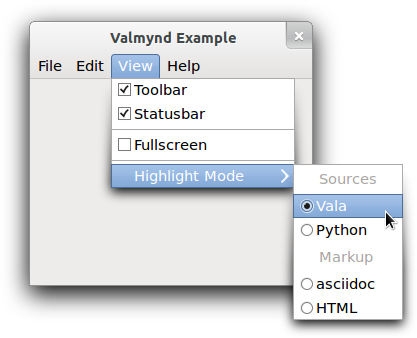
Figure: Menu
There are 8 "menus" visible in the screenshot: one menubar, two submenus and 5 sections:
- the toplevel menubar, containing 4 items
- the View submenu, containing 3 sections
- the first section of the View submenu, containing 2 items
- the second section of the View submenu, containing 1 item
- the final section of the View submenu, containing 1 item
- the Highlight Mode submenu, containing 2 sections
- the Sources section, containing 2 items
- the Markup section, containing 2 items
A menu example
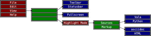
Figure: Menu model
Notice that the separators visible in the example appear nowhere in the menu model. This is because separators are not explicitly represented in the menu model. Instead, a separator is inserted between any two non-empty sections of a menu. Section items can have labels just like any other item. In that case, a display system may show a section header instead of a separator.
The motivation for this abstract model of application controls is that modern user interfaces tend to make these controls available outside the application. Examples include global menus, jumplists, dash boards, and so on. To support such uses, it is necessary to 'export' information about actions and their representation in menus, which is exactly what the g:action-group exporter and the g:menu-model exporter do for g:action-group and g:menu-model objects. The client-side counterparts to make use of the exported information are GDBusActionGroup and GDBusMenuModel.
The API of the g:menu-model class is very generic, with iterators for the attributes and links of an item, see the g:menu-model-iterate-item-attributes and g:menu-model-iterate-item-links functions. The 'standard' attributes and link types have names: "label", "action", "target", "section", and "submenu".
Items in a g:menu-model object represent active controls if they refer to an action that can get activated when the user interacts with the menu item. The reference to the action is encoded by the string ID in the "action" attribute. An action ID uniquely identifies an action in an action group. Which action group(s) provide actions depends on the context in which the menu model is used. For example, when the model is exported as the application menu of a gtk:application instance, actions can be application-wide or window specific, and thus come from two different action groups. By convention, the application-wide actions have names that start with "app.", while the names of window specific actions start with "win.".
While a wide variety of stateful actions is possible, the following is the minimum that is expected to be supported by all users of exported menu information:
- an action with no parameter type and no state
- an action with no parameter type and boolean state
- an action with string parameter type and string state
If the attribute exists and matches vtype, or if the expected type is unspecified, then the value is returned. If the attribute does not exist, or does not match the expected type then nil is returned.
This function should never be called except by g:menu-model subclasses. Any other calls to this function will very likely lead to a violation of the interface of the menu model.
The implementation should update its internal representation of the menu before emitting the signal. The implementation should further expect to receive queries about the new state of the menu, and particularly added menu items, while signal handlers are running.
The implementation must dispatch this call directly from a main loop entry and not in response to calls, particularly those from the g:menu-model API. Said another way: the menu must not change while user code is running without returning to the main loop.
You must call this function when you first acquire the iterator to advance it to the first attribute, and determine if the first attribute exists at all.
You must call this function when you first acquire the iterator to advance it to the first link, and determine if the first link exists at all.
GMenu
There are some convenience functions to allow you to directly add items, avoiding a g:menu-item object, for the common cases. To add a regular item, use theg:menu-insert function. To add a section, use the g:menu-insert-section function. To add a submenu, use the g:menu-insert-submenu function.
This function causes the g:menu-model-is-mutable function to begin returning false, which has some positive performance implications.
This means that item is essentially useless after the insertion occurs. Any changes you make to it are ignored unless it is inserted again, at which point its updated values will be copied.
There are many convenience functions to take care of common cases. See the g:menu-insert, g:menu-insert-section and g:menu-insert-submenu functions as well as "prepend" and "append" variants of each of these functions.
It is not possible to remove items by identity since items are added to the menu simply by copying their links and attributes, that is, identity of the menu item itself is not preserved.
If action is not nil it is used to set the "action" and possibly the "target" attribute of the new item. See the g:menu-item-set-detailed-action function for more information.
The effect of having one menu appear as a section of another is exactly as it sounds: the items from section become a direct part of the menu that the items are added to.
Visual separation is typically displayed between two non-empty sections. If label is not nil then it will be encorporated into this visual indication. This allows for labeled subsections of a menu.
This would be accomplished by creating three g:menu objects. The first would be populated with the "Undo" and "Redo" items, and the second with the "Cut", "Copy" and "Paste" items. The first and second menus would then be added as submenus of the third. In XML format, this would look something like the following:
<menu id='edit-menu'>
<section>
<item label='Undo'/>
<item label='Redo'/>
</section>
<section>
<item label='Cut'/>
<item label='Copy'/>
<item label='Paste'/>
</section>
</menu>
The following example is exactly equivalent. It is more illustrative of the
exact relationship between the menus and items, keeping in mind that the link element defines a new menu that is linked to the containing one.
The style of the second example is more verbose and difficult to read, and
therefore not recommended except for the purpose of understanding what is
really going on.
<menu id='edit-menu'>
<item>
<link name='section'>
<item label='Undo'/>
<item label='Redo'/>
</link>
</item>
<item>
<link name='section'>
<item label='Cut'/>
<item label='Copy'/>
<item label='Paste'/>
</link>
</item>
</menu> This API is only intended for use with "noun" menu items. Things like bookmarks or applications in an "Open With" menu. Do not use it on menu items that correspond to verbs, such as the stock icons for 'Save' or 'Quit'.
If the icon argument is nil then the "icon" attribute is unset.
If action is not nil then the "action" attribute is set. The "target" attribute is then set to the value of value if it is not nil or unset otherwise.
Normal menu items, that is not submenu, section or other custom item types, are expected to have the "action" attribute set to identify the action that they are associated with. The state type of the action help to determine the disposition of the menu item. See the g:action documentation for an overview of actions.
In general, clicking on the menu item will result in activation of the named action with the "target" attribute given as the parameter to the action invocation. If the "target" attribute is not set then the action is invoked with no parameter.
If the action has no state then the menu item is usually drawn as a plain menu item, that is with no additional decoration.
If the action has a boolean state then the menu item is usually drawn as a toggle menu item, that is with a checkmark or equivalent indication. The item should be marked as 'toggled' or 'checked' when the boolean state is true.
If the action has a string state then the menu item is usually drawn as a radio menu item, that is with a radio bullet or equivalent indication. The item should be marked as 'selected' when the string state is equal to the value of the target property.
See the g:menu-item-set-detailed-action function for a equivalent call that is probably more convenient for most uses.
See the g:menu-item-set-action-and-target-value function for a more flexible, but slightly less convenient, alternative. See also the g:menu-item-set-action-and-target-value function for a description of the semantics of the "action" and "target" attributes.
The effect of having one menu appear as a submenu of another is exactly as it sounds.
If the vtype argument is specified and the attribute does not have this type, nil is returned. nil is also returned if the attribute simply does not exist.
The attribute to set or unset is specified by attribute. This can be one of the standard attribute names "label", "action", "target", or a custom attribute name. Attribute names are restricted to lowercase characters, numbers and '-'. Furthermore, the names must begin with a lowercase character, must not end with a '-', and must not contain consecutive dashes.
If value is not nil then it is used as the new value for the attribute. If value is nil then the attribute is unset. If the g:variant parameter is floating, it is consumed.
Links are used to establish a relationship between a particular menu item and another menu. For example, the "submenu" attribute is used to associate a submenu with a particular menu item, and the "section" attribute is used to create a section. Other types of link can be used, but there is no guarantee that clients will be able to make sense of them. Link types are restricted to lowercase characters, numbers and '-'. Furthermore, the names must begin with a lowercase character, must not end with a '-', and must not contain consecutive dashes.
GNotification
(gobject:define-genum "GNotificationPriority" notification-priority (:export t :type-initializer "g_notification_priority_get_type") (:normal 0) (:low 1) (:high 2) (:urgent 3))
- :normal
- The default priority, to be used for the majority of notifications, for example email messages, software updates, completed download operations.
- :low
- For notifications that do not require immediate attention. Typically used for contextual background information, such as contact birthdays or local weather.
- :high
- For events that require more attention, usually because responses are time-sensitive, for example chat and SMS messages or alarms.
- :urgent
- For urgent notifications, or notifications that require a response in a short space of time, for example phone calls or emergency warnings.
The key difference between the g:notification implementation and other similar APIs is that, if supported by the desktop environment, notifications sent with the g:notification class will persist after the application has exited, and even across system reboots.
Since the user may click on a notification while the application is not running, applications using the g:notification class should be able to be started as a D-Bus service, using the g:application class.
User interaction with a notification, either the default action, or buttons, must be associated with actions on the application, that is, "app." actions. It is not possible to route user interaction through the notification itself, because the object will not exist if the application is autostarted as a result of a notification being clicked.
A notification can be sent with the g:application-send-notification function.
The action in action must be an application wide action, it must start with "app.". If the action argument contains a target, the given action will be activated with that target as its parameter. See the g:action-parse-detailed-name function for a description of the format for action.
When no default action is set, the application that the notification was sent on is activated.
Package pango
This is the API documentation of a Lisp binding to Pango.
Basic Pango Interfaces
Rendering
Symbols and Functions for Rendering
(gobject:define-gflags "PangoShapeFlags" shape-flags (:export t :type-initializer "pango_shape_flags_get_type") (:none 0) (:round-positions #.(ash 1 0)))
- :none
- Default value.
- :round-positions
- Round glyph positions and widths to whole device units. This option should be set if the target renderer cannot do subpixel positioning of glyphs.
(cffi:defcstruct analysis (shape-engine :pointer) (lang-engine :pointer) (font (g:object font)) (level :uint8) (gravity :uint8) (flags :uint8) (script :uint8) (language (g:boxed language)) (extra-attrs :pointer))
- shape-engine
- Unused.
- lang-engine
- Unused.
- font
- The pango:font object for the font of this segment.
- level
- The bidirectional level for this segment.
- gravity
- The pango:gravity value for the glyph orientation of this segment.
- flags
- Boolean flags for this segment.
- script
- The pango:script value for the detected script of this segment.
- language
- The pango:language object for the detected language of this segment.
- extra-attrs
- Extra attributes for this segment.
(glib:define-gboxed-opaque item "PangoItem" :export t :type-initializer "pango_item_get_type" :alloc (%item-new))
The pango:item instance stores the byte offset of the start of the item in text, the length of the item in bytes, the number of characters in the item and the pango:analysis instance for the analysis results of the item. The values can be accessed with the corresponding functions: pango:item-offset, pango:item-length, pango:item-num-chars and pango:item-analysis.
The index argument may not be 0, and it may not be greater than or equal to the length of item, that is, there must be at least one byte assigned to each item, you cannot create a zero-length item.
The offset argument is the length of the first item in chars, and must be provided because the text used to generate the item is not available, so the pango:item-split function cannot count the char length of the split items itself.
The iter iterator should be positioned before the range of the item, and will be advanced past it. This function is meant to be called in a loop over the items resulting from itemization, while passing the iterator to each call.
Since 1.54
The iter argument should be an iterator over attrs currently positioned at a range before or containing start. The iter argument will be advanced to the range covering the position just after start + len, that is, if itemizing in a loop, just keep passing in the same iter.
The direction argument specifies the base direction to use when computing bidirectional levels. For the default nil value the base direction is obtained from the pango:context object using the pango:context-base-dir function.
The index of the run of delimiters is returned in index. The index of the start of the next paragraph (index after all delimiters) is stored in next.
If no delimiters are found, both index and next are filled with the length of text (an index one off the end).
Note that the extra attributes in the analyis that is returned from the pango:itemize function have indices that are relative to the entire paragraph, so you need to subtract the item offset from their indices before calling the pango:shape function.
PangoFontDescription
(gobject:define-genum "PangoStyle" style (:export t :type-initializer "pango_style_get_type") (:normal 0) (:oblique 1) (:italic 2))
- :normal
- The font is upright.
- :oblique
- The font is slanted, but in a roman style.
- :italic
- The font is slanted in an italic style.
(gobject:define-genum "PangoWeight" weight (:export t :allow-undeclared-values t :type-initializer "pango_weight_get_type") (:thin 100) (:ultralight 200) (:light 300) (:semilight 350) (:book 380) (:normal 400) (:medium 500) (:semibold 600) (:bold 700) (:ultrabold 800) (:heavy 900) (:ultraheavy 1000))
- :thin
- The thin weight.
- :ultralight
- The ultralight weight.
- :light
- The light weight.
- :semilight
- The semilight weight.
- :book
- The book weight.
- :normal
- The default weight.
- :medium
- The normal weight.
- :semibold
- The semibold weight.
- :bold
- The bold weight.
- :ultrabold
- The ultrabold weight.
- :heavy
- The heavy weight.
- :ultraheavy
- The ultraheavy weight.
(gobject:define-genum "PangoVariant" variant (:export t :type-initializer "pango_variant_get_type") (:normal 0) (:small-caps 1) #+pango-1-50 (:all-small-caps 2) #+pango-1-50 (:petite-caps 3) #+pango-1-50 (:all-petite-caps 4) #+pango-1-50 (:unicase 5) #+pango-1-50 (:title-caps 6))
- :normal
- The normal font.
- :small-caps
- The font with the lower case characters replaced by smaller variants of the capital characters.
- :all-small-caps
- The font with all characters replaced by smaller variants of the capital characters. Since 1.50
- :petite-caps
- The font with the lower case characters replaced by smaller variants of the capital characters. Petite Caps can be even smaller than Small Caps. Since 1.50
- :all-petite-caps
- The font with all characters replaced by smaller variants of the capital characters. Petite Caps can be even smaller than Small Caps. Since 1.50
- :unicase
- The font with the upper case characters replaced by smaller variants of the capital letters. Since 1.50
- :title-caps
- The font with capital letters that are more suitable for all-uppercase title. Since 1.50
(gobject:define-genum "PangoStretch" stretch (:export t :type-initializer "pango_stretch_get_type") (:ultra-condensed 0) (:extra-condensed 1) (:condensed 2) (:semi-condensed 3) (:normal 4) (:semi-expanded 5) (:expanded 6) (:extra-expanded 7) (:ultra-expanded 8))
- :ultra-condensed
- The ultra condensed width.
- :extra-condensed
- The extra condensed width.
- :condensed
- The condensed width.
- :semi-condensed
- The semi condensed width.
- :normal
- The normal width.
- :semi-expanded
- The semi expanded width.
- :expanded
- The expanded width.
- :extra-expanded
- The extra expanded width.
- :ultra-expanded
- The ultra expanded width.
(gobject:define-gflags "PangoFontMask" font-mask (:export t :type-initializer "pango_font_mask_get_type") (:family #.(ash 1 0)) (:style #.(ash 1 1)) (:variant #.(ash 1 2)) (:weight #.(ash 1 3)) (:stretch #.(ash 1 4)) (:size #.(ash 1 5)) (:gravity #.(ash 1 6)) (:variations #.(ash 1 7)) #+pango-1-56 (:features #.(ash 1 8)))
- :family
- The font family is specified.
- :style
- The font style is specified.
- :variant
- The font variant is specified.
- :weight
- The font weight is specified.
- :stretch
- The font stretch is specified.
- :size
- The font size is specified.
- :gravity
- The font gravity is specified.
- :variations
- OpenType font variations are specified.
- :features
- OpenType font features are specified. Since Pango 1.56
(glib:define-gboxed-opaque font-description "PangoFontDescription" :export t :type-initializer "pango_font_description_get_type" :alloc (%font-description-new))
(setq desc (pango:font-description-new))
=> #<PANGO:FONT-DESCRIPTION {1005A11E63}>
(pango:font-description-weight desc)
=> :NORMAL
(setf (pango:font-description-weight desc) 450)
=> 450
(pango:font-description-weight desc)
=> 450 A size value of (* 10 pango:+scale+) is a 10 point font. The conversion factor between points and device units depends on the system configuration and the output device. For screen display, a logical DPI of 96 is common, in which case a 10 point font corresponds to a 10 * (96 / 72) = 13.3 pixel font. Use the pango:font-description-set-absolute-size function if you need a particular size in device units.
You must call the pango:font-description-size-is-absolute function to find out which is the case. Returns 0 if the size field has not previously been set or it has been set to 0 explicitly. Use the pango:font-description-set-fields function to find out if the field was explicitly set or not.
This is mutually exclusive with the pango:font-description-size function which sets the font size in points.
This function is seldom useful to the user. Gravity should normally be set on a pango:context object.
The format of the variations string is AXIS1=VALUE, AXIS2=VALUE ..., with each AXIS a 4 character tag that identifies a font axis, and each VALUE a floating point number. Unknown axes are ignored, and values are clamped to their allowed range.
Pango does not currently have a way to find supported axes of a font. Both the HarfBuzz or FreeType libraries have API for this.
(pango:font-description-from-string "Sans Bold 16")
=> #<PANGO:FONT-DESCRIPTION {10077E5773}>
(pango:font-description-set-fields *)
=> (:FAMILY :STYLE :VARIANT :WEIGHT :STRETCH :SIZE) If merge is nil, this function performs nothing.
Note that old must match desc.
The following words are understood as styles:
"Normal" "Roman" "Oblique" "Italic"The following words are understood as variants:
"Small-Caps"The following words are understood as weights:
"Thin" "Ultra-Light" "Extra-Light" "Light" "Semi-Light" "Demi-Light" "Book" "Regular" "Medium" "Semi-Bold" "Demi-Bold" "Bold" "Ultra-Bold" "Extra-Bold" "Heavy" "Black" "Ultra-Black" "Extra-Black"The following words are understood as stretch values:
"Ultra-Condensed" "Extra-Condensed" "Condensed" "Semi-Condensed" "Semi-Expanded" "Expanded" "Extra-Expanded" "Ultra-Expanded"The following words are understood as gravity values:
"Not-Rotated" "South" "Upside-Down" "North" "Rotated-Left" "East" "Rotated-Right" "West"Any one of the options may be absent. If FAMILY-LIST is absent, then the familiy name of the resulting font description will be initialized to NULL. If STYLE-OPTIONS is missing, then all style options will be set to the default values. If SIZE is missing, the size in the resulting font description will be set to 0.
(pango:font-description-from-string "Cantarell Italic Light 15 @wght=200")
=> #<PANGO:FONT-DESCRIPTION {10077E7DC3}>
(pango:font-description-to-string *)
"Cantarell Light Italic 15 @wght=200"
(pango:font-description-from-string "Sans Bold 16")
=> #<PANGO:FONT-DESCRIPTION {1007EF4DF3}>
(pango:font-description-to-filename *)
=> "sans_bold_16" PangoFontMetrics
(glib:define-gboxed-opaque font-metrics "PangoFontMetrics" :export t :type-initializer "pango_font_metrics_get_type" :alloc (error "PangoFontMetrics cannot be created from the Lisp side."))
Fonts
If the font argument is nil, this function gracefully sets some sane values in the output variables and returns.
If the font argument is nil, this function gracefully sets some sane values in the output variables and returns.
Since 1.50
To recreate a font from its serialized form, use the pango:font-deserialize function.
Since 1.50
Since 1.50
The best way to find out the grid-cell size is to call the pango:font-metrics-approximate-digit-width function, since the results of the pango:font-metrics-approximate-char-width function may be affected by double-width characters.
Since 1.52
Since 1.52
Since 1.52
If you are using Pango as part of a higher-level system, that system may have its own way of creating a Pango context. For instance, the GTK toolkit has the gtk:widget-pango-context function. Use this instead.
The font map can only be changed using backend-specific API, like changing font map resolution.
This can be used to automatically detect changes to a Pango font map, like in a pango:context object.
(let* ((fontmap (pango:cairo-font-map-default))
(context (pango:font-map-create-context fontmap))
(desc (pango:font-description-from-string "Sans Italic 12"))
(lang (pango:language-default))
(fontset (pango:font-map-load-fontset fontmap context desc lang)))
fontset)
=> #<PANGO:FONTSET {10026D1863}>
(let ((count 0))
(pango:fontset-foreach fontset
(lambda (fontset font)
(declare (ignore fontset))
(let* ((desc (pango:font-describe font))
(str (pango:font-description-to-string desc)))
(format t "~a : ~a~%" count str)
(incf count)
nil)))
count) Glyph Storage
(glib:define-gboxed-opaque glyph-string "PangoGlyphString" :export t :type-initializer "pango_glyph_string_get_type" :alloc (%glyph-string-new))
(let* ((text "Zwölf Ägypter gehen über die Straße.")
(fontmap (pango:cairo-font-map-default))
(context (pango:font-map-create-context fontmap))
(items (pango:itemize context
text
0
(babel:string-size-in-octets text)
nil
nil))
(item (first items))
(glyphs (pango:shape text
(pango:item-length item)
(pango:item-analysis item))))
glyphs)
=> #<PANGO:GLYPH-STRING {10055AAA13}> 
Figure: Glyph string positions
The x position is measured from the left edge of the run. Character positions are obtained using font metrics for ligatures where available, and computed by dividing up each cluster into equal portions, otherwise.
(glib:define-gboxed-opaque glyph-item "PangoGlyphItem" :export t :type-initializer "pango_glyph_item_get_type" :alloc (error "PangoGlyphItem cannot be created from the Lisp side."))
This function is similar in function to the pango:item-split function and uses it internally.
Text Attributes
Types and functions for text attributes
(gobject:define-genum "PangoAttrType" attr-type (:export t :allow-undeclared-values t :type-initializer "pango_attr_type_get_type") (:invalid 0) (:language 1) (:family 2) (:style 3) (:weight 4) (:variant 5) (:stretch 6) (:size 7) (:font-desc 8) (:foreground 9) (:background 10) (:underline 11) (:strikethrough 12) (:rise 13) (:shape 14) (:scale 15) (:fallback 16) (:letter-spacing 17) (:underline-color 18) (:strikethrough-color 19) (:absolute-size 20) (:gravity 21) (:gravity-hint 22) (:font-features 23) (:foreground-alpha 24) (:background-alpha 25) (:allow-breaks 26) (:show 27) (:insert-hyphens 28) (:overline 29) (:overline-color 30) (:line-height 31) (:absolute-line-height 32) (:text-transform 33) (:word 34) (:sentence 35) (:baseline-shift 36) (:font-scale 37))
- :invalid
- Does not happen.
- :language
- Language.
- :family
- Font family name list.
- :style
- Font slant style.
- :weight
- Font weight.
- :variant
- Font variant, normal or small caps.
- :stretch
- Font stretch.
- :size
- Font size in points scaled by the pango:+scale+ value.
- :font-desc
- Font description.
- :foreground
- Foreground color.
- :background
- Background color.
- :underline
- Whether the text has an underline.
- :strikethrough
- Whether the text is struck-through.
- :rise
- Baseline displacement.
- :shape
- Shape.
- :scale
- Font size scale factor.
- :fallback
- Whether fallback is enabled.
- :letter-spacing
- Letter spacing.
- :underline-color
- Underline colo.
- :strikethrough-color
- Strikethrough color.
- :absolute-size
- Font size in pixels scaled by the pango:+scale+ value.
- :gravity
- Base text gravity.
- :gravity-hint
- Gravity hint.
- :font-features
- OpenType font features.
- :foreground-alpha
- Foreground alpha.
- :background-alpha
- Background alpha.
- :allow-breaks
- Whether breaks are allowed.
- :show
- How to render invisible characters.
- :insert-hyphens
- Whether to insert hyphens at intra-word line breaks.
- :overline
- Whether the text has an overline.
- :overline-color
- Overline color.
- :line-height
- Line height factor. Since 1.50
- :absolute-line-height
- Line height. Since 1.50
- :text-transform
- How Pango treats characters during shaping. Since 1.50
- :word
- Override segmentation to classify the range of the attribute as a single word. Since 1.50
- :sentence
- Override segmentation to classify the range of the attribute as a single sentence. Since 1.50
- :baseline-shift
- Baseline displacement. Since 1.50
- :font-scale
- Font-relative size change. Since 1.50
(gobject:define-genum "PangoUnderline" underline (:export t :type-initializer "pango_underline_get_type") (:none 0) (:single 1) (:double 2) (:low 3) (:error 4) (:single-line 5) (:double-line 6) (:error-line 7))
- :none
- No underline should be drawn.
- :single
- A single underline should be drawn.
- :double
- A double underline should be drawn.
- :low
- A single underline should be drawn at a position beneath the ink extents of the text being underlined. This should be used only for underlining single characters, such as for keyboard accelerators. The :single value should be used for extended portions of text.
- :error
- A wavy underline should be drawn below. This underline is typically used to indicate an error such as a possible mispelling. In some cases a contrasting color may automatically be used.
- :single-line
- Like the :single value, but drawn continuously across multiple runs.
- :double-line
- Like the :double value, but drawn continuously across multiple runs.
- :error-line
- Like the :error value, but drawn continuously across multiple runs.
(gobject:define-genum "PangoOverline" overline (:export t :type-initializer "pango_overline_get_type") (:none 0) (:single 1))
- :none
- No overline should be drawn.
- :single
- Draw a single line above the ink extents of the text being overlined.
(gobject:define-gflags "PangoShowFlags" show-flags (:export t :type-initializer "pango_show_flags_get_type") (:none 0) (:spaces #.(ash 1 0)) (:line-breaks #.(ash 1 1)) (:ignorables #.(ash 1 2)))
- :none
- No special treatment for invisible characters.
- :spaces
- Render spaces, tabs and newlines visibly.
- :line-breaks
- Render line breaks visibly.
- :ignorables
- Render default-ignorable Unicode characters visibly.
(gobject:define-genum "PangoTextTransform" text-transform (:export t :type-initializer "pango_text_transform_get_type") :none :lowercase :uppercase :capitalize)
- :none
- Leave text unchanged.
- :lowercase
- Display letters and numbers as lowercase.
- :uppercase
- Display letters and numbers as uppercase.
- :capitalize
- Display the first character of a word in titlecase.
(gobject:define-genum "PangoBaselineShift" baseline-shift (:export t :type-initializer "pango_baseline_shift_get_type") :none :superscript :subscript)
- :none
- Leave the baseline unchanged.
- :superscript
- Shift the baseline to the superscript position, relative to the previous run.
- :subscript
- Shift the baseline to the subscript position, relative to the previous run.
(gobject:define-genum "PangoFontScale" font-scale (:export t :type-initializer "pango_font_scale_get_type") :none :superscript :subscript :small-caps)
- :none
- Leave the font size unchanged.
- :superscript
- Change the font to a size suitable for superscripts.
- :subscript
- Change the font to a size suitable for subscripts.
- :small-caps
- Change the font to a size suitable for Small Caps.
(glib:define-gboxed-opaque attribute "PangoAttribute" :export t :type-initializer "pango_attribute_get_type" :alloc (error "PangoAttribute cannot be created from the Lisp side"))
This affects the values returned by the pango:layout-line-extents, pango:layout-line-pixel-extents and pango:layout-iter-line-extents functions.
Since 1.50
This affects the values returned by the pango:layout-line-extents, pango:layout-line-pixel-extents and pango:layout-iter-line-extents functions.
Since 1.50
Since 1.50
Since 1.50
Since 1.50
Since 1.50
Since 1.50
(glib:define-gboxed-opaque attr-list "PangoAttrList" :type-initializer "pango_attr_list_get_type" :alloc (%attr-list-new))
Since the pango:attr-list structure is stored as a linear list, it is not suitable for storing attributes for large amounts of text. In general, you should not use a single pango:attr-list instance for more than one paragraph of text.
This function is slower than the pango:attr-list-insert function for creating a attribute list in order, potentially much slower for large lists. However, the pango:attr-list-insert function is not suitable for continually changing a set of attributes since it never removes or combines existing attributes.
This operation proves useful for, for instance, inserting a pre-edit string in the middle of an edit buffer.
Attributes that fall entirely in the (pos, pos + remove) range are removed. Attributes that start or end inside the (pos, pos + remove) range are shortened to reflect the removal. Attributes start and end positions are updated if they are behind pos + remove.
Since 1.50
START END TYPE VALUEWhere START and END are the indices, with -1 being accepted in place of MAXUINT, TYPE is the nickname of the attribute value type, for example weight or stretch, and the value is serialized according to its type:
- enum values as nick or numeric value
- boolean values as true or false
- integers and floats as numbers
- strings as string, optionally quoted
- font features as quoted string
- Pango language as string
- Pango font description as serialized by the pango:font-description-to-string function
- pango:color instances as serialized by the pango:color-to-string function
Note that shape attributes can not be serialized.
0 10 foreground red, 5 15 weight bold, 0 200 font-desc "Sans 10" 0 -1 weight 700 0 100 family Times
(glib:define-gboxed-opaque attr-iterator "PangoAttrIterator" :export t :type-initializer "pango_attr_iterator_get_type" :alloc (error "PangoAttrIterator cannot be created from the Lisp side."))
Pango Markup
Frequently, you want to display some text to the user with attributes applied to part of the text. For example, you might want bold or italicized words. With the base Pango interfaces, you could create a pango:attr-list instance and apply it to the text. The problem is that you would need to apply attributes to some numeric range of characters, for example "characters 12-17." This is broken from an internationalization standpoint. Once the text is translated, the word you wanted to italicize could be in a different position.
The solution is to include the text attributes in the string to be translated. Pango provides this feature with a small markup language. You can parse a marked-up string into the string text plus a pango:attr-list instance using the pango:parse-markup function.
A simple example of a marked-up string might be:
<span foreground="blue" size="x-large">Blue text</span> is <i>cool</i>!Pango uses GMarkup to parse this language, which means that XML features such as numeric character entities such as &#169; for © can be used too.
The root tag of a marked-up document is <markup>, but the pango:parse-markup function allows you to omit this tag, so you will most likely never need to use it. The most general markup tag is <span>, then there are some convenience tags.
- font_desc
- A font description string, such as "Sans Italic 12". See the pango:font-description-from-string function for a description of the format of the string representation. Note that any other span attributes will override this description. So if you have "Sans Italic" and also a style="normal" attribute, you will get Sans normal, not italic.
- font_family
- A font family name.
- font_size, size
- Font size in 1024ths of a point, or one of the absolute sizes xx-small, x-small, small, medium, large, x-large, xx-large, or one of the relative sizes smaller or larger. If you want to specify a absolute size, it is usually easier to take advantage of the ability to specify a partial font description using font. You can use font='12.5' rather than size='12800'.
- font_style
- One of normal, oblique, italic.
- font_weight
- One of ultralight, light, normal, bold, ultrabold, heavy, or a numeric weight.
- font_variant
- One of normal or smallcaps.
- font_stretch, stretch
- One of ultracondensed, extracondensed, condensed, semicondensed, normal, semiexpanded, expanded, extraexpanded, ultraexpanded.
- font_features
- A comma-separated list of OpenType font feature settings, in the same syntax as accepted by CSS, e.g. font_features='dlig=1, -kern, afrc on'.
- foreground, fgcolor
- An RGB color specification such as #00FF00 or a color name such as red. An RGBA color specification such as #00FF007F will be interpreted as specifying both a foreground color and foreground alpha.
- background, bgcolor
- An RGB color specification such as #00FF00 or a color name such as red. An RGBA color specification such as #00FF007F will be interpreted as specifying both a background color and background alpha.
- alpha, fgalpha
- An alpha value for the foreground color, either a plain integer between 1 and 65536 or a percentage value like 50 %.
- background_alpha, bgalpha
- An alpha value for the background color, either a plain integer between 1 and 65536 or a percentage value like 50 %.
- underline
- One of none, single, double, low, error, single-line, double-line or error-line.
- underline_color
- The color of underlines. An RGB color specification such as #00FF00 or a color name such as red.
- overline
- One of none or single.
- overline_color
- The color of overlines. An RGB color specification such as #00FF00 or a color name such as red.
- rise
- Vertical displacement, in Pango units. Can be negative for subscript, positive for superscript.
- strikethrough
- True or false whether to strike through the text.
- strikethrough_color
- The color of strikethrough lines. An RGB color specification such as #00FF00 or a color name such as red.
- fallback
- True or false whether to enable fallback. If disabled, then characters will only be used from the closest matching font on the system. No fallback will be done to other fonts on the system that might contain the characters in the text. Fallback is enabled by default. Most applications should not disable fallback.
- allow_breaks
- True or false whether to allow line breaks or not. If not allowed, the range will be kept in a single run as far as possible. Breaks are allowed by default.
- insert_hyphens
- True or false whether to insert hyphens when breaking lines in the middle of a word. Hyphens are inserted by default.
- show
- A value determining how invisible characters are treated. Possible values are spaces, line-breaks, ignorables or combinations, such as spaces and line-breaks.
- lang
- A language code, indicating the text language.
- letter_spacing
- Inter-letter spacing in 1024ths of a point.
- gravity
- One of south, east, north, west, auto.
- gravity_hint
- One of natural, strong, line.
- <b>
- Bold.
- <big>
- Makes font relatively larger, equivalent to <span size="larger">.
- <i>
- Italic.
- <s>
- Strikethrough.
- <sub>
- Subscript.
- <sup>
- Superscript.
- <small>
- Makes font relatively smaller, equivalent to <span size="smaller">.
- <tt>
- Monospace.
- <u>
- Underline.
attrlist -- a pango:attr-list instance
char -- a character for the accelerator char
If any error happens, nil is returned.
(multiple-value-bind (text attrlist char)
(pango:parse-markup "<b>_Text</b>" #\_)
(values text
(pango:attr-list-to-string attrlist)
char))
=> "Text"
"0 1 underline low
0 4 weight bold"
#\T
(multiple-value-bind (text attrlist char)
(pango:parse-markup "<span foreground='blue' size='x-large'>
Blue text
</span>
is <i>cool</i>!"
#\_)
(values text
(pango:attr-list-to-string attrlist)
char))
=> "Blue text is cool!"
"0 9 scale 1.440000
0 9 foreground #00000000ffff
13 17 style italic"
#\Nul Layout Objects
Types and functions for PangoLayout
(gobject:define-genum "PangoWrapMode" wrap-mode (:export t :type-initializer "pango_wrap_mode_get_type") (:word 0) (:char 1) (:word-char 2) #+pango-1-56 (:none 3))
- :word
- Wrap lines at word boundaries.
- :char
- Wrap lines at character boundaries.
- :word-char
- Wrap lines at word boundaries, but fall back to character boundaries if there is not enough space for a full word.
- :none
- Do not wrap.
(gobject:define-genum "PangoEllipsizeMode" ellipsize-mode (:export t :type-initializer "pango_ellipsize_mode_get_type") (:none 0) (:start 1) (:middle 2) (:end 3))
- :none
- No ellipsization.
- :start
- Omit characters at the start of the text.
- :middle
- Omit characters in the middle of the text.
- :end
- Omit characters at the end of the text.
(gobject:define-genum "PangoAlignment" alignment (:export t :type-initializer "pango_alignment_get_type") (:left 0) (:center 1) (:right 2))
- :left
- Put all available space on the right.
- :center
- Center the line within the available space.
- :right
- Put all available space on the left.
There are also a number of parameters to adjust the formatting of a Pango layout. It is possible, as well, to ignore the 2-D setup, and simply treat the results of a Pango layout as a list of lines.
Figure: Adjustable parameters (on the left) and font metrics (on the right) for a Pango layout
This can be used to automatically detect changes to a Pango layout, and is useful, for example, to decide whether a Pango layout needs redrawing. To force the serial to be increased, use the pango:layout-context-changed function.
Note that if you have used the pango:layout-set-markup or pango:layout-set-markup-with-accel functions on the Pango layout before, you may want to call the pango:layout-attributes function to clear the attributes set on the Pango layout from the markup as this function does not clear attributes.
If marker is nonzero, the given character will mark the character following it as an accelerator. For example, marker might be an ampersand or underscore. All characters marked as an accelerator will receive a :low attribute of the pango:underline enumeration, and the first character so marked will be returned. Two marker characters following each other produce a single literal marker character.
If no font description is set on the Pango layout, the font description from the Panto context is used.
If height is positive, it will be the maximum height of the Pango layout. Only lines would be shown that would fit, and if there is any text omitted, an ellipsis is added. At least one line is included in each paragraph regardless of how small the height value is. A value of zero will render exactly one line for the entire Pango layout.
If height is negative, it will be the (negative of) maximum number of lines per paragraph. That is, the total number of lines shown may well be more than this value if the Pango layout contains multiple paragraphs of text. The default value of -1 means that first line of each paragraph is ellipsized. This behvaior may be changed in the future to act per Pango layout instead of per paragraph. File a bug against pango at http://bugzilla.gnome.org/ if your code relies on this behavior.
Height setting only has effect if a positive width is set on the Pango layout and the ellipsization mode of the Pango layout is not :none. The behavior is undefined if a height other than -1 is set and the ellipsization mode is set to :none, and may change in the future.
Use the pango:layout-is-wrapped function to query whether any paragraphs were actually wrapped.
If the Pango layout contains characters such as newlines that force it to be layed out in multiple paragraphs, then whether each paragraph is ellipsized separately or the entire Pango layout is ellipsized as a whole depends on the set height of the Pango layout. See the pango:layout-height function for details.
Use the pango:layout-is-ellipsized function to query whether any paragraphs were actually ellipsized.
The indent setting is ignored if the Pango layout alignment is set to the :center value.
line2.top = line1.bottom + spacing
If the factor argument is non-zero, lines are placed so that
baseline2 = baseline1 + factor * height2where height2 is the line height of the second line as determined by the font. In this case, the spacing set with the pango:layout-spacing function is ignored.
If the factor argument is zero, spacing is applied as before.
When false, the choice between left-to-right and right-to-left layout is done according to the base direction of the Pango context of the Pango layout, see the pango:context-base-dir function.
When the auto-computed direction of a paragraph differs from the base direction of the Pango context, the interpretation of :left and :right are swapped.
If no pango:tab-array instance has been set, then the default tabs are in use and nil is returned. Default tabs are every 8 spaces.
This function can be used to determine if there are any fonts available to render all characters in a certain string, or when used in combination with the :fallback value of the pango:attr-type enumeration, to check if a certain font supports all the characters in the string.
Note that x is always the leading edge of the grapheme and x + width the trailing edge of the grapheme. If the directionality of the grapheme is right-to-left, then witdh will be negative.
In the presence of bidirectional text, the correspondence between logical and visual order will depend on the direction of the current run, and there may be jumps when the cursor is moved off of the end of a run.
Motion here is in cursor positions, not in characters, so a single call to the pango:layout-move-cursor-visually function may move the cursor over multiple characters when multiple characters combine to form a single grapheme.
The extents are given in Pango layout coordinates and in Pango units. Pango layout coordinates begin at the top left corner of the Pango layout.
Types and functions for PangoLayoutIter
(glib:define-gboxed-opaque layout-iter "PangoLayoutIter" :export t :type-initializer "pango_layout_iter_get_type" :alloc (error "PANGO:LAYOUT-ITER cannot be created from the Lisp side."))
Use the faster pango:layout-iter-run-readonly function if you do not plan to modify the contents of the run (glyphs, glyph widths, and so on).
This is a faster alternative to the pango:layout-iter-run function, but the user is not expected to modify the contents of the run (glyphs, glyph widths, and so on).
Types and functions for PangoLayoutLine
(gobject:define-gboxed-cstruct layout-line "PangoLayoutLine" (:export t :type-initializer "pango_layout_line_get_type") (layout (g:object layout)) (start-index :int) (length :int) (runs (g:slist-t (g:boxed glyph-item))) (is-paragraph-start :uint) (resolved-dir :uint))
- layout
- The pango:layout object this line belongs to, might be nil.
- start-index
- The integer for the start of line as byte index into the layout text.
- length
- The integer for the length of line in bytes.
- runs
- List of runs in the line, from left to right.
- is-paragraph-start
- True if this is the first line of the paragraph.
- resolved-dir
- Resolved pango:direction value of line.
Since 1.50
Since 1.50
Since 1.50
Since 1.50
Scripts and Languages
(gobject:define-genum "PangoScript" script (:export t :type-initializer "pango_script_get_type") (:INVALID-CODE -1) (:COMMON 0) (:INHERITED 1) (:ARABIC 2) (:ARMENIAN 3) (:BENGALI 4) (:BOPOMOFO 5) (:CHEROKEE 6) (:COPTIC 7) (:CYRILLIC 8) (:DESERET 9) (:DEVANAGARI 10) (:ETHIOPIC 11) (:GEORGIAN 12) (:GOTHIC 13) (:GREEK 14) (:GUJARATI 15) (:GURMUKHI 16) (:HAN 17) (:HANGUL 18) (:HEBREW 19) (:HIRAGANA 20) (:KANNADA 21) (:KATAKANA 22) (:KHMER 23) (:LAO 24) (:LATIN 25) (:MALAYALAM 26) (:MONGOLIAN 27) (:MYANMAR 28) (:OGHAM 29) (:OLD-ITALIC 30) (:ORIYA 31) (:RUNIC 32) (:SINHALA 33) (:SYRIAC 34) (:TAMIL 35) (:TELUGU 36) (:THAANA 37) (:THAI 38) (:TIBETAN 39) (:CANADIAN-ABORIGINAL 40) (:YI 41) (:TAGALOG 42) (:HANUNOO 43) (:BUHID 44) (:TAGBANWA 45) (:BRAILLE 46) (:CYPRIOT 47) (:LIMBU 48) (:OSMANYA 49) (:SHAVIAN 50) (:LINEAR-B 51) (:TAI-LE 52) (:UGARITIC 53) (:NEW-TAI-LUE 54) (:BUGINESE 55) (:GLAGOLITIC 56) (:TIFINAGH 57) (:SYLOTI-NAGRI 58) (:OLD-PERSIAN 59) (:KHAROSHTHI 60) (:UNKNOWN 61) (:BALINESE 62) (:CUNEIFORM 63) (:PHOENICIAN 64) (:PHAGS-PA 65) (:NKO 66) (:KAYAH-LI 67) (:LEPCHA 68) (:REJANG 69) (:SUNDANESE 70) (:SAURASHTRA 71) (:CHAM 72) (:OL-CHIKI 73) (:VAI 74) (:CARIAN 75) (:LYCIAN 76) (:LYDIAN 77) (:BATAK 78) (:BRAHMI 79) (:MANDAIC 80) (:CHAKMA 81) (:MEROITIC-CURSIVE 82) (:MEROITIC-HIEROGLYPHS 83) (:MIAO 84) (:SHARADA 85) (:SORA-SOMPENG 86) (:TAKRI 87) (:BASSA-VAH 88) (:CAUCASIAN-ALBANIAN 89) (:DUPLOYAN 90) (:ELBASAN 91) (:GRANTHA 92) (:KHOJKI 93) (:KHUDAWADI 94) (:LINEAR-A 95) (:MAHAJANI 96) (:MANICHAEAN 97) (:MENDE-KIKAKUI 98) (:MODI 99) (:MRO 100) (:NABATAEAN 101) (:OLD-NORTH-ARABIAN 102) (:OLD-PERMIC 103) (:PAHAWH-HMONG 104) (:PALMYRENE 105) (:PAU-CIN-HAU 106) (:PSALTER-PAHLAVI 107) (:SIDDHAM 108) (:TIRHUTA 109) (:WARANG-CITI 110) (:AHOM 111) (:ANATOLIAN-HIEROGLYPHS 112) (:HATRAN 113) (:MULTANI 114) (:OLD-HUNGARIAN 115) (:SIGNWRITING 116))
Note that this enumeration is deprecated and will not be updated to include values in newer versions of the Unicode standard. Applications should use the GUnicodeScript enumeration instead, whose values are interchangeable with the pango:script enumeration.
(glib:define-gboxed-opaque language "PangoLanguage" :export t :type-initializer "pango_language_get_type" :alloc (error "PangoLanguage cannot be created from the Lisp side."))
Use the pango:language-default function if you want to get the pango:language instance for the current locale of the process.
(pango:language-from-string "de-de") => #<PANGO-LANGUAGE {1006D76393}>
(pango:language-to-string *) => "de-de" (pango:language-matches (pango:language-default) "de-de en-gb") => T (pango:language-matches (pango:language-default) "en-gb") => NIL
This routine is used in the itemization process of Pango when determining if a supplied language tag is relevant to a particular section of text. It probably is not useful for applications in most circumstances.
This function uses the pango:language-scripts function internally.
Most languages use only one script for writing, but there are some that use two (Latin and Cyrillic for example), and a few use three, Japanese for example. Applications should not make any assumptions on the maximum number of scripts returned though, except that it is positive if the return value is not nil, and it is a small number.
On Unix systems, this is the return value derived from setlocale(LC_CTYPE, NULL), and the user can affect this through the environment variables LC_ALL, LC_CTYPE or LANG (checked in that order). The locale string typically is in the form lang_COUNTRY, where lang is an ISO-639 language code, and COUNTRY is an ISO-3166 country code. For instance, sv_FI for Swedish as written in Finland or pt_BR for Portuguese as written in Brazil.
On Windows, the C library does not use any such environment variables, and setting them will not affect the behavior of functions like ctime(). The user sets the locale through the Regional Options in the Control Panel. The C library, in the setlocale() function, does not use country and language codes, but country and language names spelled out in English. However, this function does check the above environment variables, and does return a Unix-style locale string based on either said environment variables or the thread's current locale.
Your application should call setlocale(LC_ALL, ""); for the user settings to take effect. GTK does this in its initialization functions automatically by calling gtk_set_locale().
(pango:language-default) => #<PANGO-LANGUAGE {10019E6973}>
(pango:language-to-string *) => "de-de" When choosing language specific resources, such as the sample text returned by the pango:language-sample-string function, you should first try the default language, followed by the languages returned by this function.
If language is nil, the default language as found by the pango:language-default function is used.
If Pango does not have a sample string for language, the classic "The quick brown fox ..." is returned.
(pango:language-sample-string (pango:language-default)) => "Zwölf Boxkämpfer jagen Viktor quer über den großen Sylter Deich."
For some scripts, no sample language will be returned because there is no language that is sufficiently representative. The best example of this is the :han value, where various different variants of written Chinese, Japanese, and Korean all use significantly different sets of Han characters and forms of shared characters. No sample language can be provided for many historical scripts as well.
This function checks the environment variables PANGO_LANGUAGE and LANGUAGE, checked in that order, first. If one of them is set, it is parsed as a list of language tags separated by colons or other separators. This function will return the first language in the parsed list that Pango believes may use script for writing. This last predicate is tested using the pango:language-includes-script function. This can be used to control Pango's font selection for non-primary languages. For example, a PANGO_LANGUAGE enviroment variable set to "en:fa" makes Pango choose fonts suitable for Persian (fa) instead of Arabic (ar) when a segment of Arabic text is found in an otherwise non-Arabic text. The same trick can be used to choose a default language for PANGO_SCRIPT_HAN when setting context language is not feasible.
Bidirectional Text
Pango supports bidirectional text (like Arabic and Hebrew) automatically. Some applications however, need some help to correctly handle bidirectional text.
The pango:direction enumeration can be used with the pango:context-base-dir function to instruct Pango about direction of text, though in most cases Pango detects that correctly and automatically. The rest of the facilities in this section are used internally by Pango already, and are provided to help applications that need more direct control over bidirectional setting of text.
(gobject:define-genum "PangoDirection" direction (:export t :type-initializer "pango_direction_get_type") (:ltr 0) (:rtl 1) (:ttb-ltr 2) (:ttb-rtl 3) (:weak-ltr 4) (:weak-rtl 5) (:neutral 6))
The :ttb-ltr, :ttb-rtl values come from an earlier interpretation of this enumeration as the writing direction of a block of text and are no longer used. See the pango:gravity enumeration for how vertical text is handled in Pango.
Vertical Text
(gobject:define-genum "PangoGravity" gravity (:export t :type-initializer "pango_gravity_get_type") (:south 0) (:east 1) (:north 2) (:west 3) (:auto 4))
- :south
- Glyphs stand upright (default).
- :east
- Glyphs are rotated 90 degrees clockwise.
- :north
- Glyphs are upside-down.
- :west
- Glyphs are rotated 90 degrees counter-clockwise.
- :auto
- Gravity is resolved from the context matrix.
(gobject:define-genum "PangoGravityHint" gravity-hint (:export t :type-initializer "pango_gravity_hint_get_type") (:natural 0) (:strong 1) (:line 2))
- :natural
- Scripts will take their natural gravity based on the base gravity and the script. This is the default.
- :strong
- Always use the base gravity set, regardless of the script.
- :line
- For scripts not in their natural direction, for example, Latin in East gravity, choose per-script gravity such that every script respects the line progression. This means, Latin and Arabic will take opposite gravities and both flow top-to-bottom for example.
This function is similar to the pango:gravity-for-script function except that this function makes a distinction between narrow/half-width and wide/full-width characters also. Wide/full-width characters always stand upright, that is, they always take the base gravity, whereas narrow/full-width characters are always rotated in vertical context.
If the gravity argument is :auto, it is first replaced with the preferred gravity of script.
Rendering with Pango
Introduction to Cairo Rendering
Using Pango with Cairo is straightforward. A pango:context object created with the pango:font-map-create-context function can be used on any cairo:context-t instance, but needs to be updated to match the current transformation matrix and target surface of the Cairo context using the pango:cairo-update-context function. The convenience pango:cairo-create-layout and pango:cairo-update-layout functions handle the common case where the program does not need to manipulate the properties of the pango:context object.
When you get the metrics of a layout or of a piece of a layout using functions such as the pango:layout-extents function, the reported metrics are in user-space coordinates. If a piece of text is 10 units long, and you call (cairo:scale cr 2.0), it still is more-or-less 10 units long. However, the results will be affected by hinting (that is, the process of adjusting the text to look good on the pixel grid), so you should not assume they are completely independent of the current transformation matrix. Note that the basic metrics functions in Pango report results in integer Pango units. To get to the floating point units used in Cairo divide by the pango:+scale+ value.
(defun draw-cairo-rendering (cr width height)
(let ((radius (- (/ (min width height) 2) 20))
(circle 260)
(n-words 12)
(font "Sans Bold 16"))
;; Set up a transformation matrix so that the user space
;; coordinates for where we are drawing are [-RADIUS, RADIUS],
;; [-RADIUS, RADIUS] We first center, then change the scale
(cairo:translate cr (+ radius (/ (- width (* 2 radius)) 2))
(+ radius (/ (- height (* 2 radius)) 2)))
(cairo:scale cr (/ radius circle) (/ radius circle))
;; Clear surface
(cairo:set-source-rgb cr 1.0 1.0 1.0)
(cairo:paint cr)
;; Create a PangoLayout, set the font and text
(let ((layout (pango:cairo-create-layout cr))
(desc (pango:font-description-from-string font)))
(setf (pango:layout-text layout) "Crategus")
(setf (pango:layout-font-description layout) desc)
;; Draw the layout n-words times in a circle
(do* ((i 0 (+ i 1))
(angle 0 (/ (* 360 i) n-words))
;; Gradient color
(color (/ (+ 1 (cos (* (/ pi 180) (- angle 60)))) 2)
(/ (+ 1 (cos (* (/ pi 180) (- angle 60)))) 2)))
((>= i n-words))
(cairo:save cr)
(cairo:set-source-rgb cr (/ #xFF 255) (/ #x99 255) color)
(cairo:rotate cr (/ (* angle pi) 180))
;; Inform Pango to re-layout the text with the new
;; transformation matrix
(pango:cairo-update-layout cr layout)
(cairo:move-to cr (- (/ (pango:layout-size layout) 2 pango:+scale+))
(- circle))
(pango:cairo-show-layout cr layout)
(cairo:restore cr))))) Types and functions for Cairo rendering
This can be used to change the Cairo font backend that the default font map uses. The old default font map is unreffed and the new font map referenced.
Note that the default font map is per-thread. This function only changes the default font map for the current thread. Default font maps of exisiting threads are not changed. Default font maps of any new threads will still be created using the pango:cairo-font-map-new function.
A nil value for fontmap will cause the current default font map to be released and a new default font map to be created on demand, using the pango:cairo-font-map-new function.
Note that the type of the returned object will depend on the particular font backend Cairo was compiled to use. You generally should only use the pango:font-map and pango:cairo-font-map interfaces on the returned object.
In most cases one should simply use the pango:cairo-font-map-new function, or in fact in most of those cases, just use the pango:cairo-font-map-default function.
(pango:cairo-font-map-font-type (pango:cairo-font-map-default)) => :FT
(pango:cairo-font-map-resolution (pango:cairo-font-map-default)) => 96.0d0
This function is a convenience function that creates a Pango context using the default font map, then updates it to the Cairo context. If you just need to create a Pango layout for use with the Cairo context and do not need to access the pango:context object directly, you can use the pango:cairo-create-layout function instead.
This function is the most convenient way to use Cairo with Pango, however it is slightly inefficient since it creates a separate pango:context object for each Pango layout. This might matter in an application that was laying out large amounts of text.
The origin of the glyphs, the left edge of the baseline, will be drawn at the current point of the Cairo context.
Low Level Functionality
Contexts
If you are using Pango as part of a higher-level system, that system may have its own way of create a Pango context. For instance, the GTK toolkit has, among others, the gtk:widget-pango-context function. Use those instead.
This can be used to automatically detect changes to a pango:context object, and is only useful when implementing objects that need update when their Pango context changes, like their Pango layout.
This is useful when the renderer cannot handle subpixel positioning of glyphs. The default value is to round glyph positions, to remain compatible with previous Pango behavior.
(let* ((fontmap (pango:cairo-font-map-default))
(context (pango:font-map-create-context fontmap))
(desc (pango:font-description-from-string "Sans"))
(font (pango:context-load-font context desc)))
font)
=> #<PANGO:FONT {1002920D73}>
(let* ((fontmap (pango:cairo-font-map-default))
(context (pango:font-map-create-context fontmap))
(desc (pango:font-description-from-string "Sans"))
(lang (pango:language-default))
(fontset (pango:context-load-fontset context desc lang)))
fontset)
=> #<PANGO:FONTSET {10040CFD33}> The pango:font-description instance is interpreted in the same way as by the pango:itemize function, and the family name may be a comma separated list of figures. If characters from multiple of these families would be used to render the string, then the returned fonts would be a composite of the metrics for the fonts loaded for the individual families.
Tab Stops
(gobject:define-genum "PangoTabAlign" tab-align (:export t :type-initializer "pango_tab_align_get_type") (:left 0) (:right 1) (:center 2) (:decimal 3))
- :left
- The text appears to the right of the tab stop position.
- :right
- The text appears to the left of the tab stop position until the available space is filled. Since 1.50
- :center
- The text is centered at the tab stop position until the available space is filled. Since 1.50
- :decimal
- Text before the first occurrence of the decimal point character appears to the left of the tab stop position, until the available space is filled, the rest to the right. Since 1.50
(glib:define-gboxed-opaque tab-array "PangoTabArray" :export t :type-initializer "pango_tab_array_get_type" :alloc (%tab-array-new 0 nil))
(setf tabs (pango:tab-array-from-string "100 decimal:150 right:200"))
=> #<PANGO:TAB-ARRAY {1003CAF943}>
(pango:tab-array-tabs tabs)
=> ((:LEFT 100) (:DECIMAL 150) (:RIGHT 200)) Since 1.50
Since 1.50
Since 1.50
Since 1.50
Coverage Maps
(gobject:define-genum "PangoCoverageLevel" coverage-level (:export t :type-initializer "pango_coverage_level_get_type") (:none 0) (:fallback 1) (:approximate 2) (:exact 3))
- :none
- The character is not representable with the font.
- :fallback
- The character is represented in a way that may be comprehensible but is not the correct graphical form. For instance, a Hangul character represented as a a sequence of Jamos, or a Latin transliteration of a Cyrillic word.
- :approximage
- The character is represented as basically the correct graphical form, but with a stylistic variant inappropriate for the current script.
- :exact
- The character is represented as the correct graphical form.
PangoRenderer
(gobject:define-genum "PangoRenderPart" pango:render-part (:export t :type-initializer "pango_render_part_get_type") (:foreground 0) (:background 1) (:underline 2) (:strikethrough 3) (:overline 4))
- :foreground
- The text itself.
- :background
- The area behind the text.
- :underline
- Underlines.
- :strikethrough
- Strikethrough lines.
- :overline
- Overlines.
Utilities
PangoRectangle and PangoMatrix
(cffi:defcstruct rectangle (x :int) (y :int) (width :int) (height :int))
- x
- The x coordinate of the left side of the rectangle.
- y
- The y coordinate of the the top side of the rectangle.
- width
- The width of the rectangle.
- height
- The height of the rectangle.
If no argument is given, the components of the rectangle are initialized to zero. One argument is another rectangle for initialization. The initialization with four integers initializes the x, y, width, and height slots with the given values.
Each rectangle can be initialized with values using the syntax for the pango:with-rectangle macro.
(glib:define-gboxed-cstruct matrix "PangoMatrix" (:export t :type-initializer "pango_matrix_get_type") (xx :double :initform 0.0d0) (xy :double :initform 0.0d0) (yx :double :initform 0.0d0) (yy :double :initform 0.0d0) (x0 :double :initform 0.0d0) (y0 :double :initform 0.0d0))
- xx
- 1st component of the transformation matrix.
- xy
- 2nd component of the transformation matrix.
- yx
- 3rd component of the transformation matrix.
- yy
- 4th component of the transformation matrix.
- x0
- x translation.
- y0
- y translation.
xdevice = xuser * xx + yuser * xy + x0 ydevice = xuser * yx + yuser * yy + y0
(let ((matrix (pango:matrix-init))) (pango:matrix-rotate matrix 45.0d0) ... )
dx2 = dx1 * xx + dy1 * xy; dy2 = dx1 * yx + dy1 * yy;Affine transformations are position invariant, so the same vector always transforms to the same vector. If (x1,y1) transforms to (x2,y2) then (x1+dx1, y1+dy1) will transform to (x1+dx2, y1+dy2) for all values of x1 and x2.
If you have the rectangle in Pango units and want to convert to transformed pixel bounding box, it is more accurate to transform it first using this function and pass the result to the pango:extents-to-pixels functions first argument, for an inclusive rounded rectangle. However, there are valid reasons that you may want to convert to pixels first and then transform, for example when the transformed coordinates may overflow in Pango units, large matrix translation for example.
For better accuracy, you should use the pango:matrix-transform-rectangle function on the original rectangle in Pango units and convert to pixels afterward using the pango:extents-to-pixels functions first argument.
Note that output numbers will always be non-negative.
1 λ 0 1Since 1.50
Utilities
When setting font sizes, device units are always considered to be points as in "12 point font", rather than pixels.
The inclusive rectangle is converted by flooring the x/y coordinates and extending width/height, such that the final rectangle completely includes the original rectangle.
The nearest rectangle is converted by rounding the coordinates of the rectangle to the nearest device unit (pixel).
The rule to which argument to use is: if you want the resulting device-space rectangle to completely contain the original rectangle, pass it in as inclusive. If you want two touching-but-not-overlapping rectangles stay touching-but-not-overlapping after rounding to device units, pass them in as nearest.
PangoColor
(glib:define-gboxed-cstruct color "PangoColor" (:export t :type-initializer "pango_color_get_type") (red :uint16 :initform 0) (green :uint16 :initform 0) (blue :uint16 :initform 0))
- red
- The unsigned integer for the red component of the color.
- green
- The unsigned integer for the green component of the color.
- blue
- The unsigned integer for the blue component of the color.
(pango:color-parse "blue") => #S(PANGO:COLOR :RED 0 :GREEN 0 :BLUE 65535) (pango:color-to-string *) => "#00000000ffff" (pango:color-parse "white") => #S(PANGO:COLOR :RED 65535 :GREEN 65535 :BLUE 65535) (pango:color-to-string *) => "#ffffffffffff"
Additionally, parse strings of the form #rgba, #rrggbbaa, #rrrrggggbbbbaaaa, and set alpha to the value specified by the hex digits for a. If no alpha component is found in spec, alpha is set to 0xffff, for a solid color.
Version Information
(pango:version) => 15006
(pango:version-string) => "1.50.6"
(pango:version-check 1 48 0) => NIL (pango:version-check 1 52 0) => "Pango version too old (micro mismatch)"
Package cairo
Drawing
The Cairo drawing context
The cairo:context-t instance can be pushed to a stack via the cairo:save function. They may then safely be changed, without losing the current state. Use the cairo:restore function to restore to the saved state.
Types and functions for Cairo drawing
(cffi:defcenum antialias-t :default :none :gray :subpixel :fast :good :best)
- :default
- Use the default antialiasing for the subsystem and target device.
- :none
- Use a bilevel alpha mask.
- :gray
- Perform single-color antialiasing, using shades of gray for black text on a white background, for example.
- :subpixel
- Perform antialiasing by taking advantage of the order of subpixel elements on devices such as LCD panels.
- :fast
- Hint that the backend should perform some antialiasing but prefer speed over quality.
- :good
- Hint that the backend should balance quality against performance.
- :best
- Hint that the backend should render at the highest quality, sacrificing speed if necessary.
These hints make no guarantee on how the backend will perform its rasterisation, if it even rasterises, nor that they have any differing effect other than to enable some form of antialiasing. In the case of glyph rendering, the :fast and :good values will be mapped to the :gray value, with the :best value being equivalent to the :subpixel value. The interpretation of the :default value is left entirely up to the backend, typically this will be similar to the :good value.
(cffi:defcenum fill-rule-t :winding :even-odd)
- :winding
- If the path crosses the ray from left-to-right, counts +1. If the path crosses the ray from right to left, counts -1. Left and right are determined from the perspective of looking along the ray from the starting point. If the total count is non-zero, the point will be filled.
- :even-odd
- Counts the total number of intersections, without regard to the orientation of the contour. If the total number of intersections is odd, the point will be filled.
(cffi:defcenum line-cap-t :butt :round :square)
- :butt
- Start (stop) the line exactly at the start (end) point.
- :round
- Use a round ending, the center of the circle is the end point.
- :square
- Use squared ending, the center of the square is the end point.
(cffi:defcenum line-join-t :miter :round :bevel)
- :miter
- Use a sharp (angled) corner, see the cairo:miter-limit function.
- :round
- Use a rounded join, the center of the circle is the joint point.
- :bevel
- Use a cut-off join, the join is cut off at half the line width from the joint point.
(cffi:defcenum operator-t :clear :source :over :in :out :atop :dest :dest-over :dest-in :dest-out :dest-atop :xor :add :saturate :multiply :screen :overlay :darken :lighten :color-dodge :color-burn :hard-light :soft-ligth :difference :exclusion :hsl-hue :hsl-saturation :hsl-color :hsl-luminosity)
- :clear
- Clear destination layer (bounded).
- :source
- Replace destination layer (bounded).
- :over
- Draw source layer on top of destination layer (bounded).
- :in
- Draw source where there was destination content (unbounded).
- :out
- Draw source where there was no destination content (unbounded).
- :atop
- Draw source on top of destination content and only there.
- :dest
- Ignore the source.
- :dest-over
- Draw destination on top of source.
- :dest-in
- Leave destination only where there was source content (unbounded).
- :dest-out
- Leave destination only where there was no source content.
- :dest-atop
- Leave destination on top of source content and only there (unbounded).
- :xor
- Source and destination are shown where there is only one of them.
- :add
- Source and destination layers are accumulated.
- :saturate
- Like over, but assuming source and dest are disjoint geometries.
- :multiply
- Source and destination layers are multiplied. This causes the result to be at least as dark as the darker inputs.
- :screen
- Source and destination are complemented and multiplied. This causes the result to be at least as light as the lighter inputs.
- :overlay
- Multiplies or screens, depending on the lightness of the destination color.
- :darken
- Replaces the destination with the source if it is darker, otherwise keeps the source.
- :lighten
- Replaces the destination with the source if it is lighter, otherwise keeps the source.
- :dodge
- Brightens the destination color to reflect the source color.
- :burn
- Darkens the destination color to reflect the source color.
- :hard-light
- Multiplies or screens, dependent on source color.
- :soft-light
- Darkens or lightens, dependent on source color.
- :difference
- Takes the difference of the source and destination color.
- :exclusion
- Produces an effect similar to difference, but with lower contrast.
- :hsl-hue
- Creates a color with the hue of the source and the saturation and luminosity of the target.
- :hsl-saturation
- Creates a color with the saturation of the source and the hue and luminosity of the target. Painting with this mode onto a gray area produces no change.
- :hsl-color
- Creates a color with the hue and saturation of the source and the luminosity of the target. This preserves the gray levels of the target and is useful for coloring monochrome images or tinting color images.
- :hsl-luinosity
- Creates a color with the luminosity of the source and the hue and saturation of the target. This produces an inverse effect to the :hsl-color value.
To keep things simple, the operator descriptions here document the behavior for when both source and destination are either fully transparent or fully opaque. The actual implementation works for translucent layers too. For a more detailed explanation of the effects of each operator, including the mathematical definitions, see Cairo's Compositing Operators.
Use the cairo:create function or the cairo:with-context macro to create a Cairo context for a target surface. Memory management of the cairo:context-t instance is done with the cairo:reference and cairo:destroy functions.
This macro allocates the Cairo context with the cairo:create function and destroys it with the cairo:destroy function.
The initial reference count should be released with the cairo:destroy function when you are done using the Cairo context. This function will always return a valid Cairo context. If memory cannot be allocated, a special Cairo context will be returned on which the cairo:status function returns the :no-memory value. If you attempt to target a surface which does not support writing, then a :write-error value will be raised. You can use this object normally, but no drawing will be done.
This function references target, so you can immediately call the cairo:surface-destroy function on it if you do not need to maintain a separate reference to it.
It is not necessary to clear all saved states before a Cairo context is freed. If the reference count of a Cairo context drops to zero in response to a call to the cairo:destroy function, any saved states will be freed along with the Cairo context.
This function will always return a valid Cairo surface, but the result can be a "nil" surface if cr is already in an error state.
This group functionality can be convenient for performing intermediate compositing. One common use of a group is to render objects as opaque within the group, so that they occlude each other, and then blend the result with translucence onto the destination.
Groups can be nested arbitrarily deep by making balanced calls to the cairo:push-group and cairo:pop-group functions. Each call pushes and pops the new target group onto and from a stack.
The cairo:push-group function calls the cairo:save function so that any changes to the graphics state will not be visible outside the group, the pop group functions call the cairo:restore function.
By default the intermediate group will have a :color-alpha value of the cairo:content-t enumeration. Other content types can be chosen for the group by using the cairo:push-group-with-content function instead.
(cairo:push-group cr) (setf (cairo:source cr) fill-pattern) (cairo:fill-preserve cr) (setf (cairo:source cr) stroke-pattern) (cairo:stroke cr) (cairo:pop-group-to-source cr) (cairo:paint-with-alpha cr alpha)
The ability to control the content type is the only distinction between this function and the cairo:push-group function which you should see for a more detailed description of group rendering.
The cairo:pop-group function calls the cairo:restore function, balancing a call to the cairo:save function by the push group function, so that any changes to the graphics state will not be visible outside the group.
(setf group (cairo:pop-group cr)) (setf (cairo:source cr) group) (cairo:pattern-destroy group)But this function is more convenient as their is no need for a variable to store the pattern.
The cairo:pop-group-to-source function calls the cairo:restore function, balancing a call to the cairo:save function by the push group function, so that any changes to the graphics state will not be visible outside the group.
This function will always return a valid surface, but the result can be a "nil" surface if cr is already in an error state. A "nil" surface is indicated by a value not equal to the :success value of the cairo:status-t enumeration.
The default source pattern is opaque black, that is, it is equivalent to
(cairo:set-source-rgb cr 0.0 0.0 0.0)
The default source pattern is opaque black, that is, it is equivalent to
(cairo:set-source-rgba cr 0.0 0.0 0.0 1.0)
The source pattern will be used for any subsequent drawing operation until a new source pattern is set. The default source pattern is a solid pattern that is opaque black, that is, it is equivalent to
(cairo:set-source-rgb cr 0.0 0.0 0.0)
The x and y arguments give the user-space coordinate at which the surface origin should appear. The surface origin is its upper-left corner before any transformation has been applied. The x and y arguments are negated and then set as translation values in the pattern matrix.
Other than the initial translation pattern matrix, as described above, all other pattern attributes, such as its extend mode, are set to the default values as in the cairo:pattern-create-for-surface function. The resulting pattern can be queried with the cairo:source function so that these attributes can be modified if desired, for example, to create a repeating pattern with with the cairo:pattern-extend function.
Each "on" segment will have caps applied as if the segment were a separate sub-path. In particular, it is valid to use an "on" length of 0.0 with :round or :square in order to distributed dots or squares along a path.
If the dashes argument is an empty list dashing is disabled. If the dashes argument has one list element a symmetric pattern is assumed with alternating on and off portions of the size specified by the single value in dashes. If any value in dashes is negative, or if all values are 0, then cr will be put into an error state with a status of :invalid-dash.
The default fill rule is the :winding value.
As with the other stroke parameters, the current line cap style is examined by the cairo:stroke and cairo:stroke-extents functions, but does not have any effect during path construction.
The default line cap style is the :butt value.
As with the other stroke parameters, the current line join style is examined by the cairo:stroke and cairo:stroke-extents functions, but does not have any effect during path construction.
The default line join style is the :miter value.
The line width value specifies the diameter of a pen that is circular in user space, though device-space pen may be an ellipse in general due to scaling/shear/rotation of the current transformation matrix (CTM).
As with the other stroke parameters, the current line width is examined by the cairo:stroke and cairo:stroke-extents functions, but does not have any effect during path construction.
The default line width value is 2.0.
On surfaces with native hairline support, the native hairline functionality will be used. Surfaces that support hairlines include:
- pdf/ps
- Encoded as 0-width line.
- win32_printing
- Rendered with the PS_COSMETIC pen.
- svg
- Encoded as 1 px non-scaling-stroke.
- script
- Encoded with the set-hairline function.
Since 1.18
As with the other stroke parameters, the current line miter limit is examined by the cairo:stroke and cairo:stroke-extents functions, but does not have any effect during path construction.
The default miter limit value is 10.0, which will convert joins with interior angles less than 11 degrees to bevels instead of miters. For reference, a miter limit of 2.0 makes the miter cutoff at 60 degrees, and a miter limit of 1.414 makes the cutoff at 90 degrees.
A miter limit for a desired angle in radians can be computed as:
(setf limit (/ 1.0d0 (sin (/ angle 2.0d0))))
The default operator is the :over value.
After a call of the cairo:clip function, the current path will be cleared from the Cairo context.
The current clip region affects all drawing operations by effectively masking out any changes to the surface that are outside the current clip region.
Calling the cairo:clip function can only make the clip region smaller, never larger. But the current clip is part of the graphics state, so a temporary restriction of the clip region can be achieved by calling the cairo:clip function within a cairo:save and cairo:restore pair. The only other means of increasing the size of the clip region is the cairo:reset-clip function.
Unlike the cairo:clip function, the cairo:clip-preserve function preserves the path within the Cairo context.
The current clip region affects all drawing operations by effectively masking out any changes to the surface that are outside the current clip region.
Calling the cairo:clip-preserve function can only make the clip region smaller, never larger. But the current clip is part of the graphics state, so a temporary restriction of the clip region can be achieved by calling the cairo:clip-preserve function within a cairo:save and cairo:restore pair. The only other means of increasing the size of the clip region is the cairo:reset-clip function.
y1 -- a number for the top of the resulting extents
x2 -- a number for the right of the resulting extents
y2 -- a number for the bottom of the resulting extents
See the cairo:clip and cairo:clip-preserve functions.
Note that code meant to be reusable should not call the cairo:reset-clip function as it will cause results unexpected by higher-level code which calls the cairo:clip function. Consider using the cairo:save and cairo:restore functions around the cairo:clip function as a more robust means of temporarily restricting the clip region.
;; Create a recording surface
(cairo:with-recording-surface (surface :color)
:; Create a context for the recording surface
(cairo:with-context (context surface)
;; Two rectangles
(cairo:rectangle context 10 10 15 15)
(cairo:rectangle context 20 20 10 10)
;; Clip the context
(cairo:clip context)
;; Get the current clip region
(cairo:copy-clip-rectangle-list context)))
=> ((10.0d0 10.0d0 15.0d0 10.0d0)
(10.0d0 20.0d0 20.0d0 5.0d0)
(20.0d0 25.0d0 10.0d0 5.0d0)) See the cairo:fill-rule and cairo:fill functions.
y1 -- a number for the top of the resulting extents
x2 -- a number for the right of the resulting extents
y2 -- a number for the bottom of the resulting extents
Contrast with the cairo:path-extents function, which is similar, but returns non-zero extents for some paths with no inked area, such as a simple line segment.
Note that the cairo:fill-extents function must necessarily do more work to compute the precise inked areas in light of the fill rule, so the cairo:path-extents function may be more desirable for sake of performance if the non-inked path extents are desired.
See the cairo:fill, cairo:fill-rule and cairo:fill-preserve functions.
See the cairo:fill, cairo:fill-rule and cairo:fill-preserve functions.
;; Paint the white color on the background (cairo:set-source-rgb cr 1.0 1.0 1.0) (cairo:paint cr)
- Zero-length "on" segments set in the cairo:dash function. If the cairo:line-cap-t style is :round or :square then these segments will be drawn as circular dots or squares respectively. In the case of :square, the orientation of the squares is determined by the direction of the underlying path.
- A sub-path created by the cairo:move-to function followed by either a call to the cairo:close-path function or one or more calls to the cairo:line-to function to the same coordinate as the the cairo:move-to function. If the cairo:line-cap-t style is :round then these sub-paths will be drawn as circular dots. Note that in the case of :square a degenerate sub-path will not be drawn at all, since the correct orientation is indeterminate.
See the cairo:line-width, cairo:line-join, cairo:line-cap, and cairo:dash functions.
y1 -- a number for the top of the resulting extents
x2 -- a number for the right of the resulting extents
y2 -- a number for the bottom of the resulting extents
Note that if the line width is set to exactly zero, then the cairo:stroke-extents function will return an empty rectangle. Contrast with the cairo:path-extents function which can be used to compute the non-empty bounds as the line width approaches zero.
Note that the cairo:stroke-extents function must necessarily do more work to compute the precise inked areas in light of the stroke parameters, so the cairo:path-extents function may be more desirable for sake of performance if non-inked path extents are desired.
See the cairo:stroke, cairo:line-width, cairo:line-join, cairo:line-cap, cairo:dash, and cairo:stroke-preserve functions.
See the cairo:stroke, cairo:line-width, cairo:line-join, cairo:line-cap, cairo:dash, and cairo:stroke-preserve functions.
This is a convenience function that simply calls the cairo:surface-copy-page function on the target of cr.
This is a convenience function that simply calls the cairo:surface-show-page function on the target of cr.
Paths
(cffi:defcenum path-data-type-t :move-to :line-to :curve-to :close-path)
- :move-to
- A move-to operation.
- :line-to
- A line-to operation.
- :curve-to
- A curve-to operation.
- :close-path
- A close-path operation.
(cffi:defcstruct header-t (data-type path-data-type-t) (length :int))
(cffi:defcstruct point-t (x :double) (y :double))
(cffi:defcunion path-data-t (header (:pointer (:struct header-t))) (point (:pointer (:struct point-t))))
The data structure is designed to try to balance the demands of efficiency and ease-of-use. A path is represented as an array of cairo:path-data-t instances, which is a union of headers and points.
Each portion of the path is represented by one or more elements in the array, one header followed by 0 or more points. The length value of the header is the number of array elements for the current portion including the header, that is length == 1 + # of points, and where the number of points for each element type is as follows:
:move-to 1 point :line-to 1 point :curve-to 3 points :close-path 0 pointsThe semantics and ordering of the coordinate values are consistent with the cairo:move-to, cairo:line-to, cairo:curve-to, and cairo:close-path functions.
(cffi:defcstruct path-t (status status-t) (data (:pointer (:pointer (:struct path-data-t)))) (numdata :int))
- status
- The current cairo:status-t value for the error status.
- data
- The cairo:path-data-t instances in the path.
- numdata
- The integer for the number of elements in the data array.
The numdata member gives the number of elements in the data array. This number is larger than the number of independent path portions, defined in the cairo:path-data-type-t structure, since the data includes both headers and coordinates for each portion.
This function will always return a valid path, but the result will have no data, if either of the following conditions hold:
- If there is insufficient memory to copy the path. In this case the status of the path will be set to the :no-memory value.
- If cr is already in an error state. In this case the cairo:path-status function will return the same status that would be returned by the cairo:status function.
This function is like the cairo:copy-path function except that any curves in the path will be approximated with piecewise-linear approximations, accurate to within the current tolerance value. That is, the result is guaranteed to not have any :curve-to elements which will instead be replaced by a series of :line-to elements.
This function will always return a valid path, but the result will have no data, if either of the following conditions hold:
- If there is insufficient memory to copy the path. In this case the status of the path will be set to the :no-memory value.
- If cr is already in an error state. In this case the cairo:path-status function will return the same status that would be returned by the cairo:status function.
(cairo:with-recording-surface (surface :color)
(cairo:with-context (context surface)
(cairo:new-path context)
(cairo:rectangle context 10 20 30 40)
(let ((path (cairo:copy-path-flat context)))
(prog1
(cairo:path-data-to-list path)
(cairo:path-destroy path)))))
=> (:PATH
(:MOVE-TO 10.0d0 20.0d0)
(:LINE-TO 40.0d0 20.0d0)
(:LINE-TO 40.0d0 60.0d0)
(:LINE-TO 10.0d0 60.0d0)
(:CLOSE-PATH)
(:MOVE-TO 10.0d0 20.0d0)) y -- a double float for the y coordinate of the current point
The current point is returned in the user-space coordinate system. If there is no defined current point or if cr is in an error status, x and y will both be set to 0.0. It is possible to check this in advance with the cairo:has-current-point function.
Most path construction functions alter the current point. See the following functions for details on how they affect the current point:
new-path new-sub-path append-path close-path move-to line-to curve-to rel-move-to rel-line-to rel-curve-to arc arc-negative rectangle text-path glyph-pathSome functions use and alter the current point but do not otherwise change the current path:
show-textSome functions unset the current path and as a result, the current point:
fill stroke
A call to the cairo:new-sub-path function is particularly useful when beginning a new sub-path with one of the cairo:arc calls. This makes things easier as it is no longer necessary to manually compute the initial coordinates of the arc for a call to the cairo:move-to function.
The behavior of the cairo:close-path function is distinct from simply calling the cairo:line-to function with the equivalent coordinate in the case of stroking. When a closed sub-path is stroked, there are no caps on the ends of the sub-path. Instead, there is a line join connecting the final and initial segments of the sub-path.
If there is no current point before the call to the cairo:close-path function, this function will have no effect.
y1 -- a number for the top of the resulting extents
x2 -- a number for the right of the resulting extents
y2 -- a number for the bottom of the resulting extents
Contrast with the cairo:fill-extents and cairo:stroke-extents functions which return the extents of only the area that would be "inked" by the corresponding drawing operations.
The result of the cairo:path-extents function is defined as equivalent to the limit of the cairo:stroke-extents function with the :round value as the line width approaches 0.0, but never reaching the empty-rectangle returned by the cairo:stroke-extents function for a line width of 0.0.
Specifically, this means that zero-area sub-paths such as cairo:move-to, cairo:line-to segments, even degenerate cases where the coordinates to both calls are identical, will be considered as contributing to the extents. However, a lone cairo:move-to will not contribute to the results of the cairo:path-extents function.
Given a current point of (x,y),
(cairo:rel-move-to cr dx dy)is logically equivalent to
(cairo:move-to cr (+ x dx) (+ y dy))It is an error to call this function with no current point. Doing so will cause cr to shutdown with an :no-current-point error status.
If there is no current point before the call to the cairo:line-to function this function will behave as:
(cairo:move-to cr x y)
Given a current point of (x,y),
(cairo:rel-line-to cr dx dy)is logically equivalent to
(cairo:line-to cr (+ x dx) (+ y dy))It is an error to call this function with no current point. Doing so will cause cr to shutdown with an :no-current-point error status.
If there is no current point before the call to the cairo:curve-to function this function will behave as if preceded by a call to:
(cairo:move-to cr x1 y1)
Given a current point of (x,y),
(cairo:rel-curve-to cr dx1 dy1 dx2 dy2 dx3 dy3)is logically equivalent to
(cairo:curve-to cr (+ x dx1) (+ y dy1)
(+ x dx2) (+ y dy2)
(+ x dx3) (+ y dy3))
It is an error to call this function with no current point. Doing so will cause cr to shutdown with an :no-current-point
error status. This function is logically equivalent to:
(cairo:move-to cr x y) (cairo:rel-line-to cr width 0) (cairo:rel-line-to cr 0 height) (cairo:rel-line-to cr (- width) 0) (cairo:close-path cr)
If there is a current point, an initial line segment will be added to the path to connect the current point to the beginning of the arc. If this initial line is undesired, it can be avoided by calling the cairo:new-sub-path function before calling the cairo:arc function.
Angles are measured in radians. An angle of 0 is in the direction of the positive X axis (in user space). An angle of PI/2 radians (90 degrees) is in the direction of the positive Y axis (in user space). Angles increase in the direction from the positive X axis toward the positive y axis. So with the default transformation matrix, angles increase in a clockwise direction.
This function gives the arc in the direction of increasing angles. See the cairo:arc-negative function to get the arc in the direction of decreasing angles.
(cairo:save cr) (cairo:translate cr (+ x (/ width 2)) (+ y (/ height 2))) (cairo:scale cr (/ width 2) (/ height 2)) (cairo:arc cr 0 0 1 0 (* 2 pi)) (cairo:restore cr)
See the cairo:arc function for more details. This function differs only in the direction of the arc between the two angles.
(cairo:with-context-for-recording-surface (context :color)
(cairo:glyph-path context '((20 0 10))) ; #\0
(cairo:path-data-to-list (cairo:copy-path context)))
=>
(:PATH (:MOVE-TO 3.7265625d0 10.0d0)
(:LINE-TO 2.84765625d0 10.0d0)
(:LINE-TO 2.84765625d0 4.3984375d0)
(:CURVE-TO 2.63671875d0 4.6015625d0
2.359375d0 4.8046875d0
2.015625d0 5.00390625d0)
(:CURVE-TO 1.671875d0 5.20703125d0
1.36328125d0 5.359375d0
1.08984375d0 5.4609375d0)
(:LINE-TO 1.08984375d0 4.609375d0)
(:CURVE-TO 1.58203125d0 4.37890625d0
2.01171875d0 4.09765625d0
2.37890625d0 3.76953125d0)
(:CURVE-TO 2.74609375d0 3.44140625d0
3.0078125d0 3.12109375d0
3.16015625d0 2.8125d0)
(:LINE-TO 3.7265625d0 2.8125d0)
(:CLOSE-PATH)
(:MOVE-TO 3.7265625d0 10.0d0)) Like the cairo:show-text function, after this call the current point is moved to the origin of where the next glyph would be placed in this same progression. That is, the current point will be at the origin of the final glyph offset by its advance values. This allows for chaining multiple calls to to the cairo:text-path function without having to set the current point in between.
Introduction to pattern
Types and functions for pattern
(cffi:defcenum extend-t :none :repeat :reflect :pad)
- :none
- Pixels outside of the source pattern are fully transparent.
- :repeat
- The pattern is tiled by repeating.
- :reflect
- The pattern is tiled by reflecting at the edges.
- :pad
- Pixels outside of the pattern copy the closest pixel from the source.
The default extend mode is :none for surface patterns and :pad for gradient patterns.
(cffi:defcenum filter-t :fast :good :best :nearest :bilinear :gaussian)
- :fast
- A high-performance filter, with quality similar to :nearest.
- :good
- A reasonable-performance filter, with quality similar to :bilinear.
- :best
- The highest-quality available, performance may not be suitable for interactive use.
- :nearest
- Nearest-neighbor filtering.
- :bilinear
- Linear interpolation in two dimensions.
- :gaussian
- This filter value is currently unimplemented, and should not be used in current code.
(cffi:defcenum pattern-type-t :solid :surface :linear :radial :mesh :raster-source)
- :solid
- The pattern is a solid (uniform) color. It may be opaque or translucent.
- :surface
- The pattern is a based on a surface (an image).
- :linear
- The pattern is a linear gradient.
- :radial
- The pattern is a radial gradient.
- :mesh
- The pattern is a mesh.
- :raster-source
- The pattern is a user pattern providing raster data.
Most Cairo pattern functions can be called with a pattern of any type, though trying to change the extend or filter for a solid pattern will have no effect. A notable exception are the cairo:pattern-add-color-stop-rgb and cairo:pattern-add-color-stop-rgba functions which must only be called with gradient patterns, either :linear or :radial. Otherwise the pattern will be shutdown and put into an error state.
Other than various cairo:pattern-create-type functions, some of the pattern types can be implicitly created using various cario:set-source-type functions, for example the cairo:set-source-rgb function.
The type of a pattern can be queried with the cairo:pattern-type function.
Memory management of the cairo:pattern-t structure is done with the cairo:pattern-reference and cairo:pattern-destroy functions.
The number of references to a cairo:pattern-t can be get using the cairo:pattern-reference-count function.
The default extend mode is :none for surface patterns and :pad for gradient patterns.
Note that you might want to control filtering even when you do not have an explicit cairo:pattern-t instance, for example when using the cairo:set-source-surface function. In these cases, it is convenient to use the cairo:source function to get access to the pattern that Cairo creates implicitly. For example:
(cairo:set-source-surface context image x y) (setf (cairo:pattern-filter (cairo:source cr)) :nearest)
When a pattern is first created it always has the identity matrix for its transformation matrix, which means that pattern space is initially identical to user space.
Important: Please note that the direction of this transformation matrix is from user space to pattern space. This means that if you imagine the flow from a pattern to user space, and on to device space, then coordinates in that flow will be transformed by the inverse of the pattern matrix.
For example, if you want to make a pattern appear twice as large as it does by default the correct code to use is:
(cairo:matrix-init-scale matrix 0.5 0.5) (setf (cairo:pattern-matrix pattern) matrix)Meanwhile, using values of 2.0 rather than 0.5 in the code above would cause the pattern to appear at half of its default size.
Also, please note the discussion of the user-space locking semantics of the cairo:source function.
The color is specified in the same way as in the cairo:set-source-rgb function.
If two (or more) stops are specified with identical offset values, they will be sorted according to the order in which the stops are added, stops added earlier will compare less than stops added later. This can be useful for reliably making sharp color transitions instead of the typical blend.
If two or more stops are specified with identical offset values, they will be sorted according to the order in which the stops are added, stops added earlier will compare less than stops added later. This can be useful for reliably making sharp color transitions instead of the typical blend.
red -- a number for the red component of the color
green -- a number for the green component of the color
blue -- a number for the blue component of the color
alpha -- a number for the alpha component of the color
Values of index are 0 to 1 less than the number returned by the cairo:pattern-color-stop-count function.
The color components are floating point numbers in the range 0 to 1. If the values passed in are outside that range, they will be clamped.
The color components are floating point numbers in the range 0 to 1. If the values passed in are outside that range, they will be clamped.
green -- a number for the green component of the color
blue -- a number for the blue component of the color
alpha -- a number for the alpha component of the color
The reference returned in surface is owned by the pattern. The caller should call the cairo:surface-reference function if the surface is to be retained.
Before using the gradient pattern, a number of color stops should be defined using the cairo:pattern-add-color-stop-rgb or cairo:pattern-add-color-stop-rgba functions.
y0 -- a number for the y coordinate of the first point
y0 -- a number for the x coordinate of the second point
y1 -- a number for the y coordinate of the second point
Before using the gradient pattern, a number of color stops should be defined using the cairo:pattern-add-color-stop-rgb or cairo:pattern-add-color-stop-rgba functions.
y0 -- a number for the y coordinate for the center of the first circle
r0 -- a number for the radius for the first circle
x1 -- a number for the x coordinate for the center of the second circle
y1 -- a numbe for the y coordinate for the center of the second circle
r1 -- a number for the radius for the second circle
Mesh patterns are tensor-product patch meshes (type 7 shadings in PDF). Mesh patterns may also be used to create other types of shadings that are special cases of tensor-product patch meshes such as Coons patch meshes (type 6 shading in PDF) and Gouraud-shaded triangle meshes (type 4 and 5 shadings in PDF).
Mesh patterns consist of one or more tensor-product patches, which should be defined before using the mesh pattern. Using a mesh pattern with a partially defined patch as source or mask will put the context in an :invalid-mesh-construction error status.
A tensor-product patch is defined by 4 Bézier curves (side 0, 1, 2, 3) and by 4 additional control points (P0,P1,P2,P3) that provide further control over the patch and complete the definition of the tensor-product patch. The corner C0 is the first point of the patch.
Degenerate sides are permitted so straight lines may be used. A zero length line on one side may be used to create 3 sided patches.
C1 Side 1 C2
+---------------+
| |
| P1 P2 |
| |
Side 0 | | Side 2
| |
| |
| P0 P3 |
| |
+---------------+
C0 Side 3 C3
Each patch is constructed by first calling the cairo:mesh-pattern-begin-patch function, then the cairo:mesh-pattern-move-to to specify the first point in the patch C0. Then the sides are specified with calls to the cairo:mesh-pattern-curve-to and cairo:mesh-pattern-line-to
functions.The four additional control points (P0,P1,P2,P3) in a patch can be specified with the cairo:mesh-pattern-set-control-point function.
At each corner of the patch (C0,C1,C2,C3) a color may be specified with the cairo:mesh-pattern-set-corner-color-rgb or cairo:mesh-pattern-set-corner-color-rgba functions. Any corner whose color is not explicitly specified defaults to transparent black.
A Coons patch is a special case of the tensor-product patch where the control points are implicitly defined by the sides of the patch. The default value for any control point not specified is the implicit value for a Coons patch, that is, if no control points are specified the patch is a Coons patch.
A triangle is a special case of the tensor-product patch where the control points are implicitly defined by the sides of the patch, all the sides are lines and one of them has length 0, that is, if the patch is specified using just 3 lines, it is a triangle. If the corners connected by the 0-length side have the same color, the patch is a Gouraud-shaded triangle.
Patches may be oriented differently to the above diagram. For example the first point could be at the top left. The diagram only shows the relationship between the sides, corners and control points. Regardless of where the first point is located, when specifying colors, corner 0 will always be the first point, corner 1 the point between side 0 and side 1 etc.
Calling the cairo:mesh-pattern-end-patch function completes the current patch. If less than 4 sides have been defined, the first missing side is defined as a line from the current point to the first point of the patch C0 and the other sides are degenerate lines from C0 to C0. The corners between the added sides will all be coincident with C0 of the patch and their color will be set to be the same as the color of C0.
Additional patches may be added with additional calls to the cairo:mesh-pattern-begin-patch and cairo:mesh-pattern-end-patch functions.
When two patches overlap, the last one that has been added is drawn over the first one.
When a patch folds over itself, points are sorted depending on their parameter coordinates inside the patch. The v coordinate ranges from 0 to 1 when moving from side 3 to side 1. The u coordinate ranges from 0 to 1 when going from side 0 to side 2. Points with higher v coordinate hide points with lower v coordinate. When two points have the same v coordinate, the one with higher u coordinate is above. This means that points nearer to side 1 are above points nearer to side 3. When this is not sufficient to decide which point is above (for example when both points belong to side 1 or side 3) points nearer to side 2 are above points nearer to side 0.
For a complete definition of tensor-product patches, see the PDF specification (ISO32000), which describes the parametrization in detail.
;; Add a Coons patch (let ((pattern (cairo:pattern-create-mesh))) ... ;; Start the patch (cairo:mesh-pattern-begin-patch pattern) ;; Set the path (cairo:mesh-pattern-move-to pattern 0 0) (cairo:mesh-pattern-curve-to pattern 30 -30 60 30 100 0) (cairo:mesh-pattern-curve-to pattern 60 30 130 60 100 100) (cairo:mesh-pattern-curve-to pattern 60 70 30 130 0 100) (cairo:mesh-pattern-curve-to pattern 30 70 -30 30 0 0) ;; Set the colors (cairo:mesh-pattern-set-corner-color-rgb pattern 0 1 0 0) (cairo:mesh-pattern-set-corner-color-rgb pattern 1 0 1 0) (cairo:mesh-pattern-set-corner-color-rgb pattern 2 0 0 1) (cairo:mesh-pattern-set-corner-color-rgb pattern 3 1 1 0) ;; Stop the patch (cairo:mesh-pattern-end-patch pattern) ... )
;; Add a Gouraud-shaded triangle (let ((pattern (cairo:pattern-create-mesh))) ... ;; Start the patch (cairo:mesh-pattern-begin-patch pattern) ;; Set the path (cairo:mesh-pattern-move-to pattern 100 100) (cairo:mesh-pattern-line-to patten 130 130) (cairo:mesh-pattern-line-to pattern 130 70) ;; Set the colors (cairo:mesh-pattern-set-corner-color-rgb pattern 0 1 0 0) (cairo:mesh-pattern-set-corner-color-rgb pattern 1 0 1 0) (cairo:mesh-pattern-set-corner-color-rgb pattern 2 0 0 1) ;; Stop the patch (cairo:mesh-pattern-end-patch pattern) ... )
After defining the patch, the cairo:mesh-pattern-end-patch function must be called before using the pattern as a source or mask.
If there is no current point before the call to the cairo:mesh-pattern-line-to function this function will behave as
(cairo:mesh-pattern-move-to pattern x y)After this call the current point will be (x,y).
If the current patch has no current point before the call to the cairo:mesh-pattern-curve-to function, this function will behave as if preceded by a call
(cairo:mesh-pattern-move-to pattern x1 y1)After this call the current point will be (x3,y3).
y -- a double float for the y coordinate of the control point
The index argument can range 0 to 1 less than the number returned by the cairo:mesh-pattern-patch-count function.
Valid values for point are from 0 to 3 and identify the control points as explained for the cairo:pattern-create-mesh function.
green -- a number for the green component of the color
blue -- a number for the blue component of the color
alpha -- a number for the alpha component of the color
The index argument can range 0 to 1 less than the number returned by the cairo:mesh-pattern-patch-count function.
Valid values for corner are from 0 to 3 and identify the corners as explained for the cairo:pattern-create-mesh function.
Valid values for corner are from 0 to 3 and identify the corners as explained for the cairo:pattern-create-mesh function.
Valid values for corner are from 0 to 3 and identify the corners as explained for the cairo:pattern-create-mesh function.
The number only includes patches which have been finished by calling the cairo:mesh-pattern-end-patch function. For example it will be 0 during the definition of the first patch.
The index argument can range 0 to 1 less than the number returned by the cairo:mesh-pattern-patch-count function.
Introduction to Regions
Types and functions for Regions
(cffi:defcenum region-overlap-t :in :out :part)
- :in
- The contents are entirely inside the region.
- :out
- The contents are entirely outside the region.
- :part
- The contents are partially inside and partially outside the region.
Memory management of the cairo:region-t structure is done with the cairo:region-reference and cairo:region-destroy functions.
(defvar rect (cairo:region-create-rectangle 10 20 100 200)) => RECT (cairo:region-status rect) => :SUCCESS (cairo:region-extents rect) => (10 20 100 200)
(defvar rect (cairo:region-create-rectangles '(0 0 10 20) '(10 20 50 60))) => RECT (cairo:region-status rect) => :SUCCESS (cairo:region-extents rect) => (0 0 60 80)
Introduction to Transformations
Functions for Transformations
y -- a double float for the y value of the coordinate
dy -- a double float for the y component of a distance vector
y -- a double float for the y value of the coordinate
dy -- a double float for the y component of the distance vector
Introduction to Text
The functions with glyphs in their name form Cairo's low-level text API. The low-level API relies on the user to convert text to a set of glyph indexes and positions. This is a very hard problem and is best handled by external libraries, like the pangocairo library that is part of the Pango text layout and rendering library. Pango is available from the Pango library.
Types and functions for Text
(cffi:defcenum font-slant-t :normal :italic :oblique)
- :normal
- Upright font style.
- :italic
- Italic font style.
- :oblique
- Oblique font style.
(cffi:defcenum font-slant-t :normal :bold)
- :normal
- Normal font weight.
- :bold
- Bold font weight.
(cffi:defcstruct glyph-t (index :ulong) (x :double) (y :double))
- index
- Glyph index in the font. The exact interpretation of the glyph index depends on the font technology being used.
- x
- The offset in the x direction between the origin used for drawing or measuring the string and the origin of this glyph.
- y
- The offset in the y direction between the origin used for drawing or measuring the string and the origin of this glyph.
Note that the offsets given by x and y are not cumulative. When drawing or measuring text, each glyph is individually positioned with respect to the overall origin.
(list index x y)An array of glyphs is represented as a list:
(list (list index1 x1 y1) (list index2 x2 y2) ... )
If family starts with the string "cairo:", or if no native font backends are compiled in, Cairo will use an internal font family. The internal font family recognizes many modifiers in the family string, most notably, it recognizes the string "monospace". That is, the family name "cairo:monospace" will use the monospace version of the internal font family.
If text is drawn without a call to the cairo:select-font-face function, nor the cairo:font-face function nor the cairo:scaled-font function, the default family is platform-specific, but is essentially "sans-serif". Default slant is :normal, and default weight is :normal.
This function is equivalent to a call to the cairo:toy-font-face-create function followed by the cairo:font-face function.
If text is drawn without a call to the cairo:set-font-size function, nor the cairo:font-matrix or cairo:scaled-font-t functions, the default font size is 10.0.
The font matrix gives a transformation from the design space of the font (in this space, the em-square is 1 unit by 1 unit) to user space. Normally, a simple scale is used, see the cairo:set-font-size function, but a more complex font matrix can be used to shear the font or stretch it unequally along the two axes.
Rendering font options are derived by merging options with the options derived from underlying surface. If the value in options has a default value, like :default, then the value from the surface is used.
This object is owned by Cairo. To keep a reference to it, you must call the cairo:font-face-reference function. This function always returns a cairo:font-face-t instance. If memory cannot be allocated, a special "nil" instance will be returned on which the cairo:font-face-status function returns the :no-memory value. Using this "nil" instance will cause its error state to propagate to other objects it is passed to, for example, calling the cairo:font-face function with a "nil" font will trigger an error that will shutdown the Cairo context.
Except for some translation, the current transformation matrix CTM of the Cairo context should be the same as that of the cairo:scaled-font-t instance, which can be accessed using the cairo:scaled-font-ctm function.
This object is owned by Cairo. To keep a reference to it, you must call the cairo:scaled-font-reference function. This function always returns a cairo:scaled-font-t instance. If memory cannot be allocated, a special "nil" instance will be returned on which the cairo:scaled-font-status function returns the :no-memory value. Using this "nil" instance will cause its error state to propagate to other objects it is passed to, for example, calling the cairo:scaled-font function with a "nil" font will trigger an error that will shutdown the Cairo context.
This function first computes a set of glyphs for the string of text. The first glyph is placed so that its origin is at the current point. The origin of each subsequent glyph is offset from that of the previous glyph by the advance values of the previous glyph.
After this call the current point is moved to the origin of where the next glyph would be placed in this same progression. That is, the current point will be at the origin of the final glyph offset by its advance values. This allows for easy display of a single logical string with multiple calls to the cairo:show-text function.
Note that whitespace characters do not directly contribute to the size of the rectangle width and height values. They do contribute indirectly by changing the position of non-whitespace characters. In particular, trailing whitespace characters are likely to not affect the size of the rectangle, though they will affect the xadvance and yadvance values.
Note that whitespace glyphs do not contribute to the size of the rectangle width and height values.
If family is the zero-length string "", the platform-specific default family is assumed. The default family then can be queried using the cairo:toy-font-face-family function.
The cairo:select-font-face function uses this to create font faces. See that function for limitations and other details of toy font faces.
Fonts
Introduction to Font Faces
Font faces are created using font-backend-specific constructors, typically of the form cairo:backend-font-face-create, or implicitly using the toy text API by way of the cairo:select-font-face function. The resulting face can be accessed using the cairo:font-face function.
Type and functions for Font Faces
(cffi:defcenum font-type-t :toy :ft :win32 :quartz :user :dwrite)
- :toy
- The font was created using Cairo's toy font API.
- :ft
- The font is of type FreeType.
- :win32
- The font is of type Win32.
- :quartz
- The font is of type Quartz.
- :user
- The font was created using Cairo's user font API.
- :dwrite
- The font is of type Win32 DWrite. Since 1.18
The type of a font face is determined by the function used to create it, which will generally be of the form type-font-face-create. The font face type can be queried with the cairo:font-face-type function.
The various cairo:font-face-t functions can be used with a font face of any type.
The type of a scaled font is determined by the type of the font face passed to the cairo:scaled-font-create function. The scaled font type can be queried with the cairo:scaled-font-type function.
The various cairo:scaled-font-t functions can be used with scaled fonts of any type, but some font backends also provide type-specific functions that must only be called with a scaled font of the appropriate type. These functions have names that begin with type-scaled-font such as the cairo:ft-scaled-font-lock-face function.
The behavior of calling a type-specific function with a scaled font of the wrong type is undefined.
There are various types of font faces, depending on the font backend they use. The type of a font face can be queried using the cairo:font-face-type function.
Memory management of the cairo:font-face-t structure is done with the cairo:font-face-reference and cairo:font-face-destroy functions. cairo:font-face
The number of references to a cairo:font-face-t instance can be get using the cairo:font-face-reference-count function.
Introduction to Scaled Fonts
Types and functions for Scaled Fonts
(cffi:defcstruct font-extents-t (ascent :double) (descent :double) (height :double) (max-xadvance :double) (max-yadvance :double))
- ascent
- The distance that the font extends above the baseline. Note that this is not always exactly equal to the maximum of the extents of all the glyphs in the font, but rather is picked to express the font designer's intent as to how the font should align with elements above it.
- descent
- The distance that the font extends below the baseline. This value is positive for typical fonts that include portions below the baseline. Note that this is not always exactly equal to the maximum of the extents of all the glyphs in the font, but rather is picked to express the font designer's intent as to how the font should align with elements below it.
- height
- The recommended vertical distance between baselines when setting consecutive lines of text with the font. This is greater than ascent + descent by a quantity known as the line spacing or external leading. When space is at a premium, most fonts can be set with only a distance of ascent + descent between lines.
- max-xadvance
- The maximum distance in the x direction that the origin is advanced for any glyph in the font.
- max-yadvance
- The maximum distance in the y direction that the origin is advanced for any glyph in the font. This will be zero for normal fonts used for horizontal writing. The scripts of East Asia are sometimes written vertically.
(cffi:defcstruct text-extents-t (xbearing :double) (ybearing :double) (width :double) (height :double) (xadvance :double) (yadvance :double))
- xbearing
- The horizontal distance from the origin to the leftmost part of the glyphs as drawn. Positive if the glyphs lie entirely to the right of the origin.
- ybearing
- The vertical distance from the origin to the topmost part of the glyphs as drawn. Positive only if the glyphs lie completely below the origin; will usually be negative.
- width
- Width of the glyphs as drawn.
- height
- Height of the glyphs as drawn.
- xadvance
- Distance to advance in the x direction after drawing these glyphs.
- yadvance
- Distance to advance in the y direction after drawing these glyphs. Will typically be zero except for vertical text layout as found in East-Asian languages.
There are various types of scaled fonts, depending on the font backend they use. The type of a scaled font can be queried using the cairo:scaled-font-type function.
Memory management of the cairo:scaled-font-t structure is done with the cairo:scaled-font-reference and cairo:scaled-font-destroy functions.
This macro allocates the Cairo scaled font with the cairo:scaled-font-create function and destroys it with the cairo:scaled-font-destroy function.
Note that whitespace characters do not directly contribute to the size of the rectangle width and height values. They do contribute indirectly by changing the position of non-whitespace characters. In particular, trailing whitespace characters are likely to not affect the size of the rectangle, though they will affect the xadvance and yadvance values.
Note that whitespace glyphs do not contribute to the size of the rectangle width and height values.
Introduction to Font Options
Types and functions for Font Options
(cffi:defcenum subpixel-order-t :default :rgb :bgr :vrgb :vbgr)
- :default
- Use the default subpixel order for the target device.
- :rgb
- Subpixel elements are arranged horizontally with red at the left.
- :bgr
- Subpixel elements are arranged horizontally with blue at the left.
- :vrgb
- Subpixel elements are arranged vertically with red at the top.
- :vbgr
- Subpixel elements are arranged vertically with blue at the top.
(cffi:defcenum hint-style-t :default :none :slight :medium :full)
- :default
- Use the default hint style for font backend and target device.
- :none
- Do not hint outlines.
- :sligth
- Hint outlines slightly to improve contrast while retaining good fidelity to the original shapes.
- :medium
- Hint outlines with medium strength giving a compromise between fidelity to the original shapes and contrast.
- :full
- Hint outlines to maximize contrast.
(cffi:defcenum hint-metrics-t :default :off :on)
- :default
- Hint metrics in the default manner for the font backend and target device.
- :off
- Do not hint font metrics.
- :on
- Hint font metrics.
(cffi:defcenum color-mode-t :default :no-color :color)
- :default
- Use the default color mode for font backend and target device.
- :no-color
- Disable rendering color glyphs. Glyphs are always rendered as outline glyphs.
- :color
- Enable rendering color glyphs. If the font contains a color presentation for a glyph, and when supported by the font backend, the glyph will be rendered in color.
Since 1.18
New features may be added to a cairo:font-options-t structure in the future. For this reason, the cairo:font-options-copy, cairo:font-options-equal, cairo:font-options-merge, and cairo:font-options-hash functions should be used to copy, check for equality, merge, or compute a hash value of cairo:font-options-t instances.
Font variations are specified as a string with a format that is similar to the CSS font-variation-settings. The string contains a comma-separated list of axis assignments, which each assignment consists of a 4-character axis name and a value, separated by whitespace and optional equals sign.
wght=200, wdth=140.5 wght 200, wdth 140.5
Since 1.18
If index is invalid, the default palette is used.
Individual colors within the palette may be overriden with the cairo:font-options-custom-palette-color function.
Since 1.18
The (setf cairo:font-options-custom-palette-color) function sets a custom palette color for the font options instance. This overrides the palette color at the specified color index. This override is independent of the selected palette index and will remain in place even if the cairo:font-options-color-palette function is called to change the palette index.
It is only possible to override color indexes already in the font palette.
Since 1.18
Surfaces
Introduction to Cairo Devices
Devices are created using custom functions specific to the rendering system you want to use. See the documentation for the surface types for those functions.
An important function that devices fulfill is sharing access to the rendering system between Cairo and your application. If you want to access a device directly that you used to draw to with Cairo, you must first call the cairo:device-flush function to ensure that Cairo finishes all operations on the device and resets it to a clean state.
Cairo also provides the cairo:device-acquire and cairo:device-release functions to synchronize access to the rendering system in a multithreaded environment. This is done internally, but can also be used by applications.
Putting this all together, a function that works with devices should look something like this:
(defun my-device-modifying-function (device)
(let (status)
;; Ensure the device is properly reset
(cairo:device-flush device)
;; Try to aquire the device
(unless (eq :success
(setf status
(cairo:device-aquire device)))
(warn "Failed to aquire the device: ~a" (cairo:status-to-string status))
(return-from my-device-modifying-function))
;; Do the custom operations on the device here.
;; But do not call any Cairo functions that might acquire devices.
;; Release the device when done.
(cairo:device-release device))) Note: Please refer to the documentation of each backend for additional
usage requirements, guarantees provided, and interactions with existing
surface API of the device functions for surfaces of that type. Types and functions for Cairo Devices
(cffi:defcenum device-type-t :drm :gl :script :xcb :xlib :xml :cogl :win32 (:invalid -1))
- :drm
- The device is of type Direct Render Manager.
- :gl
- The device is of type OpenGL.
- :script
- The device is of type script.
- :xcb
- The device is of type xcb.
- :xlib
- The device is of type xlib.
- :xml
- The device is of type XML.
- :cogl
- The device is of type cogl.
- :win32
- The device is of type win32.
- :invalid
- The device is invalid.
The various cairo:device-t functions can be used with devices of any type, but some backends also provide type specific functions that must only be called with a device of the appropriate type. The behavior of calling a type specific function with a device of the wrong type is undefined.
The type of a device can be queried with the cairo:device-type function. Memory management of the cairo:device-t structure is done with the cairo:device-reference and cairo:device-destroy functions.
The number of references to a cairo:device-t instance can be get using the cairo:device-reference-count function.
This function may acquire devices if the last reference was dropped.
When the last call to the cairo:device-destroy function decreases the reference count to zero, Cairo will call the cairo:device-finish function if it has not been called already, before freeing the resources associated with the device.
This function may acquire devices.
This function may acquire devices.
If the return value is :sucess, you successfully acquired the device. From now on your thread owns the device and no other thread will be able to acquire it until a matching call to the cairo:device-release function. It is allowed to recursively acquire the device multiple times from the same thread.
As various Cairo functions can acquire devices when called, these functions may also cause deadlocks when you call them with an acquired device. So you must not have a device acquired when calling them. These functions are marked in the documentation.
Introduction to Cairo Surfaces
Most surface types allow accessing the surface without using Cairo functions. If you do this, keep in mind that it is mandatory that you call the cairo:surface-flush function before reading from or writing to the surface and that you must use the cairo:surface-mark-dirty function after modifying it.
Example. Directly modifying an image surface
(defun modify-image-surface (surface)
(let ((data (cairo:image-surface-data surface))
(width (cairo:image-surface-width surface))
(height (cairo:image-surface-height surface))
(stride (cairo:image-surface-stride surface)))
;; flush to ensure all writing to the image was done
(cairo:surface-flush surface)
;; modify the image
(modify-image-data data width height stride)
;; mark the image dirty so Cairo clears its caches
(cairo:surface-mark-dirty surface)))
Note that for other surface types it might be necessary to acquire the device of the surface first. See the cairo:device-acquire function
for a discussion of devices. Functions and types for Cairo Surfaces
(cffi:defcenum content-t (:color #x1000) (:alpha #x2000) (:color-alpha #x3000))
- :color
- The surface will hold color content only.
- :alpha
- The surface will hold alpha content only.
- :color-alpha
- The surface will hold color and alpha content.
(cffi:defcenum surface-type-t :image :pdf :ps :xlib :xcb :glitz :quartz :win32 :beos :directfb :svg :os2 :win32-printing :quartz-image :script :qt :recording :vg :gl :drm :tee :xml :skia :subsurface :cogl)
- :image
- The surface is of type image.
- The surface is of type pdf.
- :ps
- The surface is of type ps.
- :xlib
- The surface is of type xlib.
- :xcb
- The surface is of type xcb.
- :glitz
- The surface is of type glitz. Deprecated 1.18: glitz support have been removed, this surface type will never be set by Cairo.
- :quartz
- The surface is of type quartz.
- :win32
- The surface is of type win32.
- :beos
- The surface is of type beos. Deprecated 1.18: beos support have been removed, this surface type will never be set by Cairo.
- :directfb
- The surface is of type directfb. Deprecated 1.18: directfb support have been removed, this surface type will never be set by Cairo.
- :svg
- The surface is of type svg.
- :os2
- The surface is of type os2. Deprecated 1.18: os2 support have been removed, this surface type will never be set by Cairo.
- :win32-printing
- The surface is a win32 printing surface.
- :quartz-image
- The surface is of type quartz_image.
- :script
- The surface is of type script.
- :qt
- The surface is of type Qt. Deprecated 1.18: Ot support have been removed, this surface type will never be set by Cairo.
- :recording
- The surface is of type recording.
- :vg
- The surface is a OpenVG surface. Deprecated 1.18: OpenVG support have been removed, this surface type will never be set by Cairo.
- :gl
- The surface is of type OpenGL. Deprecated 1.18: OpenGL support have been removed, this surface type will never be set by Cairo.
- :drm
- The surface is of type Direct Render Manager. Deprecated 1.18: DRM support have been removed, this surface type will never be set by Cairo.
- :tee
- The surface is of type 'tee' (a multiplexing surface).
- :xml
- The surface is of type XML (for debugging).
- :skia
- The surface is of type Skia. Deprecated 1.18: Skia support have been removed, this surface type will never be set by Cairo.
- :subsurface
- The surface is a subsurface created with the cairo:surface-create-for-rectangle function.
- :cogl
- This surface is of type Cogl. Deprecated 1.18: Cogl support have been removed, this surface type will never be set by Cairo.
The various cairo:surface-t functions can be used with surfaces of any type, but some backends also provide type-specific functions that must only be called with a surface of the appropriate type. These functions have names that begin with cairo:type-surface such as the cairo:image-surface-width function.
The behavior of calling a type-specific function with a surface of the wrong type is undefined.
There are different subtypes of a cairo:surface-t structure for different drawing backends. For example, the cairo:image-surface-create function creates a bitmap image in memory. The type of a surface can be queried with the cairo:surface-type function.
The initial contents of a surface after creation depend upon the manner of its creation. If Cairo creates the surface and backing storage for the user, it will be initially cleared, for example, the cairo:image-surface-create and cairo:surface-create-similar functions. Alternatively, if the user passes in a reference to some backing storage and asks Cairo to wrap that in a cairo:surface-t structure, then the contents are not modified, for example, the cairo:image-surface-create-for-data function.
Memory management of a cairo:surface-t structure is done with the cairo:surface-reference and cairo:surface-destroy functions.
The context is created with the cairo:create function and destroyed with the cairo:destroy function. The context uses a surface that is created with one of the cairo:surface-create-similar, cairo:surface-create-similar-image, or cairo:surface-create-for-rectangle functions. You can access the cairo:surface-t instance for the created context with the cairo:target function. See also the cairo:with-surface macro.
Initially the surface contents are all 0 and transparent if contents have transparency, black otherwise.
Use the cairo:surface-create-similar-image function if you need an image surface which can be painted quickly to the target surface.
Initially the surface contents are all 0 and transparent if contents have transparency, black otherwise.
Use the cairo:surface-create-similar function if you do not need an image surface.
The number of references to a cairo:surface-t instance can be get using the cairo:surface-reference-count function.
When the last call to the cairo:surface-destroy function decreases the reference count to zero, Cairo will call the cairo:surface-finish function if it has not been called already, before freeing the resources associated with the surface.
One use case for this function is when we want to create a cairo:surface-t instance that redirects drawing for a portion of an onscreen surface to an offscreen surface in a way that is completely invisible to the user of the Cairo API. Setting a transformation via the cairo:translate function is not sufficient to do this, since functions like the cairo:device-to-user function will expose the hidden offset.
Note that the offset affects drawing to the surface as well as using the surface in a source pattern.
One common use for this is to render to very high resolution display devices at a scale factor, so that code that assumes 1 pixel will be a certain size will still work. Setting a transformation via the cairo:scale function is not sufficient to do this, since functions like the cairo:device-to-user function will expose the hidden scale.
Note that the scale affects drawing to the surface as well as using the surface in a source pattern.
When certain operations are not supported natively by a backend, Cairo will fallback by rendering operations to an image and then overlaying that image onto the output. For backends that are natively vector-oriented, this function can be used to set the resolution used for these image fallbacks. Larger values will result in more detailed images, but also larger file sizes.
Some examples of natively vector-oriented backends are the ps, pdf, and svg backends.
For backends that are natively raster-oriented, image fallbacks are still possible, but they are always performed at the native device resolution. So this function has no effect on those backends.
The default fallback resoultion is 300 pixels per inch in both dimensions.
There is a convenience function for this that takes a cairo:context-t context, namely the cairo:copy-page function.
There is a convenience function that takes a cairo:context-t instance, namely the cairo:show-page function.
Introduction to Image Surfaces
Types and functions for Image Surfaces
(cffi:defcenum format-t (:invalid -1) (:argb32 0) (:rgb24 1) (:a8 2) (:a1 3) (:rgb16-565 4) (:rgb30 5) (:rgb96f 6) (:rgba128f 7))
- :invalid
- No such format exists or is supported.
- :argb32
- Each pixel is a 32-bit quantity, with alpha in the upper 8 bits, then red, then green, then blue. The 32-bit quantities are stored native-endian. Pre-multiplied alpha is used. That is, 50 % transparent red is 0x80800000, not 0x80ff0000.
- :rgb24
- Each pixel is a 32-bit quantity, with the upper 8 bits unused. Red, Green, and Blue are stored in the remaining 24 bits in that order.
- :a8
- Each pixel is a 8-bit quantity holding an alpha value.
- :a1
- Each pixel is a 1-bit quantity holding an alpha value. Pixels are packed together into 32-bit quantities. The ordering of the bits matches the endianess of the platform. On a big-endian machine, the first pixel is in the uppermost bit, on a little-endian machine the first pixel is in the least-significant bit.
- :rgb16-565
- Each pixel is a 16-bit quantity with red in the upper 5 bits, then green in the middle 6 bits, and blue in the lower 5 bits.
- :rgb30
- Like :rgb24 but with 10 bpc.
- :rgb96f
- 3 floats, R, G, B. Since 1.18
- :rgba128f
- 4 floats, R, G, B, A. Since 1.18
This function always returns a valid surface, but it will return a "nil" surface if an error such as out of memory occurs. You can use the cairo:surface-status function to check for this.
Note that the stride may be larger than width x bytes per pixel to provide proper alignment for each pixel and row. This alignment is required to allow high-performance rendering within Cairo. The correct way to obtain a legal stride value is to call the cairo:format-stride-for-width function with the desired format and maximum image width value, and then use the resulting stride value to allocate the data and to create the image surface. See the cairo:format-stride-for-width function for example code.
(let* ((height 150)
(width 200)
(stride (cairo:format-stride-for-width :argb32 width))
(data (g:malloc (* height stride)))
(surface (cairo:image-surface-create-for-data data
:argb32
width
height
stride)))
... ) Introduction to PDF Surfaces
The following MIME types are supported:
- "image/jpeg",
- "image/jp2",
- "application/x-cairo.uuid",
- "application/x-cairo.jbig2",
- "application/x-cairo.jbig2-global",
- "application/x-cairo.jbig2-global-id",
- "image/g3fax",
- "application/x-cairo.ccitt.params".
- Columns
- An integer specifying the width of the image in pixels. [required]
- Rows
- An integer specifying the height of the image in scan lines. [required]
- K
- An integer identifying the encoding scheme used. < 0 is 2 dimensional Group 4, = 0 is Group 3 1 dimensional, > 0 is mixed 1 and 2 dimensional encoding. Default is 0. [optional]
- EndOfLine
- If true end-of-line bit patterns are present. Default is false. [optional]
- EncodedByteAlign
- If true the end of line is padded with 0 bits so the next line begins on a byte boundary. Default is false. [optional]
- EndOfBlock
- If true the data contains an end-of-block pattern. Default is true. [optional]
- BlackIs1
- If true 1 bits are black pixels. Default is false. [optional]
- DamagedRowsBeforeError
- An integer specifying the number of damages rows tolerated before an error occurs. Default is 0. [optional]
These parameters are the same as the CCITTFaxDecode parameters in the PostScript Language Reference and Portable Document Format (PDF). Refer to these documents for further details.
An example "application/x-cairo.ccitt.params" string is:
"Columns=10230 Rows=40000 K=1 EndOfLine=true EncodedByteAlign=1 BlackIs1=false"
Types and functions for PDF surfaces
(cffi:defbitfield pdf-outline-flags-t (:open 1) (:bold 2) (:italic 4))
- :open
- The outline item defaults to open in the PDF viewer.
- :bold
- The outline item is displayed by the viewer in bold text.
- :italic
- The outline item is displayed by the viewer in italic text.
(cffi:defcenum pdf-metadata-t :title :author :subject :keywords :creator :create-date :mod-date)
- :title
- The document title.
- :author
- The document author.
- :subject
- The document subject.
- :keywords
- The document keywords.
- :creator
- The document creator.
- :create-date
- The document creation date.
- :mod-date
- The document modification date.
(cffi:defcenum pdf-version-t :version-1-4 :version-1-5 #+cairo-1-18 :version-1-6 #+cairo-1-18 :version-1-7)
- :version-1-4
- The version 1.4 of the PDF specification.
- :version-1-5
- The version 1.5 of the PDF specification.
- :version-1-6
- The version 1.6 of the PDF specification. Since 1.18
- :version-1-7
- The version 1.7 of the PDF specification. Since 1.18
(cairo:pdf-surface-set-metadata surface :title "My Document") (cairo:pdf-surface-set-metadata surface :create-datea "2015-12-31T23:59+02:00")
If the value argument is nil or an empty string, the name metadata will not be set.
(cairo:pdf-surface-set-custom-metadata surface "ISBN" "978-0123456789")
Introduction to PNG Support
It is a toy API. It only offers very simple support for reading and writing PNG files, which is sufficient for testing and demonstration purposes. Applications which need more control over the generated PNG file should access the pixel data directly, using the cairo:image-surface-data function or a backend-specific access function, and process it with another library, for example GdkPixbuf or libpng.
Functions for PNG support
Introduction to PostScript Surfaces
The following MIME types are supported:
- "image/jpeg",
- "application/x-cairo.uuid",
- "image/g3fax",
- "application/x-cairo.ccitt.params",
- "application/postscript",
- "application/x-cairo.eps.params".
The "image/g3fax" and "application/x-cairo.ccitt.params" MIME types are documented in CCITT Fax Images.
The "application/postscript" MIME type requires the "application/x-cairo.eps.params" MIME data to also be provided in order to specify the embeddding parameters. "application/x-cairo.eps.params" MIME data must contain a string of the form "bbox=[llx lly urx ury]" that specifies the bounding box (in PS coordinates) of the EPS graphics. The parameters are: lower left x, lower left y, upper right x, upper right y. Normally the bbox data is identical to the %%BoundingBox data in the EPS file.
Type and functions for PostScript Surfaces
(cffi:defcenum ps-level-t :level-2 :level-3)
- :level-2
- The language level 2 of the PostScript specification.
- :level-3
- The language level 3 of the PostScript specification.
This function always returns a valid pointer, but it will return a pointer to a "nil" surface if an error such as out of memory occurs. You can use the cairo:surface-status function to check for this.
Note that the size of individual pages of the PostScript output can vary. See the cairo:ps-surface-set-size function.
This function should only be called before any drawing operations have been performed on the given surface. The simplest way to do this is to call this function immediately after creating the surface.
(mapcar #'cairo:ps-level-to-string (cairo:ps-levels))
=> ("PS Level 2" "PS Level 3") This function should only be called before any drawing operations have been performed on the current page. The simplest way to do this is to call this function immediately after creating the surface. An Encapsulated PostScript file should never contain more than one page.
This function should only be called before any drawing operations have been performed on the current page. The simplest way to do this is to call this function immediately after creating the surface or immediately after completing a page with either the cairo:show-page or cairo:copy-page function.
See the cairo:ps-surface-dsc-comment function for more details.
This function call is only needed for the first page of a surface. It should be called after any call to the cairo:ps-surface-dsc-begin-setup and before any drawing is performed to the surface.
See the cairo:ps-surface-dsc-comment function for more details.
The comment string must begin with a percent character (%) and the total length of the string (including any initial percent characters) must not exceed 255 characters. Violating either of these conditions will place surface into an error state. But beyond these two conditions, this function will not enforce conformance of the comment with any particular specification.
The comment string should not have a trailing newline.
The DSC specifies different sections in which particular comments can appear. This function provides for comments to be emitted within three sections: the header, the Setup section, and the PageSetup section. Comments appearing in the first two sections apply to the entire document while comments in the BeginPageSetup section apply only to a single page.
For comments to appear in the header section, this function should be called after the surface is created, but before a call to the cairo:ps-surface-dsc-begin-setup function.
For comments to appear in the Setup section, this function should be called after a call to the cairo:ps-surface-dsc-begin-setup function but before a call to the cairo:ps-surface-dsc-begin-page-setup function.
For comments to appear in the PageSetup section, this function should be called after a call to the cairo:ps-surface-dsc-begin-page-setup function.
Note that it is only necessary to call the cairo:ps-surface-dsc-begin-page-setup function for the first page of any surface. After a call to the cairo:show-page or cairo:copy-page functions comments are unambiguously directed to the PageSetup section of the current page. But it does not hurt to call this function at the beginning of every page as that consistency may make the calling code simpler.
As a final note, Cairo automatically generates several comments on its own. As such, applications must not manually generate any of the following comments:
- Header section:
- %!PS-Adobe-3.0, %%Creator, %%CreationDate, %%Pages, %%BoundingBox, %%DocumentData, %%LanguageLevel, %%EndComments.
- Setup section:
- %%BeginSetup, %%EndSetup
- PageSetup section:
- %%BeginPageSetup, %%PageBoundingBox, %%EndPageSetup.
- Other sections:
- %%BeginProlog, %%EndProlog, %%Page, %%Trailer, %%EOF
(test cairo-ps-surface-dsc-comment
(let* ((path (sys-path "out/comment.ps"))
(width 100) (height 200)
(surface (cairo:ps-surface-create path width height)))
;; Create a context for the surface
(cairo:with-context (context surface)
;; Header page 1
(cairo:ps-surface-dsc-comment surface "%%Title: My document")
(cairo:ps-surface-dsc-comment surface
"%%Copyright: Copyright (C) 2014 Crategus")
;; Setup page 1
(cairo:ps-surface-dsc-begin-setup surface)
(cairo:ps-surface-dsc-comment surface
"%%IncludeFeature: *MediaColor White")
;; Page setup page 1
(cairo:ps-surface-dsc-begin-page-setup surface)
(cairo:ps-surface-dsc-comment surface
"%%IncludeFeature: *PageSize A3")
(cairo:ps-surface-dsc-comment surface
"%%IncludeFeature: *InputSlot Capacity")
(cairo:ps-surface-dsc-comment surface
"%%IncludeFeature: *MediaType Glossy")
(cairo:ps-surface-dsc-comment surface
"%%IncludeFeature: *MediaColor Blue")
;; Draw to first page here
...
;; Show first page
(cairo:show-page context)
;; Header page 2
(cairo:ps-surface-dsc-comment surface
"%%IncludeFeature: *PageSize A5")
;; Draw to second page here
...
;; Show second page
(cairo:show-page context))
(cairo:surface-destroy surface))) Introduction to Recording Surfaces
If you want to replay a surface so that the results in target will be identical to the results that would have been obtained if the original operations applied to the recording surface had instead been applied to the target surface, you can use code like this:
(cairo:with-context (context target) (cairo:set-source-surface context recording-surface 0.0 0.0) (cairo:paint context) ...)A recording surface is logically unbounded, that is, it has no implicit constraint on the size of the drawing surface. However, in practice this is rarely useful as you wish to replay against a particular target surface with known bounds. For this case, it is more efficient to specify the target extents to the recording surface upon creation.
The recording phase of the recording surface is careful to snapshot all necessary objects, paths, patterns, etc., in order to achieve accurate replay.
Functions for Recording Surfaces
The recording surface can then be "replayed" against any target surface by using it as a source to drawing operations. The recording phase of the recording surface is careful to snapshot all necessary objects, paths, patterns, etc., in order to achieve accurate replay.
The caller owns the surface and should call the cairo:surface-destroy function when done with it.
y -- a double float for the y coordinate of the top-left of the ink bounding box
width -- a double float for the width of the the ink bounding box
height -- a double float for the height of the the ink bounding box
y -- a double float for the y coordinate of the top-left of the bounding box
width -- a double float for the width of the the bounding box
height -- a double float for the height of the the bounding box
Introduction to SVG Surfaces
Types and functions for SVG surfaces
(cffi:defcenum svg-version-t :version-1-1 :version-1-2)
- :version-1-1
- The version 1.1 of the SVG specification.
- :version-1-2
- The version 1.2 of the SVG specification.
(cffi:defcenum svg-unit-t :user :em :ex :px :in :cm :mm :pt :pc :percent)
- :user
- User unit, a value in the current coordinate system. If used in the root element for the initial coordinate systems it corresponds to pixels.
- :em
- The size of the element's font.
- :ex
- The x-height of the element’s font.
- :px
- Pixels (1px = 1/96th of 1in).
- :in
- Inches (1in = 2.54cm = 96px).
- :cm
- Centimeters (1cm = 96px/2.54).
- :mm
- Millimeters (1mm = 1/10th of 1cm).
- :pt
- Points (1pt = 1/72th of 1in).
- :pc
- Picas (1pc = 1/6th of 1in).
- :percent
- Percent, a value that is some fraction of another reference value.
Since 1.16
The unofficial MIME type "text/x-uri" is examined first. If present, the URI is emitted as is: assuring the correctness of URI is left to the client code.
If "text/x-uri" is not present, but "image/jpeg" or "image/png" is specified, the corresponding data is Base64-encoded and emitted.
If "application/x-cairo.uuid" is present, all surfaces with the same unique identifier will only be embedded once.
The (setf cairo:svg-surface-document-unit) function sets the unit for use with the specified width and height of the generated SVG file. See the cairo:svg-unit-t enumeration for a list of available unit values that can be used here.
This function can be called at any time before generating the SVG file.
However to minimize the risk of ambiguities it is recommended to call it before any drawing operations have been performed on the given surface, to make it clearer what the unit used in the drawing operations is. The simplest way to do this is to call this function immediately after creating the SVG surface.
Note if this function is never called, the default unit for SVG documents generated by cairo will be :pt. This is for historical reasons.
Introduction to Script Surfaces
Types and functions for Script Surfaces
(cffi:defcenum script-mode-t :ascii :binary)
- :ascii
- The output will be in readable text (default).
- :binary
- The output will use byte codes.
;; Draw a rectangle on a Cairo context (defun draw-stroke (context width height) (cairo:save context) ;; Clear surface (cairo:set-source-rgb context 1.0 1.0 1.0) (cairo:paint context) ;; Example is in 1.0 x 1.0 coordinate space (cairo:scale context width height) ;; Drawing code goes here (setf (cairo:line-width context) 0.1) (cairo:set-source-rgb context 1.0 0.0 0.0) (cairo:rectangle context 0.25 0.25 0.5 0.5) (cairo:stroke context) (cairo:restore context))This is the output of this example.
;; Generate a script surface and call a draw function (defun demo-script-draw (&optional (drawfunc #'draw-stroke)) (let ((path (sys-path "out/script-draw.script")) (width 200) (height 200)) (cairo:with-script-surface (surface path :color width height) (cairo:with-context (context surface) (funcall drawfunc context width height) (cairo:surface-show-page surface)))))
%!CairoScript << /content //COLOR /width 200 /height 200 >> surface context 1 g set-source paint n 50 50 100 100 rectangle 1 0 0 rgb set-source 200 200 scale 0.1 set-line-width stroke+ show-page pop
Utilities
Generic matrix operations
(cffi:defcstruct matrix-t (xx :double) (yx :double) (xy :double) (yy :double) (x0 :double) (y0 :double))
- xx
- The double float for the xx component.
- yx
- The double float for the yx component.
- xy
- The double float for the xy component.
- yy
- The double float for the yy component.
- x0
- The double float for the x translation component.
- y0
- The double float for the y translation component.
xnew = xx * x + xy * y + x0 ynew = yx * x + yy * y + y0The current transformation matrix (CTM) of a cairo:context-t instance, represented as a cairo:matrix-t structure, defines the transformation from user space coordinates to device space coordinates. See also the cairo:matrix function.
If no argument is given, the matrix is initialized to the identity transformation with the cairo:matrix-init-identity function. The initialization with one argument initializes a rotation with the cairo:matrix-init-rotate function. The initialization with three arguments initializes a translation with the cairo:matrix-init-translate function or a transformation which scales with the cairo:matrix-init-scale function. When six numbers are given the matrix is initialized with the cairo:matrix-init function.
Each matrix can be initialized with values using the syntax for the cairo:with-matrix macro. See also the cairo:with-matrix documentation.
xnew = xx * x + xy * y + x0 ynew = yx * x + yy * y + y0The cairo:with-matrix and cairo:with-matrices macros are more convenient for defining and initialising a matrix in one step.
(cffi:with-foreign-object (matrix '(:struct cairo:matrix-t)) (cairo:matrix-init matrix 0.5 0.0 0.0 1.0 2.0 3.0) (cairo:matrix-to-float matrix)) => (0.5d0 0.0d0 0.0d0 1.0d0 2.0d0 3.0d0)Defining and initialising a matrix with the cairo:with-matrix macro.
(cairo:with-matrix (matrix 1/2 0 0 1 2 3) (cairo:matrix-to-float matrix)) => (0.5d0 0.0d0 0.0d0 1.0d0 2.0d0 3.0d0)
(cairo:with-matrix (matrix) (cairo:matrix-to-float matrix)) => (1.0d0 0.0d0 0.0d0 1.0d0 0.0d0 0.0d0)
(cairo:with-matrix (matrix :translate 1/2 2) (cairo:matrix-to-float matrix)) => (1.0d0 0.0d0 0.0d0 1.0d0 0.5d0 2.0d0)
(cairo:with-matrix (matrix :scale 1/2 2) (cairo:matrix-to-float matrix)) => (0.5d0 0.0d0 0.0d0 2.0d0 0.0d0 0.0d0)
(cairo:with-matrix (matrix (/ pi 2)) (cairo:matrix-to-float matrix)) => (6.123233995736766d-17 1.0d0 -1.0d0 6.123233995736766d-17 0.0d0 0.0d0)
The direction of rotation is defined such that positive angles rotate in the direction from the positive X axis toward the positive Y axis. With the default axis orientation of Cairo, positive angles rotate in a clockwise direction.
It is allowable for matrix to be identical to either a or b.
tdx = dx * a + dy * c tdy = dx * b + dy * dAffine transformations are position invariant, so the same vector always transforms to the same vector. If (x1,y1) transforms to (x2,y2) then (x1+dx1,y1+dy1) will transform to (x1+dx2,y1+dy2) for all values of x1 and x2.
Introduction to Error handling
Cairo's error handling is designed to be easy to use and safe. All major Cairo objects retain an error status internally which can be queried anytime by the users using cairo*-status calls. In the mean time, it is safe to call all Cairo functions normally even if the underlying object is in an error status. This means that no error handling code is required before or after each individual Cairo function call.
Types and functions for Error handling
(cffi:defcenum status-t :success :no-memory :invalid-restore :invalid-pop-group :no-current-point :invalid-matrix :invalid-status :null-pointer :invalid-string :invalid-path-data :read-error :write-error :surface-finished :surface-type-mismatch :pattern-type-mismatch :invalid-content :invalid-format :invalid-visual :file-not-found :invalid-dash :invalid-dsc-comment :invalid-index :clip-not-representable :temp-file-error :invalid-stride :font-type-mismatch :user-font-immutable :user-font-error :negative-count :invalid-clusters :invalid-slant :invalid-weight :invalid-size :user-font-not-implemented :device-type-mismatch :device-error :invalid-mesh-construction :device-finished :jbig2-global-missing :png-error :freetype-error :win32-gdk-error :tag-error #+cairo-1-18 :dwrite-error #+cairo-1-18 :svg-font-error :last-status)
- :success
- No error has occurred.
- :no-memory
- Out of memory.
- :invalid-restore
- The cairo:restore function called without matching the cairo:save function.
- :invalid-pop-group
- No saved group to pop, that is, the cairo:pop-group function without matching the cairo:push-group function.
- :no-current-point
- No current point defined.
- :invalid-matrix
- Invalid matrix (not invertible).
- :invalid-status
- Invalid cairo:status-t value for an input.
- :null-pointer
- NULL pointer.
- :invalid-string
- Input string not valid UTF-8.
- :path-data
- Input path data not valid.
- :read-error
- Error while reading from input stream.
- :write-error
- Error while writing to output stream.
- :surface-finished
- Target surface has been finished.
- :surface-type-mismatch
- The surface type is not appropriate for the operation.
- :pattern-type-mismatch
- The pattern type is not appropriate for the operation.
- :invalid-content
- Invalid cairo:content-t value for an input.
- :invalid-format
- Invalid cairo:format-t value for an input.
- :invalid-visual
- Invalid value for an input Visual.
- :file-not-found
- File not found.
- :invalid-dash
- Invalid value for a dash setting.
- :invalid-dsc-comment
- Invalid value for a DSC comment.
- :invalid-index
- Invalid index passed to getter.
- :clip-not-representable
- Clip region not representable in desired format.
- :temp-file-error
- Error creating or writing to a temporary file.
- :invalid-stride
- Invalid value for stride.
- :font-type-mismatch
- The font type is not appropriate for the operation.
- :user-font-immutable
- The user-font is immutable.
- :user-font-error
- Error occurred in a user-font callback function.
- :negative-count
- Negative number used where it is not allowed.
- :invalid-clusters
- Input clusters do not represent the accompanying text and glyph array.
- :invalid-slant
- Invalid cairo:font-slant-t value for an input.
- :invalid-weight
- Invalid cairo:font-weight-t value for an input.
- :invalid-size
- Invalid value (typically too big) for the size of the input (surface, pattern, etc.).
- :user-font-not-implemented
- User-font method not implemented.
- :device-type-mismatch
- The device type is not appropriate for the operation.
- :device-error
- An operation to the device caused an unspecified error.
- :invalid-mesh-construction
- A mesh pattern construction operation was used outside of a cairo:mesh-pattern-begin-patch and cairo:mesh-pattern-end-patch pair of functions.
- :device-finished
- Target device has been finished.
- :jbig2-global-missing
- The "application/x-cairo.jbig2-global-id" MIME type has been used on at least one image but no image provided the "application/x-cairo.jbig2-global" MIME type.
- :png-error
- Error occurred in libpng while reading from or writing to a PNG file.
- :freetype-error
- Error occurred in libfreetype.
- :win32-gdi-error
- Error occurred in the Windows Graphics Device Interface.
- :tag-error
- Invalid tag name, attributes, or nesting.
- :dwrite-error
- Error occurred in the Windows Direct Write API. Since 1.18
- :svg-font-error
- Error occurred in OpenType-SVG font rendering. Since 1.18
- :last-status
- This is a special value indicating the number of status values defined in this enumeration. When using this value, note that the version of Cairo at run-time may have additional status values defined than the value of this symbol at compile-time.
Use the cairo:status-to-string function to get a human readable representation of an error message.
Introduction to Version Information
Functions for Version Information
A run-time comparison to check that Cairo's version is greater than or equal to version x.y.z could be performed as follows:
(>= (cairo:version) (cairo:version-encode x y z))See also the cairo:version-string function.
Package graphene
Point
(cffi:defcstruct point-t (x :float) (y :float))
Access the coordinates with the graphene:point-x and graphene:point-y functions. Use the graphene:with-point and graphene:with-points macros to allocate a new graphene:point-t instance and initialize the point with values.
(graphene:with-point (p 1.0 1.5)
(list (graphene:point-x p)
(graphene:point-y p)))
=> (1.0 1.5) (graphene:with-point (p 0.5 1.0) (graphene:point-x p)) => 0.5 (graphene:with-point (p) (setf (graphene:point-x p) 3/2)) => 1.5
(graphene:with-point (p 0.5 1.0) (graphene:point-y p)) => 1.0 (graphene:with-point (p) (setf (graphene:point-y p) 3/2)) => 1.5
If no argument is given, the components of the point are initialized to zero. The initialization with two single floats uses the graphene:point-init function. The initialization from another point is done with the graphene:point-init-from-point function. That is the default when no type specifier for the value is given. If the value has the type specifier graphene:vec2-t the point is initialized with the graphene:point-init-from-vec2 function.
(graphene:with-point (p) (list (graphene:point-x p) (graphene:point-y p))) => (0.0 0.0) (graphene:with-point (p 1.5 1.7) (list (graphene:point-x p) (graphene:point-y p))) => (1.5 1.7)Use a vector for initialization of the point.
(graphene:with-vec2 (v 3.5 4.5)
(graphene:with-point (p (v graphene:vec2-t))
(list (graphene:point-x p) (graphene:point-y p))))
=> (3.5 4.5) Each point can be initialized with values using the syntax for the graphene:with-point macro. See also the graphene:with-point documentation.
(graphene:with-points (p1 (p2 1.2 1.3) (p3 p2))
(list (list (graphene:point-x p1) (graphene:point-y p1))
(list (graphene:point-x p2) (graphene:point-y p2))
(list (graphene:point-x p3) (graphene:point-y p3))))
=> ((0.0 0.0) (1.2 1.3) (1.2 1.3)) (defun point-new (x y) (graphene:point-init (graphene:point-alloc) x y)) (defun point-copy (p) (graphene:point-init-from-point (graphene:point-alloc) p))
(values (graphene:point-x (graphene:point-zero))
(graphene:point-y (graphene:point-zero)))
=> 0.0
=> 0.0
(graphene:with-point (p 1.0 2.0)
(graphene:with-vec2 (v)
(graphene:vec2-to-float (graphene:point-to-vec2 p v))))
=> (1.0 2.0) (graphene:with-points ((a 0 0) (b 1 1)) (graphene:point-distance a b)) => 1.4142135 => 1.0 => 1.0
(graphene:with-points ((a 0 0) (b 1 2) result) (graphene:point-interpolate a b 0.5 result) (values (graphene:point-x result) (graphene:point-y result))) => 0.5 => 1.0
Point3D
(cffi:defcstruct point3d-t (x :float) (y :float) (z :float))
Access the coordinates with the graphene:point3d-x, graphene:point3d-y and graphene:point3d-z functions. Use the graphene:with-point3d and graphene:with-point3ds macros to allocate a new graphene:point3d-t instance and initialize the point with values.
(graphene:with-point3d (p 1.0 1/2 5)
(list (graphene:point3d-x p)
(graphene:point3d-y p)
(graphene:point3d-z p)))
=> (1.0 0.5 5.0)
(graphene:with-point3d (p 0.5 1.0 1.5)
(list (graphene:point3d-x p) (graphene:point3d-y p) (graphene:point3d-z p)))
=> (0.5 1.0 1.5)
(graphene:with-point3d (p)
(setf (graphene:point3d-x p) 2.0
(graphene:point3d-y p) 2.5
(graphene:point3d-z p) 3.0)
(list (graphene:point3d-x p) (graphene:point3d-y p) (graphene:point3d-z p)))
=> (2.0 2.5 3.0) If no argument is given, the components of the point are initialized to zero. The initialization with three single floats uses the graphene:point3d-init function. The initialization from another point is done with the graphene:point3d-init-from-point function. That is the default when no type specifier for the value is given. If the value has the type specifier graphene:vec3-t the point is initialized with the graphene:point3d-init-from-vec3 function.
(graphene:with-point3d (p) (list (graphene:point3d-x p) (graphene:point3d-y p) (graphene:point3d-z p))) => (0.0 0.0 0.0) (graphene:with-point3d (p 1.5 1.7 1.9) (list (graphene:point3d-x p) (graphene:point3d-y p) (graphene:point3d-z p))) => (1.5 1.7 1.9)Use a vector for initialization of the point.
(graphene:with-vec3 (v 3.5 4.5 5.5)
(graphene:with-point3d (p (v graphene:vec3-t))
(list (graphene:point3d-x p)
(graphene:point3d-y p)
(graphene:point3d-z p))))
=> (3.5 4.5 5.5) This examples uses the graphene:with-point3ds macro to initialize two
points. The second point is intialized with the values from the first point.
(graphene:with-point3ds ((p1 0.3 0.5 0.7) (p2 p1))
(list (graphene:point3d-x p2)
(graphene:point3d-y p2)
(graphene:point3d-z p2)))
=> (0.3 0.5 0.7) Each point can be initialized with values using the syntax for the graphene:with-point3d macro. See also the graphene:with-point3d documentation.
(graphene:with-point3ds (p1 (p2 1.2 1.3 1.4) (p3 p2))
(list (list (graphene:point3d-x p1)
(graphene:point3d-y p1)
(graphene:point3d-z p1))
(list (graphene:point3d-x p2)
(graphene:point3d-y p2)
(graphene:point3d-z p2))
(list (graphene:point3d-x p3)
(graphene:point3d-y p3)
(graphene:point3d-z p3))))
=> ((0.0 0.0 0.0) (1.2 1.3 1.4) (1.2 1.3 1.4)) (defun point3d-new (x y z) (graphene:point3d-init (graphene:point3d-alloc) x y z)) (defun point3d-copy (p) (graphene:point3d-init-from-point (graphene:point3d-alloc) p))
(values (graphene:point3d-x (graphene:point3d-zero))
(graphene:point3d-y (graphene:point3d-zero))
(graphene:point3d-z (graphene:point3d-zero)))
=> 0.0
=> 0.0
=> 0.0
(graphene:with-point3d (p 1.0 2.0 3.0)
(graphene:with-vec3 (v)
(graphene:vec3-to-float (graphene:point3d-to-vec3 p v))))
=> (1.0 2.0 3.0)
(graphene:with-vec3 (v)
(graphene:with-point3ds ((p1 0 0 0) (p2 1 1 1))
(multiple-value-bind (dist delta)
(graphene:point3d-distance p1 p2 v)
(values dist
(graphene:vec3-to-float delta)))))
=> 1.7320508
=> (1.0 1.0 1.0)
(graphene:with-point3ds ((a 0 0 0) (b 1 2 3) result)
(graphene:point3d-interpolate a b 0.5 result)
(values (graphene:point3d-x result)
(graphene:point3d-y result)
(graphene:point3d-z result)))
=> 0.5
=> 1.0
=> 1.5 Size
(cffi:defcstruct size-t (width :float) (height :float))
Access the coordinates with the graphene:size-width and graphene:size-height functions. Use the graphene:with-size and graphene:with-sizes macros to allocate a new graphene:size-t instance and initialize the size with values.
If no argument is given, the components of the graphene:size-t instance are initialized to zero. The initialization with two single floats uses the graphene:size-init function. The initialization from another size is done with the graphene:size-init-from-size function.
(graphene:with-size (s) (list (graphene:size-width s) (graphene:size-height s))) => (0.0 0.0) (graphene:with-size (s 1.5 1.7) (list (graphene:size-width s) (graphene:size-height s))) => (1.5 1.7)This examples uses the graphene:with-sizes macro to initialize two graphene:size-t instances. The second instance is intialized with the values from the first instance.
(graphene:with-sizes ((s1 0.3 0.5) (s2 s1)) (list (graphene:size-width s2) (graphene:size-height s2))) => (0.3 0.5)
Each size can be initialized with values using the syntax for the graphene:with-size macro. See also the graphene:with-size documentation.
(graphene:with-sizes (s1 (s2 1.2 1.3) (s3 s2))
(list (list (graphene:size-width s1) (graphene:size-height s1))
(list (graphene:size-width s2) (graphene:size-height s2))
(list (graphene:size-width s3) (graphene:size-height s3))))
=> ((0.0 0.0) (1.2 1.3) (1.2 1.3))
(values (graphene:size-width (graphene:size-zero))
(graphene:size-height (graphene:size-zero)))
=> 0.0
=> 0.0 Rectangle
(cffi:defcstruct rect-t (origin (:struct point-t)) (size (:struct size-t)))
- origin
- The graphene:point-t instance for the coordinates for the origin of the rectangle.
- size
- The graphene:size-t instance for the size of the rectangle.
Application code can normalize rectangles using the graphene:rect-normalize function. This function will ensure that the width and height of a rectangle are positive values. All functions taking a graphene:rect-t instance as an argument will internally operate on a normalized copy. All functions returning a graphene:rect-t instance will always return a normalized rectangle.
(graphene:with-rect (rect 10 10 -10 -10)
(list (graphene:rect-x rect)
(graphene:rect-y rect)
(graphene:rect-width rect)
(graphene:rect-height rect)))
=> (0.0 0.0 10.0 10.0) If no argument is given, the components of the rectangle are initialized to zero. The initialization with four single floats uses the graphene:rect-init function. The initialization from another rectangle is done with the graphene:rect-init-from-rect function.
Each rectangle can be initialized with values using the syntax for the graphene:with-rect macro. See also the graphene:with-rect documentation.
(graphene:with-rect (rect 0 0 10 20)
(graphene:with-point (point)
(graphene:rect-center rect point)
(values (graphene:point-x point)
(graphene:point-y point))))
=> 5.0
=> 10.0 (graphene:with-rect (rect 0 0 2 3) (graphene:rect-area rect)) => 6.0
(graphene:with-rect (rect 0 0 2 4)
(graphene:with-vec2s (v1 v2 v3 v4)
(mapcar #'graphene:vec2-to-float
(graphene:rect-vertices rect (list v1 v2 v3 v4)))))
=> ((0.0 0.0) (2.0 0.0) (2.0 4.0) (0.0 4.0)) The origin of the rectangle is offset by dx and dy, while the size is adjusted by (2 * dx, 2 * dy). If dx and dy are positive values, the size of the rectangle is decreased. If dx and dy are negative values, the size of the rectangle is increased.
If the size of the resulting inset rectangle has a negative width or height then the size will be set to zero.
This function is the equivalent of calling floor on the coordinates of the origin, and recomputing the size calling ceil on the bottom-right coordinates.
If you want to be sure that the rounded rectangle completely covers the area that was covered by the original rectangle - that is, you want to cover the area including all its corners - this function will make sure that the size is recomputed taking into account the ceiling of the coordinates of the bottom-right corner. If the difference between the original coordinates and the coordinates of the rounded rectangle is greater than the difference between the original size and and the rounded size, then the move of the origin would not be compensated by a move in the anti-origin, leaving the corners of the original rectangle outside the rounded one.
Quad
(cffi:defcstruct quad-t)
If no argument is given, the components of the quadrilateral are initialized to zeros. The initialization with four points uses the graphene:quad-init function. The initialization from a rectangle is done with the graphene:quad-init-from-rect function.
Each quadrilateral can be initialized with values using the syntax for the graphene:with-quad macro. See also the graphene:with-quad documentation.
p0 p1 + ---------- + | | | | | | + ---------- + p3 p2
Triangle
(cffi:defcstruct triangle-t)
If no argument is given, the components of the triangle are not definied. The initialization with three points uses the graphene:triangle-init-from-point3d function. If the first value has the graphene:vec3-t type the graphene:triangle-init-from-vec3 is used for initialization with three vectors.
Each point can be initialized with values using the syntax for the graphene:with-triangle macro. See also the graphene:with-triangle documentation.
If we place the origin in the coordinates of the triangle's A point, the barycentric coordinates are u, which is on the AC vector, and v which is on the AB vector.
Figure: Barycentric coordinates
The returned vector contains the following values, in order:
(graphene:vec2-x result) => u (graphene:vec2-y result) => v
The UV coordinates will be placed in the result vector:
(graphene:vec2-x result) => u (graphene:vec2-y result) => vSee also the graphene:triangle-barycoords function.
Box
(cffi:defcstruct box-t)
If no argument is given, the components of the box are initialized to zero. The initialization with two points uses the graphene:box-init function. If the first value has the graphene:vec3-t type the graphene:box-init-from-vec3 function is used for initialization with two vectors. The initialization from another box is done with the graphene:box-init-from-box function.
Each box can be initialized with values using the syntax for the graphene:with-box macro. See also the graphene:with-box documentation.
(graphene:with-vec3s (v0 v1 v2 v3 v4 v5 v6 v7)
(graphene:with-point3ds ((min 0 0 0) (max 1 1 1))
(graphene:with-box (box min max)
(mapcar #'vec3-to-float
(box-vertices box (list v0 v1 v2 v3 v4 v5 v6 v7))))))
=> ((0.0 0.0 0.0) (0.0 0.0 1.0) (0.0 1.0 0.0) (0.0 1.0 1.0)
(1.0 0.0 0.0) (1.0 0.0 1.0) (1.0 1.0 0.0) (1.0 1.0 1.0)) Sphere
(cffi:defcstruct sphere-t)
If no argument is given, the components of the sphere are initialized to zero. The initialization from another sphere is done with the graphene:sphere-init-from-sphere function. The initialization with a center and a radius uses the graphene:sphere-init function.
Each point can be initialized with values using the syntax for the graphene:with-sphere macro. See also the graphene:with-sphere documentation.
Frustum
(cffi:defcstruct frustum-t)
Use the graphene:with-frustum and graphene:with-frustums macros to create and initalize graphene:frustum-t instances.
If no argument is given, the components of the frustum are undefined. The initialization with another frustum uses the graphene:frustum-init-from-frustum function. If the first value has the graphene:matrix-t type the graphene:frustum-init-from-matrix function is used for initialization with the matrix. The initialization from six planes is done with the graphene:frustum-init function.
Each frustum can be initialized with values using the syntax for the graphene:with-frustum macro. See also the graphene:with-frustum documentation.
Vector
graphene:vec2-t
(cffi:defcstruct vec2-t (value :float :count 4)) ; place for 4 single floats
If no argument is given, the components of the vector are initialized to zero. The initialization from another vector is done with the graphene:vec2-init-from-vec2 function. The initialization with two values x and y uses the graphene:vec2-init function.
Each vector can be initialized with values using the syntax for the graphene:with-vec2 macro. See also the graphene:with-vec2 documentation.
(defun vec2-init-from-float (v arg) (apply #'graphene:vec2-init v arg))
(graphene:with-vec2 (v 1/2 3/2) (graphene:vec2-to-float v)) => (0.5 1.5)
graphene:vec3-t
(cffi:defcstruct vec3-t (value :float :count 4)) ; place for 4 single floats
If no argument is given, the components of the vector are initialized to zero. The initialization from another vector is done with the graphene:vec3-init-from-vec3 function. The initialization with three values x, y and z uses the graphene:vec3-init function.
Each vector can be initialized with values using the syntax for the graphene:with-vec3 macro. See also the graphene:with-vec3 documentation.
(defun vec3-init-from-float (v arg) (apply #'vec3-init v arg))
graphene:vec4-t
(cffi:defcstruct vec4-t (value :float :count 4)) ; place for 4 single floats
If no argument is given, the components of the vector are initialized to zero. The initialization from another vector is done with the graphene:vec4-init-from-vec4 function. The initialization with two values uses the graphene:vec4-init-from-vec3 function and the initialization with three values values uses the graphene:vec4-init-from-vec2 function. At last, the graphene:vec4-init function initializes the vector from four values.
Each vector can be initialized with values using the syntax for the graphene:with-vec4 macro. See also the graphene:with-vec4 documentation.
(defun vec4-init-from-float (v arg) (apply #'vec4-init v arg))
Matrix
(cffi:defcstruct matrix-t)
⎡ m.x ⎤ ⎛ x.x x.y x.z x.w ⎞ ⎜ m.y ⎟ => ⎜ y.x y.y y.z y.w ⎟ ⎜ m.z ⎟ ⎜ z.x z.y z.z z.w ⎟ ⎣ m.w ⎦ ⎝ w.x w.y w.z w.w ⎠It is possible to easily convert a graphene:matrix-t instance to and from an array of floating point values that can be used with other libraries.
The contents of a graphene:matrix-t instance are private, and direct access is not possible. You can modify and read the contents of a graphene:matrix-t instance only through the provided API.
res = b × AMultiplying two matrices, on the other hand, will use right-multiplication. Given two matrices A and B, the result of the multiplication is going to be
res = A × Bas the implementation will multiply each row vector of matrix A with the matrix B to obtain the new row vectors of the result matrix:
res = ⎡ A.x × B ⎤
⎜ A.y × B ⎟
⎜ A.z × B ⎟
⎣ A.w × B ⎦ The macro uses the following function for intialization of the matrix:
- graphene:matrix-init-identity
- graphene:matrix-init-from-matrix
- graphene:matrix-init-translate
- graphene:matrix-init-rotate
- graphene:matrix-init-skew
- graphene:matrix-init-scale
- graphene:matrix-init-look-at
- graphene:matrix-init-perspective
- graphene:matrix-init-from-vec4
- graphene:matrix-init-ortho
- graphene:matrix-init-from-2d
- graphene:matrix-init-from-float
Each matrix can be initialized with values using the syntax for the graphene:with-matrix macro. See also the graphene:with-matrix documentation.
⎛ xx yx ⎞ ⎛ a b 0 ⎞ ⎜ xy yy ⎟ = ⎜ c d 0 ⎟ ⎝ x0 y0 ⎠ ⎝ tx ty 1 ⎠This function can be used to convert between an affine matrix type from other libraries and a graphene:matrix-t instance.
Before the transform, the camera is assumed to be placed at the origin, looking towards the negative Z axis, with the top side of the camera facing in the direction of the Y axis and the right side in the direction of the X axis.
In theory, one could use matrix to transform a model of such a camera into world-space. However, it is more common to use the inverse of matrix to transform another object from world coordinates to the view coordinates of the camera. Typically you would then apply the camera projection transform to get from view to screen coordinates.
⎛ 2*n/(r-l) 0 0 0 ⎞ ⎜ 0 2*n/(t-b) 0 0 ⎟ ⎜ (r+l)/(r-l) (t+b)/(t-b) -(f+n)/(f-n) -1 ⎟ ⎝ 0 0 -2*f*n/(f-n) 0 ⎠
l = left, r = right, b = bottom, t = top, n = znear, f = zfar
⎛ xx yx ⎞ ⎛ a b 0 ⎞ ⎜ xy yy ⎟ = ⎜ c d 0 ⎟ ⎝ x0 y0 ⎠ ⎝ tx ty 1 ⎠This function can be used to convert between a graphene:matrix-t instance and an affine matrix type from other libraries.
The algorithm for decomposing a matrix is taken from the CSS3 Transforms specification. Specifically, the decomposition code is based on the equivalent code published in "Graphics Gems II", edited by Jim Arvo, and available online.
While this function is faster than the graphene:matrix-equal function, it can also return false negatives, so it should be used in conjuction with either the graphene:matrix-equal or graphene:matrix-near function. For instance:
if (graphene_matrix_equal_fast (a, b))
{
// matrices are definitely the same
}
else
{
if (graphene_matrix_equal (a, b))
// matrices contain the same values within an epsilon of FLT_EPSILON
else if (graphene_matrix_near (a, b, 0.0001))
// matrices contain the same values within an epsilon of 0.0001
else
// matrices are not equal
} Euler
(cffi:defcenum euler-order-t :default ;; Deprecated since Graphene 1.10 :XYZ :YZX :ZXY :XZY :YXZ :ZYX ;; Static rotations :SXYZ :SXYX :SXZY :SXZX :SYZX :SYZY :SYXZ :SYXY :SZXY :SZXZ :SZYX :SZYZ ;; Relative rotations :RZYX :RXYX :RYZX :RXZX :RXZY :RYZY :RZXY :RYXY :RYXZ :RZXZ :RXYZ :RZYZ)
- :default
- Rotate in the default order. The default order is one of the following enumeration values.
- :XYZ
- Rotate in the X, Y, and Z order. Deprecated in Graphene 1.10, it is an alias for :SXYZ.
- :YZX
- Rotate in the Y, Z, and X order. Deprecated in Graphene 1.10, it is an alias for :SYZX.
- :ZXY
- Rotate in the Z, X, and Y order. Deprecated in Graphene 1.10, it is an alias for :SZXY.
- :XZY
- Rotate in the X, Z, and Y order. Deprecated in Graphene 1.10, it is an alias for :SXZY.
- :YXZ
- Rotate in the Y, X, and Z order. Deprecated in Graphene 1.10, it is an alias for :SYXZ.
- :ZYX
- Rotate in the Z, Y, and X order. Deprecated in Graphene 1.10, it is an alias for :SZYX.
- :SXYZ
- Defines a static rotation along the X, Y, and Z axes.
- :SXYX
- Defines a static rotation along the X, Y, and X axes.
- :SXZY
- Defines a static rotation along the X, Z, and Y axes.
- :SXZX
- Defines a static rotation along the X, Z, and X axes.
- :SYZX
- Defines a static rotation along the Y, Z, and X axes.
- :SYZY
- Defines a static rotation along the Y, Z, and Y axes.
- :SYXZ
- Defines a static rotation along the Y, X, and Z axes.
- :SYXY
- Defines a static rotation along the Y, X, and Y axes.
- :SZXY
- Defines a static rotation along the Z, X, and Y axes.
- :SZXZ
- Defines a static rotation along the Z, X, and Z axes.
- :SZYX
- Defines a static rotation along the Z, Y, and X axes.
- :SZYZ
- Defines a static rotation along the Z, Y, and Z axes.
- :RZYX
- Defines a relative rotation along the Z, Y, and X axes.
- :RXYX
- Defines a relative rotation along the X, Y, and X axes.
- :RYZX
- Defines a relative rotation along the Y, Z, and X axes.
- :RXZX
- Defines a relative rotation along the X, Z, and X axes.
- :RXZY
- Defines a relative rotation along the X, Z, and Y axes.
- :RYZY
- Defines a relative rotation along the Y, Z, and Y axes.
- :RZXY
- Defines a relative rotation along the Z, X, and Y axes.
- :RYXY
- Defines a relative rotation along the Y, X, and Y axes.
- :RYXZ
- Defines a relative rotation along the Y, X, and Z axes.
- :RZXZ
- Defines a relative rotation along the Z, X, and Z axes.
- :RXYZ
- Defines a relative rotation along the X, Y, and Z axes.
- :RZYZ
- Defines a relative rotation along the Z, Y, and Z axes.
(cffi:defcstruct euler-t)
Euler's rotation theorem states that, in three-dimensional space, any displacement of a rigid body such that a point on the rigid body remains fixed, is equivalent to a single rotation about some axis that runs through the fixed point. The angles on each axis can be placed in a vector of three components - α, β, and γ - called the Euler angle vector. Each rotation described by these components results in a rotation matrix:
rot(α) = A rot(β) = B rot(γ) = GThe resulting rotation matrix expressed by the Euler angle vector is given by the product of each rotation matrix:
G × B × A = RIn order to specify the meaning of an Euler angle vector, we need to assign each axis of rotation to the corresponding α, β, and γ components, for instance X, Y, and Z.
Additionally, we need to specify whether the rotations move the axes as they are applied, also known as intrinsic, or relative rotations; or if the axes stay fixed and the vectors move within the axis frame, also known as extrinsic, or static rotations. For instance, a static rotation alongside the ZYX axes will be interpreted as relative to extrinsic coordinate axes, and be performed, in order, about the Z, Y, and finally X axis. A relative rotation alongside the ZXZ axes will be interpreted as relative to intrinsic coordinate axes, and be performed, in order, about the Z axis, about the rotated X axis, and finally about the rotated Z axis.
Finally, we need to define the direction of the rotation, or the handedness of the coordinate system. In the case of Graphene, the direction is given by the right-hand rule, which means all rotations are counterclockwise.
Rotations described by Euler angles are typically immediately understandable, compared to rotations expressed using quaternions, but they are susceptible of "Gimbal lock" - the loss of one degree of freedom caused by two axis on the same plane. You typically should use the graphene:euler-t structure to expose rotation angles in your API, or to store them, but use the graphene:quaternion-t structure to apply rotations to modelview matrices, or interpolate between initial and final rotation transformations.
For more information, see:
- Wikipedia, Rotation Matrix
- Wikipedia, Euler Angels
- Mathworld, Euler Angles
- "Representing Attitude with Euler Angles and Quaternions: A Reference" by James Diebel, 2006
- "Graphics Gems IV", edited by Paul Heckbert, Academic Press, 1994.
If no argument is given, the components of the instance are initialized with zeros. The initialization from another instance is done with the graphene:euler-init-from-euler function. The initialization from other Graphene types is done with the graphene:euler-init-from-matrix, graphene:euler-init-from-quaternion and graphene:euler-init-from-vec3 functions.
The graphene:euler-init function initializes an instance with the rotation angles in degrees and the graphene:euler-init-from-radians function initializes an instance with the rotation angles in radians. In addition it is possible to initalize the order of the rotations.
Each instance can be initialized with values using the syntax for the graphene:with-euler macro. See also the graphene:with-euler documentation.
The rotations are applied over the reference frame axes in the order associated with the graphene:euler-t instance. For instance, if the order used to initialize euler is the :xyz value:
- the first rotation moves the body around the X axis with an angle φ
- the second rotation moves the body around the Y axis with an angle of ϑ
- the third rotation moves the body around the Z axis with an angle of ψ
Quaternion
(cffi:defcstruct quaternion-t)
Each quaternion can be initialized with values using the syntax for the graphene:with-quaternion macro. See also the graphene:with-quaternion documentation.
Plane
(cffi:defcstruct plane-t (normal :float :count 4) (constant :float :count 4))
Each plane can be initialized with values using the syntax for the graphene:with-plane macro. See also the graphene:with-plane documentation.
Ray
(cffi:defcenum ray-intersection-kind-t :none :enter :leave)
- :none
- No intersection.
- :enter
- The ray is entering the intersected object.
- :leave
- The ray is leaving the intersected object.
(cffi:defcstruct ray-t)
A common use of the graphene:ray-t implementation is ray-casting to find which objects in a 3D scene are under the coordinates of the pointer.
Each ray can be initialized with values using the syntax for the graphene:with-ray macro. See also the graphene:with-ray documentation.
Other Macros in graphene
The type argument can have one of the following values to create and initialize a corresponding Graphene instance:
- graphene:point-t
- See the graphene:with-point macro.
- graphene:point3d-t
- See the graphene:with-point3d macro.
- graphene:size-t
- See the graphene:with-size macro.
- graphene:rect-t
- See the graphene:with-rect macro.
- graphene:quad-t
- See the graphene:with-quad macro.
- graphene:triangle-t
- See the graphene:with-triangle macro.
- graphene:box-t
- See the graphene:with-box macro.
- graphene:sphere-t
- See the graphene:with-sphere macro.
- graphene:frustum-t
- See the graphene:with-frustum macro.
- graphene:vec2-t
- See the graphene:with-vec2 macro.
- graphene:vec3-t
- See the graphene:with-vec3 macro.
- graphene:vec4-t
- See the graphene:with-vec4 macro.
- graphene:matrix-t
- See the graphene:with-matrix macro.
- graphene:euler-t
- See the graphene:with-euler macro.
- graphene:quaternion-t
- See the graphene:with-quaternion macro.
- graphene:plane-t
- See the graphene:with-plane macro.
- graphene:ray-t
- See the graphene:with-ray macro.
* (macroexpand '(graphene:with-object (p graphene:point-t) p)) (LET ((P (GRAPHENE:POINT-ALLOC))) (GRAPHENE:POINT-INIT P 0.0 0.0) (UNWIND-PROTECT (PROGN P) (GRAPHENE:POINT-FREE P))) TInitialize a graphene:with-point instance with two values:
* (macroexpand '(graphene:with-object (p graphene:point-t 1 2) p)) (LET ((P (GRAPHENE:POINT-ALLOC))) (GRAPHENE:POINT-INIT P 1 2) (UNWIND-PROTECT (PROGN P) (GRAPHENE:POINT-FREE P))) T
Each object can be initialized with values using the syntax for the graphene:with-object macro. See also the graphene:with-object documentation.