Package: gtk
Class gtk:popover
Superclassesgtk:widget, gobject:initially-unowned, gtk:accessible, gtk:buildable, gtk:constraint-target, gtk:native, gtk:shortcut-manager, gobject:object, common-lisp:standard-object, common-lisp:t Documented SubclassesDirect SlotsDetails The gtk:popover widget is a bubble-like context window, primarily
meant to provide context-dependent information or options.
Popovers are attached to a parent widget. By default, they point to the whole
widget area, although this behavior can be changed with the gtk:popover-pointing-to function. 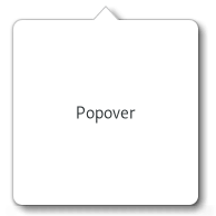 Figure: GtkPopover The position of a popover relative to the widget it is attached to can also be changed through the gtk:popover-position function. By default, the gtk:popover widget performs a GTK grab, in order to ensure input events get redirected to it while it is shown, and also so the popover is dismissed in the expected situations, clicks outside the popover, or the Escape key being pressed. If no such modal behavior is desired on a popover, the gtk:popover-autohide function may be called on it to tweak its behavior. GtkPopover as menu replacementThe gtk:popover widget is often used to replace menus. The best was to do this is to use the gtk:popover-menu subclass which supports being populated from a g:menu-model object with the gtk:popover-menu-new-from-model function.Examples
<section>
  <attribute name="display-hint">horizontal-buttons</attribute>
  <item>
    <attribute name="label">Cut</attribute>
    <attribute name="action">app.cut</attribute>
    <attribute name="verb-icon">edit-cut-symbolic</attribute>
  </item>
  <item>
    <attribute name="label">Copy</attribute>
    <attribute name="action">app.copy</attribute>
    <attribute name="verb-icon">edit-copy-symbolic</attribute>
  </item>
  <item>
    <attribute name="label">Paste</attribute>
    <attribute name="action">app.paste</attribute>
    <attribute name="verb-icon">edit-paste-symbolic</attribute>
  </item>
</section>
CSS nodesParticular uses of the gtk:popover widget, such as touch selection popups or magnifiers in gtk:entry or gtk:text-view widgets get style classes like .touch-selection or .magnifier to differentiate from plain popovers. When styling a popover directly, the popover node should usually not have any background. The visible part of the popover can have a shadow. To specify it in CSS, set the box-shadow of the contents node. Note that, in order to accomplish appropriate arrow visuals, the gtk:popover widget uses custom drawing for the arrow node. This makes it possible for the arrow to change its shape dynamically, but it also limits the possibilities of styling it using CSS. In particular, the arrow gets drawn over the content node's border so they look like one shape, which means that the border-width of the content node and the arrow node should be the same. The arrow also does not support any border shape other than solid, no border-radius, only one border width, border-bottom-width is used, and no box-shadow. Signal DetailsThe "activate-default" signallambda (popover) :action
The "closed" signallambda (popover) :run-last
| Returned bySlot Access Functions
Inherited Slot Access FunctionsSee also |
2025-07-26