Package: gtk
Class gtk:button
Superclassesgtk:widget, gobject:initially-unowned, gtk:accessible, gtk:buildable, gtk:constraint-target, gtk:actionable, gobject:object, common-lisp:standard-object, common-lisp:t Documented SubclassesDirect SlotsDetails The gtk:button widget is generally used to trigger a callback
function that is called when the button is pressed. 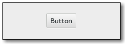 Figure: GtkButton The gtk:button widget can hold any valid child widget. That is, it can hold almost any other standard gtk:widget object. The most commonly used child is the gtk:label widget. CSS nodesOther style classes that are commonly used with the gtk:button implementation include the .suggested-action and .destructive-action style classes. In special cases, buttons can be made round by adding the .circular style class. Button-like widgets like the gtk:toggle-button, gtk:menu-button, gtk:volume-button, gtk:lock-button, gtk:color-button or gtk:font-button widgets use style classes such as the .toggle, .popup, .scale, .lock, .color style classes on the button node to differentiate themselves from a plain gtk:button widget. Signal Details | Returned bySlot Access Functions
Inherited Slot Access FunctionsSee also |
2025-06-29