Package: gtk
Class gtk:color-button
Superclassesgtk:widget, gobject:initially-unowned, gtk:accessible, gtk:buildable, gtk:constraint-target, gtk:color-chooser, gobject:object, common-lisp:standard-object, common-lisp:t Documented Subclasses
None
Direct SlotsDetails The gtk:color-button widget is a button which displays the currently
selected color and allows to open a color chooser dialog to change the
color.
It is a suitable widget for selecting a color in a preference dialog. 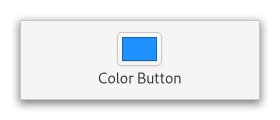 Figure: GtkColorButton CSS nodes
colorbutton
╰── button.color
    ╰── [content]
The gtk:color-button implementation has a single CSS node with name colorbutton which contains a button node. To differentiate it from a plain gtk:button widget, it gets the .color style class. Examples
(defun do-color-button (&optional application)
  (let* ((button (make-instance 'gtk:color-button
                                 :rgba (gdk:rgba-parse "Blue")
                                 :title "Choose a color from the palette"
                                 :margin-top 48
                                 :margin-bottom 48
                                 :margin-start 48
                                 :margin-end 48))
         (window (make-instance 'gtk:window
                                 :title "Color Button"
                                 :application application
                                 :child button
                                 :default-width 270
                                 :default-height 210)))
    (g:signal-connect button "color-set"
        (lambda (widget)
          (let ((rgba (gtk:color-chooser-rgba widget)))
            (format t "Selected color is ~a~%" (gdk:rgba-to-string rgba)))))
(gtk:window-present window))) WarningSignal Details | Returned bySlot Access FunctionsInherited Slot Access FunctionsSee also |
2025-07-24