Package: gtk
Class gtk-list-box
SuperclassesDocumented Subclasses
None
Direct SlotsDetails The gtk-list-box widget is a vertical container that contains gtk-list-box-row children.
These rows can by dynamically sorted and filtered, and headers can be added
dynamically depending on the row content. It also allows keyboard and mouse
navigation and selection like a typical list. 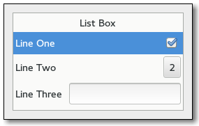 Using the gtk-list-box widget is often an alternative to the gtk-tree-view widget, especially when the list contents has a more complicated layout than what is allowed by a gtk-cell-renderer object, or when the contents is interactive, i.e. has a button in it. Although a gtk-list-box widget must have only gtk-list-box-row children you can add any kind of widget to it via the gtk-container-add function, and a gtk-list-box-row widget will automatically be inserted between the list box and the widget. The gtk-list-box-row widget can be marked as activatable or selectable. If a row is activatable, the "row-activated" signal will be emitted for it when the user tries to activate it. If it is selectable, the row will be marked as selected when the user tries to select it. CSS Nodeslist ╰── row[.activatable]The gtk-list-box implementation uses a single CSS node named list. Each gtk-list-box-row widget uses a single CSS node named row. The row nodes get the .activatable style class added when appropriate. Signal DetailsThe "activate-cursor-row" signallambda (listbox) :action
The "move-cursor" signallambda (listbox step count) :action
The "row-activated" signallambda (listbox row) :run-lastThe signal is emitted when a row has been activated by the user.
The "row-selected" signallambda (listbox row) :run-lastThe signal is emitted when a new row is selected, or when the selection is cleared. When the list box is using the :multiple selection mode, this signal will not give you the full picture of selection changes, and you should use the "selected-rows-changed" signal instead.
The "select-all" signallambda (listbox) :actionThe signal is a keybinding signal which gets emitted to select all children of the list box, if the selection mode permits it. The default bindings for this signal is the Ctrl-a key.
The "selected-rows-changed" signallambda (listbox) :run-firstThe signal is emitted when the set of selected rows changes.
The "toggle-cursor-row" signallambda (listbox) :action
The "unselect-all" signallambda (listbox) :actionThe signal is a keybinding signal which gets emitted to unselect all children of the list box, if the selection mode permits it. The default bindings for this signal is the Ctrl-Shift-a key.
| Slot Access FunctionsInherited Slot Access FunctionsSee also |
*2021-12-15