Package: gtk

Class gtk-info-bar

Superclasses

gtk-box, gtk-container, gtk-widget, gtk-buildable, gtk-orientable, g-object, common-lisp:standard-object, common-lisp:t

Documented Subclasses

None

Direct Slots

message-type
The message-type property of type gtk-message-type (Read / Write / Construct)
The type of the message. The type may be used to determine the appearance of the info bar.
Default value: :info
revealed
The revealed property of type :boolean (Read / Write)
Controls whether the action bar shows its contents or not. Since 3.22
Default value: true
show-close-button
The show-close-button property of type :boolean (Read / Write / Construct)
Whether to include a standard Close button.
Default value: false

Details

The gtk-info-bar widget can be used to show messages to the user without showing a dialog. It is often temporarily shown at the top or bottom of a document. In contrast to the gtk-dialog widget, which has a horizontal action area at the bottom, the info bar has a vertical action area at the side.


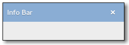
The API of the gtk-info-bar widget is very similar to the gtk-dialog widget, allowing you to add buttons to the action area with the gtk-info-bar-add-button or gtk-info-bar-new-with-buttons functions. The sensitivity of action widgets can be controlled with the gtk-info-bar-set-response-sensitive function. To add widgets to the main content area of an info bar, use the gtk-info-bar-content-area function and add your widgets to the container.

Similar to gtk-message-dialog widget, the contents of an info bar can by classified as error message, warning, informational message, etc, by using the gtk-info-bar-message-type slot access function. GTK uses the message type to determine the background color of the message area.

Example

Simple info bar usage.
(defun create-info-bar ()
  (let* ((info-bar (make-instance 'gtk-info-bar))
         (message (make-instance 'gtk-label :label "Some text"))
         (content (gtk-info-bar-content-area info-bar)))
    ;; Hide the info by default
    (setf (gtk-widget-no-show-all info-bar) t)
    ;; Add a label for the message to the content of the info bar
    (gtk-container-add content message)
    (gtk-widget-show message)
    ;; Add buttons to the info bar
    (gtk-info-bar-add-buttons info-bar "gtk-ok" 1 "gtk-cancel" 2)
    ;; Connect a signal handler to the info bar
    (g-signal-connect info-bar "response"
                      (lambda (widget response)
                        (declare (ignore response))
                        (gtk-widget-hide widget)))
    info-bar))

(defun show-error-message (info-bar message type) (let* ((content (gtk-info-bar-content-area info-bar)) (label (first (gtk-container-children content)))) (setf (gtk-label-label label) message) (setf (gtk-info-bar-message-type info-bar) type) (gtk-widget-show info-bar)))

GtkInfoBar as GtkBuildable

The gtk-info-bar implementation of the gtk-buildable interface exposes the content area and action area as internal children with the names content_area and action_area.

The gtk-info-bar implementation supports a custom <action-widgets> element, which can contain multiple <action-widget> elements. The response attribute specifies a numeric response, and the content of the element is the ID of widget, which should be a child of the dialogs action area.

CSS nodes

The gtk-info-bar implementation has a single CSS node with name infobar. The node may get one of the .info, .warning, .error or .question style classes, depending on the message type.

Style Property Details

action-area-border
The action-area-border style property of type :int (Read)
Width of the border around the action area of the info bar.
Warning: The action-area-border style property has been deprecated since version 3.6 and should not be used in newly written code. Use the gtk-container-border-width function.
Allowed values: >= 0
Default value: 5
button-spacing
The button-spacing style property of type :int (Read)
Spacing between buttons in the action area of the info bar.
Warning: The button-spacing style property has been deprecated since version 3.6 and should not be used in newly written code. Use the gtk-box-spacing function.
Allowed values: >= 0
Default value: 6
content-area-border
The content-area-border style property of type :int (Read)
The width of the border around the content content area of the info bar.
Warning: The content-area-border style property has been deprecated since version 3.6 and should not be used in newly written code. Use the gtk-container-border-width function.
Allowed values: >= 0
Default value: 8
content-area-spacing
The content-area-spacing style property of type :int (Read)
The default spacing used between elements of the content area of the info bar.
Warning: The content-area-spacing style property has been deprecated since version 3.6 and should not be used in newly written code. Use the gtk-box-spacing function.
Allowed values: >= 0
Default value: 16

Signal Details

The "close" signal
 lambda (infobar)    :action      
The signal is a keybinding signal which gets emitted when the user uses a keybinding to dismiss the info bar. The default binding for this signal is the Escape key.
infobar
The gtk-info-bar widget on which the signal is emitted.
The "response" signal
 lambda (infobar response)    :run-last      
Emitted when an action widget is clicked or the application programmer calls the gtk-dialog-response function. The response argument depends on which action widget was clicked.
infobar
The gtk-info-bar widget on which the signal is emitted.
response
An integer with the response ID.
 

Slot Access Functions

Inherited Slot Access Functions

See also

*2021-12-22