Package: gtk

Class gtk-message-dialog

Superclasses

gtk-dialog, gtk-window, gtk-bin, gtk-container, gtk-widget, gtk-buildable, g-object, common-lisp:standard-object, common-lisp:t

Documented Subclasses

None

Direct Slots

buttons
The buttons property of type gtk-buttons-type (Write / Construct Only)
The buttons shown in the message dialog.
Note: This property is not accessible from the Lisp binding.
Default value: :none
image
The image property of type gtk-widget (Read / Write)
The image for the message dialog.
Warning: The image property has been deprecated since version 3.12 and should not be used in newly written code. Use the gtk-dialog widget to create dialogs with images.
message-area
The message-area property of type gtk-widget (Read)
The gtk-box widget of :vertical orientation that corresponds to the message area of the message dialog. See the gtk-message-dialog-message-area function for a detailed description of the message area.
message-type
The message-type property of type gtk-message-type (Read / Write / Construct)
The type of the message. The type is used to determine the image that is shown in the message dialog, unless the image is explicitly set by the image property.
Default value: :info
secondary-text
The secondary-text property of type :string (Read / Write)
The secondary text of the message dialog.
Default value: nil
secondary-use-markup
The secondary-use-markup property of type :boolean (Read / Write)
True if the secondary text of the message dialog includes Pango markup.
Default value: false
text
The text property of type :string (Read / Write)
The primary text of the message dialog. If the dialog has a secondary text, this will appear as the title.
Default value: ""
use-markup
The use-markup property of type :boolean (Read / Write)
True if the primary text of the message dialog includes Pango markup.
Default value: false

Details

A gtk-message-dialog widget presents a dialog with some message text. It is simply a convenience widget. You could construct the equivalent of a message dialog from a gtk-dialog widget without too much effort, but the gtk-message-dialog widget saves typing.


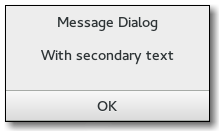
One difference from the gtk-dialog widget is that the message dialog sets the skip-taskbar-hint property to true, so that the message dialog is hidden from the taskbar by default.

The easiest way to do a modal message dialog is to use the gtk-dialog-run function, though you can also pass in the :modal flag of type gtk-dialog-flags, the gtk-dialog-run function automatically makes the message dialog modal and waits for the user to respond to it. The gtk-dialog-run function returns when any message dialog button is clicked.

Examples

A modal message dialog.
(let ((dialog (gtk-message-dialog-new main-window
                                      '(:destroy-with-parent)
                                      :error
                                      :close
                                      "Error loading file ~s"
                                      filename)))
  (gtk-dialog-run dialog)
  (gtk-widget-destroy dialog))    
You might do a non-modal message dialog as follows.
(let ((dialog (gtk-message-dialog-new main-window
                                      '(:destroy-with-parent)
                                      :error
                                      :close
                                      "Error loading file ~s"
                                      filename)))
  ;; Destroy the dialog when the user responds to it
  (g-signal-connect dialog "response"
                    (lambda (dialog response-id)
                      (declare (ignore response-id))
                      (gtk-widget-destroy dialog)))
  ... )    

GtkMessageDialog as GtkBuildable

The gtk-message-dialog implementation of the gtk-buildable interface exposes the message area as an internal child with the name message_area.

Style Properties

message-border
The message-border style property of type :int (Read)
Width of border around the label and image in the message dialog.
Allowed values: >= 0
Default value: 12
 

Slot Access Functions

Inherited Slot Access Functions

gtk-container-border-width
gtk-container-child
gtk-container-resize-mode
gtk-window-accept-focus
gtk-window-application
gtk-window-attached-to
gtk-window-decorated
gtk-window-default-height
gtk-window-default-width
gtk-window-deletable
gtk-window-destroy-with-parent
gtk-window-focus-on-map
gtk-window-focus-visible
gtk-window-gravity
gtk-window-has-resize-grip
gtk-window-has-toplevel-focus
gtk-window-hide-titlebar-when-maximized
gtk-window-icon
gtk-window-icon-name
gtk-window-is-active
gtk-window-mnemonics-visible
gtk-window-modal
gtk-window-opacity
gtk-window-resizable
gtk-window-resize-grip-visible
gtk-window-role
gtk-window-screen
gtk-window-skip-pager-hint
gtk-window-skip-taskbar-hint
gtk-window-startup-id
gtk-window-title
gtk-window-transient-for
gtk-window-type
gtk-window-type-hint
gtk-window-urgency-hint
gtk-window-window-position
gtk-dialog-use-header-bar
gtk-widget-app-paintable
gtk-widget-can-default
gtk-widget-can-focus
gtk-widget-composite-child
gtk-widget-double-buffered
gtk-widget-events
gtk-widget-expand
gtk-widget-focus-on-click
gtk-widget-halign
gtk-widget-has-default
gtk-widget-has-focus
gtk-widget-has-tooltip
gtk-widget-height-request
gtk-widget-hexpand
gtk-widget-hexpand-set
gtk-widget-is-focus
gtk-widget-margin
gtk-widget-margin-bottom
gtk-widget-margin-end
gtk-widget-margin-left
gtk-widget-margin-right
gtk-widget-margin-start
gtk-widget-margin-top
gtk-widget-name
gtk-widget-no-show-all
gtk-widget-opacity
gtk-widget-parent
gtk-widget-receives-default
gtk-widget-scale-factor
gtk-widget-sensitive
gtk-widget-style
gtk-widget-tooltip-markup
gtk-widget-tooltip-text
gtk-widget-valign
gtk-widget-vexpand
gtk-widget-vexpand-set
gtk-widget-visible
gtk-widget-width-request
gtk-widget-window
g-object-has-reference
g-object-pointer
g-object-signal-handlers

See also

*2021-12-3