Package: gtk
Class gtk-paned
Superclassesgtk-container, gtk-widget, gtk-buildable, gtk-orientable, g-object, common-lisp:standard-object, common-lisp:t Documented Subclasses
None
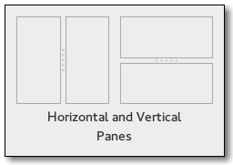
Direct SlotsDetails The gtk-paned widget has two panes, arranged either horizontally or
vertically.
The division between the two panes is adjustable by the user by dragging a
handle.  Child widgets are added to the panes of the paned widget with the gtk-paned-pack1 and gtk-paned-pack2 functions. The division between the two children is set by default from the size requests of the children, but it can be adjusted by the user. A paned widget draws a separator between the two child widgets and a small handle that the user can drag to adjust the division. It does not draw any relief around the children or around the separator. The space in which the separator is called the gutter. Often, it is useful to put each child widget inside a gtk-frame widget with the shadow type set to the :in value so that the gutter appears as a ridge. No separator is drawn if one of the children is missing. Each child widget has two child properties that can be set, the resize and shrink child properties. If the resize child property is true, then when the gtk-paned widget is resized, that child widget will expand or shrink along with the paned widget. If the shrink property is true, then that child widget can be made smaller than its requisition by the user. Setting the shrink child property to false allows the application to set a minimum size. If the resize child property is false for both children, then this is treated as if the resize child property is true for both children. The application can set the position of the slider as if it were set by the user, by calling the gtk-paned-position function. CSS nodespaned ├── <child> ├── separator[.wide] ╰── <child>The gtk-paned implementation has a main CSS node with name paned, and a subnode for the separator with name separator. The subnode gets a .wide style class when the paned is supposed to be wide. In horizontal orientation, the nodes of the children are always arranged from left to right. So :first-child will always select the leftmost child widget, regardless of text direction. Example
(let ((paned (make-instance 'gtk-paned
                            :orientation :horizontal
                            :width-request 250
                            :height-request 150))
      (frame1 (make-instance 'gtk-frame :shadow-type :in
                                        :width-request 100))
      (frame2 (make-instance 'gtk-frame :shadow-type :in
                                        :width-request 50)))
    (gtk-paned-pack1 paned frame1 :resize t :shrink nil)
    (gtk-paned-pack2 paned frame2 :resize nil :shrink nil)
    ... )
Child Property Details
Style Property Details
Signal DetailsThe "accept-position" signallambda (widget) :actionThe signal is a keybinding signal which gets emitted to accept the current position of the handle when moving it using key bindings. The default binding for this signal is the Return or Space key.
The "cancel-position" signallambda (widget) :actionThe signal is a keybinding signal which gets emitted to cancel moving the position of the handle using key bindings. The position of the handle will be reset to the value prior to moving it. The default binding for this signal is the Escape key.
The "cycle-child-focus" signallambda (widget reversed) :actionThe signal is a keybinding signal which gets emitted to cycle the focus between the children of the paned widget. The default binding is the F6 key.
The "cycle-handle-focus" signallambda (widget reversed) :actionThe signal is a keybinding signal which gets emitted to cycle whether the paned widget should grab focus to allow the user to change position of the handle by using key bindings. The default binding for this signal is the F8 key.
The "move-handle" signallambda (widget scrolltype) :actionThe signal is a keybinding signal which gets emitted to move the handle when the user is using key bindings to move it.
The "toggle-handle-focus" signallambda (widget) :actionThe signal is a keybinding signal which gets emitted to accept the current position of the handle and then move focus to the next widget in the focus chain. The default binding is the Tab key.
| Slot Access Functions
Inherited Slot Access FunctionsSee also |
*2021-12-1