Package: gtk

Class gtk-menu

Superclasses

gtk-menu-shell, gtk-container, gtk-widget, gtk-buildable, g-object, common-lisp:standard-object, common-lisp:t

Documented Subclasses

Direct Slots

accel-group
The accel-group property of type gtk-accel-group (Read / Write)
The accelerator group holding accelerators for the menu.
accel-path
The accel-path property of type :string (Read / Write)
An accel path used to conveniently construct accel paths of child items.
Default value: nil
active
The active property of type :int (Read / Write)
The index of the currently selected menu item, or -1 if no menu item is selected.
Allowed values: >= -1
Default value: -1
anchor-hints
The anchor-hints property of type gdk-anchor-hints (Read / Write / Construct)
Positioning hints for aligning the menu relative to a rectangle. These hints determine how the menu should be positioned in the case that the menu would fall off-screen if placed in its ideal position. Since 3.22
Default value: '(:flip-x :flip-y :slide-x :slide-y :resize-x :resize-y)
attach-widget
The attach-widget property of type gtk-widget (Read / Write)
The widget the menu is attached to. Setting this property attaches the menu without a GtkMenuDetachFunc callback function. If you need to use a detacher, use the gtk-menu-attach-to-widget function directly.
menu-type-hint
The menu-type-hint property of type gdk-window-type-hint (Read / Write / Construct)
The gdk-window-type-hint value to use for the gdk-window object of the menu. Since 3.22
Default value: :popup-menu
monitor
The monitor property of type :int (Read / Write)
The monitor the menu will be popped up on.
Allowed values: >= -1
Default value: -1
rect-anchor-dx
The rect-anchor-dx property of type :int (Read / Write / Construct)
Horizontal offset to apply to the menu, i.e. the rectangle or widget anchor. Since 3.22
Default value: 0
rect-anchor-dy
The rect-anchor-dy property of type :int (Read / Write / Construct)
Vertical offset to apply to the menu, i.e. the rectangle or widget anchor. Since 3.22
Default value: 0
reserve-toggle-size
The reserve-toggle-size property of type :boolean (Read / Write)
A boolean that indicates whether the menu reserves space for toggles and icons, regardless of their actual presence. This property should only be changed from its default value for special purposes such as tabular menus. Regular menus that are connected to a menu bar or context menus should reserve toggle space for consistency.
Default value: true
tearoff-state
The tearoff-state property of type :boolean (Read / Write)
A boolean that indicates whether the menu is torn-off.
Warning: The tearoff-state property has been deprecated since version 3.10 and should not be used in newly written code.
Default value: false
tearoff-title
The tearoff-title property of type :string (Read / Write)
A title that may be displayed by the window manager when this menu is torn-off.
Warning: The tearoff-title property has been deprecated since version 3.10 and should not be used in newly written code.
Default value: nil

Details

A gtk-menu widget is a gtk-menu-shell widget that implements a drop down menu consisting of a list of gtk-menu-item widgets which can be navigated and activated by the user to perform application functions.

A gtk-menu widget is most commonly dropped down by activating a gtk-menu-item widget in a gtk-menu-bar widget or popped up by activating a gtk-menu-item widget in another gtk-menu widget.

A gtk-menu widget can also be popped up by activating a gtk-combo-box widget. Other composite widgets such as the gtk-notebook widget can pop up a gtk-menu widget as well.

Applications can display a gtk-menu widget as a popup menu by calling the gtk-menu-popup-at-pointer function. The example below shows how an application can pop up a menu when a mouse button is pressed.

Example

Example with a signal handler which displays a popup menu.
(defun example-menu-popup (&optional application)
  (within-main-loop
    (let ((window (make-instance 'gtk-window
                                 :type :toplevel
                                 :application application
                                 :default-width 300
                                 :default-height 180
                                 :title "Example Popup Menu"))
          (button (gtk-button-new-with-label "Click me")))
      ;; Create pop-up menu for button
      (let ((popup (make-instance 'gtk-menu))
            (bigitem (gtk-menu-item-new-with-label "Larger"))
            (smallitem (gtk-menu-item-new-with-label "Smaller")))
        (gtk-menu-shell-append popup bigitem)
        (gtk-menu-shell-append popup smallitem)
        (gtk-widget-show-all popup)
        ;; Signal handler to pop up the menu
        (g-signal-connect button "button-press-event"
           (lambda (widget event)
             (declare (ignore widget))
             (gtk-menu-popup-at-pointer popup event)
             t)))
      (g-signal-connect window "destroy"
                        (lambda (widget)
                          (declare (ignore widget))
                          (leave-gtk-main)))
      (gtk-container-add window button)
      (gtk-widget-show-all window))))    

CSS nodes

menu
├── arrow.top
├── <child>
┊
├── <child>
╰── arrow.bottom    
The main CSS node of the gtk-menu implemenation has name menu, and there are two subnodes with name arrow, for scrolling menu arrows. These subnodes get the .top and .bottom style classes.

Child Property Details

bottom-attach
The bottom-attach child property of type :int (Read / Write)
The row number to attach the bottom of the child to.
Allowed values: >= -1
Default value: -1
left-attach
The left-attach child property of type :int (Read / Write)
The column number to attach the left side of the child to.
Allowed values: >= -1
Default value: -1
right-attach
The right-attach child property of type :int (Read / Write)
The column number to attach the right side of the child to.
Allowed values: >= -1
Default value: -1
top-attach
The top-attach child property of type :int (Read / Write)
The row number to attach the top of the child to.
Allowed values: >= -1
Default value: -1

Style Property Details

arrow-placement
The arrow-placement style property of type gtk-arrow-placement (Read)
Indicates where scroll arrows should be placed.
Warning: The arrow-placement style property has been deprecated since version 3.20 and should not be used in newly written code. The value of this style property is ignored.
Default value: :boths
arrow-scaling
The arrow-scaling style property of type :float (Read)
Arbitrary constant to scale down the size of the scroll arrow.
Warning: The arrow-scaling style property has been deprecated since version 3.20 and should not be used in newly written code. Use the standard min-width/min-height CSS properties on the arrow node. The value of this style property is ignored.
Allowed values: [0,1]
Default value: 0.7
double-arrows
The double-arrows style property of type :boolean (Read)
When scrolling, always show both arrows.
Warning: The double-arrows style property has been deprecated since version 3.20 and should not be used in newly written code. The value of this style property is ignored.
Default value: true
horizontal-offset
The horizontal-offset style property of type :int (Read)
When the menu is a submenu, position it this number of pixels offset horizontally.
Default value: -2
horizontal-padding
The horizontal-padding style property of type :int (Read)
Extra space at the left and right edges of the menu.
Warning: The horizontal-padding style property has been deprecated since version 3.8 and should not be used in newly written code. Use the standard padding CSS property, through objects like gtk-style-context and gtk-css-provider. The value of this style property is ignored.
Allowed values: >= 0
Default value: 0
vertical-offset
The vertical-offset style property of type :int (Read)
When the menu is a submenu, position it this number of pixels offset vertically.
Default value: 0
vertical-padding
The vertical-padding style property of type :int (Read)
Extra space at the top and bottom of the menu.
Warning: The vertical-padding style property has been deprecated since version 3.8 and should not be used in newly written code. Use the standard padding CSS property, through objects like gtk-style-context and gtk-css-provider. The value of this style property is ignored.
Allowed values: >= 0
Default value: 1

Signal Details

The "move-scroll" signal
 lambda (menu scrolltype)    :action      
menu
A gtk-menu widget.
scrolltype
A value of the gtk-scroll-type enumeration.
The "popped-up" signal
 lambda (menu flipped final xflipped yflipped)    :run-first      
Emitted when the position of the menu is finalized after being popped up using the gtk-menu-popup-at-rect, gtk-menu-popup-at-widget, or gtk-menu-popup-at-pointer functions.

The menu might be flipped over the anchor rectangle in order to keep it on-screen, in which case the xflipped and yflipped arguments will be set to true accordingly.

The flipped argument is the ideal position of the menu after any possible flipping, but before any possible sliding. The final argument is flipped, but possibly translated in the case that flipping is still ineffective in keeping menu on-screen.
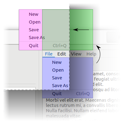


The blue menu is the ideal position of the menu, the green menu is flipped, and the red menu is final.

See the gtk-menu-popup-at-rect, gtk-menu-popup-at-widget, gtk-menu-popup-at-pointer functions, and the anchor-hints, rect-anchor-dx, rect-anchor-dy, and menu-type-hint properties.

Since 3.22
menu
A gtk-menu widget that popped up.
flipped
The position of menu after any possible flipping or nil if the backend can not obtain it.
final
The final position of menu or nil if the backend can not obtain it.
xflipped
True if the anchors were flipped horizontally.
yflipped
True if the anchors were flipped vertically.
 

Slot Access Functions

Inherited Slot Access Functions

See also

*2021-11-14