A
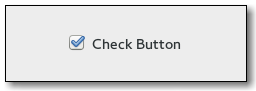
gtk-check-button widget places a discrete
gtk-toggle-button widget next to a widget, usually a
gtk-label widget. See the
gtk-toggle-button documentation for more information about
toggle/check buttons. The important "toggled" signal is also inherited from the
gtk-toggle-button class.
CSS nodes
 checkbutton
 ├── check
 ╰── <child>
A
gtk-check-button widget with indicator, see the
gtk-toggle-button-mode function, has a main CSS node with name
checkbutton and a subnode with name
check.
 button.check
 ├── check
 ╰── <child>
A
gtk-check-button widget without indicator changes the name of its main node to
button and adds a
.check style class to it. The
subnode is invisible in this case.
Style Property Details
- indicator-size
- The indicator-size style property of type :int (Read)
Size of check or radio indicator.
Warning: The indicator-size style property has been
deprecated since version 3.20 and should not be used in newly written code. Use CSS min-width and min-height on the indicator node.
Allowed values: >= 0
Default value: 16 - indicator-spacing
- The indicator-spacing style property of type :int (Read)
Spacing around check or radio indicator.
Warning: The indicator-spacing style property has been
deprecated since version 3.20 and should not be used in newly written code. Use CSS min-width and min-height on the indicator node.
Allowed values: >= 0
Default value: 2